从零学习RN for OpenHarmony----初识组件(三)
/ 1. 处理开关状态变化(Switch组件的回调方法)// 接收Switch组件传递的新状态(true/false),更新isSwitchEnabled状态// 2. 处理自定义按钮点击(TouchableOpacity的点击回调)// 第一步:弹出系统提示框(标题+内容)Alert.alert('提示', '自定义按钮被点击啦!');// 第二步:设置加载状态为true(显示loading)/
一、示例代码
为了学习rn的其他组件,我们先编写一个简单的组件使用代码。这段代码是一个RN 基础组件整合演示页面,没有复杂业务逻辑,核心目的是展示 RN 中常用的 UI 组件和基础语法,包含开关、加载指示器、自定义按钮、列表、输入框等功能,并且做了基础的样式美化和适配。
import React, { useState } from 'react';
import {
SafeAreaView,
StyleSheet,
View,
Text,
ScrollView,
Switch,
ActivityIndicator,
TouchableOpacity,
Alert,
FlatList,
SectionList,
KeyboardAvoidingView,
TextInput,
Image
} from 'react-native';
// 定义 App 组件(适配 RNOH/鸿蒙,无 Picker 相关内容)
const App = () => {
// 1. 定义各类状态(已移除 selectedCity 相关 Picker 状态)
const [isSwitchEnabled, setIsSwitchEnabled] = useState(false);
const [inputValue, setInputValue] = useState('');
const [isLoading, setIsLoading] = useState(false);
// 2. 模拟 FlatList 商品数据源
const goodsData = [
{ id: '1', name: 'React Native 入门教程', price: 99, img: 'https://reactnative.dev/img/tiny_logo.png' },
{ id: '2', name: 'React 实战指南', price: 129, img: 'https://reactnative.dev/img/tiny_logo.png' },
{ id: '3', name: '移动端开发进阶', price: 159, img: 'https://reactnative.dev/img/tiny_logo.png' },
{ id: '4', name: 'TypeScript 从入门到精通', price: 119, img: 'https://reactnative.dev/img/tiny_logo.png' },
];
// 3. 模拟 SectionList 联系人分组数据源
const contactData = [
{ title: 'A', data: ['阿伟', '阿丽', '阿强'] },
{ title: 'B', data: ['宝强', '宝丽', '宝华'] },
{ title: 'C', data: ['翠花', '翠兰', '春生'] },
];
// 4. 自定义方法
const toggleSwitch = (newValue: boolean) => {
setIsSwitchEnabled(newValue);
};
const handleCustomBtnClick = () => {
Alert.alert('提示', '自定义按钮被点击啦!');
setIsLoading(true);
setTimeout(() => {
setIsLoading(false);
}, 2000);
};
// 5. FlatList 渲染单个商品项
const renderGoodsItem = ({ item }: { item: (typeof goodsData)[0] }) => {
return (
<View style={styles.goodsItem}>
<Image source={{ uri: item.img }} style={styles.goodsImg} />
<View style={styles.goodsInfo}>
<Text style={styles.goodsName}>{item.name}</Text>
<Text style={styles.goodsPrice}>¥{item.price}</Text>
</View>
</View>
);
};
// 6. FlatList 列表分隔线
const renderGoodsSeparator = () => {
return <View style={styles.goodsSeparator} />;
};
return (
<SafeAreaView style={styles.container}>
{/* 简化的 ScrollView(无 Picker 相关嵌套) */}
<ScrollView
showsVerticalScrollIndicator={false}
contentContainerStyle={styles.scrollContent}
keyboardShouldPersistTaps="handled"
>
{/* 标题 */}
<View style={styles.pageTitleWrap}>
<Text style={styles.pageTitle}>App 组件整合演示(无 Picker 版本)</Text>
</View>
{/* 1. Switch 组件演示 */}
<View style={styles.section}>
<Text style={styles.sectionTitle}>1. 开关组件(Switch)</Text>
<View style={styles.switchWrap}>
<Text style={styles.switchText}>消息通知:{isSwitchEnabled ? '开启' : '关闭'}</Text>
<Switch
value={isSwitchEnabled}
onValueChange={toggleSwitch}
trackColor={{ false: '#e0e0e0', true: '#2196F3' }}
thumbColor={isSwitchEnabled ? '#fff' : '#999'}
/>
</View>
</View>
{/* 2. ActivityIndicator 组件演示 */}
<View style={styles.section}>
<Text style={styles.sectionTitle}>2. 加载指示器(ActivityIndicator)</Text>
<View style={styles.loadingWrap}>
<ActivityIndicator
animating={isLoading}
color="#2196F3"
size="large"
/>
<Text style={styles.loadingText}>{isLoading ? '加载中...' : '点击下方按钮触发加载'}</Text>
</View>
</View>
{/* 3. TouchableOpacity 自定义按钮演示 */}
<View style={styles.section}>
<Text style={styles.sectionTitle}>3. 自定义按钮(TouchableOpacity)</Text>
<TouchableOpacity
style={styles.customBtn}
onPress={handleCustomBtnClick}
activeOpacity={0.5}
disabled={isLoading}
>
<Text style={styles.customBtnText}>点击触发加载 & 弹窗</Text>
</TouchableOpacity>
</View>
{/* 4. FlatList 基础列表组件演示(调整序号,保持逻辑连贯) */}
<View style={styles.section}>
<Text style={styles.sectionTitle}>4. 基础列表(FlatList)</Text>
<FlatList
data={goodsData}
renderItem={renderGoodsItem}
keyExtractor={(item) => item.id}
ItemSeparatorComponent={renderGoodsSeparator}
showsVerticalScrollIndicator={false}
scrollEnabled={false}
style={styles.flatList}
/>
</View>
{/* 5. SectionList 分组列表组件演示(调整序号,保持逻辑连贯) */}
<View style={styles.section}>
<Text style={styles.sectionTitle}>5. 分组列表(SectionList)</Text>
<SectionList
sections={contactData}
renderSectionHeader={({ section }) => (
<View style={styles.sectionHeader}>
<Text style={styles.sectionHeaderText}>{section.title}</Text>
</View>
)}
renderItem={({ item }) => (
<Text style={styles.contactItem}>{item}</Text>
)}
keyExtractor={(item, index) => index.toString()}
showsVerticalScrollIndicator={false}
scrollEnabled={false}
style={styles.sectionList}
/>
</View>
{/* 6. KeyboardAvoidingView 键盘适配演示(调整序号,保持逻辑连贯) */}
<View style={styles.section}>
<Text style={styles.sectionTitle}>6. 键盘适配(KeyboardAvoidingView)</Text>
<KeyboardAvoidingView
style={styles.keyboardAvoidWrap}
behavior="padding"
keyboardVerticalOffset={20}
>
<TextInput
style={styles.input}
placeholder="请输入内容,键盘弹出不会遮挡"
placeholderTextColor="#999"
value={inputValue}
onChangeText={(text) => setInputValue(text)}
clearButtonMode="while-editing"
/>
</KeyboardAvoidingView>
</View>
</ScrollView>
</SafeAreaView>
);
};
const styles = StyleSheet.create({
container: {
flex: 1,
backgroundColor: '#f5f5f5',
},
scrollContent: {
padding: 20,
},
pageTitleWrap: {
alignItems: 'center',
marginBottom: 30,
},
pageTitle: {
fontSize: 20,
fontWeight: 'bold',
color: '#333',
},
section: {
marginBottom: 30,
backgroundColor: '#fff',
borderRadius: 12,
padding: 20,
shadowColor: '#000',
shadowOffset: { width: 0, height: 2 },
shadowOpacity: 0.05,
shadowRadius: 8,
elevation: 2, // 适配安卓/鸿蒙阴影
},
sectionTitle: {
fontSize: 16,
fontWeight: 'bold',
color: '#333',
marginBottom: 15,
},
switchWrap: {
flexDirection: 'row',
alignItems: 'center',
justifyContent: 'space-between',
},
switchText: {
fontSize: 15,
color: '#666',
},
loadingWrap: {
alignItems: 'center',
paddingVertical: 10,
},
loadingText: {
fontSize: 14,
color: '#999',
marginTop: 10,
},
customBtn: {
backgroundColor: '#2196F3',
paddingVertical: 12,
paddingHorizontal: 24,
borderRadius: 24,
alignItems: 'center',
},
customBtnText: {
color: '#fff',
fontSize: 15,
fontWeight: '500',
},
flatList: {
width: '100%',
},
goodsItem: {
flexDirection: 'row',
alignItems: 'center',
paddingVertical: 10,
},
goodsImg: {
width: 50,
height: 50,
marginRight: 12,
},
goodsInfo: {
flex: 1,
},
goodsName: {
fontSize: 14,
color: '#333',
marginBottom: 4,
},
goodsPrice: {
fontSize: 13,
color: '#f44336',
fontWeight: '500',
},
goodsSeparator: {
height: 1,
backgroundColor: '#f5f5f5',
marginVertical: 5,
},
sectionList: {
width: '100%',
},
sectionHeader: {
backgroundColor: '#f5f5f5',
padding: 10,
},
sectionHeaderText: {
fontSize: 15,
fontWeight: 'bold',
color: '#333',
},
contactItem: {
padding: 12,
fontSize: 14,
color: '#666',
borderBottomWidth: 1,
borderBottomColor: '#f5f5f5',
},
keyboardAvoidWrap: {
width: '100%',
},
input: {
width: '100%',
height: 44,
backgroundColor: '#f9f9f9',
paddingHorizontal: 15,
borderRadius: 8,
borderWidth: 1,
borderColor: '#eee',
fontSize: 15,
},
});
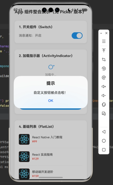
export default App;运行截图如下:
二、导入依赖
这是 RN 组件的「必备开头」,类似搭积木前先把需要的积木零件准备好。
import React, { useState } from 'react';

import {
  SafeAreaView,
  StyleSheet,
  View,
  Text,
  ScrollView,
  Switch,
  ActivityIndicator,
  TouchableOpacity,
  Alert,
  FlatList,
  SectionList,
  KeyboardAvoidingView,
  TextInput,
  Image
} from 'react-native';三、组件定义与状态管理(const App = () => {} 开头部分)
RN 的页面 / 功能都是以「组件」的形式存在,这里定义了一个名为App的函数式组件(新手先聚焦函数式组件,是目前 RN 的主流写法)。
3.1 函数式组件
RN 的函数式组件,本质上就是一个普通的 JavaScript 函数,它接收一个 props 参数(组件的属性),最终返回一段可渲染的 RN 元素(比如 View、Text、Image 等),这些返回的元素会被 RN 渲染成手机端的原生界面。现在知道即可,后面我们会详细学习。
基础特征
-
形式简单:就是普通 JS 函数,可分为「命名函数」和「箭头函数」两种写法(推荐命名函数,可读性更好)。
-
接收
props:props是一个对象,用于接收父组件传递过来的数据或方法,只读不可修改(单向数据流)。 -
返回可渲染元素:必须返回 RN 支持的可渲染节点(单个根元素、多个元素包裹在
View/Fragment中,或数组)。 -
无内置生命周期:早期函数式组件是「无状态组件」,无法维护内部状态和使用生命周期,直到 Hooks 出现后,才通过
useState(维护状态)、useEffect(模拟生命周期)实现了完整的组件能力。
3.2 状态管理:useState 钩子
useState是 React 的核心钩子,用于在函数式组件中保存可变数据(状态),数据变化时,组件会自动重新渲染,更新页面展示。
这段代码定义了 3 个状态,格式都是「const [状态名, 修改状态的方法] = useState(初始值)」:
// 开关的开启/关闭状态,初始值false(关闭)
const [isSwitchEnabled, setIsSwitchEnabled] = useState(false);
// 输入框的内容状态,初始值空字符串
const [inputValue, setInputValue] = useState('');
// 加载指示器的显示/隐藏状态,初始值false(隐藏)
const [isLoading, setIsLoading] = useState(false);
- 注意:不能直接修改状态(如
isSwitchEnabled = true),必须使用对应的修改方法(如setIsSwitchEnabled(true)),否则组件不会重新渲染。
3.3 模拟数据源(2 个列表的假数据)
定义了 2 个普通数组,作为后续FlatList和SectionList的展示数据,类似后端接口返回的数据。
// FlatList的商品数据:数组中每个元素是一个商品对象,包含id/name/price/img
const goodsData = [
  { id: '1', name: 'React Native 入门教程', price: 99, img: 'https://reactnative.dev/img/tiny_logo.png' },
  // ... 其他商品
];

// SectionList的联系人数据:数组中每个元素是一个分组对象,包含title(分组标题)和data(分组下的具体数据)
const contactData = [
  { title: 'A', data: ['阿伟', '阿丽', '阿强'] },
  // ... 其他分组
];
3.4 自定义方法(2 个业务逻辑函数)
定义了 2 个函数,处理用户交互后的逻辑:
// 1. 处理开关状态变化(Switch组件的回调方法)
const toggleSwitch = (newValue: boolean) => {
  // 接收Switch组件传递的新状态(true/false),更新isSwitchEnabled状态
  setIsSwitchEnabled(newValue);
};

// 2. 处理自定义按钮点击(TouchableOpacity的点击回调)
const handleCustomBtnClick = () => {
  // 第一步:弹出系统提示框(标题+内容)
  Alert.alert('提示', '自定义按钮被点击啦!');
  // 第二步:设置加载状态为true(显示loading)
  setIsLoading(true);
  // 第三步:模拟2秒后加载完成,隐藏loading(setTimeout是JS的延时函数)
  setTimeout(() => {
    setIsLoading(false);
  }, 2000);
};
3.5 FlatList 相关辅助方法(渲染列表项 + 分隔线)
FlatList本身只是一个列表容器,需要告诉它「如何渲染每一个列表项」「是否需要分隔线」,这两个方法就是用来实现这两个功能的。
// 1. 渲染单个商品项(接收FlatList传递的当前数据项item)
const renderGoodsItem = ({ item }: { item: (typeof goodsData)[0] }) => {
  // 返回一个UI结构,展示当前商品的图片、名称、价格
  return (
    <View style={styles.goodsItem}> {/* 商品项容器,横向布局 */}
      {/* 商品图片:source={{ uri: 网络图片地址 }} 用于加载网络图片 */}
      <Image source={{ uri: item.img }} style={styles.goodsImg} />
      {/* 商品信息容器,纵向布局 */}
      <View style={styles.goodsInfo}>
        <Text style={styles.goodsName}>{item.name}</Text>
        <Text style={styles.goodsPrice}>¥{item.price}</Text>
      </View>
    </View>
  );
};

// 2. 渲染列表项之间的分隔线(简单的灰色横线)
const renderGoodsSeparator = () => {
  return <View style={styles.goodsSeparator} />;
};欢迎加入开源鸿蒙跨平台社区:https://openharmonycrossplatform.csdn.net

开源鸿蒙跨平台开发社区汇聚开发者与厂商,共建“一次开发,多端部署”的开源生态,致力于降低跨端开发门槛,推动万物智联创新。
更多推荐


 14
14 0
0- 0


 已为社区贡献9条内容

所有评论(0)