Flutter for OpenHarmony 实战之基础组件:第十五篇 Wrap 与 Flow 流式布局
在前面的文章中,我们遇到了`Row`组件当内容过宽时会报溢出错误(Overflow)的问题。虽然可以使用`Expanded`来解决,但如果我们希望内容**自动换行**呢?比如电商 App 的搜索历史标签、商品属性选择器。本文将深入解析 Flutter 中的流式布局组件 `Wrap`,并简要介绍更高级的自定义布局 `Flow`,助你轻松实现动态标签流。

Flutter for OpenHarmony 实战之基础组件:第十五篇 Wrap 与 Flow 流式布局
前言
试想这样一个场景:你需要展示一组搜索记录标签(如:“鸿蒙系统”、“Flutter”、“跨平台开发”、“高性能”)。
- 如果用
Row:屏幕宽度不够时,右边会报错。 - 如果用
ListView:只能横向滚动,不能展示多行。
在这里,我们需要的是一种像写文档打字一样,写满一行自动换到下一行的布局方式。这就是 流式布局 (Flow Layout)。
在 Flutter 中,实现这种效果的神器就是 Wrap。
本文你将学到:
Wrap与Row的核心区别- 控制标签间距 (
spacing,runSpacing) - 对齐方式 (
alignment,runAlignment) - 实战:打造一个动态增删的“搜索历史”标签墙
一、Wrap:自动换行的 Row
Wrap 的属性和 Row 非常像,它最核心的能力就是:当主轴(Main Axis)空间不足时,自动换行。
1.1 基础用法
Wrap(
  // 💡 水平方向间距
  spacing: 8.0,
  // 💡 垂直方向间距 (行间距)
  runSpacing: 4.0,
  // 对齐方式 (Start, Center, End...)
  alignment: WrapAlignment.start,
  children: [
    Chip(label: Text('鸿蒙 OS')),
    Chip(label: Text('Flutter')),
    Chip(label: Text('ArkUI')),
    Chip(label: Text('跨平台')),
    Chip(label: Text('高性能架构')),
    Chip(label: Text('Dart 语言')),
  ],
)
相比于 Row,它不仅没有溢出报错,还自动把放不下的 “Dart 语言” 挤到了第二行,并且保留了优雅的间距。
1.2 属性详解
- direction: 布局方向,默认
Axis.horizontal(水平流),也可以设为Axis.vertical(垂直流,就像古书文字排版一样)。 - spacing: 主轴方向子组件的间距(对于水平流,就是左右间距)。
- runSpacing: 纵轴方向行的间距(对于水平流,就是上下行距)。
- alignment: 每一行内部的对齐方式。
- runAlignment: 多行之间在容器内的对齐方式(类似
Column的mainAxisAlignment,控制行与行怎么分布)。
二、Flow:自定义流式布局(高阶)
Wrap 已经能满足 95% 的需求。但如果你需要实现非常炫酷的动画效果(比如:点击菜单按钮,子菜单像扇形一样展开),那么 Wrap 就力不从心了。
这时需要用 Flow。注意:Flow 非常复杂,且需要自己计算坐标,通常只用于制作动画菜单。
由于篇幅和实用性原因,我们在基础篇中不深入展开 FlowDelegate 的数学计算。对于普通布局,请坚定地使用 Wrap。
import 'package:flutter/material.dart';
class SearchHistoryPage extends StatefulWidget {
const SearchHistoryPage({super.key});
State<SearchHistoryPage> createState() => _SearchHistoryPageState();
}
class _SearchHistoryPageState extends State<SearchHistoryPage> {
// 模拟搜索历史数据
final List<String> _history = [
'鸿蒙 OS',
'Flutter',
'ArkUI',
'跨平台开发',
'高性能架构',
'Dart 语言',
'状态管理',
'ListView 优化',
'Grid 网格',
'沉浸式设计',
'自定义组件'
];
Widget build(BuildContext context) {
return Scaffold(
appBar: AppBar(title: const Text('Wrap 流式布局')),
body: SingleChildScrollView(
padding: const EdgeInsets.all(16.0),
child: Column(
crossAxisAlignment: CrossAxisAlignment.start,
children: [
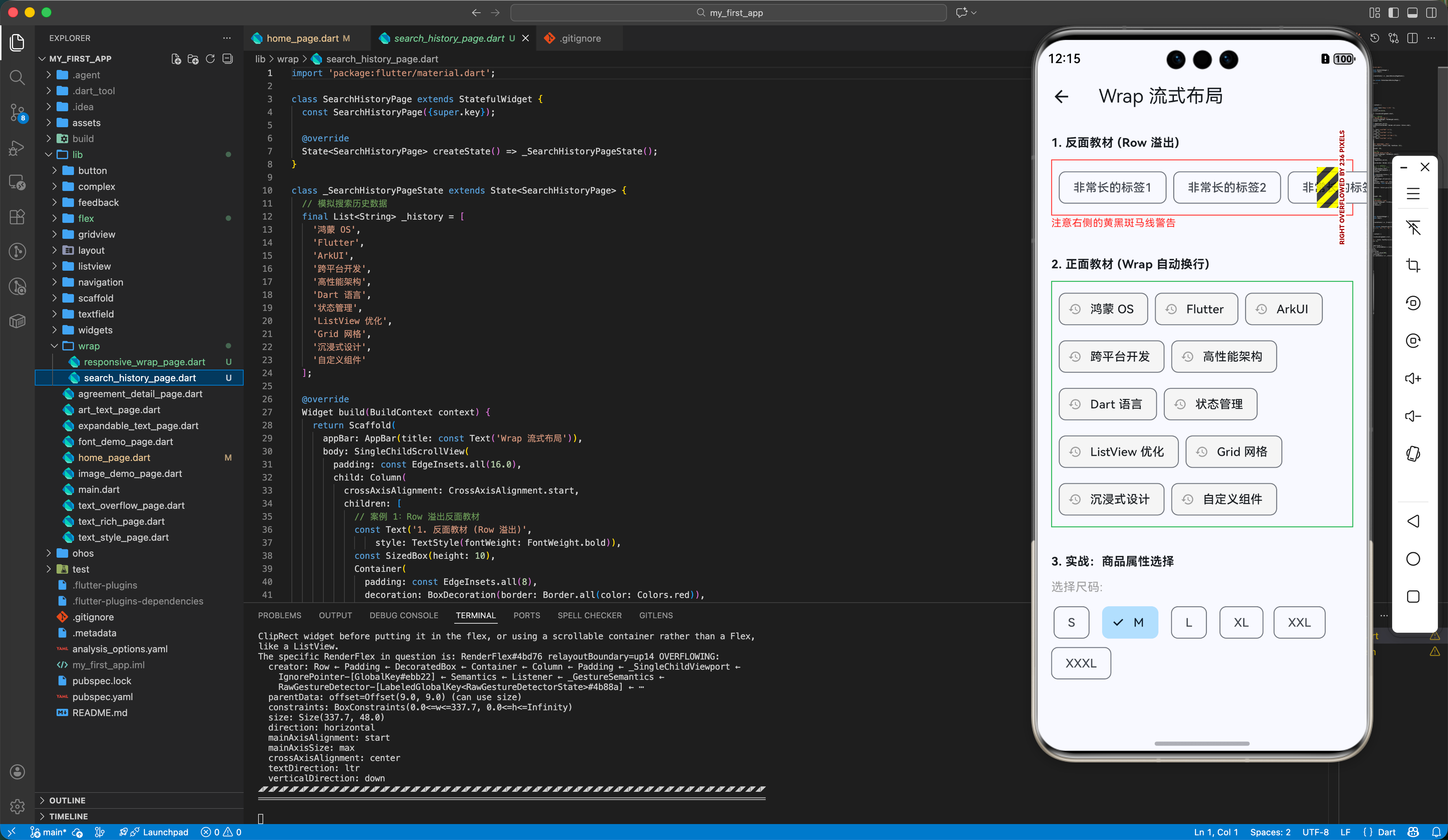
// 案例 1:Row 溢出反面教材
const Text('1. 反面教材 (Row 溢出)',
style: TextStyle(fontWeight: FontWeight.bold)),
const SizedBox(height: 10),
Container(
padding: const EdgeInsets.all(8),
decoration: BoxDecoration(border: Border.all(color: Colors.red)),
child: const Row(
children: [
Chip(label: Text('非常长的标签1')),
SizedBox(width: 8),
Chip(label: Text('非常长的标签2')),
SizedBox(width: 8),
Chip(label: Text('非常长的标签3 (溢出)')),
SizedBox(width: 8),
Chip(label: Text('非常长的标签4')),
],
),
),
const Text('注意右侧的黄黑斑马线警告',
style: TextStyle(color: Colors.red, fontSize: 12)),
const SizedBox(height: 30),
// 案例 2:Wrap 自动换行
const Text('2. 正面教材 (Wrap 自动换行)',
style: TextStyle(fontWeight: FontWeight.bold)),
const SizedBox(height: 10),
Container(
width: double.infinity,
padding: const EdgeInsets.all(8),
decoration:
BoxDecoration(border: Border.all(color: Colors.green)),
child: Wrap(
spacing: 8.0, // 💡 水平间距
runSpacing: 8.0, // 💡 垂直行间距
alignment: WrapAlignment.start,
children: _history.map((keyword) {
return ActionChip(
avatar:
const Icon(Icons.history, size: 16, color: Colors.grey),
label: Text(keyword),
onPressed: () {
ScaffoldMessenger.of(context).showSnackBar(
SnackBar(
content: Text('搜索: $keyword'),
duration: const Duration(seconds: 1)),
);
},
backgroundColor: Colors.grey[100],
);
}).toList(),
),
),
const SizedBox(height: 30),
// 案例 3:属性选择器演示
const Text('3. 实战:商品属性选择',
style: TextStyle(fontWeight: FontWeight.bold)),
const SizedBox(height: 10),
const ProductAttributes(),
],
),
),
);
}
}
class ProductAttributes extends StatefulWidget {
const ProductAttributes({super.key});
State<ProductAttributes> createState() => _ProductAttributesState();
}
class _ProductAttributesState extends State<ProductAttributes> {
final List<String> _sizes = ['S', 'M', 'L', 'XL', 'XXL', 'XXXL'];
String _selectedSize = 'M';
Widget build(BuildContext context) {
return Column(
crossAxisAlignment: CrossAxisAlignment.start,
children: [
const Text('选择尺码:', style: TextStyle(color: Colors.grey)),
const SizedBox(height: 8),
Wrap(
spacing: 12,
children: _sizes.map((size) {
final isSelected = _selectedSize == size;
return ChoiceChip(
label: Text(size),
selected: isSelected,
selectedColor: Colors.blue[100],
onSelected: (selected) {
if (selected) setState(() => _selectedSize = size);
},
);
}).toList(),
),
],
);
}
}
三、OpenHarmony 鸿蒙适配专题
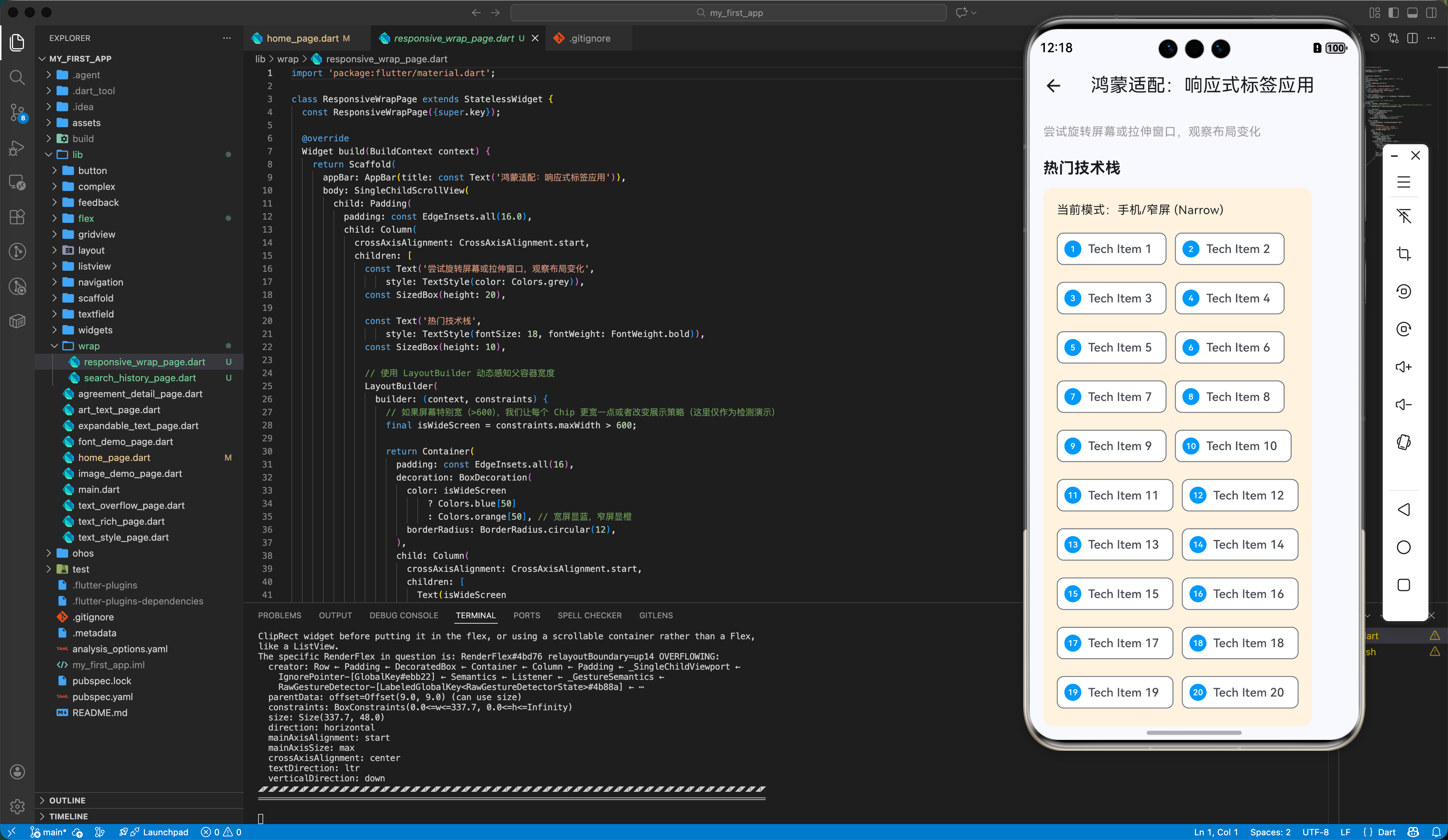
3.1 动态宽度适配
在鸿蒙平板或折叠屏上,屏幕宽度是可变的。Wrap 是实现响应式设计的利器之一。
当屏幕变宽时(如折叠屏展开),Wrap 会自动把第二行的标签提到第一行;当屏幕变窄时,自动流回第二行。这种自适应能力使得它比固定列数的 GridView 更适合展示不定宽度的内容(如搜索热词)。
3.2 结合 LayoutBuilder
为了防止 Wrap 在极小屏幕上(如手表或分屏模式)产生布局异常,我们可以结合 LayoutBuilder 限制最大行数。
LayoutBuilder(
  builder: (context, constraints) {
    if (constraints.maxWidth < 200) {
      // 屏幕太窄,只显示一列
      return Column(children: _buildTags());
    }
    return Wrap(children: _buildTags());
  },
)
四、实战:搜索历史标签墙
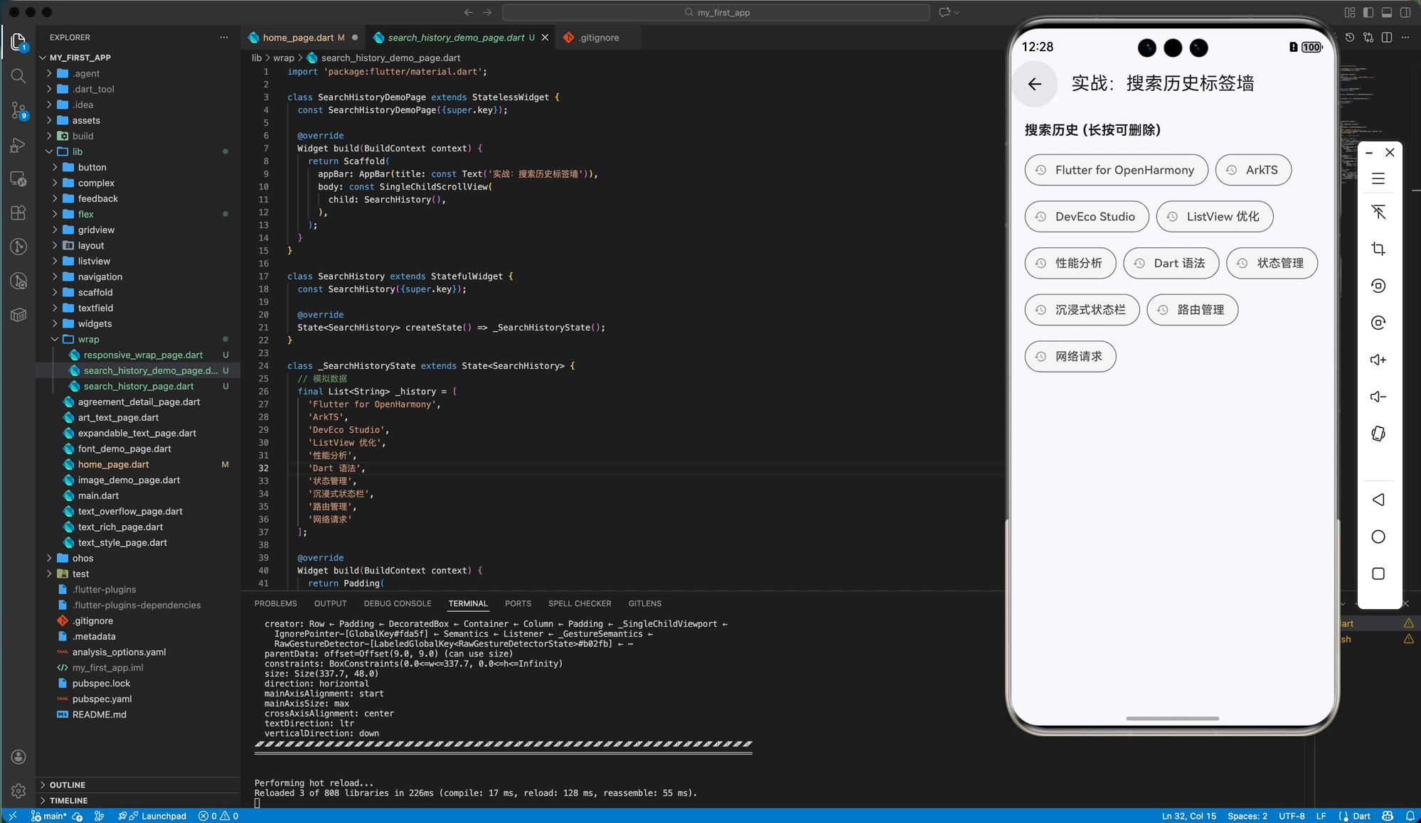
我们来实现一个常见的 App 功能:搜索历史记录。支持点击删除,且自动换行。
import 'package:flutter/material.dart';
class SearchHistoryDemoPage extends StatelessWidget {
const SearchHistoryDemoPage({super.key});
Widget build(BuildContext context) {
return Scaffold(
appBar: AppBar(title: const Text('实战:搜索历史标签墙')),
body: const SingleChildScrollView(
child: SearchHistory(),
),
);
}
}
class SearchHistory extends StatefulWidget {
const SearchHistory({super.key});
State<SearchHistory> createState() => _SearchHistoryState();
}
class _SearchHistoryState extends State<SearchHistory> {
// 模拟数据
final List<String> _history = [
'Flutter for OpenHarmony',
'ArkTS',
'DevEco Studio',
'ListView 优化',
'性能分析',
'Dart 语法',
'状态管理',
'沉浸式状态栏',
'路由管理',
'网络请求'
];
Widget build(BuildContext context) {
return Padding(
padding: const EdgeInsets.all(16.0),
child: Column(
crossAxisAlignment: CrossAxisAlignment.start,
children: [
const Text('搜索历史 (长按可删除)',
style: TextStyle(fontWeight: FontWeight.bold, fontSize: 16)),
const SizedBox(height: 12),
// 💡 核心:使用 Wrap 包裹 Chips
Wrap(
spacing: 8.0, // 左右间距
runSpacing: 8.0, // 上下间距
children: _history.map<Widget>((keyword) {
// ActionChip 不支持 onLongPress,这里使用 GestureDetector 包裹 Chip 实现
return GestureDetector(
onTap: () {
ScaffoldMessenger.of(context).showSnackBar(
SnackBar(
content: Text('点击搜索: $keyword'),
duration: const Duration(milliseconds: 500)),
);
},
onLongPress: () {
setState(() {
_history.remove(keyword);
});
ScaffoldMessenger.of(context).showSnackBar(
SnackBar(
content: Text('已删除: $keyword'),
duration: const Duration(milliseconds: 500)),
);
},
child: Chip(
avatar:
const Icon(Icons.history, size: 16, color: Colors.grey),
label: Text(keyword),
shape: RoundedRectangleBorder(
borderRadius: BorderRadius.circular(20)),
backgroundColor: Colors.grey[100],
),
);
}).toList(),
),
],
),
);
}
}
五、总结
Wrap 是解决 Flutter 中“溢出”问题的第二把钥匙(第一把是 Expanded)。
核心要点
- 场景:凡是遇到“搜索标签”、“属性选择”、“多行按钮组”,首选
Wrap。 - 替代:它替代的是
Row,而不是ListView。它不能滚动(除非外面包 ScrollView),它是把内容全部展开。 - 间距:忘记
Padding吧,直接用spacing和runSpacing更优雅。
下一篇预告
布局的三大金刚(线性、层叠、流式)我们都学完了。但如果我想给一个组件限制最大宽度(比如在 iPad 上不要撑满全屏),或者强制设为正方形,该怎么办?
《Flutter for OpenHarmony 实战之基础组件:第十六篇 约束布局 ConstrainedBox 与 AspectRatio》
我们将深入 Flutter 最反直觉的“约束传递”机制。
🌐 欢迎加入开源鸿蒙跨平台社区:开源鸿蒙跨平台开发者社区

开源鸿蒙跨平台开发社区汇聚开发者与厂商,共建“一次开发,多端部署”的开源生态,致力于降低跨端开发门槛,推动万物智联创新。
更多推荐

 15
15 0
0- 0


 已为社区贡献19条内容

所有评论(0)