Flutter for OpenHarmony 实战:底部导航栏(BottomNavigationBar)与页面切换
override用于管理导航状态。提供动画控制器所需的vsync,用于图标动画。@override@overrideduration: const Duration(seconds: 2), // 动画时长 2 秒// 循环播放@override提供单个动画控制器。控制波浪动画,repeat()让动画循环播放。Tween创建 0 到 1 的动画值。@override无状态组件,不需要状态管理。@o
欢迎加入开源鸿蒙跨平台社区: https://openharmonycrossplatform.csdn.net
前言
Flutter是Google开发的开源UI工具包,支持用一套代码构建iOS、Android、Web、Windows、macOS和Linux六大平台应用,实现"一次编写,多处运行"。
OpenHarmony是由开放原子开源基金会运营的分布式操作系统,为全场景智能设备提供统一底座,具有多设备支持、模块化设计、分布式能力和开源开放等特性。
Flutter for OpenHarmony技术方案使开发者能够:
- 复用Flutter现有代码(Skia渲染引擎、热重载、丰富组件库)
- 快速构建符合OpenHarmony规范的UI
- 降低多端开发成本
- 利用Dart生态插件资源加速生态建设
该集成方案结合了Flutter的高效开发优势和OpenHarmony的分布式特性,可显著提升跨平台应用开发效率。
本文主要讲如何实现一个具有动画效果、渐变背景和流畅交互的现代化导航界面。
应用入口和主题配置
主导航页面
首页 (HomePage)
发现页 (DiscoverPage)
消息页 (MessagePage)
个人页 (ProfilePage)
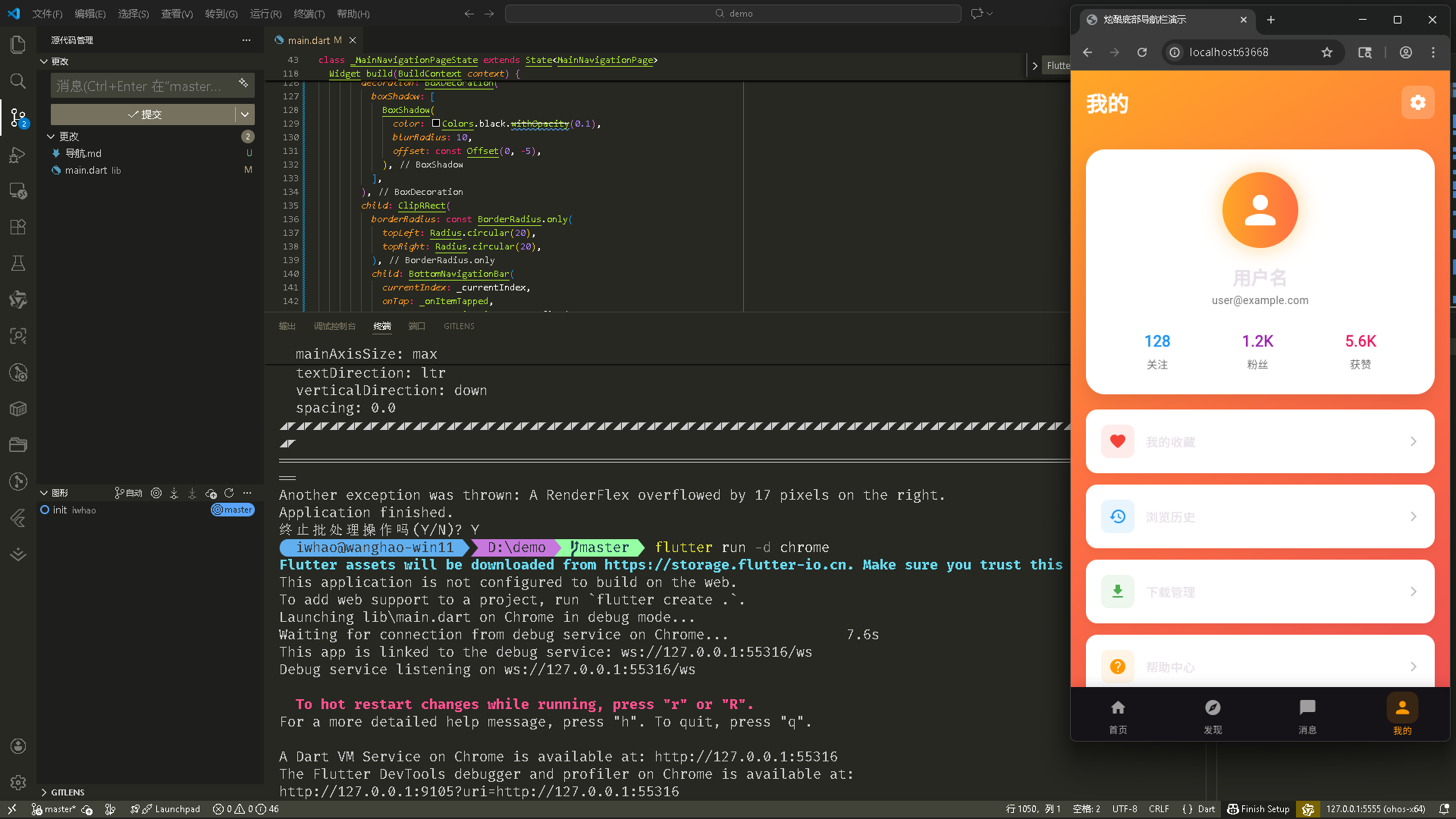
Flutte实现的 web端实时预览 完整效果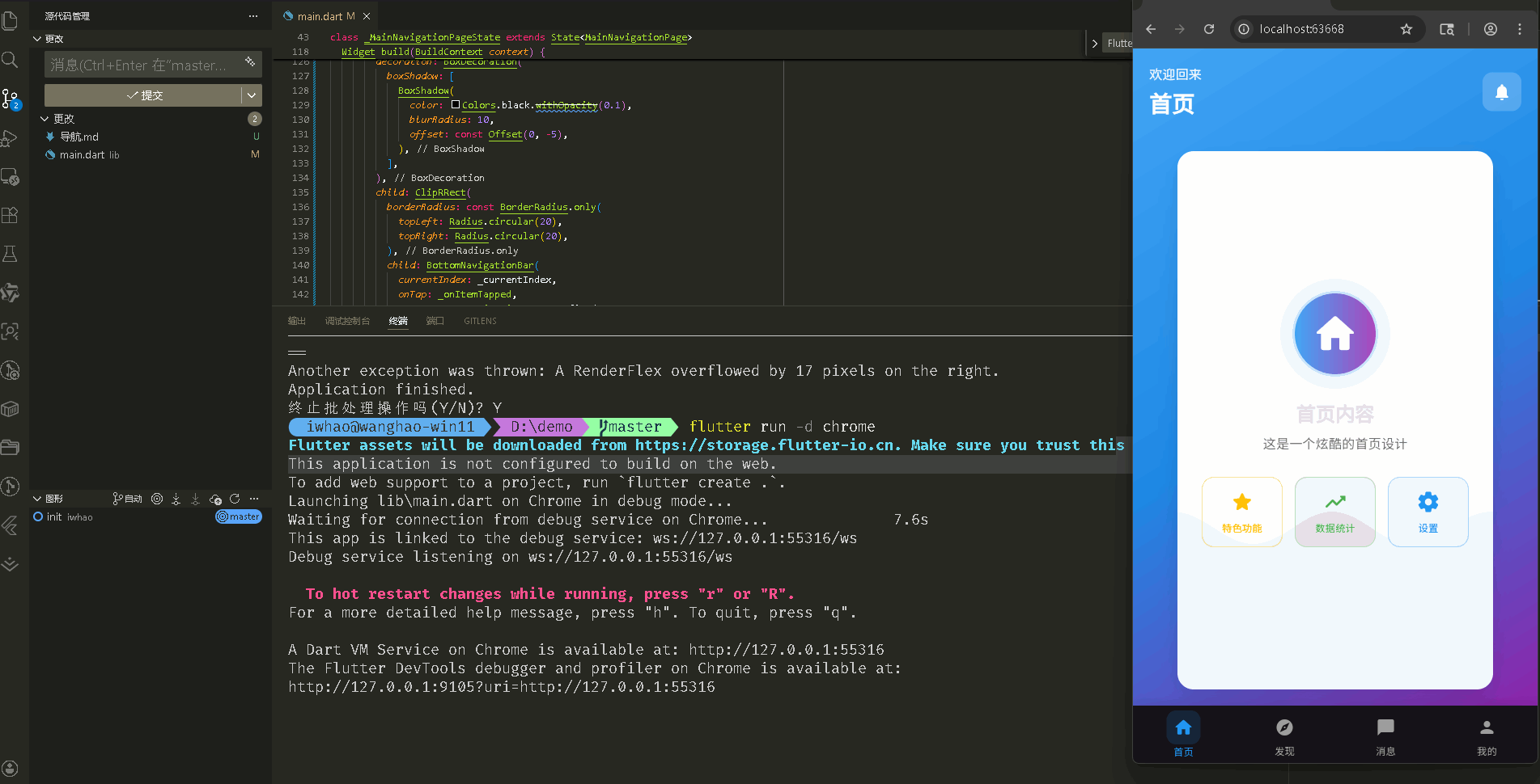
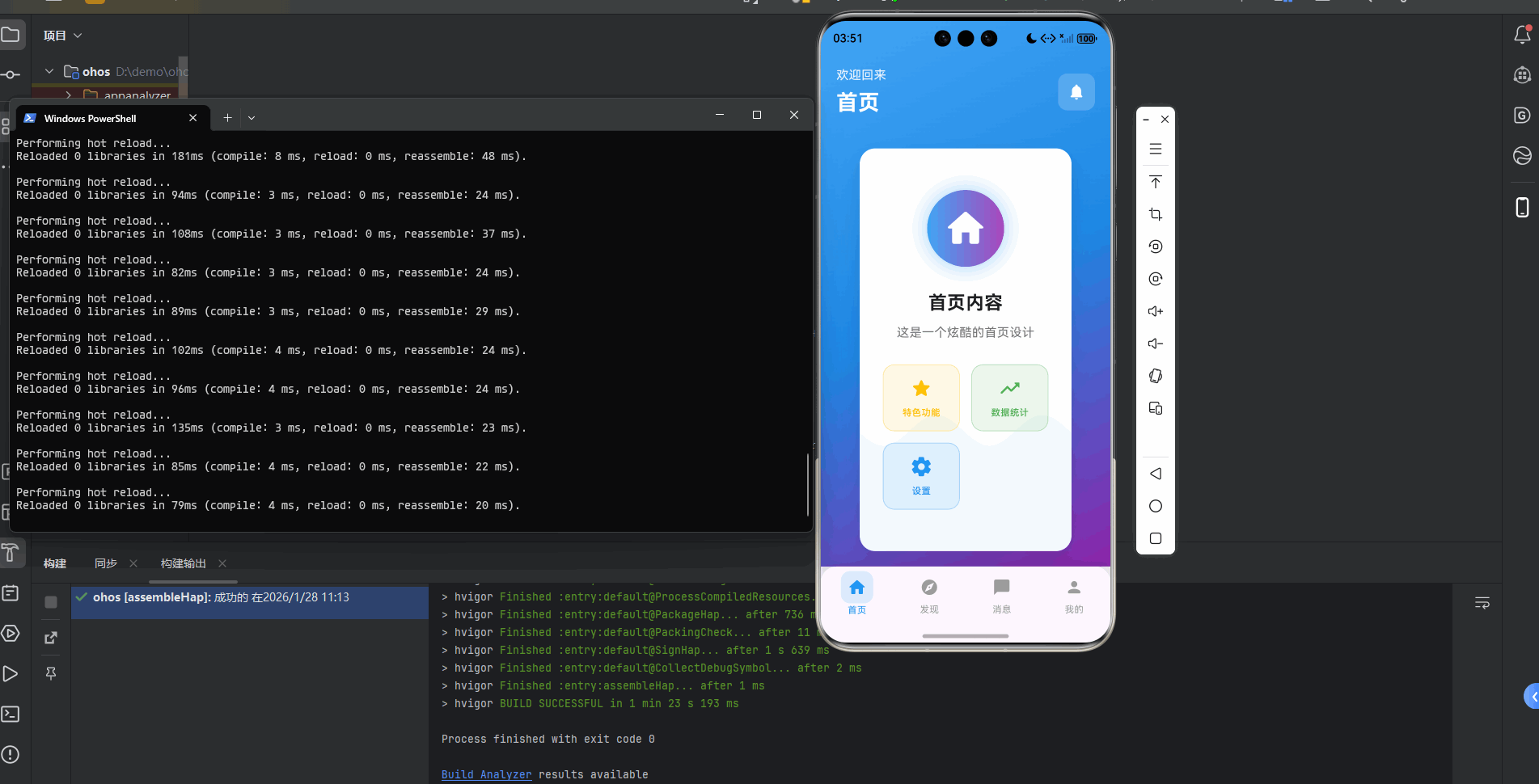
在meta70 pro 真机模拟器上成功运行后的效果
应用入口和主题配置
1. main() 函数
import 'dart:math' as math;
import 'package:flutter/material.dart';

void main() {
  runApp(const MyApp());
}
应用入口。dart:math 用于波浪动画的数学计算,runApp() 启动应用。
2. MyApp 类 - 主题配置
class MyApp extends StatelessWidget {
const MyApp({super.key});
Widget build(BuildContext context) {
return MaterialApp(
title: '炫酷底部导航栏演示',
debugShowCheckedModeBanner: false, // 隐藏调试横幅
theme: ThemeData(
colorScheme: ColorScheme.fromSeed(
seedColor: Colors.deepPurple, // 浅色主题种子色
brightness: Brightness.light,
),
useMaterial3: true,
),
darkTheme: ThemeData(
colorScheme: ColorScheme.fromSeed(
seedColor: Colors.deepPurple, // 深色主题种子色
brightness: Brightness.dark,
),
useMaterial3: true,
),
themeMode: ThemeMode.system, // 跟随系统主题
home: const MainNavigationPage(),
);
}
}
配置应用主题。theme 和 darkTheme 分别定义浅色和深色主题,themeMode: ThemeMode.system 让应用跟随系统主题自动切换。
主导航页面
1. MainNavigationPage 类定义
class MainNavigationPage extends StatefulWidget {
const MainNavigationPage({super.key});
State<MainNavigationPage> createState() => _MainNavigationPageState();
}
class _MainNavigationPageState extends State<MainNavigationPage>
with TickerProviderStateMixin {
StatefulWidget 用于管理导航状态。TickerProviderStateMixin 提供动画控制器所需的 vsync,用于图标动画。
2. 状态变量和初始化
int _currentIndex = 0; // 当前选中的导航索引
late PageController _pageController; // 页面控制器,控制页面切换
late AnimationController _animationController; // 动画控制器
// 页面列表
final List<Widget> _pages = [
const HomePage(),
const DiscoverPage(),
const MessagePage(),
const ProfilePage(),
];
// 导航项配置
final List<NavigationItem> _navigationItems = [
NavigationItem(
icon: Icons.home_rounded,
label: '首页',
color: Colors.blue,
),
NavigationItem(
icon: Icons.explore_rounded,
label: '发现',
color: Colors.purple,
),
NavigationItem(
icon: Icons.chat_bubble_rounded,
label: '消息',
color: Colors.pink,
),
NavigationItem(
icon: Icons.person_rounded,
label: '我的',
color: Colors.orange,
),
];
void initState() {
super.initState();
_pageController = PageController(); // 初始化页面控制器
_animationController = AnimationController(
vsync: this, // 使用 TickerProviderStateMixin
duration: const Duration(milliseconds: 300), // 动画时长 300ms
);
}
void dispose() {
_pageController.dispose(); // 释放页面控制器
_animationController.dispose(); // 释放动画控制器
super.dispose();
}
_currentIndex 跟踪当前页面。PageController 控制 PageView 的页面切换。_pages 存储所有页面,_navigationItems 存储导航项配置。initState() 初始化控制器,dispose() 释放资源。
3. 页面切换方法
void _onItemTapped(int index) {
  if (_currentIndex != index) {         // 只有切换到不同页面时才执行
    setState(() {
      _currentIndex = index;             // 更新当前索引
    });
    _pageController.animateToPage(       // 动画切换到指定页面
      index,
      duration: const Duration(milliseconds: 300),
      curve: Curves.easeInOut,           // 缓动曲线
    );
    _animationController.forward(from: 0.0);  // 触发图标动画
  }
}

void _onPageChanged(int index) {
  setState(() {
    _currentIndex = index;               // 同步更新索引
  });
  _animationController.forward(from: 0.0);    // 触发动画
}
_onItemTapped() 处理底部导航栏点击,_onPageChanged() 处理页面滑动。两者都会更新索引并触发动画。
4. build() 方法 - Scaffold 结构
Widget build(BuildContext context) {
return Scaffold(
body: PageView(
controller: _pageController, // 页面控制器
onPageChanged: _onPageChanged, // 页面切换回调
children: _pages, // 页面列表
),
bottomNavigationBar: Container(...), // 底部导航栏
);
}
Scaffold 提供页面骨架。PageView 实现页面滑动切换,bottomNavigationBar 是底部导航栏。
5. 底部导航栏配置
bottomNavigationBar: Container(
  decoration: BoxDecoration(
    boxShadow: [
      BoxShadow(
        color: Colors.black.withOpacity(0.1),  // 阴影颜色
        blurRadius: 10,                        // 模糊半径
        offset: const Offset(0, -5),           // 向上偏移,阴影在上方
      ),
    ],
  ),
  child: ClipRRect(
    borderRadius: const BorderRadius.only(     // 只设置顶部圆角
      topLeft: Radius.circular(20),
      topRight: Radius.circular(20),
    ),
    child: BottomNavigationBar(
      currentIndex: _currentIndex,             // 当前选中索引
      onTap: _onItemTapped,                    // 点击回调
      type: BottomNavigationBarType.fixed,     // 固定类型,所有项都显示
      backgroundColor: Theme.of(context).scaffoldBackgroundColor,
      selectedItemColor: _navigationItems[_currentIndex].color,  // 选中项颜色
      unselectedItemColor: Colors.grey,        // 未选中项颜色
      elevation: 0,                            // 移除默认阴影
      selectedFontSize: 12,
      unselectedFontSize: 12,
      items: _navigationItems.map((item) {
        final index = _navigationItems.indexOf(item);
        final isSelected = _currentIndex == index;
        return BottomNavigationBarItem(
          icon: AnimatedContainer(             // 未选中图标容器
            duration: const Duration(milliseconds: 300),
            padding: const EdgeInsets.all(8),
            decoration: BoxDecoration(
              color: isSelected
                  ? item.color.withOpacity(0.1)  // 选中时显示背景色
                  : Colors.transparent,          // 未选中时透明
              borderRadius: BorderRadius.circular(12),
            ),
            child: Icon(
              item.icon,
              size: isSelected ? 26 : 24,      // 选中时图标更大
            ),
          ),
          activeIcon: AnimatedContainer(       // 选中图标容器
            duration: const Duration(milliseconds: 300),
            padding: const EdgeInsets.all(8),
            decoration: BoxDecoration(
              color: item.color.withOpacity(0.15),  // 更明显的背景色
              borderRadius: BorderRadius.circular(12),
            ),
            child: Icon(
              item.icon,
              size: 26,                        // 固定大小
            ),
          ),
          label: item.label,
        );
      }).toList(),
    ),
  ),
),
Container 添加阴影效果。ClipRRect 裁剪顶部圆角。BottomNavigationBar 的 items 使用 map() 生成,每个项都有动画容器,选中时显示背景色和更大的图标。
6. NavigationItem 数据类
class NavigationItem {
  final IconData icon;    // 图标
  final String label;     // 标签文字
  final Color color;      // 主题颜色

  NavigationItem({
    required this.icon,
    required this.label,
    required this.color,
  });
}
简单的数据类,存储导航项的配置信息。
首页 (HomePage)
1. HomePage 类定义和动画
class HomePage extends StatefulWidget {
const HomePage({super.key});
State<HomePage> createState() => _HomePageState();
}
class _HomePageState extends State<HomePage>
with SingleTickerProviderStateMixin {
late AnimationController _controller;
late Animation<double> _animation;
void initState() {
super.initState();
_controller = AnimationController(
vsync: this,
duration: const Duration(seconds: 2), // 动画时长 2 秒
)..repeat(); // 循环播放
_animation = Tween<double>(begin: 0, end: 1).animate(
CurvedAnimation(parent: _controller, curve: Curves.easeInOut),
);
}
void dispose() {
_controller.dispose();
super.dispose();
}
SingleTickerProviderStateMixin 提供单个动画控制器。AnimationController 控制波浪动画,repeat() 让动画循环播放。Tween 创建 0 到 1 的动画值。
2. 渐变背景和头部
Widget build(BuildContext context) {
return Container(
decoration: BoxDecoration(
gradient: LinearGradient(
begin: Alignment.topLeft,
end: Alignment.bottomRight,
colors: [
Colors.blue.shade400,
Colors.blue.shade600,
Colors.purple.shade600,
],
),
),
child: SafeArea(
child: Column(
children: [
Padding(
padding: const EdgeInsets.all(20.0),
child: Row(
mainAxisAlignment: MainAxisAlignment.spaceBetween,
children: [
Column(
crossAxisAlignment: CrossAxisAlignment.start,
children: [
Text(
'欢迎回来',
style: TextStyle(
color: Colors.white.withOpacity(0.9),
fontSize: 16,
),
),
const SizedBox(height: 4),
const Text(
'首页',
style: TextStyle(
color: Colors.white,
fontSize: 28,
fontWeight: FontWeight.bold,
),
),
],
),
Container(
padding: const EdgeInsets.all(12),
decoration: BoxDecoration(
color: Colors.white.withOpacity(0.2),
borderRadius: BorderRadius.circular(12),
),
child: const Icon(
Icons.notifications_rounded,
color: Colors.white,
size: 24,
),
),
],
),
),
Container 使用三色渐变背景(蓝色到紫色)。SafeArea 避开系统状态栏。头部包含欢迎文字和通知图标。
3. 内容区域和波浪动画
Expanded(
  child: Container(
    margin: const EdgeInsets.all(20),
    decoration: BoxDecoration(
      color: Colors.white,
      borderRadius: BorderRadius.circular(20),
      boxShadow: [
        BoxShadow(
          color: Colors.black.withOpacity(0.1),
          blurRadius: 20,
          offset: const Offset(0, 10),
        ),
      ],
    ),
    child: AnimatedBuilder(
      animation: _animation,
      builder: (context, child) {
        return CustomPaint(
          painter: WavePainter(_animation.value),  // 使用动画值绘制波浪
          child: Padding(
            padding: const EdgeInsets.all(30.0),
            child: Column(
              mainAxisAlignment: MainAxisAlignment.center,
              children: [
                Container(
                  padding: const EdgeInsets.all(20),
                  decoration: BoxDecoration(
                    gradient: LinearGradient(
                      colors: [
                        Colors.blue.shade400,
                        Colors.purple.shade400,
                      ],
                    ),
                    shape: BoxShape.circle,
                    boxShadow: [
                      BoxShadow(
                        color: Colors.blue.withOpacity(0.3),
                        blurRadius: 20,
                        spreadRadius: 5,
                      ),
                    ],
                  ),
                  child: const Icon(
                    Icons.home_rounded,
                    size: 60,
                    color: Colors.white,
                  ),
                ),
                const SizedBox(height: 30),
                const Text(
                  '首页内容',
                  style: TextStyle(
                    fontSize: 24,
                    fontWeight: FontWeight.bold,
                  ),
                ),
                const SizedBox(height: 10),
                Text(
                  '这是一个炫酷的首页设计',
                  style: TextStyle(
                    fontSize: 16,
                    color: Colors.grey.shade600,
                  ),
                ),
                const SizedBox(height: 30),
                Wrap(...),  // 功能卡片
              ],
            ),
          ),
        );
      },
    ),
  ),
),
白色卡片容器包含内容。AnimatedBuilder 监听动画,每次动画值变化时重建。CustomPaint 使用 WavePainter 绘制波浪背景。中心显示渐变圆形图标和文字。
4. 功能卡片
Wrap(
  spacing: 15,        // 水平间距
  runSpacing: 15,     // 垂直间距
  children: [
    _buildFeatureCard(
      Icons.star_rounded,
      '特色功能',
      Colors.amber,
    ),
    _buildFeatureCard(
      Icons.trending_up_rounded,
      '数据统计',
      Colors.green,
    ),
    _buildFeatureCard(
      Icons.settings_rounded,
      '设置',
      Colors.blue,
    ),
  ],
),

Widget _buildFeatureCard(IconData icon, String label, Color color) {
  return Container(
    width: 100,
    padding: const EdgeInsets.all(15),
    decoration: BoxDecoration(
      color: color.withOpacity(0.1),        // 淡色背景
      borderRadius: BorderRadius.circular(15),
      border: Border.all(color: color.withOpacity(0.3)),  // 边框
    ),
    child: Column(
      children: [
        Icon(icon, color: color, size: 30),
        const SizedBox(height: 8),
        Text(
          label,
          style: TextStyle(
            color: color,
            fontSize: 12,
            fontWeight: FontWeight.w500,
          ),
        ),
      ],
    ),
  );
}
Wrap 自动换行布局。_buildFeatureCard() 创建功能卡片,使用淡色背景和边框,图标和文字使用主题色。
5. WavePainter 波浪绘制器
class WavePainter extends CustomPainter {
final double animationValue; // 动画值,0-1
WavePainter(this.animationValue);
void paint(Canvas canvas, Size size) {
final paint = Paint()
..color = Colors.blue.withOpacity(0.05) // 淡蓝色
..style = PaintingStyle.fill; // 填充模式
final path = Path();
final waveHeight = 20.0; // 波浪高度
final waveLength = size.width / 2; // 波浪长度
path.moveTo(0, size.height * 0.7); // 起始点
// 绘制波浪曲线
for (double x = 0; x <= size.width; x++) {
final y = size.height * 0.7 +
waveHeight *
math.sin((x / waveLength + animationValue * 2 * math.pi) * 2 * math.pi);
path.lineTo(x, y);
}
path.lineTo(size.width, size.height); // 右下角
path.lineTo(0, size.height); // 左下角
path.close(); // 闭合路径
canvas.drawPath(path, paint); // 绘制路径
}
bool shouldRepaint(WavePainter oldDelegate) => true; // 总是重绘
}
CustomPainter 自定义绘制器。使用 math.sin() 计算波浪曲线,animationValue 控制波浪移动。shouldRepaint 返回 true 表示每次都需要重绘。
真机效果
发现页 (DiscoverPage)
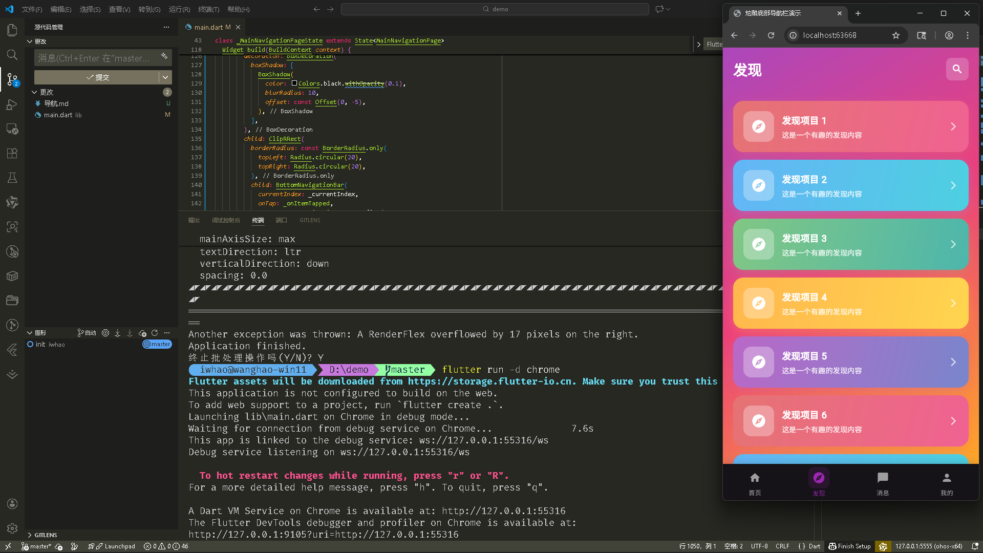
1. DiscoverPage 类定义
class DiscoverPage extends StatelessWidget {
const DiscoverPage({super.key});
Widget build(BuildContext context) {
无状态组件,不需要状态管理。
2. 渐变背景和搜索栏
return Container(
  decoration: BoxDecoration(
    gradient: LinearGradient(
      begin: Alignment.topLeft,
      end: Alignment.bottomRight,
      colors: [
        Colors.purple.shade400,
        Colors.pink.shade400,
        Colors.orange.shade400,
      ],
    ),
  ),
  child: SafeArea(
    child: Column(
      children: [
        Padding(
          padding: const EdgeInsets.all(20.0),
          child: Row(
            children: [
              const Text(
                '发现',
                style: TextStyle(
                  color: Colors.white,
                  fontSize: 28,
                  fontWeight: FontWeight.bold,
                ),
              ),
              const Spacer(),                   // 占据剩余空间
              Container(
                padding: const EdgeInsets.all(10),
                decoration: BoxDecoration(
                  color: Colors.white.withOpacity(0.2),
                  borderRadius: BorderRadius.circular(10),
                ),
                child: const Icon(
                  Icons.search_rounded,
                  color: Colors.white,
                  size: 24,
                ),
              ),
            ],
          ),
        ),
三色渐变背景(紫色到粉色到橙色)。头部包含标题和搜索图标,Spacer() 让搜索图标靠右。
3. 发现卡片列表
Expanded(
  child: ListView.builder(
    padding: const EdgeInsets.all(20),
    itemCount: 10,                              // 10 个卡片
    itemBuilder: (context, index) {
      return _buildDiscoverCard(context, index);
    },
  ),
),

Widget _buildDiscoverCard(BuildContext context, int index) {
  final colors = [
    [Colors.red.shade300, Colors.pink.shade300],
    [Colors.blue.shade300, Colors.cyan.shade300],
    [Colors.green.shade300, Colors.teal.shade300],
    [Colors.orange.shade300, Colors.amber.shade300],
    [Colors.purple.shade300, Colors.indigo.shade300],
  ];
  final colorPair = colors[index % colors.length];  // 循环使用颜色

  return Container(
    margin: const EdgeInsets.only(bottom: 15),
    decoration: BoxDecoration(
      gradient: LinearGradient(
        colors: colorPair,
        begin: Alignment.topLeft,
        end: Alignment.bottomRight,
      ),
      borderRadius: BorderRadius.circular(20),
      boxShadow: [
        BoxShadow(
          color: colorPair[0].withOpacity(0.3),
          blurRadius: 15,
          offset: const Offset(0, 5),
        ),
      ],
    ),
    child: Padding(
      padding: const EdgeInsets.all(20.0),
      child: Row(
        children: [
          Container(
            width: 60,
            height: 60,
            decoration: BoxDecoration(
              color: Colors.white.withOpacity(0.3),
              borderRadius: BorderRadius.circular(15),
            ),
            child: Icon(
              Icons.explore_rounded,
              color: Colors.white,
              size: 30,
            ),
          ),
          const SizedBox(width: 15),
          Expanded(
            child: Column(
              crossAxisAlignment: CrossAxisAlignment.start,
              children: [
                Text(
                  '发现项目 ${index + 1}',
                  style: const TextStyle(
                    color: Colors.white,
                    fontSize: 18,
                    fontWeight: FontWeight.bold,
                  ),
                ),
                const SizedBox(height: 5),
                Text(
                  '这是一个有趣的发现内容',
                  style: TextStyle(
                    color: Colors.white.withOpacity(0.9),
                    fontSize: 14,
                  ),
                ),
              ],
            ),
          ),
          Icon(
            Icons.arrow_forward_ios_rounded,
            color: Colors.white.withOpacity(0.7),
            size: 20,
          ),
        ],
      ),
    ),
  );
}
ListView.builder 创建列表。每个卡片使用不同的渐变颜色对,通过 index % colors.length 循环使用。卡片包含图标、标题、描述和箭头。
真机效果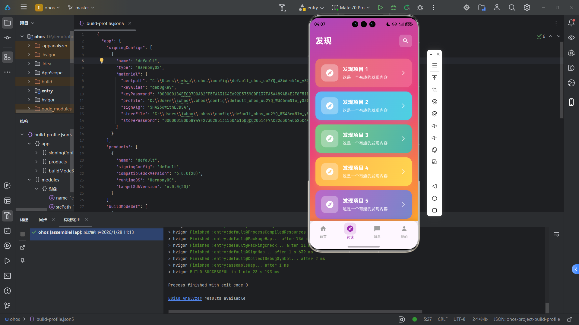
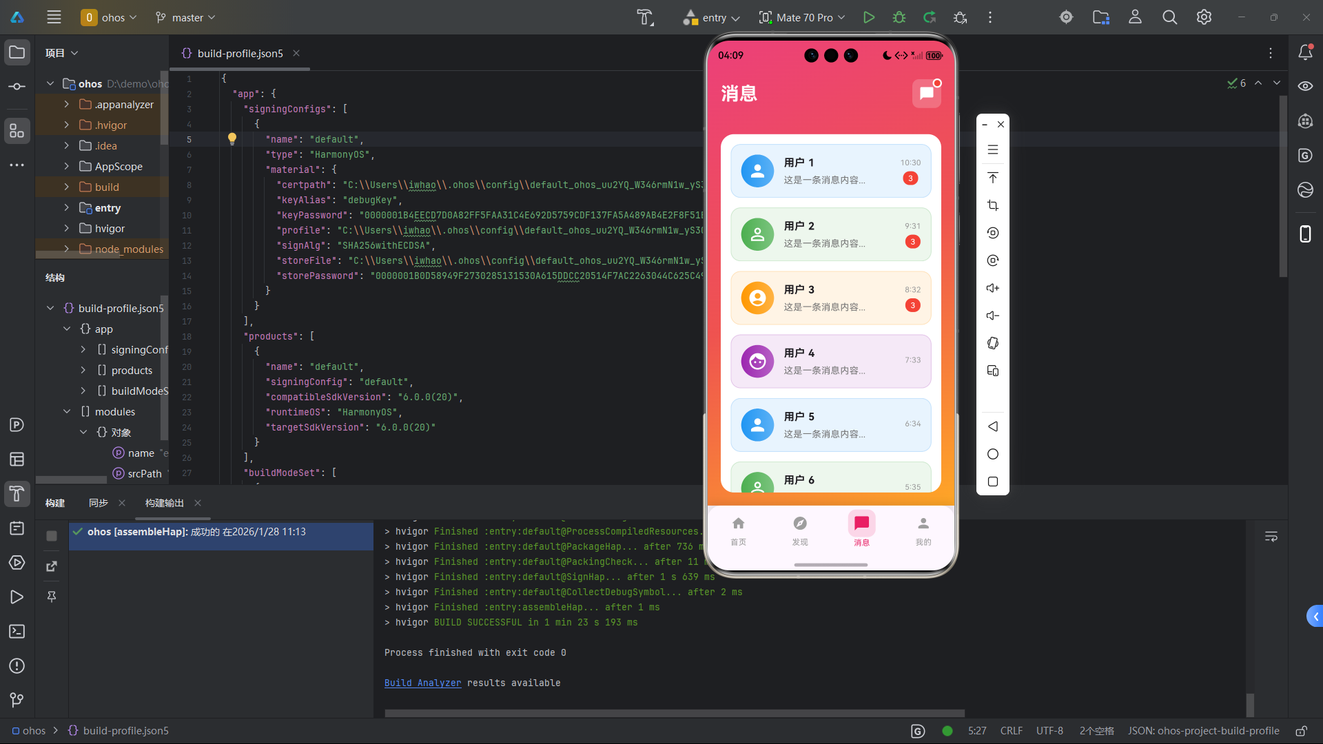
消息页 (MessagePage)
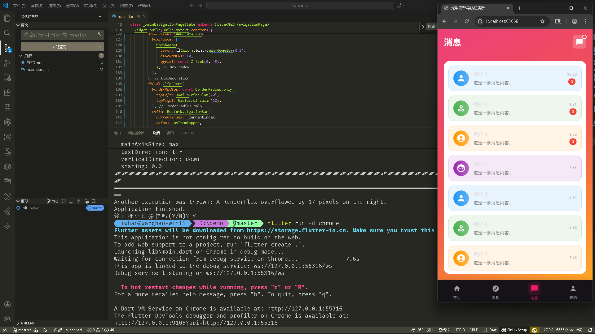
1. MessagePage 类定义和动画
class MessagePage extends StatefulWidget {
const MessagePage({super.key});
State<MessagePage> createState() => _MessagePageState();
}
class _MessagePageState extends State<MessagePage>
with SingleTickerProviderStateMixin {
late AnimationController _controller;
void initState() {
super.initState();
_controller = AnimationController(
vsync: this,
duration: const Duration(milliseconds: 1500),
)..repeat(reverse: true); // 循环播放,来回反转
}
void dispose() {
_controller.dispose();
super.dispose();
}
动画控制器用于消息图标的红点动画,repeat(reverse: true) 让动画来回播放。
2. 消息列表项
Widget build(BuildContext context) {
return Container(
decoration: BoxDecoration(
gradient: LinearGradient(
begin: Alignment.topLeft,
end: Alignment.bottomRight,
colors: [
Colors.pink.shade400,
Colors.red.shade400,
Colors.orange.shade400,
],
),
),
child: SafeArea(
child: Column(
children: [
Padding(
padding: const EdgeInsets.all(20.0),
child: Row(
children: [
const Text('消息', ...),
const Spacer(),
Stack( // 堆叠布局
children: [
Container(...), // 消息图标
Positioned( // 红点位置
right: 0,
top: 0,
child: AnimatedBuilder(
animation: _controller,
builder: (context, child) {
return Transform.scale(
scale: 1.0 + _controller.value * 0.2, // 缩放动画
child: Container(
width: 12,
height: 12,
decoration: BoxDecoration(
color: Colors.red,
shape: BoxShape.circle,
border: Border.all(
color: Colors.white,
width: 2,
),
),
),
);
},
),
),
],
),
],
),
),
Expanded(
child: Container(
margin: const EdgeInsets.all(20),
decoration: BoxDecoration(
color: Colors.white,
borderRadius: BorderRadius.circular(20),
),
child: ListView.builder(
padding: const EdgeInsets.all(15),
itemCount: 8,
itemBuilder: (context, index) {
return _buildMessageItem(index);
},
),
),
),
],
),
),
);
}
Widget _buildMessageItem(int index) {
final avatars = [
Icons.person,
Icons.person_outline,
Icons.account_circle,
Icons.face,
];
final colors = [
Colors.blue,
Colors.green,
Colors.orange,
Colors.purple,
];
return Container(
margin: const EdgeInsets.only(bottom: 15),
padding: const EdgeInsets.all(15),
decoration: BoxDecoration(
color: colors[index % colors.length].withOpacity(0.1),
borderRadius: BorderRadius.circular(15),
border: Border.all(
color: colors[index % colors.length].withOpacity(0.2),
),
),
child: Row(
children: [
Container(
width: 50,
height: 50,
decoration: BoxDecoration(
gradient: LinearGradient(
colors: [
colors[index % colors.length],
colors[index % colors.length].withOpacity(0.7),
],
),
shape: BoxShape.circle,
),
child: Icon(
avatars[index % avatars.length],
color: Colors.white,
size: 30,
),
),
const SizedBox(width: 15),
Expanded(
child: Column(
crossAxisAlignment: CrossAxisAlignment.start,
children: [
Text('用户 ${index + 1}', ...),
const SizedBox(height: 5),
Text('这是一条消息内容...', ...),
],
),
),
Column(
children: [
Text('${10 - index}:${30 + index}', ...), // 时间
const SizedBox(height: 5),
if (index < 3) // 前 3 条显示红点
Container(
padding: const EdgeInsets.symmetric(
horizontal: 8,
vertical: 2,
),
decoration: BoxDecoration(
color: Colors.red,
borderRadius: BorderRadius.circular(10),
),
child: const Text('3', ...),
),
],
),
],
),
);
}
头部使用 Stack 堆叠消息图标和动画红点。Transform.scale 实现缩放动画。消息列表项包含头像、用户名、消息内容和时间,前 3 条显示未读红点。
真机效果
个人页 (ProfilePage)
1. ProfilePage 类定义
class ProfilePage extends StatelessWidget {
const ProfilePage({super.key});
Widget build(BuildContext context) {
无状态组件。
2. 用户信息卡片
return Container(
  decoration: BoxDecoration(
    gradient: LinearGradient(
      begin: Alignment.topLeft,
      end: Alignment.bottomRight,
      colors: [
        Colors.orange.shade400,
        Colors.deepOrange.shade400,
        Colors.red.shade400,
      ],
    ),
  ),
  child: SafeArea(
    child: Column(
      children: [
        Padding(...),  // 头部
        Expanded(
          child: SingleChildScrollView(
            child: Column(
              children: [
                Container(
                  margin: const EdgeInsets.all(20),
                  padding: const EdgeInsets.all(30),
                  decoration: BoxDecoration(
                    color: Colors.white,
                    borderRadius: BorderRadius.circular(25),
                    boxShadow: [
                      BoxShadow(
                        color: Colors.black.withOpacity(0.1),
                        blurRadius: 20,
                        offset: const Offset(0, 10),
                      ),
                    ],
                  ),
                  child: Column(
                    children: [
                      Container(
                        width: 100,
                        height: 100,
                        decoration: BoxDecoration(
                          gradient: LinearGradient(
                            colors: [
                              Colors.orange.shade400,
                              Colors.deepOrange.shade400,
                            ],
                          ),
                          shape: BoxShape.circle,
                          boxShadow: [
                            BoxShadow(
                              color: Colors.orange.withOpacity(0.3),
                              blurRadius: 20,
                              spreadRadius: 5,
                            ),
                          ],
                        ),
                        child: const Icon(
                          Icons.person_rounded,
                          size: 60,
                          color: Colors.white,
                        ),
                      ),
                      const SizedBox(height: 20),
                      const Text('用户名', ...),
                      const SizedBox(height: 5),
                      Text('user@example.com', ...),
                      const SizedBox(height: 30),
                      Row(
                        mainAxisAlignment: MainAxisAlignment.spaceAround,
                        children: [
                          _buildStatItem('关注', '128', Colors.blue),
                          _buildStatItem('粉丝', '1.2K', Colors.purple),
                          _buildStatItem('获赞', '5.6K', Colors.pink),
                        ],
                      ),
                    ],
                  ),
                ),
                Padding(...),  // 菜单项
              ],
            ),
          ),
        ),
      ],
    ),
  ),
);

Widget _buildStatItem(String label, String value, Color color) {
  return Column(
    children: [
      Text(
        value,
        style: TextStyle(
          fontSize: 20,
          fontWeight: FontWeight.bold,
          color: color,
        ),
      ),
      const SizedBox(height: 5),
      Text(
        label,
        style: TextStyle(
          fontSize: 14,
          color: Colors.grey.shade600,
        ),
      ),
    ],
  );
}
橙色渐变背景。用户信息卡片包含圆形头像、用户名、邮箱和统计数据。_buildStatItem() 创建统计项。
3. 菜单项
Padding(
  padding: const EdgeInsets.symmetric(horizontal: 20),
  child: Column(
    children: [
      _buildMenuItem(
        Icons.favorite_rounded,
        '我的收藏',
        Colors.red,
      ),
      _buildMenuItem(
        Icons.history_rounded,
        '浏览历史',
        Colors.blue,
      ),
      _buildMenuItem(
        Icons.download_rounded,
        '下载管理',
        Colors.green,
      ),
      _buildMenuItem(
        Icons.help_rounded,
        '帮助中心',
        Colors.orange,
      ),
    ],
  ),
),

Widget _buildMenuItem(IconData icon, String title, Color color) {
  return Container(
    margin: const EdgeInsets.only(bottom: 15),
    padding: const EdgeInsets.all(20),
    decoration: BoxDecoration(
      color: Colors.white,
      borderRadius: BorderRadius.circular(15),
      boxShadow: [
        BoxShadow(
          color: Colors.black.withOpacity(0.05),
          blurRadius: 10,
          offset: const Offset(0, 5),
        ),
      ],
    ),
    child: Row(
      children: [
        Container(
          padding: const EdgeInsets.all(10),
          decoration: BoxDecoration(
            color: color.withOpacity(0.1),
            borderRadius: BorderRadius.circular(10),
          ),
          child: Icon(icon, color: color, size: 24),
        ),
        const SizedBox(width: 15),
        Expanded(
          child: Text(
            title,
            style: const TextStyle(
              fontSize: 16,
              fontWeight: FontWeight.w500,
            ),
          ),
        ),
        Icon(
          Icons.arrow_forward_ios_rounded,
          color: Colors.grey.shade400,
          size: 16,
        ),
      ],
    ),
  );
}
菜单项列表,每个项包含图标、标题和箭头。图标使用主题色的淡色背景。
真机效果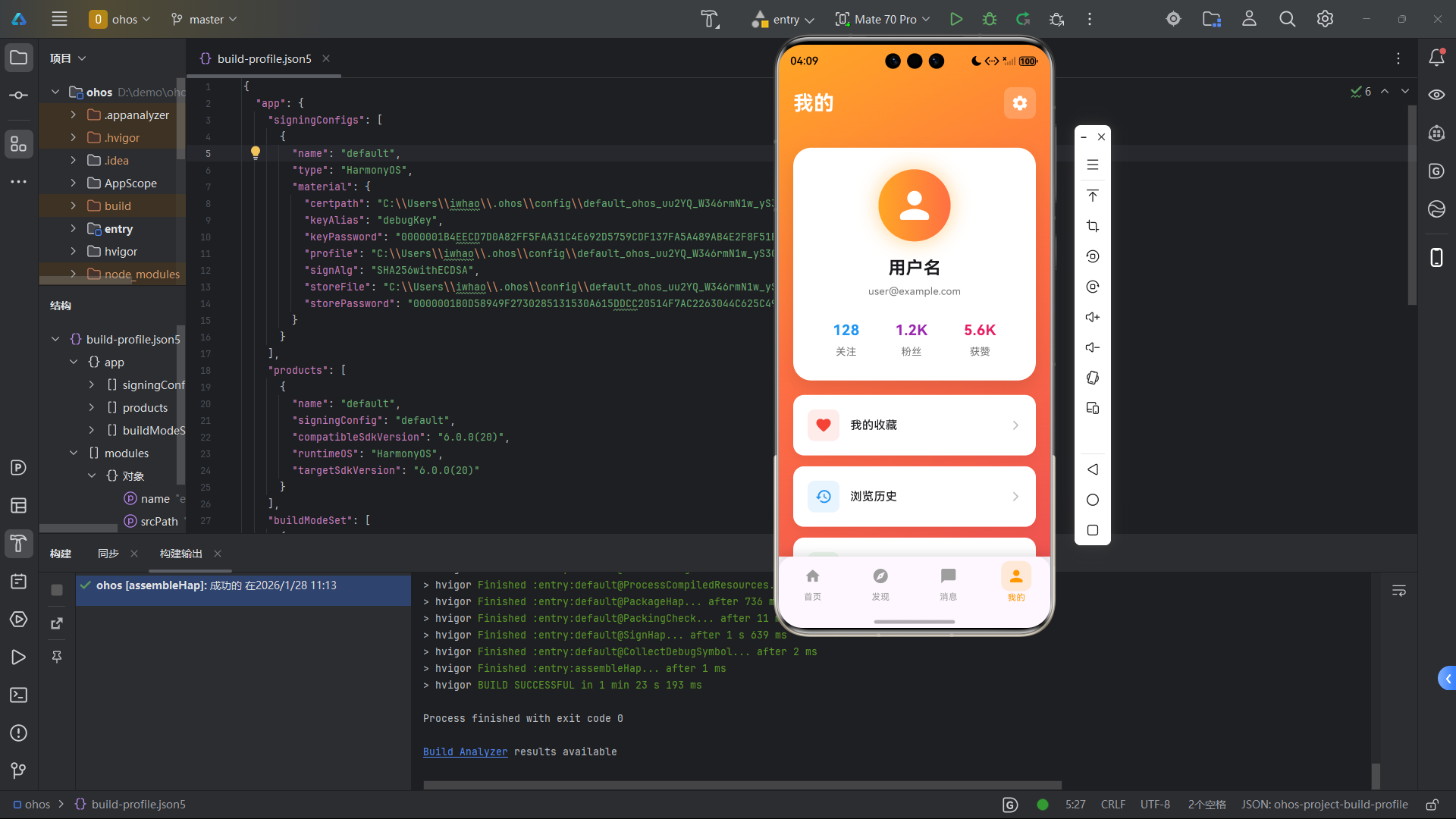
欢迎加入开源鸿蒙跨平台社区: https://openharmonycrossplatform.csdn.net

开源鸿蒙跨平台开发社区汇聚开发者与厂商,共建“一次开发,多端部署”的开源生态,致力于降低跨端开发门槛,推动万物智联创新。
更多推荐
 30
30 0
0- 0


 已为社区贡献27条内容

所有评论(0)