ReactNative for OpenHarmony项目鸿蒙化三方库:react-native-button — 自定义按钮组件
本文详细介绍了在 HarmonyOS 平台的使用方法。通过 Button 组件,你可以轻松实现各种样式的按钮,支持禁用状态、样式定制等功能。核心要点✅ 支持基础按钮点击功能✅ 支持禁用状态及样式定制✅ 支持文本和容器样式定制✅ 支持无障碍访问✅ 纯 JavaScript 实现,无原生依赖适用场景表单提交按钮页面导航按钮操作触发按钮状态切换按钮希望本文能帮助你在 HarmonyOS 项目中顺利集成按
欢迎加入开源鸿蒙跨平台社区:https://openharmonycrossplatform.csdn.net
📌 开发环境声明:本文基于 React Native 0.72.90 版本进行开发适配

🚀 一、开篇引言
按钮是移动应用中最基础也是最常用的交互组件之一。react-native-button 是一个轻量级的自定义按钮组件,提供了丰富的样式定制能力和状态管理功能。本文将带你深入了解如何在 HarmonyOS 平台上集成和使用 react-native-button,实现高度可定制的按钮组件。
1.1 你将学到什么?
- ✅ react-native-button 的核心概念与工作原理
- ✅ HarmonyOS 平台的完整集成流程
- ✅ 按钮样式定制与状态管理
- ✅ Button API 的深度解析
- ✅ 实际应用场景的最佳实践
1.2 适用人群
- 正在进行 React Native 鸿蒙化迁移的开发者
- 需要实现自定义按钮功能的应用开发者
- 对跨平台 UI 组件开发感兴趣的技术爱好者
1.3 为什么选择 react-native-button?
| 特点 | 说明 |
|---|---|
| 轻量级 | 无原生依赖,纯 JavaScript 实现 |
| 高度可定制 | 支持文本样式、容器样式、禁用样式等 |
| 跨平台一致 | 在 iOS、Android、HarmonyOS 上表现一致 |
| 简单易用 | API 简洁,上手成本低 |
📦 二、库概览
2.1 基本信息
| 项目 | 内容 |
|---|---|
| 库名称 | react-native-button |
| 版本信息 | 3.1.0 |
| 官方仓库 | https://github.com/ide/react-native-button |
| 开源协议 | MIT |
2.2 核心能力矩阵
| 能力项 | 描述 | HarmonyOS 支持 |
|---|---|---|
| 基础按钮 | 文本按钮点击 | ✅ 完全支持 |
| 禁用状态 | 按钮禁用样式 | ✅ 完全支持 |
| 样式定制 | 文本、容器样式 | ✅ 完全支持 |
| 无障碍支持 | accessibilityLabel | ✅ 完全支持 |
| 字体缩放 | allowFontScaling | ⚠️ 部分支持 |
2.3 技术架构图
2.4 典型应用场景
| 场景 | 描述 | 示例 |
|---|---|---|
| 表单提交 | 提交表单数据 | 📝 提交按钮 |
| 页面导航 | 跳转到其他页面 | 🔗 下一步 |
| 操作触发 | 触发特定操作 | ⚡ 开始下载 |
| 状态切换 | 切换应用状态 | 🔄 切换模式 |
| 确认对话框 | 确认或取消操作 | ✅ 确认 / ❌ 取消 |
| 社交互动 | 点赞、分享等 | 👍 点赞 |
⚡ 三、快速开始
3.1 环境要求
| 依赖项 | 版本要求 |
|---|---|
| React Native | 0.72.x / 0.77.x |
| RNOH (鸿蒙框架) | 0.72.90 / 0.77.18 |
| HarmonyOS SDK | 6.0.0.47+ (API 20) |
| DevEco Studio | 5.0.3+ / 6.0+ |
| Node.js | 16.18.0+ / 18.x |
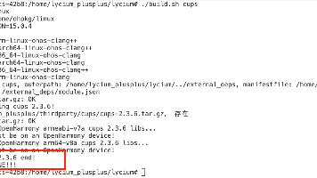
3.2 一键安装
创建鸿蒙项目的过程不再进行描述,不懂得看这篇:https://blog.csdn.net/u011178696/article/details/151932277
npm install react-native-button@3.1.0 --save
3.3 验证安装
# 检查 package.json
type package.json | findstr button

# 预期输出
# "react-native-button": "^3.1.0"
3.4 TypeScript 类型声明配置
由于 react-native-button 没有内置 TypeScript 类型声明,需要手动添加类型声明文件。
在 src/types 目录下创建 react-native-button.d.ts 文件:
declare module 'react-native-button' {
  import { ComponentType, ReactNode } from 'react';
  import { TextStyle, ViewStyle } from 'react-native';

  export interface ButtonProps {
    accessibilityLabel?: string;
    allowFontScaling?: boolean;
    disabled?: boolean;
    style?: TextStyle;
    styleDisabled?: TextStyle;
    containerStyle?: ViewStyle;
    disabledContainerStyle?: ViewStyle;
    childGroupStyle?: ViewStyle;
    androidBackground?: any;
    onPress?: () => void;
    children?: ReactNode;
  }

  const Button: ComponentType<ButtonProps>;
  export default Button;
}
3.5 基础使用
import Button from 'react-native-button';

<Button
  style={{ fontSize: 16, color: '#fff' }}
  containerStyle={{ padding: 12, backgroundColor: '#007AFF', borderRadius: 8 }}
  onPress={() => console.log('按钮被点击')}
>
  点击我
</Button>
📖 四、API 详解
4.1 基础属性
| 属性名 | 说明 | 类型 | 默认值 | HarmonyOS 支持 |
|---|---|---|---|---|
accessibilityLabel |
无障碍标签 | string | - | ✅ |
allowFontScaling |
是否允许字体缩放 | boolean | - | ⚠️ 部分支持 |
disabled |
是否禁用 | boolean | false | ✅ |
onPress |
点击回调 | function | - | ✅ |
调用示例:
// 基础按钮
<Button onPress={() => console.log('点击')}>点击我</Button>

// 带无障碍标签
<Button accessibilityLabel="提交按钮" onPress={() => {}}>提交</Button>

// 禁用状态
<Button disabled={true} onPress={() => {}}>已禁用</Button>

// 动态禁用
const [isDisabled, setIsDisabled] = useState(false);
<Button disabled={isDisabled} onPress={() => {}}>
  {isDisabled ? '已禁用' : '可点击'}
</Button>
4.2 文本样式属性
| 属性名 | 说明 | 类型 | 默认值 | HarmonyOS 支持 |
|---|---|---|---|---|
style |
文本样式 | TextStyle | {} | ✅ |
styleDisabled |
禁用状态文本样式 | TextStyle | {} | ✅ |
调用示例:
// 基本文本样式
<Button
  style={{ fontSize: 18, color: '#fff', fontWeight: 'bold' }}
  onPress={() => {}}
>
  样式按钮
</Button>

// 禁用状态文本样式
<Button
  style={{ fontSize: 16, color: '#fff' }}
  styleDisabled={{ color: '#ccc', fontWeight: 'normal' }}
  disabled={true}
  onPress={() => {}}
>
  禁用按钮
</Button>

// 文本装饰
<Button
  style={{ fontSize: 16, color: '#007AFF', textDecorationLine: 'underline' }}
  onPress={() => {}}
>
  带下划线的按钮
</Button>
4.3 容器样式属性
| 属性名 | 说明 | 类型 | 默认值 | HarmonyOS 支持 |
|---|---|---|---|---|
containerStyle |
容器样式 | ViewStyle | {} | ✅ |
disabledContainerStyle |
禁用状态容器样式 | ViewStyle | {} | ✅ |
childGroupStyle |
子视图样式 | ViewStyle | {} | ✅ |
调用示例:
// 基本容器样式
<Button
  style={{ fontSize: 16, color: '#fff' }}
  containerStyle={{ padding: 12, backgroundColor: '#007AFF', borderRadius: 8 }}
  onPress={() => {}}
>
  容器样式
</Button>

// 禁用状态容器样式
<Button
  style={{ fontSize: 16, color: '#fff' }}
  containerStyle={{ padding: 12, backgroundColor: '#007AFF', borderRadius: 8 }}
  disabledContainerStyle={{ backgroundColor: '#e0e0e0' }}
  disabled={true}
  onPress={() => {}}
>
  禁用容器
</Button>

// 圆角按钮
<Button
  style={{ fontSize: 16, color: '#fff' }}
  containerStyle={{ padding: 15, backgroundColor: '#5856D6', borderRadius: 25 }}
  onPress={() => {}}
>
  圆角按钮
</Button>

// 带边框按钮
<Button
  style={{ fontSize: 16, color: '#007AFF' }}
  containerStyle={{
    padding: 12,
    backgroundColor: 'transparent',
    borderWidth: 2,
    borderColor: '#007AFF',
    borderRadius: 8
  }}
  onPress={() => {}}
>
  边框按钮
</Button>

// 带阴影按钮
<Button
  style={{ fontSize: 16, color: '#fff' }}
  containerStyle={{
    padding: 15,
    backgroundColor: '#FF3B30',
    borderRadius: 12,
    shadowColor: '#000',
    shadowOffset: { width: 0, height: 4 },
    shadowOpacity: 0.3,
    shadowRadius: 8,
    elevation: 5
  }}
  onPress={() => {}}
>
  阴影按钮
</Button>
4.4 Android 专属属性
| 属性名 | 说明 | 类型 | 默认值 | HarmonyOS 支持 |
|---|---|---|---|---|
androidBackground |
Android 背景 | BackgroundPropType | - | ❌ |
⚠️ 五、注意事项
5.1 HarmonyOS 限制
| 限制项 | 说明 |
|---|---|
| allowFontScaling | 文本字体不跟随系统字体变化 |
| androidBackground | Android 专属属性不支持 |
5.2 常见问题
问题1:按钮点击无响应
// ❌ 错误:忘记传递 onPress
<Button>点击我</Button>

// ✅ 正确:添加 onPress 回调
<Button onPress={() => console.log('点击')}>点击我</Button>
问题2:禁用状态样式不生效
// ❌ 错误:只设置了 disabled 属性
<Button disabled={true}>禁用按钮</Button>

// ✅ 正确:同时设置禁用样式
<Button
  disabled={true}
  styleDisabled={{ color: '#ccc' }}
  disabledContainerStyle={{ backgroundColor: '#e0e0e0' }}
>
  禁用按钮
</Button>
问题3:样式覆盖问题
// ❌ 错误:内联样式每次渲染都创建新对象
<Button style={{ color: '#fff' }}>按钮</Button>

// ✅ 正确:使用 StyleSheet 优化性能
const styles = StyleSheet.create({
  buttonText: { color: '#fff' },
});
<Button style={styles.buttonText}>按钮</Button>
5.3 最佳实践
- 样式分离:将样式定义在 StyleSheet 中,提高性能
- 状态管理:使用 disabled 状态防止重复点击
- 无障碍支持:为按钮添加 accessibilityLabel
- 视觉反馈:为不同状态提供明显的视觉区分
- 防抖处理:对于网络请求等操作,添加防抖或节流
// 防抖处理示例
const [isLoading, setIsLoading] = useState(false);

const handlePress = useCallback(async () => {
  if (isLoading) return;
  setIsLoading(true);
  try {
    await fetchData();
  } finally {
    setIsLoading(false);
  }
}, [isLoading]);

<Button
  disabled={isLoading}
  style={{ fontSize: 16, color: '#fff' }}
  containerStyle={{
    padding: 15,
    backgroundColor: isLoading ? '#ccc' : '#007AFF',
    borderRadius: 8
  }}
  onPress={handlePress}
>
  {isLoading ? '处理中...' : '提交'}
</Button>
💻 六、完整示例代码
示例一:多功能按钮面板

import React, { useState } from 'react';
import {
  View,
  Text,
  StyleSheet,
  ScrollView,
  SafeAreaView,
  Alert,
} from 'react-native';
import Button from 'react-native-button';

export default function App() {
  const [isDisabled, setIsDisabled] = useState(false);
  const [clickCount, setClickCount] = useState(0);

  const handlePress = () => {
    setClickCount((prev) => prev + 1);
    Alert.alert('提示', `按钮被点击了 ${clickCount + 1} 次`);
  };

  const toggleDisabled = () => {
    setIsDisabled((prev) => !prev);
  };

  return (
    <SafeAreaView style={styles.container}>
      <ScrollView style={styles.content} contentContainerStyle={styles.scrollContent}>
        <Text style={styles.title}>Button 按钮演示</Text>

        <View style={styles.section}>
          <Text style={styles.sectionTitle}>基础按钮</Text>
          <Button
            style={styles.buttonText}
            containerStyle={styles.button}
            onPress={handlePress}
          >
            点击我
          </Button>
        </View>

        <View style={styles.section}>
          <Text style={styles.sectionTitle}>禁用状态按钮</Text>
          <Button
            style={styles.buttonText}
            styleDisabled={styles.buttonTextDisabled}
            containerStyle={styles.button}
            disabledContainerStyle={styles.buttonDisabled}
            disabled={isDisabled}
            onPress={handlePress}
          >
            {isDisabled ? '已禁用' : '可点击'}
          </Button>
          <Button
            style={styles.toggleButtonText}
            containerStyle={styles.toggleButton}
            onPress={toggleDisabled}
          >
            {isDisabled ? '启用按钮' : '禁用按钮'}
          </Button>
        </View>

        <View style={styles.section}>
          <Text style={styles.sectionTitle}>自定义样式按钮</Text>
          <Button
            style={styles.primaryButtonText}
            containerStyle={styles.primaryButton}
            onPress={handlePress}
          >
            主要按钮
          </Button>
          <Button
            style={styles.secondaryButtonText}
            containerStyle={styles.secondaryButton}
            onPress={handlePress}
          >
            次要按钮
          </Button>
          <Button
            style={styles.dangerButtonText}
            containerStyle={styles.dangerButton}
            onPress={handlePress}
          >
            危险按钮
          </Button>
        </View>

        <View style={styles.section}>
          <Text style={styles.sectionTitle}>圆角按钮</Text>
          <Button
            style={styles.roundedButtonText}
            containerStyle={styles.roundedButton}
            onPress={handlePress}
          >
            圆角按钮
          </Button>
        </View>

        <View style={styles.section}>
          <Text style={styles.sectionTitle}>无障碍支持</Text>
          <Button
            accessibilityLabel="这是一个带有无障碍标签的按钮"
            style={styles.buttonText}
            containerStyle={styles.button}
            onPress={handlePress}
          >
            无障碍按钮
          </Button>
        </View>

        <View style={styles.counterSection}>
          <Text style={styles.counterText}>点击次数: {clickCount}</Text>
        </View>
      </ScrollView>
    </SafeAreaView>
  );
}

const styles = StyleSheet.create({
  container: {
    flex: 1,
    backgroundColor: '#f5f5f5',
  },
  content: {
    flex: 1,
  },
  scrollContent: {
    padding: 20,
  },
  title: {
    fontSize: 24,
    fontWeight: 'bold',
    color: '#333',
    textAlign: 'center',
    marginBottom: 20,
  },
  section: {
    backgroundColor: '#fff',
    borderRadius: 12,
    padding: 16,
    marginBottom: 16,
  },
  sectionTitle: {
    fontSize: 18,
    fontWeight: 'bold',
    color: '#333',
    marginBottom: 12,
  },
  button: {
    padding: 12,
    backgroundColor: '#007AFF',
    borderRadius: 8,
    marginBottom: 10,
  },
  buttonText: {
    fontSize: 16,
    color: '#fff',
    fontWeight: '600',
  },
  buttonTextDisabled: {
    color: '#ccc',
  },
  buttonDisabled: {
    backgroundColor: '#e0e0e0',
  },
  toggleButton: {
    padding: 10,
    backgroundColor: '#FF9500',
    borderRadius: 8,
  },
  toggleButtonText: {
    fontSize: 14,
    color: '#fff',
    fontWeight: '600',
  },
  primaryButton: {
    padding: 12,
    backgroundColor: '#007AFF',
    borderRadius: 8,
    marginBottom: 10,
  },
  primaryButtonText: {
    fontSize: 16,
    color: '#fff',
    fontWeight: '600',
  },
  secondaryButton: {
    padding: 12,
    backgroundColor: '#34C759',
    borderRadius: 8,
    marginBottom: 10,
  },
  secondaryButtonText: {
    fontSize: 16,
    color: '#fff',
    fontWeight: '600',
  },
  dangerButton: {
    padding: 12,
    backgroundColor: '#FF3B30',
    borderRadius: 8,
    marginBottom: 10,
  },
  dangerButtonText: {
    fontSize: 16,
    color: '#fff',
    fontWeight: '600',
  },
  roundedButton: {
    padding: 12,
    backgroundColor: '#5856D6',
    borderRadius: 25,
  },
  roundedButtonText: {
    fontSize: 16,
    color: '#fff',
    fontWeight: '600',
  },
  counterSection: {
    backgroundColor: '#fff',
    borderRadius: 12,
    padding: 16,
    alignItems: 'center',
  },
  counterText: {
    fontSize: 18,
    fontWeight: 'bold',
    color: '#333',
  },
});
示例二:表单提交按钮

import React, { useState } from 'react';
import {
  View,
  Text,
  StyleSheet,
  TextInput,
  SafeAreaView,
  Alert,
} from 'react-native';
import Button from 'react-native-button';

export default function FormButtonDemo() {
  const [username, setUsername] = useState('');
  const [password, setPassword] = useState('');
  const [isLoading, setIsLoading] = useState(false);

  const isFormValid = username.length >= 3 && password.length >= 6;

  const handleSubmit = async () => {
    if (!isFormValid) return;

    setIsLoading(true);

    setTimeout(() => {
      setIsLoading(false);
      Alert.alert('成功', `欢迎 ${username}!`);
    }, 2000);
  };

  return (
    <SafeAreaView style={styles.container}>
      <View style={styles.form}>
        <Text style={styles.title}>用户登录</Text>

        <TextInput
          style={styles.input}
          placeholder="用户名 (至少3个字符)"
          value={username}
          onChangeText={setUsername}
          autoCapitalize="none"
        />

        <TextInput
          style={styles.input}
          placeholder="密码 (至少6个字符)"
          value={password}
          onChangeText={setPassword}
          secureTextEntry
        />

        <Button
          style={isFormValid ? styles.submitButtonText : styles.disabledButtonText}
          styleDisabled={styles.disabledButtonText}
          containerStyle={isFormValid ? styles.submitButton : styles.submitButtonDisabled}
          disabledContainerStyle={styles.submitButtonDisabled}
          disabled={!isFormValid || isLoading}
          onPress={handleSubmit}
        >
          {isLoading ? '登录中...' : '登录'}
        </Button>

        <Text style={styles.hint}>
          {username.length < 3 && '用户名至少需要3个字符'}
          {username.length >= 3 && password.length < 6 && '密码至少需要6个字符'}
        </Text>
      </View>
    </SafeAreaView>
  );
}

const styles = StyleSheet.create({
  container: {
    flex: 1,
    backgroundColor: '#f5f5f5',
    justifyContent: 'center',
  },
  form: {
    backgroundColor: '#fff',
    margin: 20,
    padding: 20,
    borderRadius: 12,
  },
  title: {
    fontSize: 24,
    fontWeight: 'bold',
    color: '#333',
    textAlign: 'center',
    marginBottom: 20,
  },
  input: {
    height: 50,
    borderWidth: 1,
    borderColor: '#ddd',
    borderRadius: 8,
    paddingHorizontal: 15,
    marginBottom: 15,
    fontSize: 16,
  },
  submitButton: {
    padding: 15,
    backgroundColor: '#007AFF',
    borderRadius: 8,
    alignItems: 'center',
  },
  submitButtonDisabled: {
    padding: 15,
    backgroundColor: '#ccc',
    borderRadius: 8,
    alignItems: 'center',
  },
  submitButtonText: {
    fontSize: 16,
    color: '#fff',
    fontWeight: '600',
  },
  disabledButtonText: {
    fontSize: 16,
    color: '#999',
    fontWeight: '600',
  },
  hint: {
    marginTop: 10,
    fontSize: 12,
    color: '#FF3B30',
    textAlign: 'center',
  },
});
示例三:按钮组(单选/多选)
import React, { useState } from 'react';
import {
  View,
  Text,
  StyleSheet,
  ScrollView,
  SafeAreaView,
} from 'react-native';
import Button from 'react-native-button';

export default function ButtonGroupDemo() {
  const [selectedSize, setSelectedSize] = useState('M');
  const [selectedColors, setSelectedColors] = useState<string[]>(['黑色']);

  const sizes = ['S', 'M', 'L', 'XL', 'XXL'];
  const colors = ['黑色', '白色', '红色', '蓝色', '绿色'];

  const toggleColor = (color: string) => {
    setSelectedColors((prev) =>
      prev.includes(color)
        ? prev.filter((c) => c !== color)
        : [...prev, color]
    );
  };

  return (
    <SafeAreaView style={styles.container}>
      <ScrollView style={styles.content} contentContainerStyle={styles.scrollContent}>
        <Text style={styles.title}>商品规格选择</Text>

        <View style={styles.section}>
          <Text style={styles.sectionTitle}>尺码选择(单选)</Text>
          <View style={styles.buttonGroup}>
            {sizes.map((size) => (
              <Button
                key={size}
                style={selectedSize === size ? styles.selectedButtonText : styles.unselectedButtonText}
                containerStyle={selectedSize === size ? styles.selectedButton : styles.unselectedButton}
                onPress={() => setSelectedSize(size)}
              >
                {size}
              </Button>
            ))}
          </View>
          <Text style={styles.selectedText}>已选尺码: {selectedSize}</Text>
        </View>

        <View style={styles.section}>
          <Text style={styles.sectionTitle}>颜色选择(多选)</Text>
          <View style={styles.buttonGroup}>
            {colors.map((color) => (
              <Button
                key={color}
                style={selectedColors.includes(color) ? styles.selectedButtonText : styles.unselectedButtonText}
                containerStyle={selectedColors.includes(color) ? styles.selectedButton : styles.unselectedButton}
                onPress={() => toggleColor(color)}
              >
                {color}
              </Button>
            ))}
          </View>
          <Text style={styles.selectedText}>
            已选颜色: {selectedColors.join(', ') || '未选择'}
          </Text>
        </View>

        <View style={styles.summarySection}>
          <Text style={styles.summaryTitle}>选择结果</Text>
          <Text style={styles.summaryText}>尺码: {selectedSize}</Text>
          <Text style={styles.summaryText}>颜色: {selectedColors.join(', ')}</Text>
        </View>
      </ScrollView>
    </SafeAreaView>
  );
}

const styles = StyleSheet.create({
  container: {
    flex: 1,
    backgroundColor: '#f5f5f5',
  },
  content: {
    flex: 1,
  },
  scrollContent: {
    padding: 20,
  },
  title: {
    fontSize: 24,
    fontWeight: 'bold',
    color: '#333',
    textAlign: 'center',
    marginBottom: 20,
  },
  section: {
    backgroundColor: '#fff',
    borderRadius: 12,
    padding: 16,
    marginBottom: 16,
  },
  sectionTitle: {
    fontSize: 16,
    fontWeight: 'bold',
    color: '#333',
    marginBottom: 12,
  },
  buttonGroup: {
    flexDirection: 'row',
    flexWrap: 'wrap',
    gap: 10,
  },
  selectedButton: {
    paddingVertical: 10,
    paddingHorizontal: 20,
    backgroundColor: '#007AFF',
    borderRadius: 8,
    borderWidth: 2,
    borderColor: '#007AFF',
  },
  unselectedButton: {
    paddingVertical: 10,
    paddingHorizontal: 20,
    backgroundColor: '#fff',
    borderRadius: 8,
    borderWidth: 2,
    borderColor: '#ddd',
  },
  selectedButtonText: {
    fontSize: 14,
    color: '#fff',
    fontWeight: '600',
  },
  unselectedButtonText: {
    fontSize: 14,
    color: '#333',
    fontWeight: '600',
  },
  selectedText: {
    marginTop: 12,
    fontSize: 14,
    color: '#666',
  },
  summarySection: {
    backgroundColor: '#fff',
    borderRadius: 12,
    padding: 16,
  },
  summaryTitle: {
    fontSize: 18,
    fontWeight: 'bold',
    color: '#333',
    marginBottom: 12,
  },
  summaryText: {
    fontSize: 14,
    color: '#666',
    marginBottom: 8,
  },
});
🔗 七、相关资源
📝 八、总结
本文详细介绍了 react-native-button 在 HarmonyOS 平台的使用方法。通过 Button 组件,你可以轻松实现各种样式的按钮,支持禁用状态、样式定制等功能。
核心要点:
- ✅ 支持基础按钮点击功能
- ✅ 支持禁用状态及样式定制
- ✅ 支持文本和容器样式定制
- ✅ 支持无障碍访问
- ✅ 纯 JavaScript 实现,无原生依赖
适用场景:
- 表单提交按钮
- 页面导航按钮
- 操作触发按钮
- 状态切换按钮
希望本文能帮助你在 HarmonyOS 项目中顺利集成按钮组件!

开源鸿蒙跨平台开发社区汇聚开发者与厂商,共建“一次开发,多端部署”的开源生态,致力于降低跨端开发门槛,推动万物智联创新。
更多推荐

 1
1 0
0- 0


 已为社区贡献39条内容

所有评论(0)