Flutter for OpenHarmony 实战之基础组件:第三十三篇 ProgressIndicator — 丝滑的加载进度条
摘要 本文介绍了Flutter for OpenHarmony中进度条组件(ProgressIndicator)的实战应用。主要内容包括:1)两种基本模式(不确定模式和确定模式)的使用场景与实现方式;2)LinearProgressIndicator和CircularProgressIndicator的详细配置参数与样式定制方法;3)进阶功能如缓冲进度条的实现;4)针对OpenHarmony平台的
Flutter for OpenHarmony 实战之基础组件:第三十三篇 ProgressIndicator — 丝滑的加载进度条
前言
在移动应用开发中,用户的感知体验不仅仅取决于功能的完成速度,更取决于完成过程中的反馈。当应用在进行网络请求、文件下载或资源解压时,一个动效优雅、指示明确的进度条(Progress Indicator)能有效缓解用户的焦虑感。
在 Flutter for OpenHarmony 开发中,我们可以利用 Material 3 风格的进度组件。无论是在圆形的拨盘加载,还是水平的条形拉取,都能通过简单的属性控制实现丝滑的视觉过渡。本文将深入讲解 LinearProgressIndicator 和 CircularProgressIndicator 的实战用法及其在鸿蒙端的视觉适配。
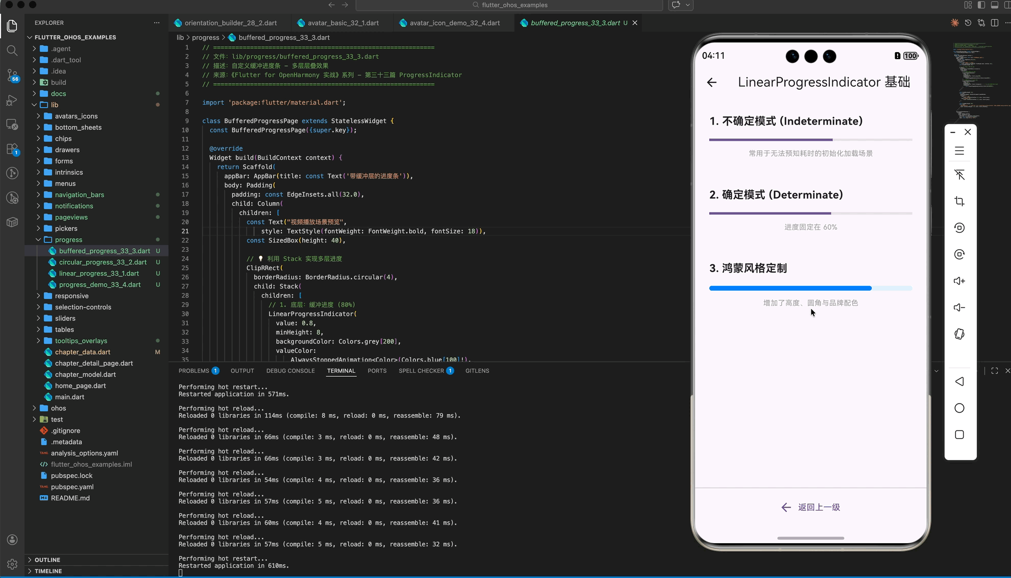
一、进度条的两大模式
在 Flutter 中,进度条分为两种基本模式:
1.1 不确定模式 (Indeterminate)
用于无法预知具体完成时间的场景(如初始化请求)。进度条会循环播放动画。
const CircularProgressIndicator() // 默认就是不确定模式
1.2 确定模式 (Determinate)
用于已知进度的场景(如文件下载)。通过 value 属性(0.0 到 1.0)精确控制。
LinearProgressIndicator(
  value: _currentValue, // 例如 0.5 代表 50%
)
二、基础组件详解
2.1 LinearProgressIndicator:水平进度条
主要用于页面顶部、卡片底部或对话框中展示线性的进度。
(1)样式定制
LinearProgressIndicator(
  value: 0.7,
  backgroundColor: Colors.blue[50], // 背景轨道色
  color: Colors.blue[700],         // 进度颜色(鸿蒙品牌蓝)
  minHeight: 6,                    // 高度定制
  borderRadius: BorderRadius.circular(3), // 鸿蒙风格的圆角边框
)
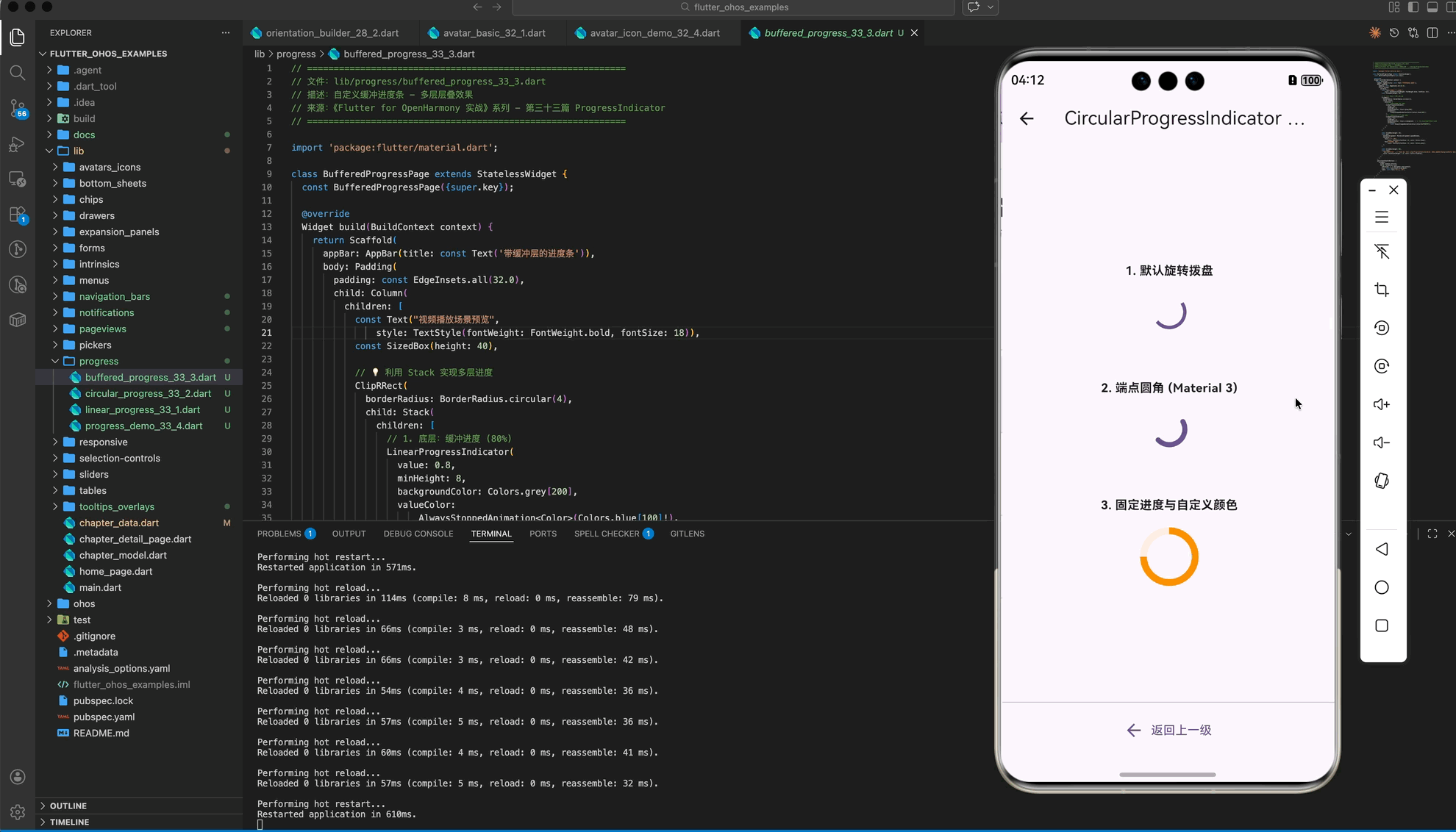
2.2 CircularProgressIndicator:圆形进度条
常用于按钮中心、页面正中央或图片加载占位。
(2)多参数控制
const CircularProgressIndicator(
  strokeWidth: 5,               // 圆环厚度
  strokeCap: StrokeCap.round,    // 端点圆角处理,视觉更柔和
  valueColor: AlwaysStoppedAnimation<Color>(Colors.orange), // 动画色
)
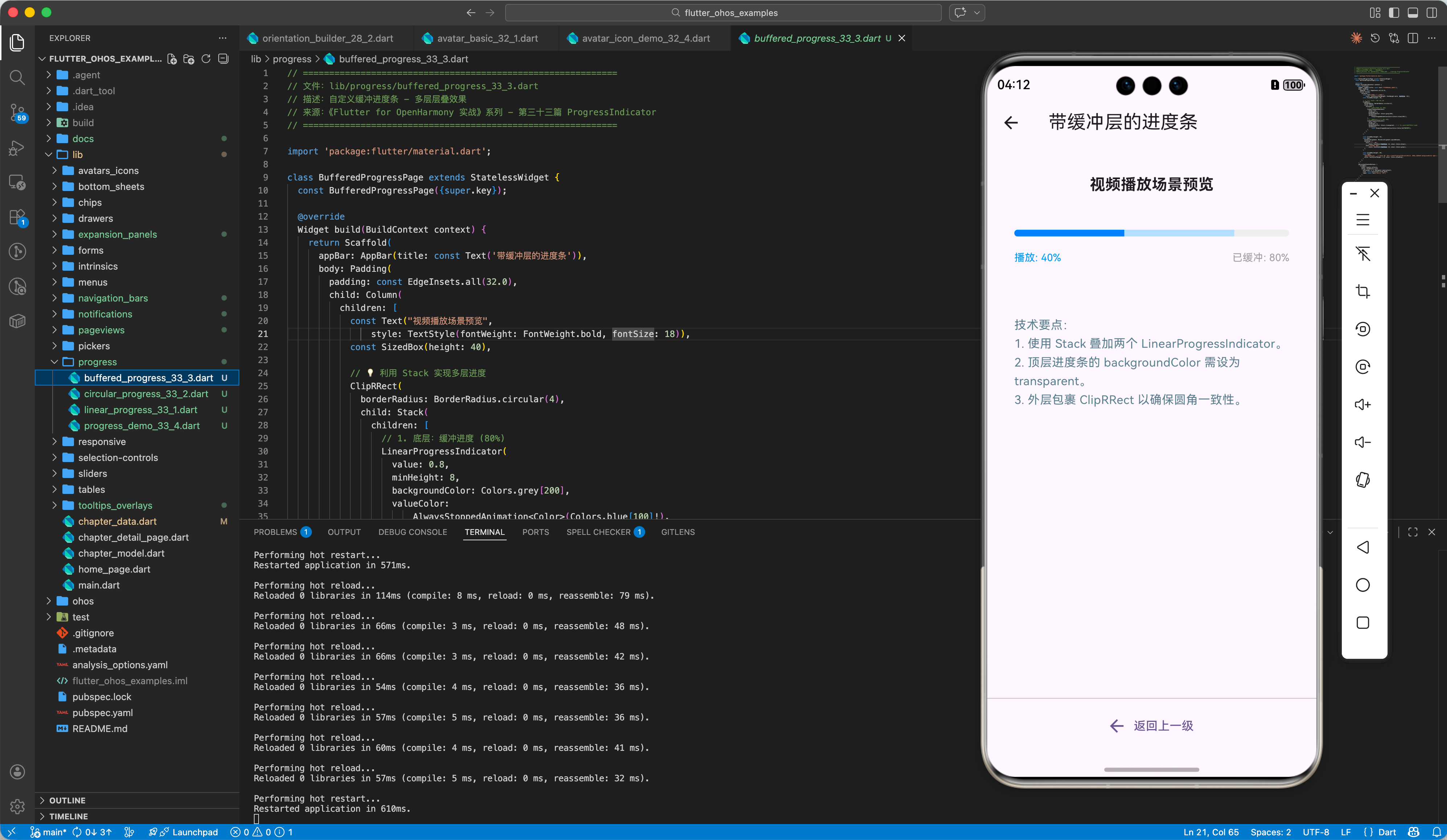
三、进阶:自定义缓冲与动画效果
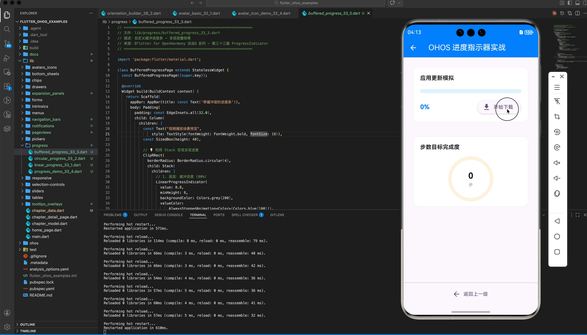
在实际业务中,我们常需要展示“已下载”和“已缓冲”两层进度。
3.1 带有背景层叠的进度条
Stack(
  children: [
    LinearProgressIndicator(
      value: 0.8, // 缓冲进度
      backgroundColor: Colors.grey[200],
      valueColor: AlwaysStoppedAnimation<Color>(Colors.blue[100]!),
    ),
    LinearProgressIndicator(
      value: 0.4, // 播放进度
      backgroundColor: Colors.transparent, // 透明背景避免覆盖
      valueColor: AlwaysStoppedAnimation<Color>(Colors.blue[700]!),
    ),
  ],
)
四、OpenHarmony 平台适配建议
4.1 动画帧率稳定性
鸿蒙设备往往支持 90Hz 或 120Hz 刷新率。
✅ 推荐方案:
尽量使用 Flutter 自带的 ProgressIndicator,它底层基于 AnimationController 实现,能自动适配鸿蒙系统的 VSync 信号,确保动画极其丝滑。
4.2 结合鸿蒙系统状态控制
当应用进入后台或由于某种原因被挂起时。
💡 调优思路:
如果是不确定模式的进度条,建议在组件不可见时(例如通过 Visibility 彻底移除)停止其渲染,以节省鸿蒙设备的功耗。
4.3 视觉风格融合
鸿蒙系统的视觉语言倾向于轻量、高光、大圆角。
✅ 最佳实践:
- 为
LinearProgressIndicator增加borderRadius。 - 采用鸿蒙常用的渐变色或品牌蓝(Color(0xFF007DFF))作为进度色。
五、完整示例代码
以下演示一个包含“模拟模拟下载进度”功能的综合示例。
import 'package:flutter/material.dart';
import 'dart:async';
void main() => runApp(const MaterialApp(home: ProgressDemoPage()));
class ProgressDemoPage extends StatefulWidget {
const ProgressDemoPage({super.key});
State<ProgressDemoPage> createState() => _ProgressDemoPageState();
}
class _ProgressDemoPageState extends State<ProgressDemoPage> {
double _progress = 0.0;
bool _isDownloading = false;
void _startDownload() {
setState(() {
_progress = 0.0;
_isDownloading = true;
});
Timer.periodic(const Duration(milliseconds: 100), (timer) {
setState(() {
_progress += 0.02;
if (_progress >= 1.0) {
_progress = 1.0;
_isDownloading = false;
timer.cancel();
}
});
});
}
Widget build(BuildContext context) {
return Scaffold(
appBar: AppBar(title: const Text('OHOS 进度指示器实战')),
body: Padding(
padding: const EdgeInsets.all(32.0),
child: Column(
children: [
const _SectionTitle("不确定模式 (加载中...)"),
const LinearProgressIndicator(),
const SizedBox(height: 24),
const CircularProgressIndicator(strokeCap: StrokeCap.round),
const SizedBox(height: 60),
const _SectionTitle("确定模式 (下载进度)"),
LinearProgressIndicator(
value: _progress,
minHeight: 10,
borderRadius: BorderRadius.circular(5),
),
const SizedBox(height: 20),
Row(
mainAxisAlignment: MainAxisAlignment.spaceBetween,
children: [
Text("当前进度: ${(_progress * 100).toInt()}%"),
ElevatedButton(
onPressed: _isDownloading ? null : _startDownload,
child: const Text("开始模拟下载"),
)
],
),
const SizedBox(height: 48),
_buildCustomCircular(),
],
),
),
);
}
Widget _buildCustomCircular() {
return Column(
children: [
const _SectionTitle("自定义形状"),
SizedBox(
width: 80, height: 80,
child: CircularProgressIndicator(
value: _progress,
strokeWidth: 8,
backgroundColor: Colors.blue[50],
valueColor: const AlwaysStoppedAnimation(Colors.deepPurple),
),
)
],
);
}
}
class _SectionTitle extends StatelessWidget {
final String text;
const _SectionTitle(this.text);
Widget build(BuildContext context) {
return Padding(
padding: const EdgeInsets.only(bottom: 16),
child: Text(text, style: const TextStyle(fontSize: 18, fontWeight: FontWeight.bold)),
);
}
}
六、总结
在 Flutter for OpenHarmony 开发中,进度条不仅仅是装饰,更是人机交互的情感纽带。
- 模式选择:能预估选“确定模式”,不能预估选“不确定模式”。
- 样式定制:利用
strokeCap和borderRadius提升细腻度。 - 性能关怀:鸿蒙端建议在组件销毁或隐藏时回收动画资源,提升续航表现。
📦 完整代码已上传至 AtomGit:flutter_ohos_examples
🌐 欢迎加入开源鸿蒙跨平台社区:开源鸿蒙跨平台开发者社区

开源鸿蒙跨平台开发社区汇聚开发者与厂商,共建“一次开发,多端部署”的开源生态,致力于降低跨端开发门槛,推动万物智联创新。
更多推荐


 12
12 0
0- 0


 已为社区贡献34条内容

所有评论(0)