Flutter for OpenHarmony 身体健康状况记录App实战 - 关于我们实现
摘要 本文介绍了Flutter应用中"关于我们"页面的实现方法,主要包含以下内容: 页面采用居中布局设计,展示应用图标、名称、版本号和简介 应用图标使用渐变背景和圆角矩形设计,搭配心形图标和阴影效果 版本信息通过package_info_plus包动态获取 应用简介使用白色卡片包裹,采用1.6行高提升可读性 可添加联系方式模块方便用户反馈 整体设计注重简洁性和用户体验,使用响应
#
前言
关于我们页面展示应用的基本信息,包括应用图标、名称、版本号和简介。这个页面虽然简单,但对于建立用户信任和品牌认知很重要。
这篇文章会讲解关于我们页面的实现,包括应用信息展示和页面布局设计。
页面整体结构
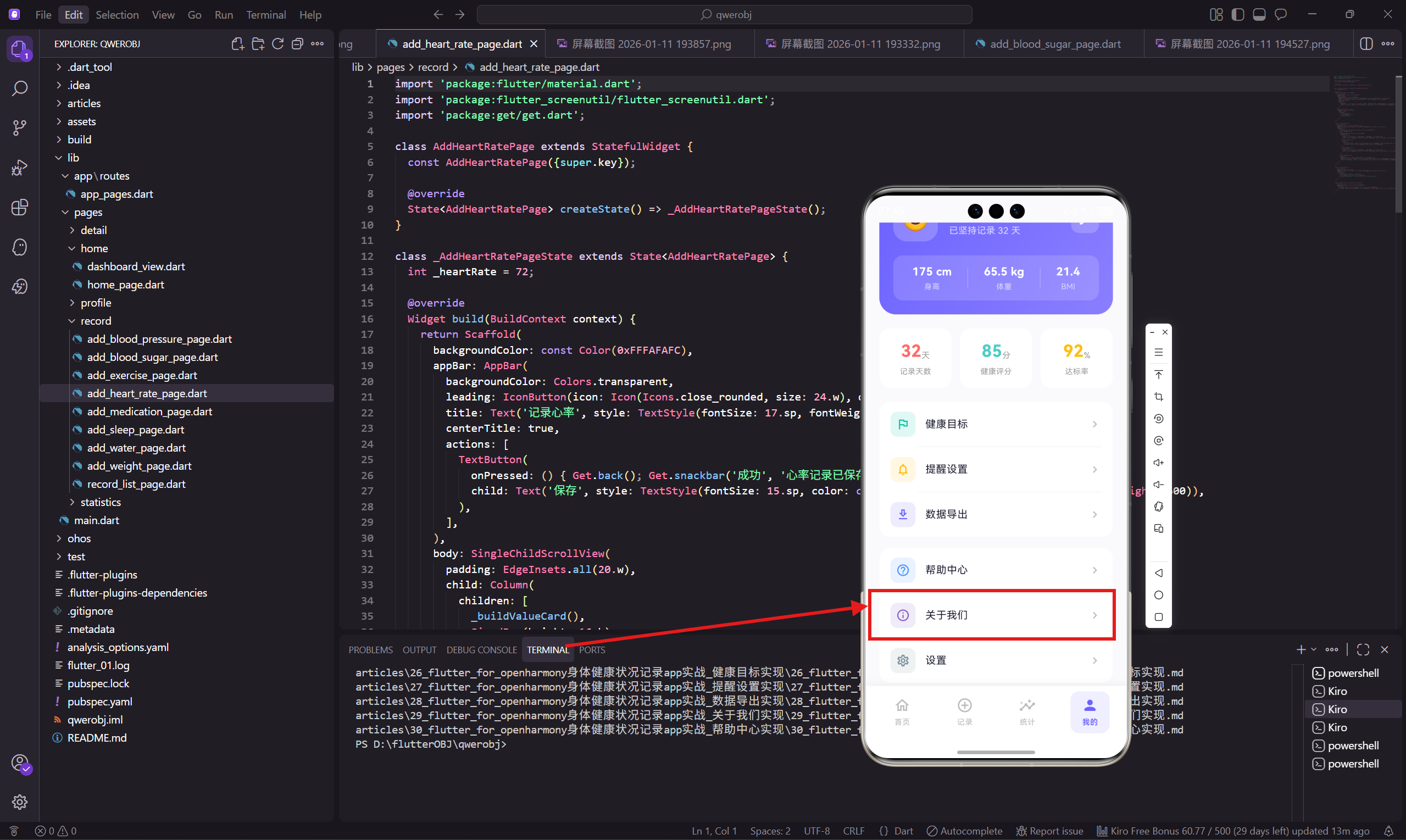
关于我们页面采用居中布局,主要展示应用图标、名称、版本号和简介。
class AboutPage extends StatelessWidget {
const AboutPage({super.key});
Widget build(BuildContext context) {
return Scaffold(
backgroundColor: const Color(0xFFFAFAFC),
appBar: AppBar(
backgroundColor: Colors.transparent,
leading: IconButton(
icon: Icon(Icons.arrow_back_ios_rounded, size: 20.w),
onPressed: () => Get.back()
),
title: Text('关于我们', style: TextStyle(fontSize: 17.sp, fontWeight: FontWeight.w600)),
centerTitle: true,
),
body: SingleChildScrollView(
padding: EdgeInsets.all(20.w),
child: Column(
children: [
SizedBox(height: 20.h),
Container(
width: 80.w,
height: 80.w,
decoration: BoxDecoration(
gradient: const LinearGradient(
colors: [Color(0xFF6C63FF), Color(0xFF8B7FFF)]
),
borderRadius: BorderRadius.circular(20.r),
),
child: Icon(Icons.favorite_rounded, size: 40.w, color: Colors.white),
),
SizedBox(height: 16.h),
Text('健康助手', style: TextStyle(
fontSize: 22.sp,
fontWeight: FontWeight.w700,
color: const Color(0xFF1A1A2E)
)),
SizedBox(height: 4.h),
Text('v2.1.3', style: TextStyle(
fontSize: 13.sp,
color: Colors.grey[500]
)),
SizedBox(height: 30.h),
Container(
padding: EdgeInsets.all(20.w),
decoration: BoxDecoration(
color: Colors.white,
borderRadius: BorderRadius.circular(20.r)
),
child: Text(
'健康助手是一款专注于个人健康管理的应用,帮助您记录和追踪各项健康指标,养成良好的生活习惯。',
style: TextStyle(
fontSize: 14.sp,
color: Colors.grey[700],
height: 1.6
),
textAlign: TextAlign.center,
),
),
],
),
),
);
}
}
页面顶部留出一些空间,让应用图标不会太靠近 AppBar。应用图标使用渐变背景和心形图标,和应用主题保持一致。
应用图标设计
应用图标使用渐变背景和圆角矩形,看起来现代且专业:
Widget _buildAppIcon() {
  return Container(
    width: 80.w,
    height: 80.w,
    decoration: BoxDecoration(
      gradient: const LinearGradient(
        begin: Alignment.topLeft,
        end: Alignment.bottomRight,
        colors: [Color(0xFF6C63FF), Color(0xFF8B7FFF)],
      ),
      borderRadius: BorderRadius.circular(20.r),
      boxShadow: [
        BoxShadow(
          color: const Color(0xFF6C63FF).withOpacity(0.3),
          blurRadius: 20,
          offset: const Offset(0, 10),
        ),
      ],
    ),
    child: Icon(Icons.favorite_rounded, size: 40.w, color: Colors.white),
  );
}
图标下方添加了紫色阴影,让它看起来像是浮在页面上,增加立体感。
版本信息展示
版本号可以从应用配置中动态获取:
Widget _buildVersionInfo() {
  return FutureBuilder<PackageInfo>(
    future: PackageInfo.fromPlatform(),
    builder: (context, snapshot) {
      final version = snapshot.data?.version ?? '1.0.0';
      final buildNumber = snapshot.data?.buildNumber ?? '1';

      return Column(
        children: [
          Text('健康助手', style: TextStyle(
            fontSize: 22.sp,
            fontWeight: FontWeight.w700,
            color: const Color(0xFF1A1A2E),
          )),
          SizedBox(height: 4.h),
          Text('v$version ($buildNumber)', style: TextStyle(
            fontSize: 13.sp,
            color: Colors.grey[500],
          )),
        ],
      );
    },
  );
}
使用 package_info_plus 包可以获取应用的版本号和构建号。
应用简介卡片
应用简介用白色卡片包裹,文字居中对齐:
Widget _buildDescription() {
  return Container(
    padding: EdgeInsets.all(20.w),
    decoration: BoxDecoration(
      color: Colors.white,
      borderRadius: BorderRadius.circular(20.r),
    ),
    child: Text(
      '健康助手是一款专注于个人健康管理的应用,帮助您记录和追踪各项健康指标,养成良好的生活习惯。\n\n'
      '主要功能包括:\n'
      '• 体重、血压、血糖等健康数据记录\n'
      '• 睡眠和运动追踪\n'
      '• 健康趋势分析和报告\n'
      '• 定时提醒功能',
      style: TextStyle(
        fontSize: 14.sp,
        color: Colors.grey[700],
        height: 1.6,
      ),
      textAlign: TextAlign.center,
    ),
  );
}
简介文字使用 1.6 的行高,让阅读更舒适。功能列表用项目符号分隔,清晰明了。
联系方式
可以添加联系方式,方便用户反馈问题:
Widget _buildContactInfo() {
  return Container(
    margin: EdgeInsets.only(top: 20.h),
    padding: EdgeInsets.all(16.w),
    decoration: BoxDecoration(
      color: Colors.white,
      borderRadius: BorderRadius.circular(16.r),
    ),
    child: Column(
      children: [
        _buildContactItem('官方网站', 'www.healthapp.com', Icons.language_rounded),
        Divider(height: 20.h, color: Colors.grey[100]),
        _buildContactItem('客服邮箱', 'support@healthapp.com', Icons.email_outlined),
        Divider(height: 20.h, color: Colors.grey[100]),
        _buildContactItem('客服电话', '400-123-4567', Icons.phone_outlined),
      ],
    ),
  );
}

Widget _buildContactItem(String label, String value, IconData icon) {
  return Row(
    children: [
      Icon(icon, size: 20.w, color: const Color(0xFF6C63FF)),
      SizedBox(width: 12.w),
      Text(label, style: TextStyle(
        fontSize: 14.sp,
        color: Colors.grey[600],
      )),
      const Spacer(),
      Text(value, style: TextStyle(
        fontSize: 14.sp,
        color: const Color(0xFF1A1A2E),
      )),
    ],
  );
}
联系方式用图标加文字的形式展示,点击可以跳转到对应的链接或拨打电话。
法律信息链接
可以添加用户协议和隐私政策的链接:
Widget _buildLegalLinks() {
  return Container(
    margin: EdgeInsets.only(top: 20.h),
    child: Row(
      mainAxisAlignment: MainAxisAlignment.center,
      children: [
        GestureDetector(
          onTap: () {
            // 打开用户协议
          },
          child: Text('用户协议', style: TextStyle(
            fontSize: 13.sp,
            color: const Color(0xFF6C63FF),
          )),
        ),
        Padding(
          padding: EdgeInsets.symmetric(horizontal: 16.w),
          child: Text('|', style: TextStyle(
            fontSize: 13.sp,
            color: Colors.grey[300],
          )),
        ),
        GestureDetector(
          onTap: () {
            // 打开隐私政策
          },
          child: Text('隐私政策', style: TextStyle(
            fontSize: 13.sp,
            color: const Color(0xFF6C63FF),
          )),
        ),
      ],
    ),
  );
}
法律信息链接放在页面底部,用紫色文字表示可点击。
版权信息
页面底部显示版权信息:
Widget _buildCopyright() {
  return Container(
    margin: EdgeInsets.only(top: 30.h, bottom: 20.h),
    child: Text(
      '© 2026 健康助手 版权所有',
      style: TextStyle(
        fontSize: 12.sp,
        color: Colors.grey[400],
      ),
    ),
  );
}
版权信息用灰色小字显示,不会太抢眼。
检查更新功能
可以添加检查更新的功能:
Widget _buildCheckUpdateButton() {
  return Container(
    margin: EdgeInsets.only(top: 20.h),
    child: GestureDetector(
      onTap: () async {
        // 检查更新
        Get.dialog(
          Center(
            child: Container(
              padding: EdgeInsets.all(20.w),
              decoration: BoxDecoration(
                color: Colors.white,
                borderRadius: BorderRadius.circular(12.r),
              ),
              child: Column(
                mainAxisSize: MainAxisSize.min,
                children: [
                  const CircularProgressIndicator(
                    valueColor: AlwaysStoppedAnimation(Color(0xFF6C63FF)),
                  ),
                  SizedBox(height: 16.h),
                  Text('正在检查更新...', style: TextStyle(
                    fontSize: 14.sp,
                    color: const Color(0xFF1A1A2E),
                  )),
                ],
              ),
            ),
          ),
          barrierDismissible: false,
        );

        // 模拟检查更新
        await Future.delayed(const Duration(seconds: 2));
        Get.back();

        Get.snackbar(
          '检查完成',
          '当前已是最新版本',
          snackPosition: SnackPosition.TOP,
          backgroundColor: const Color(0xFF00C9A7),
          colorText: Colors.white,
        );
      },
      child: Container(
        padding: EdgeInsets.symmetric(vertical: 12.h, horizontal: 24.w),
        decoration: BoxDecoration(
          color: const Color(0xFF6C63FF).withOpacity(0.1),
          borderRadius: BorderRadius.circular(20.r),
        ),
        child: Text('检查更新', style: TextStyle(
          fontSize: 14.sp,
          color: const Color(0xFF6C63FF),
          fontWeight: FontWeight.w500,
        )),
      ),
    ),
  );
}
检查更新按钮用淡紫色背景,点击后显示加载提示,完成后显示结果。
开发团队信息
可以展示开发团队的信息:
Widget _buildTeamInfo() {
  return Container(
    margin: EdgeInsets.only(top: 20.h),
    padding: EdgeInsets.all(16.w),
    decoration: BoxDecoration(
      color: Colors.white,
      borderRadius: BorderRadius.circular(16.r),
    ),
    child: Column(
      children: [
        Text('开发团队', style: TextStyle(
          fontSize: 14.sp,
          fontWeight: FontWeight.w500,
          color: const Color(0xFF1A1A2E),
        )),
        SizedBox(height: 12.h),
        Text(
          '我们是一支专注于健康科技的团队,致力于用技术帮助人们更好地管理健康。',
          style: TextStyle(
            fontSize: 13.sp,
            color: Colors.grey[600],
            height: 1.5,
          ),
          textAlign: TextAlign.center,
        ),
      ],
    ),
  );
}
团队信息让用户了解应用背后的开发者,增加信任感。
小结
关于我们页面通过应用图标、名称、版本号和简介,向用户展示应用的基本信息。
核心设计要点包括:应用图标使用渐变背景和阴影增加立体感,简介文字居中对齐便于阅读,联系方式和法律链接放在底部。这些设计让页面简洁专业,有助于建立用户信任。
欢迎加入开源鸿蒙跨平台社区:https://openharmonycrossplatform.csdn.net

开源鸿蒙跨平台开发社区汇聚开发者与厂商,共建“一次开发,多端部署”的开源生态,致力于降低跨端开发门槛,推动万物智联创新。
更多推荐

 3
3 0
0- 0


 已为社区贡献30条内容

所有评论(0)