Flutter for OpenHarmony 实现高级视差侧滑菜单:融合动效、模糊与交互动画的现代 UI 设计
Flutter for OpenHarmony 实现高级视差侧滑菜单:融合动效、模糊与交互动画的现代 UI 设计
·
Flutter for OpenHarmony 实现高级视差侧滑菜单:融合动效、模糊与交互动画的现代 UI 设计
在移动应用体验日益追求沉浸感与流畅性的今天,一个普通的侧边栏已无法满足用户对美学与交互的期待。本文将深入解析一段完整的 Flutter
代码,展示如何构建一个具备视差背景、毛玻璃效果、多层动画和精细交互动效的现代化侧滑菜单系统——它不仅是一个导航工具,更是一场视觉盛宴。
完整效果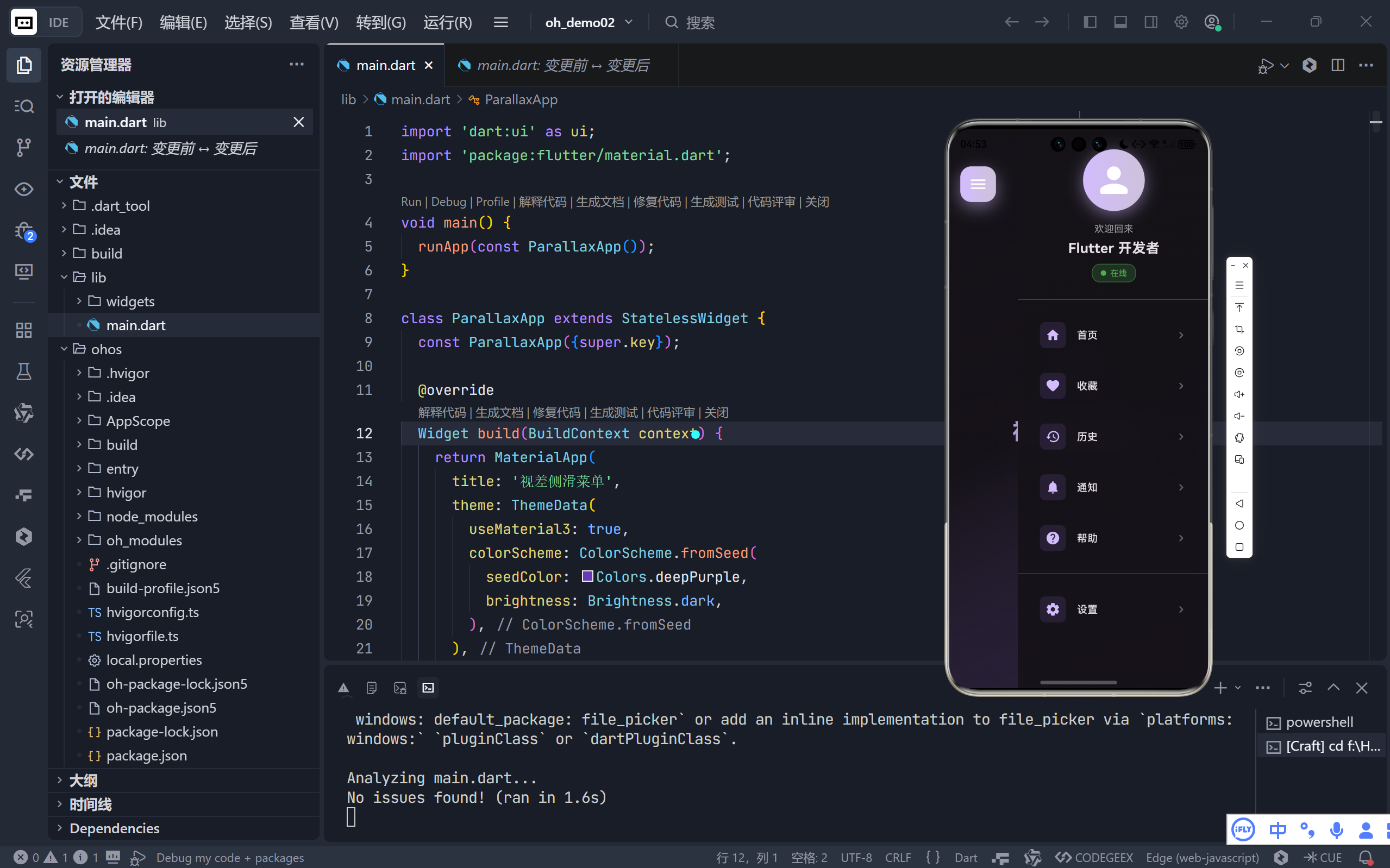
一、整体架构与设计哲学
1. 三层叠加布局
应用采用 Stack 构建三层结构:
- 底层:主内容区(带视差动画的渐变背景);
- 中层:侧边菜单(带毛玻璃模糊 + 圆角裁剪);
- 上层:遮罩层(菜单打开时半透明覆盖主内容)+ 悬浮按钮。
💡 这种分层实现了视觉深度:菜单仿佛从屏幕左侧“滑出”,而非简单覆盖。
2. 动效驱动核心体验
通过两个 AnimationController 协同工作:
_animationController:控制菜单滑入/缩放/淡入(400ms);_rotationController:专用于汉堡图标旋转(300ms),实现更细腻的反馈。
二、核心动画技术详解
1. 视差背景效果
double parallaxOffset = -_slideAnimation.value * 80;
Transform.translate(
  offset: Offset(parallaxOffset, 0),
  child: Transform.scale(scale: _scaleAnimation.value, ...)
)
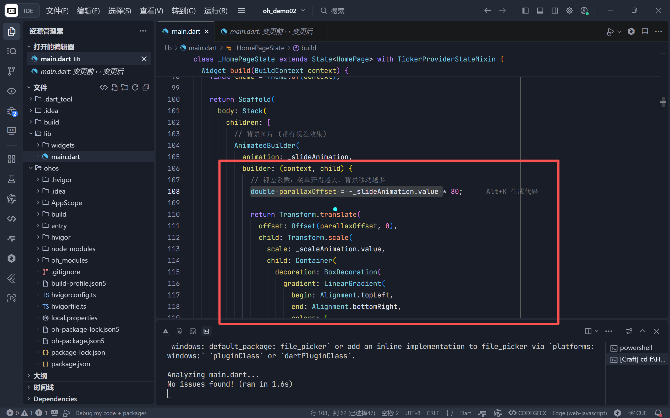
- 反向位移:菜单向右滑出时,背景向左移动(
-80px最大偏移);- 同步缩放:背景从
1.0缩小到0.9,模拟“远离”视角;- 曲线优化:
Curves.easeInOutCubic提供更自然的加速/减速。
2. 菜单滑入动效
final slideOffset = (1 - _slideAnimation.value) * 100;
Transform.translate(offset: Offset(slideOffset, 0), ...)
- 初始隐藏:
slideOffset = 100时菜单完全在屏幕外;- 弹性入场:配合
BoxShadow的动态阴影,营造“弹出”感。
3. 智能遮罩层
if (_isMenuOpen)
  AnimatedBuilder(
    animation: _fadeAnimation,
    builder: (context, _) => GestureDetector(
      onTap: _toggleMenu, // 点击遮罩关闭菜单
      child: Container(color: Colors.black.withAlpha(0.4 * fadeValue))
    )
  )
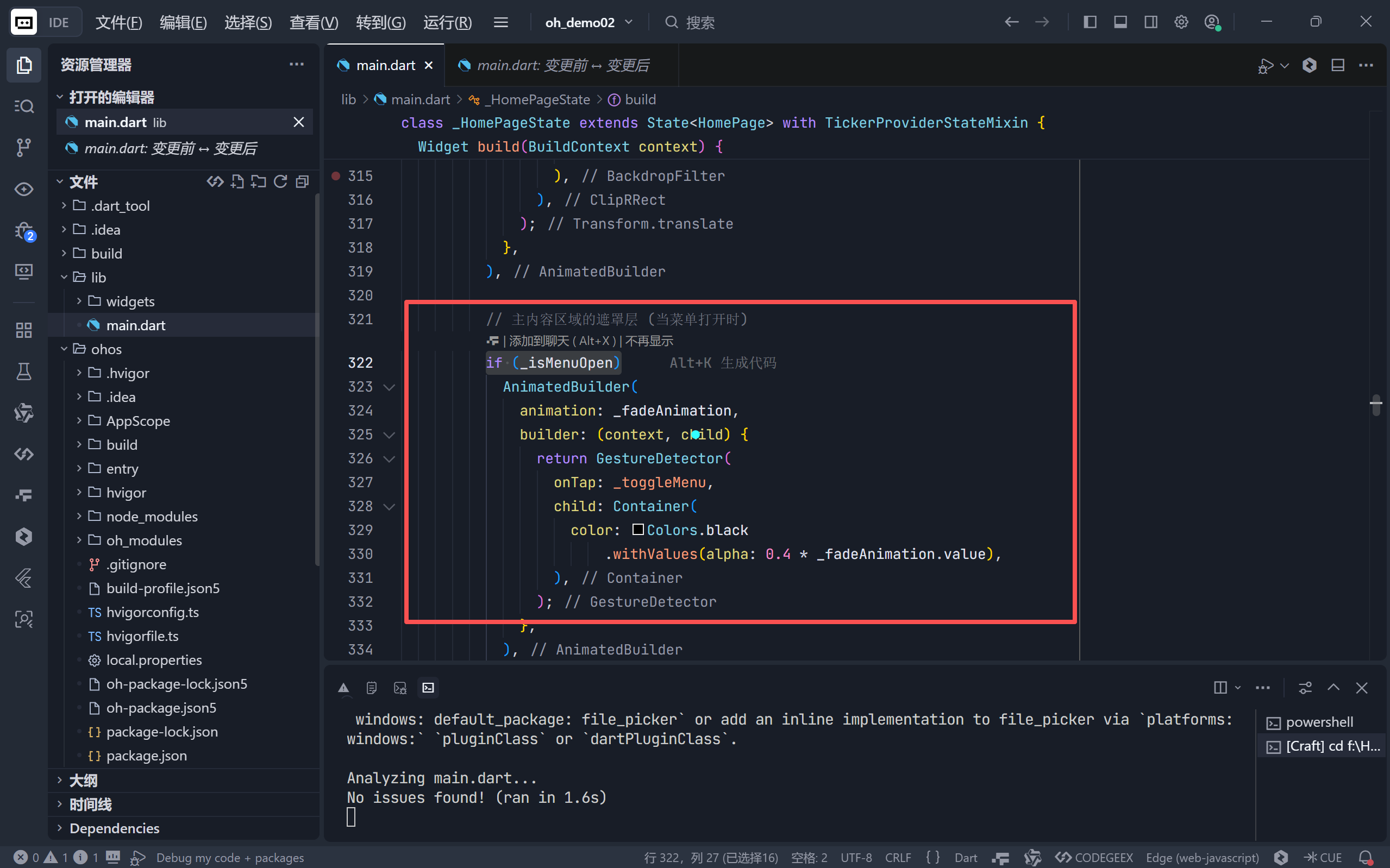
- 条件渲染:仅当菜单打开时创建遮罩;
- 手势穿透:
GestureDetector确保点击区域可响应。
三、高级视觉效果实现
1. 毛玻璃(Frosted Glass)菜单
BackdropFilter(
  filter: ui.ImageFilter.blur(sigmaX: 20, sigmaY: 20),
  child: Container(
    decoration: BoxDecoration(
      gradient: [...], // 半透明深色渐变
      boxShadow: [...]  // 左侧发光阴影
    )
  )
)
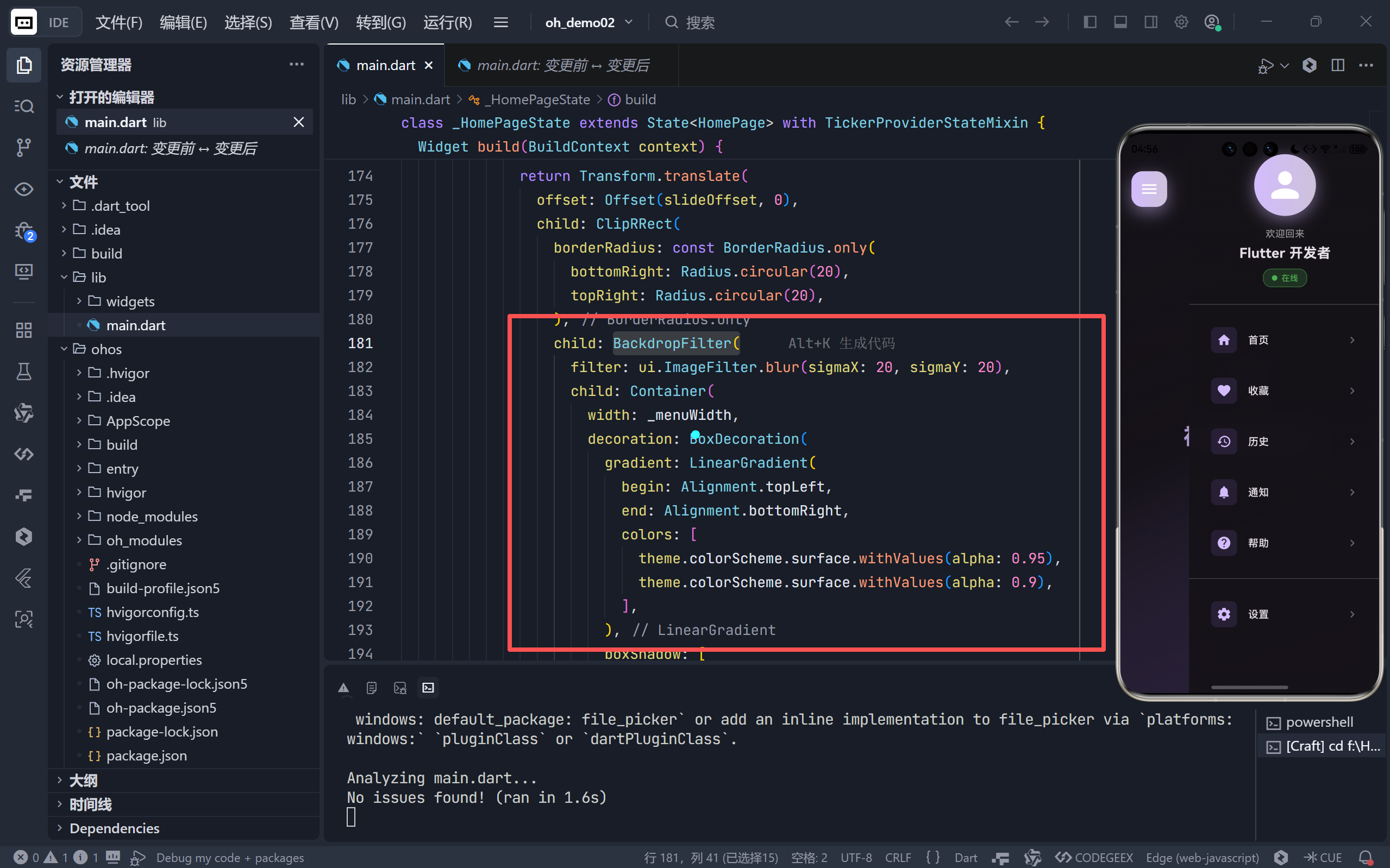
- 模糊强度:
sigma=20提供柔和的背景虚化;- 色彩叠加:
surface.withAlpha(0.95)保留背景纹理的同时确保文字可读性。
2. 动态汉堡图标
IconButton(
  icon: AnimatedIcon(
    icon: AnimatedIcons.menu_close,
    progress: _animationController,
  ),
  onPressed: _toggleMenu,
)
- 内置动画:
AnimatedIcons.menu_close自动处理 → × 的过渡; - 色彩统一:白色图标与紫色渐变按钮形成高对比度。
3. 用户信息卡片设计
Container(
  decoration: BoxDecoration(
    gradient: [primary, secondary], // 双色渐变圆环
    boxShadow: [...] // 下方发光
  ),
  child: CircleAvatar(child: Icon(Icons.person))
)
- 状态指示器:绿色“在线”标签 + 圆点,符合社交应用惯例;
- 层次分明:头像 > 名称 > 状态,信息层级清晰。
四、交互细节打磨
1. 菜单项微交互
每个菜单项包含精心设计的反馈机制:
InkWell(
  borderRadius: BorderRadius.circular(12),
  child: Container(
    padding: EdgeInsets.all(16),
    decoration: BoxDecoration(borderRadius: ...),
    child: Row(children: [
      // 图标容器(浅色背景突出)
      Container(decoration: primaryContainer.withAlpha(0.3), child: Icon(...)),
      Text(title),
      Icon(Icons.chevron_right) // 引导性箭头
    ])
  )
)
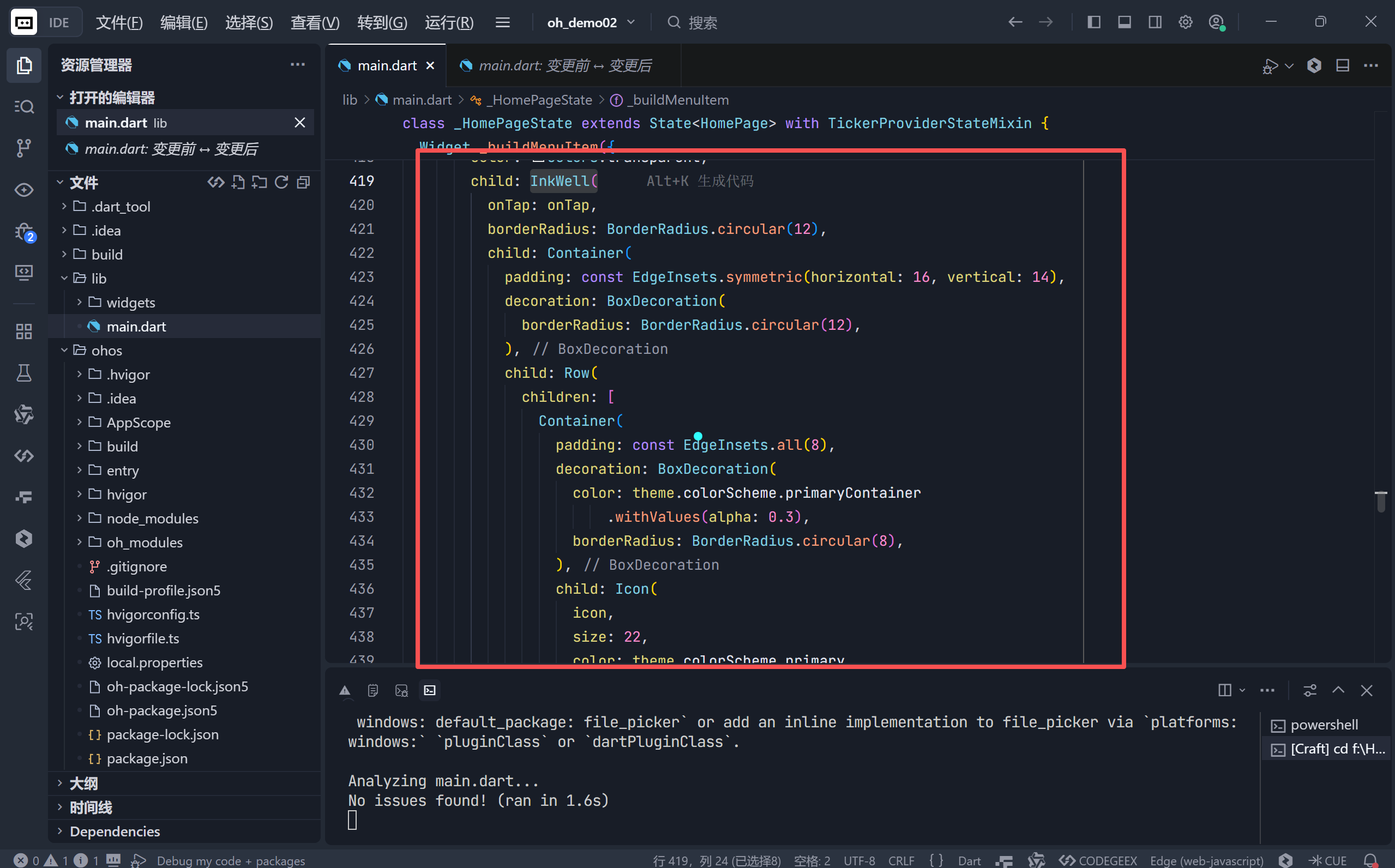
- 视觉引导:右侧箭头暗示“可操作”;
- 色彩呼应:图标容器使用
primaryContainer色系,保持品牌一致性。
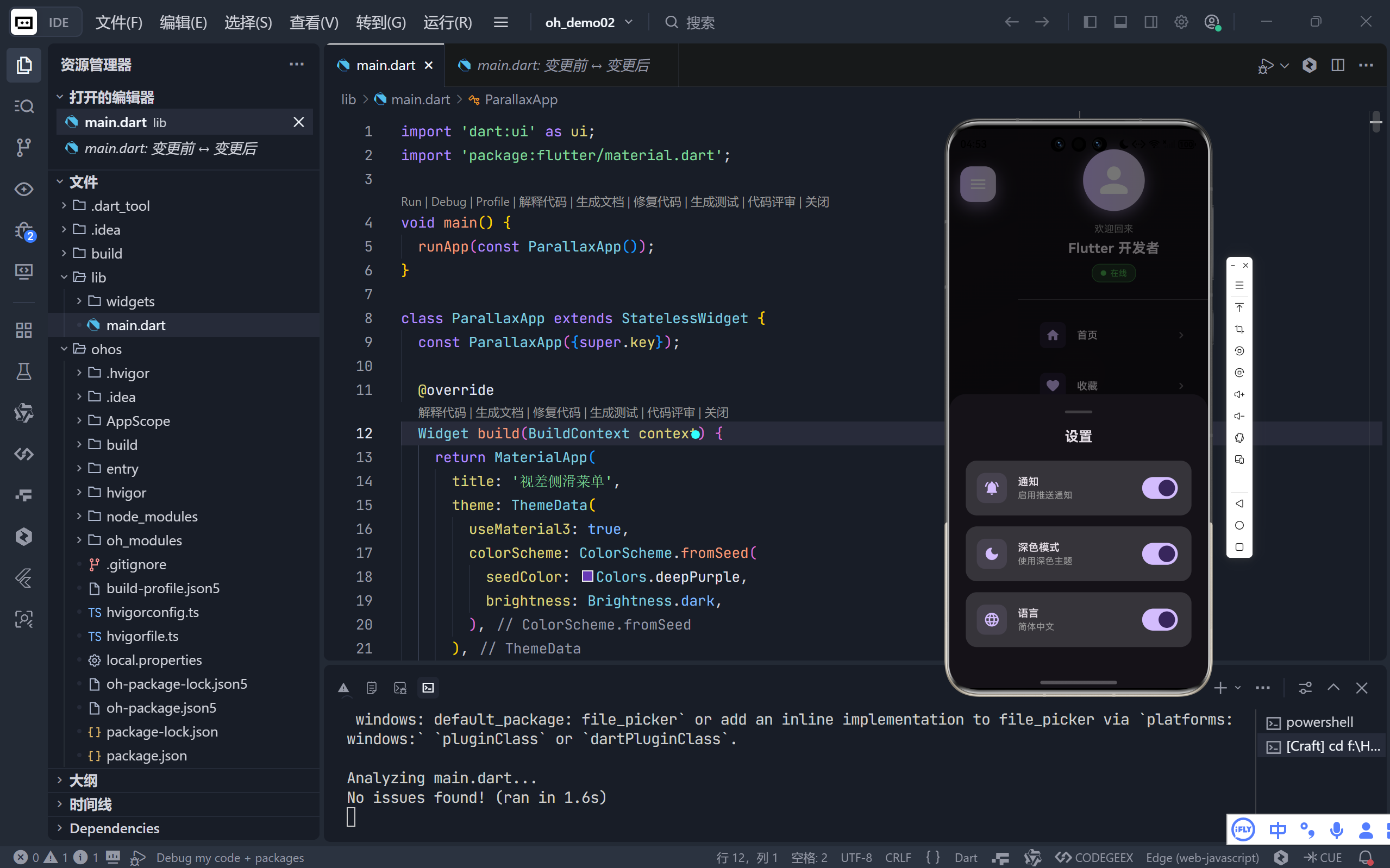
2. 底部设置面板
通过 showModalBottomSheet 实现设置页:
- 圆角顶部:
BorderRadius.only(topLeft: 24, topRight: 24); - 手柄指示器:顶部灰色短条提示可拖拽;
- 卡片式选项:每个设置项独立容器 + 开关控件。
3. 即时反馈系统
点击任意菜单项触发 SnackBar:
ScaffoldMessenger.of(context).showSnackBar(
  SnackBar(
    content: Text('点击了 ${item['title']}'),
    backgroundColor: theme.colorScheme.primary,
    behavior: SnackBarBehavior.floating,
    shape: RoundedRectangleBorder(borderRadius: BorderRadius.circular(10))
  )
);
- 浮动样式:避免遮挡底部内容;
- 圆角设计:与整体 UI 语言统一。
五、主题与适配性
1. Material 3 主题集成
theme: ThemeData(
  useMaterial3: true,
  colorScheme: ColorScheme.fromSeed(
    seedColor: Colors.deepPurple,
    brightness: Brightness.dark,
  ),
)
- 种子色系统:自动派生完整色板(primary/secondary/surface 等);
- 深色模式原生支持:所有组件自动适配深色背景。
2. 响应式安全区
Positioned(
  top: MediaQuery.of(context).padding.top + 16, // 避开状态栏
  left: 16,
  child: ...
)
- 刘海屏兼容:动态获取系统状态栏高度;
- 边缘留白:左右
16px内边距符合 Material Design 规范。
六、性能与可维护性
1. 动画资源管理
void dispose() {
_animationController.dispose();
_rotationController.dispose();
super.dispose();
}
- 内存安全:及时释放动画控制器,避免内存泄漏。
2. 组件化设计
_buildMenuItem():复用菜单项模板;_buildSettingOption():标准化设置选项;- 单一职责:每个方法只负责特定 UI 片段。
3. 高效重绘
AnimatedBuilder仅重建动画相关子树;- 条件渲染 (
if (_isMenuOpen)) 避免无用 widget 创建。
七、扩展可能性
手势滑动支持 添加
Draggable区域,支持从左侧边缘滑出菜单。多级菜单 在菜单项中嵌套子菜单,通过
ExpansionTile实现。动态内容加载 将菜单数据改为 API 驱动,支持远程配置。
主题切换 在设置面板中添加浅色/深色模式切换开关。
结语:超越功能的 UI 艺术
这个侧滑菜单项目完美诠释了 Flutter 的核心优势:用声明式代码构建媲美原生的交互动效。它不仅仅是一个导航容器,更是以下设计理念的集大成者:
- 动效即反馈:每个操作都有对应的视觉响应;
- 深度即真实:视差 + 模糊 + 阴影构建三维空间感;
- 细节即品质:从圆角半径到色彩透明度,处处体现匠心。
🌐 加入社区
欢迎加入 开源鸿蒙跨平台开发者社区,获取最新资源与技术支持:
👉 开源鸿蒙跨平台开发者社区
完整代码展示
import 'dart:ui' as ui;
import 'package:flutter/material.dart';
void main() {
runApp(const ParallaxApp());
}
class ParallaxApp extends StatelessWidget {
const ParallaxApp({super.key});
@override
Widget build(BuildContext context) {
return MaterialApp(
title: '视差侧滑菜单',
theme: ThemeData(
useMaterial3: true,
colorScheme: ColorScheme.fromSeed(
seedColor: Colors.deepPurple,
brightness: Brightness.dark,
),
),
home: const HomePage(),
debugShowCheckedModeBanner: false,
);
}
}
class HomePage extends StatefulWidget {
const HomePage({super.key});
@override
State<HomePage> createState() => _HomePageState();
}
class _HomePageState extends State<HomePage> with TickerProviderStateMixin {
bool _isMenuOpen = false;
final double _menuWidth = 280.0;
// 控制器
late AnimationController _animationController;
late AnimationController _rotationController;
late Animation<double> _slideAnimation;
late Animation<double> _scaleAnimation;
late Animation<double> _fadeAnimation;
@override
void initState() {
super.initState();
_animationController = AnimationController(
vsync: this,
duration: const Duration(milliseconds: 400),
);
_rotationController = AnimationController(
vsync: this,
duration: const Duration(milliseconds: 300),
);
_slideAnimation = Tween<double>(begin: 0, end: 1).animate(
CurvedAnimation(
parent: _animationController,
curve: Curves.easeInOutCubic,
),
);
_scaleAnimation = Tween<double>(begin: 1, end: 0.9).animate(
CurvedAnimation(
parent: _animationController,
curve: Curves.easeInOut,
),
);
_fadeAnimation = Tween<double>(begin: 0, end: 1).animate(
CurvedAnimation(parent: _animationController, curve: Curves.easeIn),
);
}
@override
void dispose() {
  _animationController.dispose();
  _rotationController.dispose();
  super.dispose();
}
void _toggleMenu() {
if (_isMenuOpen) {
_animationController.reverse();
_rotationController.reverse();
} else {
_animationController.forward();
_rotationController.forward();
}
_isMenuOpen = !_isMenuOpen;
}
@override
Widget build(BuildContext context) {
final theme = Theme.of(context);
return Scaffold(
body: Stack(
children: [
// 背景图片 (带有视差效果)
AnimatedBuilder(
animation: _slideAnimation,
builder: (context, child) {
// 视差系数:菜单开得越大,背景移动越多
double parallaxOffset = -_slideAnimation.value * 80;
return Transform.translate(
offset: Offset(parallaxOffset, 0),
child: Transform.scale(
scale: _scaleAnimation.value,
child: Container(
decoration: BoxDecoration(
gradient: LinearGradient(
begin: Alignment.topLeft,
end: Alignment.bottomRight,
colors: [
theme.colorScheme.surface,
theme.colorScheme.surface.withValues(alpha: 0.8),
theme.colorScheme.primaryContainer
.withValues(alpha: 0.3),
],
),
),
child: Center(
child: Column(
mainAxisAlignment: MainAxisAlignment.center,
children: [
Icon(
Icons.menu_open_rounded,
size: 80,
color: theme.colorScheme.primary
.withValues(alpha: 0.5),
),
const SizedBox(height: 24),
Text(
'视差侧滑菜单',
textAlign: TextAlign.center,
style: TextStyle(
fontSize: 32,
fontWeight: FontWeight.bold,
color: theme.colorScheme.primary
.withValues(alpha: 0.8),
),
),
const SizedBox(height: 12),
Text(
'点击左上角按钮打开菜单',
textAlign: TextAlign.center,
style: TextStyle(
fontSize: 16,
color: theme.colorScheme.onSurface
.withValues(alpha: 0.6),
),
),
],
),
),
),
),
);
},
),
// 侧边栏菜单
AnimatedBuilder(
animation: _slideAnimation,
builder: (context, child) {
// 计算滑入时的偏移和缩放
final slideOffset = (1 - _slideAnimation.value) * 100;
return Transform.translate(
offset: Offset(slideOffset, 0),
child: ClipRRect(
borderRadius: const BorderRadius.only(
bottomRight: Radius.circular(20),
topRight: Radius.circular(20),
),
child: BackdropFilter(
filter: ui.ImageFilter.blur(sigmaX: 20, sigmaY: 20),
child: Container(
width: _menuWidth,
decoration: BoxDecoration(
gradient: LinearGradient(
begin: Alignment.topLeft,
end: Alignment.bottomRight,
colors: [
theme.colorScheme.surface.withValues(alpha: 0.95),
theme.colorScheme.surface.withValues(alpha: 0.9),
],
),
boxShadow: [
BoxShadow(
color: Colors.black.withValues(alpha: 0.3),
blurRadius: 30,
offset: const Offset(-5, 0),
),
],
),
child: ListView(
padding: const EdgeInsets.symmetric(vertical: 20),
children: [
// 用户头像区域
Padding(
padding: const EdgeInsets.symmetric(
horizontal: 20, vertical: 10),
child: Column(
crossAxisAlignment: CrossAxisAlignment.center,
children: [
Container(
decoration: BoxDecoration(
shape: BoxShape.circle,
gradient: LinearGradient(
colors: [
theme.colorScheme.primary,
theme.colorScheme.secondary,
],
),
boxShadow: [
BoxShadow(
color: theme.colorScheme.primary
.withValues(alpha: 0.5),
blurRadius: 20,
offset: const Offset(0, 5),
),
],
),
child: const CircleAvatar(
radius: 45,
backgroundColor: Colors.transparent,
child: Icon(
Icons.person_rounded,
size: 60,
color: Colors.white,
),
),
),
const SizedBox(height: 16),
const Text(
'欢迎回来',
style: TextStyle(
fontSize: 14,
color: Colors.grey,
),
),
const SizedBox(height: 4),
Text(
'Flutter 开发者',
style: TextStyle(
fontSize: 20,
fontWeight: FontWeight.bold,
color: theme.colorScheme.onSurface,
),
),
const SizedBox(height: 8),
Container(
padding: const EdgeInsets.symmetric(
horizontal: 12,
vertical: 4,
),
decoration: BoxDecoration(
color: Colors.green.withValues(alpha: 0.2),
borderRadius: BorderRadius.circular(12),
border: Border.all(
color:
Colors.green.withValues(alpha: 0.5),
width: 1,
),
),
child: Row(
mainAxisSize: MainAxisSize.min,
children: [
Container(
width: 8,
height: 8,
decoration: const BoxDecoration(
color: Colors.green,
shape: BoxShape.circle,
),
),
const SizedBox(width: 6),
const Text(
'在线',
style: TextStyle(
fontSize: 12,
color: Colors.green,
fontWeight: FontWeight.w500,
),
),
],
),
),
],
),
),
const Divider(height: 30),
// 菜单项
..._buildMenuItems(theme),
const Divider(height: 30),
// 设置按钮
_buildMenuItem(
icon: Icons.settings_rounded,
title: '设置',
theme: theme,
onTap: () {
_showSettingsBottomSheet(context);
},
),
const SizedBox(height: 20),
],
),
),
),
),
);
},
),
// 主内容区域的遮罩层 (当菜单打开时)
if (_isMenuOpen)
AnimatedBuilder(
animation: _fadeAnimation,
builder: (context, child) {
return GestureDetector(
onTap: _toggleMenu,
child: Container(
color: Colors.black
.withValues(alpha: 0.4 * _fadeAnimation.value),
),
);
},
),
// 浮动操作按钮 (用于打开菜单)
Positioned(
top: MediaQuery.of(context).padding.top + 16,
left: 16,
child: Material(
elevation: 8,
borderRadius: BorderRadius.circular(16),
child: Container(
decoration: BoxDecoration(
gradient: LinearGradient(
colors: [
theme.colorScheme.primary,
theme.colorScheme.secondary,
],
),
borderRadius: BorderRadius.circular(16),
boxShadow: [
BoxShadow(
color: theme.colorScheme.primary.withValues(alpha: 0.5),
blurRadius: 20,
offset: const Offset(0, 8),
),
],
),
child: IconButton(
icon: AnimatedIcon(
icon: AnimatedIcons.menu_close,
progress: _animationController,
color: Colors.white,
),
onPressed: _toggleMenu,
iconSize: 28,
padding: const EdgeInsets.all(12),
),
),
),
),
],
),
);
}
List<Widget> _buildMenuItems(ThemeData theme) {
final menuItems = [
{'icon': Icons.home_rounded, 'title': '首页'},
{'icon': Icons.favorite_rounded, 'title': '收藏'},
{'icon': Icons.history_rounded, 'title': '历史'},
{'icon': Icons.notifications_rounded, 'title': '通知'},
{'icon': Icons.help_rounded, 'title': '帮助'},
];
return menuItems.map((item) {
return _buildMenuItem(
icon: item['icon'] as IconData,
title: item['title'] as String,
theme: theme,
onTap: () {
ScaffoldMessenger.of(context).showSnackBar(
SnackBar(
content: Text('点击了 ${item['title']}'),
backgroundColor: theme.colorScheme.primary,
behavior: SnackBarBehavior.floating,
shape: RoundedRectangleBorder(
borderRadius: BorderRadius.circular(10),
),
),
);
_toggleMenu();
},
);
}).toList();
}
Widget _buildMenuItem({
required IconData icon,
required String title,
required ThemeData theme,
required VoidCallback onTap,
}) {
return Padding(
padding: const EdgeInsets.symmetric(horizontal: 16, vertical: 4),
child: Material(
color: Colors.transparent,
child: InkWell(
onTap: onTap,
borderRadius: BorderRadius.circular(12),
child: Container(
padding: const EdgeInsets.symmetric(horizontal: 16, vertical: 14),
decoration: BoxDecoration(
borderRadius: BorderRadius.circular(12),
),
child: Row(
children: [
Container(
padding: const EdgeInsets.all(8),
decoration: BoxDecoration(
color: theme.colorScheme.primaryContainer
.withValues(alpha: 0.3),
borderRadius: BorderRadius.circular(8),
),
child: Icon(
icon,
size: 22,
color: theme.colorScheme.primary,
),
),
const SizedBox(width: 16),
Expanded(
child: Text(
title,
style: TextStyle(
fontSize: 15,
fontWeight: FontWeight.w500,
color: theme.colorScheme.onSurface,
),
),
),
Icon(
Icons.chevron_right_rounded,
size: 20,
color: theme.colorScheme.onSurface.withValues(alpha: 0.4),
),
],
),
),
),
),
);
}
void _showSettingsBottomSheet(BuildContext context) {
showModalBottomSheet(
context: context,
backgroundColor: Colors.transparent,
isScrollControlled: true,
builder: (context) => Container(
decoration: BoxDecoration(
color: Theme.of(context).colorScheme.surface,
borderRadius: const BorderRadius.only(
topLeft: Radius.circular(24),
topRight: Radius.circular(24),
),
),
padding: const EdgeInsets.all(24),
child: Column(
mainAxisSize: MainAxisSize.min,
children: [
Container(
width: 40,
height: 4,
decoration: BoxDecoration(
color: Colors.grey.withValues(alpha: 0.3),
borderRadius: BorderRadius.circular(2),
),
),
const SizedBox(height: 20),
const Text(
'设置',
style: TextStyle(
fontSize: 20,
fontWeight: FontWeight.bold,
),
),
const SizedBox(height: 20),
_buildSettingOption(
icon: Icons.notifications_active_rounded,
title: '通知',
subtitle: '启用推送通知',
theme: Theme.of(context),
),
_buildSettingOption(
icon: Icons.dark_mode_rounded,
title: '深色模式',
subtitle: '使用深色主题',
theme: Theme.of(context),
),
_buildSettingOption(
icon: Icons.language_rounded,
title: '语言',
subtitle: '简体中文',
theme: Theme.of(context),
),
const SizedBox(height: 20),
],
),
),
);
}
Widget _buildSettingOption({
required IconData icon,
required String title,
required String subtitle,
required ThemeData theme,
}) {
return Padding(
padding: const EdgeInsets.only(bottom: 16),
child: Container(
padding: const EdgeInsets.all(16),
decoration: BoxDecoration(
color: theme.colorScheme.surfaceContainerHighest,
borderRadius: BorderRadius.circular(16),
),
child: Row(
children: [
Container(
padding: const EdgeInsets.all(10),
decoration: BoxDecoration(
color: theme.colorScheme.primary.withValues(alpha: 0.1),
borderRadius: BorderRadius.circular(12),
),
child: Icon(
icon,
color: theme.colorScheme.primary,
),
),
const SizedBox(width: 16),
Expanded(
child: Column(
crossAxisAlignment: CrossAxisAlignment.start,
children: [
Text(
title,
style: const TextStyle(
fontWeight: FontWeight.w600,
fontSize: 15,
),
),
Text(
subtitle,
style: TextStyle(
color: Colors.grey,
fontSize: 13,
),
),
],
),
),
Switch(
value: true,
onChanged: (value) {},
),
],
),
),
);
}
}

开源鸿蒙跨平台开发社区汇聚开发者与厂商,共建“一次开发,多端部署”的开源生态,致力于降低跨端开发门槛,推动万物智联创新。
更多推荐
 11
11 0
0- 0


 已为社区贡献96条内容

所有评论(0)