Flutter for OpenHarmony 实战:如何实现吸顶/悬停的头部标签栏
override// 标签控制器// 当前标签索引'推荐','热门','最新','关注','发现',提供所需的vsync。_tabs存储标签名称,_tabColors存储每个标签对应的颜色。
前言
Flutter是Google开发的开源UI工具包,支持用一套代码构建iOS、Android、Web、Windows、macOS和Linux六大平台应用,实现"一次编写,多处运行"。
OpenHarmony是由开放原子开源基金会运营的分布式操作系统,为全场景智能设备提供统一底座,具有多设备支持、模块化设计、分布式能力和开源开放等特性。
Flutter for OpenHarmony技术方案使开发者能够:
- 复用Flutter现有代码(Skia渲染引擎、热重载、丰富组件库)
- 快速构建符合OpenHarmony规范的UI
- 降低多端开发成本
- 利用Dart生态插件资源加速生态建设
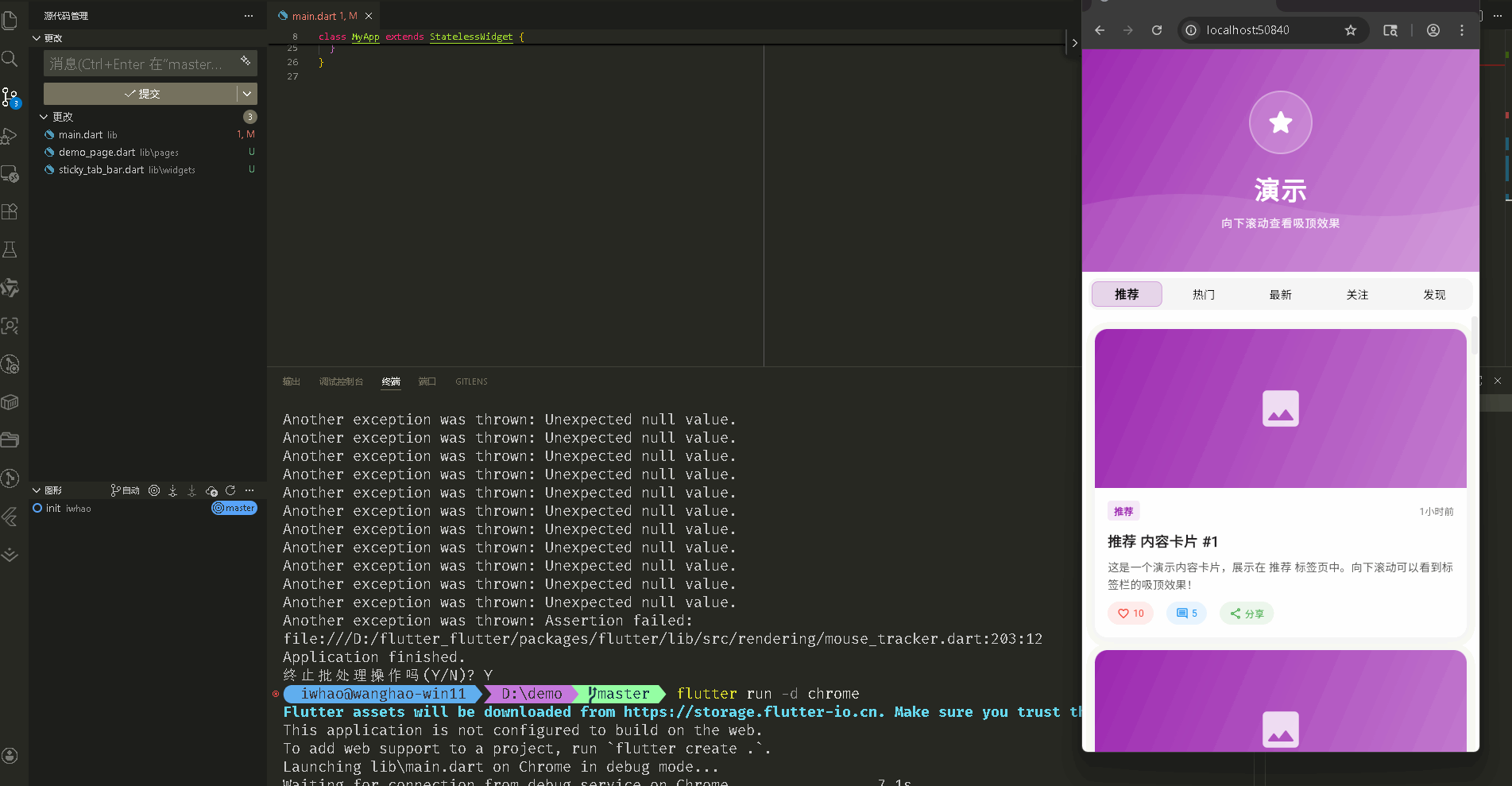
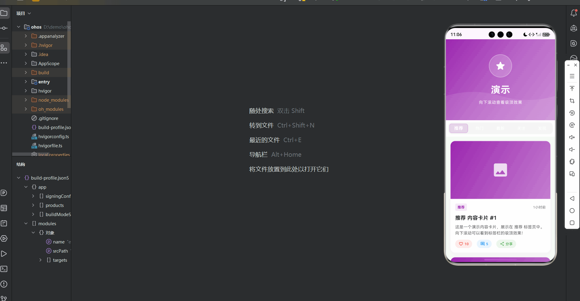
本文详细解析一个完整的 Flutter 吸顶标签栏应用的开发过程。并且成功打包运行到鸿蒙模拟器上,实现了有固定顶部标签栏、流畅滚动切换和丰富内容展示
通过本次开发,我们实现了一个功能完整的吸顶标签系统,包含 NestedScrollView 滚动联动、SliverPersistentHeader 固定定位、自定义标签栏组件、动画切换效果等核心特性。整个项目采用组件化设计,代码结构清晰,配置灵活,易于扩展。
先看效果
Flutte实现的 web端实时预览 完整效果
在meta70 pro 真机模拟器上成功运行后的效果
📋 目录
项目结构说明
应用入口
演示页面 (DemoPage)
StickyTabBar 组件
吸顶实现机制
📁 项目结构说明
文件目录结构
lib/
├── main.dart                    # 应用入口文件
├── pages/                       # 页面目录
│   └── demo_page.dart          # 演示页面(包含吸顶标签栏)
└── widgets/                     # 组件目录
    └── sticky_tab_bar.dart     # 吸顶标签栏组件
文件说明
入口文件
lib/main.dart
- 应用入口点,包含
main()函数 - 定义
MyApp类,配置应用主题 - 设置应用标题为"吸顶标签栏演示"
页面文件
lib/pages/demo_page.dart
DemoPage类:演示页面主类- 管理
TabController和当前标签索引 - 使用
NestedScrollView实现滚动联动 - 包含顶部横幅区域和标签页内容
- 管理
_StickyTabBarDelegate类:吸顶标签栏代理- 实现
SliverPersistentHeaderDelegate - 固定标签栏在顶部
- 实现
_WavePainter类:波浪背景绘制器- 自定义绘制波浪装饰效果
组件文件
lib/widgets/sticky_tab_bar.dart
StickyTabBarConfig类:标签栏配置类- 包含所有可配置的样式和行为参数
StickyTabBar组件:吸顶标签栏主组件- 管理标签切换逻辑
- 监听滚动状态
- 提供动画效果
_TabItem组件:单个标签项组件- 处理标签的激活/非激活状态
- 实现点击动画和样式切换
组件依赖关系
main.dart
  └── pages/demo_page.dart        (导入演示页面)
      └── widgets/sticky_tab_bar.dart  (导入标签栏组件)
数据流向
- 应用启动:
main.dart启动应用,显示DemoPage - 页面初始化:
DemoPage创建TabController和标签数据 - 布局构建:
NestedScrollView构建顶部横幅和吸顶标签栏 - 标签切换:用户点击标签,
TabController切换,触发内容更新 - 滚动联动:滚动时
SliverPersistentHeader保持标签栏固定在顶部
应用入口
1. main() 函数
import 'package:flutter/material.dart';
import 'pages/demo_page.dart';

void main() {
  runApp(const MyApp());
}
应用入口,导入演示页面。
2. MyApp 类 - 主题配置
class MyApp extends StatelessWidget {
const MyApp({super.key});
Widget build(BuildContext context) {
return MaterialApp(
title: '吸顶标签栏演示',
debugShowCheckedModeBanner: false,
theme: ThemeData(
colorScheme: ColorScheme.fromSeed(
seedColor: Colors.deepPurple, // 紫色主题
brightness: Brightness.light, // 浅色模式
),
useMaterial3: true,
),
home: const DemoPage(),
);
}
}
配置浅色主题,使用紫色作为种子颜色。
演示页面 (DemoPage)
1. 类定义和状态管理
class DemoPage extends StatefulWidget {
const DemoPage({super.key});
State<DemoPage> createState() => _DemoPageState();
}
class _DemoPageState extends State<DemoPage>
with SingleTickerProviderStateMixin {
late TabController _tabController; // 标签控制器
int _currentTabIndex = 0; // 当前标签索引
final List<String> _tabs = [
'推荐',
'热门',
'最新',
'关注',
'发现',
];
final List<Color> _tabColors = [
Colors.purple,
Colors.blue,
Colors.green,
Colors.orange,
Colors.pink,
];
SingleTickerProviderStateMixin 提供 TabController 所需的 vsync。_tabs 存储标签名称,_tabColors 存储每个标签对应的颜色。
2. TabController 初始化
void initState() {
super.initState();
_tabController = TabController(length: _tabs.length, vsync: this);
_tabController.addListener(() {
if (_tabController.indexIsChanging || _tabController.index != _currentTabIndex) {
setState(() {
_currentTabIndex = _tabController.index; // 同步当前索引
});
}
});
}
void dispose() {
_tabController.dispose();
super.dispose();
}
创建 TabController 并监听索引变化,同步更新 _currentTabIndex。
3. 页面布局结构
Widget build(BuildContext context) {
return Scaffold(
body: SafeArea(
top: true,
bottom: false,
child: NestedScrollView(
headerSliverBuilder: (BuildContext context, bool innerBoxIsScrolled) {
return [
// 顶部横幅区域
SliverToBoxAdapter(
child: _buildHeroSection(),
),
// 吸顶标签栏
SliverPersistentHeader(
pinned: true, // 固定到顶部
delegate: _StickyTabBarDelegate(
child: StickyTabBar(
config: StickyTabBarConfig(
tabs: _tabs,
backgroundColor: Colors.white,
activeColor: _tabColors[_currentTabIndex],
inactiveColor: Colors.grey.shade600,
height: 56.0,
elevation: 8.0,
activeTextStyle: const TextStyle(
fontSize: 15,
fontWeight: FontWeight.bold,
letterSpacing: 0.5,
),
inactiveTextStyle: TextStyle(
fontSize: 14,
fontWeight: FontWeight.w500,
letterSpacing: 0.3,
),
showIndicator: false,
indicatorHeight: 3.0,
),
initialIndex: _currentTabIndex,
onTabChanged: (index) {
_tabController.animateTo(index); // 切换标签页
},
),
),
),
];
},
body: TabBarView(
controller: _tabController,
children: _tabs.asMap().entries.map((entry) {
final index = entry.key;
final tabName = entry.value;
return _buildTabContent(tabName, index); // 构建每个标签页内容
}).toList(),
),
),
),
);
}
NestedScrollView 实现滚动联动。headerSliverBuilder 构建顶部区域和吸顶标签栏。SliverPersistentHeader 的 pinned: true 使标签栏固定在顶部。TabBarView 显示标签页内容。
4. 顶部横幅区域
Widget _buildHeroSection() {
  return Container(
    height: 280,
    decoration: BoxDecoration(
      gradient: LinearGradient(
        begin: Alignment.topLeft,
        end: Alignment.bottomRight,
        colors: [
          _tabColors[_currentTabIndex],                    // 根据当前标签变色
          _tabColors[_currentTabIndex].withOpacity(0.7),
          _tabColors[_currentTabIndex].withOpacity(0.5),
        ],
      ),
    ),
    child: Stack(
      children: [
        // 背景装饰
        Positioned.fill(
          child: CustomPaint(
            painter: _WavePainter(
              color: Colors.white.withOpacity(0.1),  // 波浪装饰
            ),
          ),
        ),
        // 内容
        Center(
          child: Column(
            mainAxisAlignment: MainAxisAlignment.center,
            children: [
              Container(
                width: 80,
                height: 80,
                decoration: BoxDecoration(
                  color: Colors.white.withOpacity(0.2),
                  shape: BoxShape.circle,
                  border: Border.all(
                    color: Colors.white.withOpacity(0.3),
                    width: 2,
                  ),
                ),
                child: const Icon(
                  Icons.star_rounded,
                  size: 40,
                  color: Colors.white,
                ),
              ),
              const SizedBox(height: 20),
              const Text(
                '演示',
                style: TextStyle(
                  fontSize: 32,
                  fontWeight: FontWeight.bold,
                  color: Colors.white,
                  letterSpacing: 2,
                ),
              ),
              const SizedBox(height: 10),
              Text(
                '向下滚动查看吸顶效果',
                style: TextStyle(
                  fontSize: 14,
                  color: Colors.white.withOpacity(0.9),
                  letterSpacing: 1,
                ),
              ),
            ],
          ),
        ),
      ],
    ),
  );
}
横幅区域高度 280,使用当前标签颜色作为渐变背景。CustomPaint 绘制波浪装饰。内容居中显示图标和文字。
5. 标签页内容构建
Widget _buildTabContent(String tabName, int index) {
  return Container(
    color: Colors.grey.shade50,
    child: ListView.builder(
      padding: const EdgeInsets.all(16),
      itemCount: 20,
      itemBuilder: (context, itemIndex) {
        return _buildContentCard(tabName, index, itemIndex);
      },
    ),
  );
}

Widget _buildContentCard(String tabName, int tabIndex, int itemIndex) {
  return Container(
    margin: const EdgeInsets.only(bottom: 16),
    decoration: BoxDecoration(
      color: Colors.white,
      borderRadius: BorderRadius.circular(16),
      boxShadow: [
        BoxShadow(
          color: Colors.black.withOpacity(0.05),
          blurRadius: 10,
          offset: const Offset(0, 2),
        ),
      ],
    ),
    child: Column(
      crossAxisAlignment: CrossAxisAlignment.start,
      children: [
        // 图片占位
        Container(
          height: 200,
          decoration: BoxDecoration(
            gradient: LinearGradient(
              begin: Alignment.topLeft,
              end: Alignment.bottomRight,
              colors: [
                _tabColors[tabIndex],
                _tabColors[tabIndex].withOpacity(0.6),
              ],
            ),
            borderRadius: const BorderRadius.only(
              topLeft: Radius.circular(16),
              topRight: Radius.circular(16),
            ),
          ),
          child: Center(
            child: Icon(
              Icons.image_rounded,
              size: 60,
              color: Colors.white.withOpacity(0.8),
            ),
          ),
        ),
        // 内容
        Padding(
          padding: const EdgeInsets.all(16),
          child: Column(
            crossAxisAlignment: CrossAxisAlignment.start,
            children: [
              Row(
                children: [
                  Container(
                    padding: const EdgeInsets.symmetric(horizontal: 8, vertical: 4),
                    decoration: BoxDecoration(
                      color: _tabColors[tabIndex].withOpacity(0.1),
                      borderRadius: BorderRadius.circular(4),
                    ),
                    child: Text(
                      tabName,
                      style: TextStyle(
                        color: _tabColors[tabIndex],
                        fontSize: 12,
                        fontWeight: FontWeight.bold,
                      ),
                    ),
                  ),
                  const Spacer(),
                  Text(
                    '${itemIndex + 1}小时前',
                    style: TextStyle(
                      color: Colors.grey.shade600,
                      fontSize: 12,
                    ),
                  ),
                ],
              ),
              const SizedBox(height: 12),
              Text(
                '$tabName 内容卡片 #${itemIndex + 1}',
                style: const TextStyle(
                  fontSize: 18,
                  fontWeight: FontWeight.bold,
                  color: Colors.black87,
                ),
              ),
              const SizedBox(height: 8),
              Text(
                '这是一个演示内容卡片,展示在 $tabName 标签页中。向下滚动可以看到标签栏的吸顶效果!',
                style: TextStyle(
                  fontSize: 14,
                  color: Colors.grey.shade700,
                  height: 1.5,
                ),
              ),
              const SizedBox(height: 12),
              Row(
                children: [
                  _buildActionButton(
                    Icons.favorite_border,
                    '${(itemIndex * 3 + 10)}',
                    Colors.red,
                  ),
                  const SizedBox(width: 16),
                  _buildActionButton(
                    Icons.comment_outlined,
                    '${(itemIndex * 2 + 5)}',
                    Colors.blue,
                  ),
                  const SizedBox(width: 16),
                  _buildActionButton(
                    Icons.share_outlined,
                    '分享',
                    Colors.green,
                  ),
                ],
              ),
            ],
          ),
        ),
      ],
    ),
  );
}

Widget _buildActionButton(IconData icon, String label, Color color) {
  return InkWell(
    onTap: () {},
    borderRadius: BorderRadius.circular(20),
    child: Container(
      padding: const EdgeInsets.symmetric(horizontal: 12, vertical: 6),
      decoration: BoxDecoration(
        color: color.withOpacity(0.1),
        borderRadius: BorderRadius.circular(20),
      ),
      child: Row(
        mainAxisSize: MainAxisSize.min,
        children: [
          Icon(icon, size: 16, color: color),
          const SizedBox(width: 4),
          Text(
            label,
            style: TextStyle(
              color: color,
              fontSize: 12,
              fontWeight: FontWeight.w500,
            ),
          ),
        ],
      ),
    ),
  );
}
每个标签页显示 20 个内容卡片。卡片包含渐变图片占位、标签名称、标题、描述和操作按钮。使用 ListView.builder 实现列表滚动。
StickyTabBar 组件
1. StickyTabBarConfig 配置类
class StickyTabBarConfig {
  final List<String> tabs;              // 标签列表
  final Color? backgroundColor;         // 背景色
  final Color? activeColor;             // 激活颜色
  final Color? inactiveColor;           // 非激活颜色
  final double height;                   // 高度
  final double elevation;               // 阴影高度
  final TextStyle? activeTextStyle;     // 激活文字样式
  final TextStyle? inactiveTextStyle;  // 非激活文字样式
  final Duration animationDuration;      // 动画时长
  final bool showIndicator;             // 是否显示指示器
  final Color? indicatorColor;          // 指示器颜色
  final double indicatorHeight;         // 指示器高度

  const StickyTabBarConfig({
    required this.tabs,
    this.backgroundColor,
    this.activeColor,
    this.inactiveColor,
    this.height = 56.0,
    this.elevation = 4.0,
    this.activeTextStyle,
    this.inactiveTextStyle,
    this.animationDuration = const Duration(milliseconds: 300),
    this.showIndicator = true,
    this.indicatorColor,
    this.indicatorHeight = 3.0,
  });
}
配置类包含所有可自定义的参数,提供默认值,使用灵活。
2. StickyTabBar 主组件
class StickyTabBar extends StatefulWidget {
final StickyTabBarConfig config;
final int initialIndex;
final ValueChanged<int>? onTabChanged;
final ScrollController? scrollController;
final double stickyOffset;
const StickyTabBar({
super.key,
required this.config,
this.initialIndex = 0,
this.onTabChanged,
this.scrollController,
this.stickyOffset = 0.0,
});
State<StickyTabBar> createState() => _StickyTabBarState();
}
class _StickyTabBarState extends State<StickyTabBar>
with SingleTickerProviderStateMixin {
late TabController _tabController;
late int _currentIndex;
bool _isSticky = false;
void initState() {
super.initState();
_currentIndex = widget.initialIndex;
_tabController = TabController(
length: widget.config.tabs.length,
initialIndex: widget.initialIndex,
vsync: this,
);
_tabController.addListener(_handleTabChange);
widget.scrollController?.addListener(_handleScroll);
}
void _handleTabChange() {
if (_tabController.indexIsChanging) {
setState(() {
_currentIndex = _tabController.index;
});
widget.onTabChanged?.call(_currentIndex);
}
}
void _handleScroll() {
final scrollController = widget.scrollController;
if (scrollController == null) return;
final offset = scrollController.offset;
final shouldBeSticky = offset > widget.stickyOffset;
if (shouldBeSticky != _isSticky) {
setState(() {
_isSticky = shouldBeSticky; // 更新吸顶状态
});
}
}
void dispose() {
_tabController.removeListener(_handleTabChange);
widget.scrollController?.removeListener(_handleScroll);
_tabController.dispose();
super.dispose();
}
void _onTabTapped(int index) {
_tabController.animateTo(index); // 动画切换
setState(() {
_currentIndex = index;
});
widget.onTabChanged?.call(index);
}
组件管理标签切换和滚动状态。_handleScroll 监听滚动,更新 _isSticky 状态。_onTabTapped 处理标签点击,使用 animateTo 实现动画切换。
3. StickyTabBar 构建方法
Widget build(BuildContext context) {
final theme = Theme.of(context);
final backgroundColor = widget.config.backgroundColor ??
theme.colorScheme.surface.withOpacity(0.95);
final activeColor = widget.config.activeColor ?? theme.colorScheme.primary;
final inactiveColor =
widget.config.inactiveColor ?? theme.colorScheme.onSurface.withOpacity(0.6);
return AnimatedContainer(
duration: widget.config.animationDuration,
curve: Curves.easeInOut,
height: widget.config.height,
decoration: BoxDecoration(
color: backgroundColor,
boxShadow: _isSticky
? [
BoxShadow(
color: Colors.black.withOpacity(0.1),
blurRadius: widget.config.elevation * 2,
offset: const Offset(0, 2),
),
]
: null, // 吸顶时显示阴影
),
child: Container(
margin: const EdgeInsets.symmetric(horizontal: 8, vertical: 8),
decoration: BoxDecoration(
color: Colors.grey.shade100,
borderRadius: BorderRadius.circular(12),
),
child: Row(
children: List.generate(
widget.config.tabs.length,
(index) => Expanded(
child: _TabItem(
label: widget.config.tabs[index],
isActive: index == _currentIndex,
activeColor: activeColor,
inactiveColor: inactiveColor,
activeTextStyle: widget.config.activeTextStyle,
inactiveTextStyle: widget.config.inactiveTextStyle,
showIndicator: widget.config.showIndicator,
indicatorColor: widget.config.indicatorColor ?? activeColor,
indicatorHeight: widget.config.indicatorHeight,
animationDuration: widget.config.animationDuration,
onTap: () => _onTabTapped(index),
),
),
),
),
),
);
}
AnimatedContainer 实现吸顶时的阴影动画。内部容器使用灰色背景和圆角。Row 水平排列标签项,每个标签使用 Expanded 平均分配宽度。
4. _TabItem 标签项组件
class _TabItem extends StatelessWidget {
final String label;
final bool isActive;
final Color activeColor;
final Color inactiveColor;
final TextStyle? activeTextStyle;
final TextStyle? inactiveTextStyle;
final bool showIndicator;
final Color indicatorColor;
final double indicatorHeight;
final Duration animationDuration;
final VoidCallback onTap;
const _TabItem({
required this.label,
required this.isActive,
required this.activeColor,
required this.inactiveColor,
this.activeTextStyle,
this.inactiveTextStyle,
required this.showIndicator,
required this.indicatorColor,
required this.indicatorHeight,
required this.animationDuration,
required this.onTap,
});
Widget build(BuildContext context) {
return GestureDetector(
onTap: onTap,
behavior: HitTestBehavior.opaque,
child: AnimatedContainer(
duration: animationDuration,
curve: Curves.easeInOut,
margin: const EdgeInsets.all(4),
decoration: BoxDecoration(
color: isActive
? activeColor.withOpacity(0.15) // 激活时显示背景色
: Colors.transparent,
borderRadius: BorderRadius.circular(8),
border: isActive
? Border.all(
color: activeColor.withOpacity(0.3),
width: 1,
)
: null, // 激活时显示边框
),
child: Container(
alignment: Alignment.center,
child: AnimatedDefaultTextStyle(
duration: animationDuration,
curve: Curves.easeInOut,
style: isActive
? (activeTextStyle ??
TextStyle(
fontSize: 16,
fontWeight: FontWeight.bold,
color: activeColor,
letterSpacing: 0.5,
))
: (inactiveTextStyle ??
TextStyle(
fontSize: 15,
fontWeight: FontWeight.w500,
color: inactiveColor,
letterSpacing: 0.3,
)),
child: Text(
label,
textAlign: TextAlign.center,
),
),
),
),
);
}
}
标签项使用 AnimatedContainer 实现背景和边框动画。AnimatedDefaultTextStyle 实现文字样式动画。激活时显示背景色和边框,非激活时透明。
吸顶实现机制
1. SliverPersistentHeader 代理
class _StickyTabBarDelegate extends SliverPersistentHeaderDelegate {
final Widget child;
_StickyTabBarDelegate({required this.child});
double get minExtent => 56.0; // 最小高度
double get maxExtent => 56.0; // 最大高度(相同则固定高度)
Widget build(
BuildContext context, double shrinkOffset, bool overlapsContent) {
return child; // 返回标签栏组件
}
bool shouldRebuild(_StickyTabBarDelegate oldDelegate) {
return child != oldDelegate.child; // 子组件变化时重建
}
}
SliverPersistentHeaderDelegate 控制吸顶行为。minExtent 和 maxExtent 相同,保持固定高度。pinned: true 使标签栏固定在顶部。
2. NestedScrollView 联动
NestedScrollView(
  headerSliverBuilder: (BuildContext context, bool innerBoxIsScrolled) {
    return [
      SliverToBoxAdapter(
        child: _buildHeroSection(),  // 顶部横幅
      ),
      SliverPersistentHeader(
        pinned: true,  // 固定标签栏
        delegate: _StickyTabBarDelegate(...),
      ),
    ];
  },
  body: TabBarView(...),  // 标签页内容
)
NestedScrollView 实现外层和内层滚动联动。headerSliverBuilder 构建顶部区域,滚动时横幅向上滚动,标签栏固定在顶部。TabBarView 的内容可以独立滚动。
使用示例
在页面中使用吸顶标签栏
class MyPage extends StatefulWidget {
State<MyPage> createState() => _MyPageState();
}
class _MyPageState extends State<MyPage> with SingleTickerProviderStateMixin {
late TabController _tabController;
int _currentIndex = 0;
final List<String> _tabs = ['标签1', '标签2', '标签3'];
void initState() {
super.initState();
_tabController = TabController(length: _tabs.length, vsync: this);
}
void dispose() {
_tabController.dispose();
super.dispose();
}
Widget build(BuildContext context) {
return Scaffold(
body: NestedScrollView(
headerSliverBuilder: (context, innerBoxIsScrolled) {
return [
SliverToBoxAdapter(
child: Container(
height: 200,
color: Colors.blue,
child: Center(child: Text('顶部内容')),
),
),
SliverPersistentHeader(
pinned: true,
delegate: _StickyTabBarDelegate(
child: StickyTabBar(
config: StickyTabBarConfig(
tabs: _tabs,
backgroundColor: Colors.white,
activeColor: Colors.blue,
inactiveColor: Colors.grey,
height: 56.0,
),
initialIndex: _currentIndex,
onTabChanged: (index) {
_tabController.animateTo(index);
},
),
),
),
];
},
body: TabBarView(
controller: _tabController,
children: _tabs.map((tab) {
return ListView.builder(
itemCount: 20,
itemBuilder: (context, index) {
return ListTile(title: Text('$tab 内容 $index'));
},
);
}).toList(),
),
),
);
}
}
class _StickyTabBarDelegate extends SliverPersistentHeaderDelegate {
final Widget child;
_StickyTabBarDelegate({required this.child});
double get minExtent => 56.0;
double get maxExtent => 56.0;
Widget build(BuildContext context, double shrinkOffset, bool overlapsContent) {
return child;
}
bool shouldRebuild(_StickyTabBarDelegate oldDelegate) {
return child != oldDelegate.child;
}
}
使用步骤总结:
- 创建
TabController管理标签切换 - 使用
NestedScrollView包裹页面 - 在
headerSliverBuilder中添加顶部内容和吸顶标签栏 - 使用
SliverPersistentHeader固定标签栏 - 在
body中使用TabBarView显示内容
欢迎加入开源鸿蒙跨平台社区: https://openharmonycrossplatform.csdn.net

开源鸿蒙跨平台开发社区汇聚开发者与厂商,共建“一次开发,多端部署”的开源生态,致力于降低跨端开发门槛,推动万物智联创新。
更多推荐

 13
13 0
0- 0


 已为社区贡献3条内容

所有评论(0)