Flutter for OpenHarmony垃圾分类指南App实战:物品详情实现
本文介绍了垃圾分类App中物品详情页的实现方案。该页面采用无状态Widget设计,通过路由参数获取物品数据,并使用GetX管理收藏状态。页面主要分为三部分:头部展示区(显示物品图标、名称和分类标签)、物品说明区(详细描述分类原因)和投放提示区(提供特殊处理建议)。关键交互包括响应式收藏按钮和分类颜色标识,提升用户体验。页面布局简洁清晰,注重文字排版和视觉层次,帮助用户快速获取垃圾分类信息。

用户搜索到某个垃圾物品后,点进去肯定想看更详细的信息。这个物品详情页就是干这个的——展示物品的分类、说明、投放提示,还有收藏功能。页面不复杂,但细节挺多,做好了用户体验会很舒服。
页面整体结构
物品详情页用的是StatelessWidget,因为页面本身不需要维护什么状态,数据都是从路由参数传过来的。收藏状态的管理交给了ProfileController,用GetX的响应式来处理。
class ItemDetailPage extends StatelessWidget {
const ItemDetailPage({super.key});
Widget build(BuildContext context) {
// 从路由参数获取物品数据
final GarbageItem item = Get.arguments;
// 根据垃圾类型获取对应颜色
final color = _getTypeColor(item.type);
// 获取用户控制器,用于收藏功能
final profileController = Get.find<ProfileController>();
这里有几个点值得说一下:
- Get.arguments:GetX路由传参的方式,上一个页面通过
Get.toNamed(Routes.itemDetail, arguments: item)把物品对象传过来 - _getTypeColor:根据垃圾类型返回对应的颜色,可回收是蓝色,有害是红色,厨余是绿色,其他是灰色
- Get.find:获取已经注册的控制器实例,这里拿到的是用户相关的控制器,用来处理收藏逻辑
AppBar的收藏按钮
详情页的AppBar右上角放了个收藏按钮,这是个很常见的交互。用户点一下就能收藏,再点一下取消收藏,图标也会跟着变。
    return Scaffold(
      appBar: AppBar(
        title: Text(item.name),
        // AppBar背景色使用分类对应的颜色
        backgroundColor: color,
        actions: [
          // 收藏按钮,用Obx包裹实现响应式
          Obx(() => IconButton(
            icon: Icon(
              profileController.isFavorite(item.id)
                  ? Icons.favorite
                  : Icons.favorite_border,
            ),
            onPressed: () {
              profileController.toggleFavorite(item);
              // 显示提示
              final isFav = profileController.isFavorite(item.id);
              Get.snackbar(
                '提示',
                isFav ? '已添加到收藏' : '已取消收藏',
                snackPosition: SnackPosition.BOTTOM,
                duration: const Duration(seconds: 1),
              );
            },
          )),
        ],
      ),
关键点:这里用
Obx包裹IconButton是有讲究的。isFavorite是个响应式的判断方法,当收藏列表变化时,Obx会自动触发重建,图标就会从空心变实心或者反过来。
AppBar的背景色用的是垃圾类型对应的颜色,这样用户一眼就能看出这个物品属于哪类垃圾,视觉上很直观。
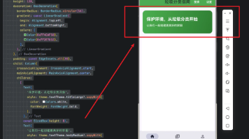
页面主体布局
页面主体用SingleChildScrollView包裹,里面是三个区块:头部展示区、物品说明区、投放提示区。
      body: SingleChildScrollView(
        child: Column(
          children: [
            _buildHeader(item, color),
            _buildInfoSection(item),
            _buildTipsSection(item, color),
          ],
        ),
      ),
    );
  }
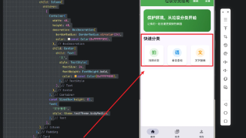
头部展示区的实现
头部区域展示物品的图标、名称和分类标签,背景用了类型颜色的浅色版本,看起来比较柔和。
Widget _buildHeader(GarbageItem item, Color color) {
  return Container(
    width: double.infinity,
    padding: EdgeInsets.all(32.w),
    decoration: BoxDecoration(
      // 使用分类颜色的浅色版本作为背景
      color: color.withOpacity(0.1),
    ),
    child: Column(
      children: [
        // 物品图标(emoji)
        Text(item.icon, style: TextStyle(fontSize: 80.sp)),
        SizedBox(height: 16.h),
        // 物品名称
        Text(
          item.name,
          style: TextStyle(fontSize: 28.sp, fontWeight: FontWeight.bold),
        ),
        SizedBox(height: 12.h),
        // 分类标签
        Container(
          padding: EdgeInsets.symmetric(horizontal: 20.w, vertical: 10.h),
          decoration: BoxDecoration(
            color: color,
            borderRadius: BorderRadius.circular(24.r),
          ),
          child: Text(
            item.typeName,
            style: TextStyle(
              color: Colors.white,
              fontSize: 16.sp,
              fontWeight: FontWeight.w500,
            ),
          ),
        ),
      ],
    ),
  );
}
这里的item.icon存的是emoji表情,比如塑料瓶是🍶,电池是🔋。用emoji做图标有个好处——不用额外加载图片资源,而且在各个平台上显示效果都还不错。
物品说明区
这个区块展示物品的详细说明,告诉用户这个东西为什么属于这类垃圾。
Widget _buildInfoSection(GarbageItem item) {
  return Container(
    margin: EdgeInsets.all(16.w),
    padding: EdgeInsets.all(16.w),
    decoration: BoxDecoration(
      color: Colors.white,
      borderRadius: BorderRadius.circular(12.r),
      boxShadow: [
        BoxShadow(
          color: Colors.black.withOpacity(0.05),
          blurRadius: 10,
          offset: const Offset(0, 2),
        ),
      ],
    ),
    child: Column(
      crossAxisAlignment: CrossAxisAlignment.start,
      children: [
        // 区块标题
        Row(
          children: [
            Icon(Icons.info_outline, color: AppTheme.primaryColor, size: 20.sp),
            SizedBox(width: 8.w),
            Text(
              '物品说明',
              style: TextStyle(fontSize: 18.sp, fontWeight: FontWeight.bold),
            ),
          ],
        ),
        SizedBox(height: 12.h),
        // 说明内容
        Text(
          item.description,
          style: TextStyle(fontSize: 15.sp, height: 1.6, color: Colors.grey.shade700),
        ),
      ],
    ),
  );
}
排版细节:说明文字的
height: 1.6设置了1.6倍行高,这样多行文字读起来不会太挤,阅读体验更好。
投放提示区
有些物品在投放时有特殊要求,比如塑料瓶要压扁、电池要单独收集。这些提示信息放在一个醒目的区块里。
Widget _buildTipsSection(GarbageItem item, Color color) {
  // 如果没有提示信息,不显示这个区块
  if (item.tips.isEmpty) return const SizedBox();

  return Container(
    margin: EdgeInsets.fromLTRB(16.w, 0, 16.w, 16.h),
    padding: EdgeInsets.all(16.w),
    decoration: BoxDecoration(
      // 使用琥珀色作为提示区域的主色调
      color: Colors.amber.withOpacity(0.1),
      borderRadius: BorderRadius.circular(12.r),
      border: Border.all(color: Colors.amber.withOpacity(0.3)),
    ),
    child: Column(
      crossAxisAlignment: CrossAxisAlignment.start,
      children: [
        // 区块标题
        Row(
          children: [
            Icon(Icons.lightbulb, color: Colors.amber.shade700, size: 20.sp),
            SizedBox(width: 8.w),
            Text(
              '投放提示',
              style: TextStyle(
                fontSize: 18.sp,
                fontWeight: FontWeight.bold,
                color: Colors.amber.shade800,
              ),
            ),
          ],
        ),
        SizedBox(height: 12.h),
        // 提示内容
        Text(
          item.tips,
          style: TextStyle(fontSize: 15.sp, height: 1.6),
        ),
      ],
    ),
  );
}
首先判断有没有提示信息,没有的话直接返回空组件。有的话就渲染一个带边框的容器,用琥珀色(amber)作为主色调,给人一种"注意"的感觉。
标题前面加了个灯泡图标,暗示这是个"小贴士"。这种视觉暗示能帮助用户快速理解内容的性质。
颜色映射方法
最后是根据垃圾类型返回对应颜色的方法:
Color _getTypeColor(GarbageType type) {
  switch (type) {
    case GarbageType.recyclable:
      return AppTheme.recyclableColor;
    case GarbageType.hazardous:
      return AppTheme.hazardousColor;
    case GarbageType.kitchen:
      return AppTheme.kitchenColor;
    case GarbageType.other:
      return AppTheme.otherColor;
  }
}
颜色定义在AppTheme里统一管理,这样整个App的配色就能保持一致。
数据模型
GarbageItem这个模型类包含了物品的所有信息:
class GarbageItem {
  final String id;           // 唯一标识
  final String name;         // 物品名称
  final String icon;         // emoji图标
  final GarbageType type;    // 所属分类
  final String description;  // 物品说明
  final String tips;         // 投放提示

  String get typeName {
    switch (type) {
      case GarbageType.recyclable: return '可回收物';
      case GarbageType.hazardous: return '有害垃圾';
      case GarbageType.kitchen: return '厨余垃圾';
      case GarbageType.other: return '其他垃圾';
    }
  }
}
这个页面的实现思路其实挺通用的,很多详情页都是这个套路:顶部大图或图标、中间主要信息、底部补充信息。掌握了这个模式,做其他详情页也能举一反三。
收藏功能的实现细节
收藏功能在ProfileController里实现:
class ProfileController extends GetxController {
  final favorites = <GarbageItem>[].obs;

  /// 判断是否已收藏
  bool isFavorite(String itemId) {
    return favorites.any((item) => item.id == itemId);
  }

  /// 切换收藏状态
  void toggleFavorite(GarbageItem item) {
    if (isFavorite(item.id)) {
      favorites.removeWhere((i) => i.id == item.id);
    } else {
      favorites.add(item);
    }
    _saveFavorites();
  }

  /// 保存到本地存储
  void _saveFavorites() {
    final data = favorites.map((item) => item.toJson()).toList();
    GetStorage().write('favorites', data);
  }
}
响应式的关键:
favorites是RxList类型,当它变化时,所有用Obx包裹的依赖它的Widget都会自动重建。这就是为什么收藏按钮能实时切换图标。
页面跳转的参数传递
从搜索结果或分类列表跳转到详情页时,需要传递完整的物品数据:
// 跳转方式1:使用arguments传递对象
Get.toNamed(Routes.itemDetail, arguments: item);

// 跳转方式2:使用parameters传递ID,在详情页再查询
Get.toNamed(Routes.itemDetail, parameters: {'id': item.id});
我们用的是方式1,直接传对象。好处是详情页不需要再查询数据,坏坏处是如果对象很大会占用内存。对于GarbageItem这种小对象,直接传是没问题的。
深色模式的适配
如果App支持深色模式,详情页需要做相应适配:
Widget _buildInfoSection(GarbageItem item) {
  // 获取当前主题的亮度
  final isDark = Theme.of(context).brightness == Brightness.dark;

  return Container(
    decoration: BoxDecoration(
      // 深色模式用深灰色背景,浅色模式用白色
      color: isDark ? Colors.grey.shade800 : Colors.white,
      // ...
    ),
    child: Text(
      item.description,
      style: TextStyle(
        // 深色模式用浅色文字
        color: isDark ? Colors.grey.shade300 : Colors.grey.shade700,
      ),
    ),
  );
}
无障碍访问的考虑
为了让视障用户也能使用,需要添加语义标签:
Semantics(
  label: '${item.name},属于${item.typeName}',
  child: _buildHeader(item, color),
);

Semantics(
  button: true,
  label: isFavorite ? '取消收藏' : '添加收藏',
  child: IconButton(
    icon: Icon(isFavorite ? Icons.favorite : Icons.favorite_border),
    onPressed: () => profileController.toggleFavorite(item),
  ),
);
Semantics组件可以为屏幕阅读器提供额外的信息,帮助视障用户理解页面内容。
页面性能优化
详情页的性能优化点:
1. 避免不必要的重建
// 只有收藏按钮需要响应式更新,用Obx单独包裹
actions: [
  Obx(() => IconButton(...)),  // 只重建这个按钮
],
2. 图片懒加载
如果物品有图片而不是emoji,应该使用懒加载:
CachedNetworkImage(
  imageUrl: item.imageUrl,
  placeholder: (context, url) => CircularProgressIndicator(),
  errorWidget: (context, url, error) => Icon(Icons.error),
);
3. 使用const构造函数
const ItemDetailPage({super.key}); // 使用const
错误处理
如果路由参数为空或类型错误,需要优雅地处理:
Widget build(BuildContext context) {
final item = Get.arguments;
// 参数校验
if (item == null || item is! GarbageItem) {
return Scaffold(
appBar: AppBar(title: Text('物品详情')),
body: Center(
child: Column(
mainAxisAlignment: MainAxisAlignment.center,
children: [
Icon(Icons.error_outline, size: 64, color: Colors.grey),
SizedBox(height: 16),
Text('无法加载物品信息'),
TextButton(
onPressed: () => Get.back(),
child: Text('返回'),
),
],
),
),
);
}
// 正常渲染
// ...
}
这样即使出现异常情况,用户也能看到友好的提示而不是崩溃。
欢迎加入开源鸿蒙跨平台社区:https://openharmonycrossplatform.csdn.net

开源鸿蒙跨平台开发社区汇聚开发者与厂商,共建“一次开发,多端部署”的开源生态,致力于降低跨端开发门槛,推动万物智联创新。
更多推荐
 7
7 0
0- 0


 已为社区贡献19条内容

所有评论(0)