Flutter for OpenHarmony 个人理财管理App实战 - 通用设置页面
本文实现了一个功能完善的Flutter设置页面,采用GetX状态管理框架。设置页面包含显示、通知、安全、数据管理等模块,通过SettingsController统一管理状态。控制器继承GetxController,使用响应式变量(.obs)自动更新UI,并与StorageService持久化存储交互。关键功能包括:深色模式切换、记账提醒设置、安全认证配置等。页面实现采用模块化设计,每个设置项独立管
通用设置页面是用户个性化配置App的入口,包括货币设置、语言切换、深色模式、提醒设置等功能。本篇将实现一个功能完善的设置页面,让用户可以根据自己的习惯定制应用。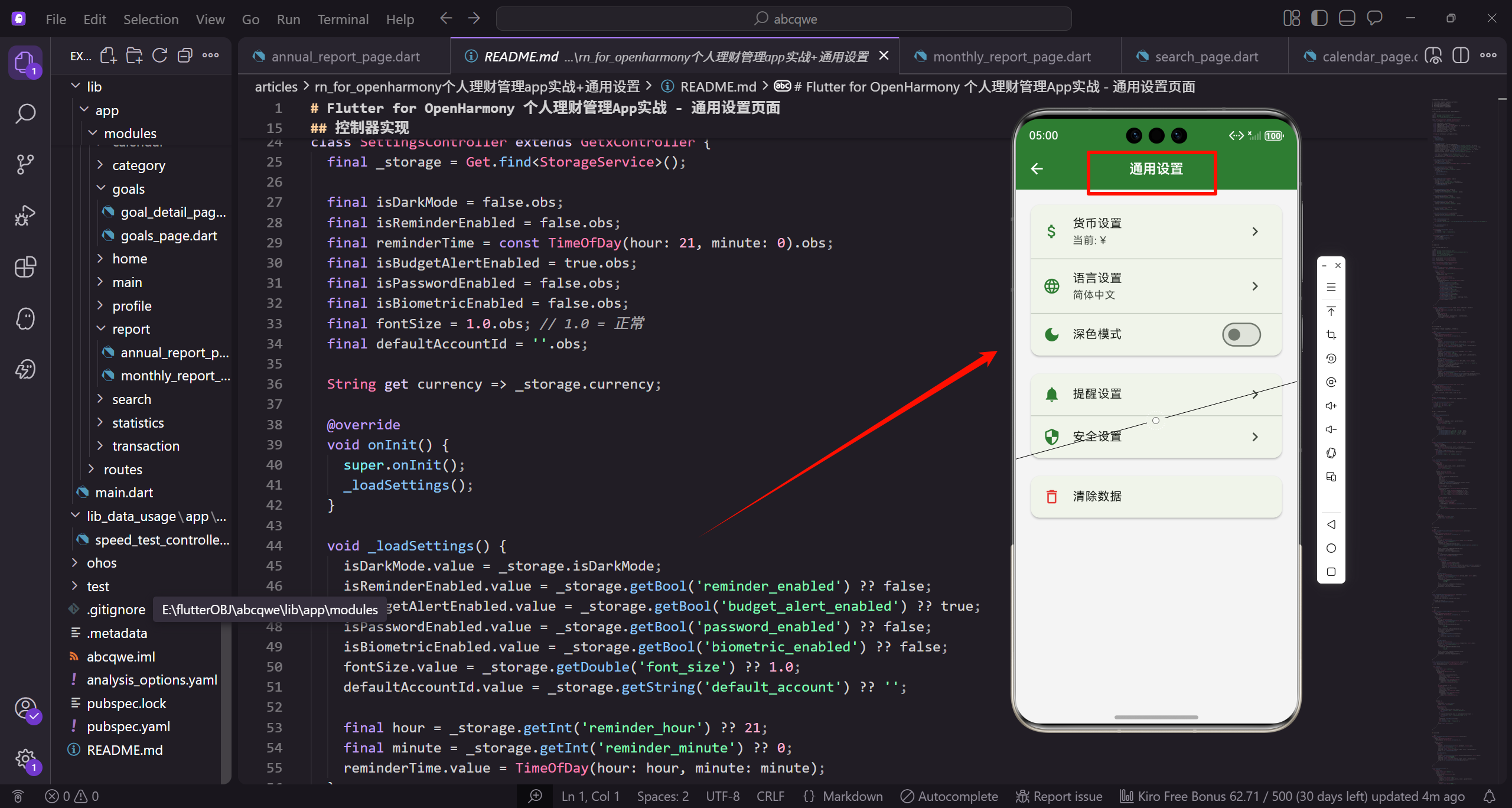
功能规划
设置页面包含以下功能模块:
- 显示设置:货币、语言、深色模式、字体大小
- 通知设置:记账提醒、预算提醒
- 安全设置:密码保护、指纹解锁
- 数据管理:清除缓存、清除数据
- 其他设置:首页布局、默认账户
控制器实现
创建 settings_controller.dart 管理设置状态:
import 'package:flutter/material.dart';
import 'package:get/get.dart';
import '../../core/services/storage_service.dart';

class SettingsController extends GetxController {
  final _storage = Get.find<StorageService>();

  final isDarkMode = false.obs;
  final isReminderEnabled = false.obs;
SettingsController 继承 GetxController 管理设置页面的状态。_storage 通过 Get.find 获取存储服务实例,用于读写设置数据。isDarkMode 和 isReminderEnabled 是响应式布尔值,.obs 让它们成为可观察对象,值改变时 UI 会自动更新。这种响应式编程模式是 GetX 的核心特性。
  final reminderTime = const TimeOfDay(hour: 21, minute: 0).obs;
  final isBudgetAlertEnabled = true.obs;
  final isPasswordEnabled = false.obs;
  final isBiometricEnabled = false.obs;
  final fontSize = 1.0.obs; // 1.0 = 正常
  final defaultAccountId = ''.obs;

  String get currency => _storage.currency;
reminderTime 存储提醒时间,默认晚上 9 点。isBudgetAlertEnabled 控制预算提醒开关,默认开启。isPasswordEnabled 和 isBiometricEnabled 控制安全功能。fontSize 控制字体大小,1.0 表示标准大小。defaultAccountId 存储默认账户 ID。currency getter 从存储服务获取货币符号。
void onInit() {
super.onInit();
_loadSettings();
}
void _loadSettings() {
isDarkMode.value = _storage.isDarkMode;
isReminderEnabled.value = _storage.getBool('reminder_enabled') ?? false;
isBudgetAlertEnabled.value = _storage.getBool('budget_alert_enabled') ?? true;
isPasswordEnabled.value = _storage.getBool('password_enabled') ?? false;
onInit 是 GetX 生命周期方法,在控制器初始化时调用,这里用来加载设置数据。_loadSettings 从存储服务读取各项设置。isDarkMode 直接从 _storage.isDarkMode 获取。其他设置用 getBool 方法读取,?? 运算符提供默认值,如果存储中没有该设置则使用默认值。这确保首次使用时有合理的初始状态。
    isBiometricEnabled.value = _storage.getBool('biometric_enabled') ?? false;
    fontSize.value = _storage.getDouble('font_size') ?? 1.0;
    defaultAccountId.value = _storage.getString('default_account') ?? '';

    final hour = _storage.getInt('reminder_hour') ?? 21;
    final minute = _storage.getInt('reminder_minute') ?? 0;
    reminderTime.value = TimeOfDay(hour: hour, minute: minute);
  }
继续加载其他设置项。fontSize 用 getDouble 读取浮点数,defaultAccountId 用 getString 读取字符串。reminderTime 需要从两个整数(小时和分钟)构造 TimeOfDay 对象。这种分开存储的方式是因为 TimeOfDay 不能直接序列化,需要拆分成基本类型存储。
  void toggleDarkMode(bool value) {
    isDarkMode.value = value;
    _storage.setDarkMode(value);
    Get.changeThemeMode(value ? ThemeMode.dark : ThemeMode.light);
  }

  void toggleReminder(bool value) {
    isReminderEnabled.value = value;
    _storage.setBool('reminder_enabled', value);
toggleDarkMode 切换深色模式。更新响应式变量,保存到存储,然后调用 Get.changeThemeMode 立即切换应用主题。toggleReminder 切换记账提醒开关,更新变量并保存。如果开启提醒则调度通知,关闭则取消通知。这种即时生效的设计让用户体验更流畅。
    if (value) {
      _scheduleReminder();
    } else {
      _cancelReminder();
    }
  }

  void setReminderTime(TimeOfDay time) {
    reminderTime.value = time;
    _storage.setInt('reminder_hour', time.hour);
    _storage.setInt('reminder_minute', time.minute);
setReminderTime 设置提醒时间。更新 reminderTime 变量,将小时和分钟分别存储为整数。如果提醒已开启,重新调度通知以使用新时间。这确保时间修改后立即生效。
    if (isReminderEnabled.value) {
      _scheduleReminder();
    }
  }

  void toggleBudgetAlert(bool value) {
    isBudgetAlertEnabled.value = value;
    _storage.setBool('budget_alert_enabled', value);
  }

  void togglePassword(bool value) {
    isPasswordEnabled.value = value;
    _storage.setBool('password_enabled', value);
  }
toggleBudgetAlert、togglePassword、toggleBiometric 等方法的实现模式一致:更新响应式变量,保存到存储。这种统一的模式让代码易于理解和维护。
  void toggleBiometric(bool value) {
    isBiometricEnabled.value = value;
    _storage.setBool('biometric_enabled', value);
  }

  void setFontSize(double size) {
    fontSize.value = size;
    _storage.setDouble('font_size', size);
  }

  void setDefaultAccount(String accountId) {
    defaultAccountId.value = accountId;
    _storage.setString('default_account', accountId);
  }
setFontSize 和 setDefaultAccount 设置字体大小和默认账户。同样是更新变量并保存的模式。
  void _scheduleReminder() {
    // 实现本地通知调度
    Get.snackbar('提醒已设置', '每天 ${reminderTime.value.format(Get.context!)} 提醒您记账');
  }

  void _cancelReminder() {
    // 取消本地通知
  }

  Future<void> clearCache() async {
    // 清除缓存
    Get.snackbar('成功', '缓存已清除');
  }

  Future<void> clearAllData() async {
    // 清除所有数据
    await _storage.clearAll();
    Get.offAllNamed('/');
  }
}
_scheduleReminder 和 _cancelReminder 是通知调度的占位方法,实际项目中需要集成本地通知插件。clearCache 清除缓存文件,clearAllData 清除所有数据并返回首页。Get.offAllNamed 会清空导航栈,确保用户无法返回到之前的页面。这些危险操作需要在 UI 层做二次确认。
页面实现
创建 settings_page.dart:
import 'package:flutter/material.dart';
import 'package:flutter_screenutil/flutter_screenutil.dart';
import 'package:get/get.dart';
import '../../routes/app_pages.dart';
import 'settings_controller.dart';

const _primaryColor = Color(0xFF2E7D32);
const _expenseColor = Color(0xFFE53935);
const _textSecondary = Color(0xFF757575);
导入必要的包和定义颜色常量。flutter_screenutil 用于响应式布局,Get 用于状态管理和路由。定义了三个主题色常量:主题绿色、支出红色和次要文字灰色,保持整个应用的视觉一致性。
class SettingsPage extends StatelessWidget {
const SettingsPage({super.key});
Widget build(BuildContext context) {
final controller = Get.put(SettingsController());
return Scaffold(
appBar: AppBar(
title: const Text('通用设置'),
centerTitle: true,
),
SettingsPage 使用 StatelessWidget 因为状态由 Controller 管理。Get.put 创建并注册 SettingsController 实例。Scaffold 提供基本的页面结构,AppBar 显示标题"通用设置"并居中。
      body: SingleChildScrollView(
        padding: EdgeInsets.all(16.w),
        child: Column(
          crossAxisAlignment: CrossAxisAlignment.start,
          children: [
            _buildSectionTitle('显示设置'),
            _buildDisplaySettings(controller),
            SizedBox(height: 24.h),
            _buildSectionTitle('通知设置'),
            _buildNotificationSettings(controller),
body 使用 SingleChildScrollView 让内容可以滚动。padding 设置 16 的内边距。Column 垂直排列各个设置分组,crossAxisAlignment.start 让内容左对齐。每个分组包含标题和设置卡片,用 SizedBox 添加 24 高度的间距分隔。
            SizedBox(height: 24.h),
            _buildSectionTitle('安全设置'),
            _buildSecuritySettings(controller),
            SizedBox(height: 24.h),
            _buildSectionTitle('其他设置'),
            _buildOtherSettings(controller),
            SizedBox(height: 24.h),
            _buildSectionTitle('数据管理', isWarning: true),
            _buildDangerZone(controller),
            SizedBox(height: 32.h),
          ],
        ),
      ),
    );
  }
继续添加安全设置、其他设置和数据管理分组。数据管理分组的标题用红色警告色,因为包含危险操作。最后添加 32 高度的底部间距,确保内容不会被底部导航栏遮挡。
  Widget _buildSectionTitle(String title, {bool isWarning = false}) {
    return Padding(
      padding: EdgeInsets.only(left: 4.w, bottom: 8.h),
      child: Text(
        title,
        style: TextStyle(
          fontSize: 13.sp,
          color: isWarning ? _expenseColor : _textSecondary,
          fontWeight: FontWeight.w600,
        ),
      ),
    );
  }
}
_buildSectionTitle 构建分组标题。Padding 设置左边 4、底部 8 的内边距。Text 显示标题文字,字号 13.sp,字重 w600(半粗体)。颜色根据 isWarning 参数变化:警告标题用红色,普通标题用次要文字色。这种视觉区分帮助用户识别危险操作区域。
显示设置卡片
显示设置包括货币、语言、深色模式和字体大小:
Widget _buildDisplaySettings(SettingsController controller) {
  return Card(
    shape: RoundedRectangleBorder(
      borderRadius: BorderRadius.circular(12.r),
    ),
    child: Column(
      children: [
        ListTile(
          leading: _buildIconContainer(Icons.attach_money, Colors.green),
_buildDisplaySettings 方法构建显示设置卡片。Card 组件提供阴影和圆角效果,shape 设置 12 的圆角。Column 垂直排列所有设置项。第一个 ListTile 是货币设置,leading 显示带背景的图标,使用绿色表示金钱相关。_buildIconContainer 是辅助方法,创建带圆角背景的图标容器。
          title: const Text('货币设置'),
          subtitle: Text('当前: ${controller.currency}'),
          trailing: const Icon(Icons.chevron_right, color: _textSecondary),
          onTap: () => Get.toNamed(Routes.currency),
        ),
        _buildDivider(),
        ListTile(
          leading: _buildIconContainer(Icons.language, Colors.blue),
title 显示"货币设置",subtitle 显示当前货币符号。trailing 显示右箭头图标,表示可以点击进入。onTap 跳转到货币设置页面。_buildDivider 添加分隔线,让设置项之间有视觉分隔。第二个 ListTile 是语言设置,使用蓝色语言图标。
          title: const Text('语言设置'),
          subtitle: const Text('简体中文'),
          trailing: const Icon(Icons.chevron_right, color: _textSecondary),
          onTap: () => _showLanguageDialog(),
        ),
        _buildDivider(),
        Obx(() => SwitchListTile(
          secondary: _buildIconContainer(Icons.dark_mode, Colors.indigo),
语言设置点击弹出语言选择对话框。_buildDivider 再次添加分隔线。深色模式使用 SwitchListTile,可以直接切换开关。Obx 包裹让组件响应 controller.isDarkMode 的变化。secondary 显示深色模式图标,使用靛蓝色。
          title: const Text('深色模式'),
          subtitle: Text(controller.isDarkMode.value ? '已开启' : '已关闭'),
          value: controller.isDarkMode.value,
          activeColor: _primaryColor,
          onChanged: controller.toggleDarkMode,
        )),
        _buildDivider(),
        ListTile(
title 显示"深色模式",subtitle 根据开关状态显示"已开启"或"已关闭"。value 绑定 controller.isDarkMode.value,activeColor 设为主题绿色。onChanged 调用 controller.toggleDarkMode 切换状态。这种即时反馈让用户清楚地看到当前设置。
          leading: _buildIconContainer(Icons.text_fields, Colors.orange),
          title: const Text('字体大小'),
          subtitle: Obx(() => Text(_getFontSizeLabel(controller.fontSize.value))),
          trailing: const Icon(Icons.chevron_right, color: _textSecondary),
          onTap: () => _showFontSizeDialog(controller),
        ),
      ],
    ),
  );
}
字体大小设置使用橙色文字图标。subtitle 用 Obx 包裹,响应 fontSize 变化,调用 _getFontSizeLabel 将数值转换为文字标签(小/标准/大/超大)。点击弹出字体大小调节对话框。整个卡片包含四个设置项,每项都有清晰的图标、标题和副标题,用户可以快速理解和操作。
辅助方法实现:
Widget _buildIconContainer(IconData icon, Color color) {
  return Container(
    padding: EdgeInsets.all(8.w),
    decoration: BoxDecoration(
      color: color.withOpacity(0.1),
      borderRadius: BorderRadius.circular(8.r),
    ),
    child: Icon(icon, color: color, size: 20.sp),
  );
}
_buildIconContainer 创建带背景的图标容器。Container 设置 8 的内边距,decoration 配置背景色为图标颜色的 10% 透明度,borderRadius 设置 8 的圆角。Icon 显示图标,颜色和尺寸都是参数化的。这种设计让图标更醒目,同时保持视觉一致性。
Widget _buildDivider() {
  return Divider(height: 1, indent: 56.w, endIndent: 16.w);
}

String _getFontSizeLabel(double size) {
  if (size <= 0.85) return '小';
  if (size <= 1.0) return '标准';
  if (size <= 1.15) return '大';
  return '超大';
}
_buildDivider 创建分隔线,height 设为 1 像素,indent 设为 56 让分隔线从图标右侧开始,endIndent 设为 16 让分隔线不贴右边缘。_getFontSizeLabel 将字体大小数值转换为文字标签,使用 if 语句判断范围。这种文字标签比数字更直观,用户更容易理解。
语言和字体选择对话框
void _showLanguageDialog() {
  Get.dialog(
    AlertDialog(
      title: Row(
        children: [
          Icon(Icons.language, color: _primaryColor),
          SizedBox(width: 8.w),
          const Text('语言设置'),
        ],
      ),
_showLanguageDialog 方法显示语言选择对话框。Get.dialog 显示 AlertDialog,title 使用 Row 横向排列图标和文字。Icon 使用主题绿色,SizedBox 添加 8 宽度的间距。这种带图标的标题设计比纯文字更生动,视觉上更吸引人。
      content: Column(
        mainAxisSize: MainAxisSize.min,
        children: [
          _buildLanguageOption('简体中文', 'zh_CN', true),
          _buildLanguageOption('繁體中文', 'zh_TW', false),
          _buildLanguageOption('English', 'en_US', false),
          _buildLanguageOption('日本語', 'ja_JP', false),
        ],
      ),
    ),
  );
}
content 使用 Column 垂直排列语言选项,mainAxisSize.min 让对话框高度自适应内容。_buildLanguageOption 构建每个语言选项,传入语言名称、语言代码和是否选中。这里提供了四种语言:简体中文、繁体中文、英文和日文,覆盖了主要用户群体。
Widget _buildLanguageOption(String name, String code, bool isSelected) {
  return ListTile(
    title: Text(name),
    leading: isSelected
        ? Icon(Icons.check_circle, color: _primaryColor)
        : const Icon(Icons.circle_outlined, color: _textSecondary),
    onTap: () {
      final parts = code.split('_');
_buildLanguageOption 构建单个语言选项。ListTile 显示语言名称,leading 根据是否选中显示不同图标:选中显示绿色实心圆加对勾,未选中显示灰色空心圆。onTap 处理点击事件,首先用 split 将语言代码拆分为语言和地区两部分。
      Get.updateLocale(Locale(parts[0], parts[1]));
      Get.back();
      Get.snackbar('成功', '语言已切换为 $name');
    },
  );
}
Get.updateLocale 切换应用语言,传入 Locale 对象。Get.back 关闭对话框。Get.snackbar 显示成功提示,告知用户语言已切换。这种即时反馈让用户清楚地知道操作已生效。语言切换后,应用中所有使用国际化的文本都会自动更新。
字体大小对话框:
void _showFontSizeDialog(SettingsController controller) {
  Get.dialog(
    AlertDialog(
      title: Row(
        children: [
          Icon(Icons.text_fields, color: _primaryColor),
          SizedBox(width: 8.w),
          const Text('字体大小'),
        ],
      ),
_showFontSizeDialog 显示字体大小调节对话框。title 同样使用带图标的设计,使用文字图标表示字体设置。这种一致的对话框标题设计让用户体验更统一。
      content: Obx(() => Column(
        mainAxisSize: MainAxisSize.min,
        children: [
          Slider(
            value: controller.fontSize.value,
            min: 0.85,
            max: 1.3,
            divisions: 3,
            activeColor: _primaryColor,
content 用 Obx 包裹让内容响应 fontSize 变化。Column 垂直排列滑块和预览。Slider 是滑动条组件,value 绑定当前字体大小,min 和 max 设置范围 0.85 到 1.3。divisions 设为 3 表示有 4 个档位(小、标准、大、超大)。activeColor 设为主题绿色。
            label: _getFontSizeLabel(controller.fontSize.value),
            onChanged: controller.setFontSize,
          ),
          SizedBox(height: 16.h),
          Row(
            mainAxisAlignment: MainAxisAlignment.spaceBetween,
            children: [
              Text('小', style: TextStyle(fontSize: 12.sp)),
              Text('标准', style: TextStyle(fontSize: 14.sp)),
label 显示当前档位的文字标签。onChanged 调用 controller.setFontSize 更新字体大小。SizedBox 添加间距。Row 横向排列四个档位标签,mainAxisAlignment.spaceBetween 让标签均匀分布。每个标签用不同字号显示,让用户直观感受大小差异。
              Text('大', style: TextStyle(fontSize: 16.sp)),
              Text('超大', style: TextStyle(fontSize: 18.sp)),
            ],
          ),
          SizedBox(height: 16.h),
          Container(
            padding: EdgeInsets.all(12.w),
            decoration: BoxDecoration(
              color: Colors.grey[100],
              borderRadius: BorderRadius.circular(8.r),
            ),
继续显示"大"和"超大"标签。SizedBox 添加间距。Container 是预览区域,padding 设置 12 的内边距,decoration 设置浅灰色背景和圆角。这个预览区域让用户在调整时实时看到效果。
            child: Text(
              '预览文字效果',
              style: TextStyle(fontSize: 14.sp * controller.fontSize.value),
            ),
          ),
        ],
      )),
      actions: [
        TextButton(
          onPressed: () => Get.back(),
          child: const Text('确定'),
        ),
      ],
    ),
  );
}
Text 显示预览文字,fontSize 设为 14.sp 乘以 controller.fontSize.value,这样滑动滑块时预览文字会实时变化。actions 是对话框底部的按钮,只有一个确定按钮,点击关闭对话框。字体大小的修改会立即保存,不需要取消按钮。这种实时预览和即时保存的设计让用户体验更流畅。
通知设置
Widget _buildNotificationSettings(SettingsController controller) {
  return Card(
    shape: RoundedRectangleBorder(
      borderRadius: BorderRadius.circular(12.r),
    ),
    child: Column(
      children: [
        Obx(() => SwitchListTile(
          secondary: _buildIconContainer(Icons.alarm, Colors.purple),
_buildNotificationSettings 方法构建通知设置卡片。Card 和 Column 的结构与显示设置卡片一致。第一个设置项是记账提醒,使用 SwitchListTile 可以直接切换开关。Obx 包裹让组件响应 controller.isReminderEnabled 的变化。secondary 显示紫色闹钟图标,表示提醒功能。
          title: const Text('记账提醒'),
          subtitle: Text(
            controller.isReminderEnabled.value
                ? '每天 ${controller.reminderTime.value.format(Get.context!)}'
                : '已关闭',
          ),
          value: controller.isReminderEnabled.value,
          activeColor: _primaryColor,
          onChanged: controller.toggleReminder,
        )),
title 显示"记账提醒",subtitle 根据开关状态显示不同内容:开启时显示提醒时间,关闭时显示"已关闭"。reminderTime.value.format 将 TimeOfDay 格式化为可读的时间字符串。value 绑定开关状态,activeColor 设为主题绿色,onChanged 调用 toggleReminder 切换状态。这种动态副标题让用户清楚地看到当前设置。
        Obx(() {
          if (!controller.isReminderEnabled.value) {
            return const SizedBox.shrink();
          }
          return Column(
            children: [
              _buildDivider(),
              ListTile(
                leading: SizedBox(width: 36.w),
Obx 包裹条件渲染逻辑。如果提醒未开启,返回 SizedBox.shrink() 不显示任何内容。如果提醒已开启,显示提醒时间设置项。Column 包含分隔线和 ListTile。leading 使用空的 SizedBox 占位,宽度 36 与图标容器对齐,让时间设置项看起来是记账提醒的子项。
                title: const Text('提醒时间'),
                subtitle: Text(controller.reminderTime.value.format(Get.context!)),
                trailing: const Icon(Icons.chevron_right, color: _textSecondary),
                onTap: () => _showTimePicker(controller),
              ),
            ],
          );
        }),
title 显示"提醒时间",subtitle 显示当前设置的时间。trailing 显示右箭头表示可以点击。onTap 调用 _showTimePicker 弹出时间选择器。这种嵌套的设置项设计让层级关系清晰,用户知道提醒时间是记账提醒的附属设置。
        _buildDivider(),
        Obx(() => SwitchListTile(
          secondary: _buildIconContainer(Icons.warning_amber, Colors.amber),
          title: const Text('预算提醒'),
          subtitle: Text(
            controller.isBudgetAlertEnabled.value
                ? '超支时提醒'
                : '已关闭',
          ),
分隔线后是预算提醒设置。使用琥珀色警告图标,因为预算提醒是警示性质的。title 显示"预算提醒",subtitle 根据开关状态显示"超支时提醒"或"已关闭"。这个提醒帮助用户及时发现预算超支情况。
          value: controller.isBudgetAlertEnabled.value,
          activeColor: _primaryColor,
          onChanged: controller.toggleBudgetAlert,
        )),
      ],
    ),
  );
}

void _showTimePicker(SettingsController controller) async {
  final time = await showTimePicker(
    context: Get.context!,
    initialTime: controller.reminderTime.value,
  );
  if (time != null) {
    controller.setReminderTime(time);
  }
}
value 绑定预算提醒开关状态,onChanged 调用 toggleBudgetAlert。_showTimePicker 方法显示系统时间选择器,initialTime 设为当前提醒时间。showTimePicker 是异步方法,返回用户选择的时间或 null(如果取消)。如果用户选择了时间,调用 setReminderTime 保存。这种使用系统原生时间选择器的方式让用户体验更一致。
安全设置
Widget _buildSecuritySettings(SettingsController controller) {
  return Card(
    shape: RoundedRectangleBorder(
      borderRadius: BorderRadius.circular(12.r),
    ),
    child: Column(
      children: [
        Obx(() => SwitchListTile(
          secondary: _buildIconContainer(Icons.lock, Colors.red),
_buildSecuritySettings 方法构建安全设置卡片。结构与前面的卡片一致。第一个设置项是密码保护,使用红色锁图标表示安全功能。Obx 包裹让组件响应 controller.isPasswordEnabled 的变化。
          title: const Text('密码保护'),
          subtitle: Text(
            controller.isPasswordEnabled.value
                ? '已开启'
                : '已关闭',
          ),
          value: controller.isPasswordEnabled.value,
          activeColor: _primaryColor,
          onChanged: (value) {
title 显示"密码保护",subtitle 根据开关状态显示"已开启"或"已关闭"。value 绑定密码保护开关状态。onChanged 的处理比较特殊,不是直接调用 controller 方法,而是先判断开关状态。
            if (value) {
              _showSetPasswordDialog(controller);
            } else {
              controller.togglePassword(false);
            }
          },
        )),
        _buildDivider(),
        Obx(() => SwitchListTile(
如果用户要开启密码保护(value 为 true),先弹出设置密码对话框。如果用户要关闭密码保护,直接调用 togglePassword(false)。这种设计确保开启密码保护时用户必须先设置密码,而不是开启后没有密码的尴尬情况。
          secondary: _buildIconContainer(Icons.fingerprint, Colors.teal),
          title: const Text('指纹/面容解锁'),
          subtitle: Text(
            controller.isBiometricEnabled.value
                ? '已开启'
                : '已关闭',
          ),
          value: controller.isBiometricEnabled.value,
          activeColor: _primaryColor,
          onChanged: controller.toggleBiometric,
        )),
      ],
    ),
  );
}
第二个设置项是生物识别解锁,使用青色指纹图标。title 显示"指纹/面容解锁",兼容不同设备的生物识别方式。subtitle 和 value 的处理与密码保护类似。onChanged 直接调用 toggleBiometric,因为生物识别不需要额外的设置步骤,系统会自动处理。
设置密码对话框:
void _showSetPasswordDialog(SettingsController controller) {
  final passwordController = TextEditingController();
  final confirmController = TextEditingController();

  Get.dialog(
    AlertDialog(
      title: const Text('设置密码'),
      content: Column(
        mainAxisSize: MainAxisSize.min,
        children: [
_showSetPasswordDialog 方法显示设置密码对话框。创建两个 TextEditingController 分别控制密码输入和确认密码输入。Get.dialog 显示 AlertDialog,title 显示"设置密码"。content 使用 Column 垂直排列两个输入框,mainAxisSize.min 让对话框高度自适应。
          TextField(
            controller: passwordController,
            obscureText: true,
            keyboardType: TextInputType.number,
            maxLength: 6,
            decoration: const InputDecoration(
              labelText: '输入6位数字密码',
              border: OutlineInputBorder(),
            ),
          ),
第一个 TextField 输入密码。obscureText 设为 true 隐藏输入内容显示为圆点。keyboardType 设为 number 弹出数字键盘。maxLength 限制最多输入 6 位。decoration 配置输入框样式,labelText 提示用户输入 6 位数字密码,border 使用 OutlineInputBorder 显示边框。
          SizedBox(height: 16.h),
          TextField(
            controller: confirmController,
            obscureText: true,
            keyboardType: TextInputType.number,
            maxLength: 6,
            decoration: const InputDecoration(
              labelText: '确认密码',
              border: OutlineInputBorder(),
            ),
          ),
        ],
      ),
SizedBox 添加 16 高度的间距。第二个 TextField 确认密码,配置与第一个输入框相同,labelText 改为"确认密码"。这种两次输入密码的设计是安全设置的标准做法,防止用户输入错误。
      actions: [
        TextButton(
          onPressed: () => Get.back(),
          child: const Text('取消'),
        ),
        ElevatedButton(
          onPressed: () {
            if (passwordController.text.length != 6) {
              Get.snackbar('错误', '请输入6位数字密码');
              return;
            }
actions 是对话框底部的按钮。第一个 TextButton 是取消按钮,点击关闭对话框。第二个 ElevatedButton 是确定按钮,点击时先验证密码长度是否为 6 位。如果不是,显示错误提示并返回,不关闭对话框。
            if (passwordController.text != confirmController.text) {
              Get.snackbar('错误', '两次输入的密码不一致');
              return;
            }
            controller.togglePassword(true);
            Get.back();
            Get.snackbar('成功', '密码已设置');
          },
          child: const Text('确定'),
        ),
      ],
    ),
  );
}
然后验证两次输入的密码是否一致。如果不一致,显示错误提示并返回。如果验证都通过,调用 togglePassword(true) 开启密码保护,关闭对话框,显示成功提示。这种多重验证确保用户设置的密码是有效且正确的,避免因输入错误导致无法解锁的问题。
其他设置
Widget _buildOtherSettings(SettingsController controller) {
  return Card(
    shape: RoundedRectangleBorder(
      borderRadius: BorderRadius.circular(12.r),
    ),
    child: Column(
      children: [
        ListTile(
          leading: _buildIconContainer(Icons.dashboard, Colors.cyan),
          title: const Text('首页布局'),
_buildOtherSettings 方法构建其他设置卡片。结构与前面的卡片一致。第一个设置项是首页布局,使用青色仪表盘图标。title 显示"首页布局"。
          subtitle: const Text('卡片式'),
          trailing: const Icon(Icons.chevron_right, color: _textSecondary),
          onTap: () => _showLayoutDialog(),
        ),
        _buildDivider(),
        ListTile(
          leading: _buildIconContainer(Icons.account_balance_wallet, Colors.pink),
          title: const Text('默认账户'),
          subtitle: const Text('现金'),
subtitle 显示当前选中的布局类型"卡片式"。trailing 显示右箭头表示可以点击。onTap 调用 _showLayoutDialog 弹出布局选择对话框。分隔线后是默认账户设置,使用粉色钱包图标。title 显示"默认账户",subtitle 显示当前默认账户"现金"。
          trailing: const Icon(Icons.chevron_right, color: _textSecondary),
          onTap: () => _showDefaultAccountDialog(controller),
        ),
      ],
    ),
  );
}
trailing 显示右箭头,onTap 调用 _showDefaultAccountDialog 弹出账户选择对话框。这两个设置项都是点击后弹出选择对话框的模式,让用户从预定义的选项中选择。
布局选择对话框:
void _showLayoutDialog() {
  Get.dialog(
    AlertDialog(
      title: const Text('首页布局'),
      content: Column(
        mainAxisSize: MainAxisSize.min,
        children: [
          ListTile(
            title: const Text('卡片式'),
            leading: Icon(Icons.check_circle, color: _primaryColor),
            onTap: () => Get.back(),
          ),
_showLayoutDialog 显示首页布局选择对话框。AlertDialog 的 title 显示"首页布局"。content 使用 Column 垂直排列选项,mainAxisSize.min 让对话框高度自适应。第一个 ListTile 是"卡片式"选项,leading 显示绿色对勾图标表示当前选中。onTap 直接关闭对话框,因为已经是选中状态。
          ListTile(
            title: const Text('列表式'),
            leading: const Icon(Icons.circle_outlined, color: _textSecondary),
            onTap: () {
              Get.back();
              Get.snackbar('提示', '布局已切换');
            },
          ),
        ],
      ),
    ),
  );
}
第二个 ListTile 是"列表式"选项,leading 显示灰色空心圆表示未选中。onTap 关闭对话框并显示提示"布局已切换"。实际项目中这里应该调用 controller 方法保存选择并刷新首页。这种简单的选择对话框让用户可以快速切换设置。
默认账户选择对话框:
void _showDefaultAccountDialog(SettingsController controller) {
  Get.dialog(
    AlertDialog(
      title: const Text('默认账户'),
      content: Column(
        mainAxisSize: MainAxisSize.min,
        children: [
          ListTile(
            title: const Text('现金'),
            leading: Icon(Icons.check_circle, color: _primaryColor),
            onTap: () => Get.back(),
          ),
_showDefaultAccountDialog 显示默认账户选择对话框。结构与布局选择对话框类似。第一个选项是"现金",显示绿色对勾表示当前选中。onTap 直接关闭对话框。
          ListTile(
            title: const Text('银行卡'),
            leading: const Icon(Icons.circle_outlined, color: _textSecondary),
            onTap: () => Get.back(),
          ),
          ListTile(
            title: const Text('支付宝'),
            leading: const Icon(Icons.circle_outlined, color: _textSecondary),
            onTap: () => Get.back(),
          ),
        ],
      ),
    ),
  );
}
后面两个选项是"银行卡"和"支付宝",都显示灰色空心圆表示未选中。onTap 都是关闭对话框。实际项目中应该调用 controller.setDefaultAccount 保存选择。这里列出了三个常用账户类型,实际应该从用户的账户列表中动态加载。这种选择对话框的设计模式在设置页面中很常见,简单直观。
危险操作区域
清除数据是危险操作,单独放在一个卡片中:
Widget _buildDangerZone(SettingsController controller) {
  return Card(
    shape: RoundedRectangleBorder(
      borderRadius: BorderRadius.circular(12.r),
      side: BorderSide(color: _expenseColor.withOpacity(0.3)),
    ),
    child: Column(
      children: [
        ListTile(
          leading: _buildIconContainer(Icons.cleaning_services, Colors.orange),
_buildDangerZone 方法构建危险操作区域卡片。Card 的 shape 除了设置圆角,还添加了 side 边框,使用支出红色的 30% 透明度,视觉上警示这是危险区域。Column 垂直排列两个危险操作。第一个 ListTile 是清除缓存,使用橙色清洁图标。
          title: const Text('清除缓存'),
          subtitle: const Text('清除图片和临时文件'),
          trailing: const Icon(Icons.chevron_right, color: _textSecondary),
          onTap: () => _showClearCacheDialog(controller),
        ),
        _buildDivider(),
        ListTile(
          leading: Container(
title 显示"清除缓存",subtitle 说明会清除什么内容"清除图片和临时文件"。trailing 显示右箭头。onTap 调用 _showClearCacheDialog 弹出确认对话框。分隔线后是清除所有数据操作。leading 使用 Container 自定义图标容器。
            padding: EdgeInsets.all(8.w),
            decoration: BoxDecoration(
              color: _expenseColor.withOpacity(0.1),
              borderRadius: BorderRadius.circular(8.r),
            ),
            child: Icon(Icons.delete_forever, color: _expenseColor, size: 20.sp),
          ),
          title: Text('清除所有数据', style: TextStyle(color: _expenseColor)),
          subtitle: const Text('删除所有记录,此操作不可恢复'),
Container 的背景色用支出红色的 10% 透明度,Icon 使用永久删除图标和红色。title 显示"清除所有数据"并用红色文字,subtitle 警告"删除所有记录,此操作不可恢复"。这种全红色的设计强烈警示用户这是危险操作。
          onTap: () => _showClearDataDialog(controller),
        ),
      ],
    ),
  );
}
onTap 调用 _showClearDataDialog 弹出确认对话框。整个危险区域卡片通过红色边框、红色图标、红色文字多重视觉元素警示用户,防止误操作。
清除缓存确认对话框:
void _showClearCacheDialog(SettingsController controller) {
  Get.dialog(
    AlertDialog(
      title: const Text('清除缓存'),
      content: const Text('确定要清除缓存吗?这不会影响您的数据。'),
      actions: [
        TextButton(
          onPressed: () => Get.back(),
          child: const Text('取消'),
        ),
_showClearCacheDialog 显示清除缓存确认对话框。title 显示"清除缓存",content 说明操作的影响"这不会影响您的数据",让用户放心。actions 包含取消和确定按钮。取消按钮关闭对话框。
        ElevatedButton(
          onPressed: () {
            Get.back();
            controller.clearCache();
          },
          child: const Text('确定'),
        ),
      ],
    ),
  );
}
确定按钮关闭对话框并调用 controller.clearCache 执行清除操作。这种二次确认的设计防止用户误操作,是危险操作的标准做法。
清除所有数据确认对话框:
void _showClearDataDialog(SettingsController controller) {
  Get.dialog(
    AlertDialog(
      title: Row(
        children: [
          Icon(Icons.warning, color: _expenseColor),
          SizedBox(width: 8.w),
          const Text('危险操作'),
        ],
      ),
_showClearDataDialog 显示清除所有数据确认对话框。title 使用 Row 横向排列红色警告图标和"危险操作"文字,视觉上强烈警示。这比普通的文字标题更能引起用户注意。
      content: Column(
        mainAxisSize: MainAxisSize.min,
        children: [
          Text(
            '确定要清除所有数据吗?',
            style: TextStyle(fontSize: 16.sp, fontWeight: FontWeight.bold),
          ),
          SizedBox(height: 12.h),
          const Text('这将删除:'),
          SizedBox(height: 8.h),
content 使用 Column 垂直排列多个元素。第一个 Text 是主问题"确定要清除所有数据吗?“,使用粗体和较大字号强调。SizedBox 添加间距。第二个 Text 显示"这将删除:”,引出下面的删除项列表。
          _buildDeleteItem('所有交易记录'),
          _buildDeleteItem('所有账户信息'),
          _buildDeleteItem('所有预算设置'),
          _buildDeleteItem('所有理财目标'),
          SizedBox(height: 12.h),
          Container(
            padding: EdgeInsets.all(12.w),
            decoration: BoxDecoration(
              color: _expenseColor.withOpacity(0.1),
调用 _buildDeleteItem 方法列出四项会被删除的内容:交易记录、账户信息、预算设置、理财目标。SizedBox 添加间距。Container 是警告提示框,padding 设置内边距,decoration 设置浅红色背景。
              borderRadius: BorderRadius.circular(8.r),
            ),
            child: Row(
              children: [
                Icon(Icons.info, color: _expenseColor, size: 20.sp),
                SizedBox(width: 8.w),
                Expanded(
                  child: Text(
                    '此操作不可恢复,请确保已备份重要数据',
                    style: TextStyle(fontSize: 12.sp, color: _expenseColor),
                  ),
                ),
              ],
            ),
          ),
        ],
      ),
borderRadius 设置圆角。Row 横向排列红色信息图标和警告文字"此操作不可恢复,请确保已备份重要数据"。Expanded 让文字占据剩余空间,可以自动换行。这个醒目的警告框是最后一道防线,提醒用户操作的严重性。
      actions: [
        TextButton(
          onPressed: () => Get.back(),
          child: const Text('取消'),
        ),
        ElevatedButton(
          style: ElevatedButton.styleFrom(backgroundColor: _expenseColor),
          onPressed: () {
            Get.back();
            controller.clearAllData();
          },
          child: const Text('确认删除'),
        ),
      ],
    ),
  );
}

Widget _buildDeleteItem(String text) {
  return Padding(
    padding: EdgeInsets.symmetric(vertical: 2.h),
    child: Row(
      children: [
        Icon(Icons.remove_circle, color: _expenseColor, size: 16.sp),
        SizedBox(width: 8.w),
        Text(text, style: TextStyle(fontSize: 14.sp)),
      ],
    ),
  );
}
actions 包含取消和确认删除按钮。确认删除按钮使用红色背景,视觉上与普通按钮区分。点击后关闭对话框并调用 clearAllData 执行删除。_buildDeleteItem 辅助方法构建删除项,显示红色减号图标和文字。这种详细列出删除内容、多重警告、红色视觉元素的设计,最大程度防止用户误操作导致数据丢失。
设计要点
设置页面的设计需要注意:
- 功能分组清晰,相关设置放在一起
- 常用设置(如深色模式)可以直接操作
- 危险操作需要二次确认,并有明显警示
- 图标颜色区分不同类型的设置
- 预留功能入口,方便后续扩展
- 设置项有清晰的状态说明
小结
通用设置页面提供了App的个性化配置入口,用户可以根据自己的习惯调整货币、语言、主题、提醒等设置。通过合理的分组和清晰的交互,让用户能够轻松找到并修改需要的设置项。下一篇将实现货币设置页面。
欢迎加入 OpenHarmony 跨平台开发社区,获取更多技术资源和交流机会:
https://openharmonycrossplatform.csdn.net

开源鸿蒙跨平台开发社区汇聚开发者与厂商,共建“一次开发,多端部署”的开源生态,致力于降低跨端开发门槛,推动万物智联创新。
更多推荐

 8
8 0
0- 0


 已为社区贡献30条内容

所有评论(0)