Flutter开发OpenHarmony应用实战:用户资料卡片深度实现
在移动应用开发领域,跨平台框架的使用已成为提升开发效率的主流选择。Flutter凭借其出色的性能和UI一致性,已成为跨平台开发的首选框架之一。随着OpenHarmony生态的快速发展,越来越多的开发者希望利用Flutter框架直接开发OpenHarmony应用,实现"一次开发,多端部署"的愿景。本文将深入探讨如何在Flutter中实现用户资料卡片组件,并针对OpenHarmony平台进行适配优化,
前言
在移动应用开发领域,跨平台框架的使用已成为提升开发效率的主流选择。Flutter凭借其出色的性能和UI一致性,已成为跨平台开发的首选框架之一。随着OpenHarmony生态的快速发展,越来越多的开发者希望利用Flutter框架直接开发OpenHarmony应用,实现"一次开发,多端部署"的愿景。本文将深入探讨如何在Flutter中实现用户资料卡片组件,并针对OpenHarmony平台进行适配优化,为开发者提供实用的开发指南。
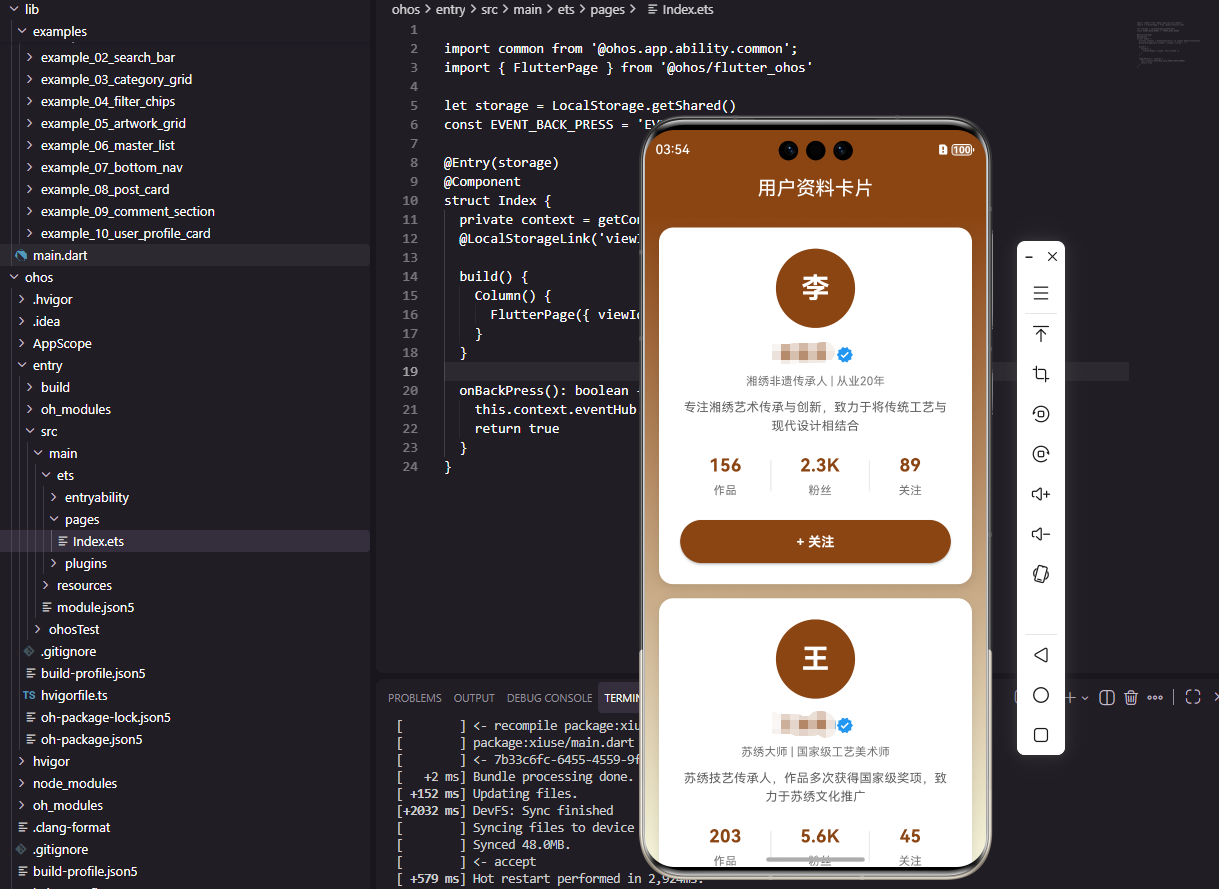
用户资料卡片组件设计
用户资料卡片是社交应用的核心组件,需要在有限空间内展示关键信息。我们的设计原则是:简洁、信息丰富、交互友好。卡片包含以下核心区域:
- 头像区域:展示用户头像和认证标识
- 用户信息:昵称、简介和认证状态
- 统计数据:作品数、粉丝数和关注数
- 操作按钮:关注/已关注状态切换
Flutter实现与OpenHarmony适配
组件结构设计
class UserProfileCard extends StatefulWidget {
const UserProfileCard({super.key});
State<UserProfileCard> createState() => _UserProfileCardState();
}
class _UserProfileCardState extends State<UserProfileCard> {
bool _isFollowed = false;
Widget build(BuildContext context) {
return Container(
margin: const EdgeInsets.symmetric(horizontal: 16),
padding: const EdgeInsets.all(20),
decoration: BoxDecoration(
color: Colors.white,
borderRadius: BorderRadius.circular(16),
boxShadow: [
BoxShadow(
color: Colors.black.withOpacity(0.1),
blurRadius: 10,
offset: const Offset(0, 4),
),
],
),
child: Column(
children: [
// 头像区域
CircleAvatar(
radius: 40,
backgroundColor: const Color(0xFF8B4513),
child: const Text(
'李',
style: TextStyle(
fontSize: 28,
color: Colors.white,
fontWeight: FontWeight.bold,
),
),
),
const SizedBox(height: 12),
// 用户信息
Row(
mainAxisAlignment: MainAxisAlignment.center,
children: [
const Text(
'李雪芬',
style: TextStyle(
fontSize: 18,
fontWeight: FontWeight.bold,
color: Color(0xFF8B4513),
),
),
const SizedBox(width: 4),
if (true) ...[
Icon(Icons.verified, size: 18, color: Colors.blue)
]
],
),
const SizedBox(height: 4),
Text(
'湘绣非遗传承人 | 从业20年',
style: TextStyle(
fontSize: 12,
color: Colors.grey[600],
),
),
const SizedBox(height: 8),
Text(
'专注湘绣艺术传承与创新,致力于将传统工艺与现代设计相结合',
style: TextStyle(
fontSize: 13,
color: Colors.grey[700],
height: 1.4,
),
textAlign: TextAlign.center,
maxLines: 2,
overflow: TextOverflow.ellipsis,
),
const SizedBox(height: 16),
// 统计数据
Row(
mainAxisAlignment: MainAxisAlignment.spaceEvenly,
children: [
_buildStatItem('作品', '156'),
Container(
width: 1,
height: 30,
color: Colors.grey[300],
),
_buildStatItem('粉丝', '2.3K'),
Container(
width: 1,
height: 30,
color: Colors.grey[300],
),
_buildStatItem('关注', '89'),
],
),
const SizedBox(height: 20),
// 关注按钮
SizedBox(
width: double.infinity,
child: ElevatedButton(
onPressed: () => setState(() => _isFollowed = !_isFollowed),
style: ElevatedButton.styleFrom(
backgroundColor: _isFollowed ? Colors.grey[300] : const Color(0xFF8B4513),
padding: const EdgeInsets.symmetric(vertical: 12),
shape: RoundedRectangleBorder(
borderRadius: BorderRadius.circular(25),
),
),
child: Text(
_isFollowed ? '已关注' : '+ 关注',
style: TextStyle(
fontSize: 14,
color: _isFollowed ? Colors.grey[700] : Colors.white,
),
),
),
),
],
),
);
}
Widget _buildStatItem(String label, String value) {
return Column(
children: [
Text(
value,
style: const TextStyle(
fontSize: 18,
fontWeight: FontWeight.bold,
color: Color(0xFF8B4513),
),
),
const SizedBox(height: 4),
Text(
label,
style: TextStyle(fontSize: 12, color: Colors.grey[600]),
),
],
);
}
}
关键API使用与注意事项
-
CircleAvatar:在OpenHarmony上,需要确保radius参数的值在鸿蒙设备上能正确渲染。鸿蒙设备的屏幕密度与Android/iOS不同,建议使用MediaQuery获取设备信息进行适配。 -
BoxShadow:鸿蒙平台对阴影的支持有限,需要检查BoxShadow的blurRadius和offset参数,避免在鸿蒙设备上显示异常。 -
TextOverflow:在鸿蒙上,TextOverflow.ellipsis需要与maxLines配合使用,确保文本溢出时显示省略号。 -
ElevatedButton:鸿蒙平台对按钮的圆角支持需要通过shape属性设置,确保在鸿蒙上能正确渲染。
Flutter与OpenHarmony架构对比
上图展示了Flutter应用在OpenHarmony上的运行架构。Flutter应用通过Flutter引擎运行,由OpenHarmony适配层将Flutter的UI指令转换为鸿蒙系统API,最终由鸿蒙UI框架渲染到设备屏幕上。
用户资料卡片实现流程
适配关键点与优化建议
-
跨平台兼容性处理:在鸿蒙设备上,需要处理不同屏幕尺寸和分辨率。使用
MediaQuery获取设备信息,动态调整组件尺寸。 -
性能优化:对于包含大量文本和图片的卡片,使用
const构造函数创建不可变组件,减少不必要的重建。 -
状态管理:在复杂应用中,建议使用
Provider或Riverpod管理关注状态,而不是使用局部StatefulWidget。 -
鸿蒙特定API:当需要使用鸿蒙特有的功能时,可以通过
MethodChannel调用鸿蒙原生API,但要确保在非鸿蒙平台也能正常运行。
结论
通过本文的实践,我们成功实现了用户资料卡片组件在Flutter中的开发,并针对OpenHarmony平台进行了适配优化。Flutter为开发者提供了强大的跨平台能力,而OpenHarmony则为应用提供了丰富的系统能力。通过合理使用Flutter的UI组件和OpenHarmony适配层,我们可以轻松地将Flutter应用部署到OpenHarmony设备上。
欢迎大家加入开源鸿蒙跨平台开发者社区,一起探索更多鸿蒙跨平台开发技术!

开源鸿蒙跨平台开发社区汇聚开发者与厂商,共建“一次开发,多端部署”的开源生态,致力于降低跨端开发门槛,推动万物智联创新。
更多推荐
 6
6 0
0- 0


 已为社区贡献46条内容

所有评论(0)