flutter_for_openharmony家庭药箱管理app实战+个人中心实现
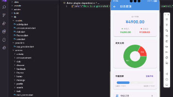
本文介绍了一个"家庭药箱"应用个人中心页面的Flutter实现方案。页面采用三段式布局:顶部渐变色用户信息区展示头像和应用名称;中部数据统计卡片实时显示药品、成员和提醒数量;底部功能菜单列表提供数据统计、位置管理等入口。设计上运用了渐变背景、卡片阴影、分割线缩进等细节处理,通过Consumer3监听多个Provider状态,使用GetX实现页面跳转。整体布局层次分明,操作直观,
个人中心是应用的重要入口,集中展示用户信息、数据统计和功能菜单。通过清晰的布局和便捷的导航,用户可以快速访问各项管理功能。
页面设计思路
个人中心采用三段式布局:顶部渐变色用户信息区、中部数据统计卡片、底部功能菜单列表。这种布局让信息层次分明,用户一眼就能看到关键数据和功能入口。
渐变色头部设计
头部使用渐变背景突出显示:
Widget _buildUserHeader() {
  return Container(
    padding: EdgeInsets.all(20.w),
    decoration: BoxDecoration(
      gradient: const LinearGradient(
        colors: [Color(0xFF00897B), Color(0xFF4DB6AC)],
        begin: Alignment.topLeft,
        end: Alignment.bottomRight,
      ),
    ),
    child: Row(
      children: [
        CircleAvatar(
          radius: 35.r,
          backgroundColor: Colors.white.withOpacity(0.2),
          child: Icon(Icons.person, size: 40.sp, color: Colors.white),
        ),
        SizedBox(width: 16.w),
        Expanded(
          child: Column(
            crossAxisAlignment: CrossAxisAlignment.start,
            children: [
              Text(
                '家庭药箱',
                style: TextStyle(fontSize: 20.sp, fontWeight: FontWeight.bold, color: Colors.white),
              ),
              SizedBox(height: 4.h),
              Text(
                '守护家人健康',
                style: TextStyle(fontSize: 14.sp, color: Colors.white70),
              ),
            ],
          ),
        ),
      ],
    ),
  );
}
使用LinearGradient创建从深绿到浅绿的渐变效果,营造出清新的视觉感受。头像使用半透明白色背景的圆形容器,内部显示人物图标。标题"家庭药箱"使用加粗白色文字,副标题"守护家人健康"使用半透明白色,形成层次感。这种设计让用户信息区域更加醒目。
数据统计卡片
统计卡片展示关键数据:
Widget _buildStatistics(BuildContext context) {
  return Consumer3<MedicineProvider, FamilyProvider, ReminderProvider>(
    builder: (context, medicineProvider, familyProvider, reminderProvider, child) {
      return Container(
        margin: EdgeInsets.symmetric(horizontal: 16.w),
        padding: EdgeInsets.all(16.w),
        decoration: BoxDecoration(
          color: Colors.white,
          borderRadius: BorderRadius.circular(12.r),
          boxShadow: [
            BoxShadow(color: Colors.black.withOpacity(0.05), blurRadius: 10, offset: const Offset(0, 2)),
          ],
        ),
        child: Row(
          mainAxisAlignment: MainAxisAlignment.spaceAround,
          children: [
            _buildStatItem('药品', '${medicineProvider.medicines.length}', Icons.medical_services),
            _buildStatItem('成员', '${familyProvider.members.length}', Icons.family_restroom),
            _buildStatItem('提醒', '${reminderProvider.activeReminders.length}', Icons.alarm),
          ],
        ),
      );
    },
  );
}
使用Consumer3同时监听三个Provider,获取药品、成员和提醒的数量。白色卡片配合轻微阴影,营造出悬浮效果。三个统计项横向均匀分布,使用spaceAround让间距自动调整。这种设计让用户能够快速了解药箱的整体情况。
统计项组件
每个统计项包含图标、数值和标签:
Widget _buildStatItem(String label, String value, IconData icon) {
  return Column(
    children: [
      Icon(icon, color: const Color(0xFF00897B), size: 28.sp),
      SizedBox(height: 8.h),
      Text(value, style: TextStyle(fontSize: 20.sp, fontWeight: FontWeight.bold)),
      Text(label, style: TextStyle(fontSize: 12.sp, color: Colors.grey[600])),
    ],
  );
}
图标使用主题色,尺寸28.sp确保清晰可见。数值使用大号加粗字体,突出显示关键信息。标签使用小号灰色字体,说明数值的含义。这种垂直排列的设计让信息层次清晰,用户能够快速读取数据。
功能菜单列表
菜单列表提供各项功能入口:
Widget _buildMenuSection() {
  return Container(
    margin: EdgeInsets.symmetric(horizontal: 16.w),
    decoration: BoxDecoration(
      color: Colors.white,
      borderRadius: BorderRadius.circular(12.r),
      boxShadow: [
        BoxShadow(color: Colors.black.withOpacity(0.05), blurRadius: 10, offset: const Offset(0, 2)),
      ],
    ),
    child: Column(
      children: [
        _buildMenuItem(Icons.bar_chart, '数据统计', () => Get.to(() => const StatisticsScreen())),
        _buildDivider(),
        _buildMenuItem(Icons.location_on, '存放位置管理', () => Get.to(() => const StorageLocationScreen())),
        _buildDivider(),
        _buildMenuItem(Icons.feedback, '意见反馈', () => Get.to(() => const FeedbackScreen())),
        _buildDivider(),
        _buildMenuItem(Icons.info, '关于我们', () => Get.to(() => const AboutScreen())),
      ],
    ),
  );
}
菜单使用白色卡片容器,圆角和阴影与统计卡片保持一致。四个菜单项垂直排列,每项之间使用分割线分隔。这种设计让菜单结构清晰,用户能够快速找到需要的功能。
菜单项组件
使用ListTile实现菜单项:
Widget _buildMenuItem(IconData icon, String title, VoidCallback onTap) {
  return ListTile(
    leading: Icon(icon, color: const Color(0xFF00897B)),
    title: Text(title),
    trailing: const Icon(Icons.chevron_right, color: Colors.grey),
    onTap: onTap,
  );
}
ListTile是Flutter提供的标准列表项组件,自动处理点击效果和布局。左侧图标使用主题色,标题使用默认文字样式,右侧箭头图标使用灰色。点击时调用传入的回调函数,使用GetX导航到对应页面。这种标准化的设计让用户操作更加直观。
分割线组件
菜单项之间的分割线:
Widget _buildDivider() {
  return Divider(height: 1, indent: 56.w);
}
Divider组件创建水平分割线,高度设为1像素。indent: 56.w让分割线从左侧缩进56宽度单位,与图标右侧对齐,避免分割线穿过图标区域。这种细节处理让界面更加精致。
AppBar设置按钮
AppBar右侧提供设置入口:
appBar: AppBar(
  title: const Text('我的'),
  actions: [
    IconButton(
      icon: const Icon(Icons.settings),
      onPressed: () => Get.to(() => const SettingsScreen()),
    ),
  ],
)
设置按钮放在AppBar右侧,用户可以快速访问应用设置。使用IconButton组件,点击时跳转到设置页面。这种设计符合用户习惯,大多数应用都将设置功能放在这个位置。
页面滚动
使用SingleChildScrollView支持滚动:
body: SingleChildScrollView(
  child: Column(
    children: [
      _buildUserHeader(),
      SizedBox(height: 16.h),
      _buildStatistics(context),
      SizedBox(height: 16.h),
      _buildMenuSection(),
    ],
  ),
)
SingleChildScrollView让页面内容可以垂直滚动,适应不同屏幕尺寸。各个区块之间使用SizedBox添加16高度单位的间距,让布局更加舒适。这种设计确保了在小屏幕设备上也能正常显示所有内容。
完整页面结构
整个页面的完整实现:
class ProfileScreen extends StatelessWidget {
const ProfileScreen({super.key});
Widget build(BuildContext context) {
return Scaffold(
appBar: AppBar(
title: const Text('我的'),
actions: [
IconButton(
icon: const Icon(Icons.settings),
onPressed: () => Get.to(() => const SettingsScreen()),
),
],
),
body: SingleChildScrollView(
child: Column(
children: [
_buildUserHeader(),
SizedBox(height: 16.h),
_buildStatistics(context),
SizedBox(height: 16.h),
_buildMenuSection(),
SizedBox(height: 16.h),
_buildVersionInfo(),
],
),
),
);
}
}
页面使用SingleChildScrollView包裹Column,确保内容可以滚动。各个组件之间使用SizedBox添加间距,保持布局的呼吸感。AppBar右侧的设置按钮提供快速访问入口。
版本信息展示
页面底部显示应用版本信息:
Widget _buildVersionInfo() {
  return Container(
    padding: EdgeInsets.all(16.w),
    child: Column(
      children: [
        Text(
          '家庭药箱管理',
          style: TextStyle(
            fontSize: 14.sp,
            color: Colors.grey[600],
            fontWeight: FontWeight.w500,
          ),
        ),
        SizedBox(height: 4.h),
        Text(
          'Version 1.0.0',
          style: TextStyle(fontSize: 12.sp, color: Colors.grey[400]),
        ),
        SizedBox(height: 8.h),
        Text(
          'Powered by Flutter for OpenHarmony',
          style: TextStyle(fontSize: 10.sp, color: Colors.grey[400]),
        ),
      ],
    ),
  );
}
版本信息使用灰色文字,不会干扰主要内容。显示应用名称、版本号和技术栈信息,让用户了解应用的基本情况。
数据响应式更新
使用Consumer3监听多个Provider:
Consumer3<MedicineProvider, FamilyProvider, ReminderProvider>(
  builder: (context, medicineProvider, familyProvider, reminderProvider, child) {
    return Container(
      // 统计卡片内容
    );
  },
)
Consumer3可以同时监听三个Provider的变化。当任何一个Provider的数据更新时,统计卡片会自动重建,显示最新的数据。这种响应式设计确保了数据的实时性。
菜单项点击处理
每个菜单项都有对应的点击处理:
_buildMenuItem(
  Icons.bar_chart,
  '数据统计',
  () => Get.to(() => const StatisticsScreen()),
)
使用GetX的Get.to方法进行页面导航,提供流畅的转场动画。回调函数在点击时执行,跳转到对应的功能页面。这种设计让代码简洁清晰。
卡片阴影效果
统计卡片和菜单卡片都使用阴影效果:
boxShadow: [
  BoxShadow(
    color: Colors.black.withOpacity(0.05),
    blurRadius: 10,
    offset: const Offset(0, 2),
  ),
],
使用半透明黑色创建轻微的阴影,模糊半径10,向下偏移2像素。这种阴影让卡片看起来悬浮在背景之上,增加了界面的层次感和立体感。
图标颜色统一
所有功能图标都使用主题色:
Icon(icon, color: const Color(0xFF00897B))
统一的图标颜色让界面风格保持一致。主题色是青绿色(#00897B),给人清新、健康的感觉,符合医疗健康类应用的定位。
文字层次设计
页面使用多种文字样式构建层次:
// 标题文字
Text(title, style: TextStyle(fontSize: 20.sp, fontWeight: FontWeight.bold, color: Colors.white))

// 副标题文字
Text(subtitle, style: TextStyle(fontSize: 14.sp, color: Colors.white70))

// 数值文字
Text(value, style: TextStyle(fontSize: 20.sp, fontWeight: FontWeight.bold))

// 标签文字
Text(label, style: TextStyle(fontSize: 12.sp, color: Colors.grey[600]))
不同层级的文字使用不同的字号、粗细和颜色。标题最大最粗,数值次之,标签最小。这种层次化设计让信息清晰易读。
间距设计规范
页面使用统一的间距规范:
SizedBox(height: 16.h)  // 组件之间的间距
SizedBox(width: 16.w)   // 水平间距
EdgeInsets.all(16.w)    // 内边距
EdgeInsets.symmetric(horizontal: 16.w)  // 水平内边距
使用ScreenUtil的响应式单位(w和h),确保在不同屏幕尺寸上保持一致的视觉效果。16是基础间距单位,其他间距都是16的倍数或分数。
圆角设计规范
所有卡片和容器都使用圆角:
BorderRadius.circular(12.r)  // 卡片圆角
BorderRadius.circular(8.r)   // 小容器圆角
BorderRadius.circular(20.r)  // 标签圆角
统一的圆角设计让界面更加柔和友好。12.r是标准卡片圆角,8.r用于小容器,20.r用于标签等小元素。
性能优化
页面使用多种优化技术:
- StatelessWidget:个人中心页面使用StatelessWidget,因为它不需要管理内部状态
- Consumer精确监听:只在需要数据的地方使用Consumer,避免不必要的重建
- const构造函数:尽可能使用const构造函数,减少Widget重建
- 懒加载:使用SingleChildScrollView而不是ListView,因为内容较少
用户体验设计
个人中心的用户体验设计包括:
- 渐变色头部:使用渐变色吸引用户注意,突出用户信息区域
- 数据可视化:通过图标和数字直观展示统计数据
- 清晰导航:功能菜单使用图标和文字组合,易于理解
- 视觉反馈:ListTile自动提供点击效果,让用户知道操作已响应
- 信息层次:通过颜色、字号、粗细构建清晰的信息层次
可扩展性设计
页面设计考虑了可扩展性:
- 菜单项可配置:通过数组或配置文件定义菜单项,方便添加新功能
- 统计项可扩展:可以轻松添加新的统计项,如健康记录数量
- 主题可定制:颜色使用常量定义,方便统一修改
- 组件可复用:_buildMenuItem等方法可以在其他页面复用
总结
个人中心页面通过渐变色头部、数据统计卡片和功能菜单列表,为用户提供了清晰的信息展示和便捷的功能入口。使用多个Provider获取实时数据,GetX实现流畅的页面导航。统一的卡片设计、颜色方案和间距规范让整个页面保持一致的视觉风格。响应式设计和性能优化确保了良好的用户体验。
欢迎加入开源鸿蒙跨平台社区:https://openharmonycrossplatform.csdn.net

开源鸿蒙跨平台开发社区汇聚开发者与厂商,共建“一次开发,多端部署”的开源生态,致力于降低跨端开发门槛,推动万物智联创新。
更多推荐
 17
17 0
0- 0


 已为社区贡献4条内容

所有评论(0)