RN for OpenHarmony英雄联盟助手App实战:首页实现
本文介绍了使用React Native for OpenHarmony开发英雄联盟助手App首页的实现过程。首页包含顶部Banner、快捷入口六宫格、热门英雄推荐和数据统计四个部分。文章详细讲解了数据加载逻辑(使用Riot Games官方API)、动态样式处理(支持主题切换)、以及组件结构设计。特别说明了在OpenHarmony平台上如何避免第三方库兼容性问题,采用自定义导航方案。通过配置化设计快

案例开源地址:https://atomgit.com/nutpi/rn_openharmony_lol
这篇文章我们来聊聊如何用 React Native for OpenHarmony 实现一个英雄联盟助手App的首页。首页作为用户打开App后看到的第一个界面,承载着展示核心功能入口、呈现热门内容的重要职责。我会把实现过程中的思考和踩过的坑都分享出来,希望对你有帮助。
前置准备
开始之前,确保你已经搭建好了 RN for OpenHarmony 的开发环境。我们这个项目使用 Riot Games 官方提供的 Data Dragon API 作为数据源,这是一个免费的静态资源接口,不需要申请 API Key 就能直接使用。
Data Dragon 是拳头官方维护的游戏静态数据仓库,包含了所有英雄、装备、符文的信息和图片资源,每个版本更新后都会同步更新数据。
首页的整体思路
首页主要包含这几个部分:
- 顶部 Banner:展示一张英雄原画作为视觉焦点
- 快捷入口:六宫格布局,快速跳转到各个功能模块
- 热门英雄:横向滚动展示随机推荐的英雄
- 数据统计:显示当前版本和英雄总数
我们会用到 ScrollView 来实现整体的滚动布局,配合 Image、TouchableOpacity 等基础组件完成交互。
引入依赖和类型定义
import React, {useEffect, useState, useMemo} from 'react';
import {View, Text, ScrollView, Image, TouchableOpacity, StyleSheet} from 'react-native';
import {useTheme} from '../../context/ThemeContext';
import {useApp} from '../../context/AppContext';
import {useNavigation} from '../../context/NavigationContext';
import {championApi} from '../../api';
import {getChampionIconUrl, getChampionSplashUrl} from '../../utils/image';
import {Loading} from '../../components/common';
import type {Champion} from '../../models/Champion';
关于依赖引入的说明:
useTheme:自定义 Hook,用于获取当前主题颜色配置,支持深色/浅色模式的动态切换useApp:全局状态管理 Hook,存储了游戏版本号、英雄列表等共享数据useNavigation:自封装的导航 Hook,不依赖 react-navigation,避免了第三方库在鸿蒙平台的兼容性问题championApi:英雄数据相关的 API 封装,包含获取列表、搜索、筛选等方法getChampionIconUrl/getChampionSplashUrl:工具函数,根据版本号和英雄ID拼接图片URL
这里特别说一下为什么不用 react-navigation。在 OpenHarmony 平台上,部分第三方库可能存在兼容性问题,自己封装一套简单的导航方案反而更可控。我们的导航方案基于 Context + State 实现,后面的文章会详细介绍。
定义快捷入口配置
const quickEntries = [
  {key: 'ChampionList', label: '英雄图鉴', icon: '⚔️'},
  {key: 'ItemList', label: '装备大全', icon: '🛡️'},
  {key: 'RuneList', label: '符文系统', icon: '✨'},
  {key: 'SpellList', label: '召唤师技能', icon: '🔮'},
  {key: 'Tools', label: '实用工具', icon: '🔧'},
  {key: 'Settings', label: '设置', icon: '⚙️'},
];
配置化的好处:
把入口信息抽成配置数组,而不是在 JSX 里硬编码,有几个好处:
- 易于维护:新增或修改入口只需要改数组,不用动渲染逻辑
- 复用性强:这个配置可以在其他地方复用,比如侧边栏菜单
- 类型安全:配合 TypeScript 可以对配置项做类型约束
这里用 Emoji 作为图标是个取巧的做法。Emoji 在各个平台上的兼容性都不错,省去了引入图标库的麻烦。如果后续想换成自定义图标,把 icon 字段改成图片路径,渲染时用 Image 组件替换 Text 就行。
组件主体结构
export function HomePage() {
  const {colors} = useTheme();
  const {state, setChampions} = useApp();
  const {navigate} = useNavigation();
  const [loading, setLoading] = useState(true);
  const [hotChampions, setHotChampions] = useState<Champion[]>([]);
状态设计说明:
状态 类型 用途 loadingboolean 控制加载动画的显示与隐藏 hotChampionsChampion[] 存储要展示的热门英雄(随机6个) 从 Context 中获取的数据:
colors:当前主题的颜色配置对象state:全局状态,包含version(版本号)和champions(英雄列表)setChampions:更新全局英雄列表的方法navigate:页面跳转函数
为什么 hotChampions 要单独用 useState 而不是直接从 state.champions 里取?因为我们需要对数据做随机处理,每次进入首页展示不同的英雄,这个处理后的结果应该是组件内部的状态。
数据加载逻辑
useEffect(() => {
  async function loadData() {
    if (!state.version) return;
    setLoading(true);
    const champions = await championApi.getChampionList(state.version);
    setChampions(champions);
    const shuffled = [...champions].sort(() => Math.random() - 0.5);
    setHotChampions(shuffled.slice(0, 6));
    setLoading(false);
  }
  loadData();
}, [state.version]);
代码解析:
依赖项
[state.version]:只有当版本号变化时才重新加载数据。版本号在 App 启动时从 API 获取,获取到后会触发这个 effect提前返回
if (!state.version) return:版本号还没获取到时,不执行后续逻辑,避免发起无效请求随机打乱算法:
sort(() => Math.random() - 0.5)是一个简单的洗牌实现。Math.random()返回 0-1 的随机数,减去 0.5 后有一半概率为正、一半为负,从而实现随机排序取前6个:
slice(0, 6)从打乱后的数组中取前6个作为热门英雄展示
这里有个小细节:我们先把数据存到全局状态 setChampions(champions),再从中取随机数据。这样其他页面(比如英雄列表页)可以直接使用全局状态里的数据,不需要重复请求。
动态样式的处理
const styles = useMemo(() => StyleSheet.create({
  container: {flex: 1, backgroundColor: colors.background},
  banner: {height: 200, position: 'relative'},
  bannerImage: {width: '100%', height: '100%'},
  bannerOverlay: {
    position: 'absolute',
    left: 0, right: 0, top: 0, bottom: 0,
    backgroundColor: 'rgba(0, 0, 0, 0.5)',
    justifyContent: 'flex-end',
    padding: 20
  },
  bannerTitle: {fontSize: 28, fontWeight: 'bold', color: colors.textGold, marginBottom: 4},
  bannerSubtitle: {fontSize: 14, color: colors.textSecondary},
  section: {padding: 16},
  sectionHeader: {flexDirection: 'row', justifyContent: 'space-between', alignItems: 'center', marginBottom: 12},
  sectionTitle: {fontSize: 18, fontWeight: '600', color: colors.textPrimary, marginBottom: 12},
  moreText: {fontSize: 14, color: colors.primary},
}), [colors]);
为什么用
useMemo包裹样式?在支持主题切换的场景下,样式需要依赖
colors对象动态生成。如果不用useMemo,每次组件渲染都会创建新的样式对象,造成不必要的性能开销。
useMemo的作用是:
- 当
colors变化时(用户切换主题),重新计算样式- 当
colors不变时,返回缓存的样式对象,避免重复创建
Banner 覆盖层的实现技巧:
bannerOverlay使用position: 'absolute'配合四个方向都设为 0,实现完全覆盖父容器。半透明黑色背景rgba(0, 0, 0, 0.5)让白色文字在任何背景图上都能清晰显示。justifyContent: 'flex-end'让内容靠底部对齐。
加载状态的处理
if (loading || !state.version) {
  return <Loading fullScreen text="加载中..." />;
}
双重判断的必要性:
loading:数据请求过程中为 true!state.version:App 刚启动时,版本号还没从 API 获取到这两个条件任一满足,都应该显示加载状态,而不是渲染空白或报错的页面。
Loading 组件是我们封装的通用加载组件,fullScreen 属性让它占满整个屏幕,text 属性自定义提示文字。这个组件也支持主题切换,加载动画的颜色会跟随主题变化。
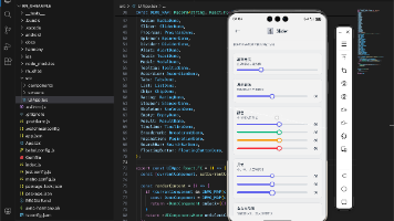
Banner 区域的实现
return (
  <ScrollView style={styles.container} showsVerticalScrollIndicator={false}>
    <View style={styles.banner}>
      <Image source={{uri: getChampionSplashUrl('Jinx', 0)}} style={styles.bannerImage} />
      <View style={styles.bannerOverlay}>
        <Text style={styles.bannerTitle}>LOL 助手</Text>
        <Text style={styles.bannerSubtitle}>版本 {state.version} · 数据已更新</Text>
      </View>
    </View>
图片URL生成函数:
getChampionSplashUrl('Jinx', 0)会生成类似这样的URL:https://ddragon.leagueoflegends.com/cdn/img/champion/splash/Jinx_0.jpg第一个参数是英雄ID,第二个参数是皮肤编号(0 表示默认皮肤)。
为什么选金克丝作为 Banner?
金克丝是英雄联盟最具代表性的角色之一,她的原画色彩鲜艳、辨识度高,作为 App 的门面非常合适。当然你也可以改成其他英雄,或者做成轮播图。
showsVerticalScrollIndicator={false} 隐藏了滚动条,让界面更简洁。在移动端,用户通常通过滑动手势来感知可滚动区域,滚动条反而显得多余。
快捷入口网格布局
<View style={styles.section}>
  <Text style={styles.sectionTitle}>快捷入口</Text>
  <View style={styles.quickGrid}>
    {quickEntries.map(entry => (
      <TouchableOpacity
        key={entry.key}
        style={styles.quickItem}
        onPress={() => navigate(entry.key)}>
        <Text style={styles.quickIcon}>{entry.icon}</Text>
        <Text style={styles.quickLabel}>{entry.label}</Text>
      </TouchableOpacity>
    ))}
  </View>
</View>
网格布局的实现:
对应的样式代码:
quickGrid: {flexDirection: 'row', flexWrap: 'wrap', marginHorizontal: -6},
quickItem: {width: '33.33%', padding: 6, alignItems: 'center'},
quickIcon: {fontSize: 32, textAlign: 'center', marginBottom: 8},
quickLabel: {fontSize: 12, color: colors.textSecondary, textAlign: 'center'},
布局原理:
flexDirection: 'row'+flexWrap: 'wrap':子元素横向排列,超出宽度自动换行width: '33.33%':每个子元素占父容器宽度的三分之一,实现三列布局marginHorizontal: -6+padding: 6:这是一个常用技巧,用来抵消最外侧的间距,让网格两边对齐容器边缘
点击事件处理:
onPress={() => navigate(entry.key)}调用导航函数跳转到对应页面。entry.key就是我们在配置数组里定义的路由名称,比如'ChampionList'、'ItemList'等。
热门英雄横向滚动列表
<View style={styles.section}>
  <View style={styles.sectionHeader}>
    <Text style={styles.sectionTitle}>热门英雄</Text>
    <TouchableOpacity onPress={() => navigate('ChampionList')}>
      <Text style={styles.moreText}>查看全部 →</Text>
    </TouchableOpacity>
  </View>
  <ScrollView
    horizontal
    showsHorizontalScrollIndicator={false}
    contentContainerStyle={styles.championList}>
    {hotChampions.map(champion => (
      <TouchableOpacity
        key={champion.id}
        style={styles.championItem}
        onPress={() => navigate('ChampionDetail', {championId: champion.id})}>
        <Image
          source={{uri: getChampionIconUrl(state.version, champion.id)}}
          style={styles.championIcon} />
        <Text style={styles.championName} numberOfLines={1}>{champion.name}</Text>
      </TouchableOpacity>
    ))}
  </ScrollView>
</View>
横向滚动的关键属性:
horizontal:让 ScrollView 变成横向滚动showsHorizontalScrollIndicator={false}:隐藏横向滚动条contentContainerStyle:设置内容容器的样式,这里用来添加右侧 padding
页面跳转传参:
navigate('ChampionDetail', {championId: champion.id})
navigate函数的第二个参数是传递给目标页面的数据。英雄详情页会通过useNavigation获取这个championId,然后加载对应英雄的详细信息。
英雄头像样式:
championIcon: {
  width: 56, height: 56,
  borderRadius: 28,
  borderWidth: 2,
  borderColor: colors.borderGold,
  marginBottom: 8
},
borderRadius: 28是宽高的一半,实现正圆形。金色边框colors.borderGold呼应英雄联盟的视觉风格。
numberOfLines={1} 限制英雄名字只显示一行,超出部分会显示省略号,避免名字过长撑乱布局。
数据统计卡片
<View style={styles.section}>
  <Text style={styles.sectionTitle}>数据统计</Text>
  <View style={styles.statsGrid}>
    <View style={styles.statItem}>
      <Text style={styles.statValue}>{state.champions.length}</Text>
      <Text style={styles.statLabel}>英雄数量</Text>
    </View>
    <View style={styles.statItem}>
      <Text style={styles.statValue}>{state.version}</Text>
      <Text style={styles.statLabel}>当前版本</Text>
    </View>
  </View>
</View>
<View style={styles.bottomSpace} />
</ScrollView>
);
}
统计卡片的样式:
statsGrid: {
  flexDirection: 'row',
  backgroundColor: colors.backgroundCard,
  borderRadius: 8,
  padding: 16,
  borderWidth: 1,
  borderColor: colors.border
},
statItem: {flex: 1, alignItems: 'center'},
statValue: {fontSize: 24, fontWeight: 'bold', color: colors.textGold, marginBottom: 4},
statLabel: {fontSize: 12, color: colors.textSecondary},
设计要点:
- 卡片背景
colors.backgroundCard在深色模式下是深灰色,浅色模式下是白色flex: 1让两个统计项平分宽度- 数值用金色大字体突出显示,标签用灰色小字体
底部留白:
bottomSpace: {height: 20},这个空的 View 给底部留出一些空间,避免内容紧贴屏幕底部或被底部导航栏遮挡。
完整的样式定义
为了方便参考,这里列出剩余的样式代码:
championList: {paddingRight: 16},
championItem: {alignItems: 'center', marginRight: 16, width: 70},
championName: {fontSize: 12, color: colors.textPrimary, textAlign: 'center'},
bottomSpace: {height: 20},
样式组织建议:
在实际项目中,可以考虑把通用样式(如 section、sectionTitle)抽到公共样式文件中,避免在每个页面重复定义。但对于页面特有的样式(如 banner、statsGrid),还是放在组件内部更清晰。
小结
这篇文章我们完成了首页的实现,涉及到几个关键的技术点:
-
Context 的使用:通过
useTheme、useApp、useNavigation三个自定义 Hook,实现了主题切换、全局状态管理和页面导航 -
动态样式:使用
useMemo+StyleSheet.create的组合,让样式能够响应主题变化,同时保持良好的性能 -
布局技巧:网格布局的负 margin 技巧、横向滚动列表、绝对定位覆盖层等
-
数据流设计:组件内部状态和全局状态的配合使用,避免重复请求
下一篇我们会实现版本资讯页面,展示游戏的更新内容和版本历史。
欢迎加入开源鸿蒙跨平台社区:https://openharmonycrossplatform.csdn.net

开源鸿蒙跨平台开发社区汇聚开发者与厂商,共建“一次开发,多端部署”的开源生态,致力于降低跨端开发门槛,推动万物智联创新。
更多推荐
 10
10 0
0- 0


 已为社区贡献2条内容

所有评论(0)