RN for OpenHarmony 实战 TodoList 项目:任务分类标签
本文围绕 RN for OpenHarmony 实战 TodoList 项目中的任务分类标签展开,主要内容如下:1. **分类意义**:如同书架按类别整理书架便于找书,任务分类能帮助用户整理任务,方便处理和筛选。2. **分类定义**:确定“工作”“生活”“学习”“其他”四个分类,可覆盖大部分场景且避免认知负担小,“其他”作为兜底选项很重要。3. **任务数据中的分类字段**:任务类型定义中,分类
案例开源地址:https://gitcode.com/lqjmac/rn_openharmony_todolist
分类的意义
想象一下你的书架。如果所有书都随意堆放,找一本书要翻遍整个书架。但如果按类别整理——小说放一起,技术书放一起,杂志放一起——找书就变得轻松多了。
任务管理也是一样。当任务越来越多,没有分类就会陷入混乱。“工作”、“生活”、"学习"这样的分类,帮助我们把相关的任务归到一起,让大脑更容易处理。
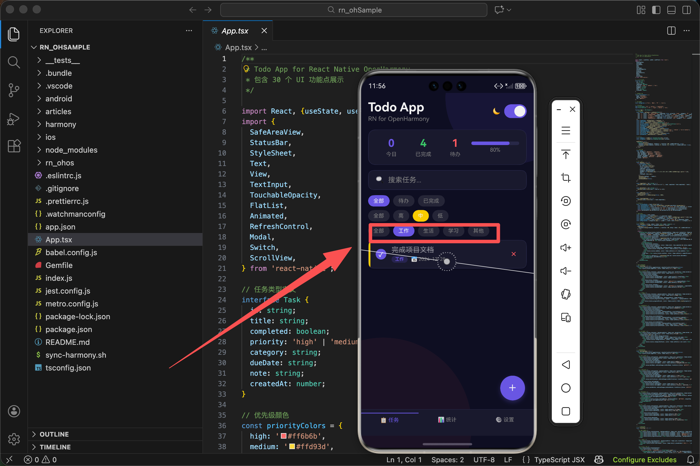
在我们的 TodoList 应用中,每个任务都有一个分类标签,显示在任务卡片上。用户还可以按分类筛选任务,只看某一类的内容。
分类的定义
首先,我们定义了四个分类:
const categories = ['工作', '生活', '学习', '其他'];
为什么是这四个?
这是一个经过考虑的选择。大多数人的日常任务可以归入这四类:
- 工作:职业相关的任务,如完成报告、参加会议、回复邮件
- 生活:日常生活事务,如买菜、打扫、缴费
- 学习:自我提升相关,如读书、上课、练习技能
- 其他:不属于以上三类的任务
四个分类不多不少。太少(比如只有两个)区分度不够,太多(比如十个)会让用户选择困难。四个刚好能覆盖大部分场景,又不会造成认知负担。
"其他"这个分类很重要。它是一个兜底选项,确保任何任务都能找到归属。没有它,用户可能会纠结:“这个任务到底算工作还是生活?”
任务数据中的分类字段
在任务的类型定义中,分类是一个字符串字段:
interface Task {
  id: string;
  title: string;
  completed: boolean;
  priority: 'high' | 'medium' | 'low';
  category: string;
  dueDate: string;
  note: string;
  createdAt: number;
}
注意 category 的类型是 string,而不是像 priority 那样的联合类型。
这是一个设计权衡。用联合类型 '工作' | '生活' | '学习' | '其他' 可以获得更好的类型检查,但灵活性较差——如果将来要增加分类,需要修改类型定义。用 string 类型更灵活,但失去了编译时的类型检查。
对于一个演示项目,string 类型足够了。在实际产品中,可能需要更复杂的设计,比如把分类做成可配置的,存储在数据库中。
初始任务的分类
看看初始数据中任务的分类分布:
const [tasks, setTasks] = useState<Task[]>([
  {id: '1', title: '学习 React Native', completed: false, priority: 'high', category: '学习', dueDate: '2024-12-30', note: '完成基础教程', createdAt: Date.now()},
  {id: '2', title: '完成项目文档', completed: true, priority: 'medium', category: '工作', dueDate: '2024-12-28', note: '', createdAt: Date.now()},
  {id: '3', title: '健身运动', completed: false, priority: 'low', category: '生活', dueDate: '2024-12-27', note: '跑步30分钟', createdAt: Date.now()},
  {id: '4', title: '阅读技术书籍', completed: false, priority: 'medium', category: '学习', dueDate: '2024-12-29', note: '', createdAt: Date.now()},
  {id: '5', title: '整理代码仓库', completed: true, priority: 'low', category: '工作', dueDate: '2024-12-26', note: '清理无用分支', createdAt: Date.now()},
]);
五个任务覆盖了三个分类:学习(2个)、工作(2个)、生活(1个)。没有"其他"分类的任务,这是故意的——"其他"是一个兜底选项,不应该是常用的分类。
任务的分类与内容是匹配的:
- “学习 React Native” → 学习
- “完成项目文档” → 工作
- “健身运动” → 生活
- “阅读技术书籍” → 学习
- “整理代码仓库” → 工作
这种匹配让示例数据看起来更真实。
分类标签的显示
在任务卡片中,分类以标签的形式显示:
<View style={styles.taskMeta}>
  <View style={[styles.categoryTag, {backgroundColor: theme.accent + '30'}]}>
    <Text style={[styles.categoryText, {color: theme.accent}]}>{item.category}</Text>
  </View>
  <Text style={[styles.dueDate, {color: theme.subText}]}>📅 {item.dueDate}</Text>
</View>
分类标签由两层组成:外层的 View 提供背景,内层的 Text 显示文字。
背景颜色
{backgroundColor: theme.accent + '30'}
theme.accent 是主题色 #6c5ce7(紫色)。后面加 '30' 是什么意思?
在 CSS 和 React Native 中,颜色可以用 8 位十六进制表示,最后两位是透明度。30 表示约 19% 的不透明度(48/255 ≈ 0.19)。
所以 #6c5ce7 + '30' = #6c5ce730,是一个半透明的紫色。
这种设计让标签有颜色但不会太抢眼。如果用纯色背景,标签会非常突出,抢走任务标题的注意力。半透明背景更柔和,与整体设计协调。
文字颜色
{color: theme.accent}
文字用纯色的主题色,与半透明背景形成对比,确保可读性。
标签的样式细节
categoryTag: {paddingHorizontal: 8, paddingVertical: 2, borderRadius: 8},
categoryText: {fontSize: 10, fontWeight: '600'},
categoryTag 样式
paddingHorizontal: 8- 左右内边距,让文字不会贴着边缘paddingVertical: 2- 上下内边距,比较小,让标签紧凑borderRadius: 8- 圆角,让标签看起来更柔和
categoryText 样式
fontSize: 10- 很小的字体,因为分类是辅助信息fontWeight: '600'- 半粗体,在小字体下保持可读性
10 像素的字体配合 600 的字重,是一个经过测试的组合。太细的字体在小尺寸下会模糊,太粗又会显得笨重。600 是一个平衡点。
添加任务时选择分类
用户在添加任务时可以选择分类:
<Text style={[styles.modalLabel, {color: theme.subText}]}>分类</Text>
<View style={styles.categorySelector}>
  {categories.map(c => (
    <TouchableOpacity
      key={c}
      style={[styles.categoryOption, {borderColor: theme.accent}, newTaskCategory === c && {backgroundColor: theme.accent}]}
      onPress={() => setNewTaskCategory(c)}>
      <Text style={{color: newTaskCategory === c ? '#fff' : theme.accent}}>{c}</Text>
    </TouchableOpacity>
  ))}
</View>
这段代码遍历 categories 数组,为每个分类生成一个按钮。
动态样式
style={[styles.categoryOption, {borderColor: theme.accent}, newTaskCategory === c && {backgroundColor: theme.accent}]}
三层样式:
- 基础样式
styles.categoryOption - 边框颜色,始终是主题色
- 背景颜色,只有选中时才有
未选中的按钮:有边框,透明背景
选中的按钮:有边框,有背景
文字颜色
{color: newTaskCategory === c ? '#fff' : theme.accent}
选中时白色(与紫色背景对比),未选中时紫色(与透明背景对比)。
分类选择器的样式
categorySelector: {flexDirection: 'row', flexWrap: 'wrap', gap: 8, marginBottom: 24},
categoryOption: {paddingHorizontal: 16, paddingVertical: 8, borderRadius: 8, borderWidth: 1},
categorySelector
flexDirection: 'row'- 按钮水平排列flexWrap: 'wrap'- 如果一行放不下,自动换行gap: 8- 按钮之间的间距marginBottom: 24- 与下方内容的间距
flexWrap: 'wrap' 很重要。如果分类很多或者屏幕很窄,按钮会自动换到下一行,不会超出屏幕。
categoryOption
paddingHorizontal: 16- 左右内边距paddingVertical: 8- 上下内边距borderRadius: 8- 圆角borderWidth: 1- 边框宽度
与优先级选择器不同,分类选择器的按钮没有设置 flex: 1,所以它们的宽度由内容决定。"工作"和"生活"宽度相同(两个字),"学习"也是两个字,"其他"也是两个字。这样看起来比较整齐。
分类的状态管理
分类选择的状态存储在 newTaskCategory 中:
const [newTaskCategory, setNewTaskCategory] = useState('其他');
默认值是"其他"。为什么?
这是一个保守的选择。如果默认是"工作",用户添加一个生活任务时可能忘记修改分类,导致分类错误。"其他"是一个中性的默认值,提醒用户主动选择正确的分类。
当然,也可以记住用户上次选择的分类,作为下次的默认值。这需要额外的状态管理,但用户体验会更好。
按分类筛选
用户可以按分类筛选任务:
<View style={styles.filterContainer}>
  <View style={styles.filterGroup}>
    <TouchableOpacity
      style={[styles.filterBtn, categoryFilter === 'all' && {backgroundColor: theme.accent}]}
      onPress={() => setCategoryFilter('all')}>
      <Text style={[styles.filterBtnText, {color: categoryFilter === 'all' ? '#fff' : theme.subText}]}>全部</Text>
    </TouchableOpacity>
    {categories.map(c => (
      <TouchableOpacity
        key={c}
        style={[styles.filterBtn, categoryFilter === c && {backgroundColor: theme.accent}]}
        onPress={() => setCategoryFilter(c)}>
        <Text style={[styles.filterBtnText, {color: categoryFilter === c ? '#fff' : theme.subText}]}>{c}</Text>
      </TouchableOpacity>
    ))}
  </View>
</View>
筛选按钮比选择器多了一个"全部"选项。点击"全部"显示所有任务,点击某个分类只显示该分类的任务。
筛选逻辑:
const filteredTasks = tasks.filter(task => {
  const matchesSearch = task.title.toLowerCase().includes(searchText.toLowerCase());
  const matchesFilter = filter === 'all' || (filter === 'active' && !task.completed) || (filter === 'completed' && task.completed);
  const matchesPriority = priorityFilter === 'all' || task.priority === priorityFilter;
  const matchesCategory = categoryFilter === 'all' || task.category === categoryFilter;
  return matchesSearch && matchesFilter && matchesPriority && matchesCategory;
});
关键的一行:
const matchesCategory = categoryFilter === 'all' || task.category === categoryFilter;
如果 categoryFilter 是 'all',所有任务都匹配。否则,只有分类相等的任务才匹配。
注意这里用的是 === 严格相等,因为分类是字符串,不需要类型转换。
筛选按钮的样式
filterContainer: {marginBottom: 8},
filterGroup: {flexDirection: 'row', gap: 8},
filterBtn: {paddingHorizontal: 12, paddingVertical: 6, borderRadius: 16, backgroundColor: 'rgba(255,255,255,0.1)'},
filterBtnText: {fontSize: 12},
filterBtn
paddingHorizontal: 12- 左右内边距paddingVertical: 6- 上下内边距borderRadius: 16- 大圆角,让按钮看起来像药丸backgroundColor: 'rgba(255,255,255,0.1)'- 半透明白色背景
药丸形状的按钮是一种常见的设计模式,用于表示可选择的标签或筛选条件。大圆角让按钮看起来更柔和、更友好。
半透明背景让按钮在深色和浅色主题下都能看到,但不会太突出。选中时背景变成主题色,形成明显的视觉反馈。
统计页面的分类统计
在统计页面,我们展示了各分类的任务数量:
<View style={[styles.statsCard, {backgroundColor: theme.card, borderColor: theme.border, marginBottom: 100}]}>
  <Text style={[styles.statsCardTitle, {color: theme.text}]}>分类统计</Text>
  {categoryStats.map((cat, idx) => (
    <View key={idx} style={styles.categoryStatItem}>
      <Text style={[styles.categoryStatName, {color: theme.text}]}>{cat.name}</Text>
      <View style={[styles.categoryStatBar, {backgroundColor: theme.border}]}>
        <View style={[styles.categoryStatFill, {width: `${totalTasks > 0 ? (cat.count / totalTasks) * 100 : 0}%`, backgroundColor: theme.accent}]} />
      </View>
      <Text style={[styles.categoryStatCount, {color: theme.subText}]}>{cat.count}</Text>
    </View>
  ))}
</View>
categoryStats 的计算:
const categoryStats = categories.map(c => ({name: c, count: tasks.filter(t => t.category === c).length}));
遍历所有分类,统计每个分类的任务数量。结果是一个数组,每个元素包含分类名称和数量。
每一行显示三个元素:
- 分类名称
- 进度条(表示该分类占总任务的比例)
- 任务数量
进度条的宽度计算:
{width: `${totalTasks > 0 ? (cat.count / totalTasks) * 100 : 0}%`}
如果总任务数大于 0,计算该分类的百分比;否则宽度为 0(避免除以零)。
分类统计的样式
categoryStatItem: {flexDirection: 'row', alignItems: 'center', marginBottom: 12},
categoryStatName: {width: 60, fontSize: 14},
categoryStatBar: {flex: 1, height: 8, borderRadius: 4, marginHorizontal: 12, overflow: 'hidden'},
categoryStatFill: {height: '100%', borderRadius: 4},
categoryStatCount: {width: 30, textAlign: 'right', fontSize: 14},
categoryStatItem
flexDirection: 'row'- 三个元素水平排列alignItems: 'center'- 垂直居中marginBottom: 12- 行间距
categoryStatName
width: 60- 固定宽度,让所有分类名称对齐fontSize: 14- 正常字体大小
categoryStatBar
flex: 1- 占据剩余空间height: 8- 进度条高度borderRadius: 4- 圆角marginHorizontal: 12- 左右间距overflow: 'hidden'- 裁剪超出的内容(让填充部分的圆角生效)
categoryStatFill
height: '100%'- 填满父容器高度borderRadius: 4- 圆角
categoryStatCount
width: 30- 固定宽度textAlign: 'right'- 右对齐fontSize: 14- 正常字体大小
固定宽度的设计让所有行的布局一致,看起来更整齐。
分类与颜色
当前的实现中,所有分类使用相同的颜色(主题色)。这是一个简化的设计。
在更复杂的应用中,可以给每个分类分配不同的颜色:
const categoryColors = {
  '工作': '#6c5ce7',  // 紫色
  '生活': '#00b894',  // 绿色
  '学习': '#0984e3',  // 蓝色
  '其他': '#636e72',  // 灰色
};
然后在显示标签时使用对应的颜色:
<View style={[styles.categoryTag, {backgroundColor: categoryColors[item.category] + '30'}]}>
  <Text style={[styles.categoryText, {color: categoryColors[item.category]}]}>{item.category}</Text>
</View>
不同颜色可以帮助用户更快地识别分类,但也会增加视觉复杂度。需要根据产品需求权衡。
分类的扩展性
当前的分类是硬编码的。如果要支持用户自定义分类,需要做一些改动:
1. 把分类存储在状态中
const [categories, setCategories] = useState(['工作', '生活', '学习', '其他']);
2. 提供添加/删除分类的功能
const addCategory = (name: string) => {
  if (!categories.includes(name)) {
    setCategories([...categories, name]);
  }
};

const removeCategory = (name: string) => {
  // 需要处理已有任务的迁移
  setCategories(categories.filter(c => c !== name));
};
3. 处理分类删除后的任务迁移
如果用户删除了一个分类,该分类下的任务怎么办?可以:
- 自动迁移到"其他"分类
- 提示用户选择新分类
- 禁止删除有任务的分类
4. 持久化存储
自定义分类需要保存到本地存储或服务器,下次打开应用时恢复。
这些功能超出了本文的范围,但值得在实际产品中考虑。
分类与搜索的配合
当前的搜索只搜索任务标题:
const matchesSearch = task.title.toLowerCase().includes(searchText.toLowerCase());
可以扩展为同时搜索分类:
const matchesSearch = task.title.toLowerCase().includes(searchText.toLowerCase()) ||
                      task.category.toLowerCase().includes(searchText.toLowerCase());
这样用户输入"工作"时,不仅能找到标题包含"工作"的任务,还能找到分类是"工作"的任务。
分类的用户体验考量
1. 分类数量
分类不宜太多。研究表明,人类短期记忆的容量是 7±2 个项目。超过这个数量,用户就难以记住所有分类,选择时会犹豫。
4 个分类是一个安全的数字,用户可以轻松记住并快速选择。
2. 分类命名
分类名称要简短、明确、互斥。"工作"和"职业"意思太接近,会让用户困惑。"工作"和"生活"则界限清晰。
3. 默认分类
每个任务都应该有分类,不能为空。"其他"作为兜底选项,确保任何任务都能归类。
4. 分类的可见性
分类标签要足够醒目,让用户一眼就能看到。但又不能太醒目,抢走任务标题的注意力。半透明背景是一个平衡点。
小结
分类是任务管理的基础功能之一。它帮助用户组织任务,让混乱变得有序。
在我们的实现中:
- 定义了四个固定分类:工作、生活、学习、其他
- 分类以标签形式显示在任务卡片上
- 用户可以在添加任务时选择分类
- 支持按分类筛选任务
- 统计页面展示各分类的任务分布
这是一个基础但完整的分类系统。在实际产品中,可以根据需求扩展:支持自定义分类、分类颜色、分类图标等。
好的分类设计应该是直观的、一致的、可扩展的。用户不需要思考就能选择正确的分类,这才是成功的设计。
欢迎加入开源鸿蒙跨平台社区:https://openharmonycrossplatform.csdn.net

开源鸿蒙跨平台开发社区汇聚开发者与厂商,共建“一次开发,多端部署”的开源生态,致力于降低跨端开发门槛,推动万物智联创新。
更多推荐

 22
22 0
0- 0


 已为社区贡献9条内容

所有评论(0)