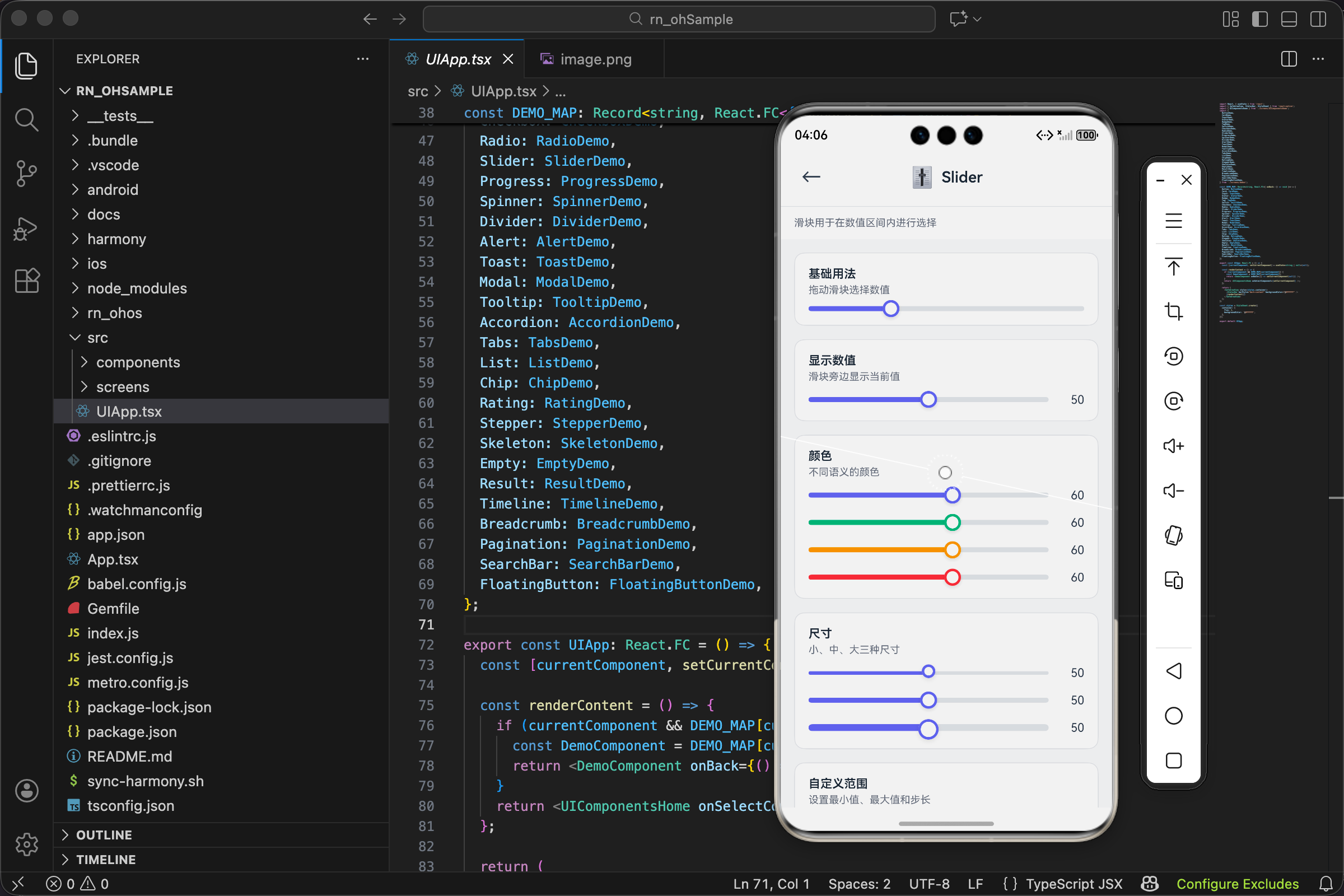
React Native for OpenHarmony Slider 滑块组件:让用户用手指选择数值
文章摘要: 本文介绍了Slider滑块组件的实现原理和设计思路。该组件由轨道、填充和滑块三部分组成,用于在指定范围内选择数值。文章详细讲解了核心功能:1) 数值与位置的百分比转换公式;2) 尺寸配置系统(sm/md/lg);3) 轨道、填充和滑块的渲染方法;4) 滑块定位的数学计算;5) 可选的数值显示功能。组件采用受控设计,支持自定义范围、步长、颜色和尺寸,适用于音量调节、亮度控制等多种场景。实
项目开源地址:https://atomgit.com/nutpi/rn_for_openharmony_element
音量调节、亮度控制、价格筛选、进度调整……这些场景都需要用户在一个范围内选择数值。用输入框让用户手动输入?太麻烦了。用滑块,手指一划就搞定,直观又高效。
今天来聊聊 Slider 组件的实现,这个组件涉及到一些数学计算和手势处理,比前面的组件稍微复杂一点。
滑块的组成部分
先搞清楚滑块长什么样。一个标准的滑块由三部分组成:
轨道(Track):一条横向的长条,表示数值的范围。通常是灰色的,让用户知道可以滑动的区域。
填充(Fill):轨道上已经"走过"的部分,从左边到滑块位置。通常是彩色的,表示当前选中的范围。
滑块(Thumb):一个可以拖动的圆形按钮,表示当前的值。用户拖动它来改变数值。
视觉上,填充和滑块的颜色一致,形成一个整体。轨道是背景色,填充是前景色,滑块是控制点。
接口设计
interface SliderProps {
  value: number;
  onValueChange: (value: number) => void;
  min?: number;
  max?: number;
  step?: number;
  color?: ColorType;
  size?: SizeType;
  showValue?: boolean;
  disabled?: boolean;
  style?: ViewStyle;
}
value 和 onValueChange 是受控组件的标准写法。value 是当前数值,onValueChange 是数值变化时的回调。
min 和 max 定义数值范围,默认是 0 到 100。这个范围决定了滑块能表示的最小值和最大值。
step 是步长,默认是 1。步长决定了数值的精度,比如 step=10 时,值只能是 0、10、20、30……不能是 15 或 23。
showValue 控制是否在滑块旁边显示当前数值。有时候用户需要知道精确的数字,有时候只需要大概的位置。
color 和 size 是老朋友了,控制颜色和尺寸。
核心计算:值和位置的转换
滑块组件的核心是值和位置的相互转换:
- 给定一个值,计算滑块应该在轨道的什么位置(百分比)
- 给定一个位置(用户拖动到的地方),计算对应的值
第一个转换用于渲染,第二个转换用于交互。
const percentage = ((value - min) / (max - min)) * 100;
这行代码把值转换成百分比:
value - min是当前值相对于最小值的偏移量max - min是整个范围的大小- 两者相除得到比例,乘以 100 得到百分比
举个例子:min=0, max=100, value=30,那么 percentage = (30-0)/(100-0)*100 = 30%。
再举个例子:min=50, max=150, value=100,那么 percentage = (100-50)/(150-50)*100 = 50%。
不管 min 和 max 是多少,这个公式都能正确计算出百分比。
尺寸配置
const sizeMap: Record<SizeType, { trackHeight: number; thumbSize: number }> = {
  sm: { trackHeight: 4, thumbSize: 16 },
  md: { trackHeight: 6, thumbSize: 20 },
  lg: { trackHeight: 8, thumbSize: 24 },
};
滑块的尺寸由两个值决定:
- trackHeight 是轨道的高度(粗细)
- thumbSize 是滑块圆的直径
sm 的轨道是 4px,滑块是 16px。这个尺寸比较精致,适合不需要太强调的场景。
md 的轨道是 6px,滑块是 20px。这是默认尺寸,大多数场景都适用。
lg 的轨道是 8px,滑块是 24px。适合需要强调的场景,比如音量控制这种重要功能。
滑块要比轨道大很多,这样才容易点击和拖动。如果滑块和轨道一样粗,用户很难精确地点中它。
轨道的渲染
<View
  style={[
    styles.track,
    {
      height: sizeMap[size].trackHeight,
      borderRadius: sizeMap[size].trackHeight / 2,
      opacity: disabled ? 0.5 : 1,
    },
  ]}
>
轨道是一个圆角矩形:
- height 是轨道的粗细,由 size 决定
- borderRadius 设为高度的一半,让两端变成半圆形
- opacity 在禁用状态下变成 0.5
基础样式:
track: { flex: 1, backgroundColor: UITheme.colors.gray[200], position: 'relative' },
- flex: 1 让轨道占满可用宽度
- backgroundColor 是浅灰色,作为背景
- position: ‘relative’ 是为了让内部的填充和滑块可以用绝对定位
填充的渲染
<View
  style={[
    styles.fill,
    {
      width: `${percentage}%`,
      height: '100%',
      borderRadius: sizeMap[size].trackHeight / 2,
      backgroundColor: colorValue,
    },
  ]}
/>
填充是轨道内部的一个彩色条:
- width 是百分比,由当前值计算得出。值越大,填充越长。
- height: ‘100%’ 让填充和轨道一样高
- borderRadius 和轨道一样,保持视觉一致
- backgroundColor 是主题色,和滑块颜色一致
填充从轨道左边开始,宽度是 percentage%,正好到滑块的位置。
滑块的渲染
<View
  style={[
    styles.thumb,
    {
      width: sizeMap[size].thumbSize,
      height: sizeMap[size].thumbSize,
      borderRadius: sizeMap[size].thumbSize / 2,
      left: `${percentage}%`,
      marginLeft: -sizeMap[size].thumbSize / 2,
      borderColor: colorValue,
    },
  ]}
/>
滑块是一个圆形按钮,定位在轨道上:
- width 和 height 相等,borderRadius 是宽度的一半,形成圆形
- left:
${percentage}%把滑块定位到对应的百分比位置 - marginLeft: -thumbSize/2 是关键,让滑块的中心对准百分比位置
为什么需要 marginLeft?因为 left 定位的是元素的左边缘。如果不加 marginLeft,滑块的左边缘会在 percentage% 的位置,滑块整体会偏右。减去半个滑块宽度后,滑块的中心才会对准正确的位置。
基础样式:
thumb: {
  position: 'absolute',
  top: '50%',
  marginTop: -10,
  backgroundColor: UITheme.colors.white,
  borderWidth: 3,
  ...UITheme.shadow.md,
},
- position: ‘absolute’ 让滑块脱离文档流,可以自由定位
- top: ‘50%’ 和 marginTop: -10 让滑块垂直居中(10 是默认滑块高度的一半)
- backgroundColor 是白色,borderWidth 是 3px 的彩色边框
- shadow 给滑块加阴影,让它看起来"浮"在轨道上面
数值显示
{showValue && <Text style={styles.value}>{value}</Text>}
如果 showValue 为 true,在滑块右边显示当前数值:
value: {
  marginLeft: UITheme.spacing.md,
  fontSize: UITheme.fontSize.md,
  color: UITheme.colors.gray[700],
  minWidth: 30,
  textAlign: 'right',
},
- marginLeft 让数值和滑块之间有间距
- minWidth: 30 保证数值区域有最小宽度,避免数值变化时布局跳动
- textAlign: ‘right’ 让数值右对齐,看起来更整齐
完整代码
import React from 'react';
import { View, Text, StyleSheet, ViewStyle } from 'react-native';
import { UITheme, ColorType, SizeType } from './theme';

interface SliderProps {
  value: number;
  onValueChange: (value: number) => void;
  min?: number;
  max?: number;
  step?: number;
  color?: ColorType;
  size?: SizeType;
  showValue?: boolean;
  disabled?: boolean;
  style?: ViewStyle;
}

export const Slider: React.FC<SliderProps> = ({
  value,
  onValueChange,
  min = 0,
  max = 100,
  step = 1,
  color = 'primary',
  size = 'md',
  showValue = false,
  disabled = false,
  style,
}) => {
  const colorValue = UITheme.colors[color];
  const sizeMap: Record<SizeType, { trackHeight: number; thumbSize: number }> = {
    sm: { trackHeight: 4, thumbSize: 16 },
    md: { trackHeight: 6, thumbSize: 20 },
    lg: { trackHeight: 8, thumbSize: 24 },
  };

  const percentage = ((value - min) / (max - min)) * 100;

  return (
    <View style={[styles.container, style]}>
      <View
        style={[
          styles.track,
          {
            height: sizeMap[size].trackHeight,
            borderRadius: sizeMap[size].trackHeight / 2,
            opacity: disabled ? 0.5 : 1,
          },
        ]}
      >
        <View
          style={[
            styles.fill,
            {
              width: `${percentage}%`,
              height: '100%',
              borderRadius: sizeMap[size].trackHeight / 2,
              backgroundColor: colorValue,
            },
          ]}
        />
        <View
          style={[
            styles.thumb,
            {
              width: sizeMap[size].thumbSize,
              height: sizeMap[size].thumbSize,
              borderRadius: sizeMap[size].thumbSize / 2,
              left: `${percentage}%`,
              marginLeft: -sizeMap[size].thumbSize / 2,
              borderColor: colorValue,
            },
          ]}
        />
      </View>
      {showValue && <Text style={styles.value}>{value}</Text>}
    </View>
  );
};

const styles = StyleSheet.create({
  container: { flexDirection: 'row', alignItems: 'center' },
  track: { flex: 1, backgroundColor: UITheme.colors.gray[200], position: 'relative' },
  fill: {},
  thumb: {
    position: 'absolute',
    top: '50%',
    marginTop: -10,
    backgroundColor: UITheme.colors.white,
    borderWidth: 3,
    ...UITheme.shadow.md,
  },
  value: {
    marginLeft: UITheme.spacing.md,
    fontSize: UITheme.fontSize.md,
    color: UITheme.colors.gray[700],
    minWidth: 30,
    textAlign: 'right',
  },
});
添加拖动交互
上面的代码只实现了显示,还不能拖动。要实现拖动,需要用 PanResponder:
const trackRef = useRef<View>(null);
const [trackWidth, setTrackWidth] = useState(0);

const panResponder = useRef(
  PanResponder.create({
    onStartShouldSetPanResponder: () => !disabled,
    onMoveShouldSetPanResponder: () => !disabled,
    onPanResponderGrant: (evt) => {
      updateValue(evt.nativeEvent.locationX);
    },
    onPanResponderMove: (evt) => {
      updateValue(evt.nativeEvent.locationX);
    },
  })
).current;

const updateValue = (locationX: number) => {
  // 计算百分比
  let percent = locationX / trackWidth;
  percent = Math.max(0, Math.min(1, percent)); // 限制在 0-1 之间

  // 计算值
  let newValue = min + percent * (max - min);

  // 应用步长
  newValue = Math.round(newValue / step) * step;

  // 限制范围
  newValue = Math.max(min, Math.min(max, newValue));

  onValueChange(newValue);
};

// 在轨道上添加手势和测量
<View
  ref={trackRef}
  onLayout={(e) => setTrackWidth(e.nativeEvent.layout.width)}
  {...panResponder.panHandlers}
  style={[styles.track, ...]}
>
拖动交互的关键点:
- onLayout 获取轨道的实际宽度,用于计算百分比
- PanResponder 处理触摸事件,获取触摸位置
- updateValue 把触摸位置转换成值,并应用步长限制
步长的处理用 Math.round(newValue / step) * step,这个公式会把值"吸附"到最近的步长倍数。比如 step=10,值 23 会变成 20,值 27 会变成 30。
使用场景
音量控制:
const [volume, setVolume] = useState(50);

<View style={{ flexDirection: 'row', alignItems: 'center' }}>
  <Text>🔈</Text>
  <Slider
    value={volume}
    onValueChange={setVolume}
    min={0}
    max={100}
    style={{ flex: 1, marginHorizontal: 12 }}
  />
  <Text>🔊</Text>
</View>
音量控制两边加上图标,左边是静音图标,右边是最大音量图标,让用户一眼就知道滑动方向。
价格筛选:
const [maxPrice, setMaxPrice] = useState(500);

<View>
  <Text>最高价格:¥{maxPrice}</Text>
  <Slider
    value={maxPrice}
    onValueChange={setMaxPrice}
    min={0}
    max={1000}
    step={50}
    color="warning"
  />
</View>
价格筛选用 step=50,让价格只能是 50 的倍数,避免出现 ¥123 这种奇怪的数字。用 warning 颜色(橙色)表示价格相关。
评分组件:
const [rating, setRating] = useState(3);

<View>
  <Slider
    value={rating}
    onValueChange={setRating}
    min={1}
    max={5}
    step={0.5}
    showValue
    color="warning"
  />
  <Text>{'⭐'.repeat(Math.floor(rating))}{rating % 1 ? '½' : ''}</Text>
</View>
评分用 min=1, max=5, step=0.5,支持半星评分。下面用星星图标显示当前评分。
亮度调节:
const [brightness, setBrightness] = useState(80);

<View style={{ backgroundColor: `rgba(0,0,0,${1 - brightness/100})`, padding: 20 }}>
  <Slider
    value={brightness}
    onValueChange={setBrightness}
    min={10}
    max={100}
    showValue
    color="info"
  />
</View>
亮度调节的背景色随着滑块变化,让用户直观感受亮度的变化。min 设为 10 而不是 0,避免完全黑屏。
进阶:双滑块范围选择
有时候需要选择一个范围,比如价格区间 100-500。这需要两个滑块:
interface RangeSliderProps {
  minValue: number;
  maxValue: number;
  onMinChange: (value: number) => void;
  onMaxChange: (value: number) => void;
  min: number;
  max: number;
}

const RangeSlider: React.FC<RangeSliderProps> = ({
  minValue, maxValue, onMinChange, onMaxChange, min, max
}) => {
  const minPercent = ((minValue - min) / (max - min)) * 100;
  const maxPercent = ((maxValue - min) / (max - min)) * 100;

  return (
    <View style={styles.track}>
      {/* 左边灰色部分 */}
      <View style={{ width: `${minPercent}%`, backgroundColor: 'gray' }} />
      {/* 中间彩色部分 */}
      <View style={{ width: `${maxPercent - minPercent}%`, backgroundColor: 'blue' }} />
      {/* 右边灰色部分 */}
      <View style={{ flex: 1, backgroundColor: 'gray' }} />
      {/* 两个滑块 */}
      <View style={[styles.thumb, { left: `${minPercent}%` }]} />
      <View style={[styles.thumb, { left: `${maxPercent}%` }]} />
    </View>
  );
};
双滑块的关键是:
- 两个滑块分别控制最小值和最大值
- 中间的填充是彩色的,两边是灰色的
- 要处理两个滑块的交叉(最小值不能大于最大值)
这个实现比较复杂,可以作为单独的组件封装。
欢迎加入开源鸿蒙跨平台社区:https://openharmonycrossplatform.csdn.net

开源鸿蒙跨平台开发社区汇聚开发者与厂商,共建“一次开发,多端部署”的开源生态,致力于降低跨端开发门槛,推动万物智联创新。
更多推荐

 24
24 0
0- 0


 已为社区贡献14条内容

所有评论(0)