React Native for OpenHarmony 实战:Badge 徽章组件的设计与实现
本文介绍了如何封装一个实用的Badge徽章组件。作者首先分析了实际项目中徽章组件的常见需求,包括数字显示、上限处理、小红点模式、颜色区分和独立使用等。然后详细讲解了组件的接口设计、尺寸配置、显示逻辑处理、样式实现和定位技术等关键实现细节。通过合理的封装,该组件可以灵活应对各种徽章场景,如消息数量提示、未读标记等,只需一行代码即可调用。文章最后提供了完整的组件代码实现,展示了如何将上述设计思路转化为
项目开源地址:https://atomgit.com/nutpi/rn_for_openharmony_element
做过 App 开发的都知道,那个小红点有多重要。微信图标右上角的数字、购物车上的商品数量、消息列表里的未读标记……这些都是徽章组件在发挥作用。别看它小,实现起来还挺有讲究的。
为什么要自己封装 Badge
你可能会问,这么简单的东西,直接写个红色圆圈不就行了?
还真不行。实际项目中会遇到各种需求:数字超过 99 要显示 99+、有时候只要一个小红点不要数字、徽章要能贴在任何元素的右上角、不同场景要用不同颜色……
如果每次都手写这些逻辑,代码会很乱。封装成组件后,一行代码就能搞定:
<Badge count={100}>
  <Icon name="message" />
</Badge>
先想清楚要支持哪些功能
动手之前,我把项目里用到徽章的地方都过了一遍,总结出这些需求:
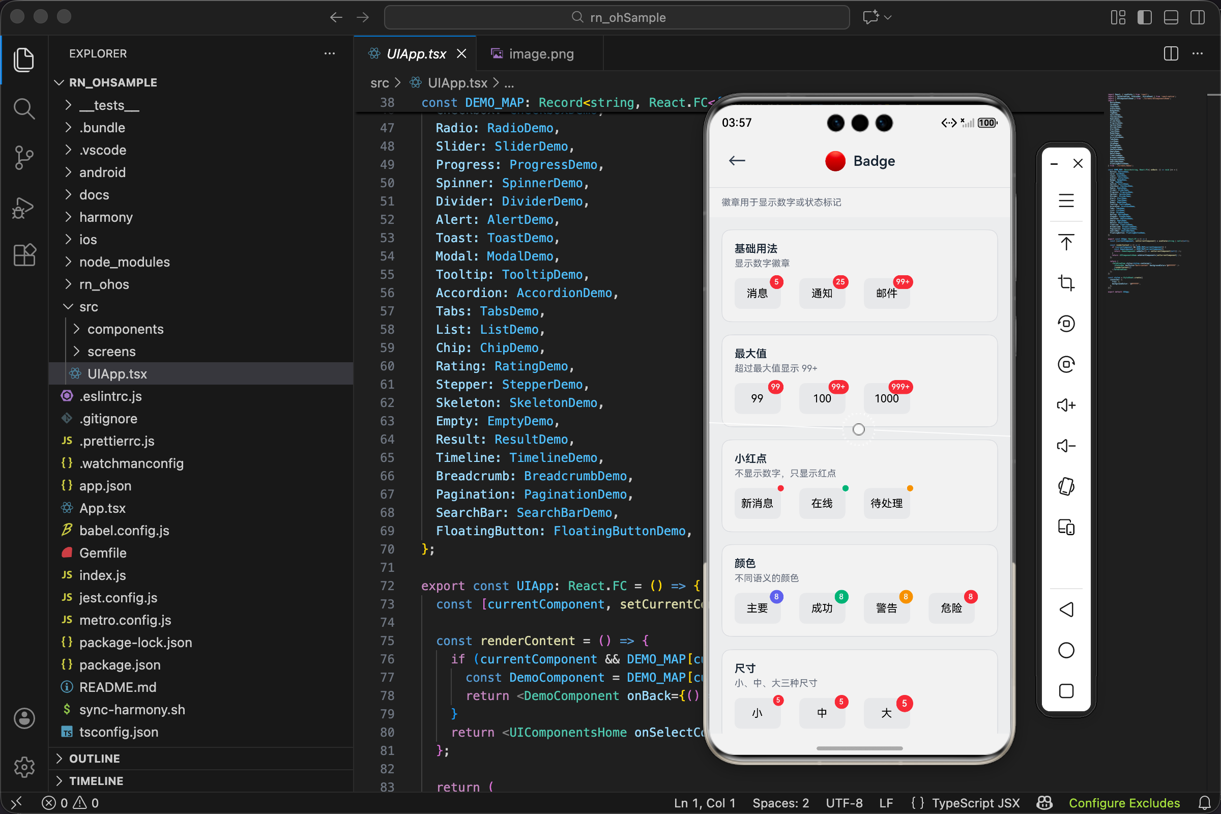
第一,显示数字。这是最基本的,消息数量、购物车商品数、未读通知数都要用。
第二,数字上限。没人想看到"你有 1234 条未读消息"这种数字,太长了也显示不下。一般超过 99 就显示 99+。
第三,小红点模式。有时候不需要具体数字,只要告诉用户"这里有新东西"就行。一个小红点足矣。
第四,颜色区分。红色表示紧急或数量,绿色表示在线状态,橙色表示警告。不同场景用不同颜色。
第五,独立使用。徽章不一定要贴在别的元素上,有时候就是单独显示一个带数字的小圆圈。
定义组件接口
想清楚需求后,接口就好定义了:
interface BadgeProps {
  count?: number;
  maxCount?: number;
  dot?: boolean;
  color?: ColorType;
  size?: SizeType;
  showZero?: boolean;
  children?: React.ReactNode;
  style?: ViewStyle;
}
说说几个关键的设计决策。
count 和 dot 是互斥的。传了 dot={true} 就只显示小红点,不管 count 是多少。这个优先级要在代码里处理好。
maxCount 默认是 99。为什么是 99 不是 100?因为两位数的宽度刚好,三位数就太宽了。99+ 这个显示方式也是业界通用的。
showZero 这个属性很有意思。默认情况下 count 为 0 时徽章不显示,但有些场景需要显示"0",比如购物车清空后显示"0"告诉用户购物车是空的。
children 决定了徽章是贴在别的元素上还是独立显示。有 children 就贴在它右上角,没有就独立显示。
尺寸配置这块有点讲究
const sizeMap: Record<SizeType, { height: number; minWidth: number; fontSize: number; dotSize: number }> = {
  sm: { height: 14, minWidth: 14, fontSize: 9, dotSize: 6 },
  md: { height: 18, minWidth: 18, fontSize: 10, dotSize: 8 },
  lg: { height: 22, minWidth: 22, fontSize: 12, dotSize: 10 },
};
为什么要同时定义 height 和 minWidth?
因为徽章的宽度是动态的。显示"5"的时候是个圆形,显示"99+"的时候要变成椭圆形。height 固定,minWidth 保证最小是个圆,内容多了自动变宽。
dotSize 单独定义是因为小红点和数字徽章的大小不一样。小红点就是个小圆点,不需要那么大。
字号的选择也是试出来的。14px 高的徽章配 9px 的字,刚好能看清又不会撑破。这种细节没有公式,就是反复调试。
显示逻辑的处理
这块代码不长但很关键:
const shouldShow = dot || (count !== undefined && (count > 0 || showZero));
const displayCount = count !== undefined && count > maxCount ? `${maxCount}+` : count;
shouldShow 决定徽章要不要显示。三种情况会显示:
- dot 模式,直接显示小红点
- count 大于 0
- count 等于 0 但 showZero 为 true
displayCount 处理数字上限。超过 maxCount 就显示"99+"这种格式。
这里有个细节,count !== undefined 这个判断很重要。因为 count 可能是 0,直接写 count && ... 会把 0 当成 false 处理,逻辑就错了。
徽章样式的实现
const badgeElement = shouldShow && (
  <View
    style={[
      styles.badge,
      dot
        ? { width: sizeMap[size].dotSize, height: sizeMap[size].dotSize, borderRadius: sizeMap[size].dotSize / 2 }
        : {
            height: sizeMap[size].height,
            minWidth: sizeMap[size].minWidth,
            borderRadius: sizeMap[size].height / 2,
            paddingHorizontal: 4,
          },
      { backgroundColor: colorValue },
      !children && styles.standalone,
    ]}
  >
    {!dot && <Text style={[styles.text, { fontSize: sizeMap[size].fontSize }]}>{displayCount}</Text>}
  </View>
);
dot 模式和数字模式的样式完全不同,所以用三元表达式分开处理。
小红点就是个固定大小的圆,宽高相等,borderRadius 是宽度的一半。
数字徽章复杂一些。高度固定,宽度用 minWidth 保证最小值,内容多了会自动撑开。paddingHorizontal: 4 让数字左右有点间距,不会贴着边。
borderRadius: sizeMap[size].height / 2 这个写法让徽章两端是半圆形。不管宽度多少,两头都是圆的,中间是直的,看起来像个胶囊。
定位是个技术活
徽章要贴在目标元素的右上角,这个定位怎么实现?
const styles = StyleSheet.create({
  container: { position: 'relative' },
  badge: {
    position: 'absolute',
    top: -4,
    right: -4,
    alignItems: 'center',
    justifyContent: 'center',
  },
  standalone: { position: 'relative', top: 0, right: 0 },
});
父容器设 position: 'relative',徽章设 position: 'absolute',然后用 top 和 right 定位。
为什么是 -4 不是 0?因为徽章要"骑"在目标元素的角上,有一部分在元素外面。-4 这个值是调出来的,让徽章刚好有一半在里面一半在外面。
standalone 样式是给独立徽章用的。独立徽章不需要绝对定位,把 position 改回 relative,top 和 right 归零。
完整的渲染逻辑
if (!shouldShow && !children) return null;

if (!children) return <View style={style}>{badgeElement}</View>;

return (
  <View style={[styles.container, style]}>
    {children}
    {badgeElement}
  </View>
);
三种情况:
-
既不需要显示徽章,也没有 children,直接返回 null,什么都不渲染。
-
没有 children,说明是独立徽章,直接渲染徽章元素。
-
有 children,把 children 和徽章都渲染出来,徽章会定位到 children 的右上角。
完整代码
import React from 'react';
import { View, Text, StyleSheet, ViewStyle } from 'react-native';
import { UITheme, ColorType, SizeType } from './theme';

interface BadgeProps {
  count?: number;
  maxCount?: number;
  dot?: boolean;
  color?: ColorType;
  size?: SizeType;
  showZero?: boolean;
  children?: React.ReactNode;
  style?: ViewStyle;
}

export const Badge: React.FC<BadgeProps> = ({
  count,
  maxCount = 99,
  dot = false,
  color = 'danger',
  size = 'md',
  showZero = false,
  children,
  style,
}) => {
  const colorValue = UITheme.colors[color];
  const sizeMap: Record<SizeType, { height: number; minWidth: number; fontSize: number; dotSize: number }> = {
    sm: { height: 14, minWidth: 14, fontSize: 9, dotSize: 6 },
    md: { height: 18, minWidth: 18, fontSize: 10, dotSize: 8 },
    lg: { height: 22, minWidth: 22, fontSize: 12, dotSize: 10 },
  };

  const shouldShow = dot || (count !== undefined && (count > 0 || showZero));
  const displayCount = count !== undefined && count > maxCount ? `${maxCount}+` : count;

  if (!shouldShow && !children) return null;

  const badgeElement = shouldShow && (
    <View
      style={[
        styles.badge,
        dot
          ? { width: sizeMap[size].dotSize, height: sizeMap[size].dotSize, borderRadius: sizeMap[size].dotSize / 2 }
          : {
              height: sizeMap[size].height,
              minWidth: sizeMap[size].minWidth,
              borderRadius: sizeMap[size].height / 2,
              paddingHorizontal: 4,
            },
        { backgroundColor: colorValue },
        !children && styles.standalone,
      ]}
    >
      {!dot && <Text style={[styles.text, { fontSize: sizeMap[size].fontSize }]}>{displayCount}</Text>}
    </View>
  );

  if (!children) return <View style={style}>{badgeElement}</View>;

  return (
    <View style={[styles.container, style]}>
      {children}
      {badgeElement}
    </View>
  );
};

const styles = StyleSheet.create({
  container: { position: 'relative' },
  badge: {
    position: 'absolute',
    top: -4,
    right: -4,
    alignItems: 'center',
    justifyContent: 'center',
  },
  standalone: { position: 'relative', top: 0, right: 0 },
  text: { color: UITheme.colors.white, fontWeight: '600' },
});
实际怎么用
消息列表的未读数
const MessageTab = ({ unreadCount }) => (
  <Badge count={unreadCount}>
    <Icon name="message" size={24} />
  </Badge>
);
最常见的用法,图标右上角显示未读数量。
购物车
const CartIcon = ({ itemCount }) => (
  <Badge count={itemCount} showZero>
    <Icon name="cart" size={24} />
  </Badge>
);
购物车用 showZero,清空后显示"0"而不是让徽章消失。这样用户知道购物车在哪,只是空了。
新功能提示
const NewFeatureButton = () => (
  <Badge dot color="danger">
    <Button title="发现" variant="ghost" />
  </Badge>
);
小红点模式,不显示数字,只是提示"这里有新东西"。
在线状态
const UserAvatar = ({ user }) => (
  <Badge dot color={user.online ? 'success' : 'gray'}>
    <Avatar source={{ uri: user.avatar }} />
  </Badge>
);
绿点表示在线,灰点表示离线。这种用法在即时通讯应用里很常见。
Tab 栏
const TabBar = ({ tabs, unreadCounts }) => (
  <View style={styles.tabBar}>
    {tabs.map((tab, index) => (
      <Badge key={tab.key} count={unreadCounts[tab.key]} size="sm">
        <TabItem icon={tab.icon} label={tab.label} />
      </Badge>
    ))}
  </View>
);
Tab 栏的图标上显示各自的未读数。用 sm 尺寸,因为 Tab 图标本身就不大。
踩过的坑
坑一:徽章被裁切
刚开始写的时候,徽章有一部分显示不出来。后来发现是父元素设了 overflow: 'hidden'。徽章用绝对定位跑到父元素外面去了,被裁掉了。
解决办法是给 Badge 组件外面再包一层,或者调整父元素的 overflow 属性。
坑二:数字闪烁
count 从 undefined 变成数字时,徽章会突然出现,看起来像闪了一下。
可以加个淡入动画:
const opacity = useRef(new Animated.Value(0)).current;

useEffect(() => {
  if (shouldShow) {
    Animated.timing(opacity, { toValue: 1, duration: 200, useNativeDriver: true }).start();
  }
}, [shouldShow]);
坑三:长数字撑破布局
虽然有 maxCount 限制,但如果有人传了个字符串进来(TypeScript 挡不住运行时),可能会出问题。
可以加个防御性代码:
const safeCount = typeof count === 'number' ? count : 0;
可以继续优化的地方
动画效果
数字变化时可以加个弹跳动画,从 5 变成 6 的时候徽章弹一下,更有活力。
自定义内容
现在只能显示数字,有时候可能想显示"新"、"热"这种文字。可以加个 text 属性支持自定义内容。
偏移量配置
现在徽章固定在右上角偏移 -4px 的位置。不同大小的目标元素可能需要不同的偏移量,可以加个 offset 属性让用户自己调。
interface BadgeProps {
  offset?: { top?: number; right?: number };
}
这些优化可以根据实际需求慢慢加,先把核心功能做稳定。
欢迎加入开源鸿蒙跨平台社区:https://openharmonycrossplatform.csdn.net

开源鸿蒙跨平台开发社区汇聚开发者与厂商,共建“一次开发,多端部署”的开源生态,致力于降低跨端开发门槛,推动万物智联创新。
更多推荐


 29
29 0
0- 0


 已为社区贡献30条内容

所有评论(0)