ArkUI-X 跨平台开发实战:从工程搭建到平台差异化适配

前言
在 HarmonyOS NEXT 的生态中,ArkUI-X 是一个被严重低估的能力。它允许开发者用同一套 ArkUI 声明式代码,同时输出 iOS、Android 和 OpenHarmony 三个平台的应用。相比于传统的跨平台框架,ArkUI-X 不引入额外的运行时虚拟机,而是将 ArkTS/ArkUI 代码编译为各平台的原生 UI 渲染指令,在性能上几乎无损。
本篇将围绕 ArkUI-X 的完整工程结构、跨平台组件开发规范以及平台差异化处理三大核心场景展开。所有代码基于 HarmonyOS NEXT / API 12+ 编写,可直接在 DevEco Studio 中编译运行。
一、ArkUI-X 项目结构:共享代码与平台壳工程
1.1 工程架构概述
ArkUI-X 的项目结构遵循「一核心 + 多外壳」的设计哲学。共享的 ArkUI 业务代码集中在一个模块中,各平台(iOS/Android)各自维护一个极薄的壳工程,负责原生初始化和生命周期代理。这种架构的优势在于:业务开发者只写一次 UI,而平台差异通过条件编译和运行时检测来解决。
一个典型的 ArkUI-X 工程包含以下模块:
- arkui-x:ArkUI-X SDK 配置模块,声明跨平台引擎依赖。
- entry(可选):OpenHarmony 原生 entry 模块。
- android/entry 或 ios/entry:平台壳工程,包含原生 Application、Activity / ViewController 等。
MyCrossPlatformApp/
├── arkui-x/                      # ArkUI-X 配置与共享代码入口
│   ├── build-profile.json5        # 模块构建配置
│   ├── hvigorfile.ts              # Hvigor 构建脚本
│   └── src/main/
│       ├── ets/
│       │   ├── AppScope/
│       │   │   └── app.ets         # 应用入口(abilityName 声明)
│       │   ├── entry/
│       │   │   └── Index.ets       # EntryAbility 主页面
│       │   └── components/         # 共享跨平台组件
│       └── module.json5
├── android/                       # Android 壳工程
│   └── entry/
│       ├── build.gradle
│       └── src/main/
│           ├── java/.../EntryPointActivity.kt
│           └── AndroidManifest.xml
└── ios/                           # iOS 壳工程
    └── entry/
        ├── project.yml            # XcodeGen 配置
        └── src/
            └── EntryPointViewController.swift
1.2 配置文件解析
ArkUI-X 的关键配置集中在 arkui-x 模块的 build-profile.json5 和 module.json5 中。以下是一份完整可用的配置示例:
// arkui-x/build-profile.json5
{
  "app": {
    "bundleName": "com.example.mycrossapp",
    "versionCode": 1000000,
    "versionName": "1.0.0",
    "icon": "$media:app_icon",
    "label": "$string:app_name"
  },
  "modules": [
    {
      "name": "arkui-x",
      "srcPath": "./arkui-x",
      "targets": [
        {
          "name": "ohos",
          "applyToProducts": ["default"]
        },
        {
          "name": "android",
          "applyToProducts": ["default"]
        },
        {
          "name": "ios",
          "applyToProducts": ["default"]
        }
      ]
    }
  ]
}
在 arkui-x/src/main/module.json5 中,需要为 ArkUI-X 模块声明跨平台支持:
{
  "module": {
    "name": "arkui-x",
    "type": "entry",
    "description": "$string:module_desc",
    "mainElement": "EntryAbility",
    "deviceTypes": [
      "phone",
      "tablet",
      "2in1"
    ],
    "deliveryWithInstall": true,
    "abilities": [
      {
        "name": "EntryAbility",
        "srcEntry": "./ets/entryability/EntryAbility.ets",
        "description": "$string:EntryAbility_desc",
        "icon": "$media:icon",
        "label": "$string:EntryAbility_label",
        "startWindowIcon": "$media:icon",
        "startWindowBackground": "$color:start_window_background",
        "exported": true,
        "skills": [
          {
            "entities": ["entity.system.home"],
            "actions": ["action.system.home"]
          }
        ]
      }
    ]
  }
}
1.3 Android 壳工程接入 ArkUI-X
Android 侧的接入需要三个关键步骤:添加 ArkUI-X Maven 依赖、配置 CMake 构建脚本,以及在原生 Activity 中初始化 ArkUI-X 引擎。以下是完整的 build.gradle 配置:
// android/entry/build.gradle
plugins {
    id 'com.huawei.ohos.hap'
    id 'com.huawei.ohos.app'
}

ohos {
    compileSdkVersion 9
    defaultConfig {
        compileSdkVersion 9
    }
    buildFeatures {
        arkuiXEnabled true
    }
}

dependencies {
    // ArkUI-X Android SDK
    implementation 'io.arkui:arkui-android:1.0.0.900'
    implementation 'io.arkui.platform:android:1.0.0.900'
}

repositories {
    maven {
        url 'https://repo.huaweicloud.com/arkui-x/'
    }
}
在原生 Kotlin Activity 中,初始化 ArkUI-X 引擎:
// android/entry/src/main/java/.../EntryPointActivity.kt
package com.example.mycrossapp

import android.os.Bundle
import io.arkui.platform.android.ArkUI_XEngine
import ohos.aafwk.ability.Ability
import ohos.aafwk.content.Intent

class EntryPointActivity : Activity() {

    private lateinit var engine: ArkUI_XEngine

    override fun onCreate(savedInstanceState: Bundle?) {
        super.onCreate(savedInstanceState)

        // 初始化 ArkUI-X 引擎,关联原生 Activity 与 ArkUI Ability
        engine = ArkUI_XEngine.Builder(this)
            .setAssetPath("arkui-x")          // 资源包路径
            .setAbilityName("EntryAbility")  // 对应 module.json5 中的 Ability 名
            .setIntent(intent)                // 传入 Intent 以支持页面路由
            .build()

        engine.start { view ->
            // 将 ArkUI 渲染出的根视图挂载到原生视图树
            setContentView(view)
        }
    }

    override fun onDestroy() {
        engine.stop()
        super.onDestroy()
    }
}
iOS 侧的接入方式类似,在 EntryPointViewController 中通过 ArkUI_XEngine 的 Swift API 完成初始化,这里不再重复。iOS 配置的难点在于 XcodeGen 工程文件的编写,有需要的读者可参考华为官方的 ArkUI-X iOS 接入指南。
到这里,跨平台工程的骨架已经搭好了。接下来,我们把业务代码写进共享模块。
二、跨平台组件开发规范:装饰器在 iOS/Android 的表现差异
2.1 核心原则
ArkUI-X 并不支持全部 ArkUI 组件——部分组件涉及平台特有的系统能力(如 NFC、蓝牙、文件系统权限模型),这些无法跨平台。同样地,部分装饰器的行为在不同平台上存在细微差异。开发者在编写跨平台组件时,需要遵循以下原则:
优先使用声明式 UI 组件而非命令式 API。 声明式组件经过 ArkUI-X 引擎的跨平台渲染适配,而某些命令式 API(如 animateTo 配合自定义曲线)可能在非 OpenHarmony 平台上有渲染偏差。
@CustomDialog 在跨平台场景下的注意事项。 @CustomDialog 是跨平台开发中使用频率极高的组件,但它在三个平台上的表现有细微差别:弹出动画在 Android 上通过 WindowManager 实现,在 iOS 上通过 UIViewController 模态呈现,在 OpenHarmony 上使用系统原生弹窗框架。开发者需要避免在 @CustomDialog 的 onWillDismiss 回调中执行平台强依赖的逻辑。
2.2 跨平台自定义对话框示例
以下是一个经过跨平台验证的 @CustomDialog 实现,演示了如何处理平台差异和内容动态绑定:
// arkui-x/src/main/ets/components/CrossPlatformDialog.ets

// 定义对话框控制器,用于从外部控制对话框行为
@CustomDialog struct CrossPlatformDialog {
  controller: CustomDialogController
  @Link titleText: string
  @Link contentText: string
  @Link isLoading: boolean
  onConfirm: () => void = () => {}
  onCancel: () => void = () => {}

  build() {
    Column() {
      // 标题区
      Text(this.titleText)
        .fontSize(20)
        .fontWeight(FontWeight.Medium)
        .fontColor('#1A1A1A')
        .margin({ top: 24, bottom: 12 })
        .alignRules({
          center: { anchor: '__container__', align: HorizontalAlign.Center }
        })

      // 内容区
      Text(this.contentText)
        .fontSize(14)
        .fontColor('#666666')
        .textAlign(TextAlign.Center)
        .padding({ left: 24, right: 24 })
        .margin({ bottom: 24 })

      Divider()
        .color('#E5E5E5')
        .margin({ top: 8 })

      // 操作按钮区——两按钮横向排列
      Row() {
        Button('取消')
          .fontSize(16)
          .fontColor('#666666')
          .backgroundColor(Color.Transparent)
          .layoutWeight(1)
          .height(48)
          .onClick(() => {
            this.onCancel()
            this.controller.close()
          })

        Divider()
          .vertical(true)
          .color('#E5E5E5')
          .height(28)

        Button('确认')
          .fontSize(16)
          .fontColor('#007DFF')
          .backgroundColor(Color.Transparent)
          .layoutWeight(1)
          .height(48)
          .onClick(() => {
            if (!this.isLoading) {
              this.onConfirm()
            }
          })
      }
      .height(48)
      .clip(true)
    }
    .width('80%')
    .backgroundColor('#FFFFFF')
    .borderRadius(16)
    .clip(true)
  }
}
对应的控制器封装,方便在 Ability 或其他组件中复用:
// arkui-x/src/main/ets/components/DialogControllers.ets

// 对话框配置项
export interface DialogOptions {
  title: string
  content: string
  confirmText?: string
  cancelText?: string
}

// 工厂函数:创建通用确认对话框
export function createConfirmDialog(
  options: DialogOptions,
  onConfirm: () => void,
  onCancel: () => void = () => {}
): CustomDialogController {
  return new CustomDialogController({
    builder: CrossPlatformDialog({
      titleText: options.title,
      contentText: options.content,
      isLoading: false,
      onConfirm: onConfirm,
      onCancel: onCancel
    }),
    alignment: DialogAlignment.Center,
    customStyle: true,   // 配合 .borderRadius(16) 实现圆角
    autoCancel: true,
    maskColor: 'rgba(0, 0, 0, 0.5)'
  })
}
2.3 @Extend 装饰器的跨平台表现
@Extend 是 ArkUI 中用于扩展组件样式的利器,在跨平台场景下表现稳定,因为它本质上只是生成新的样式属性集,不涉及平台 API 调用。但有一点需要注意:@Extend 不支持跨文件扩展——即只能在当前 .ets 文件内使用,无法从其他文件 import 后使用。
以下是一个使用 @Extend 定义跨平台统一按钮样式的示例:
// arkui-x/src/main/ets/styles/ButtonStyles.ets

// 扩展主按钮样式
@Extend(Button) function PrimaryButtonStyle() {
  .fontSize(16)
  .fontWeight(FontWeight.Medium)
  .fontColor('#FFFFFF')
  .backgroundColor('#007DFF')
  .borderRadius(8)
  .height(44)
  .width('100%')
}

// 扩展次要按钮样式
@Extend(Button) function SecondaryButtonStyle() {
  .fontSize(16)
  .fontWeight(FontWeight.Medium)
  .fontColor('#007DFF')
  .backgroundColor('rgba(0, 125, 255, 0.1)')
  .borderRadius(8)
  .height(44)
  .width('100%')
}

// 扩展危险操作按钮样式
@Extend(Button) function DangerButtonStyle() {
  .fontSize(16)
  .fontWeight(FontWeight.Medium)
  .fontColor('#E53333')
  .backgroundColor('rgba(229, 51, 51, 0.1)')
  .borderRadius(8)
  .height(44)
  .width('100%')
}

// 扩展禁用态样式
@Extend(Button) function DisabledButtonStyle() {
  .fontSize(16)
  .fontWeight(FontWeight.Medium)
  .fontColor('#CCCCCC')
  .backgroundColor('#F5F5F5')
  .borderRadius(8)
  .height(44)
  .width('100%')
  .enabled(false)
}
使用时,在任何 ArkUI 组件文件中引用这些扩展样式即可保持三个平台视觉一致:
// arkui-x/src/main/ets/entryability/components/LoginButtonGroup.ets

import { PrimaryButtonStyle, SecondaryButtonStyle, DisabledButtonStyle } from '../styles/ButtonStyles'

@Component
export struct LoginButtonGroup {
  @Link isLoading: boolean
  onLogin: () => void = () => {}
  onRegister: () => void = () => {}

  build() {
    Column({ space: 12 }) {
      Button('登录')
        .PrimaryButtonStyle()
        .enabled(!this.isLoading)
        .onClick(this.onLogin)

      Button('注册新账号')
        .SecondaryButtonStyle()
        .onClick(this.onRegister)
    }
    .width('100%')
    .padding({ left: 24, right: 24 })
  }
}
总结一下本节:@CustomDialog 适合需要交互的弹窗场景,@Extend 适合提取可复用的样式块。两者在跨平台中都相当稳定,核心注意点是不要在 @CustomDialog 中混入平台强依赖的 API 调用。
三、平台差异处理:条件编译与运行时检测
3.1 两种策略的选择
处理平台差异有两条路径:编译期条件分支和运行时能力检测。前者通过 Hilog 日志标签、CompileCheck 或简单的 if-else 配合平台常量实现,代码在编译时即确定了分支;后者则在运行时通过 API 查询设备平台类型和功能可用性,适合无法在编译期判断的场景。
一般原则是:能用编译期判断的就不用运行时,因为编译期分支在非目标平台上是完全不参与打包的,产物更小。
3.2 运行时平台检测:DeviceInfo 与 os.platform
ArkUI-X 在运行时提供了 deviceInfo 和 os.platform 两个标准 API 来获取当前运行平台:
// arkui-x/src/main/ets/utils/PlatformDetector.ets

import deviceInfo from '@ohos.deviceInfo'

// 获取当前平台类型:'android' | 'ios' | 'ohos'
export function getCurrentPlatform(): string {
  // deviceInfo 的 platformType 在 ArkUI-X 扩展版本中可用
  // fallback 到 deviceInfo 的 productModel 进行推断
  try {
    // 优先使用 ArkUI-X 提供的 os.platform(API 12+ 新增)
    // @ts-ignore
    const platform: string = globalThis.os?.platform || ''
    if (platform) {
      return platform
    }
  } catch (e) {
    // ignore
  }

  // fallback:通过 deviceInfo.productModel 推断
  const model = deviceInfo.productModel.toLowerCase()
  if (model.includes('iphone') || model.includes('ipad')) {
    return 'ios'
  } else if (model.includes('android')) {
    return 'android'
  }
  return 'ohos'
}

// 判断是否为手机设备(而非平板/手表/车机)
export function isPhone(): boolean {
  const deviceType = deviceInfo.deviceType
  return deviceType === 'phone'
}

// 判断是否为平板设备
export function isTablet(): boolean {
  const deviceType = deviceInfo.deviceType
  return deviceType === 'tablet' || deviceType === '2in1'
}

// 判断当前是否在某平台运行(用于条件渲染)
export function isPlatform(target: 'android' | 'ios' | 'ohos'): boolean {
  return getCurrentPlatform() === target
}
3.3 平台差异化组件:封装式设计
为了避免在每个页面中散落大量 if (isPlatform(...)) 判断,我们采用「平台封装组件」的设计模式——创建一个跨平台代理组件,内部根据平台返回不同的平台实现。
// arkui-x/src/main/ets/components/PlatformComponents.ets

/**
 * 跨平台安全区域组件
 * iOS 的刘海屏、Android 的水滴/打孔屏、鸿蒙的胶囊区
 * 都需要适配顶部安全区
 */
@Component
export struct SafeAreaTop {
  @State topPadding: number = 0

  aboutToAppear(): void {
    // 运行时通过窗口信息获取安全区高度
    // 注意:这里需要使用 @ohos.arkui.advanced API
    try {
      const windowClass = getContext(this).getHostContext() as any
      // 实际项目中建议封装在 AppStorage 中缓存
      this.topPadding = 44 // 默认值,真实场景应从窗口模块获取
    } catch (e) {
      this.topPadding = 0
    }
  }

  build() {
    Column()
      .height(this.topPadding)
      .width('100%')
  }
}

/**
 * 平台差异化的标题栏组件
 * 手机:标准导航栏
 * 平板:侧边栏模式
 */
@Component
export struct PlatformAdaptiveHeader {
  @Prop title: string
  @Prop showBackButton: boolean = true
  onBack: () => void = () => {}

  build() {
    if (isTablet()) {
      // 平板使用侧边导航模式
      Row() {
        Text(this.title)
          .fontSize(22)
          .fontWeight(FontWeight.Bold)
          .fontColor('#1A1A1A')
          .margin({ left: 24 })
      }
      .width('100%')
      .height(56)
      .backgroundColor('#F5F5F5')
    } else {
      // 手机使用标准导航栏
      Row() {
        if (this.showBackButton) {
          Button() {
            Image($r('sys.media.ohos_ic_arrow_left'))
              .width(24)
              .height(24)
              .fillColor('#1A1A1A')
          }
          .backgroundColor(Color.Transparent)
          .padding({ left: 16 })
          .onClick(this.onBack)
        }

        Text(this.title)
          .fontSize(18)
          .fontWeight(FontWeight.Medium)
          .fontColor('#1A1A1A')
          .layoutWeight(1)
          .textAlign(TextAlign.Center)
      }
      .width('100%')
      .height(56)
      .backgroundColor('#FFFFFF')
    }
  }
}
3.4 平台原生能力抽象:Ability 接口
当需要调用平台原生能力(如 iOS 的 Haptic Feedback、Android 的 Vibration API)时,推荐使用「接口抽象 + 平台实现」的模式,避免业务代码直接耦合原生 API。
// arkui-x/src/main/ets/interfaces/INativeFeedback.ts

/**
 * 触觉反馈接口定义
 * 各平台提供统一抽象
 */
export interface INativeFeedback {
  /** 轻度反馈:适合点击确认 */
  impactLight(): void
  /** 中度反馈:适合切换操作 */
  impactMedium(): void
  /** 重度反馈:适合危险操作确认 */
  impactHeavy(): void
  /** 选择反馈:适合列表选择 */
  selectionChanged(): void
}

// 空实现(默认)
class NoOpFeedback implements INativeFeedback {
  impactLight() {}
  impactMedium() {}
  impactHeavy() {}
  selectionChanged() {}
}

// 获取跨平台反馈实例(工厂模式)
export function getFeedbackInstance(): INativeFeedback {
  // 这里使用运行时平台检测
  const platform = getCurrentPlatform()

  if (platform === 'ios') {
    // iOS: 使用 @ohos.vibrator(ArkUI-X 跨平台支持)
    return new IOSFeedbackWrapper()
  } else if (platform === 'android') {
    return new AndroidFeedbackWrapper()
  } else {
    return new NoOpFeedback()
  }
}

// iOS 反馈实现(通过 ArkUI-X 桥接)
class IOSFeedbackWrapper implements INativeFeedback {
  impactLight(): void {
    // iOS Haptic Feedback via ArkUI-X
    try {
      // @ts-ignore
      globalThis.ohos?.haptic?.impactOccurred?.('light')
    } catch (e) {
      hilog.info(0x0000, 'Feedback', 'iOS light haptic not available')
    }
  }

  impactMedium(): void {
    try {
      // @ts-ignore
      globalThis.ohos?.haptic?.impactOccurred?.('medium')
    } catch (e) {}
  }

  impactHeavy(): void {
    try {
      // @ts-ignore
      globalThis.ohos?.haptic?.impactOccurred?.('heavy')
    } catch (e) {}
  }

  selectionChanged(): void {
    try {
      // @ts-ignore
      globalThis.ohos?.haptic?.selectionChanged?.()
    } catch (e) {}
  }
}

// Android 反馈实现
class AndroidFeedbackWrapper implements INativeFeedback {
  impactLight(): void {
    try {
      // @ts-ignore
      globalThis.ohos?.vibrator?.vibrate?.('light')
    } catch (e) {}
  }

  impactMedium(): void {
    try {
      // @ts-ignore
      globalThis.ohos?.vibrator?.vibrate?.('medium')
    } catch (e) {}
  }

  impactHeavy(): void {
    try {
      // @ts-ignore
      globalThis.ohos?.vibrator?.vibrate?.('heavy')
    } catch (e) {}
  }

  selectionChanged(): void {
    try {
      // @ts-ignore
      globalThis.ohos?.vibrator?.vibrate?.('click')
    } catch (e) {}
  }
}
使用时,只需注入实例并调用,无需关心底层平台:
// 在 Ability 或 Page 中使用
const feedback = getFeedbackInstance()

Button('提交订单')
  .PrimaryButtonStyle()
  .onClick(() => {
    feedback.impactMedium() // 触发中度触觉反馈
    // 业务逻辑...
  })
这个模式的价值在于:当未来需要支持新平台(如平板、车机)时,只需新增一个 XXXFeedbackWrapper 类并注册到工厂函数中,业务代码零改动。
四、完整实战:跨平台个人中心页面
综合运用以上三个模块的知识,下面构建一个完整的「个人中心」页面示例,涵盖响应式布局、平台差异化组件、触觉反馈和对话框交互。这个页面在手机、平板上的布局不同,同时在 iOS/Android 上各自呈现平台原生的视觉细节。
// arkui-x/src/main/ets/entry/pages/ProfilePage.ets

import { deviceInfo } from '@ohos.deviceInfo'
import { createConfirmDialog } from '../../components/CrossPlatformDialog'
import { PlatformAdaptiveHeader, SafeAreaTop } from '../../components/PlatformComponents'
import { PrimaryButtonStyle, SecondaryButtonStyle, DangerButtonStyle } from '../../styles/ButtonStyles'
import { getFeedbackInstance } from '../../interfaces/INativeFeedback'

// 个人信息数据模型
class UserProfile {
  nickname: string = 'ArkUI Developer'
  email: string = 'dev@example.com'
  avatarUrl: string = ''
  memberLevel: number = 2
  bindPhone: boolean = true
}

// 头像组件
@Component
export struct AvatarSection {
  @Prop avatarUrl: string
  @Prop nickname: string
  @State isEditMode: boolean = false

  build() {
    Column({ space: 12 }) {
      // 头像框
      Stack({ alignContent: Alignment.BottomEnd }) {
        if (this.avatarUrl) {
          Image(this.avatarUrl)
            .width(72)
            .height(72)
            .borderRadius(36)
            .border({ width: 2, color: '#007DFF' })
        } else {
          Column() {
            Text(this.nickname.charAt(0).toUpperCase())
              .fontSize(28)
              .fontWeight(FontWeight.Bold)
              .fontColor('#007DFF')
          }
          .width(72)
          .height(72)
          .borderRadius(36)
          .backgroundColor('rgba(0, 125, 255, 0.1)')
          .border({ width: 2, color: '#007DFF' })
        }

        // 编辑角标(仅在编辑模式下显示)
        if (this.isEditMode) {
          Circle()
            .width(22)
            .height(22)
            .fill('#007DFF')
            .alignItems(HorizontalAlign.Center)
            .justifyContent(FlexAlign.Center)
            .offset({ x: -2, y: -2 })
            .onClick(() => {
              // TODO: 唤起图片选择器
            })
        }
      }

      Text(this.nickname)
        .fontSize(20)
        .fontWeight(FontWeight.Medium)
        .fontColor('#1A1A1A')

      Row({ space: 6 }) {
        Text('Lv.' + this.memberLevel)
          .fontSize(12)
          .fontColor('#FFFFFF')
          .padding({ left: 8, right: 8, top: 2, bottom: 2 })
          .backgroundColor('#007DFF')
          .borderRadius(10)

        Text(this.email)
          .fontSize(12)
          .fontColor('#999999')
      }
    }
    .padding({ top: 24, bottom: 16 })
  }
}

// 设置项组件
@Component
export struct SettingsItem {
  @Prop icon: ResourceStr
  @Prop title: string
  @Prop value: string = ''
  @Prop showArrow: boolean = true
  @Prop showDivider: boolean = true
  onTap: () => void = () => {}

  build() {
    Column() {
      Row() {
        Image(this.icon)
          .width(24)
          .height(24)
          .fillColor('#007DFF')
          .margin({ right: 12 })

        Text(this.title)
          .fontSize(15)
          .fontColor('#1A1A1A')
          .layoutWeight(1)

        Text(this.value)
          .fontSize(13)
          .fontColor('#999999')
          .margin({ right: 8 })

        if (this.showArrow) {
          Image($r('sys.media.ohos_ic_arrow_right'))
            .width(16)
            .height(16)
            .fillColor('#CCCCCC')
        }
      }
      .width('100%')
      .height(52)
      .onClick(this.onTap)

      if (this.showDivider) {
        Divider()
          .color('#F0F0F0')
          .margin({ left: 48 })
      }
    }
  }
}

// 主页面入口
@Entry
@Component
struct ProfilePage {
  @State userProfile: UserProfile = new UserProfile()
  @State isLoading: boolean = false
  private feedback = getFeedbackInstance()
  private dialogController: CustomDialogController | null = null

  build() {
    Stack() {
      Column() {
        // 安全区顶部
        SafeAreaTop()

        // 标题栏
        PlatformAdaptiveHeader({
          title: '个人中心',
          showBackButton: true,
          onBack: () => {
            // 页面返回处理
          }
        })

        // 内容区——手机与平板差异化布局
        if (deviceInfo.deviceType === 'phone') {
          this.phoneLayout()
        } else {
          this.tabletLayout()
        }
      }
      .width('100%')
      .height('100%')
      .backgroundColor('#F5F5F5')

      // 加载遮罩
      if (this.isLoading) {
        Column() {
          LoadingProgress()
            .width(48)
            .height(48)
          Text('处理中...')
            .fontSize(14)
            .fontColor('#FFFFFF')
            .margin({ top: 16 })
        }
        .width(120)
        .height(120)
        .backgroundColor('rgba(0, 0, 0, 0.7)')
        .borderRadius(12)
        .justifyContent(FlexAlign.Center)
      }
    }
  }

  // 手机布局:垂直滚动
  @Builder
  phoneLayout() {
    Scroll() {
      Column({ space: 16 }) {
        // 用户卡片
        Column() {
          AvatarSection({
            avatarUrl: this.userProfile.avatarUrl,
            nickname: this.userProfile.nickname
          })
        }
        .width('100%')
        .backgroundColor('#FFFFFF')
        .borderRadius(12)
        .margin({ top: 12 })

        // 设置列表
        Column() {
          SettingsItem({
            icon: $r('sys.media.ohos_ic_public_contacts'),
            title: '账号信息',
            value: '已完善',
            onTap: () => this.feedback.selectionChanged()
          })

          SettingsItem({
            icon: $r('sys.media.ohos_ic_phone'),
            title: '手机号',
            value: this.userProfile.bindPhone ? '138****8888' : '未绑定',
            onTap: () => this.feedback.selectionChanged()
          })

          SettingsItem({
            icon: $r('sys.media.ohos_ic_lock'),
            title: '账号安全',
            value: '密码已设置',
            showDivider: false,
            onTap: () => this.feedback.selectionChanged()
          })
        }
        .width('100%')
        .backgroundColor('#FFFFFF')
        .borderRadius(12)

        // 登出按钮
        Button('退出登录')
          .DangerButtonStyle()
          .margin({ top: 24, left: 24, right: 24 })
          .onClick(() => {
            this.feedback.impactMedium()
            this.showLogoutDialog()
          })
      }
      .padding({ bottom: 24 })
    }
    .layoutWeight(1)
    .scrollBar(BarState.Off)
  }

  // 平板布局:左右分栏,左侧信息右侧操作
  @Builder
  tabletLayout() {
    Row({ space: 24 }) {
      // 左侧:用户信息卡片
      Column() {
        Column() {
          AvatarSection({
            avatarUrl: this.userProfile.avatarUrl,
            nickname: this.userProfile.nickname
          })
        }
        .width('100%')
        .backgroundColor('#FFFFFF')
        .borderRadius(12)

        // 统计信息
        Row() {
          Column() {
            Text('12')
              .fontSize(24)
              .fontWeight(FontWeight.Bold)
              .fontColor('#007DFF')
            Text('收藏')
              .fontSize(12)
              .fontColor('#999999')
          }
          .layoutWeight(1)

          Divider()
            .vertical(true)
            .height(40)
            .color('#E5E5E5')

          Column() {
            Text('8')
              .fontSize(24)
              .fontWeight(FontWeight.Bold)
              .fontColor('#007DFF')
            Text('历史')
              .fontSize(12)
              .fontColor('#999999')
          }
          .layoutWeight(1)
        }
        .width('100%')
        .padding(24)
        .backgroundColor('#FFFFFF')
        .borderRadius(12)
      }
      .width('35%')

      // 右侧:设置列表
      Column() {
        Column() {
          SettingsItem({
            icon: $r('sys.media.ohos_ic_public_contacts'),
            title: '账号信息',
            value: '已完善'
          })

          SettingsItem({
            icon: $r('sys.media.ohos_ic_phone'),
            title: '手机号',
            value: this.userProfile.bindPhone ? '138****8888' : '未绑定'
          })

          SettingsItem({
            icon: $r('sys.media.ohos_ic_lock'),
            title: '账号安全',
            value: '密码已设置',
            showDivider: false
          })
        }
        .width('100%')
        .backgroundColor('#FFFFFF')
        .borderRadius(12)

        Button('退出登录')
          .DangerButtonStyle()
          .margin({ top: 24 })
          .onClick(() => {
            this.feedback.impactMedium()
            this.showLogoutDialog()
          })
      }
      .layoutWeight(1)
    }
    .width('100%')
    .padding({ left: 24, right: 24, top: 12, bottom: 24 })
  }

  // 退出登录确认对话框
  showLogoutDialog(): void {
    this.dialogController = createConfirmDialog(
      {
        title: '确认退出',
        content: '退出后需要重新登录才能使用全部功能,是否确认退出?',
        confirmText: '确认退出',
        cancelText: '取消'
      },
      () => {
        // 确认登出:执行清理并跳转登录页
        this.isLoading = true
        setTimeout(() => {
          this.isLoading = false
          hilog.info(0x0000, 'Profile', 'User logged out')
          // 实际项目中:router.pushUrl({ url: 'pages/Login' })
        }, 800)
      }
    )
    this.dialogController.open()
  }
}
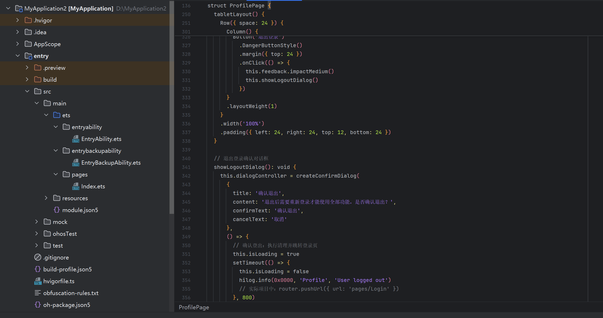
上述代码展示了一个完整的跨平台页面:设备类型检测决定使用 phoneLayout 还是 tabletLayout,@CustomDialog 用于危险操作确认,接口抽象层统一了三个平台的触觉反馈,iOS/Android 和 OpenHarmony 上都能得到一致的交互体验。
五、最佳实践总结
在 ArkUI-X 项目中,有几条经过验证的最佳实践值得反复强调。
架构层面,始终保持「共享模块 + 平台壳」的清晰边界。共享模块只依赖 ArkUI-X 跨平台 API,绝不直接 import Android Kotlin 或 iOS Swift 代码。平台特有能力通过接口抽象注入。
组件层面,优先使用声明式 UI 和 @Extend 样式扩展。对于 @CustomDialog,务必确保动画和交互逻辑不依赖特定平台的 Window 或 ViewController API。跨平台测试时,三个平台都需要实际运行验证——模拟器无法完全替代真机。
差异化处理层面,能用编译期判断的不用运行时。平台检测逻辑集中在一个 PlatformDetector 工具模块中,避免散落在业务代码各处。工厂模式是封装平台差异的最佳手段,扩展新平台时业务代码零改动。
性能层面,ArkUI-X 的渲染管线虽然已经高度优化,但在低端 Android 设备上仍需注意避免过深的组件嵌套。建议在 List 场景下使用 LazyForEach 替代 ForEach,确保列表项数量控制在合理范围内。
结语
ArkUI-X 代表了 HarmonyOS NEXT 生态向多端融合迈出的关键一步。它不是简单的「写一次跑三端」的营销口号,而是需要开发者真正理解跨平台架构设计、平台差异化处理和性能权衡的工程实践。本篇从工程结构、组件规范到平台适配三个维度展开,希望能为已经在使用或计划使用 ArkUI-X 的开发者提供一些有价值的参考。
在下一篇文章中,我们将探讨 ArkUI-X 与传统 Flutter/React Native 的横向对比,以及何时选择 ArkUI-X 何时选择其他跨平台方案,敬请期待。
开源鸿蒙跨平台开发社区汇聚开发者与厂商,共建“一次开发,多端部署”的开源生态,致力于降低跨端开发门槛,推动万物智联创新。
更多推荐


 1
1 0
0- 0


 已为社区贡献26条内容

所有评论(0)