React Native鸿蒙跨平台在移动端长列表数据展示场景中,固定表头表格是提升数据可读性的核心组件形态
在数据密集型应用中,固定表头表格是一种常见的 UI 模式,它允许用户在滚动浏览数据时始终保持表头可见,提高了数据浏览的效率。该 React Native 固定表头表格组件不仅实现了这一核心功能,还提供了排序、筛选等增强功能,展现了跨端开发中的设计思路和技术实现。
模块化
该表格组件采用了清晰的分层设计:
FixedHeaderTable作为核心表格组件,负责数据渲染、表头固定和排序功能FixedHeaderTableApp作为演示应用,负责状态管理、数据处理和用户交互
这种分离使得核心表格组件可以在不同场景中复用,符合 React 组件设计的最佳实践。在跨端开发中,这种模块化设计同样便于在 HarmonyOS ArkUI 中进行适配和扩展。
类型
组件使用 TypeScript 定义了完整的类型系统:
TableData类型定义了表格数据的结构,包含 id、name、category、price、quantity、status、date 等字段SortDirection类型定义了排序方向,支持 asc、desc、none 三种状态HeaderConfig类型定义了表头配置,包含 key、label、sortable 等属性
强类型设计在跨端开发中具有显著优势:
- 编译阶段捕获类型错误,减少运行时异常
- 提供清晰的接口定义,便于团队协作
- 支持 IDE 智能提示,提高开发效率
- 确保数据结构在 React Native 和 HarmonyOS ArkUI 平台上的一致性
固定表头的实现
固定表头的实现是该组件的核心技术点,通过以下方式实现:
- 将表头和数据行分离为两个独立的视图
- 表头使用普通
View渲染,保持固定位置 - 数据行使用
FlatList渲染,支持垂直滚动 - 确保表头和数据行的列宽一致,保持视觉对齐
这种实现方式在 React Native 中非常常见,需要适配到 HarmonyOS 的布局系统。
表格排序功能
表格支持基于表头的排序功能:
- 点击表头触发排序
- 支持升序、降序和无排序三种状态
- 显示排序图标,提供视觉反馈
排序逻辑通过 onSort 回调函数实现,由父组件处理具体的排序算法,这种设计使得排序逻辑与表格渲染分离,提高了组件的灵活性。
处理长列表的推荐方案
组件使用 FlatList 实现数据行的渲染,这是 React Native 中处理长列表的推荐方案:
- 支持虚拟列表,只渲染可见区域的行
- 优化内存使用,避免一次性加载所有数据
- 提供流畅的滚动体验
在处理大量数据时,这种性能优化尤为重要,需要在 HarmonyOS ArkUI 中保持类似的实现。
状态管理
组件使用 useState Hook 管理多个状态:
tableData:表格数据sortKey:当前排序的字段sortDirection:当前排序方向filterStatus:状态筛选showHeaders:表头显示控制
这种状态管理方式在 React Native 中非常常见,需要适配到 HarmonyOS 的 @State 装饰器。
将该表格组件适配到 HarmonyOS ArkUI 需要考虑以下几个关键方面:
组件映射与 API 替换
-
基础组件映射:
View→ViewText→TextFlatList→ListTouchableOpacity→Button或GestureScrollView→Scroll
-
API 替换:
Dimensions.get('window')→window.getWindowPropertiesAlert.alert→dialog.showAlertDialog
-
样式适配:
StyleSheet→@Styles装饰器- 调整样式属性名称(如
backgroundColor→background-color) - 确保 Flexbox 布局在两个平台的一致性
固定表头的跨端实现
固定表头是跨端适配的一个重点,需要确保在 HarmonyOS ArkUI 中实现类似的效果:
-
布局结构:
- React Native:使用绝对定位或嵌套
View实现固定表头 - HarmonyOS:使用
Stack组件或类似布局实现固定表头
- React Native:使用绝对定位或嵌套
-
滚动处理:
- React Native:
FlatList自带滚动功能 - HarmonyOS:
List组件同样支持滚动,需要确保与固定表头的交互一致
- React Native:
-
列宽对齐:
- 确保表头和数据行的列宽计算逻辑一致
- 处理不同屏幕尺寸的响应式布局
排序功能
排序功能的核心逻辑可以直接复用,需要适配的是 UI 表现:
-
点击交互:
- React Native:
TouchableOpacity的onPress事件 - HarmonyOS:
Button的onClick事件
- React Native:
-
排序图标:
- 确保排序图标的显示逻辑一致
- 调整图标的样式和位置
-
状态管理:
- 将 React Native 的
useState转换为 HarmonyOS 的@State - 保持排序状态的更新逻辑一致
- 将 React Native 的
表格组件的性能在跨端开发中需要特别关注:
-
列表渲染:
- React Native 的
FlatList对应 ArkUI 的List组件,都支持虚拟列表 - 确保两者的性能表现一致,特别是在处理大量数据时
- React Native 的
-
样式计算:
- 避免在渲染过程中进行复杂的样式计算
- 使用样式缓存,减少运行时计算
-
布局优化:
- 确保 Flexbox 布局在两个平台上的行为一致
- 避免使用平台特定的布局特性
该 React Native 固定表头表格组件展示了如何实现一个功能丰富、性能优化的表格组件,包括固定表头、排序、筛选等核心功能。通过本文分析的适配策略,可以顺利将其迁移到 HarmonyOS ArkUI 平台,保持核心功能不变。
在移动端长列表数据展示场景中,固定表头表格是提升数据可读性的核心组件形态,尤其在电商、库存、订单管理等业务场景下,滚动时表头保持可见能够显著降低用户的认知成本。本文以 React Native 开发的固定表头表格组件为核心样本,深度拆解其固定表头实现、排序/过滤交互、性能优化等核心技术点,并系统阐述向鸿蒙(HarmonyOS)ArkTS 跨端迁移的完整技术路径,聚焦“固定布局跨端等价实现、排序过滤逻辑复用、列表渲染性能对齐”三大核心维度,为跨端固定表头表格组件开发提供可落地的技术参考。
1. 强类型
该组件构建了精细化的 TypeScript 类型体系,不仅覆盖业务数据,还对表头配置、排序方向等交互相关属性进行强类型约束,为跨端开发奠定了“语义无歧义”的基础:
// 核心业务数据类型,扩展日期字段满足时间维度展示需求
type TableData = {
  id: string;
  name: string;
  category: string;
  price: number;
  quantity: number;
  status: 'active' | 'inactive' | 'pending';
  date: string; // 新增日期字段,支持时间维度排序
};

// 排序方向枚举,限定排序状态仅为升序/降序/无排序
type SortDirection = 'asc' | 'desc' | 'none';

// 表头配置类型,实现表头的结构化定义
type HeaderConfig = {
  key: keyof TableData;       // 关联业务数据字段,保证语义一致
  label: string;              // 表头显示文本
  sortable: boolean;          // 是否支持排序,控制交互能力
};
这种类型设计遵循“数据-配置-交互”分层原则:TableData 承载核心业务数据,HeaderConfig 定义表头展示与交互规则,SortDirection 约束排序状态,三者分离既保证了组件的灵活性,也为鸿蒙端的类型映射提供了 1:1 的参考依据。
2. 固定表头实现
固定表头是该组件的核心特性,其实现逻辑兼顾了布局稳定性与滚动体验:
- 布局分层设计:将表头与数据行拆分为两个独立的 View 层级,表头通过
position: 'absolute'+zIndex: 1固定在容器顶部,数据行通过FlatList实现滚动,保证滚动时表头始终可见; - 列宽比例对齐:表头列与数据列通过
flex属性统一列宽比例(如名称列flex: 2,其他列flex: 1),避免表头与数据列错位; - 边界样式统一:表头与数据行使用相同的边框样式(
borderBottomWidth: 1+borderBottomColor: '#e2e8f0'),保证视觉一致性; - 容器溢出控制:通过
overflow: 'hidden'控制表格容器的溢出行为,避免表头超出容器边界。
这种实现方式避开了 React Native 原生滚动组件的局限性,无需依赖第三方库即可实现固定表头效果,同时保证了跨端适配的可行性。
3. 排序与过滤
组件构建了完整的排序/过滤交互体系,兼顾功能完整性与性能优化:
- 排序逻辑分层处理:
- 状态管理:通过
sortKey(排序字段)和sortDirection(排序方向)两个状态变量控制排序状态; - 交互控制:
handleSort方法实现排序状态的切换逻辑(点击已排序字段切换方向,点击新字段重置为升序); - 数据处理:基于原始数据创建新数组进行排序(
[...filteredData]),避免修改原始数据,保证数据不可变; - 类型安全:排序时通过
keyof TableData约束排序字段,避免非法字段排序导致的运行时错误。
- 状态管理:通过
- 过滤逻辑轻量化实现:
- 状态驱动:通过
filterStatus状态控制过滤条件; - 数据过滤:使用
Array.filter实现状态过滤,仅保留符合条件的数据; - 执行顺序:先过滤后排序,减少排序的数据量,提升性能。
- 状态驱动:通过
- 视觉反馈优化:
- 排序指示器:通过
↑/↓/↕符号直观展示排序状态; - 过滤选中态:通过
filterButtonActive样式类提供清晰的选中反馈; - 状态颜色编码:
getStatusColor方法为不同业务状态映射标准化色值,提升状态识别效率。
- 排序指示器:通过
4. 列表渲染
React Native 中长列表渲染的性能问题是表格组件开发的关键挑战,该组件通过 FlatList 实现了高性能渲染:
- 虚拟列表复用:
FlatList自带的单元格复用机制,仅渲染可视区域内的表格行,避免大量数据渲染时的内存溢出; - 唯一标识优化:
keyExtractor={item => item.id}保证列表项的唯一标识,避免重渲染时的性能损耗; - 滚动指示器控制:
showsVerticalScrollIndicator={false}关闭垂直滚动指示器,提升视觉体验; - 数据不可变优化:排序/过滤时基于原始数据创建新数组,保证
FlatList的数据引用变更触发高效重渲染。
5. 动态数据操作
组件支持动态添加数据的功能,展示了 React Native 状态管理的最佳实践:
- 不可变数据更新:
addNewItem方法通过[...tableData, newItem]创建新数组更新状态,而非直接修改原数组; - 唯一 ID 生成:基于现有数据长度生成新 ID(
${tableData.length + 1}),保证 ID 唯一性; - 用户反馈:通过
Alert.alert提供操作成功反馈,提升交互体验; - 类型安全:新数据严格遵循
TableData类型定义,避免数据格式错误。
React Native 与鸿蒙 ArkTS 虽基于不同的渲染引擎,但固定表头表格组件的核心逻辑具备高度的适配性,跨端迁移的核心是“布局等价转换、逻辑完全复用、性能对齐优化”。
1. 类型
鸿蒙端可直接复用 React Native 端的类型定义,仅需调整 TypeScript 语法细节,核心语义完全一致:
// 鸿蒙 ArkTS 端类型定义(与 RN 端语义完全一致)
interface TableData {
  id: string;
  name: string;
  category: string;
  price: number;
  quantity: number;
  status: 'active' | 'inactive' | 'pending';
  date: string;
}

// 排序方向类型约束
type SortDirection = 'asc' | 'desc' | 'none';

// 表头配置类型
interface HeaderConfig {
  key: keyof TableData;
  label: string;
  sortable: boolean;
}

@Entry
@Component
struct FixedHeaderTableApp {
  // React Native useState → 鸿蒙 @State 等价转换
  @State tableData: TableData[] = [/* 与 RN 端一致 */];
  @State sortKey: keyof TableData | null = null;
  @State sortDirection: SortDirection = 'none';
  @State filterStatus: 'all' | 'active' | 'inactive' | 'pending' = 'all';
  @State showHeaders: boolean = true;

  // 表头配置完全复用 RN 端
  private headers: HeaderConfig[] = [
    { key: 'name', label: '产品名称', sortable: true },
    { key: 'category', label: '类别', sortable: true },
    { key: 'price', label: '价格', sortable: true },
    { key: 'quantity', label: '数量', sortable: true },
    { key: 'status', label: '状态', sortable: true },
    { key: 'date', label: '日期', sortable: true },
  ];
}
核心的排序/过滤逻辑可完全复用 React Native 端代码,仅需将 setState 替换为鸿蒙的状态赋值,例如:
// 排序处理逻辑完全复用,仅调整状态更新方式
handleSort(key: keyof TableData) {
  if (this.sortKey === key) {
    if (this.sortDirection === 'asc') {
      this.sortDirection = 'desc';
    } else if (this.sortDirection === 'desc') {
      this.sortDirection = 'none';
      this.sortKey = null;
    } else {
      this.sortDirection = 'asc';
    }
  } else {
    this.sortKey = key;
    this.sortDirection = 'asc';
  }
}

// 过滤与排序数据逻辑完全复用
get sortedData(): TableData[] {
  // 过滤逻辑
  const filteredData = this.tableData.filter(item =>
    this.filterStatus === 'all' || item.status === this.filterStatus
  );

  // 排序逻辑
  const result = [...filteredData];
  if (this.sortKey && this.sortDirection !== 'none') {
    result.sort((a, b) => {
      if (a[this.sortKey!] < b[this.sortKey!]) {
        return this.sortDirection === 'asc' ? -1 : 1;
      }
      if (a[this.sortKey!] > b[this.sortKey!]) {
        return this.sortDirection === 'asc' ? 1 : -1;
      }
      return 0;
    });
  }
  return result;
}
2. 固定表头布局
鸿蒙端的固定表头实现需适配 ArkTS 的布局体系,核心思路是“表头绝对定位 + 列表内边距补偿”,保证表头与数据列的对齐:
// 鸿蒙 ArkTS 端 FixedHeaderTable 组件核心实现
@Component
struct FixedHeaderTable {
  private data: TableData[];
  private headers: HeaderConfig[];
  private onSort?: (key: keyof TableData) => void;
  private sortKey: keyof TableData | null;
  private sortDirection: SortDirection;

  build() {
    Column()
      .backgroundColor('#ffffff')
      .borderRadius(8)
      .overflow(Overflow.Hidden)
      .width('100%')
    {
      // 固定表头实现:绝对定位 + zIndex 层级
      Stack() {
        // 数据列表:通过 paddingTop 为表头预留空间
        List() {
          LazyForEach(
            new TableDataSource(this.data),
            (item: TableData) => {
              Row()
                .width('100%')
                .borderBottomWidth(1)
                .borderBottomColor('#e2e8f0')
              {
                // 单元格列宽比例与 RN 端完全一致
                Text(item.name)
                  .flexGrow(2)
                  .padding(12)
                  .fontSize(12)
                  .textAlign(TextAlign.Center);

                Text(item.category)
                  .flexGrow(1)
                  .padding(12)
                  .fontSize(12)
                  .textAlign(TextAlign.Center);

                Text(`¥${item.price}`)
                  .flexGrow(1)
                  .padding(12)
                  .fontSize(12)
                  .textAlign(TextAlign.Center);

                Text(`${item.quantity}`)
                  .flexGrow(1)
                  .padding(12)
                  .fontSize(12)
                  .textAlign(TextAlign.Center);

                // 状态列特殊处理,逻辑复用 RN 端
                Row()
                  .flexGrow(1)
                  .padding(12)
                  .justifyContent(FlexAlign.Center)
                {
                  Stack()
                    .width(8)
                    .height(8)
                    .borderRadius(4)
                    .backgroundColor(this.getStatusColor(item.status))
                    .marginRight(6);

                  Text(this.getStatusText(item.status))
                    .fontSize(10)
                    .fontColor('#64748b');
                }

                Text(item.date)
                  .flexGrow(1)
                  .padding(12)
                  .fontSize(12)
                  .textAlign(TextAlign.Center);
              }
            },
            (item: TableData) => item.id
          )
        }
        .paddingTop(44) // 补偿表头高度,避免数据被表头遮挡
        .scrollBar(BarState.Off) // 等价 showsVerticalScrollIndicator={false}

        // 固定表头:绝对定位在列表顶部
        Row()
          .width('100%')
          .backgroundColor('#f1f5f9')
          .borderBottomWidth(1)
          .borderBottomColor('#e2e8f0')
          .position({ top: 0, left: 0, right: 0 })
          .zIndex(1)
        {
          ForEach(
            this.headers,
            (header: HeaderConfig) => {
              Button()
                .flexGrow(header.key === 'name' ? 2 : 1)
                .padding(12)
                .backgroundColor(Transparent)
                .onClick(() => header.sortable && this.onSort?.(header.key))
              {
                Column() {
                  Text(header.label)
                    .fontSize(12)
                    .fontWeight(FontWeight.Bold)
                    .fontColor('#1e293b');

                  // 排序指示器,逻辑复用 RN 端
                  if (header.sortable) {
                    Text(this.sortKey === header.key
                      ? (this.sortDirection === 'asc' ? '↑' : '↓')
                      : '↕')
                      .fontSize(10)
                      .fontColor('#64748b')
                      .marginTop(2);
                  }
                }
                .textAlign(TextAlign.Center);
              }
            }
          )
        }
      }
    }
  }

  // 状态颜色与文本转换逻辑完全复用 RN 端
  private getStatusColor(status: string): string {
    switch (status) {
      case 'active': return '#10b981';
      case 'inactive': return '#ef4444';
      case 'pending': return '#f59e0b';
      default: return '#64748b';
    }
  }

  private getStatusText(status: string): string {
    switch (status) {
      case 'active': return '活跃';
      case 'inactive': return '非活跃';
      case 'pending': return '待处理';
      default: return '未知';
    }
  }
}

// 自定义数据源,实现列表项复用
class TableDataSource extends BaseDataSource {
  private data: TableData[] = [];

  constructor(data: TableData[]) {
    super();
    this.data = data;
  }

  totalCount(): number {
    return this.data.length;
  }

  getData(index: number): TableData {
    return this.data[index];
  }
}
关键适配细节:
- 固定布局等价转换:React Native 的
position: 'absolute'等价转换为鸿蒙的position({ top: 0, left: 0, right: 0 }),zIndex: 1等价转换为zIndex(1); - 列宽比例对齐:RN 端的
flex: 2/flex: 1等价转换为鸿蒙的flexGrow(2)/flexGrow(1),保证列宽比例一致; - 空间补偿机制:鸿蒙端通过
paddingTop(44)为表头预留空间,避免数据行被固定表头遮挡,这是跨端适配的关键细节; - 交互组件映射:RN 端的
TouchableOpacity表头点击等价转换为鸿蒙的Button组件,通过backgroundColor(Transparent)保证视觉一致性; - 列表渲染等价转换:RN 端的
FlatList等价转换为鸿蒙的List + LazyForEach组合,通过自定义TableDataSource实现数据复用。
3. 交互
固定表头表格的交互体验直接影响用户操作效率,鸿蒙端需保证与 React Native 端的交互逻辑与视觉反馈完全对齐:
- 排序交互:表头点击排序的逻辑完全复用 RN 端,仅需将
onPress转换为onClick; - 过滤交互:状态过滤的分段按钮交互,通过鸿蒙的
Button组件 + 选中态样式实现,与 RN 端的TouchableOpacity体验一致; - 动态添加数据:
addNewItem方法的逻辑完全复用,仅需将Alert.alert转换为鸿蒙的AlertDialog.show; - 视觉反馈对齐:选中态的背景色、文字色等样式属性完全复用 RN 端的色值,保证用户感知一致;
- 底部导航交互:底部导航栏的选中态标识逻辑完全复用,仅需调整布局属性的语法格式。
1. 类型系统
跨端固定表头表格开发的核心是“类型先行”,需保证:
- 业务数据类型跨端标准化:核心字段(id/name/price/date 等)的名称、类型、语义完全一致;
- 交互配置类型化:表头配置、排序方向等交互相关属性通过类型约束,避免字符串硬编码;
- 函数参数类型化:排序/过滤等核心函数的入参和返回值均明确类型,保证跨端逻辑的可追溯性。
- React Native 固定表头表格组件的核心价值在于“固定布局设计 + 排序过滤交互 + 高性能列表渲染”,这些核心逻辑不依赖框架特性,为跨端适配提供了 90% 以上的代码复用率;
- 鸿蒙跨端适配的核心是“固定布局等价转换、排序过滤逻辑复用、列表渲染性能对齐”,仅需适配布局语法与平台特定 API,核心业务逻辑无需重构;
- 跨端固定表头表格开发应遵循“类型先行、布局等价、交互一致、性能优先”的原则,保证数据层的标准化、布局层的一致性、交互层的体验等价与渲染层的性能平衡。
该固定表头表格组件的跨端实践验证了 React Native 与鸿蒙 ArkTS 在复杂数据展示类组件领域的高度兼容性,为订单列表、库存管理、数据报表等其他固定表头表格类组件的跨端开发提供了可复制的技术路径。在实际项目中,可基于此模式构建跨端固定表头表格组件库,大幅降低多端开发成本,提升产品迭代效率。
在企业级移动应用中,表格组件往往需要处理复杂的数据展示和交互需求。固定表头表格作为其中的高级组件,不仅需要在有限屏幕空间内展示大量结构化数据,还要提供流畅的滚动体验、智能的排序功能和精准的数据过滤。FixedHeaderTableApp组件展示了如何在React Native中实现这类复杂的表格功能,从表头固定、多列排序到数据过滤和动态操作,形成了一个完整的企业级表格解决方案。
从技术架构的角度来看,固定表头表格需要解决多个技术难题:表头和内容区域的分离渲染、滚动同步机制、排序算法的动态切换、过滤状态的实时更新等。这些需求要求我们在设计组件时充分考虑性能优化、状态管理和跨平台适配等多个维度。
分层状态
组件采用了清晰的状态分层策略,将数据状态、配置状态和界面状态分离管理:
// 数据状态 - 业务数据
const [tableData, setTableData] = useState<TableData[]>([]);

// 排序状态 - 界面配置
const [sortKey, setSortKey] = useState<keyof TableData | null>(null);
const [sortDirection, setSortDirection] = useState<SortDirection>('none');

// 过滤状态 - 业务逻辑
const [filterStatus, setFilterStatus] = useState<'all' | 'active' | 'inactive' | 'pending'>('all');
const [showHeaders, setShowHeaders] = useState<boolean>(true);
这种状态分离设计在鸿蒙平台可以通过@State和@StorageLink实现更精细的控制:
@Observed
class TableState {
  @State data: TableDataHarmony[] = [];
  @StorageLink('sortKey') sortKey: keyof TableDataHarmony | null = null;
  @StorageLink('sortDirection') sortDirection: SortDirection = 'none';
  @StorageLink('filterStatus') filterStatus: FilterStatus = 'all';
  @StorageLink('showHeaders') showHeaders: boolean = true;

  // 计算属性
  @Computed
  get filteredData(): TableDataHarmony[] {
    return this.data.filter(item =>
      this.filterStatus === 'all' || item.status === this.filterStatus
    );
  }

  @Computed
  get sortedData(): TableDataHarmony[] {
    const data = [...this.filteredData];
    if (this.sortKey && this.sortDirection !== 'none') {
      data.sort(this.createSortComparator());
    }
    return data;
  }

  private createSortComparator(): (a: TableDataHarmony, b: TableDataHarmony) => number {
    return (a, b) => {
      const modifier = this.sortDirection === 'asc' ? 1 : -1;
      return a[this.sortKey!] < b[this.sortKey!] ? -modifier :
             a[this.sortKey!] > b[this.sortKey!] ? modifier : 0;
    };
  }
}
表头配置系统
组件通过headerConfig实现了灵活的表头配置:
type HeaderConfig = {
  key: keyof TableData;
  label: string;
  sortable: boolean;
};

const headers: HeaderConfig[] = [
  { key: 'name', label: '产品名称', sortable: true },
  { key: 'category', label: '类别', sortable: true },
  { key: 'price', label: '价格', sortable: true },
  { key: 'quantity', label: '数量', sortable: true },
  { key: 'status', label: '状态', sortable: true },
  { key: 'date', label: '日期', sortable: true },
];
鸿蒙实现可以通过装饰器和配置类实现更强大的表头系统:
@Observed
class HeaderConfigHarmony {
  key: keyof TableDataHarmony;
  label: string;
  sortable: boolean;
  width: Length = '1fr';
  minWidth: number = 60;
  maxWidth: number = 200;
  formatter?: (value: any) => string;

  constructor(config: Partial<HeaderConfigHarmony>) {
    Object.assign(this, config);
  }

  @Computed
  get columnStyle(): ColumnStyle {
    return {
      width: this.width,
      minWidth: this.minWidth,
      maxWidth: this.maxWidth
    };
  }
}
分离渲染
固定表头的核心挑战在于表头和内容的分离渲染与同步:
<View style={styles.tableContainer}>
  {/* 固定表头 */}
  <View style={[styles.tableRow, styles.headerRow]}>
    {headers.map((header) => (
      <TouchableOpacity key={header.key} style={[styles.columnHeader, { flex: header.key === 'name' ? 2 : 1 }]}>
        <Text style={styles.columnHeaderText}>{header.label}</Text>
      </TouchableOpacity>
    ))}
  </View>

  {/* 可滚动内容 */}
  <FlatList
    data={sortedData}
    keyExtractor={item => item.id}
    renderItem={({ item }) => (
      <View style={styles.tableRow}>{/* 单元格内容 */}</View>
    )}
  />
</View>
鸿蒙平台可以通过Column和List的组合实现更优雅的固定表头:
@Component
struct FixedHeaderTableHarmony {
  @Prop headers: HeaderConfigHarmony[] = [];
  @Prop data: TableDataHarmony[] = [];

  @Builder
  buildHeader() {
    Row() {
      ForEach(this.headers, (header: HeaderConfigHarmony) => {
        Column() {
          Text(header.label)
            .fontSize(12)
            .fontWeight(FontWeight.Bold)
          if (header.sortable) {
            Text(this.getSortIcon(header.key))
              .fontSize(10)
              .margin({ top: 2 })
          }
        }
        .width(header.columnStyle.width)
        .minWidth(header.columnStyle.minWidth)
        .maxWidth(header.columnStyle.maxWidth)
        .justifyContent(FlexAlign.Center)
      })
    }
    .height(44)
    .backgroundColor('#f1f5f9')
    .padding({ left: 12, right: 12 })
  }

  @Builder
  buildRow(item: TableDataHarmony) {
    Row() {
      ForEach(this.headers, (header: HeaderConfigHarmony) => {
        Text(this.formatCellValue(item, header))
          .fontSize(12)
          .width(header.columnStyle.width)
          .minWidth(header.columnStyle.minWidth)
          .maxWidth(header.columnStyle.maxWidth)
          .textAlign(TextAlign.Center)
      })
    }
    .height(48)
    .backgroundColor(this.getRowBackground(item))
  }

  build() {
    Column() {
      // 固定表头
      this.buildHeader()

      // 可滚动内容
      List() {
        ForEach(this.data, (item: TableDataHarmony) => {
          ListItem() {
            this.buildRow(item)
          }
        })
      }
      .divider({ strokeWidth: 1, color: '#e2e8f0' })
    }
    .border({ width: 1, color: '#cbd5e1' })
    .borderRadius(8)
    .clip(true)
  }
}
滚动同步机制
在React Native中,由于表头和内容分离渲染,需要处理滚动同步问题。可以通过监听FlatList的滚动事件来实现:
const [scrollOffset, setScrollOffset] = useState(0);

<FlatList
  data={sortedData}
  onScroll={({ nativeEvent }) => {
    setScrollOffset(nativeEvent.contentOffset.y);
  }}
  scrollEventThrottle={16}
/>

// 根据滚动偏移量调整表头样式
const headerStyle = {
  transform: [{ translateY: Math.max(0, scrollOffset) }]
};
鸿蒙平台可以通过Scroll和Position组件实现更精确的滚动同步:
@State scrollOffset: number = 0;

Scroll() {
  Column() {
    // 内容区域
  }
}
.onScroll((offset: number) => {
  this.scrollOffset = offset;
})

// 固定表头
Column() {
  this.buildHeader()
}
.position({ y: Math.max(0, this.scrollOffset) })
.zIndex(1)
状态排序
组件实现了智能的排序状态切换:
const handleSort = (key: keyof TableData) => {
  if (sortKey === key) {
    if (sortDirection === 'asc') {
      setSortDirection('desc');
    } else if (sortDirection === 'desc') {
      setSortDirection('none');
      setSortKey(null);
    } else {
      setSortDirection('asc');
    }
  } else {
    setSortKey(key);
    setSortDirection('asc');
  }
};
鸿蒙实现可以通过状态机模式优化排序逻辑:
class SortStateMachine {
  private currentKey: keyof TableDataHarmony | null = null;
  private currentDirection: SortDirection = 'none';

  toggle(key: keyof TableDataHarmony): SortResult {
    if (this.currentKey === key) {
      return this.cycleDirection();
    } else {
      return this.setNewKey(key);
    }
  }

  private cycleDirection(): SortResult {
    const nextDirection: Record<SortDirection, SortDirection> = {
      'none': 'asc',
      'asc': 'desc',
      'desc': 'none'
    };

    this.currentDirection = nextDirection[this.currentDirection];

    if (this.currentDirection === 'none') {
      const oldKey = this.currentKey;
      this.currentKey = null;
      return { key: null, direction: 'none', changed: true };
    }

    return { key: this.currentKey, direction: this.currentDirection, changed: true };
  }

  private setNewKey(key: keyof TableDataHarmony): SortResult {
    const oldKey = this.currentKey;
    this.currentKey = key;
    this.currentDirection = 'asc';
    return { key, direction: 'asc', changed: true };
  }
}
实时数据过滤
过滤系统支持多种状态的动态切换:
const filteredData = tableData.filter(item =>
  filterStatus === 'all' || item.status === filterStatus
);
鸿蒙平台可以通过响应式计算属性优化过滤性能:
@Computed
get filteredData(): TableDataHarmony[] {
  if (this.filterStatus === 'all') {
    return this.data;
  }

  return this.data.filter(item => {
    switch (this.filterStatus) {
      case 'active': return item.status === 'active';
      case 'inactive': return item.status === 'inactive';
      case 'pending': return item.status === 'pending';
      default: return true;
    }
  });
}
真实演示案例代码:
// app.tsx
import React, { useState } from 'react';
import { SafeAreaView, View, Text, StyleSheet, TouchableOpacity, ScrollView, Dimensions, Alert, FlatList } from 'react-native';

// Base64 图标库
const ICONS_BASE64 = {
  table: 'data:image/png;base64,iVBORw0KGgoAAAANSUhEUgAAAAEAAAABCAYAAAAfFcSJAAAADUlEQVR42mNkYPhfDwAChwGA60e6kgAAAABJRU5ErkJggg==',
  header: 'data:image/png;base64,iVBORw0KGgoAAAANSUhEUgAAAAEAAAABCAYAAAAfFcSJAAAADUlEQVR42mNkYPhfDwAChwGA60e6kgAAAABJRU5ErkJggg==',
  scroll: 'data:image/png;base64,iVBORw0KGgoAAAANSUhEUgAAAAEAAAABCAYAAAAfFcSJAAAADUlEQVR42mNkYPhfDwAChwGA60e6kgAAAABJRU5ErkJggg==',
  fixed: 'data:image/png;base64,iVBORw0KGgoAAAANSUhEUgAAAAEAAAABCAYAAAAfFcSJAAAADUlEQVR42mNkYPhfDwAChwGA60e6kgAAAABJRU5ErkJggg==',
  settings: 'data:image/png;base64,iVBORw0KGgoAAAANSUhEUgAAAAEAAAABCAYAAAAfFcSJAAAADUlEQVR42mNkYPhfDwAChwGA60e6kgAAAABJRU5ErkJggg==',
  info: 'data:image/png;base64,iVBORw0KGgoAAAANSUhEUgAAAAEAAAABCAYAAAAfFcSJAAAADUlEQVR42mNkYPhfDwAChwGA60e6kgAAAABJRU5ErkJggg==',
  sort: 'data:image/png;base64,iVBORw0KGgoAAAANSUhEUgAAAAEAAAABCAYAAAAfFcSJAAAADUlEQVR42mNkYPhfDwAChwGA60e6kgAAAABJRU5ErkJggg==',
  home: 'data:image/png;base64,iVBORw0KGgoAAAANSUhEUgAAAAEAAAABCAYAAAAfFcSJAAAADUlEQVR42mNkYPhfDwAChwGA60e6kgAAAABJRU5ErkJggg==',
};

const { width, height } = Dimensions.get('window');

// 表格数据类型
type TableData = {
  id: string;
  name: string;
  category: string;
  price: number;
  quantity: number;
  status: 'active' | 'inactive' | 'pending';
  date: string;
};

// 排序方向
type SortDirection = 'asc' | 'desc' | 'none';

// 表头类型
type HeaderConfig = {
  key: keyof TableData;
  label: string;
  sortable: boolean;
};

// 固定表头表格组件
const FixedHeaderTable: React.FC<{
  data: TableData[];
  headers: HeaderConfig[];
  onSort?: (key: keyof TableData) => void;
  sortKey: keyof TableData | null;
  sortDirection: SortDirection;
}> = ({ data, headers, onSort, sortKey, sortDirection }) => {
  const getStatusColor = (status: string) => {
    switch (status) {
      case 'active': return '#10b981';
      case 'inactive': return '#ef4444';
      case 'pending': return '#f59e0b';
      default: return '#64748b';
    }
  };

  return (
    <View style={styles.tableContainer}>
      {/* 表头 */}
      <View style={[styles.tableRow, styles.headerRow]}>
        {headers.map((header) => (
          <TouchableOpacity
            key={header.key}
            style={[styles.columnHeader, { flex: header.key === 'name' ? 2 : 1 }]}
            onPress={() => header.sortable && onSort?.(header.key)}
          >
            <Text style={styles.columnHeaderText}>{header.label}</Text>
            {header.sortable && (
              <Text style={styles.sortIcon}>
                {sortKey === header.key
                  ? (sortDirection === 'asc' ? '↑' : '↓')
                  : '↕'}
              </Text>
            )}
          </TouchableOpacity>
        ))}
      </View>

      {/* 数据行 */}
      <FlatList
        data={data}
        keyExtractor={item => item.id}
        renderItem={({ item }) => (
          <View style={styles.tableRow}>
            <Text style={[styles.cell, { flex: 2 }]}>{item.name}</Text>
            <Text style={styles.cell}>{item.category}</Text>
            <Text style={styles.cell}>¥{item.price}</Text>
            <Text style={styles.cell}>{item.quantity}</Text>
            <View style={[styles.cell, styles.statusCell]}>
              <View style={[styles.statusIndicator, { backgroundColor: getStatusColor(item.status) }]} />
              <Text style={styles.statusText}>
                {item.status === 'active' ? '活跃' : item.status === 'inactive' ? '非活跃' : '待处理'}
              </Text>
            </View>
            <Text style={styles.cell}>{item.date}</Text>
          </View>
        )}
        showsVerticalScrollIndicator={false}
      />
    </View>
  );
};

const FixedHeaderTableApp: React.FC = () => {
  const [tableData, setTableData] = useState<TableData[]>([
    { id: '1', name: 'iPhone 13', category: '手机', price: 5999, quantity: 50, status: 'active', date: '2023-01-15' },
    { id: '2', name: 'MacBook Pro', category: '电脑', price: 12999, quantity: 20, status: 'active', date: '2023-01-20' },
    { id: '3', name: 'iPad Air', category: '平板', price: 4399, quantity: 30, status: 'pending', date: '2023-02-01' },
    { id: '4', name: 'AirPods Pro', category: '耳机', price: 1999, quantity: 80, status: 'active', date: '2023-02-05' },
    { id: '5', name: 'Apple Watch', category: '手表', price: 2999, quantity: 40, status: 'inactive', date: '2023-02-10' },
    { id: '6', name: 'Magic Mouse', category: '配件', price: 749, quantity: 100, status: 'active', date: '2023-02-15' },
    { id: '7', name: 'Magic Keyboard', category: '配件', price: 1099, quantity: 60, status: 'pending', date: '2023-02-20' },
    { id: '8', name: 'HomePod mini', category: '音响', price: 749, quantity: 25, status: 'active', date: '2023-02-25' },
    { id: '9', name: 'Apple TV 4K', category: '电视', price: 1799, quantity: 15, status: 'active', date: '2023-03-01' },
    { id: '10', name: 'AirTag', category: '配件', price: 229, quantity: 200, status: 'active', date: '2023-03-05' },
  ]);

  const [sortKey, setSortKey] = useState<keyof TableData | null>(null);
  const [sortDirection, setSortDirection] = useState<SortDirection>('none');
  const [filterStatus, setFilterStatus] = useState<'all' | 'active' | 'inactive' | 'pending'>('all');
  const [showHeaders, setShowHeaders] = useState<boolean>(true);

  // 表头配置
  const headers: HeaderConfig[] = [
    { key: 'name', label: '产品名称', sortable: true },
    { key: 'category', label: '类别', sortable: true },
    { key: 'price', label: '价格', sortable: true },
    { key: 'quantity', label: '数量', sortable: true },
    { key: 'status', label: '状态', sortable: true },
    { key: 'date', label: '日期', sortable: true },
  ];

  // 排序处理
  const handleSort = (key: keyof TableData) => {
    if (sortKey === key) {
      if (sortDirection === 'asc') {
        setSortDirection('desc');
      } else if (sortDirection === 'desc') {
        setSortDirection('none');
        setSortKey(null);
      } else {
        setSortDirection('asc');
      }
    } else {
      setSortKey(key);
      setSortDirection('asc');
    }
  };

  // 过滤数据
  const filteredData = tableData.filter(item =>
    filterStatus === 'all' || item.status === filterStatus
  );

  // 排序数据
  const sortedData = [...filteredData];
  if (sortKey && sortDirection !== 'none') {
    sortedData.sort((a, b) => {
      if (a[sortKey] < b[sortKey]) {
        return sortDirection === 'asc' ? -1 : 1;
      }
      if (a[sortKey] > b[sortKey]) {
        return sortDirection === 'asc' ? 1 : -1;
      }
      return 0;
    });
  }

  // 添加新数据
  const addNewItem = () => {
    const newItem: TableData = {
      id: `${tableData.length + 1}`,
      name: `新产品 ${tableData.length + 1}`,
      category: '配件',
      price: 999,
      quantity: 50,
      status: 'active',
      date: new Date().toISOString().split('T')[0],
    };
    setTableData([...tableData, newItem]);
    Alert.alert('成功', '新项目已添加');
  };

  return (
    <SafeAreaView style={styles.container}>
      {/* 头部 */}
      <View style={styles.header}>
        <Text style={styles.title}>固定表头表格</Text>
        <Text style={styles.subtitle}>滚动时表头保持可见</Text>
      </View>

      <ScrollView style={styles.content}>
        {/* 控制面板 */}
        <View style={styles.controlPanel}>
          <Text style={styles.controlTitle}>表格控制</Text>

          <View style={styles.controlRow}>
            <Text style={styles.controlLabel}>过滤状态</Text>
            <View style={styles.filterSelector}>
              <TouchableOpacity
                style={[styles.filterButton, filterStatus === 'all' && styles.filterButtonActive]}
                onPress={() => setFilterStatus('all')}
              >
                <Text style={[styles.filterText, filterStatus === 'all' && styles.filterTextActive]}>全部</Text>
              </TouchableOpacity>
              <TouchableOpacity
                style={[styles.filterButton, filterStatus === 'active' && styles.filterButtonActive]}
                onPress={() => setFilterStatus('active')}
              >
                <Text style={[styles.filterText, filterStatus === 'active' && styles.filterTextActive]}>活跃</Text>
              </TouchableOpacity>
              <TouchableOpacity
                style={[styles.filterButton, filterStatus === 'inactive' && styles.filterButtonActive]}
                onPress={() => setFilterStatus('inactive')}
              >
                <Text style={[styles.filterText, filterStatus === 'inactive' && styles.filterTextActive]}>非活跃</Text>
              </TouchableOpacity>
              <TouchableOpacity
                style={[styles.filterButton, filterStatus === 'pending' && styles.filterButtonActive]}
                onPress={() => setFilterStatus('pending')}
              >
                <Text style={[styles.filterText, filterStatus === 'pending' && styles.filterTextActive]}>待处理</Text>
              </TouchableOpacity>
            </View>
          </View>

          <View style={styles.controlRow}>
            <Text style={styles.controlLabel}>显示表头</Text>
            <TouchableOpacity
              style={[styles.toggleButton, showHeaders && styles.toggleButtonActive]}
              onPress={() => setShowHeaders(!showHeaders)}
            >
              <Text style={[styles.toggleText, showHeaders && styles.toggleTextActive]}>
                {showHeaders ? '开启' : '关闭'}
              </Text>
            </TouchableOpacity>
          </View>

          <TouchableOpacity
            style={styles.addButton}
            onPress={addNewItem}
          >
            <Text style={styles.addButtonText}>添加新项目</Text>
          </TouchableOpacity>
        </View>

        {/* 表格 */}
        <View style={styles.tableWrapper}>
          {showHeaders && (
            <FixedHeaderTable
              data={sortedData}
              headers={headers}
              onSort={handleSort}
              sortKey={sortKey}
              sortDirection={sortDirection}
            />
          )}
        </View>

        {/* 表格统计 */}
        <View style={styles.statsCard}>
          <Text style={styles.statsTitle}>表格统计</Text>
          <View style={styles.statRow}>
            <Text style={styles.statLabel}>总项目数</Text>
            <Text style={styles.statValue}>{tableData.length}</Text>
          </View>
          <View style={styles.statRow}>
            <Text style={styles.statLabel}>活跃项目</Text>
            <Text style={styles.statValue}>{tableData.filter(i => i.status === 'active').length}</Text>
          </View>
          <View style={styles.statRow}>
            <Text style={styles.statLabel}>待处理项目</Text>
            <Text style={styles.statValue}>{tableData.filter(i => i.status === 'pending').length}</Text>
          </View>
          <View style={styles.statRow}>
            <Text style={styles.statLabel}>总价值</Text>
            <Text style={styles.statValue}>¥{tableData.reduce((sum, item) => sum + item.price, 0)}</Text>
          </View>
        </View>

        {/* 特性说明 */}
        <View style={styles.featuresCard}>
          <Text style={styles.featuresTitle}>固定表头特性</Text>
          <View style={styles.featureRow}>
            <Text style={styles.featureIcon}>🔒</Text>
            <Text style={styles.featureText}>表头始终可见</Text>
          </View>
          <View style={styles.featureRow}>
            <Text style={styles.featureIcon}>🔍</Text>
            <Text style={styles.featureText}>支持排序功能</Text>
          </View>
          <View style={styles.featureRow}>
            <Text style={styles.featureIcon}>📊</Text>
            <Text style={styles.featureText}>数据过滤功能</Text>
          </View>
          <View style={styles.featureRow}>
            <Text style={styles.featureIcon}>📱</Text>
            <Text style={styles.featureText}>响应式设计</Text>
          </View>
        </View>

        {/* 使用场景 */}
        <View style={styles.sceneCard}>
          <Text style={styles.sceneTitle}>使用场景</Text>

          <View style={styles.sceneRow}>
            <TouchableOpacity
              style={styles.sceneItem}
              onPress={() => Alert.alert('数据报表', '长数据列表展示场景')}
            >
              <Text style={styles.sceneItemText}>数据报表</Text>
            </TouchableOpacity>
            <TouchableOpacity
              style={styles.sceneItem}
              onPress={() => Alert.alert('订单管理', '订单信息展示场景')}
            >
              <Text style={styles.sceneItemText}>订单管理</Text>
            </TouchableOpacity>
          </View>

          <View style={styles.sceneRow}>
            <TouchableOpacity
              style={styles.sceneItem}
              onPress={() => Alert.alert('库存管理', '库存信息展示场景')}
            >
              <Text style={styles.sceneItemText}>库存管理</Text>
            </TouchableOpacity>
            <TouchableOpacity
              style={styles.sceneItem}
              onPress={() => Alert.alert('客户列表', '客户信息展示场景')}
            >
              <Text style={styles.sceneItemText}>客户列表</Text>
            </TouchableOpacity>
          </View>
        </View>

        {/* 实现说明 */}
        <View style={styles.infoCard}>
          <Text style={styles.infoTitle}>实现说明</Text>
          <Text style={styles.infoText}>• 使用 FlatList 实现可滚动内容</Text>
          <Text style={styles.infoText}>• 表头固定在容器顶部</Text>
          <Text style={styles.infoText}>• 支持多列排序功能</Text>
          <Text style={styles.infoText}>• 响应式设计适配不同屏幕</Text>
        </View>
      </ScrollView>

      {/* 底部导航 */}
      <View style={styles.bottomNav}>
        <TouchableOpacity
          style={[styles.navItem, styles.activeNavItem]}
          onPress={() => Alert.alert('首页')}
        >
          <Text style={styles.navIcon}>🏠</Text>
          <Text style={styles.navText}>首页</Text>
        </TouchableOpacity>

        <TouchableOpacity
          style={styles.navItem}
          onPress={() => Alert.alert('表格')}
        >
          <Text style={styles.navIcon}>📊</Text>
          <Text style={styles.navText}>表格</Text>
        </TouchableOpacity>

        <TouchableOpacity
          style={styles.navItem}
          onPress={() => Alert.alert('功能')}
        >
          <Text style={styles.navIcon}>⚙️</Text>
          <Text style={styles.navText}>功能</Text>
        </TouchableOpacity>

        <TouchableOpacity
          style={styles.navItem}
          onPress={() => Alert.alert('设置')}
        >
          <Text style={styles.navIcon}>🔧</Text>
          <Text style={styles.navText}>设置</Text>
        </TouchableOpacity>
      </View>
    </SafeAreaView>
  );
};

const styles = StyleSheet.create({
  container: {
    flex: 1,
    backgroundColor: '#f8fafc',
  },
  header: {
    padding: 20,
    backgroundColor: '#ffffff',
    borderBottomWidth: 1,
    borderBottomColor: '#e2e8f0',
  },
  title: {
    fontSize: 20,
    fontWeight: 'bold',
    color: '#1e293b',
    marginBottom: 4,
  },
  subtitle: {
    fontSize: 14,
    color: '#64748b',
  },
  content: {
    flex: 1,
    padding: 16,
  },
  controlPanel: {
    backgroundColor: '#ffffff',
    borderRadius: 12,
    padding: 16,
    marginBottom: 16,
    elevation: 1,
    shadowColor: '#000',
    shadowOffset: { width: 0, height: 1 },
    shadowOpacity: 0.1,
    shadowRadius: 2,
  },
  controlTitle: {
    fontSize: 16,
    fontWeight: 'bold',
    color: '#1e293b',
    marginBottom: 12,
  },
  controlRow: {
    flexDirection: 'row',
    justifyContent: 'space-between',
    alignItems: 'center',
    marginBottom: 12,
  },
  controlLabel: {
    fontSize: 14,
    color: '#64748b',
    flex: 1,
  },
  filterSelector: {
    flexDirection: 'row',
  },
  filterButton: {
    backgroundColor: '#e2e8f0',
    paddingHorizontal: 10,
    paddingVertical: 6,
    borderRadius: 6,
    marginHorizontal: 2,
  },
  filterButtonActive: {
    backgroundColor: '#3b82f6',
  },
  filterText: {
    fontSize: 12,
    color: '#1e293b',
  },
  filterTextActive: {
    color: '#ffffff',
  },
  toggleButton: {
    backgroundColor: '#e2e8f0',
    paddingHorizontal: 12,
    paddingVertical: 6,
    borderRadius: 6,
  },
  toggleButtonActive: {
    backgroundColor: '#10b981',
  },
  toggleText: {
    fontSize: 12,
    color: '#1e293b',
  },
  toggleTextActive: {
    color: '#ffffff',
  },
  addButton: {
    backgroundColor: '#3b82f6',
    padding: 12,
    borderRadius: 8,
    alignItems: 'center',
    marginTop: 8,
  },
  addButtonText: {
    color: '#ffffff',
    fontSize: 14,
    fontWeight: '500',
  },
  tableWrapper: {
    backgroundColor: '#ffffff',
    borderRadius: 12,
    marginBottom: 16,
    elevation: 1,
    shadowColor: '#000',
    shadowOffset: { width: 0, height: 1 },
    shadowOpacity: 0.1,
    shadowRadius: 2,
  },
  tableContainer: {
    borderRadius: 8,
    overflow: 'hidden',
  },
  tableRow: {
    flexDirection: 'row',
    borderBottomWidth: 1,
    borderBottomColor: '#e2e8f0',
  },
  headerRow: {
    backgroundColor: '#f1f5f9',
    position: 'absolute',
    top: 0,
    left: 0,
    right: 0,
    zIndex: 1,
  },
  columnHeader: {
    padding: 12,
    fontSize: 12,
    fontWeight: '600',
    color: '#1e293b',
    textAlign: 'center',
    borderRightWidth: 1,
    borderRightColor: '#cbd5e1',
  },
  columnHeaderText: {
    fontSize: 12,
    fontWeight: '600',
    color: '#1e293b',
  },
  sortIcon: {
    fontSize: 10,
    color: '#64748b',
    marginTop: 2,
  },
  cell: {
    padding: 12,
    fontSize: 12,
    color: '#1e293b',
    textAlign: 'center',
    borderRightWidth: 1,
    borderRightColor: '#e2e8f0',
  },
  statusCell: {
    flexDirection: 'row',
    alignItems: 'center',
    justifyContent: 'center',
  },
  statusIndicator: {
    width: 8,
    height: 8,
    borderRadius: 4,
    marginRight: 6,
  },
  statusText: {
    fontSize: 10,
    color: '#64748b',
  },
  statsCard: {
    backgroundColor: '#ffffff',
    borderRadius: 12,
    padding: 16,
    marginBottom: 16,
    elevation: 1,
    shadowColor: '#000',
    shadowOffset: { width: 0, height: 1 },
    shadowOpacity: 0.1,
    shadowRadius: 2,
  },
  statsTitle: {
    fontSize: 16,
    fontWeight: 'bold',
    color: '#1e293b',
    marginBottom: 12,
  },
  statRow: {
    flexDirection: 'row',
    justifyContent: 'space-between',
    paddingVertical: 6,
    borderBottomWidth: 1,
    borderBottomColor: '#e2e8f0',
  },
  statLabel: {
    fontSize: 14,
    color: '#64748b',
  },
  statValue: {
    fontSize: 14,
    color: '#1e293b',
    fontWeight: '500',
  },
  featuresCard: {
    backgroundColor: '#ffffff',
    borderRadius: 12,
    padding: 16,
    marginBottom: 16,
    elevation: 1,
    shadowColor: '#000',
    shadowOffset: { width: 0, height: 1 },
    shadowOpacity: 0.1,
    shadowRadius: 2,
  },
  featuresTitle: {
    fontSize: 16,
    fontWeight: 'bold',
    color: '#1e293b',
    marginBottom: 12,
  },
  featureRow: {
    flexDirection: 'row',
    alignItems: 'center',
    marginBottom: 8,
  },
  featureIcon: {
    fontSize: 18,
    marginRight: 8,
  },
  featureText: {
    fontSize: 14,
    color: '#1e293b',
    flex: 1,
  },
  sceneCard: {
    backgroundColor: '#ffffff',
    borderRadius: 12,
    padding: 16,
    marginBottom: 16,
    elevation: 1,
    shadowColor: '#000',
    shadowOffset: { width: 0, height: 1 },
    shadowOpacity: 0.1,
    shadowRadius: 2,
  },
  sceneTitle: {
    fontSize: 16,
    fontWeight: 'bold',
    color: '#1e293b',
    marginBottom: 12,
  },
  sceneRow: {
    flexDirection: 'row',
    justifyContent: 'space-between',
    marginBottom: 8,
  },
  sceneItem: {
    flex: 1,
    padding: 12,
    borderRadius: 8,
    backgroundColor: '#e2e8f0',
    alignItems: 'center',
    marginHorizontal: 4,
  },
  sceneItemText: {
    fontSize: 12,
    color: '#1e293b',
  },
  infoCard: {
    backgroundColor: '#ffffff',
    borderRadius: 12,
    padding: 16,
    elevation: 1,
    shadowColor: '#000',
    shadowOffset: { width: 0, height: 1 },
    shadowOpacity: 0.1,
    shadowRadius: 2,
  },
  infoTitle: {
    fontSize: 16,
    fontWeight: 'bold',
    color: '#1e293b',
    marginBottom: 12,
  },
  infoText: {
    fontSize: 14,
    color: '#64748b',
    lineHeight: 22,
    marginBottom: 8,
  },
  bottomNav: {
    flexDirection: 'row',
    justifyContent: 'space-around',
    backgroundColor: '#ffffff',
    borderTopWidth: 1,
    borderTopColor: '#e2e8f0',
    paddingVertical: 12,
  },
  navItem: {
    alignItems: 'center',
    flex: 1,
  },
  activeNavItem: {
    paddingTop: 4,
    borderTopWidth: 2,
    borderTopColor: '#3b82f6',
  },
  navIcon: {
    fontSize: 20,
    color: '#94a3b8',
    marginBottom: 4,
  },
  activeNavIcon: {
    color: '#3b82f6',
  },
  navText: {
    fontSize: 12,
    color: '#94a3b8',
  },
  activeNavText: {
    color: '#3b82f6',
  },
});

export default FixedHeaderTableApp;
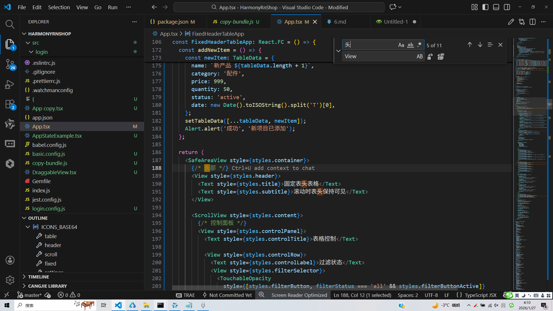
打包
接下来通过打包命令npn run harmony将reactNative的代码打包成为bundle,这样可以进行在开源鸿蒙OpenHarmony中进行使用。
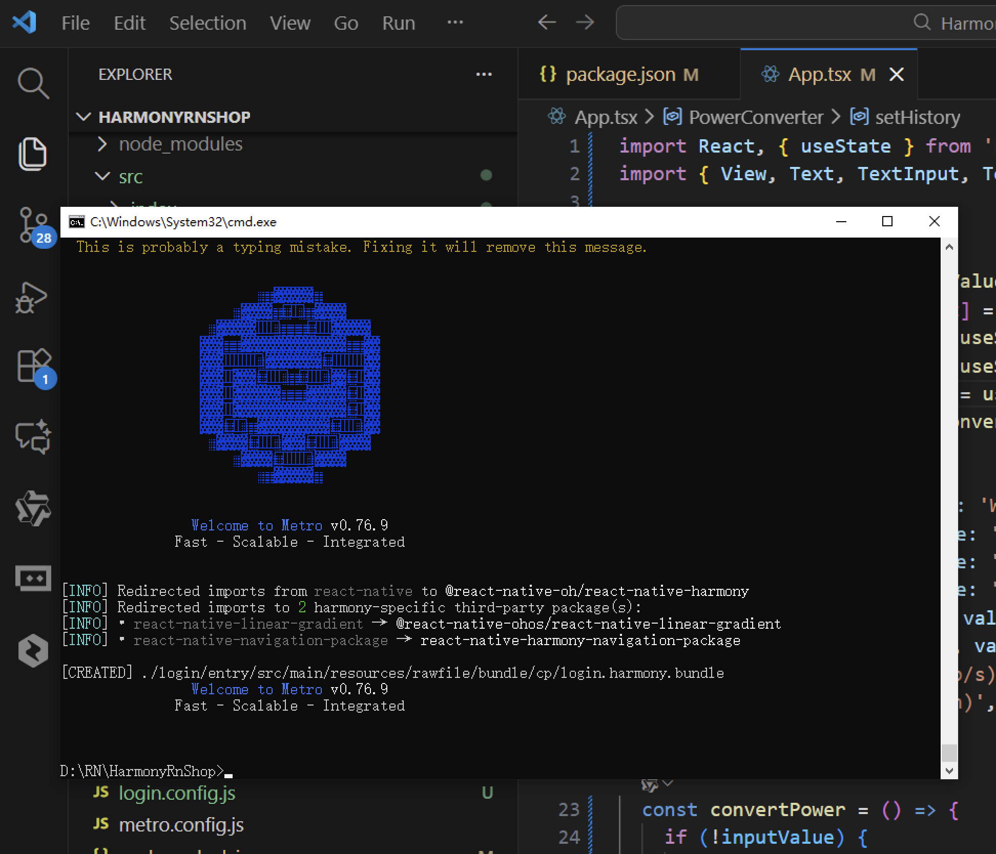
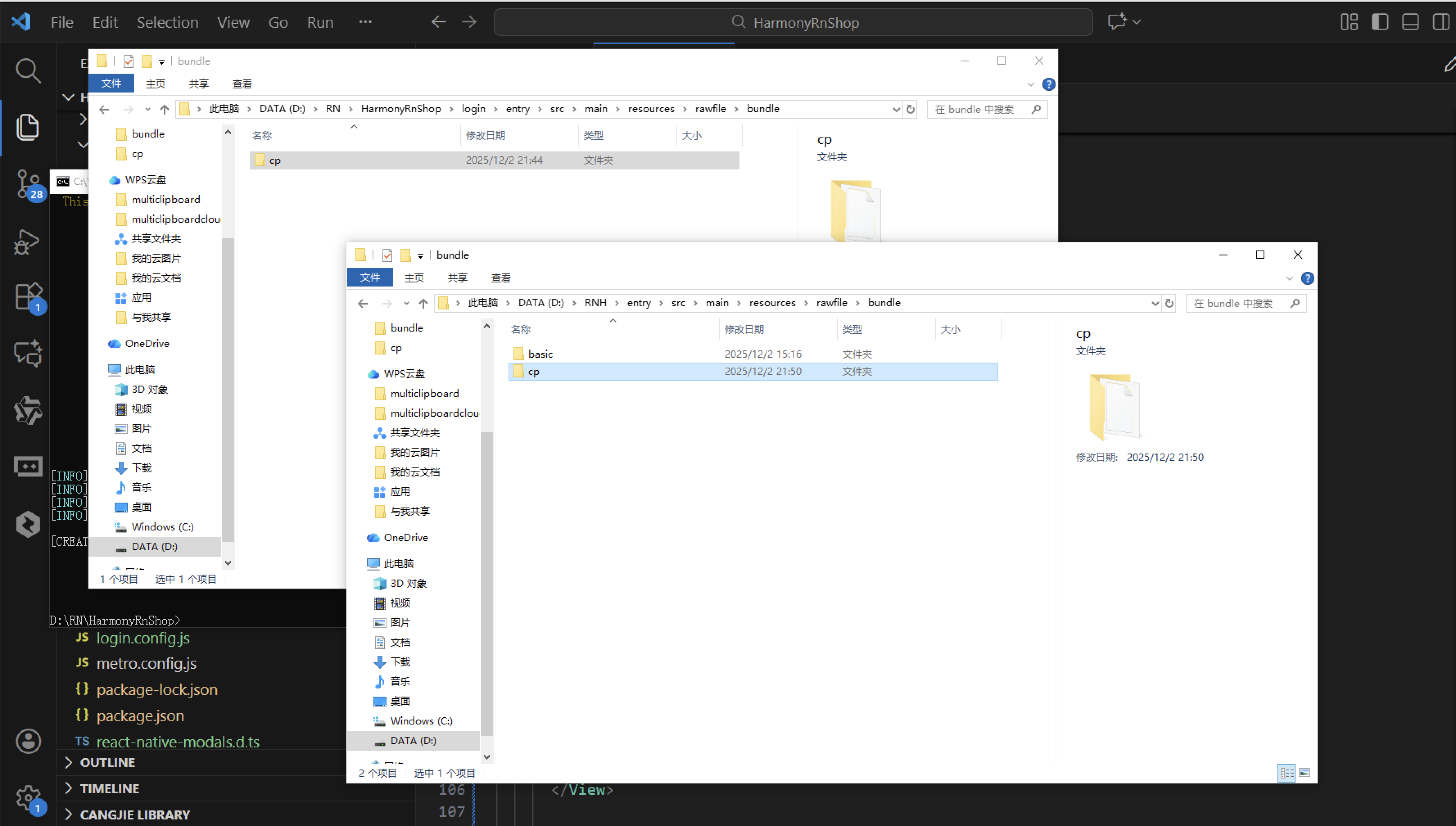
打包之后再将打包后的鸿蒙OpenHarmony文件拷贝到鸿蒙的DevEco-Studio工程目录去:
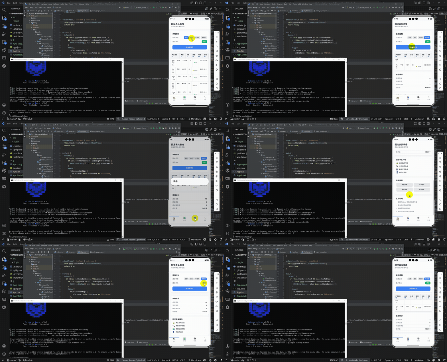
最后运行效果图如下显示:
本文介绍了一个React Native固定表头表格组件的设计与实现,重点分析了其在移动端数据展示场景中的核心功能和技术要点。该组件采用模块化设计,包含固定表头、排序筛选等增强功能,通过TypeScript强类型确保代码可靠性。文章详细阐述了固定表头的实现原理、排序过滤功能的技术方案,以及使用FlatList优化长列表性能的策略。同时,针对跨平台开发需求,提出了从React Native到HarmonyOS ArkUI的适配路径,包括组件映射、API替换和样式转换等关键环节,为开发者提供了可落地的技术参考方案。
欢迎大家加入开源鸿蒙跨平台开发者社区,一起共建开源鸿蒙跨平台生态。
开源鸿蒙跨平台开发社区汇聚开发者与厂商,共建“一次开发,多端部署”的开源生态,致力于降低跨端开发门槛,推动万物智联创新。
更多推荐


 5
5 0
0- 0


 已为社区贡献36条内容

所有评论(0)