Flutter for OpenHarmony 第三方库实战:使用 percent_indicator 构建习惯养成进度仪表盘应用
在移动应用开发中,进度展示是非常常见的功能。例如学习计划、健身记录、饮水打卡、阅读目标、课程完成度、任务进度和项目统计页面,都经常需要用进度条展示当前完成情况。如果只用普通文字写“已完成 60%”,用户当然也能看懂,但视觉表现比较弱。进度条可以让完成情况更加直观,用户一眼就能判断自己今天还差多少。人类对圆圈和条形图的信任程度有时候比对自己还高,离谱,但确实好用。Flutter 原生提供了和,可以实
欢迎加入开源鸿蒙跨平台社区:
https://openharmonycrossplatform.csdn.net
项目效果
本文实现的是一个基于 Flutter for OpenHarmony 的习惯养成进度仪表盘应用。项目中使用 Flutter 第三方库 percent_indicator 实现圆形进度条和线性进度条效果,用于展示饮水、阅读、运动、专注和睡眠等习惯任务的完成进度。
最终运行效果如下:
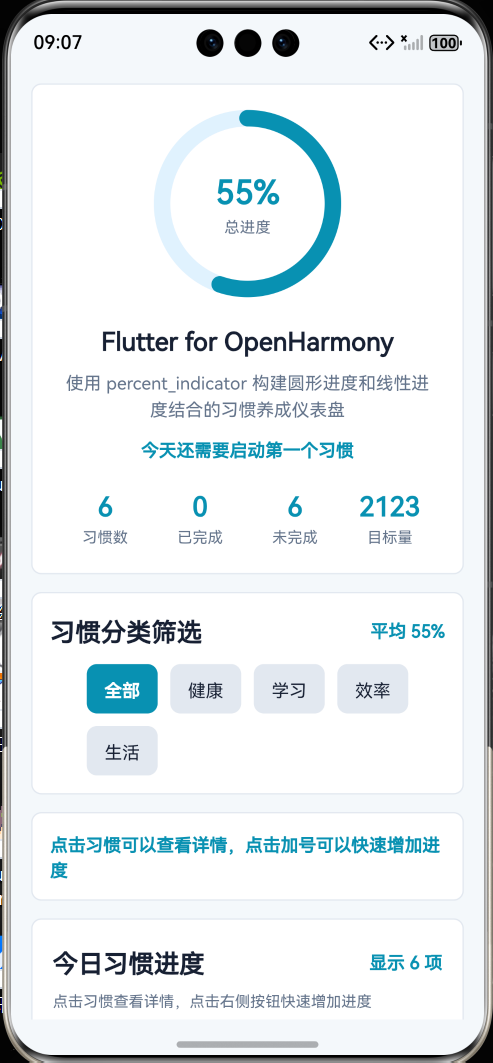
页面主要包含以下内容:
- 顶部标题栏;
- 今日习惯总览卡片;
- 圆形总体完成进度;
- 习惯分类筛选按钮;
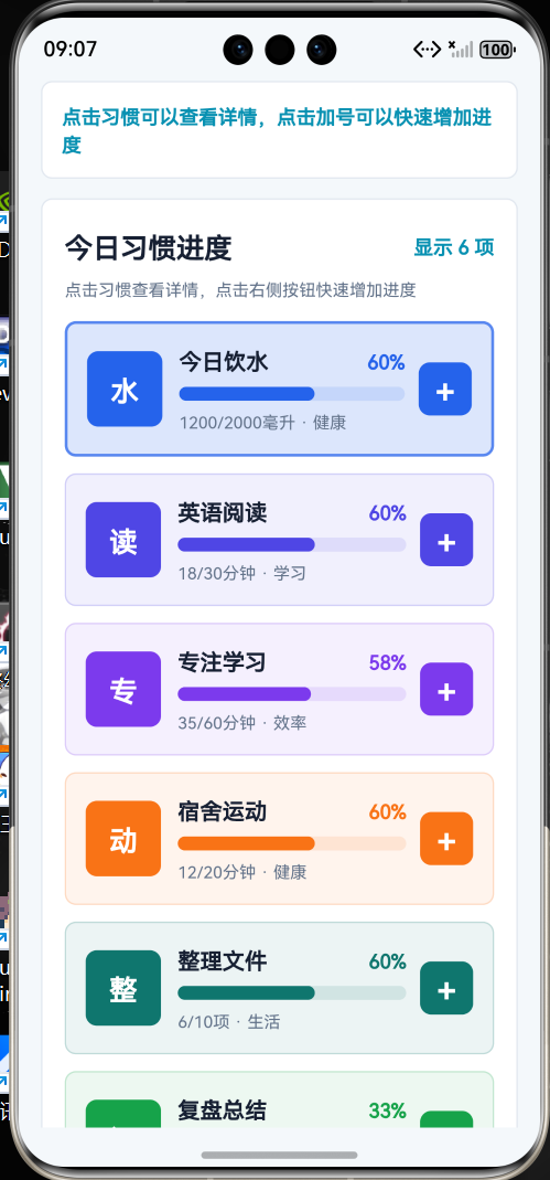
- 多个线性习惯进度条;
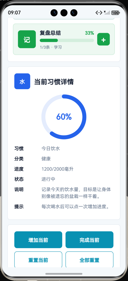
- 当前习惯详情卡片;
- 快速增加进度按钮;
- 一键完成当前习惯按钮;
- 重置当前习惯按钮;
- 第三方库使用说明;
- 页面整体采用 Flutter Material 风格布局。
本文重点是演示如何在 Flutter for OpenHarmony 项目中使用 Flutter 第三方库 percent_indicator。项目代码写在 lib/main.dart 中,依赖配置写在 pubspec.yaml 中,符合 Flutter for OpenHarmony 第三方库实践方向。
前言
在移动应用开发中,进度展示是非常常见的功能。例如学习计划、健身记录、饮水打卡、阅读目标、课程完成度、任务进度和项目统计页面,都经常需要用进度条展示当前完成情况。
如果只用普通文字写“已完成 60%”,用户当然也能看懂,但视觉表现比较弱。进度条可以让完成情况更加直观,用户一眼就能判断自己今天还差多少。人类对圆圈和条形图的信任程度有时候比对自己还高,离谱,但确实好用。
Flutter 原生提供了 LinearProgressIndicator 和 CircularProgressIndicator,可以实现基础进度效果。但如果需要更灵活的圆形百分比文本、动画效果、中心文字、进度颜色、线性进度条圆角等样式,就需要写更多自定义代码。
因此本文选择使用 Flutter 第三方库 percent_indicator 来实现百分比进度展示。它可以快速创建圆形百分比进度条和线性百分比进度条,非常适合 Flutter for OpenHarmony 项目中的统计面板、目标打卡和任务进度页面。
本项目以“习惯养成进度仪表盘应用”为例,使用 percent_indicator 展示多个习惯任务的完成进度,并结合分类筛选、进度更新、详情展示和状态统计完成一个完整页面。
一、项目目标
本次实践主要实现以下目标:
- 创建 Flutter for OpenHarmony 项目;
- 在
pubspec.yaml中添加第三方库percent_indicator; - 使用
flutter pub get获取依赖; - 在
lib/main.dart中引入percent_indicator; - 使用
CircularPercentIndicator构建圆形百分比进度; - 使用
LinearPercentIndicator构建线性习惯进度条; - 使用动画效果展示进度变化;
- 实现习惯分类筛选;
- 实现当前习惯详情展示;
- 实现增加习惯进度;
- 实现一键完成当前习惯;
- 实现重置当前习惯;
- 使用 Flutter Material 组件构建完整页面;
- 将应用运行到 OpenHarmony 设备或模拟器中。
二、技术栈
| 类型 | 内容 |
|---|---|
| 开发方向 | Flutter for OpenHarmony |
| 开发语言 | Dart |
| UI 框架 | Flutter |
| 第三方库 | percent_indicator |
| 功能场景 | 习惯打卡 / 进度展示 / 仪表盘 |
| 核心组件 | CircularPercentIndicator / LinearPercentIndicator |
| 项目入口 | lib/main.dart |
| 依赖配置 | pubspec.yaml |
| 运行平台 | OpenHarmony 设备或模拟器 |
三、为什么选择 percent_indicator
在实际开发中,百分比进度展示可以用于很多场景,例如:
- 学习计划完成度;
- 阅读目标进度;
- 健身训练完成度;
- 饮水打卡进度;
- 项目任务完成率;
- 文件上传进度;
- 课程学习进度;
- 睡眠目标统计;
- 每日目标仪表盘;
- 用户成长等级进度。
Flutter 原生进度条功能比较基础,如果想要做出更完整的百分比仪表盘效果,需要额外处理中心文字、圆形进度、线性进度、颜色区分和动画刷新。
percent_indicator 已经封装好了圆形和线性百分比组件,可以直接通过 CircularPercentIndicator 和 LinearPercentIndicator 实现进度展示。
在本项目中,percent_indicator 主要完成以下工作:
- 展示今日习惯总体完成度;
- 展示每个习惯的线性进度条;
- 展示当前选中习惯的圆形进度;
- 通过百分比文本显示完成情况;
- 使用动画提升进度变化效果;
- 配合按钮实现进度动态更新;
- 减少手写自定义进度条的代码量。
四、创建 Flutter for OpenHarmony 项目
在已经配置好 Flutter for OpenHarmony 开发环境的前提下,可以创建一个 Flutter 项目。
示例项目名称:
flutter create habit_progress_demo
进入项目目录:
cd habit_progress_demo
项目创建完成后,主要关注两个文件:
habit_progress_demo
 ├── pubspec.yaml
 └── lib
     └── main.dart
其中:
| 文件 | 作用 |
|---|---|
| pubspec.yaml | 配置 Flutter 项目依赖 |
| lib/main.dart | 编写 Flutter 页面和业务逻辑 |
五、添加 percent_indicator 第三方库
打开项目根目录下的 pubspec.yaml 文件,在 dependencies 中添加 percent_indicator。
示例配置如下:
dependencies:
  flutter:
    sdk: flutter

  percent_indicator: ^4.2.5
完整结构大致如下:
name: habit_progress_demo
description: A Flutter for OpenHarmony percent indicator demo.
publish_to: 'none'

version: 1.0.0+1

environment:
  sdk: '>=3.4.0 <4.0.0'

dependencies:
  flutter:
    sdk: flutter

  percent_indicator: ^4.2.5

dev_dependencies:
  flutter_test:
    sdk: flutter

flutter:
  uses-material-design: true
添加完成后,在终端执行:
flutter pub get
执行成功后,就可以在 Dart 代码中使用 percent_indicator 了。
六、项目结构
本项目主要修改 lib/main.dart 文件:
lib
 └── main.dart
本项目不需要编写 OpenHarmony 原生 ArkTS 页面,也不需要修改 Index.ets。
因为这是 Flutter for OpenHarmony 项目,页面主体应该是 Flutter 代码。审核重点会看:
- 是否使用
pubspec.yaml添加 Flutter 第三方库; - 是否在 Dart 文件中
import package; - 是否在
lib/main.dart中实际调用第三方库; - 是否属于 Flutter for OpenHarmony 项目。
看到 pubspec.yaml、lib/main.dart、import 'package:percent_indicator/percent_indicator.dart';,这才是正确方向。不是在标题里写 Flutter for OpenHarmony,项目就会自己变成 Flutter 项目,世界还没这么听话。
七、核心实现思路
本项目的核心流程如下:
- 在
pubspec.yaml中添加percent_indicator; - 在
main.dart中引入第三方库; - 定义习惯目标数据模型;
- 准备多个习惯目标数据;
- 使用
CircularPercentIndicator构建总体进度圆环; - 使用
LinearPercentIndicator构建每个习惯的进度条; - 使用分类按钮筛选不同类型的习惯;
- 使用当前选中习惯展示详细进度;
- 使用按钮增加习惯进度;
- 使用按钮完成当前习惯;
- 使用按钮重置当前习惯;
- 使用
setState()更新页面状态; - 使用 Flutter Material 组件构建完整页面。
第三方库引入代码如下:
import 'package:percent_indicator/percent_indicator.dart';
圆形进度条核心代码如下:
CircularPercentIndicator(
  radius: 68,
  lineWidth: 12,
  percent: goal.percent,
  animation: true,
  circularStrokeCap: CircularStrokeCap.round,
  center: Text('${(goal.percent * 100).round()}%'),
  progressColor: goal.color,
  backgroundColor: goal.color.withOpacity(0.12),
)
线性进度条核心代码如下:
LinearPercentIndicator(
  lineHeight: 10,
  percent: goal.percent,
  animation: true,
  barRadius: const Radius.circular(10),
  progressColor: goal.color,
  backgroundColor: goal.color.withOpacity(0.12),
)
这两段代码是本文重点,说明项目确实使用了 Flutter 第三方库实现进度展示效果。
八、main.dart 完整代码
打开文件:
lib/main.dart
将其中内容替换为下面代码:
import 'package:flutter/material.dart';
import 'package:percent_indicator/percent_indicator.dart';
void main() {
runApp(const HabitProgressApp());
}
class HabitProgressApp extends StatelessWidget {
const HabitProgressApp({super.key});
Widget build(BuildContext context) {
return MaterialApp(
title: 'Habit Progress Demo',
debugShowCheckedModeBanner: false,
theme: ThemeData(
colorScheme: ColorScheme.fromSeed(
seedColor: Colors.cyan,
brightness: Brightness.light,
),
useMaterial3: true,
),
home: const HabitProgressHomePage(),
);
}
}
class HabitGoal {
HabitGoal({
required this.id,
required this.title,
required this.category,
required this.description,
required this.current,
required this.target,
required this.unit,
required this.icon,
required this.color,
required this.tip,
});
final int id;
final String title;
final String category;
final String description;
int current;
final int target;
final String unit;
final IconData icon;
final Color color;
final String tip;
double get percent {
if (target <= 0) {
return 0;
}
final double value = current / target;
if (value < 0) {
return 0;
}
if (value > 1) {
return 1;
}
return value;
}
bool get completed {
return current >= target;
}
}
class HabitProgressHomePage extends StatefulWidget {
const HabitProgressHomePage({super.key});
State<HabitProgressHomePage> createState() => _HabitProgressHomePageState();
}
class _HabitProgressHomePageState extends State<HabitProgressHomePage> {
final List<String> _categories = const [
'全部',
'健康',
'学习',
'效率',
'生活',
];
String _selectedCategory = '全部';
int _selectedGoalId = 1;
final List<HabitGoal> _goals = [
HabitGoal(
id: 1,
title: '今日饮水',
category: '健康',
description: '记录今天的饮水量,目标是让身体别像被遗忘的盆栽一样干着。',
current: 1200,
target: 2000,
unit: '毫升',
icon: Icons.water_drop,
color: Colors.blue,
tip: '每次喝水后可以点一次增加进度。',
),
HabitGoal(
id: 2,
title: '英语阅读',
category: '学习',
description: '完成英文短文阅读,积累句子表达,不要只背孤零零的单词。',
current: 18,
target: 30,
unit: '分钟',
icon: Icons.menu_book,
color: Colors.indigo,
tip: '建议把不熟的表达记录到笔记里。',
),
HabitGoal(
id: 3,
title: '专注学习',
category: '效率',
description: '进行一段不刷手机的专注学习时间,手机不是空气,离开它也能活。',
current: 35,
target: 60,
unit: '分钟',
icon: Icons.timer,
color: Colors.deepPurple,
tip: '可以分成两段完成,不一定一次做完。',
),
HabitGoal(
id: 4,
title: '宿舍运动',
category: '健康',
description: '完成简单宿舍训练,例如深蹲、靠墙俯卧撑、哑铃动作或拉伸。',
current: 12,
target: 20,
unit: '分钟',
icon: Icons.fitness_center,
color: Colors.orange,
tip: '动作要标准,不要为了数量把自己练成故障机器。',
),
HabitGoal(
id: 5,
title: '整理文件',
category: '生活',
description: '整理项目文件、截图和文章素材,避免桌面变成电子垃圾场。',
current: 6,
target: 10,
unit: '项',
icon: Icons.folder_copy,
color: Colors.teal,
tip: '建议按项目名新建文件夹,截图和代码分开放。',
),
HabitGoal(
id: 6,
title: '复盘总结',
category: '学习',
description: '记录今天完成了什么、卡在哪里、明天先做哪一步。',
current: 1,
target: 3,
unit: '条',
icon: Icons.edit_note,
color: Colors.green,
tip: '复盘不是写作文,写清楚问题和下一步就行。',
),
];
List<HabitGoal> get _visibleGoals {
if (_selectedCategory == '全部') {
return _goals;
}
return _goals.where((goal) {
return goal.category == _selectedCategory;
}).toList();
}
HabitGoal get _selectedGoal {
return _goals.firstWhere(
(goal) {
return goal.id == _selectedGoalId;
},
orElse: () {
return _goals.first;
},
);
}
int get _completedCount {
return _goals.where((goal) {
return goal.completed;
}).length;
}
int get _unfinishedCount {
return _goals.length - _completedCount;
}
double get _overallPercent {
if (_goals.isEmpty) {
return 0;
}
double total = 0;
for (final HabitGoal goal in _goals) {
total += goal.percent;
}
return total / _goals.length;
}
double get _visibleAveragePercent {
final List<HabitGoal> goals = _visibleGoals;
if (goals.isEmpty) {
return 0;
}
double total = 0;
for (final HabitGoal goal in goals) {
total += goal.percent;
}
return total / goals.length;
}
int get _totalTargetCount {
int total = 0;
for (final HabitGoal goal in _goals) {
total += goal.target;
}
return total;
}
void _selectCategory(String category) {
setState(() {
_selectedCategory = category;
final List<HabitGoal> visibleGoals = _visibleGoals;
if (visibleGoals.isNotEmpty) {
_selectedGoalId = visibleGoals.first.id;
}
});
}
void _selectGoal(HabitGoal goal) {
setState(() {
_selectedGoalId = goal.id;
});
}
void _increaseGoal(HabitGoal goal) {
setState(() {
final int step = _getStep(goal);
goal.current += step;
if (goal.current > goal.target) {
goal.current = goal.target;
}
_selectedGoalId = goal.id;
});
_showMessage('${goal.title} 进度已更新');
}
void _finishSelectedGoal() {
setState(() {
_selectedGoal.current = _selectedGoal.target;
});
_showMessage('当前习惯已完成');
}
void _resetSelectedGoal() {
setState(() {
_selectedGoal.current = 0;
});
_showMessage('当前习惯已重置');
}
void _resetAllGoals() {
setState(() {
for (final HabitGoal goal in _goals) {
goal.current = 0;
}
});
_showMessage('所有习惯进度已重置');
}
int _getStep(HabitGoal goal) {
if (goal.unit == '毫升') {
return 250;
}
if (goal.unit == '分钟') {
return 5;
}
return 1;
}
void _showMessage(String text) {
ScaffoldMessenger.of(context)
..clearSnackBars()
..showSnackBar(
SnackBar(
content: Text(text),
behavior: SnackBarBehavior.floating,
duration: const Duration(milliseconds: 1200),
),
);
}
String get _overviewText {
if (_completedCount == _goals.length) {
return '今日习惯目标已全部完成';
}
if (_completedCount == 0) {
return '今天还需要启动第一个习惯';
}
return '已完成 $_completedCount 项,还剩 $_unfinishedCount 项';
}
Widget build(BuildContext context) {
final ThemeData theme = Theme.of(context);
final List<HabitGoal> visibleGoals = _visibleGoals;
return Scaffold(
appBar: AppBar(
title: const Text('习惯进度仪表盘'),
centerTitle: true,
),
body: SafeArea(
child: ListView(
padding: const EdgeInsets.all(16),
children: [
_buildOverviewCard(theme),
const SizedBox(height: 16),
_buildCategoryCard(theme),
const SizedBox(height: 16),
_buildGoalListCard(theme, visibleGoals),
const SizedBox(height: 16),
_buildSelectedGoalCard(theme),
const SizedBox(height: 16),
_buildActionCard(theme),
const SizedBox(height: 16),
_buildLibraryCard(theme),
],
),
),
);
}
Widget _buildOverviewCard(ThemeData theme) {
final int percentText = (_overallPercent * 100).round();
return Card(
elevation: 3,
shape: RoundedRectangleBorder(
borderRadius: BorderRadius.circular(22),
),
child: Padding(
padding: const EdgeInsets.all(24),
child: Column(
children: [
CircularPercentIndicator(
radius: 72,
lineWidth: 13,
percent: _overallPercent,
animation: true,
animationDuration: 700,
circularStrokeCap: CircularStrokeCap.round,
progressColor: theme.colorScheme.primary,
backgroundColor: theme.colorScheme.primary.withOpacity(0.12),
center: Column(
mainAxisAlignment: MainAxisAlignment.center,
children: [
Text(
'$percentText%',
style: theme.textTheme.headlineSmall?.copyWith(
fontWeight: FontWeight.bold,
color: theme.colorScheme.primary,
),
),
Text(
'总进度',
style: theme.textTheme.bodySmall?.copyWith(
color: theme.colorScheme.onSurfaceVariant,
),
),
],
),
),
const SizedBox(height: 20),
Text(
'Flutter for OpenHarmony',
style: theme.textTheme.headlineSmall?.copyWith(
fontWeight: FontWeight.bold,
),
textAlign: TextAlign.center,
),
const SizedBox(height: 8),
Text(
'使用 percent_indicator 构建圆形进度和线性进度结合的习惯养成仪表盘',
style: theme.textTheme.bodyMedium?.copyWith(
color: theme.colorScheme.onSurfaceVariant,
height: 1.5,
),
textAlign: TextAlign.center,
),
const SizedBox(height: 14),
Text(
_overviewText,
style: theme.textTheme.titleMedium?.copyWith(
color: theme.colorScheme.primary,
fontWeight: FontWeight.bold,
),
),
const SizedBox(height: 18),
Row(
children: [
_buildStatItem(
theme,
title: '习惯数',
value: '${_goals.length}',
icon: Icons.flag,
),
_buildStatItem(
theme,
title: '已完成',
value: '$_completedCount',
icon: Icons.done_all,
),
_buildStatItem(
theme,
title: '未完成',
value: '$_unfinishedCount',
icon: Icons.pending_actions,
),
_buildStatItem(
theme,
title: '目标量',
value: '$_totalTargetCount',
icon: Icons.data_usage,
),
],
),
],
),
),
);
}
Widget _buildStatItem(
ThemeData theme, {
required String title,
required String value,
required IconData icon,
}) {
return Expanded(
child: Column(
children: [
Icon(
icon,
color: theme.colorScheme.primary,
),
const SizedBox(height: 6),
Text(
value,
style: theme.textTheme.titleMedium?.copyWith(
fontWeight: FontWeight.bold,
color: theme.colorScheme.primary,
),
overflow: TextOverflow.ellipsis,
),
const SizedBox(height: 2),
Text(
title,
style: theme.textTheme.bodySmall?.copyWith(
color: theme.colorScheme.onSurfaceVariant,
),
),
],
),
);
}
Widget _buildCategoryCard(ThemeData theme) {
final int averageText = (_visibleAveragePercent * 100).round();
return Card(
elevation: 2,
shape: RoundedRectangleBorder(
borderRadius: BorderRadius.circular(18),
),
child: Padding(
padding: const EdgeInsets.all(16),
child: Column(
children: [
Row(
children: [
Icon(
Icons.filter_alt,
color: theme.colorScheme.primary,
),
const SizedBox(width: 8),
Expanded(
child: Text(
'习惯分类筛选',
style: theme.textTheme.titleMedium?.copyWith(
fontWeight: FontWeight.bold,
),
),
),
Text(
'平均 $averageText%',
style: theme.textTheme.bodyMedium?.copyWith(
color: theme.colorScheme.primary,
fontWeight: FontWeight.bold,
),
),
],
),
const SizedBox(height: 14),
Wrap(
spacing: 10,
runSpacing: 10,
children: _categories.map((category) {
final bool selected = category == _selectedCategory;
return ChoiceChip(
label: Text(category),
selected: selected,
selectedColor: theme.colorScheme.primaryContainer,
labelStyle: TextStyle(
color: selected
? theme.colorScheme.onPrimaryContainer
: theme.colorScheme.onSurface,
fontWeight: selected ? FontWeight.bold : FontWeight.normal,
),
onSelected: (_) {
_selectCategory(category);
},
);
}).toList(),
),
],
),
),
);
}
Widget _buildGoalListCard(
ThemeData theme,
List<HabitGoal> visibleGoals,
) {
return Card(
elevation: 2,
shape: RoundedRectangleBorder(
borderRadius: BorderRadius.circular(18),
),
child: Padding(
padding: const EdgeInsets.fromLTRB(16, 20, 16, 10),
child: Column(
crossAxisAlignment: CrossAxisAlignment.start,
children: [
Row(
children: [
Expanded(
child: Text(
'今日习惯进度',
style: theme.textTheme.titleLarge?.copyWith(
fontWeight: FontWeight.bold,
),
),
),
Text(
'显示 ${visibleGoals.length} 项',
style: theme.textTheme.bodyMedium?.copyWith(
color: theme.colorScheme.primary,
fontWeight: FontWeight.bold,
),
),
],
),
const SizedBox(height: 8),
Text(
'点击习惯可以查看详情,点击右侧按钮可以快速增加进度',
style: theme.textTheme.bodySmall?.copyWith(
color: theme.colorScheme.onSurfaceVariant,
),
),
const SizedBox(height: 16),
if (visibleGoals.isEmpty)
Padding(
padding: const EdgeInsets.all(24),
child: Center(
child: Text(
'当前分类下暂无习惯目标',
style: theme.textTheme.titleMedium?.copyWith(
color: theme.colorScheme.onSurfaceVariant,
),
),
),
)
else
...visibleGoals.map((goal) {
return _buildGoalItem(theme, goal);
}),
],
),
),
);
}
Widget _buildGoalItem(ThemeData theme, HabitGoal goal) {
final bool selected = goal.id == _selectedGoalId;
final int percentText = (goal.percent * 100).round();
return GestureDetector(
onTap: () {
_selectGoal(goal);
},
child: AnimatedContainer(
duration: const Duration(milliseconds: 220),
margin: const EdgeInsets.only(bottom: 12),
padding: const EdgeInsets.all(14),
decoration: BoxDecoration(
color: selected
? goal.color.withOpacity(0.16)
: goal.color.withOpacity(0.08),
borderRadius: BorderRadius.circular(18),
border: Border.all(
color: selected
? goal.color.withOpacity(0.72)
: goal.color.withOpacity(0.20),
width: selected ? 2 : 1,
),
),
child: Row(
children: [
Container(
width: 54,
height: 54,
decoration: BoxDecoration(
color: goal.color.withOpacity(0.18),
borderRadius: BorderRadius.circular(18),
),
child: Icon(
goal.icon,
color: goal.color,
size: 28,
),
),
const SizedBox(width: 14),
Expanded(
child: Column(
crossAxisAlignment: CrossAxisAlignment.start,
children: [
Row(
children: [
Expanded(
child: Text(
goal.title,
style: theme.textTheme.titleMedium?.copyWith(
fontWeight: FontWeight.bold,
),
),
),
Text(
'$percentText%',
style: theme.textTheme.bodyMedium?.copyWith(
color: goal.color,
fontWeight: FontWeight.bold,
),
),
],
),
const SizedBox(height: 6),
LinearPercentIndicator(
padding: EdgeInsets.zero,
lineHeight: 10,
percent: goal.percent,
animation: true,
animationDuration: 500,
barRadius: const Radius.circular(10),
progressColor: goal.color,
backgroundColor: goal.color.withOpacity(0.12),
),
const SizedBox(height: 7),
Text(
'${goal.current}/${goal.target}${goal.unit} · ${goal.category}',
style: theme.textTheme.bodySmall?.copyWith(
color: theme.colorScheme.onSurfaceVariant,
),
),
],
),
),
const SizedBox(width: 10),
IconButton(
onPressed: () {
_increaseGoal(goal);
},
icon: const Icon(Icons.add_circle),
color: goal.color,
tooltip: '增加进度',
),
],
),
),
);
}
Widget _buildSelectedGoalCard(ThemeData theme) {
final HabitGoal goal = _selectedGoal;
final int percentText = (goal.percent * 100).round();
return Card(
elevation: 2,
shape: RoundedRectangleBorder(
borderRadius: BorderRadius.circular(18),
),
child: Padding(
padding: const EdgeInsets.all(20),
child: Column(
children: [
Row(
children: [
Icon(
Icons.insights,
color: goal.color,
),
const SizedBox(width: 10),
Expanded(
child: Text(
'当前习惯详情',
style: theme.textTheme.titleLarge?.copyWith(
fontWeight: FontWeight.bold,
),
),
),
],
),
const SizedBox(height: 18),
CircularPercentIndicator(
radius: 68,
lineWidth: 12,
percent: goal.percent,
animation: true,
animationDuration: 600,
circularStrokeCap: CircularStrokeCap.round,
progressColor: goal.color,
backgroundColor: goal.color.withOpacity(0.12),
center: Text(
'$percentText%',
style: theme.textTheme.headlineSmall?.copyWith(
fontWeight: FontWeight.bold,
color: goal.color,
),
),
),
const SizedBox(height: 18),
_buildInfoRow(
theme,
title: '习惯',
value: goal.title,
color: goal.color,
),
_buildInfoRow(
theme,
title: '分类',
value: goal.category,
color: goal.color,
),
_buildInfoRow(
theme,
title: '进度',
value: '${goal.current}/${goal.target}${goal.unit}',
color: goal.color,
),
_buildInfoRow(
theme,
title: '状态',
value: goal.completed ? '已完成' : '进行中',
color: goal.color,
),
_buildInfoRow(
theme,
title: '说明',
value: goal.description,
color: goal.color,
),
_buildInfoRow(
theme,
title: '提示',
value: goal.tip,
color: goal.color,
),
],
),
),
);
}
Widget _buildInfoRow(
ThemeData theme, {
required String title,
required String value,
required Color color,
}) {
return Padding(
padding: const EdgeInsets.only(bottom: 12),
child: Row(
crossAxisAlignment: CrossAxisAlignment.start,
children: [
Container(
width: 7,
height: 7,
margin: const EdgeInsets.only(top: 8),
decoration: BoxDecoration(
color: color,
shape: BoxShape.circle,
),
),
const SizedBox(width: 10),
SizedBox(
width: 58,
child: Text(
title,
style: theme.textTheme.bodyMedium?.copyWith(
fontWeight: FontWeight.bold,
),
),
),
Expanded(
child: Text(
value,
style: theme.textTheme.bodyMedium?.copyWith(
color: theme.colorScheme.onSurfaceVariant,
height: 1.5,
),
),
),
],
),
);
}
Widget _buildActionCard(ThemeData theme) {
return Card(
elevation: 2,
shape: RoundedRectangleBorder(
borderRadius: BorderRadius.circular(18),
),
child: Padding(
padding: const EdgeInsets.all(20),
child: Column(
children: [
Row(
children: [
Expanded(
child: ElevatedButton.icon(
onPressed: () {
_increaseGoal(_selectedGoal);
},
icon: const Icon(Icons.add),
label: const Text('增加当前'),
),
),
const SizedBox(width: 12),
Expanded(
child: ElevatedButton.icon(
onPressed: _finishSelectedGoal,
icon: const Icon(Icons.check_circle),
label: const Text('完成当前'),
),
),
],
),
const SizedBox(height: 12),
Row(
children: [
Expanded(
child: OutlinedButton.icon(
onPressed: _resetSelectedGoal,
icon: const Icon(Icons.restart_alt),
label: const Text('重置当前'),
),
),
const SizedBox(width: 12),
Expanded(
child: OutlinedButton.icon(
onPressed: _resetAllGoals,
icon: const Icon(Icons.refresh),
label: const Text('全部重置'),
),
),
],
),
],
),
),
);
}
Widget _buildLibraryCard(ThemeData theme) {
return Card(
elevation: 2,
shape: RoundedRectangleBorder(
borderRadius: BorderRadius.circular(18),
),
child: Padding(
padding: const EdgeInsets.all(20),
child: Column(
crossAxisAlignment: CrossAxisAlignment.start,
children: [
Text(
'第三方库说明',
style: theme.textTheme.titleLarge?.copyWith(
fontWeight: FontWeight.bold,
),
),
const SizedBox(height: 12),
_buildLibraryInfoRow(
theme,
title: '库名称',
value: 'percent_indicator',
),
_buildLibraryInfoRow(
theme,
title: '配置文件',
value: 'pubspec.yaml',
),
_buildLibraryInfoRow(
theme,
title: '导入方式',
value: "import 'package:percent_indicator/percent_indicator.dart';",
),
_buildLibraryInfoRow(
theme,
title: '核心组件',
value: 'CircularPercentIndicator / LinearPercentIndicator',
),
_buildLibraryInfoRow(
theme,
title: '核心能力',
value: '圆形百分比进度、线性百分比进度、动画进度、中心文本展示',
),
_buildLibraryInfoRow(
theme,
title: '应用场景',
value: '习惯打卡、学习进度、任务完成率、健身记录、项目统计',
),
],
),
),
);
}
Widget _buildLibraryInfoRow(
ThemeData theme, {
required String title,
required String value,
}) {
return Padding(
padding: const EdgeInsets.only(bottom: 10),
child: Row(
crossAxisAlignment: CrossAxisAlignment.start,
children: [
SizedBox(
width: 82,
child: Text(
title,
style: theme.textTheme.bodyMedium?.copyWith(
fontWeight: FontWeight.bold,
),
),
),
Expanded(
child: Text(
value,
style: theme.textTheme.bodyMedium?.copyWith(
color: theme.colorScheme.onSurfaceVariant,
height: 1.5,
),
),
),
],
),
);
}
}
九、代码实现说明
1. 引入 percent_indicator 第三方库
代码开头引入第三方库:
import 'package:percent_indicator/percent_indicator.dart';
这说明项目确实使用了 Flutter 第三方库,而不是 OpenHarmony 原生库。
本项目中主要使用以下组件:
CircularPercentIndicator
LinearPercentIndicator
CircularStrokeCap
其中:
| 组件 | 作用 |
|---|---|
| CircularPercentIndicator | 构建圆形百分比进度条 |
| LinearPercentIndicator | 构建线性百分比进度条 |
| CircularStrokeCap | 设置圆形进度条线段端点样式 |
2. 使用 CircularPercentIndicator 构建圆形进度
项目顶部总览区域使用了圆形进度条:
CircularPercentIndicator(
  radius: 72,
  lineWidth: 13,
  percent: _overallPercent,
  animation: true,
  circularStrokeCap: CircularStrokeCap.round,
  progressColor: theme.colorScheme.primary,
  backgroundColor: theme.colorScheme.primary.withOpacity(0.12),
  center: Text('$percentText%'),
)
参数说明如下:
| 参数 | 作用 |
|---|---|
| radius | 圆形进度条半径 |
| lineWidth | 进度条线宽 |
| percent | 当前百分比,范围为 0 到 1 |
| animation | 是否开启动画 |
| circularStrokeCap | 圆形进度条端点样式 |
| progressColor | 已完成部分颜色 |
| backgroundColor | 未完成背景颜色 |
| center | 圆形进度条中间显示的内容 |
这里的 _overallPercent 表示全部习惯的平均完成度。
3. 使用 LinearPercentIndicator 构建线性进度条
每个习惯列表项中都使用了线性进度条:
LinearPercentIndicator(
  padding: EdgeInsets.zero,
  lineHeight: 10,
  percent: goal.percent,
  animation: true,
  barRadius: const Radius.circular(10),
  progressColor: goal.color,
  backgroundColor: goal.color.withOpacity(0.12),
)
参数说明如下:
| 参数 | 作用 |
|---|---|
| padding | 进度条内边距 |
| lineHeight | 线性进度条高度 |
| percent | 当前进度百分比 |
| animation | 是否开启动画 |
| barRadius | 进度条圆角 |
| progressColor | 已完成部分颜色 |
| backgroundColor | 未完成背景颜色 |
这种线性进度条适合展示多个习惯任务的进度,信息密度比较高,页面也不会太乱。终于不是一堆纯文字堆在屏幕上互相折磨了。
4. 定义习惯目标数据模型
项目中定义了 HabitGoal 模型:
class HabitGoal {
  HabitGoal({
    required this.id,
    required this.title,
    required this.category,
    required this.description,
    required this.current,
    required this.target,
    required this.unit,
    required this.icon,
    required this.color,
    required this.tip,
  });

  final int id;
  final String title;
  final String category;
  final String description;
  int current;
  final int target;
  final String unit;
  final IconData icon;
  final Color color;
  final String tip;
}
字段说明如下:
| 字段 | 作用 |
|---|---|
| id | 习惯编号 |
| title | 习惯名称 |
| category | 习惯分类 |
| description | 习惯说明 |
| current | 当前完成量 |
| target | 目标完成量 |
| unit | 单位 |
| icon | 图标 |
| color | 主题色 |
| tip | 提示内容 |
其中 current 是可变化字段,用于记录当前完成进度。
5. 计算百分比进度
HabitGoal 中定义了 percent:
double get percent {
  if (target <= 0) {
    return 0;
  }

  final double value = current / target;

  if (value < 0) {
    return 0;
  }

  if (value > 1) {
    return 1;
  }

  return value;
}
这里将当前完成量除以目标量,得到百分比。
由于 percent_indicator 的 percent 参数范围是 0 到 1,所以代码中限制了最小值和最大值。
例如:
| current | target | percent |
|---|---|---|
| 500 | 2000 | 0.25 |
| 1000 | 2000 | 0.5 |
| 2000 | 2000 | 1.0 |
这样就可以把数据转换成进度条能识别的形式。
6. 实现总体完成进度
总体完成进度通过 _overallPercent 计算:
double get _overallPercent {
  if (_goals.isEmpty) {
    return 0;
  }

  double total = 0;

  for (final HabitGoal goal in _goals) {
    total += goal.percent;
  }

  return total / _goals.length;
}
它会把所有习惯的百分比加起来,再除以习惯数量,得到平均完成度。
这个值用于顶部的圆形总进度。
7. 实现习惯分类筛选
页面提供以下分类:
final List<String> _categories = const [
  '全部',
  '健康',
  '学习',
  '效率',
  '生活',
];
筛选逻辑如下:
List<HabitGoal> get _visibleGoals {
  if (_selectedCategory == '全部') {
    return _goals;
  }

  return _goals.where((goal) {
    return goal.category == _selectedCategory;
  }).toList();
}
如果选择“全部”,展示所有习惯。
如果选择“健康”,只展示健康分类下的习惯。
分类切换代码如下:
void _selectCategory(String category) {
  setState(() {
    _selectedCategory = category;

    final List<HabitGoal> visibleGoals = _visibleGoals;
    if (visibleGoals.isNotEmpty) {
      _selectedGoalId = visibleGoals.first.id;
    }
  });
}
切换分类后,当前选中习惯会自动切换到该分类下的第一项。
8. 实现增加习惯进度
增加进度的方法如下:
void _increaseGoal(HabitGoal goal) {
  setState(() {
    final int step = _getStep(goal);
    goal.current += step;

    if (goal.current > goal.target) {
      goal.current = goal.target;
    }

    _selectedGoalId = goal.id;
  });

  _showMessage('${goal.title} 进度已更新');
}
不同单位对应不同增加步长:
int _getStep(HabitGoal goal) {
  if (goal.unit == '毫升') {
    return 250;
  }

  if (goal.unit == '分钟') {
    return 5;
  }

  return 1;
}
例如:
| 单位 | 每次增加 |
|---|---|
| 毫升 | 250 |
| 分钟 | 5 |
| 项 | 1 |
| 条 | 1 |
这样点击增加按钮时,习惯进度会动态变化。
9. 实现完成当前习惯
一键完成当前习惯的方法如下:
void _finishSelectedGoal() {
  setState(() {
    _selectedGoal.current = _selectedGoal.target;
  });

  _showMessage('当前习惯已完成');
}
这里直接将当前完成量设置为目标量。
进度条会变成 100%,状态也会变成“已完成”。
10. 实现重置当前习惯
重置当前习惯的方法如下:
void _resetSelectedGoal() {
  setState(() {
    _selectedGoal.current = 0;
  });

  _showMessage('当前习惯已重置');
}
执行后,当前习惯的进度会回到 0。
这个功能适合测试页面效果,也适合用户重新开始记录。
11. 展示当前习惯详情
当前选中习惯通过 _selectedGoal 获取:
HabitGoal get _selectedGoal {
  return _goals.firstWhere(
    (goal) {
      return goal.id == _selectedGoalId;
    },
    orElse: () {
      return _goals.first;
    },
  );
}
点击某个习惯时,会执行:
void _selectGoal(HabitGoal goal) {
  setState(() {
    _selectedGoalId = goal.id;
  });
}
详情卡片中展示:
- 习惯名称;
- 习惯分类;
- 当前进度;
- 完成状态;
- 习惯说明;
- 操作提示。
这样列表和详情区域可以联动更新。至少页面终于知道用户点了哪个,而不是像某些系统一样装死。
12. 使用 SnackBar 显示操作反馈
项目中封装了提示方法:
void _showMessage(String text) {
  ScaffoldMessenger.of(context)
    ..clearSnackBars()
    ..showSnackBar(
      SnackBar(
        content: Text(text),
        behavior: SnackBarBehavior.floating,
        duration: const Duration(milliseconds: 1200),
      ),
    );
}
当用户增加进度、完成当前、重置当前或全部重置时,页面底部会显示提示。
这样可以让用户明确知道操作已经生效,不至于点完按钮后怀疑自己是不是在和空气互动。
十、运行项目
完成代码后,在终端执行:
flutter pub get
然后连接 OpenHarmony 设备或启动 OpenHarmony 模拟器。
查看设备:
flutter devices
运行项目:
flutter run
如果环境配置正确,应用会运行到 OpenHarmony 设备或模拟器中。
运行成功后,页面会显示“习惯进度仪表盘”。用户可以查看今日所有习惯的总体完成度,也可以通过分类筛选、进度按钮、完成按钮和重置按钮来管理不同习惯的完成情况。
十一、开发中遇到的问题
1. percent_indicator 依赖没有生效
如果代码中出现找不到 percent_indicator 的问题,可以检查 pubspec.yaml 中是否添加了:
percent_indicator: ^4.2.5
然后重新执行:
flutter pub get
如果还是不行,可以重启编辑器。编辑器有时候像没睡醒,依赖装好了还假装看不见,软件行业的经典保留节目。
2. import 导入报错
如果下面代码报错:
import 'package:percent_indicator/percent_indicator.dart';
通常有几种原因:
pubspec.yaml中没有添加依赖;- 没有执行
flutter pub get; - YAML 缩进错误;
- 包名写错;
- 编辑器没有刷新依赖。
其中 YAML 缩进最容易出问题。依赖必须写在 dependencies 下面,并且缩进要正确。一个空格就能毁掉运行结果,编程世界真是优雅得像陷阱。
3. 进度条没有显示
如果进度条没有显示,可以检查:
- 是否正确引入
percent_indicator; - 是否执行了
flutter pub get; percent是否在 0 到 1 之间;progressColor是否和背景色太接近;radius或lineHeight是否设置过小;- 页面是否成功运行。
基础写法如下:
CircularPercentIndicator(
  radius: 60,
  lineWidth: 10,
  percent: 0.6,
  center: Text('60%'),
)
4. percent 数值报错
percent_indicator 中的 percent 参数应该是 0 到 1 之间的小数。
错误写法:
percent: 60
正确写法:
percent: 0.6
如果把 60 当成百分比传进去,组件当然会不高兴。它要的是 0.6,不是你脑子里的 60%。
5. 进度超过 100%
如果当前完成量超过目标量,需要限制最大值:
if (goal.current > goal.target) {
  goal.current = goal.target;
}
这样可以避免进度超过 100%。
本项目中 percent 也做了限制:
if (value > 1) {
  return 1;
}
双重保护比较稳,省得进度条像喝多了一样冲出边界。
6. LinearPercentIndicator 宽度异常
如果线性进度条宽度显示异常,可以检查它所在的父组件是否有足够空间。
本项目中 LinearPercentIndicator 放在 Expanded 内部的 Column 中,能够正常适应列表项宽度。
同时使用:
padding: EdgeInsets.zero
可以避免进度条因为默认内边距导致对齐不自然。
7. 圆形进度中心文字不居中
如果圆形进度中心文字不居中,可以将 center 设置为一个简单的 Text 或者使用 Column 并设置:
mainAxisAlignment: MainAxisAlignment.center
本项目顶部总进度使用了:
center: Column(
  mainAxisAlignment: MainAxisAlignment.center,
  children: [
    Text('$percentText%'),
    Text('总进度'),
  ],
)
这样中心内容会垂直居中显示。
8. 点击按钮后页面没有刷新
如果点击按钮后进度没有更新,需要检查数据修改是否放在 setState() 中:
setState(() {
  goal.current += step;
});
Flutter 不会自己读心。你不告诉它状态变了,它就继续假装世界和平。
9. 运行不到 OpenHarmony 设备
如果项目无法运行到 OpenHarmony 设备或模拟器,可以检查:
- Flutter for OpenHarmony 环境是否配置完成;
- 设备是否连接成功;
flutter devices是否能识别设备;- 是否执行了
flutter pub get; - 是否选择了正确的运行设备;
- 项目是否为 Flutter 项目,而不是原生鸿蒙项目。
如果 flutter devices 都识别不到设备,那应该先处理环境问题,而不是盯着 percent_indicator 怀疑人生。进度条没有权限把设备藏起来。
十二、本文和原生鸿蒙项目的区别
本文是 Flutter for OpenHarmony 第三方库实践,不是 OpenHarmony 原生 ArkTS 项目。
主要区别如下:
| 对比项 | 本文写法 | 原生鸿蒙写法 |
|---|---|---|
| UI 技术 | Flutter | ArkUI |
| 主要语言 | Dart | ArkTS |
| 页面入口 | lib/main.dart | Index.ets |
| 依赖配置 | pubspec.yaml | oh-package.json5 |
| 依赖安装 | flutter pub get | ohpm install |
| 第三方库 | percent_indicator | OpenHarmony 原生库 |
| 页面组件 | MaterialApp / Scaffold / CircularPercentIndicator | @Entry / @Component |
因此本文符合 Flutter for OpenHarmony 第三方库实践方向。
十三、总结
本篇完成了一个基于 percent_indicator 的 Flutter for OpenHarmony 习惯养成进度仪表盘应用。项目通过 Flutter 第三方库实现了圆形百分比进度条、线性百分比进度条、进度动画、中心百分比文本和多习惯进度展示,并结合分类筛选、进度更新、当前习惯详情和操作反馈完成了一个完整页面。
通过本次实践,我主要完成了以下内容:
- 创建 Flutter for OpenHarmony 项目;
- 在
pubspec.yaml中添加percent_indicator依赖; - 使用
flutter pub get获取第三方库; - 在
lib/main.dart中引入percent_indicator; - 使用
CircularPercentIndicator构建圆形进度条; - 使用
LinearPercentIndicator构建线性进度条; - 使用数据模型管理习惯目标;
- 使用
ChoiceChip实现习惯分类筛选; - 使用
setState()实现进度动态更新; - 使用
SnackBar显示操作反馈; - 使用 Flutter Material 组件构建完整页面;
- 将项目运行到 OpenHarmony 设备或模拟器中。
这个项目虽然只是一个基础习惯进度页面,但完整展示了 Flutter for OpenHarmony 项目中第三方库的使用流程。
后续可以在这个基础上继续扩展,例如:
- 添加习惯新增功能;
- 添加习惯编辑功能;
- 添加习惯删除功能;
- 添加每日打卡记录;
- 添加本地数据保存;
- 添加连续打卡天数;
- 添加周报统计;
- 添加图表分析;
- 添加暗色主题;
- 添加通知提醒;
- 添加云端同步功能。
整体来看,percent_indicator 可以帮助 Flutter 开发者快速实现百分比进度展示效果。通过这个项目,可以理解 Flutter for OpenHarmony 中第三方库依赖配置、圆形进度条使用、线性进度条使用、状态管理和页面交互更新之间的基本关系。

开源鸿蒙跨平台开发社区汇聚开发者与厂商,共建“一次开发,多端部署”的开源生态,致力于降低跨端开发门槛,推动万物智联创新。
更多推荐
 5
5 0
0- 0


 已为社区贡献10条内容

所有评论(0)