React Native跨平台鸿蒙开发实战系列:Alert提示弹框,提示一些警告信息
在React Native与鸿蒙系统的融合架构中,Alert提示弹框的实现涉及多层次的技术整合与跨平台适配。这一机制不仅关系到用户交互体验,更体现了两个生态系统在技术理念和实现路径上的深度协作。Alert弹框在React Native与鸿蒙系统间的通信建立在三层架构基础上。最底层是鸿蒙系统的原生能力层,提供基础的UI组件渲染和系统级弹窗支持。中间层是React Native的JavaScript运
在React Native与鸿蒙系统的融合架构中,Alert提示弹框的实现涉及多层次的技术整合与跨平台适配。这一机制不仅关系到用户交互体验,更体现了两个生态系统在技术理念和实现路径上的深度协作。
Alert弹框在React Native与鸿蒙系统间的通信建立在三层架构基础上。最底层是鸿蒙系统的原生能力层,提供基础的UI组件渲染和系统级弹窗支持。中间层是React Native的JavaScript运行环境,负责业务逻辑处理和界面描述。最上层是桥接层,实现两个系统间的指令转换和数据传递。
当JavaScript代码调用Alert.alert()方法时,实际上触发了React Native框架内部的一个复杂事件链。首先,React Native的JavaScript核心会解析传入的参数对象,包括标题、消息内容、按钮配置等。这些参数经过序列化处理后,通过特定的通信通道传递给鸿蒙原生端。这个通信过程基于异步消息队列机制,确保在主线程不被阻塞的情况下完成界面更新。
鸿蒙系统接收到的指令需要经过ArkUI框架的二次解析。ArkUI作为鸿蒙的声明式UI开发框架,其组件树结构与React Native的虚拟DOM存在显著差异。因此,在数据传输过程中需要进行组件属性的映射转换。例如,React Native中的按钮样式属性需要转换为鸿蒙系统的对应样式定义。
一、组件渲染的差异化处理
在渲染层面,Alert弹框需要处理两个平台间的显著差异。鸿蒙系统采用方舟编译器对UI组件进行优化,其渲染管线与React Native的传统渲染机制有所不同。鸿蒙的渲染引擎基于更现代的图形架构,能够更好地利用硬件加速能力。
对于按钮布局的处理尤为关键。React Native允许动态配置按钮数量和排列方式,而鸿蒙系统的Alert组件有固定的布局约束。这就需要中间层实现智能的布局适配算法,根据按钮数量和文本长度动态调整弹框尺寸和按钮分布。
二、样式系统的转换机制
样式转换是Alert弹框实现中的重要环节。React Native使用基于JavaScript的样式系统,而鸿蒙系统采用原生样式定义。这种差异要求框架在运行时执行复杂的样式计算和单位转换。
色彩系统的处理也需要特别注意。React Native使用十六进制颜色表示法,而鸿蒙系统支持更丰富的色彩空间和渐变效果。转换层需要确保在两个系统间保持视觉一致性,同时充分利用鸿蒙系统的视觉增强特性。
字体渲染方面也存在技术差异。React Native依赖系统字体栈,而鸿蒙系统提供自定义字体能力。这为Alert弹框的文本显示提供了更多的个性化选择。
三、交互事件的响应处理
用户与Alert弹框的交互事件需要经过精心设计的处理流程。当用户点击某个按钮时,鸿蒙系统首先捕获到原生交互事件,然后通过事件分发系统传递给React Native的JavaScript环境。
事件传递过程中涉及多个技术环节。首先是触摸事件的坐标映射,需要确保点击区域在两个系统的坐标系中准确对应。其次是事件类型的匹配,确保React Native能够正确识别鸿蒙系统传递的交互意图。
创建AlertDialog
在React Native中,你可以使用Alert组件或者更推荐的是使用第三方库如react-native-dialogs来创建自定义的对话框。但是,对于简单的提示和确认对话框,你可以直接使用原生的Alert组件。如果你需要更复杂的对话框,可以考虑使用react-native-modal-dropdown或react-native-popup-menu等库。
使用原生Alert组件
import React from 'react';
import { Alert, Text, Button, Platform, Linking } from 'react-native';
import Clipboard from '@react-native-community/clipboard';

const MyComponent = () => {
  const showAlert = () => {
    Alert.alert(
      '提示',
      '这是一个提示信息',
      [
        {text: '取消', onPress: () => console.log('取消'), style: 'cancel'},
        {text: '确定', onPress: () => console.log('确定')},
      ],
      { cancelable: false }
    );
  };

  const copyToClipboard = () => {
    Clipboard.setString('要复制的文本');
    Alert.alert('已复制', '文本已复制到剪贴板');
  };

  return (
    <View>
      <Button title="显示提示框" onPress={showAlert} />
      <Button title="复制到剪贴板" onPress={copyToClipboard} />
    </View>
  );
};
React Native,是一个混合移动应用开发框架,是目前流行的跨平台移动应用开发框架之一。React Native 采用不同的方法进行混合移动应用开发。它不会生成原生 UI 组件,而是基于 React,React Native是一个用于构建基于 Web 的交互界面的 JavaScript 库,因此会有更丰富的 UI 体验效果,同时也能够很好地调用底层框架的UI使用。
React Native 弹出框 Alert
-
弹出框是浮于当前界面之上的,用于阻止用户的下一步操作,直到用户点击了弹出框上的任意按钮为止。
-
弹出框一般用于弹出 提示、弹出警告、弹出确认 等需要用户注意和确认的动作。
弹出提示,弹出提示框一般只有一个 确认 按钮,用户点击 确认 就是 我知道了的 意思。
import React from 'react';
import { View, Text, Dimensions, StyleSheet, Image, TextInput, TouchableOpacity, Alert } from 'react-native';
//获取屏幕的宽高
const screenWidth =Math.round( Dimensions.get('window').width);
const screenHight =Math.round( Dimensions.get('window').height);
const AppStyles = StyleSheet.create({
wrap: {
width: '100%',
height: screenHight,
backgroundColor: '#85BDFF'
},
title: {
width: '100%',
height: 72,
fontFamily: 'OPPOSans, OPPOSans',
fontWeight: 'normal',
paddingTop: 50,
fontSize: 36,
color: '#304057',
lineHeight: 72,
textAlign: 'center',
fontStyle: 'normal'
},
banner: {
paddingTop: 50,
paddingRight: 32,
paddingLeft: 32,
},
bannerItem: {
paddingTop: 10,
display: 'flex',
flexDirection:'row',
alignItems: 'center',
justifyContent: 'center',
width: '50%',
},
loginBox: {
position: 'relative',
width: '100%',
paddingTop: 29,
paddingLeft: 20,
paddingRight: 20,
borderTopRightRadius: 30,
borderTopLeftRadius: 30,
backgroundColor: '#F2F8FF',
flex: 1
},
loginBoxCode: {
marginTop: 20,
position: 'relative',
width: '100%',
},
loginBoxCodeBtn: {
position: 'absolute',
right: 4,
top: 4,
width: 110,
height: 40,
lineHeight: 40,
borderRadius: 10,
backgroundColor: '#1669E3',
textAlign: 'center',
fontWeight: 'bold',
fontSize: 14,
color: '#FFFFFF',
},
loginBtn: {
position: 'absolute',
left: 20,
bottom: 30,
width: '100%',
height: 48,
lineHeight: 48,
borderRadius: 10,
backgroundColor: '#1669E3',
textAlign: 'center',
fontWeight: 'bold',
fontSize: 14,
color: '#FFFFFF',
}
})
function App() {
const [phone, onChangePhone] = React.useState('');
const [code, onChangeCode] = React.useState('');
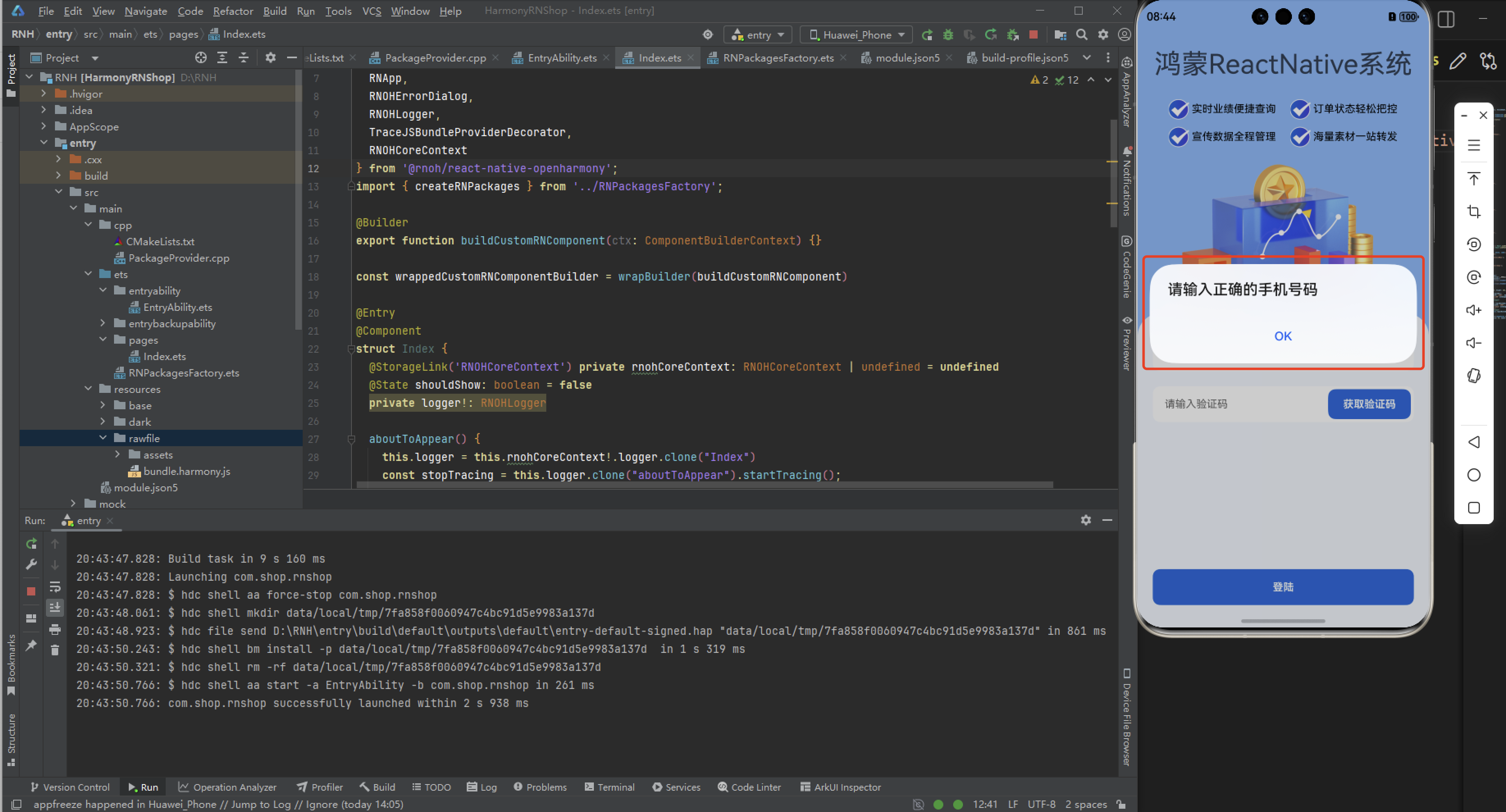
const submitLogin = () => {
console.log('submitLogin', phone, code);
var regex = /^1[3-9]\d{9}$/;
if (!regex.test(phone)) {
Alert.alert('请输入正确的手机号码');
return;
}
var regex = /^\d{6}$/;
if (!regex.test(code)) {
Alert.alert('请输入正确的验证码');
return;
}
}
return (
<View style={AppStyles.wrap}>
<Text style={AppStyles.title}>鸿蒙ReactNative系统</Text>
<View style={AppStyles.banner}>
<View style={{display:'flex',flexDirection:'row',justifyContent:'space-between'}}>
<View style={AppStyles.bannerItem}>
<Image style={{width:27,height:27}} source={require('./images/checked.png')}></Image>
<Text style={{paddingLeft: 4}}>实时业绩便捷查询</Text>
</View>
<View style={AppStyles.bannerItem}>
<Image style={{width:27,height:27}} source={require('./images/checked.png')}></Image>
<Text style={{paddingLeft: 4}}>订单状态轻松把控</Text>
</View>
</View>
<View style={{display:'flex',flexDirection:'row',justifyContent:'space-between'}}>
<View style={AppStyles.bannerItem}>
<Image style={{width:27,height:27}} source={require('./images/checked.png')}></Image>
<Text style={{paddingLeft: 4}}>宣传数据全程管理</Text>
</View>
<View style={AppStyles.bannerItem}>
<Image style={{width:27,height:27}} source={require('./images/checked.png')}></Image>
<Text style={{paddingLeft: 4}}>海量素材一站转发</Text>
</View>
</View>
</View>
<Image style={{width:289, height: 182, display: 'flex', alignSelf: 'center', margin: 20}} source={require('./images/login-bg.png')}></Image>
<View style={AppStyles.loginBox}>
<TextInput style={{width: '100%', height: 48, borderRadius: 10, backgroundColor: '#FFFFFF', paddingLeft: 16, paddingRight: 16, fontSize: 14, color: '#304057'}}
placeholder="请输入手机号" onChangeText={onChangePhone} value={phone}
keyboardType="numeric"
maxLength={11}></TextInput>
<View style={AppStyles.loginBoxCode}>
<TextInput style={{width: '100%', height: 48, borderRadius: 10, backgroundColor: '#FFFFFF', paddingLeft: 16, paddingRight: 16, fontSize: 14, color: '#304057'}}
placeholder="请输入验证码" onChangeText={onChangeCode} value={code}
keyboardType="numeric"
maxLength={6}></TextInput>
<Text style={AppStyles.loginBoxCodeBtn}>获取验证码</Text>
</View>
<TouchableOpacity style={AppStyles.loginBtn} onPress={submitLogin}>
<Text style={{fontSize: 14, color: '#FFFFFF', lineHeight: 48, textAlign: 'center', fontWeight: 'bold'}}>登陆</Text>
</TouchableOpacity>
</View>
</View>
);
}
export default App;
Alert启动一个提示对话框,包含对应的标题和信息。你还可以指定一系列的按钮,点击对应的按钮会调用对应的 onPress 回调并且关闭提示框。默认情况下,对话框会仅有一个’确定’按钮。
欢迎大家加入开源鸿蒙跨平台开发者社区,一起共建开源鸿蒙跨平台生态。

开源鸿蒙跨平台开发社区汇聚开发者与厂商,共建“一次开发,多端部署”的开源生态,致力于降低跨端开发门槛,推动万物智联创新。
更多推荐
 0
0 0
0- 0


 已为社区贡献55条内容

所有评论(0)