ReactNative项目OpenHarmony三方库集成实战:react-native-progress
进度指示器是移动应用中最常见的 UI 组件之一,无论是文件下载、数据加载、表单提交还是任务处理,都需要通过进度条来向用户反馈当前操作的状态。是一个功能丰富的进度指示器库,提供了多种样式的进度组件,包括条形进度条、圆形进度、饼图进度和旋转加载动画,能够满足各种场景下的进度展示需求。库名称版本信息5.0.1: 支持 RN 0.72 版本5.1.0: 支持 RN 0.77 版本官方仓库鸿蒙仓库主要功能?
欢迎加入开源鸿蒙跨平台社区:https://openharmonycrossplatform.csdn.net
📋 前言
进度指示器是移动应用中最常见的 UI 组件之一,无论是文件下载、数据加载、表单提交还是任务处理,都需要通过进度条来向用户反馈当前操作的状态。react-native-progress 是一个功能丰富的进度指示器库,提供了多种样式的进度组件,包括条形进度条、圆形进度、饼图进度和旋转加载动画,能够满足各种场景下的进度展示需求。
🎯 库简介
基本信息
- 库名称:
react-native-progress - 版本信息:
5.0.1+@react-native-oh-tpl/react-native-progress: 支持 RN 0.72 版本5.1.0+@react-native-ohos/react-native-progress: 支持 RN 0.77 版本
- 官方仓库: https://github.com/oblador/react-native-progress
- 鸿蒙仓库: https://atomgit.com/openharmony-sig/rntpc_react-native-progress
- 主要功能:
- 📊 条形进度条(Bar)
- ⭕ 圆形进度指示器(Circle)
- 🥧 饼图进度指示器(Pie)
- 🐌 旋转加载动画(CircleSnail)
- ✨ 支持动画效果
- 🎨 丰富的样式定制
组件类型
| 组件 | 说明 | 适用场景 |
|---|---|---|
| Progress.Bar | 线性进度条 | 文件上传、数据加载 |
| Progress.Circle | 圆形进度指示器 | 应用启动、操作确认 |
| Progress.Pie | 饼图进度指示器 | 存储空间、完成度展示 |
| Progress.CircleSnail | 旋转加载动画 | 加载中状态 |
为什么需要进度指示器库?
| 特性 | 手动实现 | react-native-progress |
|---|---|---|
| 多种样式 | ❌ 需分别实现 | ✅ 内置多种组件 |
| 动画效果 | ⚠️ 需自行编写 | ✅ 内置动画支持 |
| 不确定进度 | ❌ 需额外处理 | ✅ indeterminate 模式 |
| SVG 渲染 | ❌ 需引入额外库 | ✅ 基于 react-native-svg |
| 样式定制 | ⚠️ 代码量大 | ✅ 丰富的 props |
| HarmonyOS 支持 | ❌ 无 | ✅ 完善适配 |
核心功能
| 功能 | 说明 | HarmonyOS 支持 |
|---|---|---|
| 进度值显示 | 0-1 之间的进度值 | ✅ |
| 不确定进度 | 旋转动画模式 | ✅ |
| 动画效果 | 进度变化动画 | ✅ |
| 自定义颜色 | 进度条颜色定制 | ✅ |
| 自定义尺寸 | 宽度、高度、直径等 | ✅ |
| 文本显示 | 显示进度百分比 | ✅ |
| 方向控制 | 顺时针/逆时针 | ✅ |
兼容性验证
在以下环境验证通过:
- RNOH: 0.72.90; SDK: HarmonyOS 6.0.0 (API Version 20); IDE: DevEco Studio 6.0.2; ROM: HarmonyOS 6.0.0
📦 安装步骤
1. 安装依赖
请到三方库的 Releases 发布地址查看配套的版本信息:
| 三方库版本 | 发布信息 | 支持 RN 版本 |
|---|---|---|
| 5.0.1 | @react-native-oh-tpl/react-native-progress | 0.72 |
| 5.1.0 | @react-native-ohos/react-native-progress | 0.77 |
# RN 0.72 版本
npm install @react-native-oh-tpl/react-native-progress

# RN 0.77 版本
npm install @react-native-ohos/react-native-progress

# 或者使用 yarn
yarn add @react-native-ohos/react-native-progress
2. 验证安装
安装完成后,检查 package.json 文件:
{
  "dependencies": {
    "@react-native-ohos/react-native-progress": "^5.0.1-0.0.3"
  }
}
3. TypeScript 类型定义配置(可选)
如果您的项目使用 TypeScript,可能会遇到类型定义问题。由于鸿蒙适配版本的类型定义文件可能不完整,建议在项目中添加自定义类型定义文件。
在 src/types 目录下创建 react-native-progress.d.ts 文件:
declare module '@react-native-oh-tpl/react-native-progress' {
  import React from 'react';
  import { TextStyle, ViewProperties } from 'react-native';

  export interface DefaultPropTypes extends ViewProperties {
    animated?: boolean;
    indeterminate?: boolean;
    indeterminateAnimationDuration?: number;
    progress?: number;
    color?: string;
    unfilledColor?: string;
    borderWidth?: number;
    borderColor?: string;
  }

  export interface BarPropTypes extends DefaultPropTypes {
    width?: number | null;
    height?: number;
    borderRadius?: number;
    useNativeDriver?: boolean;
    animationConfig?: {};
    animationType?: 'decay' | 'timing' | 'spring';
  }

  export interface CirclePropTypes extends DefaultPropTypes {
    size?: number;
    thickness?: number;
    showsText?: boolean;
    formatText?: (progress: number) => string;
    textStyle?: TextStyle;
    allowFontScaling?: boolean;
    direction?: 'clockwise' | 'counter-clockwise';
    strokeCap?: 'butt' | 'square' | 'round';
    fill?: string;
    endAngle?: number;
  }

  export interface PiePropTypes extends DefaultPropTypes {
    size?: number;
  }

  export interface CircleSnailPropTypes extends Omit<DefaultPropTypes, 'color'> {
    animating?: boolean;
    hidesWhenStopped?: boolean;
    size?: number;
    color?: string | string[];
    thickness?: number;
    duration?: number;
    spinDuration?: number;
    strokeCap?: 'butt' | 'square' | 'round';
    direction?: 'clockwise' | 'counter-clockwise';
  }

  export class Bar extends React.Component<BarPropTypes> {}
  export class Circle extends React.Component<CirclePropTypes> {}
  export class Pie extends React.Component<PiePropTypes> {}
  export class CircleSnail extends React.Component<CircleSnailPropTypes> {}
}
然后在 tsconfig.json 中确保包含该类型文件:
{
  "compilerOptions": {
    "typeRoots": ["./node_modules/@types", "./src/types"]
  },
  "include": ["src/**/*", "src/types/**/*"]
}
🔧 HarmonyOS 平台配置 ⭐
依赖说明
⚠️ 重要:本库依赖
react-native-svg的原生端代码进行 SVG 渲染,如已在鸿蒙工程中引入过该库,则无需再次引入,可跳过本章节步骤,直接使用。
可以参考这篇文章:https://blog.csdn.net/2402_83107102/article/details/159203447
1. 在工程根目录的 oh-package.json5 添加 overrides 字段
打开 harmony/oh-package.json5,添加以下配置:
{
  // ... 其他配置
  "overrides": {
    "@rnoh/react-native-openharmony": "0.72.90"
  }
}
2. 引入原生端代码
打开 harmony/entry/oh-package.json5,添加以下依赖:
"dependencies": {
  "@react-native-ohos/react-native-progress": "file:../../node_modules/@react-native-ohos/react-native-progress/harmony/react_native_progress.har"
}
3. 同步依赖
点击 DevEco Studio 右上角的 sync 按钮,或者在终端执行:
cd harmony/entry
ohpm install
🚀 同步并运行
点击 DevEco Studio 右上角的 sync 按钮,或者在终端执行:
cd harmony/entry
ohpm install
然后编译、运行即可。
📖 API 详解
通用属性(所有进度组件)
以下属性适用于所有进度组件(Bar、Circle、Pie),掌握这些通用属性可以快速上手所有进度组件。
progress - 进度值
设置当前进度值,取值范围为 0 到 1 之间。这是进度组件最核心的属性,决定了进度条的填充程度。
类型:number
默认值:0
取值范围:0 - 1
使用场景:
- 文件下载/上传进度显示
- 表单填写完成度
- 任务执行进度
import * as Progress from '@react-native-oh-tpl/react-native-progress';

// 50% 进度
<Progress.Bar progress={0.5} />

// 75% 进度
<Progress.Circle progress={0.75} />

// 30% 进度
<Progress.Pie progress={0.3} />

// 动态更新进度
const [progress, setProgress] = useState(0);

useEffect(() => {
  const interval = setInterval(() => {
    setProgress(prev => Math.min(1, prev + 0.1));
  }, 500);
  return () => clearInterval(interval);
}, []);
color - 进度颜色
设置已填充部分的进度颜色。可以使用任意有效的颜色值,包括十六进制、RGB、颜色名称等。
类型:string
默认值:rgba(0, 122, 255, 1)(iOS 系统蓝色)
使用场景:
- 不同状态使用不同颜色(成功绿色、警告橙色、错误红色)
- 品牌色适配
- 暗色/亮色主题适配
// 单色进度条
<Progress.Bar progress={0.5} color="#007AFF" />

// 成功状态 - 绿色
<Progress.Circle progress={1} color="#34C759" />

// 警告状态 - 橙色
<Progress.Bar progress={0.6} color="#FF9500" />

// 错误状态 - 红色
<Progress.Pie progress={0.3} color="#FF3B30" />

// 根据进度动态变色
const getProgressColor = (progress: number) => {
  if (progress < 0.3) return '#FF3B30'; // 红色
  if (progress < 0.7) return '#FF9500'; // 橙色
  return '#34C759'; // 绿色
};

<Progress.Bar progress={progress} color={getProgressColor(progress)} />
unfilledColor - 未填充颜色
设置进度条未填充部分的背景颜色。合理设置可以让进度条更加美观和易读。
类型:string
默认值:透明或浅灰色(取决于组件类型)
使用场景:
- 浅色主题:使用浅灰色背景
- 深色主题:使用深灰色背景
- 突出进度:使用对比色
// 浅色主题
<Progress.Circle
  progress={0.6}
  color="#007AFF"
  unfilledColor="#E5E5EA"
/>

// 深色主题
<Progress.Bar
  progress={0.6}
  color="#0A84FF"
  unfilledColor="#2C2C2E"
/>

// 自定义背景
<Progress.Pie
  progress={0.5}
  color="#34C759"
  unfilledColor="#F2F2F7"
/>
animated - 是否启用动画
控制进度值变化时是否播放动画效果。启用动画可以让进度变化更加平滑自然。
类型:boolean
默认值:true
使用场景:
- 平滑过渡效果
- 用户体验优化
- 注意:频繁更新的场景建议关闭动画以提高性能
// 启用动画(默认)
<Progress.Bar progress={0.8} animated={true} />

// 禁用动画 - 立即显示
<Progress.Circle progress={0.5} animated={false} />

// 根据场景动态控制
const [isAnimating, setIsAnimating] = useState(true);

<Progress.Bar
  progress={progress}
  animated={isAnimating && progress < 1}
/>
indeterminate - 不确定进度模式
当无法确定具体进度时,启用不确定进度模式,显示持续动画效果。常用于加载状态。
类型:boolean
默认值:false
使用场景:
- 网络请求等待
- 数据加载中
- 初始化过程
// 不确定进度模式
<Progress.Circle indeterminate={true} color="#007AFF" />

// 条形进度条不确定模式
<Progress.Bar indeterminate={true} width={200} />

// 根据加载状态切换
const [isLoading, setIsLoading] = useState(true);
const [progress, setProgress] = useState(0);

<Progress.Circle
  progress={progress}
  indeterminate={isLoading}
  color="#007AFF"
/>

// 加载完成后切换
useEffect(() => {
  fetchData().then(() => {
    setIsLoading(false);
    setProgress(1);
  });
}, []);
Progress.Bar 属性
条形进度条组件,是最常用的进度指示器,适用于文件上传、数据加载、表单填写等线性进度场景。
width / height - 尺寸
设置进度条的宽度和高度。宽度可以是固定数值或百分比,高度通常使用较小值。
类型:number | string
默认值:width: 150, height: 6
使用场景:
- 固定宽度进度条
- 响应式布局
- 粗细不同的进度条
// 固定尺寸
<Progress.Bar progress={0.5} width={200} height={10} />

// 响应式宽度
<Progress.Bar progress={0.5} width={null} style={{ width: '100%' }} height={8} />

// 细线进度条
<Progress.Bar progress={0.7} width={300} height={2} />

// 粗进度条
<Progress.Bar progress={0.5} width={280} height={20} />

// 使用 Dimensions 获取屏幕宽度
import { Dimensions } from 'react-native';
const screenWidth = Dimensions.get('window').width;

<Progress.Bar
  progress={0.5}
  width={screenWidth - 32}
  height={12}
/>
borderRadius - 圆角
设置进度条的圆角半径,让进度条更加美观。
类型:number
默认值:height / 2(自动圆角)
使用场景:
- 圆角进度条
- 方角进度条
- 自定义样式
// 自动圆角(默认)
<Progress.Bar progress={0.5} height={12} borderRadius={6} />

// 完全圆角
<Progress.Bar progress={0.5} height={10} borderRadius={5} />

// 方角
<Progress.Bar progress={0.5} height={10} borderRadius={0} />

// 自定义圆角
<Progress.Bar progress={0.5} height={16} borderRadius={8} />
borderWidth / borderColor - 边框
设置进度条的边框宽度和颜色,增加视觉层次感。
类型:borderWidth: number, borderColor: string
默认值:borderWidth: 1, borderColor: '#ccc'
// 带边框的进度条
<Progress.Bar
  progress={0.5}
  borderWidth={1}
  borderColor="#007AFF"
/>

// 无边框
<Progress.Bar
  progress={0.5}
  borderWidth={0}
/>

// 粗边框
<Progress.Bar
  progress={0.5}
  borderWidth={2}
  borderColor="#E5E5EA"
/>
animationType - 动画类型
设置进度变化时的动画类型,提供不同的动画效果。
类型:'timing' | 'spring' | 'decay'
默认值:'timing'
动画类型说明:
| animationType | 说明 | 适用场景 |
|---|---|---|
timing |
线性动画,匀速变化 | 常规进度更新 |
spring |
弹簧动画,有弹性效果 | 游戏化界面、趣味应用 |
decay |
衰减动画,逐渐减速 | 模拟物理效果 |
// 线性动画(默认)
<Progress.Bar progress={0.5} animated={true} animationType="timing" />

// 弹簧动画
<Progress.Bar progress={0.5} animated={true} animationType="spring" />

// 衰减动画
<Progress.Bar progress={0.5} animated={true} animationType="decay" />

// 弹簧动画配合自定义参数
<Progress.Bar
  progress={progress}
  animated={true}
  animationType="spring"
  animationConfig={{
    tension: 100,
    friction: 7,
  }}
/>
useNativeDriver - 使用原生驱动
是否使用原生动画驱动,可以提高动画性能。
类型:boolean
默认值:false
使用场景:
- 高性能动画需求
- 复杂动画场景
- 注意:某些属性不支持原生驱动
<Progress.Bar
  progress={0.5}
  animated={true}
  useNativeDriver={true}
/>
Progress.Circle 属性
圆形进度指示器组件,适用于应用启动、操作确认、加载等待等场景,视觉效果更加突出。
size - 圆的直径
设置圆形进度指示器的直径大小。
类型:number
默认值:40
使用场景:
- 小型加载指示器
- 大型进度展示
- 嵌入式进度显示
// 小型
<Progress.Circle progress={0.5} size={30} />

// 中型
<Progress.Circle progress={0.5} size={60} />

// 大型
<Progress.Circle progress={0.5} size={100} />

// 根据屏幕尺寸适配
const circleSize = screenWidth > 400 ? 80 : 60;
<Progress.Circle progress={0.5} size={circleSize} />
thickness - 内圆厚度
设置圆形进度条的线条粗细。
类型:number
默认值:size / 10
使用场景:
- 细线圆形进度
- 粗线圆形进度
- 视觉风格调整
// 细线
<Progress.Circle progress={0.5} size={100} thickness={3} />

// 中等
<Progress.Circle progress={0.5} size={100} thickness={6} />

// 粗线
<Progress.Circle progress={0.5} size={100} thickness={12} />

// 极细线
<Progress.Circle progress={0.75} size={80} thickness={2} />
showsText - 显示进度文本
是否在圆形中心显示进度文本。
类型:boolean
默认值:false
使用场景:
- 显示百分比进度
- 显示剩余时间
- 显示具体数值
// 显示进度文本
<Progress.Circle progress={0.75} showsText={true} />

// 配合 formatText 自定义文本
<Progress.Circle
  progress={0.75}
  showsText={true}
  formatText={(progress) => `${Math.round(progress * 100)}%`}
/>

// 不显示文本
<Progress.Circle progress={0.75} showsText={false} />
formatText - 格式化文本
自定义进度文本的显示格式,接收一个函数作为参数。
类型:(progress: number) => string
参数:
progress: 当前进度值(0-1)
使用场景:
- 自定义百分比格式
- 显示剩余时间
- 显示文件大小
// 百分比格式
<Progress.Circle
  progress={0.75}
  showsText={true}
  formatText={(progress) => `${Math.round(progress * 100)}%`}
/>

// 分数格式
<Progress.Circle
  progress={0.75}
  showsText={true}
  formatText={(progress) => `${Math.round(progress * 10)}/10`}
/>

// 剩余时间格式
<Progress.Circle
  progress={0.6}
  showsText={true}
  formatText={(progress) => `${Math.round((1 - progress) * 60)}s`}
/>

// 文件大小格式
const totalSize = 100; // MB
<Progress.Circle
  progress={downloadProgress}
  showsText={true}
  formatText={(progress) => `${Math.round(progress * totalSize)}MB`}
/>
direction - 方向
设置进度条的绘制方向,支持顺时针和逆时针。
类型:'clockwise' | 'counter-clockwise'
默认值:'clockwise'
使用场景:
- 不同视觉风格
- 特殊交互效果
- 对比显示
// 顺时针(默认)
<Progress.Circle progress={0.75} direction="clockwise" />

// 逆时针
<Progress.Circle progress={0.75} direction="counter-clockwise" />

// 对比显示
<View style={{ flexDirection: 'row', gap: 20 }}>
  <Progress.Circle progress={0.6} direction="clockwise" />
  <Progress.Circle progress={0.6} direction="counter-clockwise" />
</View>
strokeCap - 笔画端点样式
设置进度条端点的形状样式,影响进度条终点的视觉效果。这个属性对于短进度(如进度值较小)时效果更明显,因为端点位置更容易观察。
类型:'butt' | 'square' | 'round'
默认值:'round'
样式说明:
| strokeCap | 说明 | 视觉效果 |
|---|---|---|
butt |
平头,端点与线条齐平 | 直角端点,无延伸 |
square |
方形,端点延伸半个线宽 | 方形端点,略延伸 |
round |
圆形,端点为半圆 | 圆滑端点,延伸明显 |
使用建议:
- 进度较小时(< 50%)建议使用
round以获得更好的视觉效果 - 界面风格锐利简洁时可使用
butt - 需要强调进度端点时可使用
square
// 进度 25% 时的对比(更能体现端点样式差异)
<View style={{ flexDirection: 'row', gap: 20 }}>
  <View style={{ alignItems: 'center' }}>
    <Progress.Circle progress={0.25} size={60} thickness={8} strokeCap="round" />
    <Text>round - 圆头</Text>
  </View>
  <View style={{ alignItems: 'center' }}>
    <Progress.Circle progress={0.25} size={60} thickness={8} strokeCap="butt" />
    <Text>butt - 平头</Text>
  </View>
  <View style={{ alignItems: 'center' }}>
    <Progress.Circle progress={0.25} size={60} thickness={8} strokeCap="square" />
    <Text>square - 方头</Text>
  </View>
</View>
fill - 填充颜色
设置圆形内部的填充颜色。
类型:string
默认值:透明
使用场景:
- 填充圆形内部
- 创建实心进度指示器
- 特殊视觉效果
// 透明填充(默认)
<Progress.Circle progress={0.75} fill="transparent" />

// 白色填充
<Progress.Circle progress={0.75} fill="#FFFFFF" />

// 浅色填充
<Progress.Circle progress={0.75} fill="#F2F2F7" />
Progress.Pie 属性
饼图进度指示器组件,以扇形方式展示进度,适用于存储空间、完成度展示等场景。
size - 饼图直径
设置饼图的直径大小。
类型:number
默认值:40
// 小型饼图
<Progress.Pie progress={0.5} size={40} />

// 中型饼图
<Progress.Pie progress={0.5} size={80} />

// 大型饼图
<Progress.Pie progress={0.5} size={120} />
endAngle - 结束角度
设置饼图的结束角度,默认从顶部(-90度)开始。
类型:number
默认值:0.9(约 324 度)
// 默认角度
<Progress.Pie progress={0.75} size={80} />

// 自定义角度
<Progress.Pie progress={0.75} size={80} endAngle={1} />
Progress.CircleSnail 属性
旋转加载动画组件,适用于加载中状态展示,提供持续旋转的动画效果。
color - 圆圈颜色
设置旋转圆圈的颜色,支持单色或多色数组。
类型:string | string[]
默认值:rgba(0, 122, 255, 1)
使用场景:
- 单色加载动画
- 多色彩虹效果
- 品牌色适配
// 单色
<Progress.CircleSnail color="#007AFF" />

// 多色彩虹效果
<Progress.CircleSnail color={['#F44336', '#2196F3', '#009688']} />

// 品牌色渐变
<Progress.CircleSnail color={['#FF6B6B', '#4ECDC4', '#45B7D1']} />

// 自定义颜色组合
<Progress.CircleSnail
  color={['#FF9500', '#FF3B30', '#AF52DE', '#5856D6']}
  size={60}
/>
animating - 是否动画
控制是否播放旋转动画。
类型:boolean
默认值:true
使用场景:
- 条件性显示加载动画
- 手动控制动画状态
- 性能优化
// 持续动画
<Progress.CircleSnail animating={true} />

// 根据加载状态控制
const [isLoading, setIsLoading] = useState(true);

<Progress.CircleSnail animating={isLoading} />

// 条件渲染
{isLoading && <Progress.CircleSnail animating={true} />}
size / thickness - 尺寸和厚度
设置旋转动画的尺寸和线条厚度。
类型:size: number, thickness: number
默认值:size: 80, thickness: size / 12
// 小型
<Progress.CircleSnail size={40} thickness={3} />

// 中型
<Progress.CircleSnail size={60} thickness={5} />

// 大型
<Progress.CircleSnail size={100} thickness={8} />
direction - 旋转方向
设置旋转动画的方向。
类型:'clockwise' | 'counter-clockwise'
默认值:'clockwise'
// 顺时针(默认)
<Progress.CircleSnail direction="clockwise" />

// 逆时针
<Progress.CircleSnail direction="counter-clockwise" />
spinDuration - 旋转周期
设置完成一次旋转的时间(毫秒)。
类型:number
默认值:3000
// 快速旋转
<Progress.CircleSnail spinDuration={1500} />

// 正常速度
<Progress.CircleSnail spinDuration={3000} />

// 慢速旋转
<Progress.CircleSnail spinDuration={5000} />
📋 完整示例
import React, { useEffect, useState } from "react";
import {
SafeAreaView,
ScrollView,
StyleSheet,
Text,
View,
TouchableOpacity,
} from "react-native";
import * as Progress from "@react-native-oh-tpl/react-native-progress";
const App: React.FC = () => {
const [progress, setProgress] = useState(0);
const [indeterminate, setIndeterminate] = useState(true);
useEffect(() => {
let interval: ReturnType<typeof setInterval>;
const timer = setTimeout(() => {
setIndeterminate(false);
interval = setInterval(() => {
setProgress((prev) => {
if (prev >= 1) return 0;
return Math.min(1, prev + Math.random() / 5);
});
}, 500);
}, 1500);
return () => {
clearTimeout(timer);
clearInterval(interval);
};
}, []);
const handleReset = () => {
setProgress(0);
setIndeterminate(true);
setTimeout(() => setIndeterminate(false), 1500);
};
return (
<SafeAreaView style={styles.container}>
<ScrollView contentContainerStyle={styles.content}>
<Text style={styles.title}>进度指示器示例</Text>
{/* 条形进度条 */}
<View style={styles.card}>
<Text style={styles.cardTitle}>Progress.Bar</Text>
<Progress.Bar
progress={progress}
indeterminate={indeterminate}
width={280}
height={12}
color="#007AFF"
unfilledColor="#E5E5EA"
borderRadius={6}
borderWidth={0}
/>
<Text style={styles.progressText}>
{indeterminate ? "加载中..." : `${Math.round(progress * 100)}%`}
</Text>
</View>
{/* 圆形进度 */}
<View style={styles.card}>
<Text style={styles.cardTitle}>Progress.Circle</Text>
<View style={styles.row}>
<Progress.Circle
progress={progress}
indeterminate={indeterminate}
size={70}
color="#34C759"
thickness={6}
/>
<Progress.Circle
progress={progress}
indeterminate={indeterminate}
size={70}
color="#FF9500"
direction="counter-clockwise"
thickness={6}
/>
<Progress.Circle
progress={progress}
indeterminate={indeterminate}
size={70}
color="#5856D6"
showsText={true}
formatText={(p) => `${Math.round(p * 100)}%`}
thickness={6}
/>
</View>
</View>
{/* 饼图进度 */}
<View style={styles.card}>
<Text style={styles.cardTitle}>Progress.Pie</Text>
<View style={styles.row}>
<Progress.Pie
progress={progress}
indeterminate={indeterminate}
size={70}
color="#FF3B30"
/>
<Progress.Pie
progress={0.75}
size={70}
color="#007AFF"
/>
<Progress.Pie
progress={0.5}
size={70}
color="#34C759"
/>
</View>
</View>
{/* 旋转加载动画 */}
<View style={styles.card}>
<Text style={styles.cardTitle}>Progress.CircleSnail</Text>
<View style={styles.row}>
<Progress.CircleSnail size={50} color="#007AFF" />
<Progress.CircleSnail size={50} color={["#F44336", "#2196F3", "#009688"]} />
<Progress.CircleSnail size={50} color="#34C759" direction="counter-clockwise" />
</View>
</View>
{/* 样式变体 */}
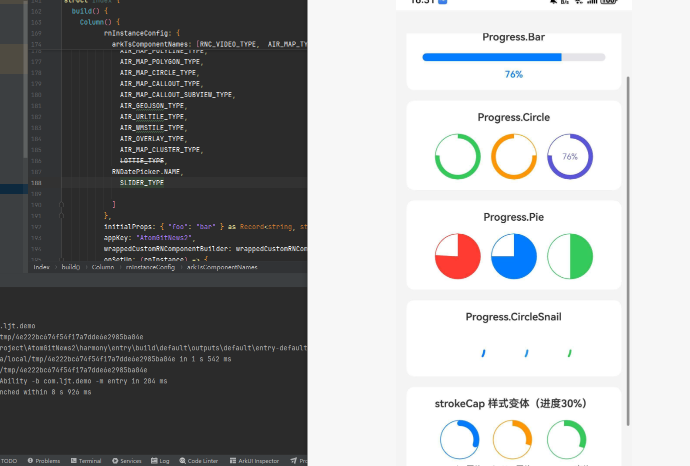
<View style={styles.card}>
<Text style={styles.cardTitle}>strokeCap 样式变体(进度30%)</Text>
<View style={styles.row}>
<View style={styles.variantItem}>
<Progress.Circle progress={0.3} size={60} thickness={8} color="#007AFF" strokeCap="round" />
<Text style={styles.variantLabel}>round - 圆头</Text>
</View>
<View style={styles.variantItem}>
<Progress.Circle progress={0.3} size={60} thickness={8} color="#FF9500" strokeCap="butt" />
<Text style={styles.variantLabel}>butt - 平头</Text>
</View>
<View style={styles.variantItem}>
<Progress.Circle progress={0.3} size={60} thickness={8} color="#34C759" strokeCap="square" />
<Text style={styles.variantLabel}>square - 方头</Text>
</View>
</View>
</View>
<TouchableOpacity style={styles.resetButton} onPress={handleReset}>
<Text style={styles.resetButtonText}>重置进度</Text>
</TouchableOpacity>
</ScrollView>
</SafeAreaView>
);
};
const styles = StyleSheet.create({
container: { flex: 1, backgroundColor: "#F5F5F5" },
content: { padding: 16 },
title: { fontSize: 24, fontWeight: "bold", marginBottom: 20, color: "#333", textAlign: "center" },
card: { backgroundColor: "#FFF", borderRadius: 12, padding: 16, marginBottom: 16, alignItems: "center" },
cardTitle: { fontSize: 16, fontWeight: "600", marginBottom: 16, color: "#333" },
progressText: { marginTop: 12, fontSize: 14, color: "#007AFF", fontWeight: "500" },
row: { flexDirection: "row", justifyContent: "center", alignItems: "center", gap: 16 },
variantItem: { alignItems: "center" },
variantLabel: { marginTop: 8, fontSize: 12, color: "#666" },
resetButton: { backgroundColor: "#007AFF", paddingVertical: 14, borderRadius: 8, alignItems: "center", marginTop: 8 },
resetButtonText: { color: "#FFF", fontSize: 16, fontWeight: "500" },
});
export default App;
⚠️ 遗留问题

开源鸿蒙跨平台开发社区汇聚开发者与厂商,共建“一次开发,多端部署”的开源生态,致力于降低跨端开发门槛,推动万物智联创新。
更多推荐

 3
3 0
0- 0


 已为社区贡献87条内容

所有评论(0)