Flutter for OpenHarmony 实战之基础组件:第五十一篇 NavigationRail — 适配平板与折叠屏的侧边导航
本文介绍了Flutter for OpenHarmony中适配平板与折叠屏的侧边导航组件NavigationRail的使用方法。核心内容包括: NavigationRail基础实现:作为Row的第一个元素,包含选中索引、目标项等基本结构,可添加顶部和底部扩展内容。 响应式切换策略:通过LayoutBuilder判断屏幕宽度,在窄屏时使用底部导航栏,宽屏时切换为侧边导航,实现自动适配。 进阶功能:支

Flutter for OpenHarmony 实战之基础组件:第五十一篇 NavigationRail — 适配平板与折叠屏的侧边导航
前言
随着移动设备形态的多样化,特别是鸿蒙平板(MatePad)和华为 Mate X 系列折叠屏的普及,传统的底部导航栏在横屏模式下往往会造成竖向空间的浪费,且在大屏上点击不便。
在 Flutter for OpenHarmony 开发中,NavigationRail(侧边导航轨)是专为宽屏设计的导航组件。它能常驻在屏幕左侧,提供极致的左右手持握交互体验。本文将详解 NavigationRail 的实现及如何根据屏幕宽度动态切换导航模式。
一、NavigationRail 核心结构
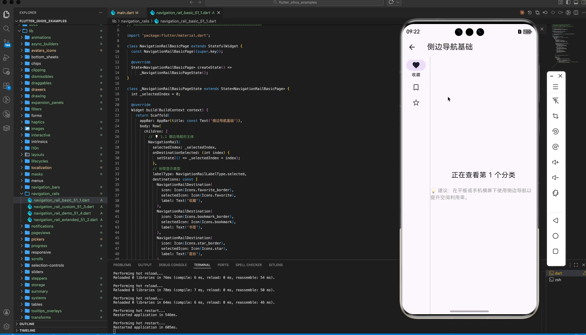
NavigationRail 通常作为 Row 的第一个元素,紧邻主内容区域展示。
1.1 基础实现代码
NavigationRail(
  selectedIndex: _selectedIndex,
  onDestinationSelected: (int index) {
    setState(() => _selectedIndex = index);
  },
  labelType: NavigationRailLabelType.selected, // 仅选中时显示文字
  destinations: const <NavigationRailDestination>[
    NavigationRailDestination(icon: Icon(Icons.favorite_border), selectedIcon: Icon(Icons.favorite), label: Text('收藏')),
    NavigationRailDestination(icon: Icon(Icons.bookmark_border), selectedIcon: Icon(Icons.bookmark), label: Text('书签')),
    NavigationRailDestination(icon: Icon(Icons.star_border), selectedIcon: Icon(Icons.star), label: Text('星标')),
  ],
)
1.2 扩展性:添加 Leading 与 Trailing
你可以像原生鸿蒙应用一样,在侧边栏顶部放置头像,底部放置设置图标。
NavigationRail(
  leading: const CircleAvatar(child: Text('OH')),
  trailing: IconButton(icon: const Icon(Icons.settings), onPressed: () {}),
  //...
)
二、响应式切换:底部 vs 侧边
💡 实战技巧:在鸿蒙开发中,我们应该根据屏幕宽度自动选择最合适的导航方式。
LayoutBuilder(
  builder: (context, constraints) {
    bool isWide = constraints.maxWidth > 600; // 宽屏判断逻辑
    return Scaffold(
      bottomNavigationBar: isWide ? null : _buildBottomBar(), // 手机端用底部导航
      body: Row(
        children: [
          if (isWide) _buildNavRail(), // 宽屏/平板用侧边导航
          const VerticalDivider(thickness: 1, width: 1),
          const Expanded(child: Center(child: Text("页面内容"))),
        ],
      ),
    );
  },
)
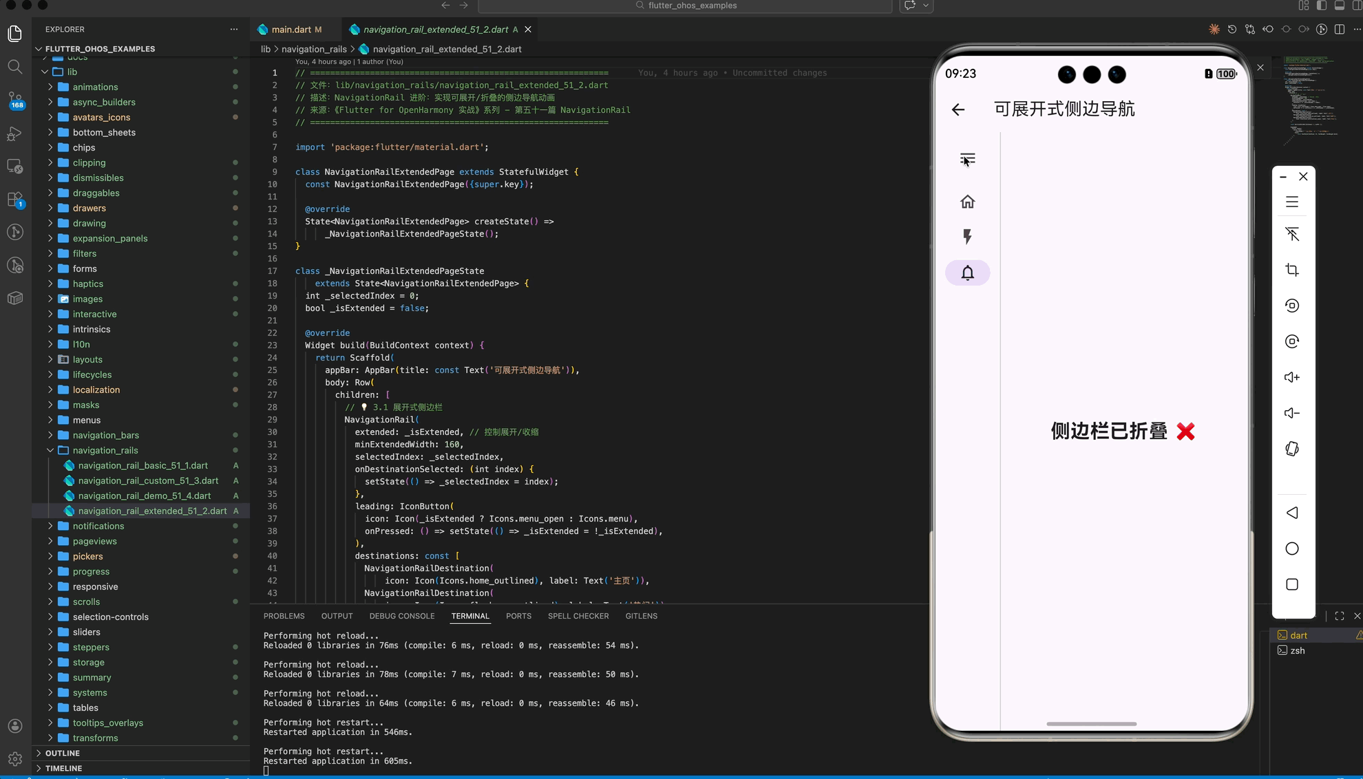
三、进阶:标签模式与浮动效果
在鸿蒙的高级 UI 规范中,侧边栏往往具有一定的通透感或背景悬浮效果。
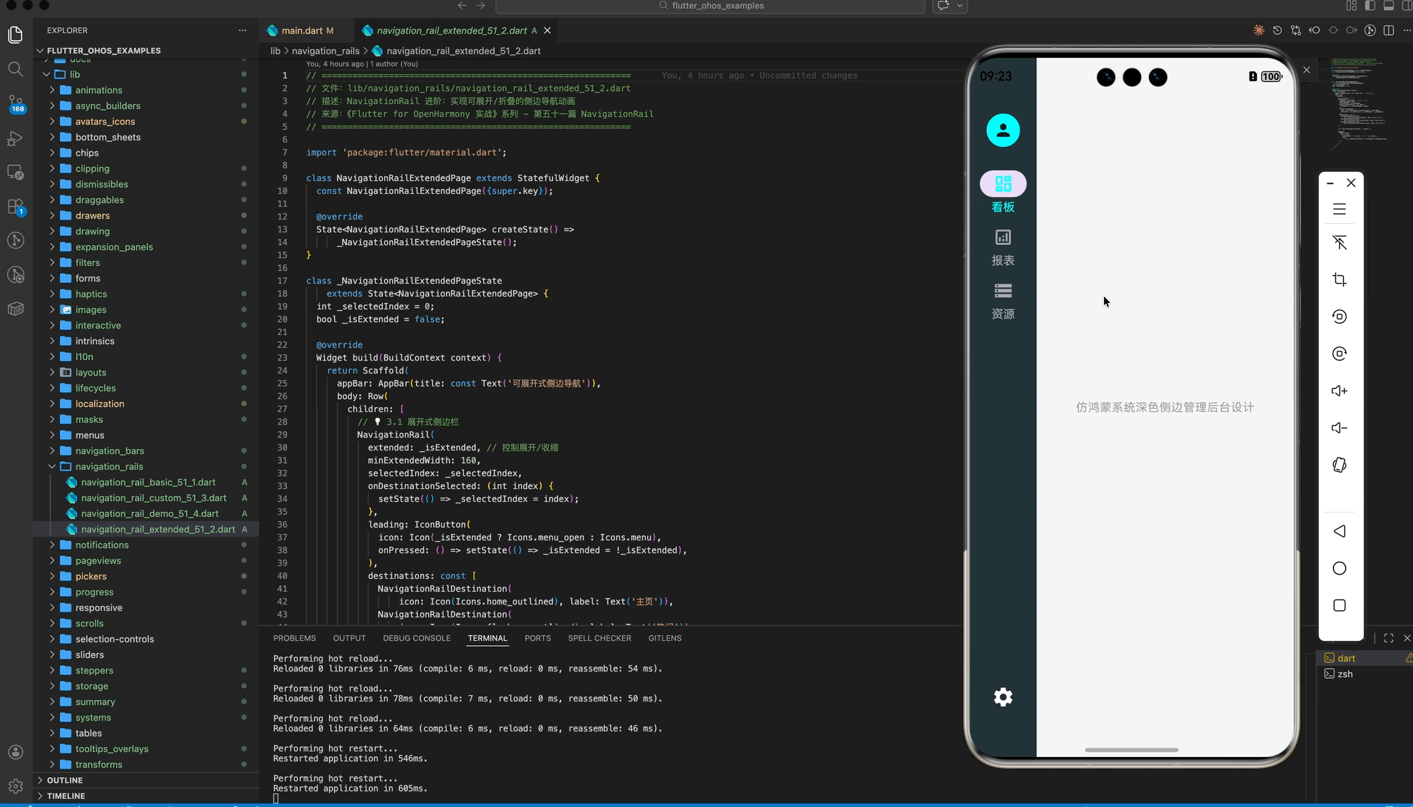
3.1 展开式侧边栏 (Extended)
如果你希望侧边栏能够像桌面应用一样展开显示完整文字,可以设置 extended 属性。
NavigationRail(
  extended: _isExtended, // 通过按钮切换展开/收起
  minExtendedWidth: 200,
  //...
)
四、OpenHarmony 平台适配建议
4.1 手势区避让 (Sidebar Gestures)
鸿蒙系统支持侧边滑动返回手势。如果 NavigationRail 设置得太宽,可能会干扰用户的系统手势操作。
✅ 推荐方案:
保留默认的 minWidth: 72。如果需要扩展宽度,建议在 NavigationRail 外层包裹一层 SafeArea,确保其不会遮挡鸿蒙系统的核心交互边距。
4.2 适配平行视界 (Multiplier Window)
鸿蒙系统的“平行视界”会将一个应用拆分为左右两屏。
💡 调优建议:
在平行视界下,由于单屏宽度变窄,应用可能会错误地将 NavigationRail 切换为底部导航。建议在判断 isWide 时,结合 MediaQuery.of(context).orientation。只有在物理横屏且宽度确实足够时才启用侧边导航,避免在分屏状态下导致布局过度拥挤。
4.3 视觉细节与马达反馈
点击侧边项时,图标应具有明显的缩放或颜色填充反馈。
✅ 最佳实践:
- 为选中的
NavigationRailDestination设置selectedIcon。 - 点击时调用
HapticFeedback.selectionClick()。
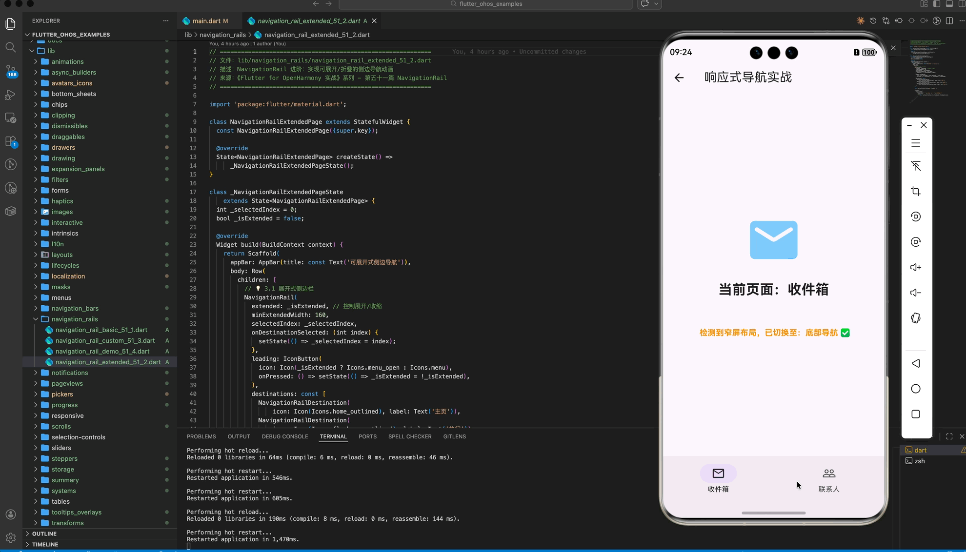
五、完整示��代码
以下代码演示了一个可以根据窗口大小自动在“底部导航”与“侧边导航”之间切换的专业主页框架。
import 'package:flutter/material.dart';
class NavigationRailDemoPage extends StatefulWidget {
const NavigationRailDemoPage({super.key});
State<NavigationRailDemoPage> createState() => _NavigationRailDemoPageState();
}
class _NavigationRailDemoPageState extends State<NavigationRailDemoPage> {
int _idx = 0;
Widget build(BuildContext context) {
// 💡 二、响应式切换:物理宽度判断
final double screenWidth = MediaQuery.of(context).size.width;
final bool isWide = screenWidth > 600;
return Scaffold(
appBar: AppBar(title: const Text('响应式导航实战')),
// 💡 手机端显示底部导航(或平行视界单屏模式)
bottomNavigationBar: isWide
? null
: NavigationBar(
selectedIndex: _idx,
onDestinationSelected: (i) => setState(() => _idx = i),
destinations: const [
NavigationDestination(
icon: Icon(Icons.mail_outline), label: "收件箱"),
NavigationDestination(
icon: Icon(Icons.people_outline), label: "联系人"),
],
),
body: Row(
children: [
// 💡 宽屏/平板显示侧边导航
if (isWide)
NavigationRail(
selectedIndex: _idx,
labelType: NavigationRailLabelType.all,
onDestinationSelected: (i) => setState(() => _idx = i),
destinations: const [
NavigationRailDestination(
icon: Icon(Icons.mail_outline), label: Text("收件箱")),
NavigationRailDestination(
icon: Icon(Icons.people_outline), label: Text("联系人")),
],
),
if (isWide) const VerticalDivider(thickness: 1, width: 1),
Expanded(
child: Column(
mainAxisAlignment: MainAxisAlignment.center,
children: [
Icon(_idx == 0 ? Icons.mail_rounded : Icons.people_rounded,
size: 100, color: Colors.blue[200]),
const SizedBox(height: 20),
Text("当前页面:${_idx == 0 ? "收件箱" : "联系人"}",
style: const TextStyle(
fontSize: 24, fontWeight: FontWeight.bold)),
const SizedBox(height: 48),
Text(
isWide ? " 检测到宽屏布局,已切换至:侧边导航 ✅" : " 检测到窄屏布局,已切换至:底部导航 ✅",
style: TextStyle(
color: isWide ? Colors.green : Colors.orange,
fontWeight: FontWeight.bold),
),
],
),
),
],
),
);
}
}
六、总结
在 Flutter for OpenHarmony 的大屏适配之路上,NavigationRail 是不可或缺的利器。
- 形态选择:宽屏用 Rail,竖屏用 Bar。
- 空间利用:Rail 能有效释放纵向空间,在大屏阅读类应用中体验极佳。
- 细节打磨:关注鸿蒙端的分屏适配与手势避让,让你的应用在平板和折叠屏上展现出真正的“原生感”。
📦 完整代码已上传至 AtomGit:flutter_ohos_examples
🌐 欢迎加入开源鸿蒙跨平台社区:开源鸿蒙跨平台开发者社区

开源鸿蒙跨平台开发社区汇聚开发者与厂商,共建“一次开发,多端部署”的开源生态,致力于降低跨端开发门槛,推动万物智联创新。
更多推荐

 30
30 0
0- 0


 已为社区贡献265条内容

所有评论(0)