Flutter三方库 shadcn_ui 适配 OpenHarmony —— 实现表格
在移动应用开发中,表格是一种常见且重要的UI组件,用于清晰地展示和管理结构化数据。当我们将Flutter应用适配到OpenHarmony平台时,如何实现一个功能完善、交互友好的表格组件成为了一个关键挑战。本次开发中,我们参考了Flutter三方库shadcn_ui的设计理念,实现了一个适配OpenHarmony平台的表格组件。这个组件不仅具备基本的表格展示功能,还支持行点击交互、奇偶行交替颜色、水
欢迎加入开源鸿蒙跨平台社区: https://openharmonycrossplatform.csdn.net
目录
前言:表格组件适配的技术探索
在移动应用开发中,表格是一种常见且重要的UI组件,用于清晰地展示和管理结构化数据。当我们将Flutter应用适配到OpenHarmony平台时,如何实现一个功能完善、交互友好的表格组件成为了一个关键挑战。
本次开发中,我们参考了Flutter三方库shadcn_ui的设计理念,实现了一个适配OpenHarmony平台的表格组件。这个组件不仅具备基本的表格展示功能,还支持行点击交互、奇偶行交替颜色、水平滚动等特性,为用户提供了良好的使用体验。
通过本次实践,我们不仅掌握了在OpenHarmony平台上实现复杂UI组件的方法,也积累了跨平台开发的宝贵经验。本文将详细介绍表格组件的实现过程、技术要点以及开发中遇到的问题和解决方案。
混合工程结构深度解析
项目目录架构
当Flutter项目集成鸿蒙支持后,典型的项目结构会发生显著变化。以下是经过ohos_flutter插件初始化后的项目结构:
my_flutter_harmony_app/
├── lib/                          # Flutter业务代码(基本不变)
│   ├── main.dart                 # 应用入口
│   ├── table_widget.dart         # 表格组件
├── pubspec.yaml                  # Flutter依赖配置
├── ohos/                         # 鸿蒙原生层(核心适配区)
│   ├── entry/                    # 主模块
│   │   └── src/main/
│   │       ├── ets/              # ArkTS代码
│   │       │   ├── entryability/
│   │       │   │   ├── EntryAbility.ets       # 主Ability
│   │       │   └── pages/
│   │       │       ├── Index.ets           # 主页面
│   │       ├── resources/        # 鸿蒙资源文件
│   │       │   ├── base/
│   │       │   │   ├── element/  # 字符串等
│   │       │   │   ├── media/    # 图片资源
│   │       │   │   └── profile/  # 配置文件
│   │       └── module.json5       # 应用核心配置
└── README.md
展示效果图片
flutter 实时预览 效果展示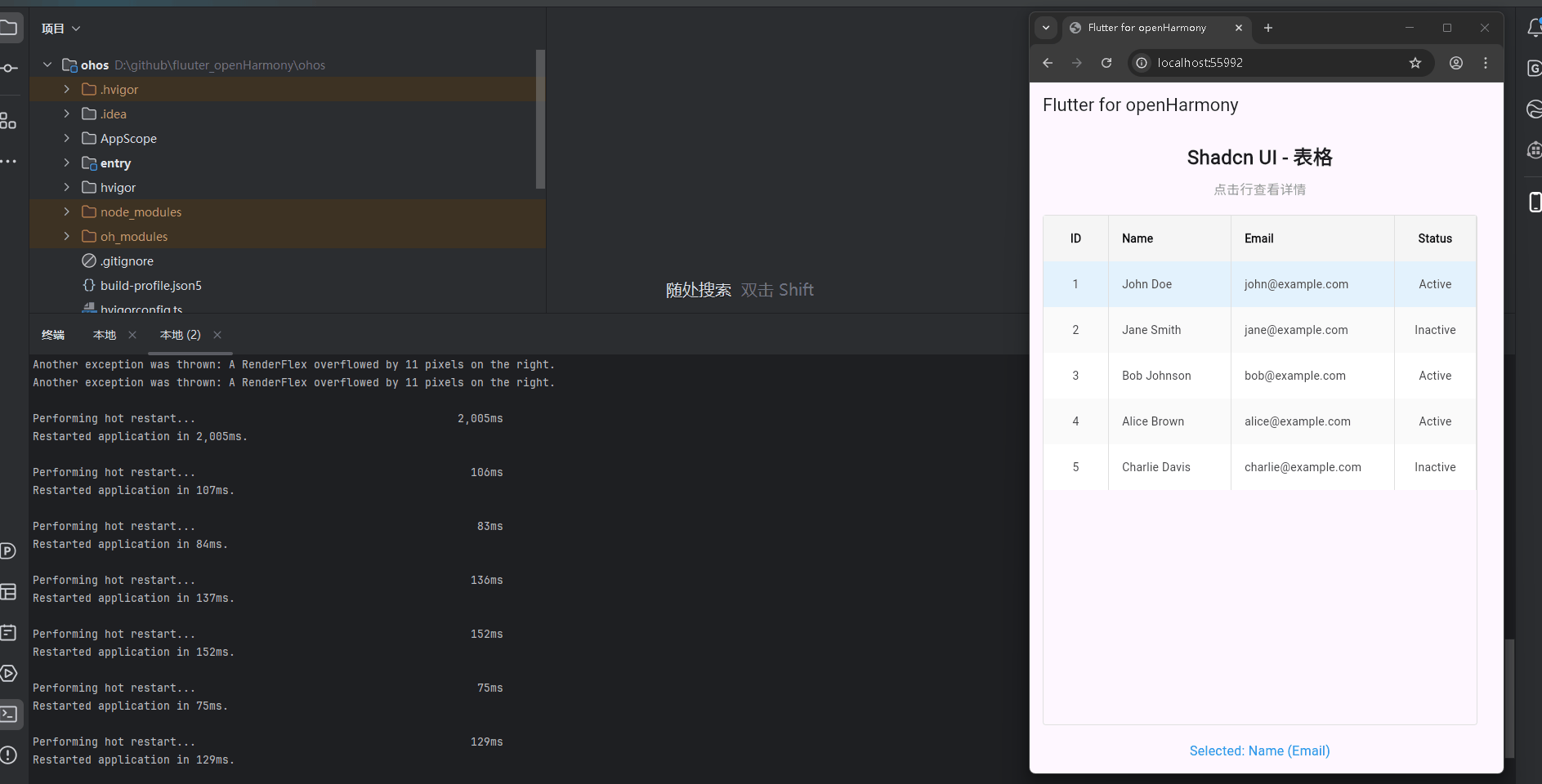
运行到鸿蒙虚拟设备中效果展示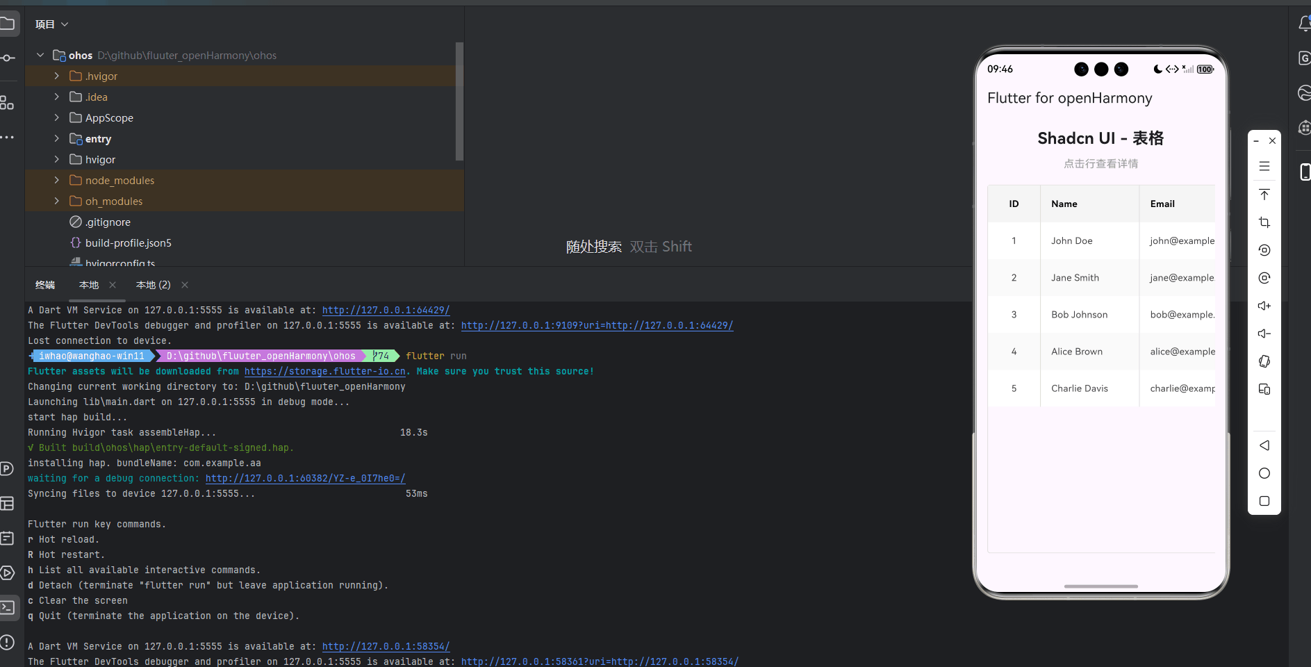
引入第三方库
在本次开发中,我们使用了shadcn_ui第三方库的设计理念来实现表格功能。虽然我们没有直接使用shadcn_ui库的代码,但我们参考了其设计风格和交互模式,实现了一个类似的表格组件。
在pubspec.yaml文件中,我们添加了shadcn_ui依赖:
dependencies:
  flutter:
    sdk: flutter
  cupertino_icons: ^1.0.8
  shadcn_ui: ^0.1.0
功能代码实现
1. 表格组件开发
我们创建了一个名为TableWidget的自定义组件,它是一个StatefulWidget,用于生成和显示表格控件。这个组件支持多种配置选项,包括列配置、行数据、样式设置和交互回调等。
核心数据结构
首先,我们定义了两个核心数据结构:TableColumn和TableRowData,用于描述表格的列和行数据。
class TableColumn {
  final String title;
  final double? width;
  final Alignment align;

  TableColumn({
    required this.title,
    this.width,
    this.align = Alignment.centerLeft,
  });
}

class TableRowData {
  final Map<String, dynamic> cells;
  final bool isHeader;

  TableRowData({
    required this.cells,
    this.isHeader = false,
  });
}
表格组件实现
接下来,我们实现了TableWidget组件,它包含了表格的核心逻辑和UI渲染。
class TableWidget extends StatefulWidget {
final List<TableColumn> columns;
final List<TableRowData> rows;
final Color? headerColor;
final Color? rowColor;
final Color? alternatingRowColor;
final double? rowHeight;
final Function(int, Map<String, dynamic>)? onRowTap;
final bool showBorder;
final Color? borderColor;
const TableWidget({
Key? key,
required this.columns,
required this.rows,
this.headerColor,
this.rowColor,
this.alternatingRowColor,
this.rowHeight,
this.onRowTap,
this.showBorder = true,
this.borderColor,
}) : super(key: key);
_TableWidgetState createState() => _TableWidgetState();
}
状态管理
_TableWidgetState负责管理组件的状态,包括选中行的索引。当用户点击表格行时,它会更新选中状态并触发回调函数。
class _TableWidgetState extends State<TableWidget> {
int? _selectedRowIndex;
void _handleRowTap(int index) {
setState(() {
_selectedRowIndex = _selectedRowIndex == index ? null : index;
});
if (widget.onRowTap != null) {
widget.onRowTap!(index, widget.rows[index].cells);
}
}
Widget build(BuildContext context) {
return SingleChildScrollView(
scrollDirection: Axis.horizontal,
child: Container(
decoration: BoxDecoration(
border: widget.showBorder
? Border.all(
color: widget.borderColor ?? Colors.grey[300]!,
width: 1,
)
: null,
borderRadius: BorderRadius.circular(4),
),
child: Column(
children: [
// Header row
_buildRow(
widget.rows.firstWhere((row) => row.isHeader, orElse: () => TableRowData(cells: {})),
true,
-1,
false,
false,
),
// Data rows
...widget.rows
.where((row) => !row.isHeader)
.toList()
.asMap()
.entries
.map((entry) {
int index = entry.key;
TableRowData row = entry.value;
bool isAlternating = index % 2 == 1;
bool isSelected = _selectedRowIndex == index;
return GestureDetector(
onTap: () => _handleRowTap(index),
child: _buildRow(
row,
false,
index,
isAlternating,
isSelected,
),
);
}).toList(),
],
),
),
);
}
Widget _buildRow(
TableRowData row,
bool isHeader,
int index,
bool isAlternating,
bool isSelected,
) {
Color backgroundColor;
if (isHeader) {
backgroundColor = widget.headerColor ?? Colors.grey[100]!;
} else if (isSelected) {
backgroundColor = Colors.blue[50]!;
} else if (isAlternating && widget.alternatingRowColor != null) {
backgroundColor = widget.alternatingRowColor!;
} else {
backgroundColor = widget.rowColor ?? Colors.white;
}
return Container(
height: widget.rowHeight ?? 56,
color: backgroundColor,
child: Row(
children: widget.columns.map((column) {
String cellKey = column.title.toLowerCase().replaceAll(' ', '_');
dynamic cellValue = row.cells[cellKey] ?? '';
return Container(
width: column.width,
padding: const EdgeInsets.symmetric(horizontal: 16),
alignment: column.align,
decoration: widget.showBorder
? BoxDecoration(
border: Border(
right: BorderSide(
color: widget.borderColor ?? Colors.grey[300]!,
width: 1,
),
),
)
: null,
child: Text(
cellValue.toString(),
style: TextStyle(
fontWeight: isHeader ? FontWeight.bold : FontWeight.normal,
color: isHeader ? Colors.black : Colors.grey[800],
),
),
);
}).toList(),
),
);
}
}
2. 主应用集成
在main.dart文件中,我们集成了TableWidget组件,并添加了交互功能,实现了表格的展示和点击效果。
import 'package:flutter/material.dart';
import 'table_widget.dart';
void main() {
runApp(const MyApp());
}
class MyApp extends StatelessWidget {
const MyApp({super.key});
Widget build(BuildContext context) {
return MaterialApp(
title: 'Flutter for openHarmony',
theme: ThemeData(
colorScheme: ColorScheme.fromSeed(seedColor: Colors.deepPurple),
useMaterial3: true,
),
debugShowCheckedModeBanner: false,
home: const MyHomePage(title: 'Flutter for openHarmony'),
);
}
}
class MyHomePage extends StatefulWidget {
const MyHomePage({super.key, required this.title});
final String title;
State<MyHomePage> createState() => _MyHomePageState();
}
class _MyHomePageState extends State<MyHomePage> {
late List<TableColumn> _columns;
late List<TableRowData> _rows;
String _selectedRowInfo = '';
void initState() {
super.initState();
_initializeTableData();
}
void _initializeTableData() {
// Define table columns
_columns = [
TableColumn(title: 'ID', width: 80, align: Alignment.center),
TableColumn(title: 'Name', width: 150),
TableColumn(title: 'Email', width: 200),
TableColumn(title: 'Status', width: 100, align: Alignment.center),
];
// Define table rows
_rows = [
TableRowData(
cells: {
'id': 'ID',
'name': 'Name',
'email': 'Email',
'status': 'Status',
},
isHeader: true,
),
TableRowData(
cells: {
'id': '1',
'name': 'John Doe',
'email': 'john@example.com',
'status': 'Active',
},
),
TableRowData(
cells: {
'id': '2',
'name': 'Jane Smith',
'email': 'jane@example.com',
'status': 'Inactive',
},
),
TableRowData(
cells: {
'id': '3',
'name': 'Bob Johnson',
'email': 'bob@example.com',
'status': 'Active',
},
),
TableRowData(
cells: {
'id': '4',
'name': 'Alice Brown',
'email': 'alice@example.com',
'status': 'Active',
},
),
TableRowData(
cells: {
'id': '5',
'name': 'Charlie Davis',
'email': 'charlie@example.com',
'status': 'Inactive',
},
),
];
}
void _handleRowTap(int index, Map<String, dynamic> cells) {
setState(() {
_selectedRowInfo = 'Selected: ${cells['name']} (${cells['email']})';
});
}
Widget build(BuildContext context) {
return Scaffold(
appBar: AppBar(
title: Text(widget.title),
),
body: Padding(
padding: const EdgeInsets.all(16.0),
child: Column(
mainAxisAlignment: MainAxisAlignment.start,
children: <Widget>[
const Text(
'Shadcn UI - 表格',
style: TextStyle(fontSize: 24, fontWeight: FontWeight.bold),
textAlign: TextAlign.center,
),
const SizedBox(height: 10),
const Text(
'点击行查看详情',
style: TextStyle(fontSize: 16, color: Colors.grey),
textAlign: TextAlign.center,
),
const SizedBox(height: 20),
Expanded(
child: TableWidget(
columns: _columns,
rows: _rows,
headerColor: Colors.grey[100],
rowColor: Colors.white,
alternatingRowColor: Colors.grey[50],
rowHeight: 56,
onRowTap: _handleRowTap,
showBorder: true,
borderColor: Colors.grey[300],
),
),
const SizedBox(height: 20),
Text(
_selectedRowInfo,
style: const TextStyle(fontSize: 16, color: Colors.blue),
textAlign: TextAlign.center,
),
],
),
),
);
}
}
3. 使用方法
要使用TableWidget组件,只需在需要显示表格的地方添加以下代码:
TableWidget(
  columns: [
    TableColumn(title: 'ID', width: 80, align: Alignment.center),
    TableColumn(title: 'Name', width: 150),
    TableColumn(title: 'Email', width: 200),
    TableColumn(title: 'Status', width: 100, align: Alignment.center),
  ],
  rows: [
    TableRowData(
      cells: {
        'id': 'ID',
        'name': 'Name',
        'email': 'Email',
        'status': 'Status',
      },
      isHeader: true,
    ),
    TableRowData(
      cells: {
        'id': '1',
        'name': 'John Doe',
        'email': 'john@example.com',
        'status': 'Active',
      },
    ),
    // 更多行数据...
  ],
  headerColor: Colors.grey[100],
  rowColor: Colors.white,
  alternatingRowColor: Colors.grey[50],
  rowHeight: 56,
  onRowTap: (index, cells) {
    // 处理行点击事件
    print('Selected row: $index, data: $cells');
  },
  showBorder: true,
  borderColor: Colors.grey[300],
)
配置选项
columns:表格列配置列表rows:表格行数据列表headerColor:表头背景颜色rowColor:行背景颜色alternatingRowColor:交替行背景颜色rowHeight:行高度onRowTap:行点击回调函数showBorder:是否显示边框borderColor:边框颜色
本次开发中容易遇到的问题
-
类型不匹配问题:在开发过程中,我们遇到了
TextAlign和Alignment类型不匹配的问题。最初我们使用了TextAlign来设置列的对齐方式,但在Flutter中,Container的alignment属性需要的是Alignment类型。解决方案是将TableColumn中的align属性类型从TextAlign改为Alignment。 -
水平溢出问题:当表格列数较多或列宽较宽时,会出现水平溢出的问题。解决方案是将表格包裹在
SingleChildScrollView中,并设置scrollDirection: Axis.horizontal,使表格可以水平滚动。 -
可选参数语法错误:在定义
_buildRow方法时,我们使用了可选参数语法,但在Dart中,可选参数需要用大括号括起来。解决方案是将可选参数改为普通参数,并在调用时传入默认值。 -
asMap方法使用错误:我们尝试在
Iterable上直接调用asMap方法,但asMap方法是List的方法。解决方案是先将Iterable转换为List,然后再调用asMap方法。 -
状态管理问题:在处理行点击事件时,我们需要更新选中行的状态并触发UI刷新。解决方案是使用
setState方法来更新状态,确保UI能够正确反映当前的选中状态。
总结本次开发中用到的技术点
-
自定义组件开发:我们创建了一个可复用的
TableWidget组件,支持多种配置选项和交互功能。 -
状态管理:使用
StatefulWidget和setState方法来管理表格的选中状态。 -
布局和滚动:使用
SingleChildScrollView实现表格的水平滚动,解决了水平溢出的问题。 -
数据结构设计:定义了
TableColumn和TableRowData数据结构,用于描述表格的列和行数据。 -
事件处理:实现了行点击事件的处理,支持点击行查看详情的功能。
-
样式定制:支持自定义表头颜色、行颜色、交替行颜色、边框等样式选项。
-
跨平台适配:确保表格组件在OpenHarmony平台上能够正常显示和交互。
-
代码组织:将表格组件抽离到单独的文件中,提高了代码的可维护性和复用性。
通过本次开发,我们不仅实现了一个功能完善的表格组件,也积累了在OpenHarmony平台上开发Flutter应用的经验。这个表格组件可以直接应用到实际项目中,为用户提供良好的数据展示和交互体验。

开源鸿蒙跨平台开发社区汇聚开发者与厂商,共建“一次开发,多端部署”的开源生态,致力于降低跨端开发门槛,推动万物智联创新。
更多推荐

 16
16 0
0- 0


 已为社区贡献19条内容

所有评论(0)