【开源鸿蒙跨平台开发先锋训练营】DAY8~DAY13底部导航栏Tab选项卡4-我的
本文介绍了一个Flutter个人主页的开发实现。页面采用StatefulWidget构建,包含三个主要组件:用户信息卡片(展示头像、用户名和打卡天数)、统计卡片(显示累计打卡、连续打卡和完成率)和功能菜单(提供打卡日历、数据统计、徽章查看和退出登录入口)。目前使用模拟数据,仅实现了退出登录功能。页面采用绿色系配色方案(主色#4CAF50),使用SingleChildScrollView支持滚动,布
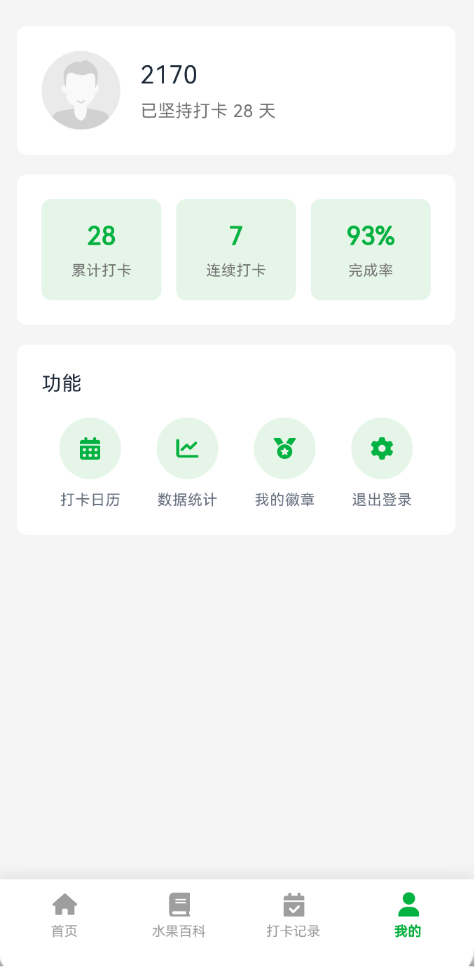
1.我的页面也就是个人中心的开发先看截图效果
1.1 简单说明
该页面包含用户信息展示、数据统计、功能菜单以及退出登录等核心功能。
2.功能简介
2.1用户信息
展示头像、用户名和打卡天数,嘿嘿 当前写死的假数据
2.2统计数据卡片
展示累计打卡、连续打卡和完成率 嘿嘿 当前写死的假数据
2.3 功能菜单
提供打卡日历、数据统计、我的徽章和退出登录等功能入口,目前只有实现退出登录
3.页面结构
使用 StatefulWidget, SingleChildScrollView支持滚动
class ProfilePage extends StatefulWidget {
  const ProfilePage({super.key});

  @override
  State<ProfilePage> createState() => _ProfilePageState();
}

class _ProfilePageState extends State<ProfilePage> {
  @override
  Widget build(BuildContext context) {
    return Scaffold(
      backgroundColor: const Color(0xFFF5F5F5),
      body: SafeArea(
        child: SingleChildScrollView(
          child: Column(
            children: [
              _buildUserInfoCard(),
              _buildStatsCard(),
              _buildFunctionsCard(context),
            ],
          ),
        ),
      ),
    );
  }
}
4.技术实现
4.1用户信息卡片实现
用户信息卡片展示用户头像、昵称和打卡天数
在做之前我还是在页面初始化的时候加载我的初始化信息,记住目前只有名字没有其他的,均为死数据。
@override
void initState() {
super.initState();
// 加载用户信息
userManager.loadUserInfo();
}
Widget _buildUserInfoCard() {
  return Container(
    margin: const EdgeInsets.symmetric(horizontal: 16),
    padding: const EdgeInsets.all(20),
    decoration: BoxDecoration(
      color: Colors.white,
      borderRadius: BorderRadius.circular(8),
    ),
    child: Row(
      children: [
        // 圆形头像容器
        Container(
          width: 64,
          height: 64,
          decoration: const BoxDecoration(
            color: Color(0xFFE8F5E9),
            shape: BoxShape.circle,
          ),
          child: ClipOval(
            child: Image.asset(
              'assets/images/icons/new_user_logo.png',
              width: 64,
              height: 64,
              fit: BoxFit.cover,
              errorBuilder: (context, error, stackTrace) {
                return const Icon(
                  Icons.person,
                  size: 36,
                  color: Color(0xFF4CAF50),
                );
              },
            ),
          ),
        ),
        const SizedBox(width: 16),
        // 用户信息文本
        Column(
          crossAxisAlignment: CrossAxisAlignment.start,
          children: [
            Text(
              userManager.displayName,
              style: const TextStyle(
                fontSize: 20,
                fontWeight: FontWeight.w400,
                color: Color(0xFF1F2937),
              ),
            ),
            const SizedBox(height: 4),
            Text(
              '已坚持打卡 28 天',
              style: TextStyle(fontSize: 14, color: Colors.grey[600]),
            ),
          ],
        ),
      ],
    ),
  );
}
4.1.1 实现步骤
第一步.使用 ClipOval将头像为圆形
第二步.提供 errorBuilder处理图片加载失败的情况
第三步.通过 userManager.displayName动态获取用户名
第四步.使用浅绿色背景 0xFFE8F5E9作为头像容器背景
4.2 统计数据卡片实现
Widget _buildStatsCard() {
  return Container(
    margin: const EdgeInsets.symmetric(horizontal: 16),
    padding: const EdgeInsets.all(20),
    decoration: BoxDecoration(
      color: Colors.white,
      borderRadius: BorderRadius.circular(8),
    ),
    child: Row(
      children: [
        _buildStatItem('28', '累计打卡'),
        const SizedBox(width: 12),
        _buildStatItem('7', '连续打卡'),
        const SizedBox(width: 12),
        _buildStatItem('93%', '完成率'),
      ],
    ),
  );
}

Widget _buildStatItem(String value, String label) {
  return Expanded(
    child: Container(
      padding: const EdgeInsets.all(16),
      decoration: BoxDecoration(
        color: const Color(0xFFE8F5E9),
        borderRadius: BorderRadius.circular(8),
      ),
      child: Column(
        children: [
          Text(
            value,
            style: const TextStyle(
              fontSize: 20,
              fontWeight: FontWeight.bold,
              color: Color(0xFF4CAF50),
            ),
          ),
          const SizedBox(height: 4),
          Text(
            label,
            style: TextStyle(fontSize: 12, color: Colors.grey[600]),
          ),
        ],
      ),
    ),
  );
}
4.2.1 实现步骤
第一步使用 Expanded让三个统计项平均分配空间
第二步使用绿色0xFF4CAF50显示
第三步每个统计项都有独立的浅绿色背景色
4.3 功能菜单实现
Widget _buildFunctionsCard(BuildContext context) {
  return Container(
    margin: const EdgeInsets.symmetric(horizontal: 16),
    padding: const EdgeInsets.all(20),
    decoration: BoxDecoration(
      color: Colors.white,
      borderRadius: BorderRadius.circular(8),
    ),
    child: Column(
      crossAxisAlignment: CrossAxisAlignment.start,
      children: [
        const Text('功能', style: TextStyle(fontSize: 16)),
        const SizedBox(height: 16),
        Row(
          mainAxisAlignment: MainAxisAlignment.spaceAround,
          children: [
            _buildFunctionItem(
              iconPath: 'assets/images/profile/calendar.png',
              label: '打卡日历',
              onTap: () {
                // TODO: 跳转到打卡日历
              },
            ),
            _buildFunctionItem(
              iconPath: 'assets/images/profile/chart.png',
              label: '数据统计',
              onTap: () {
                // TODO: 跳转到数据统计
              },
            ),
            _buildFunctionItem(
              iconPath: 'assets/images/profile/badge.png',
              label: '我的徽章',
              onTap: () {
                // TODO: 跳转到我的徽章
              },
            ),
            _buildFunctionItem(
              iconPath: 'assets/images/profile/setting.png',
              label: '退出登录',
              onTap: () {
                _showLogoutDialog(context);
              },
            ),
          ],
        ),
      ],
    ),
  );
}
5.颜色推荐
| 颜色用途 | 颜色值 | 说明 |
| 主题色 | 0xFF4CAF50 | 用于强调元素和按钮 |
| 浅绿背景 | 0xFFE8F5E9 | 用于卡片和容器背景 |
| 页面背景 | 0xFFF5F5F5 | 浅灰色 |
| 主文本 | 0xFF1F2937 | 深灰色 |
| 次要文本 | 0xFF6B7280 | 中灰色 |
6.最后
欢迎加入开源鸿蒙跨平台社区:
https://openharmonycrossplatform.csdn.net

开源鸿蒙跨平台开发社区汇聚开发者与厂商,共建“一次开发,多端部署”的开源生态,致力于降低跨端开发门槛,推动万物智联创新。
更多推荐

 5
5 0
0- 0


 已为社区贡献15条内容

所有评论(0)