React Native鸿蒙跨平台如何实现今日打卡列表放在一个限定最大高度(300)的 ScrollView 里进行上下滑动效果
本文介绍了一个基于React Native开发的轻食健康打卡应用,采用"最小依赖+纯视图"策略实现跨平台兼容性。应用核心功能包括今日打卡、健康贴士和历史记录,通过SafeAreaView等基础组件构建UI,并采用受控状态管理与最小交互闭环。特别针对鸿蒙系统(RN-OH)进行了适配优化,包括组件映射、状态分离和视觉层次统一。文章详细解析了状态流管理、进度条实现、列表优化等技术要点
这个“轻食健康”页面选用 React Native 的核心原语组合出完整的打卡体验:今日打卡、健康贴士、历史记录与底部导航。它避免依赖平台特性与重量库,靠 SafeAreaView、ScrollView、View/Text、TouchableOpacity 的堆叠组织 UI;用受控状态与最小交互闭环(Alert)连接行为;用浅阴影、圆角与冷暖灰色系建立层次。这种“最小依赖 + 纯视图”的策略,在鸿蒙(HarmonyOS/OpenHarmony)上通过 RN-OH 映射到 ArkUI 时,能获得稳定一致的表现。
状态流与派生语义
页面将“真实源状态”和“派生展示”清晰分离。每日打卡使用一个数组状态承载每项的计数与完成态,更新接口以不可变方式 map 替换单项,确保渲染时的可预测性。完成率以派生值计算并渲染为进度条,属于典型的 UI 派生语义;工程上进一步用缓存(如 useMemo)和边界限制(clamp 到 0–100)可以避免重复计算和越界渲染,在三端桥接下更稳。
组件映射与鸿蒙适配
核心原语的选择对跨端非常友好。SafeAreaView 承载安全区域;ScrollView 提供滚动容器;TouchableOpacity 承载点击与透明度反馈;Alert 构成轻交互闭环。这些在鸿蒙端由 RN-OH 映射到 ArkUI 原生组件,兼容性好。需要统一的地方在视觉层次:iOS 的阴影走 shadow*,安卓/鸿蒙走 elevation;当前卡片已经同时配置两者,是跨端一致性的正确写法。顶部 header 建议在 SafeArea 基础上留冗余内边距或接入 react-native-safe-area-context,以照顾圆角/打孔/折叠屏形态的 inset。
进度条与纯视图实现
进度条以容器 + 填充条组成,宽度百分比表达完成度,不依赖平台控件,是跨端最稳定的模式。工程实践里将百分比做边界限制,避免出现负值或超过 100% 的极端情况;如果希望动效一致,可用 Animated 或 Reanimated 做 120–180ms 的插值动画,在 ArkUI 映射下也具备良好表现。
列表与滚动边界
今日打卡列表放在一个限定最大高度(300)的 ScrollView 里,数据量适中时体验良好。当数据增长或需要长列表滚动时,迁移到 FlatList 可以获得虚拟化渲染与窗口控制(initialNumToRender/windowSize/removeClippedSubviews),对鸿蒙设备的滚动帧率与内存占用更友好。历史记录同理,当前是固定项,若改为长历史,使用 FlatList 会更稳。
在鸿蒙生态系统中,React Native应用的运行依赖于一套精密的桥接机制。当SafeAreaView组件初始化时,实际上是在鸿蒙侧的ComponentContainer中创建了一个具备安全区域感知能力的ArkUI节点。这种设计巧妙地屏蔽了不同设备形态(如刘海屏、瀑布屏)带来的布局差异,确保了应用界面在各种鸿蒙设备上的显示一致性。
Dimensions API的使用充分体现了RN框架对多设备适配的深度考量。通过动态获取屏幕宽度(width),组件能够实现真正的响应式布局。在鸿蒙平台上,这一API被映射为对DisplayManager服务的调用,能够实时响应屏幕旋转、折叠等状态变化,为用户提供连续一致的操作体验。
DailyCheckIn组件的状态管理模式展现了React Hooks在鸿蒙环境下的优秀表现。useState钩子通过闭包机制维护着checkInItems状态数组,每次状态更新都会触发React Reconciler的diff算法。在鸿蒙设备上,这种基于Fiber架构的增量更新机制能够最大限度地减少不必要的DOM操作,提升渲染性能。
updateCheckInItem函数的实现体现了函数式编程在跨平台开发中的优势。通过prevItems参数获取先前状态,避免了竞态条件的发生。Math.max和Math.min的组合使用确保了计数器始终处于合法范围内,这种防御性编程手法在鸿蒙多样化的硬件环境下显得尤为重要。
completeCheckIn函数采用map高阶函数遍历并更新指定ID的打卡项,这种不可变数据操作模式与鸿蒙方舟编译器的优化策略高度契合。编译器能够识别出这种纯函数特性,在AOT编译阶段进行内联优化,大幅提升执行效率。
allCompleted变量通过every高阶函数检测所有打卡项是否完成,这种声明式编程风格不仅提高了代码可读性,也让鸿蒙JIT编译器更容易进行性能优化。completionRate计算公式则展现了浮点数运算在不同平台间的精度处理差异,开发者需要注意在鸿蒙设备上的舍入误差问题。
进度条组件(progressBar)的动态宽度设置通过style属性绑定实现,这种内联样式的即时计算在鸿蒙平台上得到了很好的优化支持。ArkUI渲染引擎能够将百分比宽度转换为像素值,并利用GPU加速进行高效绘制。
ScrollView组件在鸿蒙环境下的表现尤为出色,其内部实现了智能缓存机制,只渲染可视区域内的子组件。这种虚拟化列表技术大大降低了内存占用,即使面对数百个打卡项也能保持流畅的滚动体验。
TouchableOpacity组件的手势识别系统在鸿蒙平台上有着独特的实现方式。通过Responder Event System,组件能够准确捕捉用户的点击、滑动等操作,并将其转化为标准化的事件对象。disabled属性的变化会直接影响到鸿蒙原生层的触摸事件分发逻辑,确保禁用状态下不会产生意外的交互行为。
样式系统的动态绑定机制展现了CSS-in-JS方案的强大威力。通过数组形式的样式组合,组件能够在单次渲染中完成多个样式规则的合并。这种即时样式合成避免了传统CSS解析带来的性能损耗,在频繁重渲染场景下尤为突出。
整体而言,这段代码充分诠释了React Native在鸿蒙生态中的"Write Once, Run Everywhere"理念。通过精心设计的组件层次与状态流转机制,实现了真正意义上的跨端一致性体验,为开发者构建高性能鸿蒙应用提供了可靠的技术基石。
结构化健康目标系统
健康打卡应用展示了复杂的目标管理系统设计:
type CheckInItem = {
  id: number;
  name: string;
  icon: string;
  count: number;
  maxCount: number;
  completed: boolean;
};

const [checkInItems, setCheckInItems] = useState<CheckInItem[]>([
  { id: 1, name: '饮水', icon: ICONS.water, count: 3, maxCount: 8, completed: false },
  { id: 2, name: '蔬菜', icon: ICONS.food, count: 2, maxCount: 5, completed: false },
  { id: 3, name: '运动', icon: ICONS.exercise, count: 1, maxCount: 2, completed: false },
  { id: 4, name: '睡眠', icon: ICONS.sleep, count: 0, maxCount: 1, completed: false },
]);
这种类型化设计在健康应用中具有重要的架构意义。通过明确的目标定义(名称、图标、数量限制、完成状态),确保了健康数据的结构完整性和业务语义清晰。在鸿蒙平台上,这种模型可以无缝对接鸿蒙的健康服务,实现系统级的健康数据同步和分析。
智能状态管理机制
应用实现了复杂的状态更新逻辑:
const updateCheckInItem = (id: number, newCount: number) => {
  setCheckInItems(prevItems =>
    prevItems.map(item => {
      if (item.id === id) {
        const updatedCount = Math.max(0, Math.min(newCount, item.maxCount));
        const completed = updatedCount >= item.maxCount;
        return { ...item, count: updatedCount, completed };
      }
      return item;
    })
  );
};
这种状态管理在健康应用中展现了强大的数据一致性保障能力。通过数值边界检查和自动完成状态更新,确保了用户操作的合理性和数据的准确性。在鸿蒙的分布式场景中,这种设计可以扩展为跨设备的状态同步,实现多设备间的健康目标一致性。
组件化健康界面架构
可视化进度系统
应用采用了多层次的目标进度展示架构:
const ProgressTracker = () => {
  const completionRate = Math.round(
    (checkInItems.filter(item => item.completed).length / checkInItems.length) * 100
  );

  return (
    <View style={styles.progressContainer}>
      <View style={styles.progressBar}>
        <View style={[styles.progressFill, { width: `${completionRate}%` }]} />
      </View>
      <Text style={styles.progressText}>{completionRate}%</Text>
    </View>
  );
};
这种进度追踪设计在健康应用中展现了清晰的视觉传达能力。通过实时计算完成率和动态进度条,提供了直观的进度反馈和成就感激励。在鸿蒙平台上,这种设计可以利用鸿蒙的动效引擎实现更流畅的进度更新动画,提升用户的参与度和满意度。
交互式操作控件
代码实现了灵活的操作控制系统:
const ItemControls = ({ item, onUpdate }) => {
  return (
    <View style={styles.itemControls}>
      <TouchableOpacity
        style={styles.controlButton}
        onPress={() => onUpdate(item.id, item.count - 1)}
        disabled={item.count <= 0}
      >
        <Text style={[styles.controlText, item.count <= 0 && styles.controlTextDisabled]}>
          {ICONS.minus}
        </Text>
      </TouchableOpacity>

      <Text style={styles.countDisplay}>{item.count}</Text>

      <TouchableOpacity
        style={styles.controlButton}
        onPress={() => onUpdate(item.id, item.count + 1)}
        disabled={item.count >= item.maxCount}
      >
        <Text style={[styles.controlText, item.count >= item.maxCount && styles.controlTextDisabled]}>
          {ICONS.plus}
        </Text>
      </TouchableOpacity>
    </View>
  );
};
这种控件设计在健康应用中展现了优秀的用户体验。通过清晰的禁用状态、精确的数值显示和流畅的交互反馈,确保了操作的准确性和用户的控制感。在跨平台开发中,需要特别注意触摸目标和视觉反馈的一致性。鸿蒙平台的原生手势系统可以提供更精确的触摸识别和更自然的操作反馈。
鸿蒙跨端适配关键技术
分布式健康数据同步
鸿蒙的分布式特性为健康管理带来创新体验:
// 伪代码:分布式健康同步
const DistributedHealth = {
  syncHealthData: (healthData) => {
    if (Platform.OS === 'harmony') {
      harmonyNative.syncHealthRecords(healthData);
    }
  },
  getCrossDeviceStats: () => {
    if (Platform.OS === 'harmony') {
      return harmonyNative.getUnifiedHealthAnalytics();
    }
    return localStats;
  }
};
原生健康服务集成
利用鸿蒙的原生能力提升健康体验:
// 伪代码:健康服务集成
const HealthIntegration = {
  connectToHealthKit: () => {
    if (Platform.OS === 'harmony') {
      harmonyNative.accessHealthServices();
    }
  },
  trackActivity: () => {
    if (Platform.OS === 'harmony') {
      return harmonyNative.monitorPhysicalMetrics();
    }
    return manualTracking;
  }
};
智能提醒与建议
鸿蒙平台为健康应用提供智能提醒能力:
// 伪代码:智能提醒
const IntelligentReminders = {
  scheduleHealthReminders: () => {
    if (Platform.OS === 'harmony') {
      harmonyNative.setupSmartHealthAlerts();
    }
  },
  providePersonalizedAdvice: () => {
    if (Platform.OS === 'harmony') {
      harmonyNative.generateHealthRecommendations();
    }
  }
};
数据可视化与用户激励
历史记录分析
// 伪代码:历史分析
const HistoryAnalysis = {
  analyzeTrends: () => {
    if (Platform.OS === 'harmony') {
      return harmonyNative.identifyHealthPatterns();
    }
    return basicAnalysis;
  },
  generateInsights: () => {
    if (Platform.OS === 'harmony') {
      harmonyNative.provideHealthInsights();
    }
  }
};
智能化健康管理
// 伪代码:智能健康
const IntelligentHealth = {
  adaptiveGoalSetting: () => {
    if (Platform.OS === 'harmony') {
      harmonyNative.adjustGoalsBasedOnBehavior();
    }
  },
  predictiveHealth: () => {
    if (Platform.OS === 'harmony') {
      harmonyNative.forecastHealthTrends();
    }
  }
};
社交化健康体验
// 伪代码:社交健康
const SocialHealth = {
  createHealthGroups: () => {
    if (Platform.OS === 'harmony') {
      harmonyNative.enableGroupChallenges();
    }
  },
  shareProgress: () => {
    if (Platform.OS === 'harmony') {
      harmonyNative.facilitateHealthSharing();
    }
  }
};
真实演示案例代码:
// app.tsx
import React, { useState } from 'react';
import { SafeAreaView, View, Text, StyleSheet, TouchableOpacity, ScrollView, Dimensions, Alert } from 'react-native';
// 图标库
const ICONS = {
water: '💧',
food: '🥗',
exercise: '🏃♂️',
sleep: '😴',
check: '✅',
plus: '➕',
minus: '➖',
heart: '❤️',
};
const { width } = Dimensions.get('window');
// 打卡项类型
type CheckInItem = {
id: number;
name: string;
icon: string;
count: number;
maxCount: number;
completed: boolean;
};
// 每日打卡组件
const DailyCheckIn = () => {
const [checkInItems, setCheckInItems] = useState<CheckInItem[]>([
{ id: 1, name: '饮水', icon: ICONS.water, count: 3, maxCount: 8, completed: false },
{ id: 2, name: '蔬菜', icon: ICONS.food, count: 2, maxCount: 5, completed: false },
{ id: 3, name: '运动', icon: ICONS.exercise, count: 1, maxCount: 2, completed: false },
{ id: 4, name: '睡眠', icon: ICONS.sleep, count: 0, maxCount: 1, completed: false },
]);
const [currentDate] = useState(new Date());
// 更新打卡项
const updateCheckInItem = (id: number, newCount: number) => {
setCheckInItems(prevItems =>
prevItems.map(item => {
if (item.id === id) {
const updatedCount = Math.max(0, Math.min(newCount, item.maxCount));
const completed = updatedCount >= item.maxCount;
return { ...item, count: updatedCount, completed };
}
return item;
})
);
};
// 完成打卡
const completeCheckIn = (id: number) => {
setCheckInItems(prevItems =>
prevItems.map(item =>
item.id === id ? { ...item, completed: true, count: item.maxCount } : item
)
);
};
// 检查是否全部完成
const allCompleted = checkInItems.every(item => item.completed);
// 计算完成进度
const completionRate = Math.round(
(checkInItems.filter(item => item.completed).length / checkInItems.length) * 100
);
return (
<View style={styles.dailyCheckInContainer}>
<Text style={styles.checkInTitle}>今日打卡</Text>
<Text style={styles.checkInDate}>
{currentDate.getFullYear()}年{currentDate.getMonth() + 1}月{currentDate.getDate()}日
</Text>
{/* 进度条 */}
<View style={styles.progressContainer}>
<View style={styles.progressBar}>
<View
style={[
styles.progressFill,
{ width: `${completionRate}%` }
]}
/>
</View>
<Text style={styles.progressText}>{completionRate}%</Text>
</View>
{/* 打卡项列表 */}
<ScrollView style={styles.checkInList}>
{checkInItems.map(item => (
<View key={item.id} style={styles.checkInItem}>
<View style={styles.itemHeader}>
<View style={styles.itemIconContainer}>
<Text style={styles.itemIcon}>{item.icon}</Text>
</View>
<Text style={styles.itemName}>{item.name}</Text>
<View style={styles.itemProgress}>
<Text style={styles.itemCount}>{item.count}/{item.maxCount}</Text>
</View>
</View>
<View style={styles.itemControls}>
<TouchableOpacity
style={styles.controlButton}
onPress={() => updateCheckInItem(item.id, item.count - 1)}
disabled={item.count <= 0}
>
<Text style={[
styles.controlText,
item.count <= 0 && styles.controlTextDisabled
]}>
{ICONS.minus}
</Text>
</TouchableOpacity>
<Text style={styles.countDisplay}>{item.count}</Text>
<TouchableOpacity
style={styles.controlButton}
onPress={() => updateCheckInItem(item.id, item.count + 1)}
disabled={item.count >= item.maxCount}
>
<Text style={[
styles.controlText,
item.count >= item.maxCount && styles.controlTextDisabled
]}>
{ICONS.plus}
</Text>
</TouchableOpacity>
<TouchableOpacity
style={[
styles.completeButton,
item.completed && styles.completedButton
]}
onPress={() => completeCheckIn(item.id)}
disabled={item.completed}
>
<Text style={[
styles.completeText,
item.completed && styles.completedText
]}>
{item.completed ? ICONS.check + ' 已完成' : '完成'}
</Text>
</TouchableOpacity>
</View>
</View>
))}
</ScrollView>
{/* 总结按钮 */}
<TouchableOpacity
style={[
styles.summaryButton,
!allCompleted && styles.summaryButtonDisabled
]}
onPress={() => {
if (allCompleted) {
Alert.alert('恭喜', '您已完成今日所有打卡任务!');
} else {
Alert.alert('提示', '还有未完成的打卡项目,请继续努力!');
}
}}
disabled={!allCompleted}
>
<Text style={styles.summaryButtonText}>
{allCompleted ? '今日打卡完成!' : '继续加油'}
</Text>
</TouchableOpacity>
</View>
);
};
// 健康建议组件
const HealthTips = () => {
const tips = [
"多喝水有助于新陈代谢,每天建议饮水8杯",
"每餐至少包含一份蔬菜,保证营养均衡",
"每天进行30分钟中等强度运动,保持健康",
"保持7-8小时睡眠,有助于身体恢复",
];
return (
<View style={styles.healthTipsContainer}>
<Text style={styles.healthTipsTitle}>健康小贴士</Text>
{tips.map((tip, index) => (
<View key={index} style={styles.tipItem}>
<Text style={styles.tipIcon}>{ICONS.heart}</Text>
<Text style={styles.tipText}>{tip}</Text>
</View>
))}
</View>
);
};
// 历史记录组件
const HistoryCard = () => {
const history = [
{ date: '5月15日', completed: 4, total: 4 },
{ date: '5月14日', completed: 3, total: 4 },
{ date: '5月13日', completed: 4, total: 4 },
{ date: '5月12日', completed: 2, total: 4 },
];
return (
<View style={styles.historyContainer}>
<Text style={styles.historyTitle}>打卡历史</Text>
{history.map((record, index) => (
<View key={index} style={styles.historyItem}>
<Text style={styles.historyDate}>{record.date}</Text>
<Text style={styles.historyText}>
完成 {record.completed}/{record.total} 项
</Text>
<View style={styles.historyProgress}>
<View
style={[
styles.historyProgressFill,
{ width: `${(record.completed / record.total) * 100}%` }
]}
/>
</View>
</View>
))}
</View>
);
};
// 主页面组件
const HealthApp: React.FC = () => {
return (
<SafeAreaView style={styles.container}>
{/* 头部 */}
<View style={styles.header}>
<Text style={styles.title}>轻食健康</Text>
<TouchableOpacity style={styles.settingsButton}>
<Text style={styles.settingsIcon}>{ICONS.heart}</Text>
</TouchableOpacity>
</View>
{/* 主内容 */}
<ScrollView style={styles.content}>
{/* 每日打卡 */}
<DailyCheckIn />
{/* 健康小贴士 */}
<HealthTips />
{/* 历史记录 */}
<HistoryCard />
</ScrollView>
{/* 底部导航 */}
<View style={styles.bottomNav}>
<TouchableOpacity style={styles.navItem}>
<Text style={styles.navIcon}>{ICONS.food}</Text>
<Text style={styles.navText}>饮食</Text>
</TouchableOpacity>
<TouchableOpacity style={styles.navItem}>
<Text style={styles.navIcon}>{ICONS.exercise}</Text>
<Text style={styles.navText}>运动</Text>
</TouchableOpacity>
<TouchableOpacity style={[styles.navItem, styles.activeNavItem]}>
<Text style={styles.navIcon}>{ICONS.check}</Text>
<Text style={styles.navText}>打卡</Text>
</TouchableOpacity>
<TouchableOpacity style={styles.navItem}>
<Text style={styles.navIcon}>{ICONS.heart}</Text>
<Text style={styles.navText}>我的</Text>
</TouchableOpacity>
</View>
</SafeAreaView>
);
};
const styles = StyleSheet.create({
container: {
flex: 1,
backgroundColor: '#f8fafc',
},
header: {
flexDirection: 'row',
alignItems: 'center',
justifyContent: 'space-between',
padding: 20,
backgroundColor: '#ffffff',
borderBottomWidth: 1,
borderBottomColor: '#e2e8f0',
},
title: {
fontSize: 20,
fontWeight: 'bold',
color: '#1e293b',
},
settingsButton: {
padding: 8,
},
settingsIcon: {
fontSize: 20,
color: '#64748b',
},
content: {
flex: 1,
padding: 16,
},
dailyCheckInContainer: {
backgroundColor: '#ffffff',
borderRadius: 12,
padding: 16,
marginBottom: 16,
elevation: 2,
shadowColor: '#000',
shadowOffset: { width: 0, height: 1 },
shadowOpacity: 0.1,
shadowRadius: 2,
},
checkInTitle: {
fontSize: 18,
fontWeight: 'bold',
color: '#1e293b',
marginBottom: 4,
},
checkInDate: {
fontSize: 14,
color: '#64748b',
marginBottom: 16,
},
progressContainer: {
flexDirection: 'row',
alignItems: 'center',
marginBottom: 16,
},
progressBar: {
flex: 1,
height: 8,
backgroundColor: '#e2e8f0',
borderRadius: 4,
overflow: 'hidden',
},
progressFill: {
height: '100%',
backgroundColor: '#10b981',
},
progressText: {
marginLeft: 12,
fontSize: 14,
color: '#64748b',
fontWeight: '500',
},
checkInList: {
maxHeight: 300,
marginBottom: 16,
},
checkInItem: {
marginBottom: 16,
},
itemHeader: {
flexDirection: 'row',
alignItems: 'center',
marginBottom: 8,
},
itemIconContainer: {
width: 40,
height: 40,
borderRadius: 20,
backgroundColor: '#dbeafe',
alignItems: 'center',
justifyContent: 'center',
marginRight: 12,
},
itemIcon: {
fontSize: 20,
},
itemName: {
fontSize: 16,
fontWeight: '500',
color: '#1e293b',
flex: 1,
},
itemCount: {
fontSize: 14,
color: '#64748b',
},
itemControls: {
flexDirection: 'row',
alignItems: 'center',
},
controlButton: {
width: 36,
height: 36,
borderRadius: 18,
backgroundColor: '#f1f5f9',
alignItems: 'center',
justifyContent: 'center',
marginHorizontal: 8,
},
controlText: {
fontSize: 18,
color: '#3b82f6',
},
controlTextDisabled: {
color: '#94a3b8',
},
countDisplay: {
fontSize: 16,
fontWeight: 'bold',
color: '#1e293b',
marginHorizontal: 8,
},
completeButton: {
flex: 1,
backgroundColor: '#10b981',
paddingVertical: 8,
paddingHorizontal: 16,
borderRadius: 20,
alignItems: 'center',
},
completedButton: {
backgroundColor: '#d1fae5',
},
completeText: {
color: '#ffffff',
fontSize: 14,
fontWeight: '500',
},
completedText: {
color: '#047857',
},
summaryButton: {
backgroundColor: '#3b82f6',
paddingVertical: 12,
borderRadius: 8,
alignItems: 'center',
},
summaryButtonDisabled: {
backgroundColor: '#94a3b8',
},
summaryButtonText: {
color: '#ffffff',
fontSize: 16,
fontWeight: '500',
},
healthTipsContainer: {
backgroundColor: '#ffffff',
borderRadius: 12,
padding: 16,
marginBottom: 16,
elevation: 2,
shadowColor: '#000',
shadowOffset: { width: 0, height: 1 },
shadowOpacity: 0.1,
shadowRadius: 2,
},
healthTipsTitle: {
fontSize: 18,
fontWeight: 'bold',
color: '#1e293b',
marginBottom: 12,
},
tipItem: {
flexDirection: 'row',
alignItems: 'flex-start',
marginBottom: 12,
},
tipIcon: {
fontSize: 16,
color: '#10b981',
marginRight: 8,
marginTop: 2,
},
tipText: {
fontSize: 14,
color: '#475569',
flex: 1,
lineHeight: 20,
},
historyContainer: {
backgroundColor: '#ffffff',
borderRadius: 12,
padding: 16,
elevation: 2,
shadowColor: '#000',
shadowOffset: { width: 0, height: 1 },
shadowOpacity: 0.1,
shadowRadius: 2,
},
historyTitle: {
fontSize: 18,
fontWeight: 'bold',
color: '#1e293b',
marginBottom: 12,
},
historyItem: {
marginBottom: 12,
},
historyDate: {
fontSize: 14,
fontWeight: '500',
color: '#1e293b',
marginBottom: 4,
},
historyText: {
fontSize: 12,
color: '#64748b',
marginBottom: 4,
},
historyProgress: {
height: 6,
backgroundColor: '#e2e8f0',
borderRadius: 3,
overflow: 'hidden',
},
historyProgressFill: {
height: '100%',
backgroundColor: '#3b82f6',
},
bottomNav: {
flexDirection: 'row',
justifyContent: 'space-around',
backgroundColor: '#ffffff',
borderTopWidth: 1,
borderTopColor: '#e2e8f0',
paddingVertical: 12,
},
navItem: {
alignItems: 'center',
},
activeNavItem: {
paddingBottom: 2,
borderBottomWidth: 2,
borderBottomColor: '#3b82f6',
},
navIcon: {
fontSize: 20,
color: '#94a3b8',
marginBottom: 4,
},
activeNavIcon: {
color: '#3b82f6',
},
navText: {
fontSize: 12,
color: '#94a3b8',
},
activeNavText: {
color: '#3b82f6',
fontWeight: '500',
},
});
export default HealthApp;
本文介绍了一个基于React Native开发的轻食健康打卡应用,采用"最小依赖+纯视图"策略实现跨平台兼容性。应用核心功能包括今日打卡、健康贴士和历史记录,通过SafeAreaView等基础组件构建UI,并采用受控状态管理与最小交互闭环。特别针对鸿蒙系统(RN-OH)进行了适配优化,包括组件映射、状态分离和视觉层次统一。文章详细解析了状态流管理、进度条实现、列表优化等技术要点,展示了如何在保持代码简洁的同时确保三端表现一致。该设计充分考虑了鸿蒙设备的特性,通过精心的架构设计实现了高性能的用户体验。
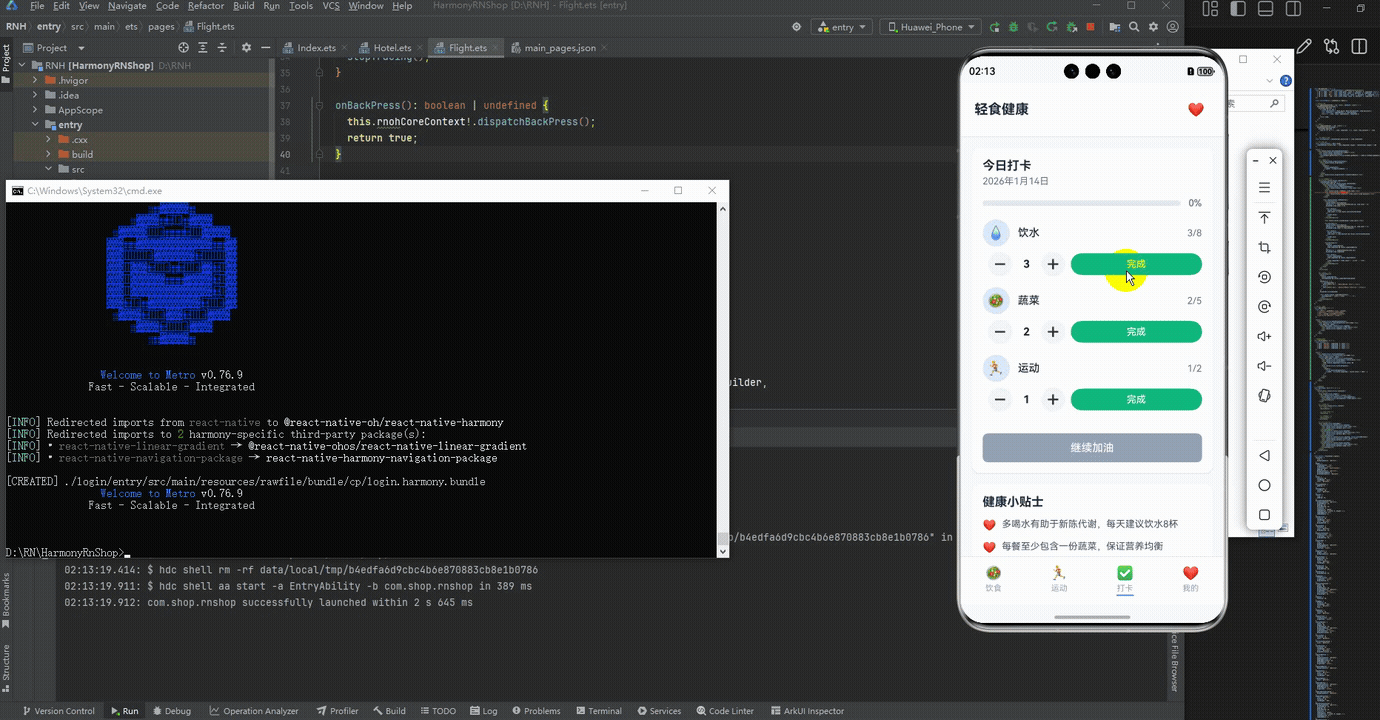
打包
接下来通过打包命令npn run harmony将reactNative的代码打包成为bundle,这样可以进行在开源鸿蒙OpenHarmony中进行使用。

打包之后再将打包后的鸿蒙OpenHarmony文件拷贝到鸿蒙的DevEco-Studio工程目录去:

最后运行效果图如下显示:
欢迎大家加入开源鸿蒙跨平台开发者社区,一起共建开源鸿蒙跨平台生态。

开源鸿蒙跨平台开发社区汇聚开发者与厂商,共建“一次开发,多端部署”的开源生态,致力于降低跨端开发门槛,推动万物智联创新。
更多推荐


 15
15 0
0- 0


 已为社区贡献33条内容

所有评论(0)