在鸿蒙上使用 dynamic_layouts Flutter 包
dynamic_layouts 是一个 Flutter 包,提供 Wrap 和 Staggered 两种动态网格布局模式,支持不同尺寸的子组件自动排列。该包支持主轴/交叉轴间距配置,提供高效的 builder 构造函数,并兼容原生 GridView 功能。通过 git 引入后,开发者可使用 DynamicGridView.wrap、DynamicGridView.staggered 等构造函数快速
插件介绍
dynamic_layouts 是一个 Flutter 包,它提供了两种灵活的动态网格布局:Wrap(自适应)和 Staggered(交错)布局。这些布局允许开发者创建具有不同大小和形状的网格项目,为应用界面提供更丰富的视觉效果和更好的用户体验。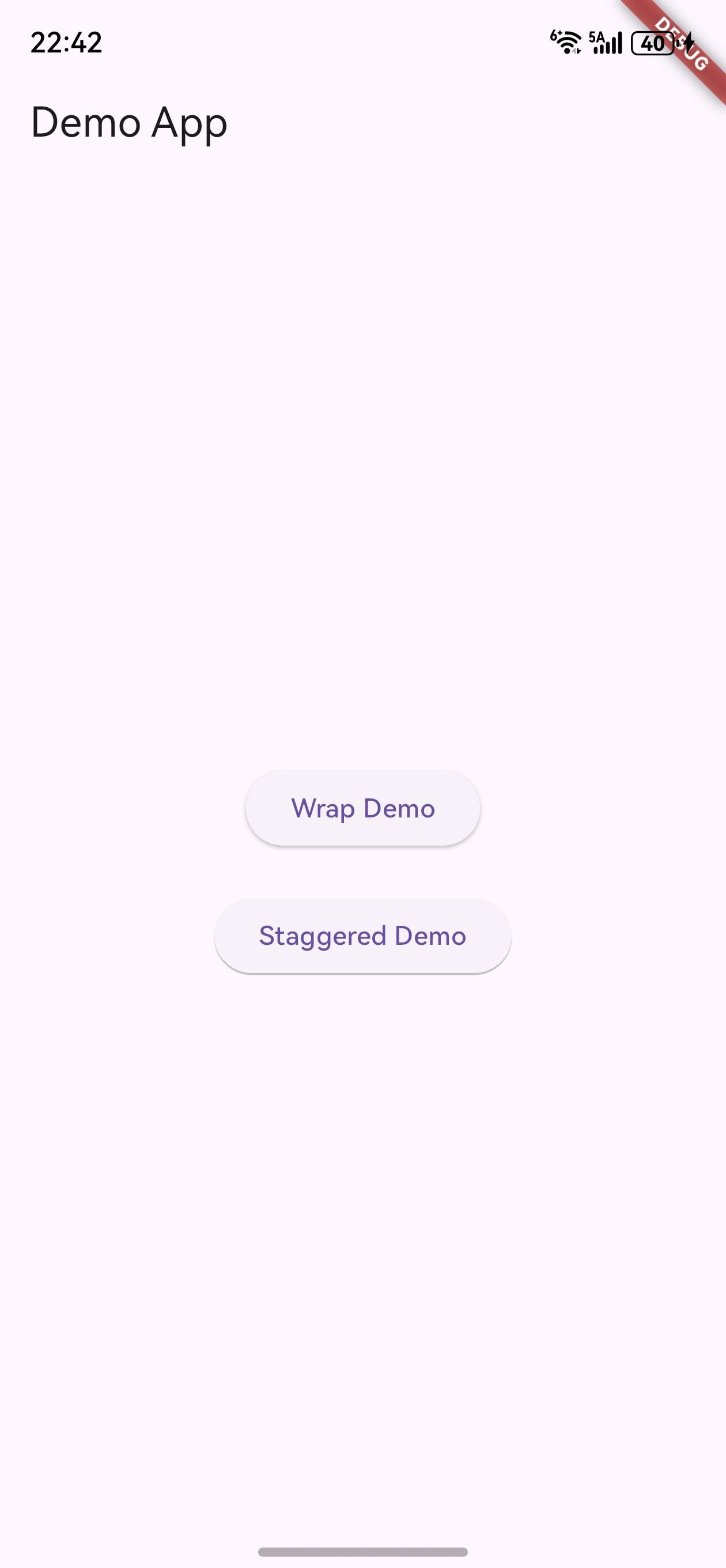
该包的主要特点包括:
-
两种动态布局模式:
- Wrap 布局:自适应子组件大小,根据子组件的实际尺寸自动排列,类似于 iOS 的 UICollectionView
- Staggered 布局:交错网格布局,允许子组件在交叉轴上具有不同的大小,类似于 Android 的 StaggeredGridLayoutManager
-
灵活的配置选项:支持设置主轴间距、交叉轴间距、子组件尺寸等参数
-
高效的构建方式:提供了 builder 构造函数,用于高效创建大量子组件
-
与 Flutter 原生网格视图兼容:继承自 GridView,支持 GridView 的所有基本功能
在鸿蒙平台上使用 dynamic_layouts 包,可以为应用界面创建更加灵活和动态的网格布局,提升应用的视觉吸引力和用户体验。
如何使用插件
包的引入
由于这是一个为鸿蒙平台定制修改的版本,需要以 git 形式引入。在项目的 pubspec.yaml 文件中添加以下依赖配置:
dependencies:
  dynamic_layouts:
    git:
      url: "https://gitcode.com/openharmony-tpc/flutter_packages.git"
      path: "packages/dynamic_layouts"
添加依赖后,运行 flutter pub get 命令来获取包:
flutter pub get
导入包
在需要使用动态布局的 Dart 文件中导入包:
import 'package:dynamic_layouts/dynamic_layouts.dart';
API 的调用
dynamic_layouts 包的核心组件是 DynamicGridView,它提供了多个构造函数来创建不同类型的动态网格布局。
1. Wrap 布局
Wrap 布局会根据子组件的实际尺寸自动排列,类似于流式布局。使用 DynamicGridView.wrap 构造函数可以创建这种布局。
DynamicGridView.wrap(
  mainAxisSpacing: 10,  // 主轴间距
  crossAxisSpacing: 20, // 交叉轴间距
  children: [
    Container(
      height: 100,
      width: 200,
      color: Colors.amberAccent[100],
      child: const Center(child: Text('Item 1')),
    ),
    Container(
      height: 50,
      width: 70,
      color: Colors.blue[100],
      child: const Center(child: Text('Item 2')),
    ),
    Container(
      height: 82,
      width: 300,
      color: Colors.pink[100],
      child: const Center(child: Text('Item 3')),
    ),
    Container(
      color: Colors.green[100],
      child: const Center(child: Text('Item 4')),
    ),
  ],
)
2. Staggered 布局
Staggered 布局是一种交错的网格布局,允许子组件在交叉轴上具有不同的大小。使用 DynamicGridView.staggered 构造函数可以创建这种布局。
DynamicGridView.staggered(
  maxCrossAxisExtent: 100, // 交叉轴上的最大项目宽度
  crossAxisSpacing: 2,     // 交叉轴间距
  mainAxisSpacing: 2,      // 主轴间距
  children: List.generate(
    50,
    (int index) => Container(
      height: index % 3 * 50 + 20, // 不同高度的项目
      color: Colors.amber[index % 9 * 100],
      child: Center(child: Text("Index $index")),
    ),
  ),
)
也可以使用 crossAxisCount 参数来指定交叉轴上的项目数量:
DynamicGridView.staggered(
  crossAxisCount: 3,       // 交叉轴上的项目数量
  crossAxisSpacing: 2,
  mainAxisSpacing: 2,
  children: List.generate(
    50,
    (int index) => Container(
      height: index % 3 * 50 + 20,
      color: Colors.amber[index % 9 * 100],
      child: Center(child: Text("Index $index")),
    ),
  ),
)
3. Builder 构造函数
当需要创建大量子组件时,使用 DynamicGridView.builder 构造函数可以提高性能,因为它只在子组件可见时才会构建它们。
DynamicGridView.builder(
  gridDelegate: SliverGridDelegateWithWrapping(
    mainAxisSpacing: 10,
    crossAxisSpacing: 20,
  ),
  itemCount: 100, // 项目数量
  itemBuilder: (BuildContext context, int index) {
    return Container(
      height: index % 4 * 30 + 30,
      width: index % 3 * 50 + 50,
      color: Colors.blue[index % 9 * 100],
      child: Center(child: Text("Item $index")),
    );
  },
)
完整示例
以下是一个完整的示例,展示了如何在鸿蒙应用中使用 dynamic_layouts 包:
import 'package:flutter/material.dart';
import 'package:dynamic_layouts/dynamic_layouts.dart';
import 'package:css_colors/css_colors.dart';
void main() {
runApp(const MyApp());
}
class MyApp extends StatelessWidget {
const MyApp({Key? key}) : super(key: key);
Widget build(BuildContext context) {
return MaterialApp(
title: 'Dynamic Layouts Demo',
theme: ThemeData(
primarySwatch: Colors.blue,
),
home: const LayoutDemoPage(),
);
}
}
class LayoutDemoPage extends StatefulWidget {
const LayoutDemoPage({Key? key}) : super(key: key);
State<LayoutDemoPage> createState() => _LayoutDemoPageState();
}
class _LayoutDemoPageState extends State<LayoutDemoPage> {
int _currentTab = 0;
Widget build(BuildContext context) {
return Scaffold(
appBar: AppBar(
title: const Text('Dynamic Layouts Demo'),
backgroundColor: CSSColors.deepPurple,
),
body: _buildContent(),
bottomNavigationBar: BottomNavigationBar(
currentIndex: _currentTab,
onTap: (int index) {
setState(() {
_currentTab = index;
});
},
items: const [
BottomNavigationBarItem(
icon: Icon(Icons.view_module),
label: 'Wrap Layout',
),
BottomNavigationBarItem(
icon: Icon(Icons.view_comfy),
label: 'Staggered Layout',
),
BottomNavigationBarItem(
icon: Icon(Icons.grid_view),
label: 'Builder Demo',
),
],
selectedItemColor: CSSColors.purple,
unselectedItemColor: CSSColors.grey,
backgroundColor: CSSColors.lightGray,
),
);
}
Widget _buildContent() {
switch (_currentTab) {
case 0:
return _buildWrapLayout();
case 1:
return _buildStaggeredLayout();
case 2:
return _buildBuilderDemo();
default:
return _buildWrapLayout();
}
}
// Wrap 布局示例
Widget _buildWrapLayout() {
return DynamicGridView.wrap(
mainAxisSpacing: 10,
crossAxisSpacing: 10,
children: [
_buildGridItem('Item 1', CSSColors.red, 120, 200),
_buildGridItem('Item 2', CSSColors.orange, 80, 150),
_buildGridItem('Item 3', CSSColors.yellow, 100, 100),
_buildGridItem('Item 4', CSSColors.green, 150, 180),
_buildGridItem('Item 5', CSSColors.blue, 90, 120),
_buildGridItem('Item 6', CSSColors.purple, 130, 160),
_buildGridItem('Item 7', CSSColors.pink, 70, 100),
_buildGridItem('Item 8', CSSColors.teal, 110, 140),
_buildGridItem('Item 9', CSSColors.cyan, 140, 120),
_buildGridItem('Item 10', CSSColors.lime, 95, 130),
_buildGridItem('Item 11', CSSColors.indigo, 105, 110),
_buildGridItem('Item 12', CSSColors.brown, 85, 170),
],
);
}
// Staggered 布局示例
Widget _buildStaggeredLayout() {
return DynamicGridView.staggered(
crossAxisCount: 3,
crossAxisSpacing: 8,
mainAxisSpacing: 8,
children: List.generate(
20,
(int index) => Container(
height: index % 4 * 40 + 60,
color: _getRandomColor(index),
child: Center(
child: Text(
"Item $index",
style: const TextStyle(
color: Colors.white,
fontWeight: FontWeight.bold,
),
),
),
),
),
);
}
// Builder 构造函数示例
Widget _buildBuilderDemo() {
return DynamicGridView.builder(
gridDelegate: SliverGridDelegateWithWrapping(
mainAxisSpacing: 10,
crossAxisSpacing: 10,
childCrossAxisExtent: double.infinity,
childMainAxisExtent: double.infinity,
),
itemCount: 100,
itemBuilder: (BuildContext context, int index) {
return Container(
height: index % 5 * 25 + 50,
width: index % 4 * 40 + 60,
color: _getRandomColor(index),
child: Center(
child: Text(
"Item $index",
style: const TextStyle(
color: Colors.white,
fontWeight: FontWeight.bold,
),
),
),
);
},
);
}
// 构建网格项目
Widget _buildGridItem(String text, Color color, double height, double width) {
return Container(
height: height,
width: width,
color: color,
child: Center(
child: Text(
text,
style: const TextStyle(
color: Colors.white,
fontWeight: FontWeight.bold,
fontSize: 16,
),
),
),
);
}
// 获取随机颜色
Color _getRandomColor(int index) {
final List<Color> colors = [
CSSColors.red,
CSSColors.orange,
CSSColors.yellow,
CSSColors.green,
CSSColors.blue,
CSSColors.purple,
CSSColors.pink,
CSSColors.teal,
CSSColors.cyan,
CSSColors.lime,
];
return colors[index % colors.length];
}
}
注意事项
-
布局性能:当使用大量子组件时,建议使用
DynamicGridView.builder构造函数,以提高性能。 -
滚动方向:可以通过
scrollDirection参数设置网格视图的滚动方向,默认为垂直方向。 -
主轴和交叉轴:
- 在垂直滚动的网格中,主轴是垂直方向,交叉轴是水平方向
- 在水平滚动的网格中,主轴是水平方向,交叉轴是垂直方向
-
子组件尺寸:
- 在 Wrap 布局中,子组件的尺寸会影响其在网格中的位置
- 在 Staggered 布局中,只有主轴方向的尺寸会影响布局,交叉轴方向的尺寸由布局决定
-
间距设置:通过
mainAxisSpacing和crossAxisSpacing参数可以设置项目之间的间距,以调整布局的视觉效果。 -
版本兼容性:确保使用与 Flutter SDK 版本兼容的
dynamic_layouts包版本,避免出现兼容性问题。
总结
dynamic_layouts 是一个功能强大的 Flutter 包,它为开发者提供了两种灵活的动态网格布局:Wrap 和 Staggered 布局。在鸿蒙平台上使用该包,可以:
- 创建具有不同大小和形状的网格项目,提供更丰富的视觉效果
- 灵活配置布局参数,满足不同的设计需求
- 利用高效的构建方式,处理大量子组件的场景
- 与 Flutter 原生网格视图兼容,易于集成到现有应用中
通过本文的介绍,你应该已经了解了如何在鸿蒙平台上引入和使用 dynamic_layouts 包,以及如何利用其提供的 API 来创建各种动态网格布局。无论是创建自适应大小的网格还是交错的瀑布流布局,dynamic_layouts 包都能为你提供简洁易用的解决方案,帮助你构建更加美观和用户友好的鸿蒙应用界面。
欢迎加入开源鸿蒙跨平台社区: https://openharmonycrossplatform.csdn.net

开源鸿蒙跨平台开发社区汇聚开发者与厂商,共建“一次开发,多端部署”的开源生态,致力于降低跨端开发门槛,推动万物智联创新。
更多推荐

 4
4 0
0- 0


 已为社区贡献17条内容

所有评论(0)