ReactNative项目Openharmony三方库集成实战:react-native-safe-area-context
适配不同设备的安全区域是一个至关重要的需求。随着全面屏、刘海屏、挖孔屏等各种异形屏幕的普及,应用需要正确处理状态栏、导航栏、底部指示条等系统UI元素占据的区域,确保内容不被遮挡。是React Native生态中最流行的安全区域处理方案,提供了灵活的API来获取和处理设备的安全区域信息,是开发跨平台应用的必备工具。库名称版本信息4.7.5: 支持 RN 0.72 版本5.1.1: 支持 RN 0.7
欢迎加入开源鸿蒙跨平台社区:https://openharmonycrossplatform.csdn.net
📋 前言
适配不同设备的安全区域是一个至关重要的需求。随着全面屏、刘海屏、挖孔屏等各种异形屏幕的普及,应用需要正确处理状态栏、导航栏、底部指示条等系统UI元素占据的区域,确保内容不被遮挡。react-native-safe-area-context 是React Native生态中最流行的安全区域处理方案,提供了灵活的API来获取和处理设备的安全区域信息,是开发跨平台应用的必备工具。
🎯 库简介
基本信息
- 库名称:
@react-native-ohos/react-native-safe-area-context - 版本信息:
4.7.5: 支持 RN 0.72 版本5.1.1: 支持 RN 0.77 版本
- 官方仓库: https://github.com/react-native-oh-library/react-native-safe-area-context
- 主要功能:
- 📐 获取设备安全区域插入值(insets)
- 🖼️ 获取安全区域的frame信息
- 🎯 SafeAreaView组件自动处理安全区域
- 🔄 支持横竖屏切换自动更新
- 📱 支持异形屏幕适配(刘海屏、挖孔屏等)
为什么选择 Safe Area Context?
| 特性 | 手动计算 | Safe Area Context |
|---|---|---|
| 跨平台一致性 | ⚠️ 需分别处理 | ✅ 统一API |
| 异形屏适配 | ⚠️ 需额外处理 | ✅ 自动适配 |
| 横竖屏切换 | ⚠️ 需监听处理 | ✅ 自动更新 |
| Hooks支持 | ❌ 需自行实现 | ✅ 内置Hooks |
| TypeScript支持 | ⚠️ 需自行定义 | ✅ 完整类型 |
| HarmonyOS支持 | ❌ 不支持 | ✅ 完整支持 |
兼容性验证
在以下环境验证通过:
- RNOH: 0.72.90; SDK: HarmonyOS 6.0.0 Release SDK; IDE: DevEco Studio 6.0.0.858; ROM: 6.0.0.112
📦 安装步骤
1. 使用 npm 安装
文章基于RN0.72.90开发
在项目根目录执行以下命令:
# RN 0.72 版本
npm install @react-native-ohos/react-native-safe-area-context@4.7.5-rc.1

# 或者使用 yarn
yarn add @react-native-ohos/react-native-safe-area-context@4.7.5-rc.1
2. 验证安装
安装完成后,检查 package.json 文件,应该能看到新增的依赖:
{
  "dependencies": {
    "@react-native-ohos/react-native-safe-area-context": "4.7.5-rc.1",
    // ... 其他依赖
  }
}
🔧 HarmonyOS 平台配置 ⭐
由于 HarmonyOS 暂不支持 AutoLink(部分版本支持),需要手动配置原生端代码。
Link支持情况
| 版本 | 是否支持AutoLink | RN版本 |
|---|---|---|
| ~5.1.1 | ❌ No | 0.77 |
| ~4.7.5 | ✅ Yes | 0.72 |
| <= 4.7.4-0.2.1@deprecated | ❌ No | 0.72 |
💡 提示:如果使用支持AutoLink的版本且工程已接入AutoLink,可跳过ManualLink配置。
手动配置步骤(ManualLink)
1. 在工程根目录的 oh-package.json5 添加 overrides 字段
打开 harmony/oh-package.json5,添加以下配置: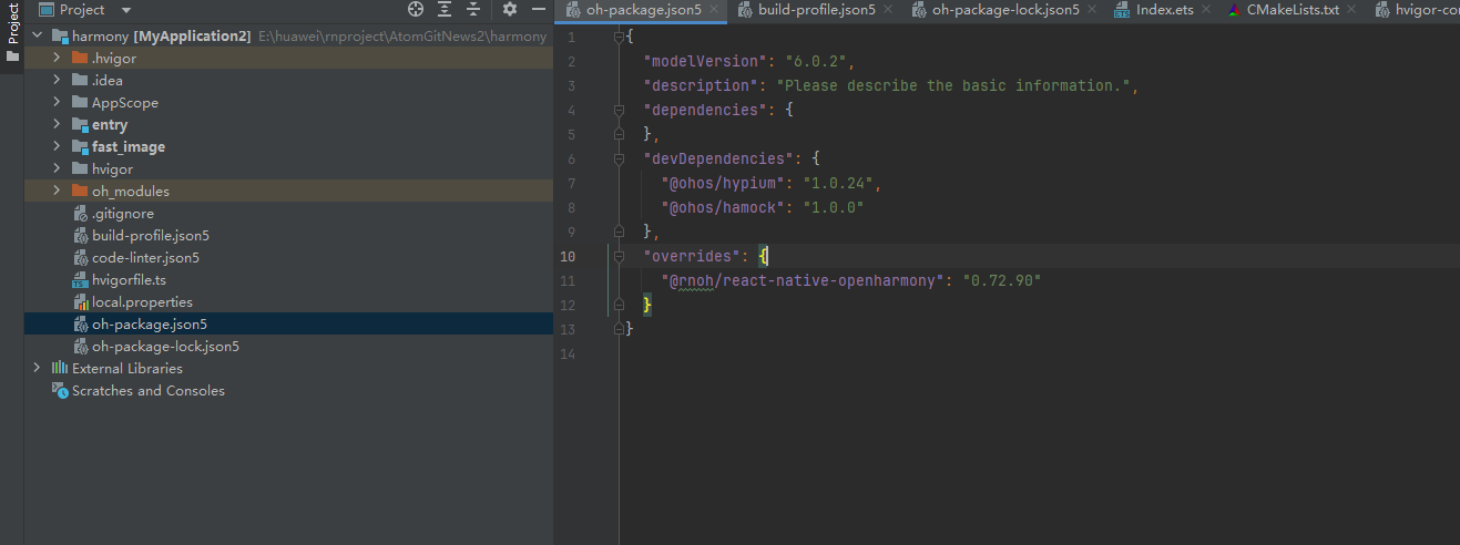
{
  // ... 其他配置
  "overrides": {
    "@rnoh/react-native-openharmony": "0.72.90"
  }
}
2. 引入原生端代码
方法一:通过 HAR 包引入(推荐)
打开 harmony/entry/oh-package.json5,添加以下依赖:
"dependencies": {
  "@rnoh/react-native-openharmony": "0.72.90",
  "@react-native-ohos/react-native-safe-area-context": "file:../../node_modules/@react-native-ohos/react-native-safe-area-context/harmony/safe_area.har"
}
点击 DevEco Studio 右上角的 sync 按钮,或者在终端执行:
cd harmony/entry
ohpm install
方法二:直接链接源码
将 node_modules/@react-native-ohos/react-native-safe-area-context/harmony/safe_area 目录复制到 harmony 工程根目录,然后在 harmony/build-profile.json5 中添加模块配置。
3. 配置 CMakeLists 和引入 SafeAreaViewPackage
⚠️ 注意:若使用的是 <= 4.7.4-0.2.1 版本,请跳过此章节。
修改 entry/src/main/cpp/CMakeLists.txt
project(rnapp)
cmake_minimum_required(VERSION 3.4.1)
set(CMAKE_SKIP_BUILD_RPATH TRUE)
set(RNOH_APP_DIR "${CMAKE_CURRENT_SOURCE_DIR}")
set(NODE_MODULES "${CMAKE_CURRENT_SOURCE_DIR}/../../../../../node_modules")
set(RNOH_CPP_DIR "${CMAKE_CURRENT_SOURCE_DIR}/../../../../../../react-native-harmony/harmony/cpp")
set(LOG_VERBOSITY_LEVEL 1)
set(CMAKE_ASM_FLAGS "-Wno-error=unused-command-line-argument -Qunused-arguments")
set(CMAKE_CXX_FLAGS "-fstack-protector-strong -Wl,-z,relro,-z,now,-z,noexecstack -s -fPIE -pie")
set(WITH_HITRACE_SYSTRACE 1)
+ set(OH_MODULES "${CMAKE_CURRENT_SOURCE_DIR}/../../../oh_modules")
add_compile_definitions(WITH_HITRACE_SYSTRACE)

add_subdirectory("${RNOH_CPP_DIR}" ./rn)

# 添加 SafeArea 模块
+ add_subdirectory("${OH_MODULES}/@react-native-ohos/react-native-safe-area-context/src/main/cpp" ./safe-area)

file(GLOB GENERATED_CPP_FILES "./generated/*.cpp")

add_library(rnoh_app SHARED
    ${GENERATED_CPP_FILES}
    "./PackageProvider.cpp"
    "${RNOH_CPP_DIR}/RNOHAppNapiBridge.cpp"
)
target_link_libraries(rnoh_app PUBLIC rnoh)

# 链接 SafeArea 库
+ target_link_libraries(rnoh_app PUBLIC rnoh_safe_area)
修改 entry/src/main/cpp/PackageProvider.cpp
#include "RNOH/PackageProvider.h"
#include "generated/RNOHGeneratedPackage.h"
+ #include "SafeAreaViewPackage.h"

using namespace rnoh;

std::vector<std::shared_ptr<Package>> PackageProvider::getPackages(Package::Context ctx) {
    return {
        std::make_shared<RNOHGeneratedPackage>(ctx),
        + std::make_shared<SafeAreaViewPackage>(ctx),
    };
}
4. 在 ArkTs 侧引入 SafeAreaViewPackage
打开 harmony/entry/src/main/ets/RNPackagesFactory.ts,添加:
import type { RNPackageContext, RNPackage } from 'rnoh/ts';
+ import { SafeAreaViewPackage } from '@react-native-ohos/react-native-safe-area-context/ts';

export function createRNPackages(ctx: RNPackageContext): RNPackage[] {
  return [
    // ... 其他包
    + new SafeAreaViewPackage(ctx),
  ];
}
5. 同步并运行
点击 DevEco Studio 右上角的 sync 按钮,然后编译运行即可。
📖 API 详解
🔷 组件:SafeAreaProvider
SafeAreaProvider 是安全区域功能的根组件,需要在应用的根节点包裹。它会自动测量并提供安全区域信息给子组件。
import { SafeAreaProvider } from 'react-native-safe-area-context';

<SafeAreaProvider>
  <App />
</SafeAreaProvider>
| 属性 | 说明 | 类型 | 必填 | HarmonyOS支持 |
|---|---|---|---|---|
...ViewProps |
接受所有View属性,默认样式{flex: 1} | object | ❌ | ✅ |
initialMetrics |
提供初始的frame和insets值,允许立即渲染 | object | ❌ | ✅ |
⚠️ 注意:Provider 不应放在使用 Animated 动画的 View 内或 ScrollView 内,这可能导致频繁更新。
🔷 组件:SafeAreaView
SafeAreaView 是一个自动应用安全区域插入的View组件,支持padding或margin模式。
import { SafeAreaView } from 'react-native-safe-area-context';

<SafeAreaView style={{ flex: 1, backgroundColor: 'red' }}>
  <Text>内容不会被系统UI遮挡</Text>
</SafeAreaView>
| 属性 | 说明 | 类型 | 必填 | HarmonyOS支持 |
|---|---|---|---|---|
...ViewProps |
接受所有View属性 | object | ❌ | ✅ |
edges |
设置要应用安全区域的边,默认全部 | array | ❌ | ✅ |
mode |
应用模式:padding(默认)或 margin | string | ❌ | ✅ |
edges 参数说明:
type Edge = 'top' | 'right' | 'bottom' | 'left';

// 只处理顶部和底部
<SafeAreaView edges={['top', 'bottom']}>
  {/* 内容 */}
</SafeAreaView>
mode 参数说明:
// padding模式(默认):安全区域作为padding
<SafeAreaView mode="padding">
  {/* 内容会有padding偏移 */}
</SafeAreaView>

// margin模式:安全区域作为margin
<SafeAreaView mode="margin">
  {/* 内容会有margin偏移 */}
</SafeAreaView>
🔷 Hooks:useSafeAreaInsets
返回最近 Provider 的安全区域插入值,是最常用的API。
import { useSafeAreaInsets } from 'react-native-safe-area-context';

function MyComponent() {
  const insets = useSafeAreaInsets();

  return (
    <View style={{
      paddingTop: insets.top,
      paddingBottom: insets.bottom,
      paddingLeft: insets.left,
      paddingRight: insets.right,
    }}>
      <Text>安全区域:{JSON.stringify(insets)}</Text>
    </View>
  );
}
返回值类型:
interface EdgeInsets {
  top: number;      // 顶部安全区域高度
  bottom: number;   // 底部安全区域高度
  left: number;     // 左侧安全区域宽度
  right: number;    // 右侧安全区域宽度
}
🔷 Hooks:useSafeAreaFrame
返回最近 Provider 的 frame 信息,可替代 Dimensions 模块使用。
import { useSafeAreaFrame } from 'react-native-safe-area-context';

function MyComponent() {
  const frame = useSafeAreaFrame();

  return (
    <View>
      <Text>安全区域尺寸:{frame.width} x {frame.height}</Text>
    </View>
  );
}
返回值类型:
interface Frame {
  x: number;      // x坐标
  y: number;      // y坐标
  width: number;  // 宽度
  height: number; // 高度
}
🔷 Context:SafeAreaInsetsContext
提供安全区域插入值的 React Context,用于类组件或自定义Hook。
import { SafeAreaInsetsContext } from 'react-native-safe-area-context';

class MyComponent extends React.Component {
  static contextType = SafeAreaInsetsContext;

  render() {
    const insets = this.context;
    return <Text>顶部安全区域:{insets.top}</Text>;
  }
}
🔷 Context:SafeAreaFrameContext
提供安全区域 frame 值的 React Context。
import { SafeAreaFrameContext } from 'react-native-safe-area-context';

function MyComponent() {
  return (
    <SafeAreaFrameContext.Consumer>
      {(frame) => <Text>尺寸:{frame.width}x{frame.height}</Text>}
    </SafeAreaFrameContext.Consumer>
  );
}
🔷 高阶组件:withSafeAreaInsets
将安全区域插入作为 props 传递给包装组件的高阶组件(5.1.1+版本支持)。
import { withSafeAreaInsets } from 'react-native-safe-area-context';

interface Props {
  insets: EdgeInsets;
}

class MyComponent extends React.Component<Props> {
  render() {
    const { insets } = this.props;
    return <Text>顶部:{insets.top}</Text>;
  }
}

export default withSafeAreaInsets(MyComponent);
🔷 常量:initialWindowMetrics
提供初始渲染时窗口的插入和 frame,可与 SafeAreaProvider 的 initialMetrics 配合使用,避免首次渲染时的布局跳动。
import {
  SafeAreaProvider,
  initialWindowMetrics
} from 'react-native-safe-area-context';

<SafeAreaProvider initialMetrics={initialWindowMetrics}>
  <App />
</SafeAreaProvider>
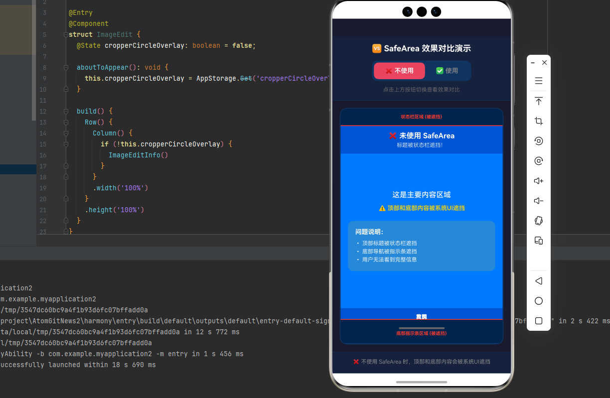
🆚 效果对比演示
下面通过一个直观的对比示例,展示使用和不使用 SafeArea 的效果差异。
对比场景说明
在异形屏幕(刘海屏、挖孔屏)设备上,不处理安全区域会导致:
- 🔴 顶部内容被状态栏/刘海遮挡
- 🔴 底部内容被导航条遮挡
- 🔴 用户体验极差,信息无法完整展示
对比代码示例
import React, { useState } from 'react';
import { View, Text, StyleSheet, TouchableOpacity, StatusBar, Dimensions } from 'react-native';
import { SafeAreaProvider, useSafeAreaInsets } from 'react-native-safe-area-context';

const { height: SCREEN_HEIGHT } = Dimensions.get('window');

// 模拟的安全区域值(模拟刘海屏设备)
const MOCK_INSETS = {
  top: 44,      // 模拟状态栏高度
  bottom: 34,   // 模拟底部指示条高度
  left: 0,
  right: 0,
};

// ❌ 不使用 SafeArea - 内容会被遮挡
function WithoutSafeArea() {
  return (
    <View style={styles.container}>
      <StatusBar barStyle="light-content" />

      {/* 模拟状态栏遮挡区域 */}
      <View style={styles.statusBarOverlay}>
        <Text style={styles.overlayText}>状态栏区域 (被遮挡)</Text>
      </View>

      {/* 顶部标题栏 - 被状态栏遮挡 */}
      <View style={styles.header}>
        <Text style={styles.headerTitle}>❌ 未使用 SafeArea</Text>
        <Text style={styles.headerSubtitle}>标题被状态栏遮挡!</Text>
      </View>

      {/* 中间内容区域 */}
      <View style={styles.content}>
        <Text style={styles.contentText}>这是主要内容区域</Text>
        <Text style={styles.warningText}>⚠️ 顶部和底部内容被系统UI遮挡</Text>

        <View style={styles.infoBox}>
          <Text style={styles.infoTitle}>问题说明:</Text>
          <Text style={styles.infoItem}>• 顶部标题被状态栏遮挡</Text>
          <Text style={styles.infoItem}>• 底部导航被指示条遮挡</Text>
          <Text style={styles.infoItem}>• 用户无法看到完整信息</Text>
        </View>
      </View>

      {/* 底部导航栏 - 被底部指示条遮挡 */}
      <View style={styles.bottomBar}>
        <TouchableOpacity style={styles.navButton}>
          <Text style={styles.navButtonText}>首页</Text>
        </TouchableOpacity>
        <TouchableOpacity style={styles.navButton}>
          <Text style={styles.navButtonText}>发现</Text>
        </TouchableOpacity>
        <TouchableOpacity style={styles.navButton}>
          <Text style={styles.navButtonText}>我的</Text>
        </TouchableOpacity>
      </View>

      {/* 模拟底部指示条遮挡区域 */}
      <View style={styles.bottomIndicatorOverlay}>
        <View style={styles.indicatorBar} />
        <Text style={styles.overlayText}>底部指示条区域 (被遮挡)</Text>
      </View>
    </View>
  );
}

// ✅ 使用 SafeArea - 内容完整显示
function WithSafeArea() {
  // 使用真实设备的 insets
  const realInsets = useSafeAreaInsets();

  // 如果真实 insets 为 0,使用模拟值(方便在非刘海屏设备上演示)
  const insets = realInsets.top > 0 ? realInsets : MOCK_INSETS;

  return (
    <View style={styles.container}>
      <StatusBar barStyle="light-content" />

      {/* 顶部标题栏 - 自动适配顶部安全区域 */}
      <View style={[styles.header, { paddingTop: insets.top + 12 }]}>
        <Text style={styles.headerTitle}>✅ 使用 SafeArea</Text>
        <Text style={styles.headerSubtitle}>标题完整显示!</Text>
        <Text style={styles.insetValue}>顶部安全区域: {insets.top}px</Text>
      </View>

      {/* 中间内容区域 */}
      <View style={styles.content}>
        <Text style={styles.contentText}>这是主要内容区域</Text>
        <Text style={styles.successText}>✅ 所有内容都在安全区域内</Text>

        <View style={[styles.infoBox, { backgroundColor: 'rgba(74, 222, 128, 0.2)' }]}>
          <Text style={styles.infoTitle}>效果说明:</Text>
          <Text style={styles.infoItem}>• 顶部标题完整显示</Text>
          <Text style={styles.infoItem}>• 底部导航完整显示</Text>
          <Text style={styles.infoItem}>• 用户体验良好</Text>
        </View>

        <View style={styles.insetsDisplay}>
          <Text style={styles.insetsLabel}>安全区域值:</Text>
          <Text style={styles.insetsValue}>Top: {insets.top}px</Text>
          <Text style={styles.insetsValue}>Bottom: {insets.bottom}px</Text>
        </View>
      </View>

      {/* 底部导航栏 - 自动适配底部安全区域 */}
      <View style={[styles.bottomBar, { paddingBottom: insets.bottom + 12 }]}>
        <TouchableOpacity style={styles.navButton}>
          <Text style={styles.navButtonText}>首页</Text>
        </TouchableOpacity>
        <TouchableOpacity style={styles.navButton}>
          <Text style={styles.navButtonText}>发现</Text>
        </TouchableOpacity>
        <TouchableOpacity style={styles.navButton}>
          <Text style={styles.navButtonText}>我的</Text>
        </TouchableOpacity>
        <Text style={styles.bottomIndicator}>底部安全区域: {insets.bottom}px</Text>
      </View>
    </View>
  );
}

// 主应用 - 切换对比
function ComparisonDemo() {
  const [showComparison, setShowComparison] = useState(false);
  const insets = useSafeAreaInsets();
  const realInsets = insets.top > 0 ? insets : MOCK_INSETS;

  return (
    <View style={[styles.mainContainer, { paddingTop: realInsets.top }]}>
      <StatusBar barStyle="light-content" />

      {/* 顶部切换栏 */}
      <View style={styles.toggleContainer}>
        <Text style={styles.toggleTitle}>🆚 SafeArea 效果对比演示</Text>
        <View style={styles.toggleButtons}>
          <TouchableOpacity
            style={[
              styles.toggleButton,
              !showComparison && styles.toggleButtonActive,
            ]}
            onPress={() => setShowComparison(false)}
          >
            <Text style={[
              styles.toggleButtonText,
              !showComparison && styles.toggleButtonTextActive,
            ]}>
              ❌ 不使用
            </Text>
          </TouchableOpacity>
          <TouchableOpacity
            style={[
              styles.toggleButton,
              showComparison && styles.toggleButtonActive,
            ]}
            onPress={() => setShowComparison(true)}
          >
            <Text style={[
              styles.toggleButtonText,
              showComparison && styles.toggleButtonTextActive,
            ]}>
              ✅ 使用
            </Text>
          </TouchableOpacity>
        </View>
        <Text style={styles.toggleHint}>
          点击上方按钮切换查看效果对比
        </Text>
      </View>

      {/* 对比内容区域 */}
      <View style={styles.demoContainer}>
        {showComparison ? <WithSafeArea /> : <WithoutSafeArea />}
      </View>

      {/* 底部说明 */}
      <View style={[styles.footerInfo, { paddingBottom: realInsets.bottom + 16 }]}>
        <Text style={styles.footerText}>
          {showComparison
            ? '✅ 使用 SafeArea 后,内容自动适配安全区域,不会被系统UI遮挡'
            : '❌ 不使用 SafeArea 时,顶部和底部内容会被系统UI遮挡'
          }
        </Text>
      </View>
    </View>
  );
}

// 根组件
function App() {
  return (
    <SafeAreaProvider>
      <ComparisonDemo />
    </SafeAreaProvider>
  );
}

const styles = StyleSheet.create({
  mainContainer: {
    flex: 1,
    backgroundColor: '#1a1a2e',
  },
  toggleContainer: {
    backgroundColor: '#16213e',
    paddingVertical: 16,
    paddingHorizontal: 20,
    alignItems: 'center',
    borderBottomWidth: 1,
    borderBottomColor: '#0f3460',
  },
  toggleTitle: {
    color: '#fff',
    fontSize: 18,
    fontWeight: 'bold',
    marginBottom: 16,
  },
  toggleButtons: {
    flexDirection: 'row',
    backgroundColor: '#0f3460',
    borderRadius: 12,
    padding: 4,
  },
  toggleButton: {
    paddingVertical: 10,
    paddingHorizontal: 24,
    borderRadius: 10,
  },
  toggleButtonActive: {
    backgroundColor: '#e94560',
  },
  toggleButtonText: {
    color: '#888',
    fontSize: 14,
    fontWeight: '600',
  },
  toggleButtonTextActive: {
    color: '#fff',
  },
  toggleHint: {
    color: '#666',
    fontSize: 12,
    marginTop: 12,
  },
  demoContainer: {
    flex: 1,
    margin: 16,
    borderRadius: 16,
    overflow: 'hidden',
    borderWidth: 2,
    borderColor: '#0f3460',
  },
  container: {
    flex: 1,
    backgroundColor: '#007AFF',
  },
  statusBarOverlay: {
    backgroundColor: 'rgba(0, 0, 0, 0.7)',
    paddingVertical: 12,
    alignItems: 'center',
    borderBottomWidth: 2,
    borderBottomColor: '#FF3B30',
  },
  overlayText: {
    color: '#FF3B30',
    fontSize: 10,
    fontWeight: 'bold',
  },
  header: {
    backgroundColor: '#0055D4',
    paddingHorizontal: 16,
    paddingVertical: 12,
    alignItems: 'center',
  },
  headerTitle: {
    color: '#fff',
    fontSize: 16,
    fontWeight: 'bold',
  },
  headerSubtitle: {
    color: 'rgba(255,255,255,0.8)',
    fontSize: 12,
    marginTop: 4,
  },
  insetValue: {
    color: 'rgba(255,255,255,0.6)',
    fontSize: 10,
    marginTop: 4,
  },
  content: {
    flex: 1,
    justifyContent: 'center',
    alignItems: 'center',
    paddingHorizontal: 16,
    backgroundColor: '#007AFF',
  },
  contentText: {
    color: '#fff',
    fontSize: 16,
    textAlign: 'center',
    fontWeight: '500',
  },
  warningText: {
    color: '#FFD700',
    fontSize: 13,
    marginTop: 12,
    textAlign: 'center',
    fontWeight: '600',
  },
  successText: {
    color: '#4ADE80',
    fontSize: 13,
    marginTop: 12,
    textAlign: 'center',
    fontWeight: '600',
  },
  infoBox: {
    backgroundColor: 'rgba(255, 215, 0, 0.15)',
    padding: 16,
    borderRadius: 12,
    marginTop: 20,
    width: '100%',
  },
  infoTitle: {
    color: '#fff',
    fontSize: 14,
    fontWeight: 'bold',
    marginBottom: 8,
  },
  infoItem: {
    color: 'rgba(255,255,255,0.9)',
    fontSize: 12,
    marginVertical: 2,
  },
  insetsDisplay: {
    marginTop: 16,
    padding: 12,
    backgroundColor: 'rgba(255,255,255,0.1)',
    borderRadius: 8,
  },
  insetsLabel: {
    color: '#fff',
    fontSize: 12,
    fontWeight: 'bold',
    marginBottom: 4,
  },
  insetsValue: {
    color: 'rgba(255,255,255,0.8)',
    fontSize: 11,
  },
  bottomBar: {
    backgroundColor: '#0055D4',
    paddingVertical: 12,
    paddingHorizontal: 8,
    alignItems: 'center',
  },
  navButton: {
    flex: 1,
    alignItems: 'center',
  },
  navButtonText: {
    color: '#fff',
    fontSize: 12,
    fontWeight: '500',
  },
  bottomIndicator: {
    color: 'rgba(255,255,255,0.6)',
    fontSize: 10,
    marginTop: 8,
  },
  bottomIndicatorOverlay: {
    backgroundColor: 'rgba(0, 0, 0, 0.7)',
    paddingVertical: 16,
    alignItems: 'center',
    borderTopWidth: 2,
    borderTopColor: '#FF3B30',
  },
  indicatorBar: {
    width: 100,
    height: 4,
    backgroundColor: '#666',
    borderRadius: 2,
    marginBottom: 4,
  },
  footerInfo: {
    backgroundColor: '#16213e',
    paddingHorizontal: 20,
    paddingVertical: 12,
    borderTopWidth: 1,
    borderTopColor: '#0f3460',
  },
  footerText: {
    color: '#888',
    fontSize: 12,
    textAlign: 'center',
    lineHeight: 18,
  },
});

export default App;
效果对比图示
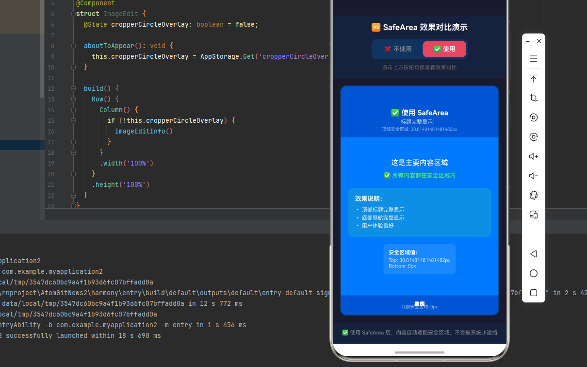
关键差异总结
| 对比项 | 不使用 SafeArea | 使用 SafeArea |
|---|---|---|
| 顶部标题 | 🔴 被状态栏遮挡 | 🟢 完整显示 |
| 底部导航 | 🔴 被指示条遮挡 | 🟢 完整显示 |
| 用户体验 | 🔴 差,信息丢失 | 🟢 好,信息完整 |
| 适配成本 | 无需额外代码 | 仅需包裹组件 |
| 跨平台一致性 | 🔴 各设备表现不同 | 🟢 统一表现 |
💻 完整代码示例
下面是一个完整的示例,展示了安全区域的各种应用场景:
import React from 'react';
import {
View,
Text,
StyleSheet,
ScrollView,
TouchableOpacity,
StatusBar,
} from 'react-native';
import {
SafeAreaProvider,
SafeAreaView,
useSafeAreaInsets,
useSafeAreaFrame,
initialWindowMetrics,
} from 'react-native-safe-area-context';
// 示例1:基础使用
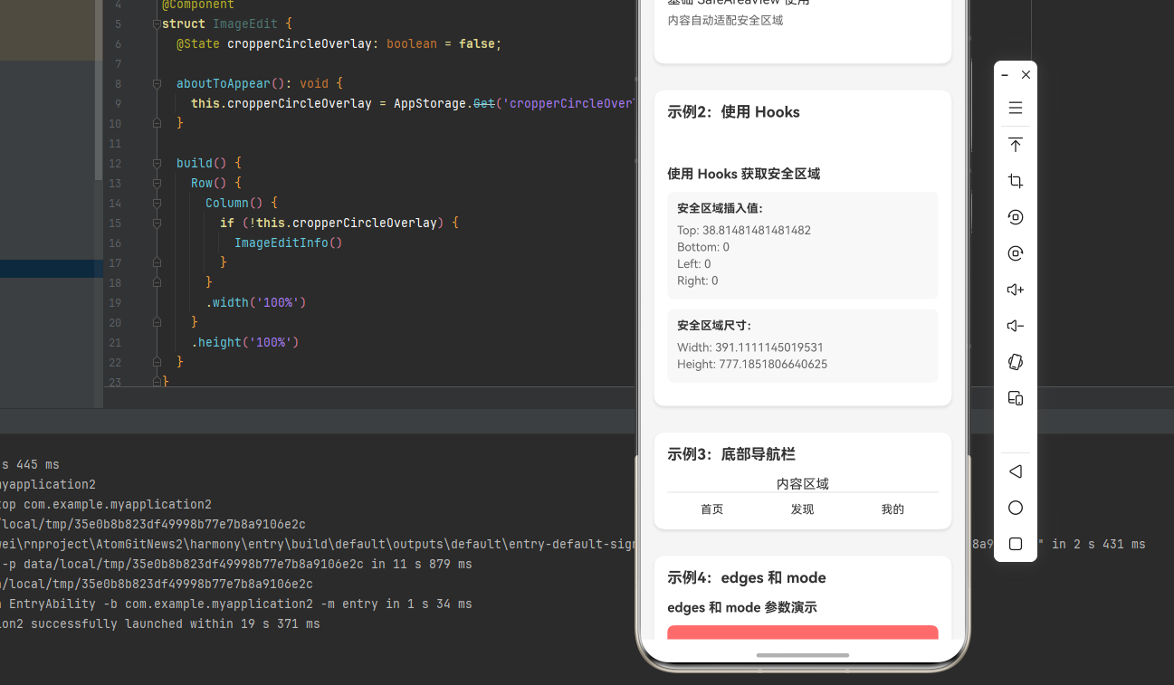
function BasicExample() {
return (
<SafeAreaView style={styles.container}>
<Text style={styles.text}>基础 SafeAreaView 使用</Text>
<Text style={styles.hint}>内容自动适配安全区域</Text>
</SafeAreaView>
);
}
// 示例2:使用 Hooks
function HooksExample() {
const insets = useSafeAreaInsets();
const frame = useSafeAreaFrame();
return (
<View style={[
styles.container,
{
paddingTop: insets.top,
paddingBottom: insets.bottom,
paddingLeft: insets.left,
paddingRight: insets.right,
}
]}>
<Text style={styles.title}>使用 Hooks 获取安全区域</Text>
<View style={styles.infoBox}>
<Text style={styles.label}>安全区域插入值:</Text>
<Text style={styles.value}>Top: {insets.top}</Text>
<Text style={styles.value}>Bottom: {insets.bottom}</Text>
<Text style={styles.value}>Left: {insets.left}</Text>
<Text style={styles.value}>Right: {insets.right}</Text>
</View>
<View style={styles.infoBox}>
<Text style={styles.label}>安全区域尺寸:</Text>
<Text style={styles.value}>Width: {frame.width}</Text>
<Text style={styles.value}>Height: {frame.height}</Text>
</View>
</View>
);
}
// 示例3:自定义底部导航栏
function BottomNavExample() {
const insets = useSafeAreaInsets();
return (
<View style={styles.container}>
<View style={styles.content}>
<Text style={styles.text}>内容区域</Text>
</View>
{/* 底部导航栏,自动适配底部安全区域 */}
<View style={[
styles.bottomNav,
{ paddingBottom: insets.bottom }
]}>
<TouchableOpacity style={styles.navItem}>
<Text style={styles.navText}>首页</Text>
</TouchableOpacity>
<TouchableOpacity style={styles.navItem}>
<Text style={styles.navText}>发现</Text>
</TouchableOpacity>
<TouchableOpacity style={styles.navItem}>
<Text style={styles.navText}>我的</Text>
</TouchableOpacity>
</View>
</View>
);
}
// 示例4:edges 和 mode 参数
function EdgesModeExample() {
return (
<View style={styles.container}>
<Text style={styles.title}>edges 和 mode 参数演示</Text>
{/* 只处理顶部 */}
<SafeAreaView
edges={['top']}
style={[styles.box, { backgroundColor: '#FF6B6B' }]}
>
<Text style={styles.boxText}>只处理顶部</Text>
</SafeAreaView>
{/* 只处理底部 */}
<SafeAreaView
edges={['bottom']}
style={[styles.box, { backgroundColor: '#4ECDC4' }]}
>
<Text style={styles.boxText}>只处理底部</Text>
</SafeAreaView>
{/* margin 模式 */}
<SafeAreaView
mode="margin"
style={[styles.box, { backgroundColor: '#45B7D1' }]}
>
<Text style={styles.boxText}>margin 模式</Text>
</SafeAreaView>
</View>
);
}
// 主应用
function App() {
return (
<SafeAreaProvider initialMetrics={initialWindowMetrics}>
<StatusBar barStyle="dark-content" />
<ScrollView style={styles.scrollView}>
<View style={styles.section}>
<Text style={styles.sectionTitle}>示例1:基础使用</Text>
<BasicExample />
</View>
<View style={styles.section}>
<Text style={styles.sectionTitle}>示例2:使用 Hooks</Text>
<HooksExample />
</View>
<View style={styles.section}>
<Text style={styles.sectionTitle}>示例3:底部导航栏</Text>
<BottomNavExample />
</View>
<View style={styles.section}>
<Text style={styles.sectionTitle}>示例4:edges 和 mode</Text>
<EdgesModeExample />
</View>
</ScrollView>
</SafeAreaProvider>
);
}
const styles = StyleSheet.create({
scrollView: {
flex: 1,
backgroundColor: '#F5F5F5',
},
container: {
flex: 1,
backgroundColor: '#FFFFFF',
},
section: {
margin: 16,
padding: 16,
backgroundColor: '#FFFFFF',
borderRadius: 12,
shadowColor: '#000',
shadowOffset: { width: 0, height: 2 },
shadowOpacity: 0.1,
shadowRadius: 4,
elevation: 3,
},
sectionTitle: {
fontSize: 18,
fontWeight: 'bold',
marginBottom: 16,
color: '#333',
},
title: {
fontSize: 16,
fontWeight: 'bold',
marginBottom: 12,
color: '#333',
},
text: {
fontSize: 16,
color: '#333',
},
hint: {
fontSize: 14,
color: '#666',
marginTop: 8,
},
infoBox: {
backgroundColor: '#F8F8F8',
padding: 12,
borderRadius: 8,
marginBottom: 12,
},
label: {
fontSize: 14,
fontWeight: 'bold',
color: '#333',
marginBottom: 8,
},
value: {
fontSize: 14,
color: '#666',
marginVertical: 2,
},
content: {
flex: 1,
justifyContent: 'center',
alignItems: 'center',
},
bottomNav: {
flexDirection: 'row',
backgroundColor: '#FFFFFF',
borderTopWidth: 1,
borderTopColor: '#E0E0E0',
paddingVertical: 12,
},
navItem: {
flex: 1,
alignItems: 'center',
},
navText: {
fontSize: 14,
color: '#333',
},
box: {
padding: 20,
borderRadius: 8,
marginBottom: 12,
alignItems: 'center',
},
boxText: {
color: '#FFFFFF',
fontSize: 14,
fontWeight: 'bold',
},
});
export default App;
📊 API 支持情况汇总
| API | 说明 | HarmonyOS支持 |
|---|---|---|
SafeAreaProvider |
根组件Provider | ✅ |
SafeAreaView |
安全区域View组件 | ✅ |
useSafeAreaInsets |
获取安全区域插入Hook | ✅ |
useSafeAreaFrame |
获取安全区域frame Hook | ✅ |
SafeAreaInsetsContext |
安全区域Context | ✅ |
SafeAreaFrameContext |
Frame Context | ✅ |
withSafeAreaInsets |
高阶组件(5.1.1+) | ✅ |
initialWindowMetrics |
初始窗口metrics | ✅ |
⚠️ 已知问题
暂无已知问题。
📝 最佳实践
-
在应用根节点包裹 SafeAreaProvider
// App.tsx import { SafeAreaProvider } from 'react-native-safe-area-context'; export default function App() { return ( <SafeAreaProvider> <Navigation /> </SafeAreaProvider> ); } -
使用 initialMetrics 优化首次渲染
<SafeAreaProvider initialMetrics={initialWindowMetrics}> <App /> </SafeAreaProvider> -
优先使用 Hooks 而非 SafeAreaView
Hooks 提供更灵活的控制,适合复杂布局场景。 -
避免在动画View或ScrollView内嵌套Provider
这可能导致频繁的测量和更新。

开源鸿蒙跨平台开发社区汇聚开发者与厂商,共建“一次开发,多端部署”的开源生态,致力于降低跨端开发门槛,推动万物智联创新。
更多推荐

 3
3 0
0- 0


 已为社区贡献60条内容

所有评论(0)