ReactNative项目OpenHarmony三方库集成实战:react-native-appearance(更推荐自带的Appearance)
深色模式(Dark Mode)已经成为标配功能。无论是系统级别的深浅主题切换,还是应用内的自定义主题,都能显著提升用户体验,同时在 OLED 屏幕上还能节省电量。是由 Expo 团队开发的外观管理库,提供了获取系统外观偏好、监听外观变化等功能,是实现主题切换的基础组件。库名称版本信息0.3.5-rc.1: 支持 RN 0.72/0.77 版本官方仓库原始仓库主要功能🌓 获取系统当前外观模式(浅色
欢迎加入开源鸿蒙跨平台社区:https://openharmonycrossplatform.csdn.net
📋 前言
,深色模式(Dark Mode)已经成为标配功能。无论是系统级别的深浅主题切换,还是应用内的自定义主题,都能显著提升用户体验,同时在 OLED 屏幕上还能节省电量。react-native-appearance 是由 Expo 团队开发的外观管理库,提供了获取系统外观偏好、监听外观变化等功能,是实现主题切换的基础组件。
🎯 库简介
基本信息
- 库名称:
react-native-appearance - 版本信息:
0.3.5-rc.1: 支持 RN 0.72/0.77 版本
- 官方仓库: https://github.com/react-native-oh-library/react-native-appearance
- 原始仓库: https://github.com/expo/react-native-appearance
- 主要功能:
- 🌓 获取系统当前外观模式(浅色/深色)
- 🔄 监听系统外观模式变化
- ⚙️ 手动设置应用外观模式
- 📱 跨平台一致性表现
- 🎯 React Native 0.62+ 内置 useColorScheme 支持
为什么选择 Appearance?
| 特性 | 原生实现 | react-native-appearance |
|---|---|---|
| 获取系统主题 | ⚠️ 需原生代码 | ✅ 统一 API |
| 监听主题变化 | ⚠️ 需原生代码 | ✅ 内置监听 |
| 跨平台一致 | ❌ 需分别实现 | ✅ 统一表现 |
| React Hook | ❌ | ✅ useColorScheme |
| HarmonyOS支持 | ❌ | ✅ |
支持的 API
| API | 说明 | HarmonyOS 支持 | 备注 |
|---|---|---|---|
useColorScheme |
获取当前外观模式 | ✅ | 请使用 react-native 内置的 |
getColorScheme |
获取当前外观模式 | ✅ | |
setColorScheme |
设置外观模式 | ✅ | |
addChangeListener |
监听外观模式变化 | ✅ |
外观模式类型
| 模式 | 值 | 说明 |
|---|---|---|
| 浅色模式 | light |
浅色背景,深色文字 |
| 深色模式 | dark |
深色背景,浅色文字 |
| 无偏好 | null |
未设置或无法获取 |
兼容性验证
在以下环境验证通过:
- RNOH: 0.72.90; SDK: HarmonyOS6.0.0; IDE: DevEco Studio 6.0.2; ROM: 6.0.0
📦 安装步骤
1. 安装依赖
本文基于 ReactNative0.72.90 开发在项目根目录执行以下命令:
# 使用 npm
npm install @react-native-oh-tpl/react-native-appearance@0.3.5-rc.1

# 或者使用 yarn
yarn add @react-native-oh-tpl/react-native-appearance@0.3.5-rc.1
2. 验证安装
安装完成后,检查 package.json 文件,应该能看到新增的依赖:
{
  "dependencies": {
    "@react-native-oh-tpl/react-native-appearance": "0.3.5-rc.1",
    // ... 其他依赖
  }
}
💡 提示:
react-native-appearance在 HarmonyOS 平台上通过原生模块实现,但库本身已封装好,安装后直接使用即可。
3. TypeScript 类型声明
如果项目使用 TypeScript,可以创建类型声明文件以获得更好的类型支持。
在项目中创建类型声明文件 src/types/react-native-appearance.d.ts:
declare module '@react-native-oh-tpl/react-native-appearance' {
  import { NativeEventSubscription } from 'react-native';

  export type ColorSchemeName = 'light' | 'dark' | null | undefined;

  export interface AppearancePreferences {
    colorScheme: ColorSchemeName;
  }

  export interface AppearanceListener {
    (preferences: AppearancePreferences): void;
  }

  export class AppearanceHarmony {
    static getColorScheme(): ColorSchemeName;
    static setColorScheme(scheme: ColorSchemeName | null | undefined): void;
    static addChangeListener(listener: AppearanceListener): NativeEventSubscription;
  }
}
在tsconfig.json中添加配置
{
  "include": [
    "**/*.ts",
    "**/*.tsx"
  ]
}
⚠️ 注意:
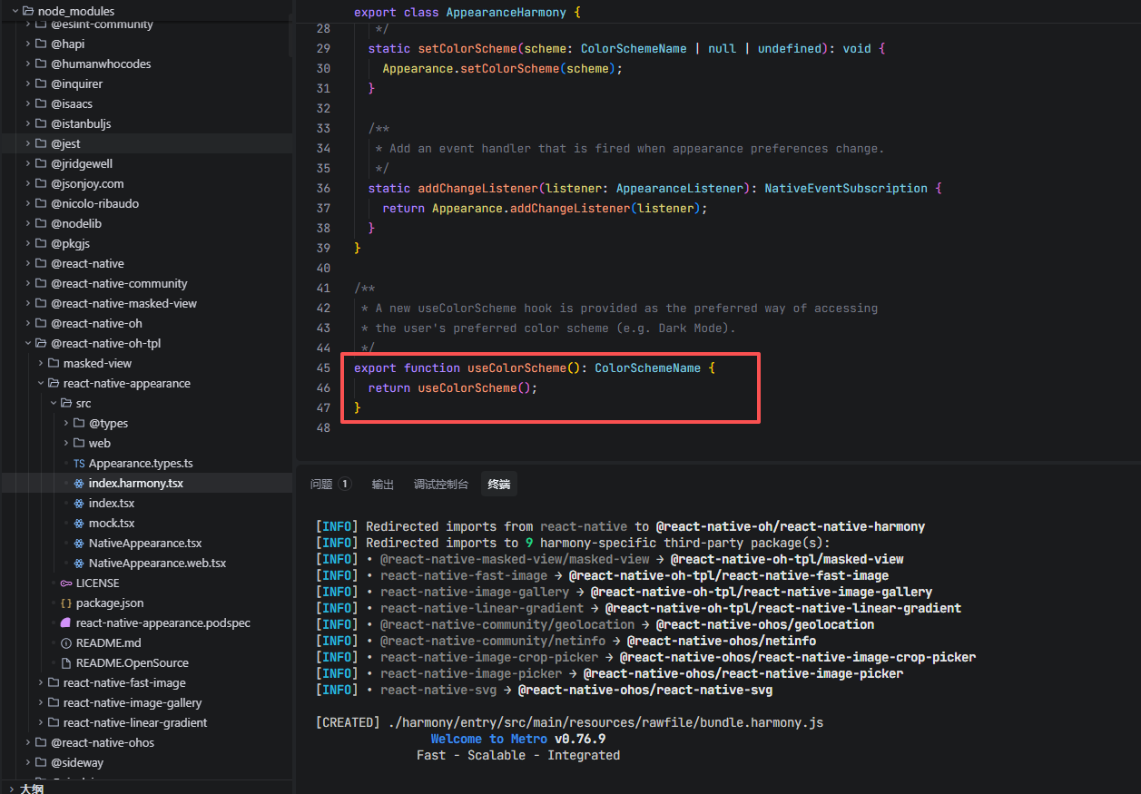
useColorScheme请直接从react-native导入使用,因为该库的useColorScheme存在 bug(无限递归)。我真就无法理解,这样的代码是怎么提交上去的,真的很无语,还不如自带的Appearance
📖 API 详解
🔷 useColorScheme - 获取当前外观模式 ⭐
React Hook 方式获取当前系统的外观模式。
⚠️ 注意:由于该库的
useColorScheme存在 bug(无限递归),请直接使用 React Native 内置的useColorScheme。
// 使用 React Native 内置的 useColorScheme
import { useColorScheme } from 'react-native';

const colorScheme = useColorScheme();
// 返回值: 'light' | 'dark' | null | undefined
返回值说明:
| 值 | 说明 |
|---|---|
'light' |
系统处于浅色模式 |
'dark' |
系统处于深色模式 |
null |
无法获取系统外观偏好 |
undefined |
初始状态或组件未挂载 |
应用场景:
import React from 'react';
import { View, Text, StyleSheet, useColorScheme } from 'react-native';

// 场景1:基础主题切换
function ThemedComponent() {
  const colorScheme = useColorScheme();
  const isDark = colorScheme === 'dark';

  return (
    <View style={[styles.container, isDark ? styles.darkContainer : styles.lightContainer]}>
      <Text style={[styles.text, isDark ? styles.darkText : styles.lightText]}>
        当前模式: {colorScheme || '未知'}
      </Text>
    </View>
  );
}

// 场景2:根据主题动态切换样式
function DynamicStyleComponent() {
  const colorScheme = useColorScheme();

  const themeStyles = {
    light: {
      background: '#FFFFFF',
      text: '#000000',
      card: '#F5F5F5',
    },
    dark: {
      background: '#121212',
      text: '#FFFFFF',
      card: '#1E1E1E',
    },
  };

  const theme = colorScheme === 'dark' ? themeStyles.dark : themeStyles.light;

  return (
    <View style={[styles.container, { backgroundColor: theme.background }]}>
      <View style={[styles.card, { backgroundColor: theme.card }]}>
        <Text style={[styles.text, { color: theme.text }]}>
          动态主题组件
        </Text>
      </View>
    </View>
  );
}

const styles = StyleSheet.create({
  container: {
    flex: 1,
    justifyContent: 'center',
    alignItems: 'center',
  },
  darkContainer: {
    backgroundColor: '#1a1a1a',
  },
  lightContainer: {
    backgroundColor: '#ffffff',
  },
  text: {
    fontSize: 18,
  },
  darkText: {
    color: '#ffffff',
  },
  lightText: {
    color: '#000000',
  },
  card: {
    padding: 20,
    borderRadius: 10,
  },
});
🔷 getColorScheme - 获取当前外观模式
命令式方法获取当前系统的外观模式。
import { AppearanceHarmony } from '@react-native-oh-tpl/react-native-appearance';

const colorScheme = AppearanceHarmony.getColorScheme();
// 返回值: 'light' | 'dark' | null | undefined
应用场景:
import { AppearanceHarmony } from '@react-native-oh-tpl/react-native-appearance';

// 场景1:在组件外获取外观模式
const currentTheme = AppearanceHarmony.getColorScheme();
console.log('当前主题:', currentTheme);

// 场景2:在非 React 代码中使用
function getThemeColors() {
  const scheme = AppearanceHarmony.getColorScheme();
  return scheme === 'dark' ? darkColors : lightColors;
}

// 场景3:初始化应用主题
const initializeTheme = async () => {
  const savedTheme = await AsyncStorage.getItem('userTheme');
  if (savedTheme) {
    return savedTheme;
  }
  return AppearanceHarmony.getColorScheme() || 'light';
};

// 场景4:在 class 组件中使用
class ThemeComponent extends React.Component {
  state = {
    colorScheme: AppearanceHarmony.getColorScheme(),
  };

  componentDidMount() {
    // 初始化时获取主题
    this.setState({
      colorScheme: AppearanceHarmony.getColorScheme(),
    });
  }

  render() {
    const { colorScheme } = this.state;
    return (
      <View style={{ backgroundColor: colorScheme === 'dark' ? '#121212' : '#FFFFFF' }}>
        <Text>当前主题: {colorScheme}</Text>
      </View>
    );
  }
}
🔷 setColorScheme - 设置外观模式 ⚙️
手动设置应用的外观模式,可以覆盖系统设置。
import { AppearanceHarmony } from '@react-native-oh-tpl/react-native-appearance';

AppearanceHarmony.setColorScheme(colorScheme: 'light' | 'dark' | 'no-preference');
参数说明:
| 参数 | 说明 |
|---|---|
'light' |
强制应用使用浅色模式 |
'dark' |
强制应用使用深色模式 |
'no-preference' |
恢复跟随系统设置 |
应用场景:
import React, { useState } from 'react';
import { View, Button, Text, StyleSheet, TouchableOpacity, useColorScheme } from 'react-native';
import { AppearanceHarmony } from '@react-native-oh-tpl/react-native-appearance';

// 场景1:基础主题切换
function ThemeSwitcher() {
  const systemScheme = useColorScheme();
  const [userScheme, setUserScheme] = useState<'light' | 'dark' | null>(null);

  const currentScheme = userScheme || systemScheme;

  const setLight = () => {
    AppearanceHarmony.setColorScheme('light');
    setUserScheme('light');
  };

  const setDark = () => {
    AppearanceHarmony.setColorScheme('dark');
    setUserScheme('dark');
  };

  const setAuto = () => {
    AppearanceHarmony.setColorScheme('no-preference');
    setUserScheme(null);
  };

  return (
    <View style={[styles.container, currentScheme === 'dark' && styles.darkBg]}>
      <Text style={[styles.text, currentScheme === 'dark' && styles.darkText]}>
        当前主题: {currentScheme || '跟随系统'}
      </Text>
      <View style={styles.buttonGroup}>
        <Button title="浅色模式" onPress={setLight} />
        <Button title="深色模式" onPress={setDark} />
        <Button title="跟随系统" onPress={setAuto} />
      </View>
    </View>
  );
}

// 场景2:主题选择器组件
function ThemeSelector() {
  const [selectedTheme, setSelectedTheme] = useState<'light' | 'dark' | 'auto'>('auto');

  const themes = [
    { key: 'light', label: '浅色', icon: '☀️' },
    { key: 'dark', label: '深色', icon: '🌙' },
    { key: 'auto', label: '跟随系统', icon: '🔄' },
  ];

  const handleThemeChange = (theme: 'light' | 'dark' | 'auto') => {
    setSelectedTheme(theme);
    if (theme === 'auto') {
      AppearanceHarmony.setColorScheme('no-preference');
    } else {
      AppearanceHarmony.setColorScheme(theme);
    }
  };

  return (
    <View style={styles.themeSelector}>
      {themes.map((theme) => (
        <TouchableOpacity
          key={theme.key}
          style={[
            styles.themeOption,
            selectedTheme === theme.key && styles.themeOptionActive,
          ]}
          onPress={() => handleThemeChange(theme.key as 'light' | 'dark' | 'auto')}
        >
          <Text style={styles.themeIcon}>{theme.icon}</Text>
          <Text style={styles.themeLabel}>{theme.label}</Text>
        </TouchableOpacity>
      ))}
    </View>
  );
}

// 场景3:保存用户主题偏好
function PersistentThemeSwitcher() {
  const colorScheme = useColorScheme();

  useEffect(() => {
    // 从存储加载用户偏好
    loadThemePreference();
  }, []);

  const loadThemePreference = async () => {
    const saved = await AsyncStorage.getItem('theme');
    if (saved) {
      AppearanceHarmony.setColorScheme(saved as 'light' | 'dark');
    }
  };

  const saveAndSetTheme = async (theme: 'light' | 'dark' | 'no-preference') => {
    await AsyncStorage.setItem('theme', theme === 'no-preference' ? 'auto' : theme);
    AppearanceHarmony.setColorScheme(theme);
  };

  return (
    <View>
      {/* UI 组件 */}
    </View>
  );
}

const styles = StyleSheet.create({
  container: {
    flex: 1,
    padding: 20,
    backgroundColor: '#ffffff',
  },
  darkBg: {
    backgroundColor: '#1a1a1a',
  },
  text: {
    fontSize: 18,
    marginBottom: 20,
    color: '#000000',
  },
  darkText: {
    color: '#ffffff',
  },
  buttonGroup: {
    gap: 10,
  },
  themeSelector: {
    flexDirection: 'row',
    justifyContent: 'space-around',
    padding: 16,
  },
  themeOption: {
    alignItems: 'center',
    padding: 16,
    borderRadius: 12,
    backgroundColor: '#F5F5F5',
  },
  themeOptionActive: {
    backgroundColor: '#007AFF',
  },
  themeIcon: {
    fontSize: 24,
    marginBottom: 8,
  },
  themeLabel: {
    fontSize: 14,
    color: '#333',
  },
});
🔷 addChangeListener - 监听外观变化 🔄
监听系统外观模式的变化,当系统主题改变时触发回调。
import { AppearanceHarmony, AppearancePreferences } from '@react-native-oh-tpl/react-native-appearance';

const listener = AppearanceHarmony.addChangeListener(
  (preferences: AppearancePreferences) => {
    console.log('外观模式变化:', preferences.colorScheme);
  }
);

// 移除监听
listener.remove();
回调参数说明:
| 属性 | 类型 | 说明 |
|---|---|---|
colorScheme |
ColorSchemeName |
新的外观模式 |
返回值:包含 remove() 方法的监听器对象
应用场景:
import React, { useState, useEffect } from 'react';
import { View, Text, StyleSheet } from 'react-native';
import { AppearanceHarmony, AppearancePreferences } from '@react-native-oh-tpl/react-native-appearance';

// 场景1:监听系统主题变化
function ThemeListener() {
  const [colorScheme, setColorScheme] = useState<'light' | 'dark' | null>(
    AppearanceHarmony.getColorScheme()
  );

  useEffect(() => {
    const listener = AppearanceHarmony.addChangeListener(
      ({ colorScheme: newScheme }: AppearancePreferences) => {
        console.log('系统主题变化:', newScheme);
        setColorScheme(newScheme);
      }
    );

    return () => {
      listener.remove();
    };
  }, []);

  return (
    <View style={[
      styles.container,
      colorScheme === 'dark' && styles.darkContainer
    ]}>
      <Text style={[
        styles.text,
        colorScheme === 'dark' && styles.darkText
      ]}>
        当前主题: {colorScheme || '未知'}
      </Text>
      <Text style={styles.hint}>
        切换系统主题以查看效果
      </Text>
    </View>
  );
}

// 场景2:主题变化时执行特定逻辑
function ThemeAwareComponent() {
  useEffect(() => {
    const listener = AppearanceHarmony.addChangeListener(({ colorScheme }) => {
      // 主题变化时重新加载数据或更新 UI
      console.log('主题已切换为:', colorScheme);

      // 可以在这里执行:
      // - 更新 Redux/Context 状态
      // - 重新请求适配主题的资源
      // - 记录用户行为日志
    });

    return () => listener.remove();
  }, []);

  return <View>{/* 组件内容 */}</View>;
}

// 场景3:多个监听器管理
function MultiListenerManager() {
  useEffect(() => {
    const listeners: Array<{ remove: () => void }> = [];

    // 监听器1:更新 UI 状态
    listeners.push(
      AppearanceHarmony.addChangeListener(({ colorScheme }) => {
        updateUIState(colorScheme);
      })
    );

    // 监听器2:记录日志
    listeners.push(
      AppearanceHarmony.addChangeListener(({ colorScheme }) => {
        analytics.log('theme_changed', { theme: colorScheme });
      })
    );

    // 清理所有监听器
    return () => {
      listeners.forEach(listener => listener.remove());
    };
  }, []);

  return <View>{/* 组件内容 */}</View>;
}

const styles = StyleSheet.create({
  container: {
    flex: 1,
    justifyContent: 'center',
    alignItems: 'center',
    backgroundColor: '#ffffff',
  },
  darkContainer: {
    backgroundColor: '#121212',
  },
  text: {
    fontSize: 20,
    fontWeight: 'bold',
    color: '#000000',
  },
  darkText: {
    color: '#ffffff',
  },
  hint: {
    marginTop: 10,
    fontSize: 14,
    color: '#666666',
  },
});
💻 完整代码示例:小说阅读器
下面是一个完整的小说阅读器示例,展示了多主题切换的各种功能应用:
import React, { useState, useEffect, useCallback, useRef } from 'react';
import {
View,
Text,
StyleSheet,
ScrollView,
SafeAreaView,
TouchableOpacity,
StatusBar,
Dimensions,
FlatList,
useColorScheme,
} from 'react-native';
import {
AppearanceHarmony,
AppearancePreferences,
} from '@react-native-oh-tpl/react-native-appearance';
const { width: SCREEN_WIDTH, height: SCREEN_HEIGHT } = Dimensions.get('window');
// 主题类型定义
interface ThemeType {
name: string;
displayName: string;
background: string;
surface: string;
text: string;
textSecondary: string;
primary: string;
border: string;
statusBar: 'light-content' | 'dark-content';
readerBg: string;
readerText: string;
}
// 主题配置
const themes: Record<string, ThemeType> = {
light: {
name: 'light',
displayName: '明亮',
background: '#FFFFFF',
surface: '#F5F5F5',
text: '#1A1A1A',
textSecondary: '#666666',
primary: '#007AFF',
border: '#E0E0E0',
statusBar: 'dark-content',
readerBg: '#FFFFFF',
readerText: '#333333',
},
dark: {
name: 'dark',
displayName: '深色',
background: '#121212',
surface: '#1E1E1E',
text: '#FFFFFF',
textSecondary: '#B0B0B0',
primary: '#0A84FF',
border: '#333333',
statusBar: 'light-content',
readerBg: '#1A1A1A',
readerText: '#E0E0E0',
},
sepia: {
name: 'sepia',
displayName: '护眼',
background: '#F4ECD8',
surface: '#EDE4D0',
text: '#5B4636',
textSecondary: '#7A6B5D',
primary: '#8B7355',
border: '#D4C4B0',
statusBar: 'dark-content',
readerBg: '#F4ECD8',
readerText: '#433422',
},
green: {
name: 'green',
displayName: '羊皮纸',
background: '#CCE8CF',
surface: '#B8D8BB',
text: '#2D4A3E',
textSecondary: '#4A6B5E',
primary: '#3D7A5E',
border: '#A8C8AB',
statusBar: 'dark-content',
readerBg: '#CCE8CF',
readerText: '#2D4A3E',
},
night: {
name: 'night',
displayName: '夜间',
background: '#000000',
surface: '#1A1A1A',
text: '#CCCCCC',
textSecondary: '#888888',
primary: '#444444',
border: '#333333',
statusBar: 'light-content',
readerBg: '#0A0A0A',
readerText: '#888888',
},
};
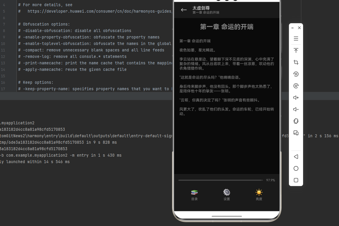
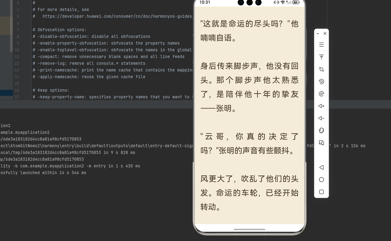
const novelContent = `第一章 命运的开端
夜色如墨,星光稀疏。
李云站在悬崖边,望着脚下深不见底的深渊,心中充满了复杂的情绪。风从谷底吹上来,带着一丝凉意,吹动他的衣角猎猎作响。
"这就是命运的尽头吗?"他喃喃自语。
身后传来脚步声,他没有回头。那个脚步声他太熟悉了,是陪伴他十年的挚友——张明。
"云哥,你真的决定了吗?"张明的声音有些颤抖。
风更大了,吹乱了他们的头发。命运的车轮,已经开始转动。`;
const chapters = [
{ id: 1, title: '第一章 命运的开端' },
{ id: 2, title: '第二章 深渊奇遇' },
{ id: 3, title: '第三章 初试剑诀' },
{ id: 4, title: '第四章 血煞现身' },
{ id: 5, title: '第五章 绝地反击' },
];
function NovelReader() {
const [currentThemeName, setCurrentThemeName] = useState('light');
const [fontSize, setFontSize] = useState(18);
const [lineHeight, setLineHeight] = useState(1.8);
const [showMenu, setShowMenu] = useState(false);
const [showSettings, setShowSettings] = useState(false);
const [showChapterList, setShowChapterList] = useState(false);
const [currentChapter, setCurrentChapter] = useState(1);
const [progress, setProgress] = useState(0);
const scrollViewRef = useRef<ScrollView>(null);
const theme = themes[currentThemeName];
useEffect(() => {
const listener = AppearanceHarmony.addChangeListener(({ colorScheme }) => {
console.log('系统主题变化:', colorScheme);
});
return () => listener.remove();
}, []);
const handleScroll = (event: { nativeEvent: { contentOffset: { y: number }; contentSize: { height: number }; layoutMeasurement: { height: number } } }) => {
const { contentOffset, contentSize, layoutMeasurement } = event.nativeEvent;
const totalHeight = contentSize.height - layoutMeasurement.height;
if (totalHeight > 0) {
setProgress(Math.min(100, Math.max(0, (contentOffset.y / totalHeight) * 100)));
}
};
const selectChapter = (id: number) => {
setCurrentChapter(id);
setShowChapterList(false);
scrollViewRef.current?.scrollTo({ y: 0, animated: false });
};
// 阅读页面
if (!showSettings && !showChapterList) {
return (
<SafeAreaView style={[styles.container, { backgroundColor: theme.readerBg }]}>
<StatusBar barStyle={theme.statusBar} />
<ScrollView
ref={scrollViewRef}
style={styles.scrollView}
contentContainerStyle={styles.scrollContent}
onScroll={handleScroll}
scrollEventThrottle={16}
>
<Text style={[styles.chapterTitle, { color: theme.readerText }]}>
{chapters.find(c => c.id === currentChapter)?.title}
</Text>
<Text style={[
styles.novelText,
{ color: theme.readerText, fontSize, lineHeight: fontSize * lineHeight }
]}>
{novelContent}
</Text>
</ScrollView>
{/* 点击中间区域显示菜单 */}
<TouchableOpacity
style={styles.touchArea}
activeOpacity={1}
onPress={() => setShowMenu(!showMenu)}
/>
{/* 顶部菜单 */}
{showMenu && (
<View style={[styles.topBar, { backgroundColor: theme.surface }]}>
<TouchableOpacity style={styles.backBtn}>
<Text style={{ color: theme.text, fontSize: 24 }}>←</Text>
</TouchableOpacity>
<View>
<Text style={{ color: theme.text, fontSize: 16, fontWeight: '600' }}>太虚剑尊</Text>
<Text style={{ color: theme.textSecondary, fontSize: 12 }}>
{chapters.find(c => c.id === currentChapter)?.title}
</Text>
</View>
</View>
)}
{/* 底部菜单 */}
{showMenu && (
<View style={[styles.bottomBar, { backgroundColor: theme.surface }]}>
<View style={styles.progressRow}>
<View style={[styles.progressBg, { backgroundColor: theme.border }]}>
<View style={[styles.progressFill, { backgroundColor: theme.primary, width: `${progress}%` }]} />
</View>
<Text style={{ color: theme.textSecondary, fontSize: 12 }}>{progress.toFixed(1)}%</Text>
</View>
<View style={styles.menuRow}>
<TouchableOpacity style={styles.menuItem} onPress={() => { setShowMenu(false); setShowChapterList(true); }}>
<Text style={{ fontSize: 24 }}>📚</Text>
<Text style={{ color: theme.textSecondary, fontSize: 12, marginTop: 4 }}>目录</Text>
</TouchableOpacity>
<TouchableOpacity style={styles.menuItem} onPress={() => { setShowMenu(false); setShowSettings(true); }}>
<Text style={{ fontSize: 24 }}>⚙️</Text>
<Text style={{ color: theme.textSecondary, fontSize: 12, marginTop: 4 }}>设置</Text>
</TouchableOpacity>
<TouchableOpacity style={styles.menuItem}>
<Text style={{ fontSize: 24 }}>☀️</Text>
<Text style={{ color: theme.textSecondary, fontSize: 12, marginTop: 4 }}>亮度</Text>
</TouchableOpacity>
</View>
</View>
)}
</SafeAreaView>
);
}
// 设置页面
if (showSettings) {
return (
<SafeAreaView style={[styles.fullScreen, { backgroundColor: theme.background }]}>
<StatusBar barStyle={theme.statusBar} />
{/* 标题栏 */}
<View style={[styles.header, { borderBottomColor: theme.border }]}>
<TouchableOpacity onPress={() => setShowSettings(false)}>
<Text style={{ color: theme.text, fontSize: 24 }}>←</Text>
</TouchableOpacity>
<Text style={[styles.headerTitle, { color: theme.text }]}>阅读设置</Text>
<View style={{ width: 24 }} />
</View>
<ScrollView style={styles.settingsScroll}>
{/* 主题选择 */}
<View style={styles.section}>
<Text style={[styles.sectionTitle, { color: theme.text }]}>主题切换</Text>
<View style={styles.themeList}>
{Object.values(themes).map((t) => (
<TouchableOpacity
key={t.name}
style={[
styles.themeItem,
{ backgroundColor: t.readerBg },
currentThemeName === t.name && { borderWidth: 2, borderColor: theme.primary }
]}
onPress={() => setCurrentThemeName(t.name)}
>
<Text style={{ color: t.readerText, fontSize: 16, fontWeight: '500' }}>文</Text>
<Text style={{ color: theme.textSecondary, fontSize: 12, marginTop: 4 }}>{t.displayName}</Text>
</TouchableOpacity>
))}
</View>
</View>
{/* 字体大小 */}
<View style={[styles.section, { borderBottomWidth: 1, borderBottomColor: theme.border }]}>
<View style={styles.row}>
<Text style={[styles.sectionTitle, { color: theme.text }]}>字体大小</Text>
<View style={styles.stepper}>
<TouchableOpacity
style={[styles.stepBtn, { borderColor: theme.border }]}
onPress={() => setFontSize(Math.max(14, fontSize - 2))}
>
<Text style={{ color: theme.text, fontSize: 18 }}>−</Text>
</TouchableOpacity>
<Text style={[styles.stepValue, { color: theme.text }]}>{fontSize}</Text>
<TouchableOpacity
style={[styles.stepBtn, { borderColor: theme.border }]}
onPress={() => setFontSize(Math.min(28, fontSize + 2))}
>
<Text style={{ color: theme.text, fontSize: 18 }}>+</Text>
</TouchableOpacity>
</View>
</View>
</View>
{/* 行间距 */}
<View style={styles.section}>
<View style={styles.row}>
<Text style={[styles.sectionTitle, { color: theme.text }]}>行间距</Text>
<View style={styles.stepper}>
<TouchableOpacity
style={[styles.stepBtn, { borderColor: theme.border }]}
onPress={() => setLineHeight(Math.max(1.2, lineHeight - 0.2))}
>
<Text style={{ color: theme.text, fontSize: 18 }}>−</Text>
</TouchableOpacity>
<Text style={[styles.stepValue, { color: theme.text }]}>{lineHeight.toFixed(1)}</Text>
<TouchableOpacity
style={[styles.stepBtn, { borderColor: theme.border }]}
onPress={() => setLineHeight(Math.min(2.6, lineHeight + 0.2))}
>
<Text style={{ color: theme.text, fontSize: 18 }}>+</Text>
</TouchableOpacity>
</View>
</View>
</View>
</ScrollView>
</SafeAreaView>
);
}
// 目录页面
return (
<SafeAreaView style={[styles.fullScreen, { backgroundColor: theme.background }]}>
<StatusBar barStyle={theme.statusBar} />
<View style={[styles.header, { borderBottomColor: theme.border }]}>
<TouchableOpacity onPress={() => setShowChapterList(false)}>
<Text style={{ color: theme.text, fontSize: 24 }}>←</Text>
</TouchableOpacity>
<Text style={[styles.headerTitle, { color: theme.text }]}>目录</Text>
<View style={{ width: 24 }} />
</View>
<FlatList
data={chapters}
keyExtractor={(item) => item.id.toString()}
renderItem={({ item }) => (
<TouchableOpacity
style={[
styles.chapterItem,
currentChapter === item.id && { backgroundColor: theme.surface }
]}
onPress={() => selectChapter(item.id)}
>
<Text style={{
color: currentChapter === item.id ? theme.primary : theme.text,
fontSize: 16
}}>
{item.title}
</Text>
</TouchableOpacity>
)}
/>
</SafeAreaView>
);
}
const styles = StyleSheet.create({
container: { flex: 1 },
fullScreen: { flex: 1 },
scrollView: { flex: 1 },
scrollContent: { padding: 20, paddingTop: 40 },
chapterTitle: { fontSize: 24, fontWeight: 'bold', textAlign: 'center', marginBottom: 30 },
novelText: { textAlign: 'justify' },
touchArea: { position: 'absolute', top: '30%', left: '20%', right: '20%', bottom: '30%' },
topBar: {
position: 'absolute', top: 0, left: 0, right: 0,
height: 60, flexDirection: 'row', alignItems: 'center', paddingHorizontal: 16
},
backBtn: { padding: 8, marginRight: 12 },
bottomBar: {
position: 'absolute', bottom: 0, left: 0, right: 0,
padding: 16, paddingBottom: 30
},
progressRow: { flexDirection: 'row', alignItems: 'center', marginBottom: 16 },
progressBg: { flex: 1, height: 4, borderRadius: 2, marginRight: 12 },
progressFill: { height: '100%', borderRadius: 2 },
menuRow: { flexDirection: 'row', justifyContent: 'space-around' },
menuItem: { alignItems: 'center', padding: 8 },
header: {
height: 50, flexDirection: 'row', alignItems: 'center',
justifyContent: 'space-between', paddingHorizontal: 16, borderBottomWidth: 1
},
headerTitle: { fontSize: 18, fontWeight: '600' },
settingsScroll: { flex: 1 },
section: { padding: 16 },
sectionTitle: { fontSize: 16, fontWeight: '500', marginBottom: 16 },
themeList: { flexDirection: 'row', flexWrap: 'wrap' },
themeItem: {
alignItems: 'center', justifyContent: 'center',
width: 60, height: 70, borderRadius: 8, marginRight: 12, marginBottom: 12
},
row: { flexDirection: 'row', justifyContent: 'space-between', alignItems: 'center' },
stepper: { flexDirection: 'row', alignItems: 'center' },
stepBtn: {
width: 36, height: 36, borderRadius: 18, borderWidth: 1,
justifyContent: 'center', alignItems: 'center'
},
stepValue: { fontSize: 16, marginHorizontal: 20, minWidth: 30, textAlign: 'center' },
chapterItem: { padding: 16, borderBottomWidth: 1, borderBottomColor: '#E0E0E0' },
});
export default NovelReader;
🔗 相关链接
📝 总结
react-native-appearance 是实现应用主题切换的基础组件,提供了完整的 API 来获取、设置和监听系统外观模式。在 HarmonyOS 平台上,该库通过原生模块实现,API 与 iOS/Android 保持一致,开发者可以无缝使用。
吐槽
react-native-appearance 三方库挖坑,预埋无限递归函数。排查代码没发现问题,排查源码发现了

开源鸿蒙跨平台开发社区汇聚开发者与厂商,共建“一次开发,多端部署”的开源生态,致力于降低跨端开发门槛,推动万物智联创新。
更多推荐

 2
2 0
0- 0


 已为社区贡献51条内容

所有评论(0)