技术博客:基于 Flutter × HarmonyOS 6.0 的新生宿舍管理系统——欢迎区域实现解析
摘要: 本文介绍了基于Flutter和HarmonyOS 6.0开发的新生宿舍管理系统欢迎区域实现方案。针对传统宿舍管理效率低、信息孤岛等问题,系统采用Flutter跨端框架与HarmonyOS分布式能力结合,构建了简洁友好的欢迎界面。通过Container、Row、Column等Flutter组件实现渐变背景、自适应布局和主题适配,支持多终端统一展示。核心代码解析了UI构建技巧,包括文本样式、间
技术博客:基于 Flutter × HarmonyOS 6.0 的新生宿舍管理系统——欢迎区域实现解析
前言
随着高校信息化建设的推进,传统的宿舍管理模式存在效率低、信息孤岛多、交互体验差等问题。新生入住宿舍是学校管理中非常关键的环节,从分配床位、办理入住手续,到查询宿舍信息,管理流程繁杂。
本篇文章以 Flutter × HarmonyOS 6.0 为基础,分享 DormMate 新生宿舍管理系统中“欢迎区域”模块的实现方法。重点解析 UI 构建、跨端适配以及 Flutter 组件使用技巧,为想在 HarmonyOS 平台上进行 Flutter 开发的读者提供参考。
背景
-
传统管理痛点:
- 手工登记信息,易出错
- 新生对流程不熟悉,需人工指导
- 信息更新慢,难以实时共享
-
系统设计目标:
- 简洁友好的欢迎界面:让新生第一眼就感受到服务功能
- 高可扩展性:欢迎区域可以轻松添加活动信息、公告、快捷入口
- 跨端统一体验:手机、平板、桌面端界面一致
-
技术选型:
- Flutter:快速构建高性能跨端界面
- HarmonyOS 6.0:支持分布式多端运行,提供丰富的设备交互能力
Flutter × HarmonyOS 6.0 跨端开发介绍
HarmonyOS 6.0 提供了 多设备分布式能力,支持从手机到平板、电视、IoT 设备的统一 UI 展示。Flutter 则提供了 声明式 UI 构建、丰富组件库和热重载能力。两者结合的优势如下:
| 特性 | Flutter | HarmonyOS |
|---|---|---|
| 跨端开发 | ✅ 支持 Android、iOS、Web | ✅ 支持 HarmonyOS 多终端 |
| UI 构建 | ✅ 声明式 Widget | ✅ 分布式能力增强 |
| 性能 | 高性能 GPU 渲染 | 支持多设备适配 |
| 开发效率 | 热重载 + 丰富插件 | 与 JS/Java/Kotlin 互通 |
在 DormMate 系统中,我们将利用 Flutter 的 Widget 构建界面,同时利用 HarmonyOS 分布式特性,实现多端统一欢迎页面。
开发核心代码:欢迎区域实现
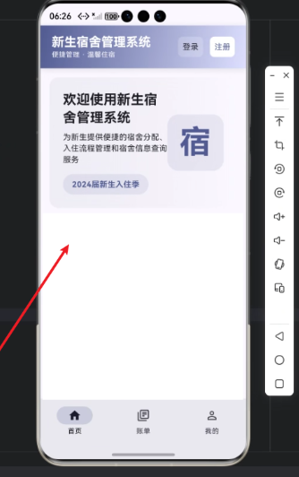
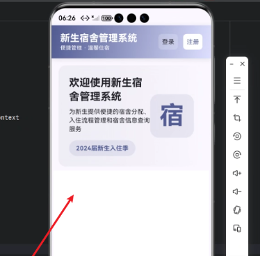
下面是“欢迎区域”的核心实现代码,以及逐行解析。该模块的功能包括:
- 欢迎新生文字提示
- 简介功能
- 当季入住信息
- 图标装饰
完整代码
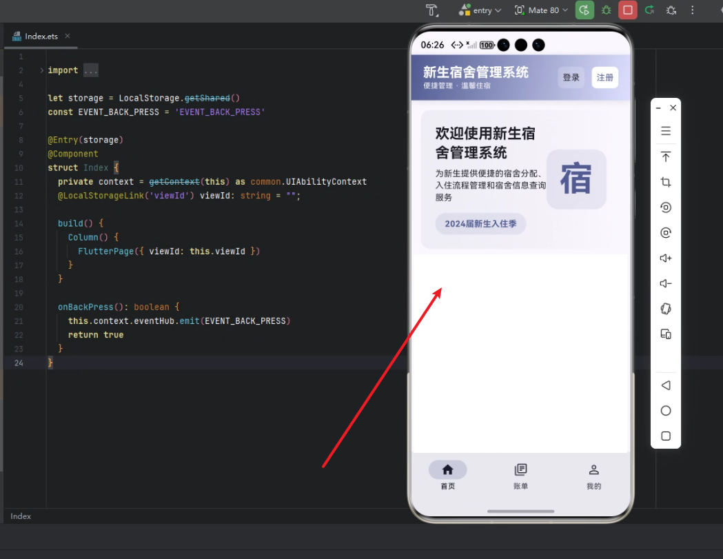
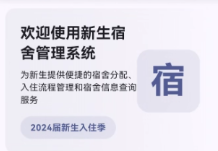
Widget _buildWelcomeSection(ThemeData theme) {
  return Container(
    padding: const EdgeInsets.all(24),
    decoration: BoxDecoration(
      gradient: LinearGradient(
        begin: Alignment.centerLeft,
        end: Alignment.centerRight,
        colors: [
          theme.colorScheme.surfaceVariant.withOpacity(0.5),
          theme.colorScheme.surface.withOpacity(0.8),
        ],
      ),
      borderRadius: BorderRadius.circular(16),
    ),
    child: Row(
      children: [
        Expanded(
          child: Column(
            crossAxisAlignment: CrossAxisAlignment.start,
            children: [
              Text(
                '欢迎使用新生宿舍管理系统',
                style: theme.textTheme.headlineSmall?.copyWith(
                  fontWeight: FontWeight.bold,
                ),
              ),
              const SizedBox(height: 8),
              Text(
                '为新生提供便捷的宿舍分配、入住流程管理和宿舍信息查询服务',
                style: theme.textTheme.bodyMedium,
              ),
              const SizedBox(height: 16),
              Container(
                padding: const EdgeInsets.symmetric(horizontal: 16, vertical: 8),
                decoration: BoxDecoration(
                  color: theme.colorScheme.primary.withOpacity(0.1),
                  borderRadius: BorderRadius.circular(20),
                ),
                child: Text(
                  '2024届新生入住季',
                  style: TextStyle(
                    color: theme.colorScheme.primary,
                    fontWeight: FontWeight.bold,
                  ),
                ),
              ),
            ],
          ),
        ),
        Container(
          width: 100,
          height: 100,
          decoration: BoxDecoration(
            color: theme.colorScheme.primary.withOpacity(0.1),
            borderRadius: BorderRadius.circular(20),
          ),
          child: Center(
            child: Text(
              '宿',
              style: theme.textTheme.displayLarge?.copyWith(
                color: theme.colorScheme.primary,
                fontWeight: FontWeight.bold,
              ),
            ),
          ),
        ),
      ],
    ),
  );
}
逐行解析
1. 顶层容器
return Container(
  padding: const EdgeInsets.all(24),
  decoration: BoxDecoration(
    gradient: LinearGradient(
      begin: Alignment.centerLeft,
      end: Alignment.centerRight,
      colors: [
        theme.colorScheme.surfaceVariant.withOpacity(0.5),
        theme.colorScheme.surface.withOpacity(0.8),
      ],
    ),
    borderRadius: BorderRadius.circular(16),
  ),
-
Container:Flutter 中最常用的容器,用于布局和装饰。 -
padding:内部空隙,保持内容不贴边。 -
decoration:gradient:渐变背景,从左到右。borderRadius:圆角 16,增加柔和感。
-
使用
theme.colorScheme让界面随主题变化自动适配 Light/Dark 模式。
2. 内容布局:Row + Column
child: Row(
  children: [
    Expanded(
      child: Column(
        crossAxisAlignment: CrossAxisAlignment.start,
        children: [
          ...
        ],
      ),
    ),
    Container(
      width: 100,
      height: 100,
      ...
    ),
  ],
),
Row:水平布局,将文字区域与装饰图标并排显示。Expanded:文字区域占据剩余空间,确保自适应不同屏幕。Column:垂直布局,逐行展示标题、描述、入住季信息。
3. 标题与描述
Text(
  '欢迎使用新生宿舍管理系统',
  style: theme.textTheme.headlineSmall?.copyWith(
    fontWeight: FontWeight.bold,
  ),
),
const SizedBox(height: 8),
Text(
  '为新生提供便捷的宿舍分配、入住流程管理和宿舍信息查询服务',
  style: theme.textTheme.bodyMedium,
),
Text:显示文字。theme.textTheme.headlineSmall:使用主题字体大小,保证统一风格。copyWith(fontWeight: FontWeight.bold):加粗标题。SizedBox(height: 8):行间距,增强视觉层次感。
4. 入住季提示
Container(
  padding: const EdgeInsets.symmetric(horizontal: 16, vertical: 8),
  decoration: BoxDecoration(
    color: theme.colorScheme.primary.withOpacity(0.1),
    borderRadius: BorderRadius.circular(20),
  ),
  child: Text(
    '2024届新生入住季',
    style: TextStyle(
      color: theme.colorScheme.primary,
      fontWeight: FontWeight.bold,
    ),
  ),
),
- 使用
Container包裹文字,增加背景色和圆角。 withOpacity(0.1):降低背景色饱和度,让文字更突出。- 圆角
20和内边距增强按钮/标签效果。
5. 装饰图标
Container(
  width: 100,
  height: 100,
  decoration: BoxDecoration(
    color: theme.colorScheme.primary.withOpacity(0.1),
    borderRadius: BorderRadius.circular(20),
  ),
  child: Center(
    child: Text(
      '宿',
      style: theme.textTheme.displayLarge?.copyWith(
        color: theme.colorScheme.primary,
        fontWeight: FontWeight.bold,
      ),
    ),
  ),
),
- 为欢迎区域添加一个醒目的“宿”字图标。
- 使用
Center居中显示。 displayLarge文字样式,配合主题色,突出视觉焦点。
小结
通过 Row + Column + Container + Text 的组合,我们构建了一个美观、跨端适配、主题感知的欢迎区域。该组件可以轻松集成到 DormMate 首页,并在手机、平板、HarmonyOS 桌面端统一呈现。
心得
-
Flutter × HarmonyOS 结合的优势:
- Flutter 提供声明式 UI,组件化易于复用。
- HarmonyOS 主题与分布式能力增强了跨设备适配性。
-
UI 设计技巧:
- 渐变和圆角让界面更现代化。
- 使用
ThemeData的颜色与字体可以保证暗黑模式和亮色模式下的统一。
-
开发效率:
- 热重载 + Widget 组合,快速实现多样化布局。
- 组件拆分方便扩展,例如未来增加快捷入口或公告条。
总结
本文介绍了基于 Flutter × HarmonyOS 6.0 开发的 DormMate 新生宿舍管理系统欢迎区域模块实现思路。通过精心设计的布局、主题适配和渐变背景,我们为新生提供了一个简洁、易读、现代化的入口界面。同时,通过组件化设计,这一模块可扩展性强,可快速在多端复用。
DormMate 的设计理念是:简洁、美观、跨端统一,为学校宿舍管理系统提供了一套高效、易维护的前端解决方案。

开源鸿蒙跨平台开发社区汇聚开发者与厂商,共建“一次开发,多端部署”的开源生态,致力于降低跨端开发门槛,推动万物智联创新。
更多推荐

 11
11 0
0- 0


 已为社区贡献59条内容

所有评论(0)