进阶实战 Flutter for OpenHarmony:ExpansionPanelList 组件实战 - 可折叠信息面板系统
可折叠面板(Expansion Panel)是一种常见的 UI 组件,它允许用户通过点击标题栏来展开或收起内容区域。这种设计模式在移动应用中非常流行,因为它能够在有限的屏幕空间内展示大量信息,同时保持界面的整洁和易用性。想象一下这样的场景:用户打开一个设置页面,看到多个设置分组,每个分组都有一个标题和展开图标。当用户点击某个分组时,该分组展开显示详细的设置选项,其他分组保持收起状态。这种交互方式让
欢迎加入开源鸿蒙跨平台社区:https://openharmonycrossplatform.csdn.net
🔍 一、组件概述与应用场景
📱 1.1 什么是可折叠面板?
可折叠面板(Expansion Panel)是一种常见的 UI 组件,它允许用户通过点击标题栏来展开或收起内容区域。这种设计模式在移动应用中非常流行,因为它能够在有限的屏幕空间内展示大量信息,同时保持界面的整洁和易用性。
想象一下这样的场景:用户打开一个设置页面,看到多个设置分组,每个分组都有一个标题和展开图标。当用户点击某个分组时,该分组展开显示详细的设置选项,其他分组保持收起状态。这种交互方式让用户可以快速定位到需要的设置项,而不需要在长长的列表中滚动查找。
这就是 ExpansionPanelList 要实现的功能。它提供了一套完整的可折叠面板解决方案,支持单选、多选、动画过渡等特性。
📋 1.2 ExpansionPanelList 是什么?
ExpansionPanelList 是 Flutter Material 库中的内置组件,用于展示一组可折叠的面板。每个面板由 ExpansionPanel 组成,包含标题栏和内容区域。用户可以通过点击标题栏来切换面板的展开/收起状态。
🎯 1.3 核心功能特性
| 功能特性 | 详细说明 | OpenHarmony 支持 |
|---|---|---|
| 单选模式 | 同时只能展开一个面板 | ✅ 完全支持 |
| 多选模式 | 可以同时展开多个面板 | ✅ 完全支持 |
| 动画过渡 | 展开/收起带有平滑动画 | ✅ 完全支持 |
| 自定义样式 | 可自定义标题和内容样式 | ✅ 完全支持 |
| 分隔线 | 可配置面板间的分隔线 | ✅ 完全支持 |
💡 1.4 典型应用场景
FAQ问答系统:问题列表,点击展开显示答案。
设置分组:将设置项按类别分组,点击展开显示详细设置。
表单步骤:多步骤表单,每个步骤可展开查看详情。
课程大纲:章节列表,点击展开显示小节内容。
🏗️ 二、系统架构设计
📐 2.1 整体架构
┌─────────────────────────────────────────────────────────┐
│                    UI 层 (展示层)                        │
│  ┌─────────────┐  ┌─────────────┐  ┌─────────────┐     │
│  │  面板标题   │  │  面板内容   │  │  展开图标   │     │
│  └─────────────┘  └─────────────┘  └─────────────┘     │
├─────────────────────────────────────────────────────────┤
│                  服务层 (业务逻辑)                       │
│  ┌─────────────────────────────────────────────────┐   │
│  │         ExpansionPanelController                 │   │
│  │  • 展开状态管理                                  │   │
│  │  • 面板数据管理                                  │   │
│  │  • 交互逻辑处理                                  │   │
│  └─────────────────────────────────────────────────┘   │
├─────────────────────────────────────────────────────────┤
│                  基础设施层 (底层实现)                   │
│  ┌─────────────────────────────────────────────────┐   │
│  │         ExpansionPanelList 组件                  │   │
│  │  • ExpansionPanel - 单个面板                     │   │
│  │  • ExpansionPanelList - 面板列表                 │   │
│  │  • ExpansionPanelList.radio - 单选面板列表       │   │
│  └─────────────────────────────────────────────────┘   │
└─────────────────────────────────────────────────────────┘
📊 2.2 数据模型设计
/// 面板数据模型
class PanelItem {
  /// 唯一标识
  final String id;

  /// 标题
  final String title;

  /// 副标题
  final String? subtitle;

  /// 内容
  final String content;

  /// 图标
  final IconData? icon;

  /// 是否已展开
  bool isExpanded;

  PanelItem({
    required this.id,
    required this.title,
    this.subtitle,
    required this.content,
    this.icon,
    this.isExpanded = false,
  });
}

/// 面板配置模型
class PanelConfig {
  /// 展开动画时长
  final Duration animationDuration;

  /// 是否显示分隔线
  final bool divider;

  /// 是否启用单选模式
  final bool radioMode;

  /// 展开图标
  final Icon? expandIcon;

  /// 收起图标
  final Icon? collapseIcon;

  const PanelConfig({
    this.animationDuration = const Duration(milliseconds: 200),
    this.divider = true,
    this.radioMode = false,
    this.expandIcon,
    this.collapseIcon,
  });
}
🛠️ 三、核心组件详解
🎬 3.1 ExpansionPanel - 单个面板
ExpansionPanel 是构成 ExpansionPanelList 的基本单元。
ExpansionPanel(
  // 面板标题
  headerBuilder: (BuildContext context, bool isExpanded) {
    return ListTile(
      leading: Icon(Icons.info),
      title: Text('面板标题'),
      subtitle: Text('点击展开查看详情'),
    );
  },
  // 面板内容
  body: Container(
    padding: EdgeInsets.all(16),
    child: Text('这是面板的内容区域,可以放置任意组件。'),
  ),
  // 是否展开
  isExpanded: false,
  // 是否可以点击标题栏展开
  canTapOnHeader: true,
  // 背景色
  backgroundColor: Colors.white,
);
📋 3.2 ExpansionPanelList - 面板列表
ExpansionPanelList 用于管理多个 ExpansionPanel。
ExpansionPanelList(
  // 子面板列表
  children: [
    ExpansionPanel(
      headerBuilder: (context, isExpanded) => ListTile(title: Text('面板1')),
      body: Text('内容1'),
      isExpanded: false,
    ),
    ExpansionPanel(
      headerBuilder: (context, isExpanded) => ListTile(title: Text('面板2')),
      body: Text('内容2'),
      isExpanded: false,
    ),
  ],
  // 展开状态变化回调
  expansionCallback: (panelIndex, isExpanded) {
    // 处理展开状态变化
  },
  // 动画时长
  animationDuration: Duration(milliseconds: 300),
  // 分隔线颜色
  dividerColor: Colors.grey.shade300,
);
🔘 3.3 ExpansionPanelList.radio - 单选模式
ExpansionPanelList.radio 确保同一时间只有一个面板展开。
ExpansionPanelList.radio(
  // 子面板列表
  children: [
    ExpansionPanelRadio(
      value: 'panel1',
      headerBuilder: (context, isExpanded) => ListTile(title: Text('面板1')),
      body: Text('内容1'),
    ),
    ExpansionPanelRadio(
      value: 'panel2',
      headerBuilder: (context, isExpanded) => ListTile(title: Text('面板2')),
      body: Text('内容2'),
    ),
  ],
  // 当前展开的面板
  initialOpenPanelValue: null,
  // 展开状态变化回调
  expansionCallback: (panelIndex, isExpanded) {
    // 处理展开状态变化
  },
);
📝 四、完整示例代码
下面是一个完整的可折叠信息面板系统示例:
import 'package:flutter/material.dart';
void main() {
runApp(const ExpansionPanelApp());
}
class ExpansionPanelApp extends StatelessWidget {
const ExpansionPanelApp({super.key});
Widget build(BuildContext context) {
return MaterialApp(
title: '可折叠面板系统',
debugShowCheckedModeBanner: false,
theme: ThemeData(
colorScheme: ColorScheme.fromSeed(seedColor: Colors.teal),
useMaterial3: true,
),
home: const MainPage(),
);
}
}
class MainPage extends StatefulWidget {
const MainPage({super.key});
State<MainPage> createState() => _MainPageState();
}
class _MainPageState extends State<MainPage> {
int _currentIndex = 0;
final List<Widget> _pages = [
const FAQPage(),
const SettingsGroupPage(),
const FormStepsPage(),
];
Widget build(BuildContext context) {
return Scaffold(
body: _pages[_currentIndex],
bottomNavigationBar: NavigationBar(
selectedIndex: _currentIndex,
onDestinationSelected: (index) {
setState(() => _currentIndex = index);
},
destinations: const [
NavigationDestination(icon: Icon(Icons.help), label: 'FAQ'),
NavigationDestination(icon: Icon(Icons.settings), label: '设置'),
NavigationDestination(icon: Icon(Icons.list_alt), label: '表单'),
],
),
);
}
}
// ============ FAQ 问答页面 ============
class FAQPage extends StatefulWidget {
const FAQPage({super.key});
State<FAQPage> createState() => _FAQPageState();
}
class _FAQPageState extends State<FAQPage> {
final List<FAQItem> _faqItems = [
FAQItem(
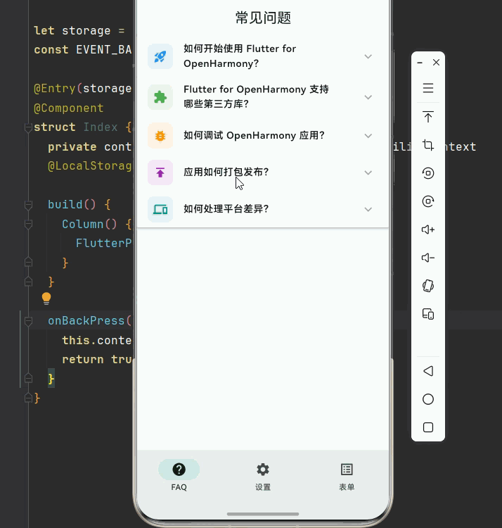
question: '如何开始使用 Flutter for OpenHarmony?',
answer: '首先需要安装 Flutter SDK 和 OpenHarmony 开发环境,然后创建一个新的 Flutter 项目,配置 OpenHarmony 平台支持即可开始开发。',
icon: Icons.rocket_launch,
color: Colors.blue,
),
FAQItem(
question: 'Flutter for OpenHarmony 支持哪些第三方库?',
answer: '大部分常用的 Flutter 第三方库都已经适配 OpenHarmony,包括 shared_preferences、path_provider、video_player、image_picker 等。具体可以查看 OpenHarmony-TPC 仓库。',
icon: Icons.extension,
color: Colors.green,
),
FAQItem(
question: '如何调试 OpenHarmony 应用?',
answer: '可以使用 Flutter DevTools 进行调试,也可以使用 DevEco Studio 的调试功能。在模拟器或真机上运行应用后,可以通过日志查看运行状态。',
icon: Icons.bug_report,
color: Colors.orange,
),
FAQItem(
question: '应用如何打包发布?',
answer: '使用 flutter build ohos 命令构建 HAP 包,然后可以通过 DevEco Studio 签名并上传到应用市场。',
icon: Icons.publish,
color: Colors.purple,
),
FAQItem(
question: '如何处理平台差异?',
answer: '可以使用条件导入和平台检测来处理不同平台的差异。Flutter 提供了 Platform.isAndroid、Platform.isIOS 等属性来判断当前运行平台。',
icon: Icons.devices,
color: Colors.teal,
),
];
Widget build(BuildContext context) {
return Scaffold(
appBar: AppBar(
title: const Text('常见问题'),
centerTitle: true,
),
body: SingleChildScrollView(
child: ExpansionPanelList(
expansionCallback: (index, isExpanded) {
setState(() {
_faqItems[index].isExpanded = isExpanded;
});
},
animationDuration: const Duration(milliseconds: 300),
dividerColor: Colors.grey.shade200,
children: _faqItems.asMap().entries.map((entry) {
final index = entry.key;
final item = entry.value;
return ExpansionPanel(
headerBuilder: (context, isExpanded) {
return ListTile(
leading: Container(
width: 40,
height: 40,
decoration: BoxDecoration(
color: item.color.withOpacity(0.1),
borderRadius: BorderRadius.circular(10),
),
child: Icon(item.icon, color: item.color, size: 22),
),
title: Text(
item.question,
style: const TextStyle(
fontWeight: FontWeight.w600,
fontSize: 15,
),
),
);
},
body: Container(
padding: const EdgeInsets.fromLTRB(16, 0, 16, 20),
child: Container(
padding: const EdgeInsets.all(16),
decoration: BoxDecoration(
color: Colors.grey.shade50,
borderRadius: BorderRadius.circular(12),
),
child: Text(
item.answer,
style: TextStyle(
color: Colors.grey.shade700,
height: 1.6,
),
),
),
),
isExpanded: item.isExpanded,
canTapOnHeader: true,
backgroundColor: Colors.white,
);
}).toList(),
),
),
);
}
}
// ============ 设置分组页面 ============
class SettingsGroupPage extends StatefulWidget {
const SettingsGroupPage({super.key});
State<SettingsGroupPage> createState() => _SettingsGroupPageState();
}
class _SettingsGroupPageState extends State<SettingsGroupPage> {
final List<SettingsGroup> _groups = [
SettingsGroup(
title: '账户设置',
icon: Icons.account_circle,
color: Colors.indigo,
items: [
SettingsItem(title: '修改用户名', subtitle: '更改您的显示名称'),
SettingsItem(title: '修改密码', subtitle: '更新登录密码'),
SettingsItem(title: '绑定手机', subtitle: '已绑定:138****8888'),
SettingsItem(title: '绑定邮箱', subtitle: '已绑定:test@example.com'),
],
),
SettingsGroup(
title: '通知设置',
icon: Icons.notifications,
color: Colors.red,
items: [
SettingsItem(title: '推送通知', subtitle: '接收应用推送消息'),
SettingsItem(title: '邮件通知', subtitle: '接收邮件提醒'),
SettingsItem(title: '短信通知', subtitle: '接收短信提醒'),
],
),
SettingsGroup(
title: '隐私设置',
icon: Icons.privacy_tip,
color: Colors.green,
items: [
SettingsItem(title: '隐私政策', subtitle: '查看隐私政策'),
SettingsItem(title: '用户协议', subtitle: '查看用户协议'),
SettingsItem(title: '数据导出', subtitle: '导出您的数据'),
],
),
SettingsGroup(
title: '关于',
icon: Icons.info,
color: Colors.orange,
items: [
SettingsItem(title: '版本信息', subtitle: '当前版本:1.0.0'),
SettingsItem(title: '检查更新', subtitle: '检查是否有新版本'),
SettingsItem(title: '联系我们', subtitle: '意见反馈与客服支持'),
],
),
];
Widget build(BuildContext context) {
return Scaffold(
appBar: AppBar(
title: const Text('设置'),
centerTitle: true,
),
body: SingleChildScrollView(
child: Column(
children: _groups.asMap().entries.map((entry) {
final index = entry.key;
final group = entry.value;
return _buildSettingsGroup(index, group);
}).toList(),
),
),
);
}
Widget _buildSettingsGroup(int groupIndex, SettingsGroup group) {
return Container(
margin: const EdgeInsets.fromLTRB(16, 12, 16, 0),
decoration: BoxDecoration(
color: Colors.white,
borderRadius: BorderRadius.circular(16),
boxShadow: [
BoxShadow(
color: Colors.black.withOpacity(0.05),
blurRadius: 10,
offset: const Offset(0, 2),
),
],
),
child: ClipRRect(
borderRadius: BorderRadius.circular(16),
child: ExpansionPanelList(
expansionCallback: (panelIndex, isExpanded) {
setState(() {
_groups[groupIndex].isExpanded = isExpanded;
});
},
animationDuration: const Duration(milliseconds: 250),
dividerColor: Colors.grey.shade100,
elevation: 0,
children: [
ExpansionPanel(
headerBuilder: (context, isExpanded) {
return ListTile(
leading: Container(
width: 44,
height: 44,
decoration: BoxDecoration(
color: group.color.withOpacity(0.1),
borderRadius: BorderRadius.circular(12),
),
child: Icon(group.icon, color: group.color),
),
title: Text(
group.title,
style: const TextStyle(
fontWeight: FontWeight.bold,
fontSize: 16,
),
),
subtitle: Text(
'${group.items.length} 个选项',
style: TextStyle(color: Colors.grey.shade500, fontSize: 13),
),
);
},
body: Column(
children: group.items.asMap().entries.map((entry) {
final itemIndex = entry.key;
final item = entry.value;
return _buildSettingsItem(item, itemIndex, group.items.length);
}).toList(),
),
isExpanded: group.isExpanded,
canTapOnHeader: true,
backgroundColor: Colors.white,
),
],
),
),
);
}
Widget _buildSettingsItem(SettingsItem item, int index, int total) {
return InkWell(
onTap: () {
ScaffoldMessenger.of(context).showSnackBar(
SnackBar(
content: Text('点击了:${item.title}'),
behavior: SnackBarBehavior.floating,
duration: const Duration(seconds: 1),
),
);
},
child: Container(
padding: const EdgeInsets.symmetric(horizontal: 20, vertical: 14),
decoration: BoxDecoration(
border: index < total - 1
? Border(bottom: BorderSide(color: Colors.grey.shade100))
: null,
),
child: Row(
children: [
Expanded(
child: Column(
crossAxisAlignment: CrossAxisAlignment.start,
children: [
Text(
item.title,
style: const TextStyle(fontSize: 15),
),
const SizedBox(height: 2),
Text(
item.subtitle,
style: TextStyle(
color: Colors.grey.shade500,
fontSize: 13,
),
),
],
),
),
Icon(Icons.chevron_right, color: Colors.grey.shade400, size: 20),
],
),
),
);
}
}
// ============ 表单步骤页面 ============
class FormStepsPage extends StatefulWidget {
const FormStepsPage({super.key});
State<FormStepsPage> createState() => _FormStepsPageState();
}
class _FormStepsPageState extends State<FormStepsPage> {
final List<FormStep> _steps = [
FormStep(
title: '基本信息',
description: '填写您的个人基本信息',
icon: Icons.person_outline,
color: Colors.blue,
fields: ['姓名', '性别', '出生日期', '联系电话'],
),
FormStep(
title: '教育背景',
description: '填写您的教育经历',
icon: Icons.school_outlined,
color: Colors.green,
fields: ['最高学历', '毕业院校', '专业', '毕业时间'],
),
FormStep(
title: '工作经历',
description: '填写您的工作经历',
icon: Icons.work_outline,
color: Colors.orange,
fields: ['公司名称', '职位', '入职时间', '离职时间'],
),
FormStep(
title: '技能特长',
description: '填写您的专业技能',
icon: Icons.star_outline,
color: Colors.purple,
fields: ['技能名称', '熟练程度', '相关证书', '项目经验'],
),
];
Widget build(BuildContext context) {
return Scaffold(
appBar: AppBar(
title: const Text('表单步骤'),
centerTitle: true,
),
body: SingleChildScrollView(
child: Column(
children: [
_buildProgressHeader(),
ExpansionPanelList.radio(
initialOpenPanelValue: _steps.first.title,
expansionCallback: (panelIndex, isExpanded) {
setState(() {
_steps[panelIndex].isExpanded = isExpanded;
});
},
animationDuration: const Duration(milliseconds: 300),
dividerColor: Colors.grey.shade200,
children: _steps.asMap().entries.map((entry) {
final index = entry.key;
final step = entry.value;
return ExpansionPanelRadio(
value: step.title,
headerBuilder: (context, isExpanded) {
return _buildStepHeader(index, step, isExpanded);
},
body: _buildStepBody(step),
backgroundColor: Colors.white,
canTapOnHeader: true,
);
}).toList(),
),
const SizedBox(height: 24),
_buildSubmitButton(),
const SizedBox(height: 32),
],
),
),
);
}
Widget _buildProgressHeader() {
final completedCount = _steps.where((s) => s.isCompleted).length;
final progress = completedCount / _steps.length;
return Container(
margin: const EdgeInsets.all(16),
padding: const EdgeInsets.all(20),
decoration: BoxDecoration(
gradient: LinearGradient(
colors: [Colors.teal.shade400, Colors.teal.shade600],
begin: Alignment.topLeft,
end: Alignment.bottomRight,
),
borderRadius: BorderRadius.circular(16),
),
child: Column(
children: [
Row(
mainAxisAlignment: MainAxisAlignment.spaceBetween,
children: [
const Text(
'表单完成进度',
style: TextStyle(
color: Colors.white,
fontSize: 16,
fontWeight: FontWeight.w500,
),
),
Text(
'$completedCount/${_steps.length}',
style: const TextStyle(
color: Colors.white,
fontSize: 20,
fontWeight: FontWeight.bold,
),
),
],
),
const SizedBox(height: 16),
ClipRRect(
borderRadius: BorderRadius.circular(4),
child: LinearProgressIndicator(
value: progress,
backgroundColor: Colors.white.withOpacity(0.3),
valueColor: const AlwaysStoppedAnimation<Color>(Colors.white),
minHeight: 8,
),
),
],
),
);
}
Widget _buildStepHeader(int index, FormStep step, bool isExpanded) {
return Container(
padding: const EdgeInsets.symmetric(horizontal: 16, vertical: 8),
child: Row(
children: [
Container(
width: 40,
height: 40,
decoration: BoxDecoration(
color: step.isCompleted
? Colors.green
: step.color.withOpacity(0.1),
borderRadius: BorderRadius.circular(10),
),
child: step.isCompleted
? const Icon(Icons.check, color: Colors.white)
: Icon(step.icon, color: step.color),
),
const SizedBox(width: 12),
Expanded(
child: Column(
crossAxisAlignment: CrossAxisAlignment.start,
children: [
Row(
children: [
Text(
'步骤 ${index + 1}',
style: TextStyle(
color: Colors.grey.shade500,
fontSize: 12,
),
),
const SizedBox(width: 8),
if (step.isCompleted)
Container(
padding: const EdgeInsets.symmetric(
horizontal: 6,
vertical: 2,
),
decoration: BoxDecoration(
color: Colors.green.shade50,
borderRadius: BorderRadius.circular(4),
),
child: const Text(
'已完成',
style: TextStyle(
color: Colors.green,
fontSize: 10,
),
),
),
],
),
Text(
step.title,
style: const TextStyle(
fontWeight: FontWeight.bold,
fontSize: 16,
),
),
],
),
),
],
),
);
}
Widget _buildStepBody(FormStep step) {
return Container(
padding: const EdgeInsets.fromLTRB(16, 0, 16, 20),
child: Column(
crossAxisAlignment: CrossAxisAlignment.start,
children: [
Text(
step.description,
style: TextStyle(
color: Colors.grey.shade600,
fontSize: 14,
),
),
const SizedBox(height: 16),
...step.fields.map((field) => _buildFormField(field)),
const SizedBox(height: 16),
SizedBox(
width: double.infinity,
child: ElevatedButton(
onPressed: () {
setState(() {
step.isCompleted = true;
});
ScaffoldMessenger.of(context).showSnackBar(
SnackBar(
content: Text('${step.title} 已保存'),
behavior: SnackBarBehavior.floating,
backgroundColor: Colors.green,
duration: const Duration(seconds: 1),
),
);
},
style: ElevatedButton.styleFrom(
backgroundColor: step.color,
foregroundColor: Colors.white,
padding: const EdgeInsets.symmetric(vertical: 14),
shape: RoundedRectangleBorder(
borderRadius: BorderRadius.circular(10),
),
),
child: const Text('保存此步骤'),
),
),
],
),
);
}
Widget _buildFormField(String label) {
return Padding(
padding: const EdgeInsets.only(bottom: 12),
child: TextField(
decoration: InputDecoration(
labelText: label,
labelStyle: TextStyle(color: Colors.grey.shade600),
border: OutlineInputBorder(
borderRadius: BorderRadius.circular(10),
borderSide: BorderSide(color: Colors.grey.shade300),
),
enabledBorder: OutlineInputBorder(
borderRadius: BorderRadius.circular(10),
borderSide: BorderSide(color: Colors.grey.shade300),
),
focusedBorder: OutlineInputBorder(
borderRadius: BorderRadius.circular(10),
borderSide: const BorderSide(color: Colors.teal, width: 2),
),
contentPadding: const EdgeInsets.symmetric(
horizontal: 16,
vertical: 14,
),
),
),
);
}
Widget _buildSubmitButton() {
final allCompleted = _steps.every((s) => s.isCompleted);
return Container(
margin: const EdgeInsets.symmetric(horizontal: 16),
width: double.infinity,
child: ElevatedButton(
onPressed: allCompleted
? () {
ScaffoldMessenger.of(context).showSnackBar(
const SnackBar(
content: Text('表单提交成功!'),
behavior: SnackBarBehavior.floating,
backgroundColor: Colors.green,
),
);
}
: null,
style: ElevatedButton.styleFrom(
backgroundColor: Colors.teal,
foregroundColor: Colors.white,
disabledBackgroundColor: Colors.grey.shade300,
padding: const EdgeInsets.symmetric(vertical: 16),
shape: RoundedRectangleBorder(
borderRadius: BorderRadius.circular(12),
),
),
child: Text(
allCompleted ? '提交表单' : '请完成所有步骤',
style: const TextStyle(
fontSize: 16,
fontWeight: FontWeight.bold,
),
),
),
);
}
}
// ============ 数据模型 ============
class FAQItem {
final String question;
final String answer;
final IconData icon;
final Color color;
bool isExpanded;
FAQItem({
required this.question,
required this.answer,
required this.icon,
required this.color,
this.isExpanded = false,
});
}
class SettingsGroup {
final String title;
final IconData icon;
final Color color;
final List<SettingsItem> items;
bool isExpanded;
SettingsGroup({
required this.title,
required this.icon,
required this.color,
required this.items,
this.isExpanded = false,
});
}
class SettingsItem {
final String title;
final String subtitle;
SettingsItem({
required this.title,
required this.subtitle,
});
}
class FormStep {
final String title;
final String description;
final IconData icon;
final Color color;
final List<String> fields;
bool isExpanded;
bool isCompleted;
FormStep({
required this.title,
required this.description,
required this.icon,
required this.color,
required this.fields,
this.isExpanded = false,
this.isCompleted = false,
});
}
🏆 五、最佳实践与注意事项
⚠️ 5.1 状态管理最佳实践
使用唯一标识:为每个面板分配唯一标识,便于状态管理。
避免重建:使用 key 属性避免不必要的重建。
状态持久化:在需要时保存展开状态,如使用 shared_preferences。
🔐 5.2 用户体验注意事项
canTapOnHeader:设置为 true 让用户可以点击整个标题栏展开。
动画时长:建议 200-300ms,过长会影响体验。
分隔线:合理使用分隔线,让面板边界更清晰。
📱 5.3 OpenHarmony 平台特殊说明
原生支持:ExpansionPanelList 是 Flutter 内置组件,OpenHarmony 完全支持。
性能表现:动画流畅,无性能问题。
样式一致:Material Design 风格在 OpenHarmony 上表现一致。
📌 六、总结
本文通过一个完整的可折叠信息面板系统案例,深入讲解了 ExpansionPanelList 组件的使用方法与最佳实践:
FAQ问答系统:使用 ExpansionPanelList 展示问答列表,支持多选模式。
设置分组:将设置项按类别分组,提供清晰的层级结构。
表单步骤:使用 ExpansionPanelList.radio 实现单选模式的步骤表单。
状态管理:通过 expansionCallback 管理展开状态,支持状态持久化。
掌握这些技巧,你就能构建出专业级的可折叠面板系统,提升应用的信息展示效率。
参考资料

开源鸿蒙跨平台开发社区汇聚开发者与厂商,共建“一次开发,多端部署”的开源生态,致力于降低跨端开发门槛,推动万物智联创新。
更多推荐


 5
5 0
0- 0


 已为社区贡献43条内容

所有评论(0)