基础入门 Flutter for OpenHarmony:flutter_slidable 列表滑动操作实战
在移动应用开发中,列表项的侧滑操作是一种非常常见的交互模式。用户通过在列表项上左右滑动,可以快速执行删除、编辑、归档等操作,这种交互方式直观且高效。Flutter 提供了 flutter_slidable 插件,让开发者能够轻松实现这种交互效果。侧滑操作是指用户在列表项上水平滑动时,显示隐藏的操作按钮的一种交互模式。删除操作:向左滑动显示删除按钮,快速删除列表项编辑操作:向右滑动显示编辑按钮,进入
欢迎加入开源鸿蒙跨平台社区:https://openharmonycrossplatform.csdn.net
🎯 欢迎来到 Flutter for OpenHarmony 社区!本文将深入讲解 Flutter 中 flutter_slidable 列表滑动操作组件的使用方法,带你从基础到精通,掌握侧滑删除、滑动菜单等常见交互模式。
一、flutter_slidable 组件概述
在移动应用开发中,列表项的侧滑操作是一种非常常见的交互模式。用户通过在列表项上左右滑动,可以快速执行删除、编辑、归档等操作,这种交互方式直观且高效。Flutter 提供了 flutter_slidable 插件,让开发者能够轻松实现这种交互效果。
📋 flutter_slidable 组件特点
| 特点 | 说明 |
|---|---|
| 纯 Dart 实现 | 无需原生平台适配,跨平台一致性高 |
| 多种动画效果 | 支持 Scroll、Drawer、Behind、Stretch 等动画 |
| 双向滑动 | 支持从左侧或右侧滑动显示操作菜单 |
| 自定义操作 | 支持自定义操作按钮、图标、颜色等 |
| 滑动监听 | 支持监听滑动状态和滑动比例 |
| 组操作 | 支持多个操作按钮组合显示 |
| 手势控制 | 支持控制滑动灵敏度、阈值等参数 |
| 通知回调 | 支持滑动开始、结束、取消等事件回调 |
什么是侧滑操作?
侧滑操作是指用户在列表项上水平滑动时,显示隐藏的操作按钮的一种交互模式。常见的应用场景包括:
- 删除操作:向左滑动显示删除按钮,快速删除列表项
- 编辑操作:向右滑动显示编辑按钮,进入编辑模式
- 归档操作:滑动显示归档按钮,将项目移至归档
- 标记操作:滑动显示标记按钮,标记为已读/未读
- 分享操作:滑动显示分享按钮,快速分享内容
flutter_slidable 与 Dismissible 的区别
Flutter 内置的 Dismissible 组件也可以实现滑动删除,但功能相对简单:
| 特性 | flutter_slidable | Dismissible |
|---|---|---|
| 多个操作按钮 | 支持 | 不支持 |
| 自定义动画 | 多种动画可选 | 固定动画 |
| 双向滑动 | 支持 | 仅支持单向 |
| 滑动菜单 | 支持 | 不支持 |
| 滑动直接删除 | 支持 | 支持 |
| 适用场景 | 复杂侧滑交互 | 简单滑动删除 |
💡 使用场景:flutter_slidable 适合需要多个操作按钮、自定义动画效果的侧滑场景。如果只需要简单的滑动删除,可以使用 Flutter 内置的 Dismissible 组件。
二、flutter_slidable 基础用法
flutter_slidable 的使用非常简单,只需要提供操作面板和子组件。让我们从最基础的用法开始学习。
2.1 最简单的 Slidable
最基础的 Slidable 只需要设置 endActionPane 参数和 child 子组件:
Slidable(
  endActionPane: ActionPane(
    motion: const ScrollMotion(),
    children: [
      SlidableAction(
        onPressed: (context) {
          // 处理删除操作
        },
        backgroundColor: Colors.red,
        icon: Icons.delete,
        label: '删除',
      ),
    ],
  ),
  child: const ListTile(
    title: Text('列表项'),
    subtitle: Text('向左滑动查看操作'),
  ),
)
代码解析:
endActionPane:右侧操作面板,向左滑动时显示ActionPane:操作面板容器,包含多个操作按钮motion:滑动动画类型SlidableAction:单个操作按钮child:要添加侧滑操作的子组件
2.2 双向滑动
Slidable 支持同时设置左右两侧的操作面板:
Slidable(
  startActionPane: ActionPane(
    motion: const DrawerMotion(),
    children: [
      SlidableAction(
        onPressed: (context) {},
        backgroundColor: Colors.blue,
        icon: Icons.edit,
        label: '编辑',
      ),
    ],
  ),
  endActionPane: ActionPane(
    motion: const ScrollMotion(),
    children: [
      SlidableAction(
        onPressed: (context) {},
        backgroundColor: Colors.red,
        icon: Icons.delete,
        label: '删除',
      ),
    ],
  ),
  child: const ListTile(
    title: Text('双向滑动'),
    subtitle: Text('左右滑动显示不同操作'),
  ),
)
滑动方向说明:
| 操作面板 | 滑动方向 | 显示位置 |
|---|---|---|
| startActionPane | 从左向右 | 左侧显示 |
| endActionPane | 从右向左 | 右侧显示 |
2.3 完整示例
下面是一个完整的可运行示例,展示了 Slidable 的基础用法:
class SlidableBasicExample extends StatelessWidget {
const SlidableBasicExample({super.key});
Widget build(BuildContext context) {
return Scaffold(
appBar: AppBar(title: const Text('Slidable 基础示例')),
body: ListView.builder(
itemCount: 10,
itemBuilder: (context, index) {
return Slidable(
key: ValueKey(index),
endActionPane: ActionPane(
motion: const ScrollMotion(),
children: [
SlidableAction(
onPressed: (context) {
ScaffoldMessenger.of(context).showSnackBar(
SnackBar(content: Text('删除第 ${index + 1} 项')),
);
},
backgroundColor: Colors.red,
foregroundColor: Colors.white,
icon: Icons.delete,
label: '删除',
),
],
),
child: ListTile(
title: Text('列表项 ${index + 1}'),
subtitle: const Text('向左滑动查看操作'),
trailing: const Icon(Icons.chevron_right),
),
);
},
),
);
}
}
三、ActionPane 操作面板详解
ActionPane 是 Slidable 的核心组件,用于定义滑动后显示的操作区域。掌握 ActionPane 的各种属性是使用 Slidable 的关键。
3.1 motion - 滑动动画
ActionPane 提供了四种滑动动画效果:
ScrollMotion(滚动动画):
ActionPane(
  motion: const ScrollMotion(),
  children: [...],
)
操作按钮跟随手指滑动,从边缘逐渐出现,是最常用的动画效果。
DrawerMotion(抽屉动画):
ActionPane(
  motion: const DrawerMotion(),
  children: [...],
)
操作按钮从边缘滑出,类似抽屉展开的效果。
BehindMotion(背后动画):
ActionPane(
  motion: const BehindMotion(),
  children: [...],
)
操作按钮固定在背后,滑动时逐渐露出。
StretchMotion(拉伸动画):
ActionPane(
  motion: const StretchMotion(),
  children: [...],
)
操作按钮随滑动拉伸,有弹性效果。
动画效果对比:
| 动画类型 | 效果描述 | 适用场景 |
|---|---|---|
| ScrollMotion | 操作按钮跟随手指滚动,从边缘逐渐出现 | 通用场景 |
| DrawerMotion | 操作按钮从边缘滑出,类似抽屉展开 | 多个操作按钮 |
| BehindMotion | 操作按钮固定在背后,滑动时逐渐露出 | 简洁风格 |
| StretchMotion | 操作按钮随滑动拉伸,有弹性效果 | 现代风格应用 |
3.2 extentRatio - 操作区域占比
通过 extentRatio 控制操作区域占列表项的比例:
ActionPane(
  motion: const ScrollMotion(),
  extentRatio: 0.3,
  children: [...],
)
占比说明:
| 值 | 效果 |
|---|---|
| 0.25 | 默认值,占 1/4 |
| 0.3 | 占 30% |
| 0.5 | 占一半 |
| 1.0 | 占满整个列表项 |
3.3 children - 操作按钮列表
ActionPane 的 children 属性用于添加操作按钮:
ActionPane(
  motion: const ScrollMotion(),
  children: [
    SlidableAction(
      onPressed: (context) {},
      backgroundColor: Colors.blue,
      icon: Icons.edit,
      label: '编辑',
    ),
    SlidableAction(
      onPressed: (context) {},
      backgroundColor: Colors.red,
      icon: Icons.delete,
      label: '删除',
    ),
  ],
)
3.4 dismissible - 滑动直接删除
使用 dismissible 实现滑动超过阈值后直接删除:
ActionPane(
  motion: const ScrollMotion(),
  dismissible: DismissiblePane(
    onDismissed: () {
      // 执行删除操作
    },
  ),
  children: [
    SlidableAction(
      onPressed: (context) {},
      backgroundColor: Colors.red,
      icon: Icons.delete,
      label: '删除',
    ),
  ],
)
DismissiblePane 参数详解:
| 参数 | 说明 |
|---|---|
| onDismissed | 滑动删除后的回调 |
| confirmDismiss | 删除前的确认回调 |
| closeOnCancel | 取消删除后是否关闭操作面板 |
📊 ActionPane 属性速查表
| 属性 | 类型 | 说明 |
|---|---|---|
| motion | Widget | 滑动动画类型 |
| extentRatio | double | 操作区域占比 |
| children | List | 操作按钮列表 |
| dismissible | DismissiblePane? | 滑动直接删除配置 |
四、SlidableAction 操作按钮详解
SlidableAction 用于定义单个操作按钮,支持自定义图标、颜色、标签等。
4.1 基本用法
SlidableAction(
  onPressed: (context) {
    // 处理点击操作
  },
  backgroundColor: Colors.red,
  foregroundColor: Colors.white,
  icon: Icons.delete,
  label: '删除',
)
4.2 完整参数
SlidableAction(
  onPressed: (context) {},
  backgroundColor: Colors.red,
  foregroundColor: Colors.white,
  icon: Icons.delete,
  label: '删除',
  autoClose: true,
  spacing: 8,
  padding: const EdgeInsets.symmetric(horizontal: 16),
  borderRadius: BorderRadius.circular(8),
)
参数详解:
| 参数 | 说明 |
|---|---|
| onPressed | 点击回调,为 null 时按钮不可点击 |
| backgroundColor | 背景颜色 |
| foregroundColor | 前景颜色(图标和文字) |
| icon | 图标 |
| label | 文字标签 |
| autoClose | 点击后是否自动关闭操作面板,默认 true |
| spacing | 图标和文字之间的间距 |
| padding | 内边距 |
| borderRadius | 圆角 |
4.3 自定义操作按钮
除了 SlidableAction,也可以使用自定义 Widget 作为操作按钮:
ActionPane(
  motion: const ScrollMotion(),
  children: [
    Expanded(
      child: GestureDetector(
        onTap: () {},
        child: Container(
          color: Colors.purple,
          child: const Column(
            mainAxisAlignment: MainAxisAlignment.center,
            children: [
              Icon(Icons.star, color: Colors.white),
              SizedBox(height: 4),
              Text('收藏', style: TextStyle(color: Colors.white)),
            ],
          ),
        ),
      ),
    ),
  ],
)
五、Slidable 实际应用场景
Slidable 在实际开发中有着广泛的应用,让我们通过具体示例来学习。
5.1 待办事项列表
使用 Slidable 实现待办事项的侧滑操作:
class TodoListExample extends StatefulWidget {
const TodoListExample({super.key});
State<TodoListExample> createState() => _TodoListExampleState();
}
class _TodoListExampleState extends State<TodoListExample> {
final List<TodoItem> _items = [];
void initState() {
super.initState();
_items.addAll([
TodoItem(id: '1', title: '完成项目报告', isCompleted: false),
TodoItem(id: '2', title: '团队会议', isCompleted: true),
TodoItem(id: '3', title: '学习 Flutter', isCompleted: false),
]);
}
void _deleteItem(int index) {
setState(() {
_items.removeAt(index);
});
ScaffoldMessenger.of(context).showSnackBar(
const SnackBar(content: Text('已删除')),
);
}
void _toggleComplete(int index) {
setState(() {
_items[index].isCompleted = !_items[index].isCompleted;
});
}
Widget build(BuildContext context) {
return Scaffold(
appBar: AppBar(title: const Text('待办事项')),
body: ListView.builder(
itemCount: _items.length,
itemBuilder: (context, index) {
final item = _items[index];
return Slidable(
key: ValueKey(item.id),
endActionPane: ActionPane(
motion: const ScrollMotion(),
children: [
SlidableAction(
onPressed: (_) => _toggleComplete(index),
backgroundColor: Colors.green,
foregroundColor: Colors.white,
icon: item.isCompleted ? Icons.undo : Icons.check,
label: item.isCompleted ? '撤销' : '完成',
),
SlidableAction(
onPressed: (_) => _deleteItem(index),
backgroundColor: Colors.red,
foregroundColor: Colors.white,
icon: Icons.delete,
label: '删除',
),
],
),
child: ListTile(
leading: Icon(
item.isCompleted ? Icons.check_circle : Icons.circle_outlined,
color: item.isCompleted ? Colors.green : Colors.grey,
),
title: Text(
item.title,
style: TextStyle(
decoration: item.isCompleted ? TextDecoration.lineThrough : null,
),
),
),
);
},
),
);
}
}
class TodoItem {
final String id;
final String title;
bool isCompleted;
TodoItem({required this.id, required this.title, required this.isCompleted});
}
5.2 购物车商品管理
使用 Slidable 实现购物车商品的侧滑删除:
class ShoppingCartExample extends StatefulWidget {
const ShoppingCartExample({super.key});
State<ShoppingCartExample> createState() => _ShoppingCartExampleState();
}
class _ShoppingCartExampleState extends State<ShoppingCartExample> {
final List<CartItem> _items = [
CartItem(id: '1', name: 'iPhone 15 Pro', price: 8999, quantity: 1),
CartItem(id: '2', name: 'MacBook Pro', price: 14999, quantity: 1),
CartItem(id: '3', name: 'AirPods Pro', price: 1899, quantity: 2),
];
void _removeItem(int index) {
setState(() {
_items.removeAt(index);
});
}
Widget build(BuildContext context) {
return Scaffold(
appBar: AppBar(title: const Text('购物车')),
body: ListView.builder(
itemCount: _items.length,
itemBuilder: (context, index) {
final item = _items[index];
return Slidable(
key: ValueKey(item.id),
endActionPane: ActionPane(
motion: const BehindMotion(),
dismissible: DismissiblePane(
onDismissed: () => _removeItem(index),
),
children: [
SlidableAction(
onPressed: (_) => _removeItem(index),
backgroundColor: Colors.red,
icon: Icons.delete,
label: '删除',
),
],
),
child: ListTile(
title: Text(item.name),
subtitle: Text('¥${item.price}'),
trailing: Text('x${item.quantity}'),
),
);
},
),
);
}
}
class CartItem {
final String id;
final String name;
final double price;
int quantity;
CartItem({
required this.id,
required this.name,
required this.price,
required this.quantity,
});
}
5.3 邮件列表
使用 Slidable 实现邮件列表的侧滑操作:
class MailListExample extends StatelessWidget {
const MailListExample({super.key});
Widget build(BuildContext context) {
final mails = [
Mail(id: '1', sender: '张三', subject: '项目进度报告', time: '10:30'),
Mail(id: '2', sender: '李四', subject: '会议邀请', time: '09:15'),
Mail(id: '3', sender: '王五', subject: '文档审核', time: '昨天'),
];
return Scaffold(
appBar: AppBar(title: const Text('邮件')),
body: ListView.builder(
itemCount: mails.length,
itemBuilder: (context, index) {
final mail = mails[index];
return Slidable(
key: ValueKey(mail.id),
startActionPane: ActionPane(
motion: const DrawerMotion(),
children: [
SlidableAction(
onPressed: (_) {},
backgroundColor: Colors.blue,
icon: Icons.archive,
label: '归档',
),
SlidableAction(
onPressed: (_) {},
backgroundColor: Colors.orange,
icon: Icons.bookmark,
label: '标记',
),
],
),
endActionPane: ActionPane(
motion: const ScrollMotion(),
children: [
SlidableAction(
onPressed: (_) {},
backgroundColor: Colors.grey,
icon: Icons.drive_file_move,
label: '移动',
),
SlidableAction(
onPressed: (_) {},
backgroundColor: Colors.red,
icon: Icons.delete,
label: '删除',
),
],
),
child: ListTile(
title: Text(mail.sender),
subtitle: Text(mail.subject),
trailing: Text(mail.time, style: const TextStyle(color: Colors.grey)),
),
);
},
),
);
}
}
class Mail {
final String id;
final String sender;
final String subject;
final String time;
Mail({required this.id, required this.sender, required this.subject, required this.time});
}
六、SlidableController 控制器详解
SlidableController 用于程序化控制 Slidable 的状态。
6.1 基本用法
class SlidableControllerExample extends StatefulWidget {
const SlidableControllerExample({super.key});
State<SlidableControllerExample> createState() => _SlidableControllerExampleState();
}
class _SlidableControllerExampleState extends State<SlidableControllerExample> {
final SlidableController _controller = SlidableController();
void _openSlidable() {
_controller.openEndActionPane();
}
void _closeSlidable() {
_controller.close();
}
Widget build(BuildContext context) {
return Scaffold(
appBar: AppBar(title: const Text('SlidableController 示例')),
body: Column(
children: [
Row(
mainAxisAlignment: MainAxisAlignment.spaceEvenly,
children: [
ElevatedButton(
onPressed: _openSlidable,
child: const Text('打开'),
),
ElevatedButton(
onPressed: _closeSlidable,
child: const Text('关闭'),
),
],
),
Expanded(
child: ListView(
children: [
Slidable(
controller: _controller,
endActionPane: ActionPane(
motion: const ScrollMotion(),
children: [
SlidableAction(
onPressed: (_) {},
backgroundColor: Colors.red,
icon: Icons.delete,
label: '删除',
),
],
),
child: const ListTile(
title: Text('可控的列表项'),
subtitle: Text('点击上方按钮控制'),
),
),
],
),
),
],
),
);
}
}
6.2 控制器方法
| 方法 | 说明 |
|---|---|
| openStartActionPane() | 打开左侧操作面板 |
| openEndActionPane() | 打开右侧操作面板 |
| close() | 关闭所有操作面板 |
七、Slidable 事件监听
Slidable 提供了多个回调函数用于监听滑动状态。
7.1 滑动状态监听
Slidable(
  onSlideAnimationChange: (animation) {
    print('滑动动画值: ${animation.value}');
  },
  onSlideIsOpenChange: (isOpen) {
    print('滑动状态: ${isOpen ? "打开" : "关闭"}');
  },
  endActionPane: ActionPane(
    motion: const ScrollMotion(),
    children: [...],
  ),
  child: ListTile(...),
)
7.2 事件回调说明
| 回调 | 说明 |
|---|---|
| onSlideAnimationChange | 滑动动画值变化时触发 |
| onSlideIsOpenChange | 滑动状态变化时触发 |
八、最佳实践
8.1 操作按钮设计原则
| 原则 | 说明 |
|---|---|
| 数量适中 | 每侧操作按钮不超过 3 个 |
| 颜色语义化 | 删除用红色、编辑用蓝色、完成用绿色 |
| 图标清晰 | 使用用户熟悉的图标 |
| 标签简洁 | 操作标签文字不超过 2 个字 |
8.2 交互设计建议
| 建议 | 说明 |
|---|---|
| 提供撤销功能 | 删除操作后提供撤销选项 |
| 确认危险操作 | 删除前弹出确认对话框 |
| 视觉反馈 | 操作后显示 SnackBar 提示 |
| 动画流畅 | 选择合适的 Motion 类型 |
8.3 性能优化
Slidable(
  key: ValueKey(item.id),
  closeOnScroll: true,
  useTextDirection: true,
  ...
)
| 参数 | 说明 |
|---|---|
| closeOnScroll | 滚动时自动关闭滑动菜单 |
| useTextDirection | 根据文字方向调整滑动方向 |
九、总结
flutter_slidable 是一个功能强大且易于使用的 Flutter 插件,用于实现列表项的侧滑操作。由于它是纯 Dart 实现,无需任何原生平台适配,可以直接在 OpenHarmony 平台上使用。
通过本文的学习,你应该已经掌握了:
- flutter_slidable 的基本用法和核心概念
- ActionPane 和 SlidableAction 的详细配置
- 四种滑动动画效果的区别和应用场景
- 如何使用 SlidableController 程序化控制滑动状态
- 如何监听滑动事件和状态变化
- 实际应用场景中的最佳实践
在实际开发中,合理使用 flutter_slidable 可以显著提升应用的交互体验,特别是在邮件、待办事项、聊天列表等场景中,侧滑操作已成为用户习惯的交互方式。
十、完整示例代码
下面是一个完整的可运行示例,展示了 flutter_slidable 的各种用法:
import 'package:flutter/material.dart';
import 'package:flutter_slidable/flutter_slidable.dart';
void main() {
runApp(const MyApp());
}
class MyApp extends StatelessWidget {
const MyApp({super.key});
Widget build(BuildContext context) {
return MaterialApp(
title: 'flutter_slidable 示例',
theme: ThemeData(
colorScheme: ColorScheme.fromSeed(seedColor: Colors.blue),
useMaterial3: true,
),
home: const SlidableDemoPage(),
);
}
}
class SlidableDemoPage extends StatefulWidget {
const SlidableDemoPage({super.key});
State<SlidableDemoPage> createState() => _SlidableDemoPageState();
}
class _SlidableDemoPageState extends State<SlidableDemoPage> {
int _selectedIndex = 0;
Widget build(BuildContext context) {
return Scaffold(
appBar: AppBar(
title: const Text('flutter_slidable 示例'),
backgroundColor: Theme.of(context).colorScheme.inversePrimary,
),
drawer: Drawer(
child: ListView(
children: [
const DrawerHeader(
decoration: BoxDecoration(color: Colors.blue),
child: Text(
'Slidable 示例',
style: TextStyle(color: Colors.white, fontSize: 24),
),
),
ListTile(
leading: const Icon(Icons.list),
title: const Text('基础侧滑'),
selected: _selectedIndex == 0,
onTap: () {
setState(() => _selectedIndex = 0);
Navigator.pop(context);
},
),
ListTile(
leading: const Icon(Icons.check_box),
title: const Text('待办事项'),
selected: _selectedIndex == 1,
onTap: () {
setState(() => _selectedIndex = 1);
Navigator.pop(context);
},
),
ListTile(
leading: const Icon(Icons.shopping_cart),
title: const Text('购物车'),
selected: _selectedIndex == 2,
onTap: () {
setState(() => _selectedIndex = 2);
Navigator.pop(context);
},
),
ListTile(
leading: const Icon(Icons.email),
title: const Text('邮件列表'),
selected: _selectedIndex == 3,
onTap: () {
setState(() => _selectedIndex = 3);
Navigator.pop(context);
},
),
ListTile(
leading: const Icon(Icons.animation),
title: const Text('动画效果'),
selected: _selectedIndex == 4,
onTap: () {
setState(() => _selectedIndex = 4);
Navigator.pop(context);
},
),
],
),
),
body: _buildPage(),
);
}
Widget _buildPage() {
switch (_selectedIndex) {
case 0:
return const BasicSlidablePage();
case 1:
return const TodoListPage();
case 2:
return const ShoppingCartPage();
case 3:
return const MailListPage();
case 4:
return const AnimationDemoPage();
default:
return const BasicSlidablePage();
}
}
}
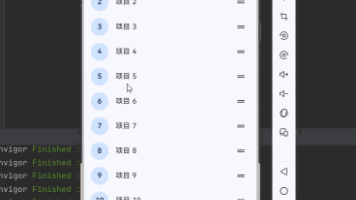
class BasicSlidablePage extends StatelessWidget {
const BasicSlidablePage({super.key});
Widget build(BuildContext context) {
return ListView.builder(
itemCount: 10,
itemBuilder: (context, index) {
return Slidable(
key: ValueKey(index),
endActionPane: ActionPane(
motion: const ScrollMotion(),
children: [
SlidableAction(
onPressed: (context) {
ScaffoldMessenger.of(context).showSnackBar(
SnackBar(content: Text('删除第 ${index + 1} 项')),
);
},
backgroundColor: Colors.red,
foregroundColor: Colors.white,
icon: Icons.delete,
label: '删除',
),
SlidableAction(
onPressed: (context) {
ScaffoldMessenger.of(context).showSnackBar(
SnackBar(content: Text('编辑第 ${index + 1} 项')),
);
},
backgroundColor: Colors.blue,
foregroundColor: Colors.white,
icon: Icons.edit,
label: '编辑',
),
],
),
child: ListTile(
title: Text('列表项 ${index + 1}'),
subtitle: const Text('向左滑动查看操作'),
trailing: const Icon(Icons.chevron_right),
),
);
},
);
}
}
class TodoListPage extends StatefulWidget {
const TodoListPage({super.key});
State<TodoListPage> createState() => _TodoListPageState();
}
class _TodoListPageState extends State<TodoListPage> {
final List<TodoItem> _items = [
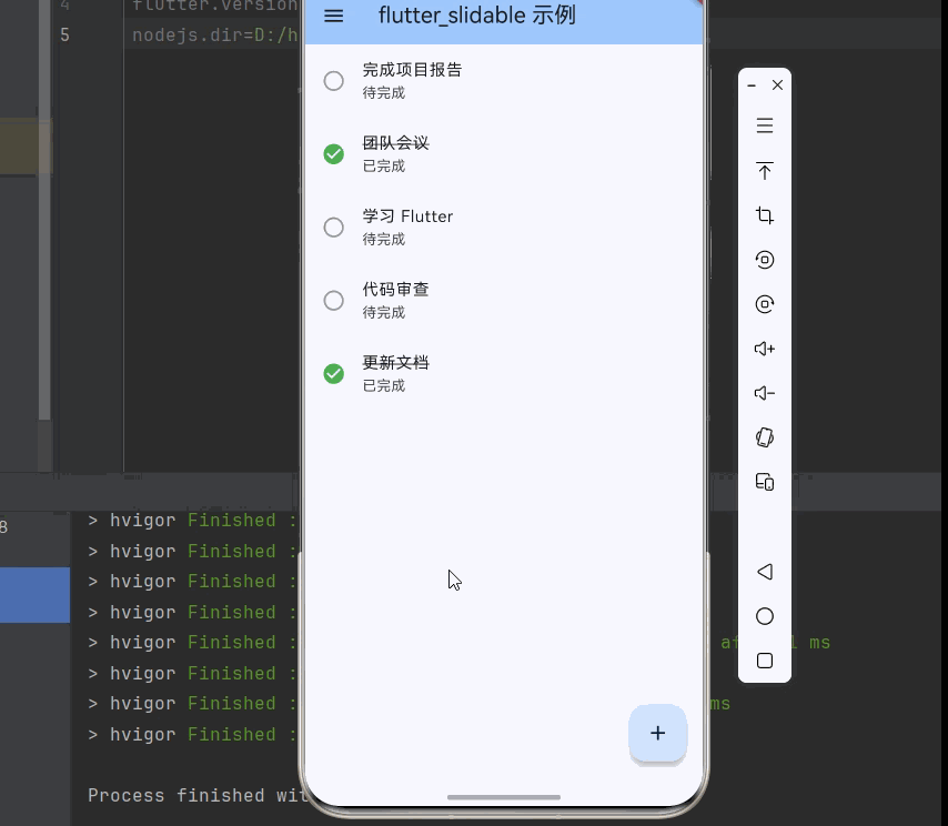
TodoItem(id: '1', title: '完成项目报告', isCompleted: false),
TodoItem(id: '2', title: '团队会议', isCompleted: true),
TodoItem(id: '3', title: '学习 Flutter', isCompleted: false),
TodoItem(id: '4', title: '代码审查', isCompleted: false),
TodoItem(id: '5', title: '更新文档', isCompleted: true),
];
void _deleteItem(int index) {
setState(() {
_items.removeAt(index);
});
ScaffoldMessenger.of(context).showSnackBar(
const SnackBar(content: Text('已删除')),
);
}
void _toggleComplete(int index) {
setState(() {
_items[index].isCompleted = !_items[index].isCompleted;
});
}
Widget build(BuildContext context) {
return Scaffold(
body: _items.isEmpty
? const Center(child: Text('暂无待办事项'))
: ListView.builder(
itemCount: _items.length,
itemBuilder: (context, index) {
final item = _items[index];
return Slidable(
key: ValueKey(item.id),
startActionPane: ActionPane(
motion: const DrawerMotion(),
children: [
SlidableAction(
onPressed: (_) => _toggleComplete(index),
backgroundColor: Colors.green,
foregroundColor: Colors.white,
icon: item.isCompleted ? Icons.undo : Icons.check,
label: item.isCompleted ? '撤销' : '完成',
),
],
),
endActionPane: ActionPane(
motion: const ScrollMotion(),
children: [
SlidableAction(
onPressed: (_) => _deleteItem(index),
backgroundColor: Colors.red,
foregroundColor: Colors.white,
icon: Icons.delete,
label: '删除',
),
],
),
child: ListTile(
leading: Icon(
item.isCompleted ? Icons.check_circle : Icons.circle_outlined,
color: item.isCompleted ? Colors.green : Colors.grey,
),
title: Text(
item.title,
style: TextStyle(
decoration: item.isCompleted ? TextDecoration.lineThrough : null,
),
),
subtitle: Text(item.isCompleted ? '已完成' : '待完成'),
),
);
},
),
floatingActionButton: FloatingActionButton(
onPressed: () {
setState(() {
_items.add(TodoItem(
id: DateTime.now().toString(),
title: '新任务 ${_items.length + 1}',
isCompleted: false,
));
});
},
child: const Icon(Icons.add),
),
);
}
}
class TodoItem {
final String id;
final String title;
bool isCompleted;
TodoItem({required this.id, required this.title, required this.isCompleted});
}
class ShoppingCartPage extends StatefulWidget {
const ShoppingCartPage({super.key});
State<ShoppingCartPage> createState() => _ShoppingCartPageState();
}
class _ShoppingCartPageState extends State<ShoppingCartPage> {
final List<CartItem> _items = [
CartItem(id: '1', name: 'iPhone 15 Pro', price: 8999, quantity: 1),
CartItem(id: '2', name: 'MacBook Pro', price: 14999, quantity: 1),
CartItem(id: '3', name: 'AirPods Pro', price: 1899, quantity: 2),
CartItem(id: '4', name: 'iPad Air', price: 4799, quantity: 1),
];
void _removeItem(int index) {
setState(() {
_items.removeAt(index);
});
ScaffoldMessenger.of(context).showSnackBar(
const SnackBar(content: Text('已从购物车移除')),
);
}
double get _totalPrice {
return _items.fold(0, (sum, item) => sum + item.price * item.quantity);
}
Widget build(BuildContext context) {
return Column(
children: [
Expanded(
child: ListView.builder(
itemCount: _items.length,
itemBuilder: (context, index) {
final item = _items[index];
return Slidable(
key: ValueKey(item.id),
endActionPane: ActionPane(
motion: const BehindMotion(),
dismissible: DismissiblePane(
onDismissed: () => _removeItem(index),
),
children: [
SlidableAction(
onPressed: (_) => _removeItem(index),
backgroundColor: Colors.red,
foregroundColor: Colors.white,
icon: Icons.delete,
label: '删除',
),
],
),
child: Card(
margin: const EdgeInsets.symmetric(horizontal: 8, vertical: 4),
child: ListTile(
leading: Container(
width: 48,
height: 48,
color: Colors.grey[200],
child: const Icon(Icons.shopping_bag),
),
title: Text(item.name),
subtitle: Text('¥${item.price}'),
trailing: Row(
mainAxisSize: MainAxisSize.min,
children: [
IconButton(
icon: const Icon(Icons.remove),
onPressed: () {
if (item.quantity > 1) {
setState(() {
item.quantity--;
});
}
},
),
Text('${item.quantity}'),
IconButton(
icon: const Icon(Icons.add),
onPressed: () {
setState(() {
item.quantity++;
});
},
),
],
),
),
),
);
},
),
),
Container(
padding: const EdgeInsets.all(16),
decoration: BoxDecoration(
color: Colors.grey[100],
boxShadow: [
BoxShadow(
color: Colors.grey.withOpacity(0.3),
blurRadius: 4,
offset: const Offset(0, -2),
),
],
),
child: Row(
mainAxisAlignment: MainAxisAlignment.spaceBetween,
children: [
const Text('合计:', style: TextStyle(fontSize: 18)),
Text(
'¥${_totalPrice.toStringAsFixed(2)}',
style: const TextStyle(fontSize: 20, fontWeight: FontWeight.bold, color: Colors.red),
),
ElevatedButton(
onPressed: _items.isEmpty ? null : () {},
child: const Text('结算'),
),
],
),
),
],
);
}
}
class CartItem {
final String id;
final String name;
final double price;
int quantity;
CartItem({
required this.id,
required this.name,
required this.price,
required this.quantity,
});
}
class MailListPage extends StatelessWidget {
const MailListPage({super.key});
Widget build(BuildContext context) {
final mails = [
Mail(id: '1', sender: '张三', subject: '项目进度报告', time: '10:30', isRead: false),
Mail(id: '2', sender: '李四', subject: '会议邀请', time: '09:15', isRead: true),
Mail(id: '3', sender: '王五', subject: '文档审核', time: '昨天', isRead: false),
Mail(id: '4', sender: '赵六', subject: '周报提交', time: '昨天', isRead: true),
Mail(id: '5', sender: '钱七', subject: '产品需求', time: '周一', isRead: true),
];
return ListView.builder(
itemCount: mails.length,
itemBuilder: (context, index) {
final mail = mails[index];
return Slidable(
key: ValueKey(mail.id),
startActionPane: ActionPane(
motion: const DrawerMotion(),
children: [
SlidableAction(
onPressed: (_) {
ScaffoldMessenger.of(context).showSnackBar(
SnackBar(content: Text('归档: ${mail.subject}')),
);
},
backgroundColor: Colors.blue,
foregroundColor: Colors.white,
icon: Icons.archive,
label: '归档',
),
SlidableAction(
onPressed: (_) {
ScaffoldMessenger.of(context).showSnackBar(
SnackBar(content: Text('标记: ${mail.subject}')),
);
},
backgroundColor: Colors.orange,
foregroundColor: Colors.white,
icon: Icons.bookmark,
label: '标记',
),
],
),
endActionPane: ActionPane(
motion: const ScrollMotion(),
children: [
SlidableAction(
onPressed: (_) {
ScaffoldMessenger.of(context).showSnackBar(
SnackBar(content: Text('移动: ${mail.subject}')),
);
},
backgroundColor: Colors.grey,
foregroundColor: Colors.white,
icon: Icons.drive_file_move,
label: '移动',
),
SlidableAction(
onPressed: (_) {
ScaffoldMessenger.of(context).showSnackBar(
SnackBar(content: Text('删除: ${mail.subject}')),
);
},
backgroundColor: Colors.red,
foregroundColor: Colors.white,
icon: Icons.delete,
label: '删除',
),
],
),
child: ListTile(
leading: CircleAvatar(
backgroundColor: mail.isRead ? Colors.grey : Colors.blue,
child: Text(mail.sender[0], style: const TextStyle(color: Colors.white)),
),
title: Text(
mail.sender,
style: TextStyle(
fontWeight: mail.isRead ? FontWeight.normal : FontWeight.bold,
),
),
subtitle: Text(mail.subject),
trailing: Text(mail.time, style: TextStyle(color: Colors.grey[600])),
),
);
},
);
}
}
class Mail {
final String id;
final String sender;
final String subject;
final String time;
final bool isRead;
Mail({
required this.id,
required this.sender,
required this.subject,
required this.time,
required this.isRead,
});
}
class AnimationDemoPage extends StatelessWidget {
const AnimationDemoPage({super.key});
Widget build(BuildContext context) {
return ListView(
padding: const EdgeInsets.all(16),
children: [
const Text('ScrollMotion', style: TextStyle(fontWeight: FontWeight.bold)),
const SizedBox(height: 8),
_buildSlidableWithMotion(const ScrollMotion()),
const SizedBox(height: 24),
const Text('DrawerMotion', style: TextStyle(fontWeight: FontWeight.bold)),
const SizedBox(height: 8),
_buildSlidableWithMotion(const DrawerMotion()),
const SizedBox(height: 24),
const Text('BehindMotion', style: TextStyle(fontWeight: FontWeight.bold)),
const SizedBox(height: 8),
_buildSlidableWithMotion(const BehindMotion()),
const SizedBox(height: 24),
const Text('StretchMotion', style: TextStyle(fontWeight: FontWeight.bold)),
const SizedBox(height: 8),
_buildSlidableWithMotion(const StretchMotion()),
],
);
}
Widget _buildSlidableWithMotion(Widget motion) {
return Slidable(
key: ValueKey(motion.hashCode),
endActionPane: ActionPane(
motion: motion,
children: [
SlidableAction(
onPressed: (_) {},
backgroundColor: Colors.blue,
foregroundColor: Colors.white,
icon: Icons.share,
label: '分享',
),
SlidableAction(
onPressed: (_) {},
backgroundColor: Colors.green,
foregroundColor: Colors.white,
icon: Icons.edit,
label: '编辑',
),
SlidableAction(
onPressed: (_) {},
backgroundColor: Colors.red,
foregroundColor: Colors.white,
icon: Icons.delete,
label: '删除',
),
],
),
child: Container(
padding: const EdgeInsets.all(16),
decoration: BoxDecoration(
color: Colors.grey[100],
borderRadius: BorderRadius.circular(8),
),
child: const Text('向左滑动查看不同动画效果'),
),
);
}
}
参考资料

开源鸿蒙跨平台开发社区汇聚开发者与厂商,共建“一次开发,多端部署”的开源生态,致力于降低跨端开发门槛,推动万物智联创新。
更多推荐
 16
16 0
0- 0


 已为社区贡献30条内容

所有评论(0)