基础入门 Flutter for OpenHarmony:Opacity 透明度组件详解
在用户界面设计中,透明度是一种强大的视觉工具。通过调整元素的透明度,我们可以创造出层次感、强调重点、实现淡入淡出效果,以及表达元素的状态。Flutter 提供了 Opacity 组件,让开发者能够轻松地控制子组件的透明度。Opacity 组件是 Flutter 中控制透明度的核心组件。Opacity 组件的基本概念:了解了透明度在 UI 设计中的重要性Opacity 的基本用法:学会了使用 opa
欢迎加入开源鸿蒙跨平台社区:https://openharmonycrossplatform.csdn.net
🎯 欢迎来到 Flutter for OpenHarmony 社区!本文将深入讲解 Flutter 中 Opacity 透明度组件的使用方法,带你从基础到精通,掌握这一重要的视觉效果组件。
一、Opacity 组件概述
在用户界面设计中,透明度是一种强大的视觉工具。通过调整元素的透明度,我们可以创造出层次感、强调重点、实现淡入淡出效果,以及表达元素的状态。Flutter 提供了 Opacity 组件,让开发者能够轻松地控制子组件的透明度。
📋 Opacity 组件特点
| 特点 | 说明 |
|---|---|
| 简单易用 | 只需要一个 opacity 参数即可控制透明度 |
| 范围控制 | 透明度值范围 0.0(完全透明)到 1.0(完全不透明) |
| 性能优化 | 支持动画时的性能优化 |
| 嵌套支持 | 透明度效果可以叠加 |
| 无障碍支持 | 支持语义化配置 |
透明度在 UI 设计中的作用
透明度在用户界面设计中有着广泛的应用:
- 层次感:通过不同透明度区分前景和背景元素
- 状态表达:禁用状态通常使用较低的透明度
- 视觉过渡:淡入淡出动画效果
- 信息优先级:重要信息使用较高透明度,次要信息使用较低透明度
- 视觉美感:半透明效果可以创造出精致的视觉体验
- 遮罩效果:在背景上创建半透明遮罩
💡 使用场景:Opacity 广泛应用于禁用状态、加载遮罩、淡入淡出动画、悬浮提示、模态对话框背景等场景。
二、Opacity 基础用法
Opacity 组件的使用非常简单,它只有一个必填参数 opacity。让我们从最基础的用法开始学习。
2.1 最简单的 Opacity
最基础的 Opacity 只需要设置 opacity 参数和 child 子组件:
Opacity(
  opacity: 0.5,
  child: Container(
    width: 100,
    height: 100,
    color: Colors.blue,
  ),
)
代码解析:
opacity: 0.5:设置透明度为 50%,即半透明状态child:要应用透明度效果的子组件- 子组件及其所有内容都会受到透明度影响
2.2 opacity 参数详解
opacity 参数是一个 double 类型的值,范围从 0.0 到 1.0:
| 值 | 效果 | 说明 |
|---|---|---|
| 0.0 | 完全透明 | 元素不可见,但仍占用布局空间 |
| 0.25 | 25% 不透明 | 非常淡,几乎看不清 |
| 0.5 | 50% 不透明 | 半透明,经典效果 |
| 0.75 | 75% 不透明 | 较清晰,轻微透明 |
| 1.0 | 完全不透明 | 元素正常显示,无透明效果 |
2.3 完整示例
下面是一个完整的可运行示例,展示了不同透明度的效果:
class OpacityExample extends StatelessWidget {
const OpacityExample({super.key});
Widget build(BuildContext context) {
return Scaffold(
appBar: AppBar(title: const Text('Opacity 示例')),
body: Center(
child: Column(
mainAxisAlignment: MainAxisAlignment.center,
children: [
_buildOpacityBox(1.0, '1.0 (不透明)'),
const SizedBox(height: 16),
_buildOpacityBox(0.75, '0.75'),
const SizedBox(height: 16),
_buildOpacityBox(0.5, '0.5 (半透明)'),
const SizedBox(height: 16),
_buildOpacityBox(0.25, '0.25'),
const SizedBox(height: 16),
_buildOpacityBox(0.0, '0.0 (完全透明)'),
],
),
),
);
}
Widget _buildOpacityBox(double opacity, String label) {
return Column(
children: [
Opacity(
opacity: opacity,
child: Container(
width: 100,
height: 50,
color: Colors.blue,
child: const Center(
child: Text(
'内容',
style: TextStyle(color: Colors.white),
),
),
),
),
const SizedBox(height: 4),
Text(label, style: const TextStyle(fontSize: 12)),
],
);
}
}
三、Opacity 常用属性详解
虽然 Opacity 组件很简单,但了解它的所有属性可以帮助我们更好地使用它。
3.1 opacity - 透明度值
opacity 是 Opacity 组件的核心属性,控制子组件的透明程度。
Opacity(
  opacity: 0.5,  // 50% 透明度
  child: const Text('半透明文字'),
)
深入理解 opacity:
- opacity 影响子组件及其所有后代组件
- opacity 是一个乘数,会与子组件自身的透明度相乘
- 例如:子组件透明度 0.8,Opacity 设置 0.5,最终透明度为 0.8 × 0.5 = 0.4
3.2 alwaysIncludeSemantics - 语义包含
alwaysIncludeSemantics 控制是否在语义树中包含该节点,即使它是完全透明的。这对无障碍访问很重要。
Opacity(
  opacity: 0.0,
  alwaysIncludeSemantics: true,  // 即使不可见也包含在语义树中
  child: const Text('隐藏但可被屏幕阅读器读取'),
)
使用场景:
- 当元素暂时隐藏但需要保持无障碍访问时
- 当元素正在执行淡出动画但需要保持可访问时
3.3 child - 子组件
child 是要应用透明度效果的子组件。
Opacity(
  opacity: 0.5,
  child: Container(
    padding: const EdgeInsets.all(16),
    color: Colors.blue,
    child: const Text('半透明容器'),
  ),
)
📊 Opacity 属性速查表
| 属性 | 类型 | 默认值 | 说明 |
|---|---|---|---|
| opacity | double | - | 透明度值(必填,范围 0.0-1.0) |
| alwaysIncludeSemantics | bool | false | 是否始终包含在语义树中 |
| child | Widget? | - | 子组件 |
四、Opacity 实际应用场景
Opacity 在实际开发中有着广泛的应用,让我们通过具体示例来学习。
4.1 禁用状态效果
当按钮或控件被禁用时,通常会降低其透明度来表示不可用状态:
class DisabledButtonExample extends StatefulWidget {
const DisabledButtonExample({super.key});
State<DisabledButtonExample> createState() => _DisabledButtonExampleState();
}
class _DisabledButtonExampleState extends State<DisabledButtonExample> {
bool _isEnabled = false;
Widget build(BuildContext context) {
return Scaffold(
appBar: AppBar(title: const Text('禁用状态示例')),
body: Center(
child: Column(
mainAxisAlignment: MainAxisAlignment.center,
children: [
Opacity(
opacity: _isEnabled ? 1.0 : 0.5,
child: ElevatedButton(
onPressed: _isEnabled ? () {} : null,
child: const Text('操作按钮'),
),
),
const SizedBox(height: 24),
Switch(
value: _isEnabled,
onChanged: (value) {
setState(() {
_isEnabled = value;
});
},
),
Text(_isEnabled ? '已启用' : '已禁用'),
],
),
),
);
}
}
4.2 加载遮罩
在页面加载时,通常会显示一个半透明的遮罩层:
class LoadingOverlayExample extends StatefulWidget {
const LoadingOverlayExample({super.key});
State<LoadingOverlayExample> createState() => _LoadingOverlayExampleState();
}
class _LoadingOverlayExampleState extends State<LoadingOverlayExample> {
bool _isLoading = false;
Widget build(BuildContext context) {
return Scaffold(
appBar: AppBar(title: const Text('加载遮罩示例')),
body: Stack(
children: [
Center(
child: Column(
mainAxisAlignment: MainAxisAlignment.center,
children: [
const Text('页面内容'),
const SizedBox(height: 24),
ElevatedButton(
onPressed: () {
setState(() {
_isLoading = true;
});
Future.delayed(const Duration(seconds: 2), () {
setState(() {
_isLoading = false;
});
});
},
child: const Text('开始加载'),
),
],
),
),
if (_isLoading)
Opacity(
opacity: 0.7,
child: Container(
color: Colors.white,
child: const Center(
child: CircularProgressIndicator(),
),
),
),
],
),
);
}
}
4.3 模态对话框背景
模态对话框通常会使用半透明背景来突出对话框:
class ModalDialogExample extends StatelessWidget {
const ModalDialogExample({super.key});
void _showModalDialog(BuildContext context) {
showGeneralDialog(
context: context,
barrierDismissible: true,
barrierLabel: '关闭',
barrierColor: Colors.transparent,
transitionDuration: const Duration(milliseconds: 300),
pageBuilder: (context, animation, secondaryAnimation) {
return Material(
color: Colors.transparent,
child: Stack(
children: [
Opacity(
opacity: 0.5,
child: GestureDetector(
onTap: () => Navigator.of(context).pop(),
child: Container(color: Colors.black),
),
),
Center(
child: Container(
width: 280,
padding: const EdgeInsets.all(24),
decoration: BoxDecoration(
color: Colors.white,
borderRadius: BorderRadius.circular(12),
),
child: Column(
mainAxisSize: MainAxisSize.min,
children: [
const Text(
'提示',
style: TextStyle(
fontSize: 18,
fontWeight: FontWeight.bold,
),
),
const SizedBox(height: 16),
const Text('这是一个模态对话框'),
const SizedBox(height: 24),
ElevatedButton(
onPressed: () => Navigator.of(context).pop(),
child: const Text('确定'),
),
],
),
),
),
],
),
);
},
);
}
Widget build(BuildContext context) {
return Scaffold(
appBar: AppBar(title: const Text('模态对话框示例')),
body: Center(
child: ElevatedButton(
onPressed: () => _showModalDialog(context),
child: const Text('显示对话框'),
),
),
);
}
}
4.4 水印效果
使用低透明度文字创建水印效果:
class WatermarkExample extends StatelessWidget {
const WatermarkExample({super.key});
Widget build(BuildContext context) {
return Scaffold(
appBar: AppBar(title: const Text('水印效果示例')),
body: Stack(
children: [
const Center(
child: Padding(
padding: EdgeInsets.all(32),
child: Text(
'这是页面的主要内容,展示了如何在内容上添加水印效果。'
'水印通常用于标识文档来源或防止未经授权的复制。',
style: TextStyle(fontSize: 16),
),
),
),
Positioned.fill(
child: Opacity(
opacity: 0.1,
child: Center(
child: Transform.rotate(
angle: -0.5,
child: const Text(
'机密文件',
style: TextStyle(
fontSize: 48,
fontWeight: FontWeight.bold,
),
),
),
),
),
),
],
),
);
}
}
4.5 图片叠加效果
使用透明度创建图片叠加效果:
class ImageOverlayExample extends StatelessWidget {
const ImageOverlayExample({super.key});
Widget build(BuildContext context) {
return Scaffold(
appBar: AppBar(title: const Text('图片叠加示例')),
body: Center(
child: Container(
width: 300,
height: 200,
decoration: BoxDecoration(
borderRadius: BorderRadius.circular(12),
image: const DecorationImage(
image: NetworkImage('https://picsum.photos/300/200'),
fit: BoxFit.cover,
),
),
child: Stack(
children: [
Positioned(
bottom: 0,
left: 0,
right: 0,
child: Opacity(
opacity: 0.7,
child: Container(
padding: const EdgeInsets.all(12),
color: Colors.black,
child: const Text(
'图片标题',
style: TextStyle(
color: Colors.white,
fontSize: 16,
fontWeight: FontWeight.bold,
),
),
),
),
),
],
),
),
),
);
}
}
五、Opacity 动画效果
Opacity 经常与动画配合使用,实现淡入淡出效果。Flutter 提供了 AnimatedOpacity 组件来简化动画实现。
5.1 AnimatedOpacity 基础用法
class AnimatedOpacityExample extends StatefulWidget {
const AnimatedOpacityExample({super.key});
State<AnimatedOpacityExample> createState() => _AnimatedOpacityExampleState();
}
class _AnimatedOpacityExampleState extends State<AnimatedOpacityExample> {
double _opacity = 1.0;
Widget build(BuildContext context) {
return Scaffold(
appBar: AppBar(title: const Text('AnimatedOpacity 示例')),
body: Center(
child: Column(
mainAxisAlignment: MainAxisAlignment.center,
children: [
AnimatedOpacity(
opacity: _opacity,
duration: const Duration(milliseconds: 500),
child: Container(
width: 200,
height: 100,
color: Colors.blue,
child: const Center(
child: Text(
'淡入淡出',
style: TextStyle(color: Colors.white),
),
),
),
),
const SizedBox(height: 32),
ElevatedButton(
onPressed: () {
setState(() {
_opacity = _opacity == 1.0 ? 0.0 : 1.0;
});
},
child: Text(_opacity == 1.0 ? '隐藏' : '显示'),
),
],
),
),
);
}
}
5.2 AnimatedOpacity 属性
| 属性 | 类型 | 说明 |
|---|---|---|
| opacity | double | 目标透明度 |
| duration | Duration | 动画持续时间 |
| curve | Curve | 动画曲线 |
| onEnd | VoidCallback? | 动画结束回调 |
| child | Widget? | 子组件 |
5.3 带动画曲线的淡入淡出
AnimatedOpacity(
  opacity: _opacity,
  duration: const Duration(milliseconds: 500),
  curve: Curves.easeInOut,  // 使用缓动曲线
  child: const Text('带曲线的动画'),
)
常用动画曲线:
| 曲线 | 效果 |
|---|---|
| Curves.linear | 线性变化 |
| Curves.easeIn | 开始慢,结束快 |
| Curves.easeOut | 开始快,结束慢 |
| Curves.easeInOut | 两头慢,中间快 |
| Curves.bounceIn | 弹跳进入 |
| Curves.elasticIn | 弹性进入 |
六、Opacity 与其他透明度控制方式的对比
Flutter 中有多种控制透明度的方式,了解它们的区别可以帮助我们选择最合适的方法。
6.1 Opacity vs Color.withOpacity
// 方式一:使用 Opacity 组件
Opacity(
  opacity: 0.5,
  child: Container(color: Colors.blue),
)

// 方式二:使用 Color.withOpacity
Container(color: Colors.blue.withOpacity(0.5))
区别:
| 特性 | Opacity 组件 | Color.withOpacity |
|---|---|---|
| 影响范围 | 整个子组件树 | 仅影响颜色 |
| 性能 | 可能需要合成层 | 直接修改颜色值 |
| 适用场景 | 需要整体透明效果 | 仅颜色需要透明 |
| 子组件影响 | 所有子组件都受影响 | 子组件不受影响 |
6.2 Opacity vs Visibility
// 方式一:使用 Opacity
Opacity(
  opacity: 0.0,
  child: const Text('隐藏'),
)

// 方式二:使用 Visibility
Visibility(
  visible: false,
  child: const Text('隐藏'),
)
区别:
| 特性 | Opacity | Visibility |
|---|---|---|
| 隐藏时占用空间 | 是 | 可配置 |
| 支持动画 | 是 | 否 |
| 性能 | 需要渲染 | 可完全跳过渲染 |
| 无障碍 | 可配置 | 可配置 |
6.3 Opacity vs AnimatedOpacity
// 方式一:Opactiy + AnimationController(复杂)
// 需要手动管理 AnimationController

// 方式二:AnimatedOpacity(简单)
AnimatedOpacity(
  opacity: _opacity,
  duration: const Duration(milliseconds: 300),
  child: const Text('动画'),
)
七、性能考虑
Opacity 组件虽然简单易用,但在某些情况下可能会影响性能。
7.1 性能优化建议
- 避免频繁改变 Opacity:如果需要频繁改变透明度,考虑使用 AnimatedOpacity
- 使用 Color.withOpacity:如果只需要颜色透明,使用
Color.withOpacity更高效 - 避免嵌套多层 Opacity:多层嵌套会增加渲染负担
- 使用 Visibility 替代完全透明:当 opacity 为 0 时,考虑使用 Visibility
7.2 何时使用 Opacity
推荐使用:
- 需要整体透明效果
- 需要动态改变透明度
- 需要淡入淡出动画
不推荐使用:
- 只需要颜色透明(用 Color.withOpacity)
- 完全隐藏元素(用 Visibility 或 Offstage)
- 静态透明效果(用带透明度的颜色)
八、实际应用示例
8.1 完整的卡片组件
class CardWithOpacityExample extends StatelessWidget {
const CardWithOpacityExample({super.key});
Widget build(BuildContext context) {
return Scaffold(
appBar: AppBar(title: const Text('卡片示例')),
body: Padding(
padding: const EdgeInsets.all(16),
child: Column(
children: [
_buildCard('正常状态', 1.0, true),
const SizedBox(height: 16),
_buildCard('禁用状态', 0.5, false),
const SizedBox(height: 16),
_buildCard('只读状态', 0.7, false),
],
),
),
);
}
Widget _buildCard(String title, double opacity, bool enabled) {
return Opacity(
opacity: opacity,
child: Card(
child: Padding(
padding: const EdgeInsets.all(16),
child: Row(
children: [
Container(
width: 48,
height: 48,
decoration: BoxDecoration(
color: enabled ? Colors.blue : Colors.grey,
borderRadius: BorderRadius.circular(24),
),
child: Icon(
enabled ? Icons.check : Icons.close,
color: Colors.white,
),
),
const SizedBox(width: 16),
Expanded(
child: Column(
crossAxisAlignment: CrossAxisAlignment.start,
children: [
Text(
title,
style: const TextStyle(
fontSize: 16,
fontWeight: FontWeight.bold,
),
),
const SizedBox(height: 4),
Text(
enabled ? '点击进行操作' : '当前不可用',
style: TextStyle(
fontSize: 14,
color: Colors.grey[600],
),
),
],
),
),
Icon(
Icons.arrow_forward_ios,
size: 16,
color: enabled ? Colors.blue : Colors.grey,
),
],
),
),
),
);
}
}
8.2 渐变透明效果
class GradientOpacityExample extends StatelessWidget {
const GradientOpacityExample({super.key});
Widget build(BuildContext context) {
return Scaffold(
appBar: AppBar(title: const Text('渐变透明')),
body: Center(
child: Column(
mainAxisAlignment: MainAxisAlignment.center,
children: List.generate(10, (index) {
return Opacity(
opacity: (10 - index) / 10,
child: Container(
width: 200,
height: 30,
margin: const EdgeInsets.only(bottom: 4),
color: Colors.blue,
),
);
}),
),
),
);
}
}
九、最佳实践与注意事项
9.1 设计原则
- 适度使用:不要过度使用透明效果,保持界面清晰
- 保持一致性:同一应用中的透明度使用应保持一致
- 注意可读性:确保文字在透明背景下仍然可读
- 考虑背景:透明效果会受背景颜色影响
9.2 无障碍考虑
- 使用
alwaysIncludeSemantics保持语义信息 - 确保透明元素仍然可以通过辅助技术访问
- 不要仅依赖透明度来传达信息
9.3 常见问题
问题 1:透明度叠加
// 透明度会叠加
Opacity(
  opacity: 0.5,
  child: Opacity(
    opacity: 0.5,
    child: Container(color: Colors.blue),  // 最终透明度约 0.25
  ),
)
问题 2:完全透明仍占用空间
// opacity: 0.0 时元素仍占用布局空间
Opacity(
  opacity: 0.0,
  child: Container(width: 100, height: 100),  // 仍占用 100x100 空间
)

// 如果需要不占用空间,使用 Visibility
Visibility(
  visible: false,
  maintainSize: false,  // 不占用空间
  child: Container(width: 100, height: 100),
)
十、完整代码示例
下面是一个完整的、可以直接运行的 main.dart 文件,展示了 Opacity 组件的各种用法:
import 'package:flutter/material.dart';
void main() {
runApp(const MyApp());
}
class MyApp extends StatelessWidget {
const MyApp({super.key});
Widget build(BuildContext context) {
return MaterialApp(
title: 'Opacity 组件示例',
theme: ThemeData(
primarySwatch: Colors.blue,
useMaterial3: true,
),
home: const OpacityDemoPage(),
);
}
}
class OpacityDemoPage extends StatefulWidget {
const OpacityDemoPage({super.key});
State<OpacityDemoPage> createState() => _OpacityDemoPageState();
}
class _OpacityDemoPageState extends State<OpacityDemoPage> {
double _currentOpacity = 1.0;
bool _isLoading = false;
Widget build(BuildContext context) {
return Scaffold(
appBar: AppBar(
title: const Text('Opacity 透明度组件详解'),
),
body: Stack(
children: [
SingleChildScrollView(
padding: const EdgeInsets.all(16),
child: Column(
crossAxisAlignment: CrossAxisAlignment.start,
children: [
_buildSection('一、基础透明度', [
const Text('不同透明度值的效果:'),
const SizedBox(height: 12),
Row(
mainAxisAlignment: MainAxisAlignment.spaceEvenly,
children: [
_buildOpacityBox(1.0, '1.0'),
_buildOpacityBox(0.75, '0.75'),
_buildOpacityBox(0.5, '0.5'),
_buildOpacityBox(0.25, '0.25'),
_buildOpacityBox(0.0, '0.0'),
],
),
]),
const SizedBox(height: 24),
_buildSection('二、滑块控制透明度', [
const Text('拖动滑块实时调整透明度:'),
const SizedBox(height: 12),
Container(
padding: const EdgeInsets.all(16),
decoration: BoxDecoration(
color: Colors.grey[100],
borderRadius: BorderRadius.circular(8),
),
child: Column(
children: [
Opacity(
opacity: _currentOpacity,
child: Container(
width: double.infinity,
height: 80,
decoration: BoxDecoration(
color: Colors.blue,
borderRadius: BorderRadius.circular(8),
),
child: const Center(
child: Text(
'透明度示例',
style: TextStyle(
color: Colors.white,
fontSize: 18,
fontWeight: FontWeight.bold,
),
),
),
),
),
const SizedBox(height: 16),
Row(
children: [
const Text('透明度: '),
Text(
_currentOpacity.toStringAsFixed(2),
style: const TextStyle(fontWeight: FontWeight.bold),
),
],
),
Slider(
value: _currentOpacity,
onChanged: (value) {
setState(() {
_currentOpacity = value;
});
},
),
],
),
),
]),
const SizedBox(height: 24),
_buildSection('三、禁用状态效果', [
const Text('使用透明度表示禁用状态:'),
const SizedBox(height: 12),
Row(
mainAxisAlignment: MainAxisAlignment.spaceEvenly,
children: [
_buildStateCard('正常', 1.0, true),
_buildStateCard('禁用', 0.5, false),
_buildStateCard('只读', 0.7, false),
],
),
]),
const SizedBox(height: 24),
_buildSection('四、AnimatedOpacity 动画', [
const Text('淡入淡出动画效果:'),
const SizedBox(height: 12),
_AnimatedOpacityDemo(),
]),
const SizedBox(height: 24),
_buildSection('五、加载遮罩', [
const Text('点击按钮显示加载遮罩:'),
const SizedBox(height: 12),
SizedBox(
height: 150,
child: Stack(
children: [
Container(
decoration: BoxDecoration(
color: Colors.grey[100],
borderRadius: BorderRadius.circular(8),
),
child: const Center(
child: Column(
mainAxisSize: MainAxisSize.min,
children: [
Icon(Icons.article, size: 48, color: Colors.blue),
SizedBox(height: 8),
Text('页面内容'),
],
),
),
),
if (_isLoading)
Opacity(
opacity: 0.7,
child: Container(
decoration: BoxDecoration(
color: Colors.white,
borderRadius: BorderRadius.circular(8),
),
child: const Center(
child: CircularProgressIndicator(),
),
),
),
],
),
),
const SizedBox(height: 12),
ElevatedButton(
onPressed: () {
setState(() {
_isLoading = true;
});
Future.delayed(const Duration(seconds: 2), () {
setState(() {
_isLoading = false;
});
});
},
child: const Text('模拟加载'),
),
]),
const SizedBox(height: 24),
_buildSection('六、渐变透明效果', [
const Text('渐变透明排列:'),
const SizedBox(height: 12),
Container(
padding: const EdgeInsets.all(16),
decoration: BoxDecoration(
color: Colors.grey[100],
borderRadius: BorderRadius.circular(8),
),
child: Column(
children: List.generate(8, (index) {
return Opacity(
opacity: (8 - index) / 8,
child: Container(
width: double.infinity,
height: 24,
margin: const EdgeInsets.only(bottom: 4),
decoration: BoxDecoration(
color: Colors.blue,
borderRadius: BorderRadius.circular(4),
),
),
);
}),
),
),
]),
const SizedBox(height: 24),
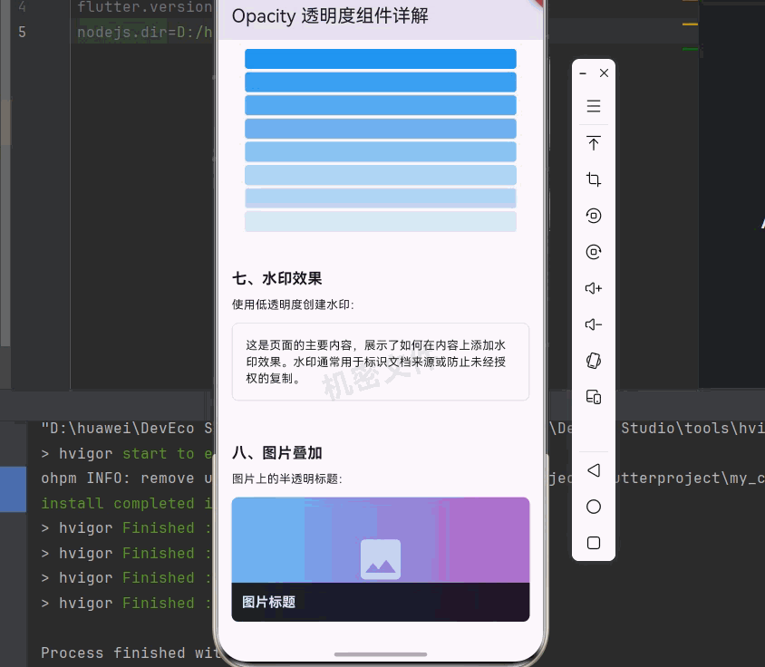
_buildSection('七、水印效果', [
const Text('使用低透明度创建水印:'),
const SizedBox(height: 12),
SizedBox(
height: 120,
child: Stack(
children: [
Container(
padding: const EdgeInsets.all(16),
decoration: BoxDecoration(
color: Colors.grey[50],
borderRadius: BorderRadius.circular(8),
border: Border.all(color: Colors.grey[300]!),
),
child: const Text(
'这是页面的主要内容,展示了如何在内容上添加水印效果。'
'水印通常用于标识文档来源或防止未经授权的复制。',
style: TextStyle(fontSize: 14),
),
),
Positioned.fill(
child: Opacity(
opacity: 0.1,
child: Center(
child: Transform.rotate(
angle: -0.3,
child: const Text(
'机密文件',
style: TextStyle(
fontSize: 36,
fontWeight: FontWeight.bold,
),
),
),
),
),
),
],
),
),
]),
const SizedBox(height: 24),
_buildSection('八、图片叠加', [
const Text('图片上的半透明标题:'),
const SizedBox(height: 12),
ClipRRect(
borderRadius: BorderRadius.circular(8),
child: Container(
width: double.infinity,
height: 150,
decoration: BoxDecoration(
gradient: LinearGradient(
colors: [Colors.blue[300]!, Colors.purple[300]!],
),
),
child: Stack(
children: [
const Center(
child: Icon(Icons.image, size: 64, color: Colors.white54),
),
Positioned(
bottom: 0,
left: 0,
right: 0,
child: Opacity(
opacity: 0.8,
child: Container(
padding: const EdgeInsets.all(12),
color: Colors.black,
child: const Text(
'图片标题',
style: TextStyle(
color: Colors.white,
fontSize: 16,
fontWeight: FontWeight.bold,
),
),
),
),
),
],
),
),
),
]),
const SizedBox(height: 32),
],
),
),
],
),
);
}
Widget _buildSection(String title, List<Widget> children) {
return Column(
crossAxisAlignment: CrossAxisAlignment.start,
children: [
Text(
title,
style: const TextStyle(
fontSize: 18,
fontWeight: FontWeight.bold,
),
),
const SizedBox(height: 8),
...children,
],
);
}
Widget _buildOpacityBox(double opacity, String label) {
return Column(
children: [
Opacity(
opacity: opacity,
child: Container(
width: 50,
height: 50,
decoration: BoxDecoration(
color: Colors.blue,
borderRadius: BorderRadius.circular(8),
),
),
),
const SizedBox(height: 4),
Text(label, style: const TextStyle(fontSize: 12)),
],
);
}
Widget _buildStateCard(String title, double opacity, bool enabled) {
return Opacity(
opacity: opacity,
child: Container(
width: 100,
padding: const EdgeInsets.all(12),
decoration: BoxDecoration(
color: enabled ? Colors.blue[50] : Colors.grey[100],
borderRadius: BorderRadius.circular(8),
border: Border.all(
color: enabled ? Colors.blue : Colors.grey,
),
),
child: Column(
children: [
Icon(
enabled ? Icons.check_circle : Icons.cancel,
color: enabled ? Colors.blue : Colors.grey,
),
const SizedBox(height: 8),
Text(
title,
style: TextStyle(
fontWeight: FontWeight.bold,
color: enabled ? Colors.blue : Colors.grey,
),
),
],
),
),
);
}
}
class _AnimatedOpacityDemo extends StatefulWidget {
State<_AnimatedOpacityDemo> createState() => _AnimatedOpacityDemoState();
}
class _AnimatedOpacityDemoState extends State<_AnimatedOpacityDemo> {
double _opacity = 1.0;
Widget build(BuildContext context) {
return Container(
padding: const EdgeInsets.all(16),
decoration: BoxDecoration(
color: Colors.grey[100],
borderRadius: BorderRadius.circular(8),
),
child: Column(
children: [
AnimatedOpacity(
opacity: _opacity,
duration: const Duration(milliseconds: 500),
curve: Curves.easeInOut,
child: Container(
width: double.infinity,
height: 60,
decoration: BoxDecoration(
color: Colors.purple,
borderRadius: BorderRadius.circular(8),
),
child: const Center(
child: Text(
'淡入淡出动画',
style: TextStyle(color: Colors.white, fontSize: 16),
),
),
),
),
const SizedBox(height: 16),
ElevatedButton(
onPressed: () {
setState(() {
_opacity = _opacity == 1.0 ? 0.0 : 1.0;
});
},
child: Text(_opacity == 1.0 ? '隐藏' : '显示'),
),
],
),
);
}
}
代码说明:
- 基础透明度:展示不同透明度值(1.0 到 0.0)的效果
- 滑块控制透明度:通过 Slider 实时调整透明度值
- 禁用状态效果:使用透明度表示正常、禁用、只读三种状态
- AnimatedOpacity 动画:实现淡入淡出动画效果
- 加载遮罩:模拟加载时显示半透明遮罩层
- 渐变透明效果:创建渐变透明的视觉效果
- 水印效果:使用低透明度创建水印
- 图片叠加:在图片上添加半透明标题
十一、总结
Opacity 组件是 Flutter 中控制透明度的核心组件。通过本文的学习,我们掌握了:
- Opacity 组件的基本概念:了解了透明度在 UI 设计中的重要性
- Opacity 的基本用法:学会了使用 opacity 参数控制透明度
- Opacity 的各种属性:掌握了 opacity、alwaysIncludeSemantics 等属性
- 实际应用场景:学会了在禁用状态、加载遮罩、模态对话框等场景中使用
- AnimatedOpacity 动画:学会了实现淡入淡出动画效果
- 与其他方式的对比:理解了 Opacity 与其他透明度控制方式的区别
- 性能考虑:了解了如何正确使用 Opacity 以避免性能问题
💡 学习建议:透明度是一个简单但强大的视觉效果工具。关键在于"适度"使用,过多的透明效果会让界面显得混乱。建议多观察优秀应用的设计,学习它们如何使用透明度来增强用户体验。
📚 延伸阅读:

开源鸿蒙跨平台开发社区汇聚开发者与厂商,共建“一次开发,多端部署”的开源生态,致力于降低跨端开发门槛,推动万物智联创新。
更多推荐
 9
9 0
0- 0


 已为社区贡献55条内容

所有评论(0)