基础入门 Flutter for OpenHarmony:Spacer 间距组件详
在 Flutter 布局系统中,Spacer 是一个非常实用但经常被忽视的组件。它是一个能够自动填充剩余空间的"弹性间距"组件,专门用于 Flex 容器(如 Row、Column)中。通过 Spacer,我们可以轻松实现各种复杂的布局效果,而不需要手动计算间距大小。Spacer 组件虽然简单,但在 Flutter 布局中扮演着重要的角色。Spacer 组件的基本概念:了解了 Spacer 的作用和
欢迎加入开源鸿蒙跨平台社区:https://openharmonycrossplatform.csdn.net
🎯 欢迎来到 Flutter for OpenHarmony 社区!本文将深入讲解 Flutter 中 Spacer 间距组件的使用方法,带你从基础到精通,掌握这一灵活的布局控制组件。
一、Spacer 组件概述
在 Flutter 布局系统中,Spacer 是一个非常实用但经常被忽视的组件。它是一个能够自动填充剩余空间的"弹性间距"组件,专门用于 Flex 容器(如 Row、Column)中。通过 Spacer,我们可以轻松实现各种复杂的布局效果,而不需要手动计算间距大小。
📋 Spacer 组件特点
| 特点 | 说明 |
|---|---|
| 弹性填充 | 自动填充父容器中的剩余空间 |
| 简洁易用 | 无需手动计算间距,代码更简洁 |
| 灵活分配 | 支持通过 flex 参数控制空间分配比例 |
| 仅限 Flex 容器 | 只能在 Row、Column 等 Flex 容器中使用 |
| 零视觉元素 | 本身不显示任何内容,只占用空间 |
Spacer 与其他间距组件的区别
在 Flutter 中,有多种方式可以创建间距:
| 组件 | 特点 | 适用场景 |
|---|---|---|
| Spacer | 弹性填充剩余空间 | 需要自动分配空间的场景 |
| SizedBox | 固定尺寸间距 | 精确控制间距大小 |
| Container | 可设置多种属性 | 需要背景色、边框等装饰 |
| Padding | 内边距包装 | 为子组件添加内边距 |
| Expanded | 填充空间并包含子组件 | 需要子组件填充空间 |
💡 使用场景:Spacer 最常用于将子组件推到容器的两端,或者按比例分配空间。例如:将按钮推到右侧、在标题和操作按钮之间创建弹性间距等。
二、Spacer 基础用法
学习 Spacer 组件非常简单,它只有一个可选参数 flex。让我们从最基础的用法开始,逐步深入。
2.1 最简单的 Spacer
最基础的 Spacer 不需要任何参数,它会自动填充 Row 或 Column 中的所有剩余空间。
Row(
  children: [
    const Text('左侧'),
    const Spacer(),
    const Text('右侧'),
  ],
)
代码解析:
Spacer()会填充 Row 中"左侧"和"右侧"文本之间的所有空间- 效果是"左侧"文本靠左,"右侧"文本靠右
- 这比使用
SizedBox(width: 具体数值)更灵活,因为不需要知道容器的宽度
2.2 Spacer 的工作原理
理解 Spacer 的工作原理非常重要。Spacer 本质上是 Expanded 包装的一个空白 SizedBox:
// Spacer 的内部实现(简化版)
class Spacer extends StatelessWidget {
const Spacer({super.key, this.flex = 1});
final int flex;
Widget build(BuildContext context) {
return Expanded(
flex: flex,
child: const SizedBox.shrink(),
);
}
}
关键点:
- Spacer 继承自 Expanded,具有弹性布局特性
- 它包含一个零尺寸的 SizedBox,所以不显示任何内容
- 通过 flex 参数可以控制多个 Spacer 之间的空间分配比例
2.3 完整示例
下面是一个完整的可运行示例,展示了 Spacer 组件的基本使用:
class SpacerExample extends StatelessWidget {
const SpacerExample({super.key});
Widget build(BuildContext context) {
return Scaffold(
appBar: AppBar(title: const Text('Spacer 示例')),
body: Padding(
padding: const EdgeInsets.all(16),
child: Column(
children: [
_buildRow('基本用法', [
const Text('左侧'),
const Spacer(),
const Text('右侧'),
]),
const SizedBox(height: 16),
_buildRow('多个 Spacer', [
const Text('A'),
const Spacer(),
const Text('B'),
const Spacer(),
const Text('C'),
]),
const SizedBox(height: 16),
_buildRow('flex 比例', [
const Text('1:2'),
const Spacer(flex: 1),
const Text('中间'),
const Spacer(flex: 2),
const Text('右侧'),
]),
],
),
),
);
}
Widget _buildRow(String title, List<Widget> children) {
return Column(
crossAxisAlignment: CrossAxisAlignment.start,
children: [
Text(
title,
style: const TextStyle(
fontSize: 14,
color: Colors.grey,
),
),
const SizedBox(height: 8),
Container(
padding: const EdgeInsets.all(8),
decoration: BoxDecoration(
border: Border.all(color: Colors.grey.shade300),
borderRadius: BorderRadius.circular(8),
),
child: Row(children: children),
),
],
);
}
}
三、Spacer 的 flex 属性
Spacer 只有一个属性 flex,它控制多个 Spacer 之间的空间分配比例。理解 flex 的工作原理是掌握 Spacer 的关键。
3.1 flex 属性详解
flex 是一个整数值,默认为 1。当有多个 Spacer 时,它们会按照 flex 的比例分配剩余空间。
Row(
  children: [
    const Text('A'),
    const Spacer(flex: 1),  // 占 1/3 的剩余空间
    const Text('B'),
    const Spacer(flex: 2),  // 占 2/3 的剩余空间
    const Text('C'),
  ],
)
计算方式:
- 第一个 Spacer 的 flex = 1
- 第二个 Spacer 的 flex = 2
- 总 flex = 1 + 2 = 3
- 第一个 Spacer 占 1/3 的剩余空间
- 第二个 Spacer 占 2/3 的剩余空间
3.2 多个 Spacer 的空间分配
让我们通过一个更直观的例子来理解多个 Spacer 的空间分配:
Column(
  children: [
    _buildFlexExample('1:1', [1, 1]),
    _buildFlexExample('1:2', [1, 2]),
    _buildFlexExample('1:2:3', [1, 2, 3]),
    _buildFlexExample('2:3:5', [2, 3, 5]),
  ],
)

Widget _buildFlexExample(String label, List<int> flexValues) {
  return Column(
    crossAxisAlignment: CrossAxisAlignment.start,
    children: [
      Text('比例 $label'),
      const SizedBox(height: 4),
      Row(
        children: [
          Container(width: 40, height: 30, color: Colors.blue),
          ...flexValues.map((flex) => [
            Spacer(flex: flex),
            Container(width: 40, height: 30, color: Colors.green),
          ]).expand((e) => e),
        ],
      ),
      const SizedBox(height: 16),
    ],
  );
}
3.3 flex 使用场景
场景一:均匀分布
当所有 Spacer 的 flex 值相同时(或使用默认值),空间会均匀分配:
Row(
  children: [
    const Icon(Icons.home),
    const Spacer(),  // flex: 1
    const Icon(Icons.search),
    const Spacer(),  // flex: 1
    const Icon(Icons.person),
  ],
)
场景二:按比例分配
当需要不同大小的间距时,可以设置不同的 flex 值:
Row(
  children: [
    const Text('标题'),
    const Spacer(flex: 3),  // 较大的间距
    const Text('副标题'),
    const Spacer(flex: 1),  // 较小的间距
    const Icon(Icons.more_vert),
  ],
)
四、Spacer 在 Row 中的应用
Row 是水平布局容器,Spacer 在 Row 中会创建水平方向的弹性间距。这是 Spacer 最常见的使用场景。
4.1 两端对齐
将两个元素分别放在容器的两端:
Container(
  padding: const EdgeInsets.all(16),
  child: Row(
    children: [
      const Text(
        '应用标题',
        style: TextStyle(fontSize: 20, fontWeight: FontWeight.bold),
      ),
      const Spacer(),
      IconButton(
        icon: const Icon(Icons.settings),
        onPressed: () {},
      ),
    ],
  ),
)
应用场景:
- 顶部导航栏
- 列表项标题和操作按钮
- 卡片头部和尾部
- 表单标签和输入框
4.2 三栏布局
创建左、中、右三栏布局:
Row(
  children: [
    const Icon(Icons.arrow_back),
    const Spacer(),
    const Text('页面标题'),
    const Spacer(),
    const Icon(Icons.menu),
  ],
)
4.3 不均匀分布
创建不均匀的空间分布:
Row(
  children: [
    const Text('标签:'),
    const SizedBox(width: 8),
    const Expanded(child: TextField()),
    const Spacer(flex: 2),
    ElevatedButton(
      onPressed: () {},
      child: const Text('提交'),
    ),
  ],
)
4.4 完整工具栏示例
class ToolbarExample extends StatelessWidget {
const ToolbarExample({super.key});
Widget build(BuildContext context) {
return Scaffold(
appBar: AppBar(title: const Text('工具栏示例')),
body: Column(
children: [
Container(
padding: const EdgeInsets.symmetric(horizontal: 16, vertical: 12),
decoration: BoxDecoration(
color: Colors.grey[100],
border: Border(bottom: BorderSide(color: Colors.grey[300]!)),
),
child: Row(
children: [
const Icon(Icons.home, color: Colors.blue),
const Spacer(),
const Icon(Icons.search, color: Colors.grey),
const SizedBox(width: 16),
const Icon(Icons.notifications, color: Colors.grey),
const SizedBox(width: 16),
const Icon(Icons.person, color: Colors.grey),
],
),
),
const Expanded(
child: Center(child: Text('页面内容')),
),
],
),
);
}
}
五、Spacer 在 Column 中的应用
Column 是垂直布局容器,Spacer 在 Column 中会创建垂直方向的弹性间距。
5.1 顶部和底部对齐
将内容推到容器的顶部和底部:
SizedBox(
  height: 300,
  child: Column(
    children: [
      const Text('顶部内容'),
      const Spacer(),
      const Text('底部内容'),
    ],
  ),
)
5.2 垂直居中
使用两个 Spacer 实现垂直居中:
SizedBox(
  height: 300,
  child: Column(
    children: [
      const Spacer(),
      const Text('垂直居中的内容'),
      const Spacer(),
    ],
  ),
)
5.3 三等分布局
创建三等分的垂直布局:
SizedBox(
  height: 300,
  child: Column(
    children: [
      Container(
        height: 60,
        color: Colors.red[100],
        child: const Center(child: Text('第一部分')),
      ),
      const Spacer(),
      Container(
        height: 60,
        color: Colors.green[100],
        child: const Center(child: Text('第二部分')),
      ),
      const Spacer(),
      Container(
        height: 60,
        color: Colors.blue[100],
        child: const Center(child: Text('第三部分')),
      ),
    ],
  ),
)
5.4 完整登录页面示例
class LoginPageExample extends StatelessWidget {
const LoginPageExample({super.key});
Widget build(BuildContext context) {
return Scaffold(
body: Padding(
padding: const EdgeInsets.all(24),
child: Column(
children: [
const Spacer(flex: 2),
const Icon(
Icons.lock_outline,
size: 80,
color: Colors.blue,
),
const SizedBox(height: 24),
const Text(
'欢迎登录',
style: TextStyle(fontSize: 28, fontWeight: FontWeight.bold),
),
const SizedBox(height: 8),
const Text(
'请输入您的账号和密码',
style: TextStyle(color: Colors.grey),
),
const SizedBox(height: 48),
const TextField(
decoration: InputDecoration(
labelText: '账号',
border: OutlineInputBorder(),
prefixIcon: Icon(Icons.person),
),
),
const SizedBox(height: 16),
const TextField(
obscureText: true,
decoration: InputDecoration(
labelText: '密码',
border: OutlineInputBorder(),
prefixIcon: Icon(Icons.lock),
),
),
const SizedBox(height: 24),
SizedBox(
width: double.infinity,
child: ElevatedButton(
onPressed: () {},
child: const Text('登录'),
),
),
const Spacer(flex: 3),
Row(
mainAxisAlignment: MainAxisAlignment.center,
children: [
const Text('还没有账号?'),
TextButton(
onPressed: () {},
child: const Text('立即注册'),
),
],
),
const SizedBox(height: 16),
],
),
),
);
}
}
六、Spacer 与 Expanded 的对比
Spacer 和 Expanded 都可以用于填充空间,但它们有重要的区别。理解这些区别可以帮助你选择正确的组件。
6.1 核心区别
| 特性 | Spacer | Expanded |
|---|---|---|
| 是否包含子组件 | 否(空白) | 是 |
| 用途 | 创建空白间距 | 让子组件填充空间 |
| 视觉效果 | 不可见 | 取决于子组件 |
| 使用场景 | 元素之间的间距 | 子组件需要扩展 |
6.2 代码对比
使用 Spacer:
Row(
  children: [
    const Text('左侧'),
    const Spacer(),  // 空白间距
    const Text('右侧'),
  ],
)
使用 Expanded:
Row(
  children: [
    const Text('左侧'),
    Expanded(
      child: Container(color: Colors.blue),  // 包含子组件
    ),
    const Text('右侧'),
  ],
)
6.3 何时使用哪个?
使用 Spacer 的场景:
- 只需要空白间距,不需要显示任何内容
- 将元素推到容器的两端
- 在元素之间创建弹性间距
使用 Expanded 的场景:
- 需要子组件填充剩余空间
- 需要在填充区域内显示内容
- 需要控制子组件的扩展行为
6.4 等价关系
以下两种写法是等价的:
// 写法一:使用 Spacer
const Spacer()

// 写法二:使用 Expanded
const Expanded(child: SizedBox.shrink())
七、Spacer 与 SizedBox 的对比
SizedBox 是另一种常用的间距组件,它与 Spacer 有本质的区别。
7.1 核心区别
| 特性 | Spacer | SizedBox |
|---|---|---|
| 尺寸类型 | 弹性(自动计算) | 固定 |
| 是否需要知道容器大小 | 否 | 是 |
| 响应式 | 是 | 否 |
| 适用场景 | 不确定空间大小 | 确定间距大小 |
7.2 代码对比
使用 Spacer:
Row(
  children: [
    const Text('左侧'),
    const Spacer(),  // 自动填充剩余空间
    const Text('右侧'),
  ],
)
使用 SizedBox:
Row(
  children: [
    const Text('左侧'),
    const SizedBox(width: 100),  // 固定宽度
    const Text('右侧'),
  ],
)
7.3 何时使用哪个?
使用 Spacer 的场景:
- 不确定容器的大小
- 需要响应式布局
- 需要将元素推到两端
使用 SizedBox 的场景:
- 需要精确控制间距大小
- 间距大小是固定的
- 不需要响应式布局
7.4 混合使用
在实际开发中,Spacer 和 SizedBox 经常混合使用:
Row(
  children: [
    const Text('标签:'),
    const SizedBox(width: 8),  // 固定小间距
    const Expanded(child: TextField()),
    const SizedBox(width: 16),  // 固定间距
    ElevatedButton(
      onPressed: () {},
      child: const Text('提交'),
    ),
  ],
)
八、实际应用场景
8.1 列表项布局
class ListItemExample extends StatelessWidget {
const ListItemExample({super.key});
Widget build(BuildContext context) {
return Scaffold(
appBar: AppBar(title: const Text('列表项布局')),
body: ListView(
children: List.generate(10, (index) {
return Container(
padding: const EdgeInsets.all(16),
decoration: BoxDecoration(
border: Border(
bottom: BorderSide(color: Colors.grey[300]!),
),
),
child: Row(
children: [
CircleAvatar(
child: Text('${index + 1}'),
),
const SizedBox(width: 16),
Expanded(
child: Column(
crossAxisAlignment: CrossAxisAlignment.start,
children: [
Text(
'标题 ${index + 1}',
style: const TextStyle(fontWeight: FontWeight.bold),
),
const SizedBox(height: 4),
Text(
'描述内容',
style: TextStyle(color: Colors.grey[600]),
),
],
),
),
const Spacer(),
const Icon(Icons.arrow_forward_ios, size: 16),
],
),
);
}),
),
);
}
}
8.2 底部操作栏
class BottomBarExample extends StatelessWidget {
const BottomBarExample({super.key});
Widget build(BuildContext context) {
return Scaffold(
appBar: AppBar(title: const Text('底部操作栏')),
body: const Center(child: Text('页面内容')),
bottomNavigationBar: Container(
padding: const EdgeInsets.all(16),
decoration: BoxDecoration(
color: Colors.white,
boxShadow: [
BoxShadow(
color: Colors.grey.withOpacity(0.3),
blurRadius: 4,
offset: const Offset(0, -2),
),
],
),
child: Row(
children: [
const Text(
'¥99.00',
style: TextStyle(
fontSize: 20,
fontWeight: FontWeight.bold,
color: Colors.red,
),
),
const Spacer(),
OutlinedButton(
onPressed: () {},
child: const Text('加入购物车'),
),
const SizedBox(width: 12),
ElevatedButton(
onPressed: () {},
child: const Text('立即购买'),
),
],
),
),
);
}
}
8.3 卡片头部
class CardHeaderExample extends StatelessWidget {
const CardHeaderExample({super.key});
Widget build(BuildContext context) {
return Scaffold(
appBar: AppBar(title: const Text('卡片头部')),
body: Padding(
padding: const EdgeInsets.all(16),
child: Column(
children: [
Card(
child: Padding(
padding: const EdgeInsets.all(16),
child: Column(
crossAxisAlignment: CrossAxisAlignment.start,
children: [
Row(
children: [
const Icon(Icons.article, color: Colors.blue),
const SizedBox(width: 8),
const Text(
'文章标题',
style: TextStyle(
fontSize: 18,
fontWeight: FontWeight.bold,
),
),
const Spacer(),
IconButton(
icon: const Icon(Icons.more_horiz),
onPressed: () {},
),
],
),
const SizedBox(height: 12),
const Text(
'这是文章的描述内容,展示了如何使用 Spacer 来创建卡片头部的布局。',
style: TextStyle(color: Colors.grey),
),
],
),
),
),
],
),
),
);
}
}
九、最佳实践与注意事项
9.1 使用原则
- 优先使用 Spacer:在需要弹性间距时,优先使用 Spacer 而不是手动计算 SizedBox
- 保持简洁:Spacer 的代码更简洁,可读性更好
- 合理使用 flex:只在需要不同比例时设置 flex 值
- 注意容器类型:Spacer 只能在 Flex 容器中使用
9.2 常见错误
错误一:在非 Flex 容器中使用
// 错误:Spacer 不能在 Container 中使用
Container(
  child: const Spacer(),  // 会报错
)

// 正确:在 Row 或 Column 中使用
Row(
  children: [
    const Spacer(),  // 正确
  ],
)
错误二:与 Expanded 冲突
// 错误:Expanded 已经占满空间,Spacer 没有空间可填充
Row(
  children: [
    const Expanded(child: Text('内容')),
    const Spacer(),  // 没有效果
  ],
)
9.3 性能考虑
- Spacer 是轻量级组件,性能开销很小
- 在复杂布局中,合理使用 Spacer 可以减少嵌套层级
- 避免在 Spacer 中添加不必要的子组件
十、完整代码示例
下面是一个完整的、可以直接运行的 main.dart 文件,展示了 Spacer 组件的各种用法:
import 'package:flutter/material.dart';
void main() {
runApp(const MyApp());
}
class MyApp extends StatelessWidget {
const MyApp({super.key});
Widget build(BuildContext context) {
return MaterialApp(
title: 'Spacer 组件示例',
theme: ThemeData(
primarySwatch: Colors.blue,
useMaterial3: true,
),
home: const SpacerDemoPage(),
);
}
}
class SpacerDemoPage extends StatelessWidget {
const SpacerDemoPage({super.key});
Widget build(BuildContext context) {
return Scaffold(
appBar: AppBar(
title: const Text('Spacer 间距组件详解'),
),
body: SingleChildScrollView(
padding: const EdgeInsets.all(16),
child: Column(
crossAxisAlignment: CrossAxisAlignment.start,
children: [
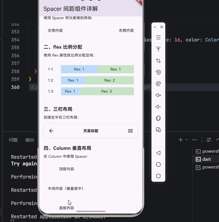
_buildSection('一、基础用法 - 两端对齐', [
const Text('使用 Spacer 将元素推到两端:'),
const SizedBox(height: 12),
Container(
padding: const EdgeInsets.all(16),
decoration: BoxDecoration(
color: Colors.grey[100],
borderRadius: BorderRadius.circular(8),
),
child: const Row(
children: [
Text('左侧内容'),
Spacer(),
Text('右侧内容'),
],
),
),
]),
const SizedBox(height: 24),
_buildSection('二、flex 比例分配', [
const Text('使用 flex 属性按比例分配空间:'),
const SizedBox(height: 12),
Container(
padding: const EdgeInsets.all(16),
decoration: BoxDecoration(
color: Colors.grey[100],
borderRadius: BorderRadius.circular(8),
),
child: Column(
children: [
_buildFlexRow('1:1', 1, 1),
const SizedBox(height: 12),
_buildFlexRow('1:2', 1, 2),
const SizedBox(height: 12),
_buildFlexRow('1:3', 1, 3),
],
),
),
]),
const SizedBox(height: 24),
_buildSection('三、三栏布局', [
const Text('创建左中右三栏布局:'),
const SizedBox(height: 12),
Container(
padding: const EdgeInsets.all(16),
decoration: BoxDecoration(
border: Border.all(color: Colors.grey[300]!),
borderRadius: BorderRadius.circular(8),
),
child: const Row(
children: [
Icon(Icons.arrow_back),
Spacer(),
Text('页面标题', style: TextStyle(fontWeight: FontWeight.bold)),
Spacer(),
Icon(Icons.menu),
],
),
),
]),
const SizedBox(height: 24),
_buildSection('四、Column 垂直布局', [
const Text('在 Column 中使用 Spacer:'),
const SizedBox(height: 12),
SizedBox(
height: 200,
child: Container(
padding: const EdgeInsets.all(16),
decoration: BoxDecoration(
color: Colors.grey[100],
borderRadius: BorderRadius.circular(8),
),
child: const Column(
children: [
Text('顶部内容'),
Spacer(),
Text('中间内容(垂直居中)'),
Spacer(),
Text('底部内容'),
],
),
),
),
]),
const SizedBox(height: 24),
_buildSection('五、工具栏布局', [
const Text('创建工具栏布局:'),
const SizedBox(height: 12),
Container(
padding: const EdgeInsets.symmetric(horizontal: 16, vertical: 12),
decoration: BoxDecoration(
color: Colors.blue[50],
borderRadius: BorderRadius.circular(8),
),
child: Row(
children: [
const Icon(Icons.home, color: Colors.blue),
const Spacer(),
IconButton(
icon: const Icon(Icons.search, color: Colors.grey),
onPressed: () {},
),
IconButton(
icon: const Icon(Icons.notifications, color: Colors.grey),
onPressed: () {},
),
IconButton(
icon: const Icon(Icons.person, color: Colors.grey),
onPressed: () {},
),
],
),
),
]),
const SizedBox(height: 24),
_buildSection('六、列表项布局', [
const Text('在列表项中使用 Spacer:'),
const SizedBox(height: 12),
Card(
child: Column(
children: [
_buildListItem('1', '标题一', '这是描述内容'),
const Divider(height: 1),
_buildListItem('2', '标题二', '这是描述内容'),
const Divider(height: 1),
_buildListItem('3', '标题三', '这是描述内容'),
],
),
),
]),
const SizedBox(height: 24),
_buildSection('七、底部操作栏', [
const Text('创建底部操作栏:'),
const SizedBox(height: 12),
Container(
padding: const EdgeInsets.all(16),
decoration: BoxDecoration(
color: Colors.white,
borderRadius: BorderRadius.circular(8),
boxShadow: [
BoxShadow(
color: Colors.grey.withOpacity(0.2),
blurRadius: 4,
offset: const Offset(0, 2),
),
],
),
child: Row(
children: [
const Column(
crossAxisAlignment: CrossAxisAlignment.start,
mainAxisSize: MainAxisSize.min,
children: [
Text(
'¥99.00',
style: TextStyle(
fontSize: 20,
fontWeight: FontWeight.bold,
color: Colors.red,
),
),
Text(
'已选: 白色 / M',
style: TextStyle(fontSize: 12, color: Colors.grey),
),
],
),
const Spacer(),
OutlinedButton(
onPressed: () {},
child: const Text('加入购物车'),
),
const SizedBox(width: 12),
ElevatedButton(
onPressed: () {},
child: const Text('立即购买'),
),
],
),
),
]),
const SizedBox(height: 24),
_buildSection('八、卡片头部', [
const Text('创建卡片头部布局:'),
const SizedBox(height: 12),
Card(
child: Padding(
padding: const EdgeInsets.all(16),
child: Column(
crossAxisAlignment: CrossAxisAlignment.start,
children: [
Row(
children: [
Container(
width: 40,
height: 40,
decoration: BoxDecoration(
color: Colors.blue[100],
borderRadius: BorderRadius.circular(20),
),
child: const Icon(Icons.article, color: Colors.blue),
),
const SizedBox(width: 12),
const Expanded(
child: Column(
crossAxisAlignment: CrossAxisAlignment.start,
children: [
Text(
'文章标题',
style: TextStyle(
fontSize: 16,
fontWeight: FontWeight.bold,
),
),
SizedBox(height: 2),
Text(
'作者 · 2024-01-15',
style: TextStyle(fontSize: 12, color: Colors.grey),
),
],
),
),
const Spacer(),
IconButton(
icon: const Icon(Icons.more_horiz),
onPressed: () {},
),
],
),
const SizedBox(height: 12),
const Text(
'这是文章的描述内容,展示了如何使用 Spacer 来创建卡片头部的布局。',
style: TextStyle(color: Colors.grey),
),
],
),
),
),
]),
const SizedBox(height: 32),
],
),
),
);
}
Widget _buildSection(String title, List<Widget> children) {
return Column(
crossAxisAlignment: CrossAxisAlignment.start,
children: [
Text(
title,
style: const TextStyle(
fontSize: 18,
fontWeight: FontWeight.bold,
),
),
const SizedBox(height: 8),
...children,
],
);
}
Widget _buildFlexRow(String label, int flex1, int flex2) {
return Row(
children: [
SizedBox(
width: 50,
child: Text(label),
),
Expanded(
flex: flex1,
child: Container(
height: 30,
color: Colors.blue[100],
child: Center(child: Text('flex: $flex1')),
),
),
Expanded(
flex: flex2,
child: Container(
height: 30,
color: Colors.green[100],
child: Center(child: Text('flex: $flex2')),
),
),
],
);
}
Widget _buildListItem(String number, String title, String subtitle) {
return Padding(
padding: const EdgeInsets.all(16),
child: Row(
children: [
CircleAvatar(
backgroundColor: Colors.blue,
child: Text(number, style: const TextStyle(color: Colors.white)),
),
const SizedBox(width: 16),
Expanded(
child: Column(
crossAxisAlignment: CrossAxisAlignment.start,
children: [
Text(
title,
style: const TextStyle(fontWeight: FontWeight.bold),
),
const SizedBox(height: 4),
Text(
subtitle,
style: TextStyle(color: Colors.grey[600], fontSize: 12),
),
],
),
),
const Spacer(),
const Icon(Icons.arrow_forward_ios, size: 16, color: Colors.grey),
],
),
);
}
}
代码说明:
- 基础用法:使用 Spacer 将元素推到两端
- flex 比例分配:通过 flex 属性按比例分配空间(1:1、1:2、1:3)
- 三栏布局:创建左中右三栏布局
- Column 垂直布局:在 Column 中使用 Spacer 实现垂直居中和两端对齐
- 工具栏布局:创建常见的工具栏布局
- 列表项布局:在列表项中使用 Spacer
- 底部操作栏:创建电商商品详情页的底部操作栏
- 卡片头部:创建卡片头部的复杂布局
十一、总结
Spacer 组件虽然简单,但在 Flutter 布局中扮演着重要的角色。通过本文的学习,我们掌握了:
- Spacer 组件的基本概念:了解了 Spacer 的作用和特点
- Spacer 的基本用法:学会了创建基本的弹性间距
- flex 属性的使用:掌握了按比例分配空间的方法
- Row 中的应用:学会了在水平布局中使用 Spacer
- Column 中的应用:学会了在垂直布局中使用 Spacer
- 与其他组件的对比:理解了 Spacer 与 Expanded、SizedBox 的区别
- 实际应用场景:学会了在列表项、底部栏、卡片等场景中使用 Spacer
💡 学习建议:Spacer 是 Flutter 布局系统中的"润滑剂",它可以让你的布局代码更加简洁和灵活。建议在实际项目中多使用 Spacer,体会它带来的便利。
📚 延伸阅读:

开源鸿蒙跨平台开发社区汇聚开发者与厂商,共建“一次开发,多端部署”的开源生态,致力于降低跨端开发门槛,推动万物智联创新。
更多推荐
 1
1 0
0- 0


 已为社区贡献20条内容

所有评论(0)