基础入门 Flutter for OpenHarmony:Button 按钮组件详解
在 Flutter 应用开发中,按钮是用户与应用交互的核心组件之一。Flutter 提供了多种按钮组件,满足不同的设计需求和交互场景。它们都基于构建,严格遵循 Material Design 规范,确保在不同平台上都能提供一致的用户体验。虽然 TextButton 默认样式已经相当简洁,但在实际应用中,我们经常需要根据设计需求进行定制。styleFrom方法提供了丰富的样式配置选项。),child
🎯欢迎加入开源鸿蒙跨平台社区:https://openharmonycrossplatform.csdn.net
一、Button 组件概述
在 Flutter 应用开发中,按钮是用户与应用交互的核心组件之一。Flutter 提供了多种按钮组件,满足不同的设计需求和交互场景。它们都基于 MaterialButton 构建,严格遵循 Material Design 规范,确保在不同平台上都能提供一致的用户体验。
📋 按钮组件类型
| 组件名称 | 主要用途 | 推荐场景 |
|---|---|---|
TextButton |
文本按钮 | 次要操作、导航链接 |
OutlinedButton |
轮廓按钮 | 取消操作、次要确认 |
ElevatedButton |
填充按钮 | 主要操作、提交表单 |
IconButton |
图标按钮 | 工具栏操作、收藏/分享 |
FloatingActionButton |
悬浮按钮 | 快速操作、创建新项 |
了解每种按钮的特点和适用场景,能够帮助我们设计出更加符合用户预期的界面。在实际开发中,合理搭配使用不同类型的按钮,可以构建层次分明、交互清晰的用户界面。
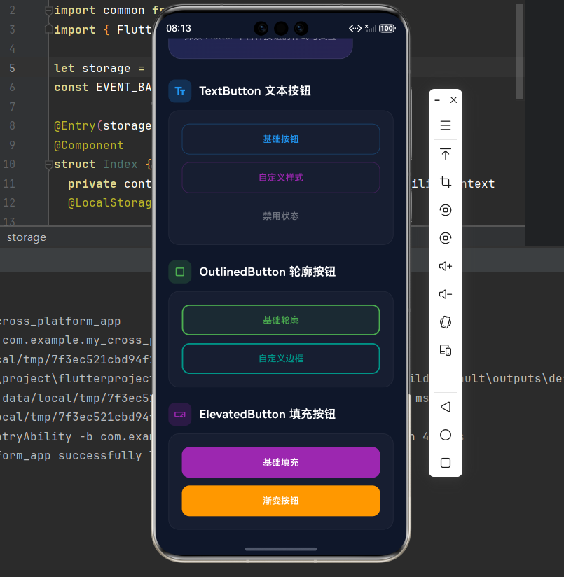
二、TextButton 文本按钮
2.1 基础用法
TextButton 是最简单的按钮类型,只有文本内容,没有背景和边框。它视觉上最轻量,适合用于次要操作,如"取消"、"了解更多"等场景。由于没有强烈的视觉冲击,TextButton 不会过多分散用户的注意力。
TextButton(
  onPressed: () {
    print('按钮被点击');
  },
  child: const Text('点击我'),
)
在 Material Design 3 中,TextButton 的默认样式经过了重新设计,使其在各种背景下都能保持良好的可读性和可点击性。
2.2 自定义样式
虽然 TextButton 默认样式已经相当简洁,但在实际应用中,我们经常需要根据设计需求进行定制。styleFrom 方法提供了丰富的样式配置选项。
TextButton(
  onPressed: () {},
  style: TextButton.styleFrom(
    foregroundColor: Colors.blue,
    padding: const EdgeInsets.symmetric(horizontal: 24, vertical: 12),
    textStyle: const TextStyle(fontSize: 16),
  ),
  child: const Text('自定义样式'),
)
通过调整 foregroundColor,我们可以让按钮文字与应用的主题色保持一致,增强视觉统一性。padding 属性则控制按钮内部的留白,影响按钮的可点击区域大小。
🎨 styleFrom 常用属性
| 属性 | 说明 | 默认值 | 使用建议 |
|---|---|---|---|
foregroundColor |
文本颜色 | 主题色 | 根据主题调整 |
backgroundColor |
背景颜色 | 透明 | 一般不设置 |
padding |
内边距 | EdgeInsets(8, 16) | 增大可提高点击舒适度 |
minimumSize |
最小尺寸 | Size(64, 36) | 确保足够大的点击区域 |
shape |
按钮形状 | RoundedRectangleBorder | 可定制圆角 |
elevation |
阴影高度 | 0 | TextButton 通常为 0 |
三、OutlinedButton 轮廓按钮
3.1 基础用法
OutlinedButton 带有边框,视觉上比 TextButton 更突出,适合用于取消操作或次要确认。
OutlinedButton(
  onPressed: () {},
  child: const Text('轮廓按钮'),
)
3.2 自定义边框和圆角
OutlinedButton(
  onPressed: () {},
  style: OutlinedButton.styleFrom(
    foregroundColor: Colors.green,
    side: const BorderSide(color: Colors.green, width: 2),
    padding: const EdgeInsets.symmetric(horizontal: 24, vertical: 12),
    shape: RoundedRectangleBorder(
      borderRadius: BorderRadius.circular(12),
    ),
  ),
  child: const Text('自定义轮廓按钮'),
)
💡 小贴士:
OutlinedButton的边框颜色会跟随foregroundColor变化,如果想设置不同颜色,需要单独指定side属性。
四、ElevatedButton 填充按钮
4.1 基础用法
ElevatedButton 是视觉上最突出的按钮类型,它有背景色和阴影效果,能够立即吸引用户的注意力。这种设计让它成为主要操作的首选,如"提交"、“保存”、"确认"等需要用户重点关注的场景。
ElevatedButton(
  onPressed: () {},
  child: const Text('填充按钮'),
)
ElevatedButton 的阴影效果提供了重要的视觉层次感,让按钮看起来像是浮在页面之上。这种物理隐喻能够引导用户的直觉,暗示按钮是可以点击的。
4.2 自定义颜色和阴影
通过 elevation 属性,我们可以控制按钮阴影的强度,从而影响按钮的视觉权重。shadowColor 则允许我们自定义阴影的颜色,创造出更丰富的视觉效果。
ElevatedButton(
  onPressed: () {},
  style: ElevatedButton.styleFrom(
    backgroundColor: Colors.purple,
    foregroundColor: Colors.white,
    padding: const EdgeInsets.symmetric(horizontal: 32, vertical: 16),
    elevation: 4,
    shadowColor: Colors.purple.withOpacity(0.5),
    shape: RoundedRectangleBorder(
      borderRadius: BorderRadius.circular(16),
    ),
  ),
  child: const Text('主要操作'),
)
当按钮处于按下状态时,elevation 会自动降低,产生按钮下沉的视觉效果。这种微妙的动画反馈能够显著提升用户的操作体验。
📊 不同 elevation 效果对比
Row(
  children: [
    ElevatedButton(
      onPressed: () {},
      style: ElevatedButton.styleFrom(elevation: 0),
      child: const Text('无阴影'),
    ),
    const SizedBox(width: 12),
    ElevatedButton(
      onPressed: () {},
      style: ElevatedButton.styleFrom(elevation: 4),
      child: const Text('中等阴影'),
    ),
    const SizedBox(width: 12),
    ElevatedButton(
      onPressed: () {},
      style: ElevatedButton.styleFrom(elevation: 8),
      child: const Text('高阴影'),
    ),
  ],
)
五、IconButton 图标按钮
5.1 基础用法
IconButton 只显示图标,没有文字标签。这种简洁的设计让它非常适合用于工具栏、导航栏等空间有限的场景。图标按钮通常承载着明确的语义,用户无需阅读文字就能理解其功能。
IconButton(
  onPressed: () {},
  icon: const Icon(Icons.favorite),
  tooltip: '收藏',
)
tooltip 属性为图标按钮提供了文字说明,当用户长按按钮时会显示。这不仅提升了可访问性,也帮助新用户理解按钮的功能。
5.2 图标按钮样式定制
虽然 IconButton 的视觉元素很简单,但我们仍然可以通过多种方式来定制它的外观,使其更符合应用的整体设计风格。
IconButton(
  onPressed: () {},
  icon: const Icon(Icons.bookmark),
  iconSize: 32,
  color: Colors.blue,
  splashColor: Colors.blue.withOpacity(0.3),
  tooltip: '书签',
)
iconSize 控制图标的大小,通常在 24px 到 48px 之间。splashColor 则定义了按钮被点击时的波纹效果颜色,这个微妙的反馈能够增强用户的操作感知。
🎯 常用图标按钮组合
在实际应用中,图标按钮经常成组出现,用于提供一组相关的操作。合理的间距和排列方式能够提升整体的视觉平衡。
Row(
  children: [
    IconButton(
      onPressed: () {},
      icon: const Icon(Icons.favorite_border),
      tooltip: '收藏',
    ),
    IconButton(
      onPressed: () {},
      icon: const Icon(Icons.share),
      tooltip: '分享',
    ),
    IconButton(
      onPressed: () {},
      icon: const Icon(Icons.more_vert),
      tooltip: '更多',
    ),
  ],
)
六、FloatingActionButton 悬浮按钮
6.1 基础用法
FloatingActionButton 是一个圆形的悬浮按钮,通常位于屏幕右下角,用于快速操作。
FloatingActionButton(
  onPressed: () {},
  child: const Icon(Icons.add),
)
6.2 不同尺寸的 FAB
Row(
  children: [
    FloatingActionButton.small(
      onPressed: () {},
      child: const Icon(Icons.edit),
    ),
    const SizedBox(width: 16),
    FloatingActionButton(
      onPressed: () {},
      child: const Icon(Icons.add),
    ),
    const SizedBox(width: 16),
    FloatingActionButton.extended(
      onPressed: () {},
      icon: const Icon(Icons.create),
      label: const Text('新建'),
    ),
  ],
)
6.3 在 Scaffold 中使用 FAB
Scaffold(
  appBar: AppBar(title: const Text('FAB 示例')),
  body: const Center(child: Text('内容区域')),
  floatingActionButton: FloatingActionButton(
    onPressed: () {
      ScaffoldMessenger.of(context).showSnackBar(
        const SnackBar(content: Text('创建新项目')),
      );
    },
    child: const Icon(Icons.add),
  ),
)
⚠️ 注意:FAB 通常配合
Scaffold.floatingActionButton使用,这样可以获得正确的位置和动画效果。
七、按钮状态
7.1 禁用状态
将 onPressed 设为 null 即可禁用按钮。
Column(
  children: [
    ElevatedButton(
      onPressed: () {},
      child: const Text('启用状态'),
    ),
    const SizedBox(height: 12),
    ElevatedButton(
      onPressed: null, // 禁用
      style: ElevatedButton.styleFrom(
        backgroundColor: Colors.grey,
      ),
      child: const Text('禁用状态'),
    ),
  ],
)
7.2 加载状态按钮
一个完整的加载状态按钮实现:
class LoadingButton extends StatefulWidget {
final bool isLoading;
final VoidCallback onPressed;
final String text;
const LoadingButton({
super.key,
required this.isLoading,
required this.onPressed,
required this.text,
});
State<LoadingButton> createState() => _LoadingButtonState();
}
class _LoadingButtonState extends State<LoadingButton> {
Widget build(BuildContext context) {
return ElevatedButton(
onPressed: widget.isLoading ? null : widget.onPressed,
style: ElevatedButton.styleFrom(
minimumSize: const Size(double.infinity, 48),
),
child: widget.isLoading
? const SizedBox(
width: 20,
height: 20,
child: CircularProgressIndicator(
strokeWidth: 2,
color: Colors.white,
),
)
: Text(widget.text),
);
}
}
7.3 带图标和文本的按钮
ElevatedButton.icon(
  onPressed: () {},
  icon: const Icon(Icons.download),
  label: const Text('下载'),
  style: ElevatedButton.styleFrom(
    padding: const EdgeInsets.symmetric(horizontal: 24, vertical: 12),
  ),
)
八、按钮尺寸控制
8.1 固定宽度
SizedBox(
  width: 200,
  child: ElevatedButton(
    onPressed: () {},
    child: const Text('固定宽度 200'),
  ),
)
8.2 全宽按钮
SizedBox(
  width: double.infinity,
  child: ElevatedButton(
    onPressed: () {},
    child: const Text('全宽按钮'),
  ),
)
8.3 使用 minimumSize 控制最小尺寸
ElevatedButton(
  onPressed: () {},
  style: ElevatedButton.styleFrom(
    minimumSize: const Size(120, 48),
  ),
  child: const Text('最小尺寸 120x48'),
)
九、按钮形状定制
9.1 圆角按钮
ElevatedButton(
  onPressed: () {},
  style: ElevatedButton.styleFrom(
    shape: RoundedRectangleBorder(
      borderRadius: BorderRadius.circular(24),
    ),
  ),
  child: const Text('圆角按钮'),
)
9.2 圆形按钮
ElevatedButton(
  onPressed: () {},
  style: ElevatedButton.styleFrom(
    shape: const CircleBorder(),
    padding: const EdgeInsets.all(24),
  ),
  child: const Icon(Icons.add),
)
9.3 切角按钮
OutlinedButton(
  onPressed: () {},
  style: OutlinedButton.styleFrom(
    shape: const RoundedRectangleBorder(
      borderRadius: BorderRadius.only(
        topLeft: Radius.circular(0),
        topRight: Radius.circular(20),
        bottomLeft: Radius.circular(20),
        bottomRight: Radius.circular(0),
      ),
    ),
  ),
  child: const Text('切角按钮'),
)
十、按钮布局实践
良好的按钮布局不仅关乎美观,更直接影响用户的操作体验。本节将介绍几种常见的按钮布局方式,帮助你打造既美观又实用的界面。
10.1 水平排列按钮
使用 Row 组件可以将按钮水平排列,适合放置相关的操作按钮,如"确定"和"取消"。通过 MainAxisAlignment 可以控制按钮的对齐方式。
Row(
  children: [
    Expanded(
      child: OutlinedButton(
        onPressed: () {},
        child: const Text('取消'),
      ),
    ),
    const SizedBox(width: 12),
    Expanded(
      child: ElevatedButton(
        onPressed: () {},
        child: const Text('确定'),
      ),
    ),
  ],
)
使用 Expanded 可以让两个按钮平分宽度,保持视觉平衡。SizedBox 则用于创建按钮之间的间距,避免按钮过于拥挤。
10.2 垂直排列按钮
Column 组件适合垂直排列多个按钮,常用于表单底部或选项列表中。垂直排列时,要注意按钮的间距,确保每个按钮都有足够的点击区域。
Column(
  children: [
    ElevatedButton(
      onPressed: () {},
      style: ElevatedButton.styleFrom(
        minimumSize: const Size(double.infinity, 48),
      ),
      child: const Text('主要操作'),
    ),
    const SizedBox(height: 12),
    OutlinedButton(
      onPressed: () {},
      style: OutlinedButton.styleFrom(
        minimumSize: const Size(double.infinity, 48),
      ),
      child: const Text('次要操作'),
    ),
    const SizedBox(height: 12),
    TextButton(
      onPressed: () {},
      style: TextButton.styleFrom(
        minimumSize: const Size(double.infinity, 48),
      ),
      child: const Text('帮助'),
    ),
  ],
)
minimumSize 确保所有按钮都有统一的高度和宽度,创造整齐划一的视觉效果。这种布局在移动端的表单底部尤为常见。
10.3 自动换行布局
当按钮数量较多或屏幕空间有限时,可以使用 Wrap 组件实现自动换行布局。这种方式能够适应不同屏幕尺寸,避免按钮溢出屏幕。
Wrap(
  spacing: 8, // 水平间距
  runSpacing: 8, // 垂直间距
  children: [
    ElevatedButton(
      onPressed: () {},
      child: const Text('按钮1'),
    ),
    OutlinedButton(
      onPressed: () {},
      child: const Text('按钮2'),
    ),
    ElevatedButton(
      onPressed: () {},
      child: const Text('按钮3'),
    ),
    TextButton(
      onPressed: () {},
      child: const Text('按钮4'),
    ),
  ],
)
spacing 控制同一行内按钮之间的水平间距,runSpacing 控制不同行之间的垂直间距。Wrap 会自动计算布局,在空间不足时将按钮换到下一行。
10.4 按钮组布局
对于语义相关的按钮组,可以将它们放在一个卡片容器中,并用分隔线或间距来区分不同的组别。这种布局有助于提升界面的层次感。
Container(
  decoration: BoxDecoration(
    color: Colors.white.withOpacity(0.05),
    borderRadius: BorderRadius.circular(12),
    border: Border.all(
      color: Colors.white.withOpacity(0.1),
    ),
  ),
  padding: const EdgeInsets.all(16),
  child: Column(
    children: [
      // 主要操作组
      Row(
        children: [
          Expanded(
            child: ElevatedButton(
              onPressed: () {},
              child: const Text('主要操作'),
            ),
          ),
        ],
      ),
      const SizedBox(height: 12),
      const Divider(),
      const SizedBox(height: 12),
      // 次要操作组
      Row(
        children: [
          Expanded(
            child: OutlinedButton(
              onPressed: () {},
              child: const Text('次要操作'),
            ),
          ),
        ],
      ),
    ],
  ),
)
使用 Divider 可以在视觉上区分不同的操作组,让用户更清楚地理解按钮的层次关系。
10.5 响应式按钮布局
为了适应不同屏幕尺寸,可以使用 LayoutBuilder 获取可用空间,然后根据屏幕宽度调整按钮的布局方式。
LayoutBuilder(
  builder: (context, constraints) {
    if (constraints.maxWidth > 600) {
      // 大屏幕:水平排列
      return Row(
        children: [
          Expanded(
            child: OutlinedButton(
              onPressed: () {},
              child: const Text('取消'),
            ),
          ),
          const SizedBox(width: 12),
          Expanded(
            child: ElevatedButton(
              onPressed: () {},
              child: const Text('确定'),
            ),
          ),
        ],
      );
    } else {
      // 小屏幕:垂直排列
      return Column(
        children: [
          SizedBox(
            width: double.infinity,
            child: OutlinedButton(
              onPressed: () {},
              child: const Text('取消'),
            ),
          ),
          const SizedBox(height: 12),
          SizedBox(
            width: double.infinity,
            child: ElevatedButton(
              onPressed: () {},
              child: const Text('确定'),
            ),
          ),
        ],
      );
    }
  },
)
这种响应式布局确保了在平板和手机上都能提供最佳的用户体验。
📐 布局最佳实践
| 场景 | 推荐布局 | 注意事项 |
|---|---|---|
| 表单底部按钮 | 垂直排列 | 主按钮在上,次要按钮在下 |
| 对话框按钮 | 水平排列 | 使用 Expanded 平分宽度 |
| 标签页操作 | 水平排列 | 按钮数量不宜超过 3 个 |
| 工具栏按钮 | 图标按钮 | 保持间距一致 |
| 移动端列表 | 全宽按钮 | 添加适当的上下间距 |
十一、完整示例代码
下面是一个完整的 Flutter 应用示例,展示所有按钮组件的效果,采用精美的卡片式设计。
import 'package:flutter/material.dart';
void main() {
runApp(const ButtonDemo());
}
class ButtonDemo extends StatelessWidget {
const ButtonDemo({super.key});
Widget build(BuildContext context) {
return MaterialApp(
title: 'Button 组件演示',
debugShowCheckedModeBanner: false,
theme: ThemeData(
colorScheme: ColorScheme.dark(
primary: const Color(0xFF6366F1),
secondary: const Color(0xFF8B5CF6),
surface: const Color(0xFF1E293B),
background: const Color(0xFF0F172A),
brightness: Brightness.dark,
),
useMaterial3: true,
),
home: const ButtonPage(),
);
}
}
class ButtonPage extends StatelessWidget {
const ButtonPage({super.key});
Widget build(BuildContext context) {
return Scaffold(
backgroundColor: const Color(0xFF0F172A),
body: SafeArea(
child: SingleChildScrollView(
padding: const EdgeInsets.all(20),
child: Column(
crossAxisAlignment: CrossAxisAlignment.start,
children: [
// 标题区域
Container(
padding: const EdgeInsets.all(24),
decoration: BoxDecoration(
gradient: LinearGradient(
begin: Alignment.topLeft,
end: Alignment.bottomRight,
colors: [
const Color(0xFF6366F1).withOpacity(0.2),
const Color(0xFF8B5CF6).withOpacity(0.2),
],
),
borderRadius: BorderRadius.circular(20),
border: Border.all(
color: Colors.white.withOpacity(0.1),
),
),
child: Column(
crossAxisAlignment: CrossAxisAlignment.start,
children: [
const Text(
'🔘 Button 组件',
style: TextStyle(
fontSize: 28,
fontWeight: FontWeight.bold,
color: Colors.white,
letterSpacing: 0.5,
),
),
const SizedBox(height: 8),
Text(
'探索 Flutter 中各种按钮的样式与交互',
style: TextStyle(
fontSize: 14,
color: Colors.white.withOpacity(0.7),
height: 1.5,
),
),
],
),
),
const SizedBox(height: 32),
// TextButton
_buildSection(
title: 'TextButton 文本按钮',
icon: Icons.text_fields,
color: Colors.blue,
child: Column(
children: [
_buildButtonContainer([
_buildStyledTextButton('基础按钮', Colors.blue),
const SizedBox(height: 12),
_buildStyledTextButton('自定义样式', Colors.purple),
const SizedBox(height: 12),
_buildStyledTextButton('禁用状态', Colors.grey, enabled: false),
]),
],
),
),
const SizedBox(height: 24),
// OutlinedButton
_buildSection(
title: 'OutlinedButton 轮廓按钮',
icon: Icons.crop_square,
color: Colors.green,
child: Column(
children: [
_buildButtonContainer([
_buildStyledOutlinedButton('基础轮廓', Colors.green),
const SizedBox(height: 12),
_buildStyledOutlinedButton('自定义边框', Colors.teal),
]),
],
),
),
const SizedBox(height: 24),
// ElevatedButton
_buildSection(
title: 'ElevatedButton 填充按钮',
icon: Icons.smart_button,
color: Colors.purple,
child: Column(
children: [
_buildButtonContainer([
_buildStyledElevatedButton('基础填充', Colors.purple),
const SizedBox(height: 12),
_buildStyledElevatedButton('渐变按钮', Colors.orange),
]),
],
),
),
const SizedBox(height: 24),
// IconButton
_buildSection(
title: 'IconButton 图标按钮',
icon: Icons.touch_app,
color: Colors.pink,
child: Container(
padding: const EdgeInsets.all(20),
decoration: BoxDecoration(
color: Colors.white.withOpacity(0.03),
borderRadius: BorderRadius.circular(16),
),
child: Row(
mainAxisAlignment: MainAxisAlignment.spaceEvenly,
children: [
_buildStyledIconButton(Icons.favorite_border, '收藏', Colors.pink),
_buildStyledIconButton(Icons.bookmark_border, '书签', Colors.amber),
_buildStyledIconButton(Icons.share, '分享', Colors.blue),
_buildStyledIconButton(Icons.more_vert, '更多', Colors.grey),
],
),
),
),
const SizedBox(height: 24),
// FloatingActionButton
_buildSection(
title: 'FloatingActionButton 悬浮按钮',
icon: Icons.radio_button_checked,
color: Colors.red,
child: Container(
padding: const EdgeInsets.all(20),
decoration: BoxDecoration(
color: Colors.white.withOpacity(0.03),
borderRadius: BorderRadius.circular(16),
),
child: Row(
mainAxisAlignment: MainAxisAlignment.spaceEvenly,
children: [
_buildStyledFAB(Icons.edit, '编辑', 40),
_buildStyledFAB(Icons.add, '添加', 56),
],
),
),
),
const SizedBox(height: 24),
// 带图标的按钮
_buildSection(
title: '带图标的按钮',
icon: Icons.label,
color: Colors.cyan,
child: _buildButtonContainer([
Row(
children: [
Expanded(
child: ElevatedButton.icon(
onPressed: () {},
icon: const Icon(Icons.download),
label: const Text('下载'),
style: ElevatedButton.styleFrom(
padding: const EdgeInsets.symmetric(horizontal: 20, vertical: 14),
),
),
),
const SizedBox(width: 12),
Expanded(
child: OutlinedButton.icon(
onPressed: () {},
icon: const Icon(Icons.upload),
label: const Text('上传'),
style: OutlinedButton.styleFrom(
padding: const EdgeInsets.symmetric(horizontal: 20, vertical: 14),
),
),
),
],
),
]),
),
const SizedBox(height: 24),
// 不同尺寸
_buildSection(
title: '不同尺寸',
icon: Icons.straighten,
color: Colors.lime,
child: _buildButtonContainer([
Row(
mainAxisAlignment: MainAxisAlignment.spaceBetween,
children: [
_buildSizeButton('小', 12),
_buildSizeButton('中', 16),
_buildSizeButton('大', 20),
],
),
]),
),
const SizedBox(height: 24),
// 按钮状态
_buildSection(
title: '按钮状态',
icon: Icons.toggle_on,
color: Colors.orange,
child: _buildButtonContainer([
Row(
children: [
Expanded(
child: _buildStateButton('启用状态', true, Colors.green),
),
const SizedBox(width: 12),
Expanded(
child: _buildStateButton('禁用状态', false, Colors.grey),
),
],
),
]),
),
const SizedBox(height: 80),
],
),
),
),
);
}
Widget _buildSection({
required String title,
required IconData icon,
required Color color,
required Widget child,
}) {
return Column(
crossAxisAlignment: CrossAxisAlignment.start,
children: [
Row(
children: [
Container(
padding: const EdgeInsets.all(8),
decoration: BoxDecoration(
color: color.withOpacity(0.2),
borderRadius: BorderRadius.circular(10),
),
child: Icon(icon, color: color, size: 20),
),
const SizedBox(width: 12),
Text(
title,
style: const TextStyle(
fontSize: 18,
fontWeight: FontWeight.w600,
color: Colors.white,
),
),
],
),
const SizedBox(height: 12),
child,
],
);
}
Widget _buildButtonContainer(List<Widget> children) {
return Container(
width: double.infinity,
padding: const EdgeInsets.all(20),
decoration: BoxDecoration(
color: Colors.white.withOpacity(0.03),
borderRadius: BorderRadius.circular(16),
border: Border.all(
color: Colors.white.withOpacity(0.05),
),
),
child: Column(
children: children,
),
);
}
Widget _buildStyledTextButton(String text, Color color, {bool enabled = true}) {
return SizedBox(
width: double.infinity,
height: 48,
child: TextButton(
onPressed: enabled ? () {} : null,
style: TextButton.styleFrom(
foregroundColor: enabled ? color : Colors.grey,
shape: RoundedRectangleBorder(
borderRadius: BorderRadius.circular(12),
side: BorderSide(
color: enabled ? color.withOpacity(0.3) : Colors.transparent,
width: 1,
),
),
),
child: Text(text),
),
);
}
Widget _buildStyledOutlinedButton(String text, Color color) {
return SizedBox(
width: double.infinity,
height: 48,
child: OutlinedButton(
onPressed: () {},
style: OutlinedButton.styleFrom(
foregroundColor: color,
side: BorderSide(color: color, width: 2),
shape: RoundedRectangleBorder(
borderRadius: BorderRadius.circular(12),
),
),
child: Text(text),
),
);
}
Widget _buildStyledElevatedButton(String text, Color color) {
return SizedBox(
width: double.infinity,
height: 48,
child: ElevatedButton(
onPressed: () {},
style: ElevatedButton.styleFrom(
backgroundColor: color,
foregroundColor: Colors.white,
elevation: 0,
shape: RoundedRectangleBorder(
borderRadius: BorderRadius.circular(12),
),
),
child: Text(text),
),
);
}
Widget _buildStyledIconButton(IconData icon, String label, Color color) {
return Column(
children: [
Container(
padding: const EdgeInsets.all(12),
decoration: BoxDecoration(
color: color.withOpacity(0.15),
borderRadius: BorderRadius.circular(16),
),
child: Icon(icon, color: color, size: 24),
),
const SizedBox(height: 8),
Text(
label,
style: TextStyle(
fontSize: 12,
color: Colors.white.withOpacity(0.7),
),
),
],
);
}
Widget _buildStyledFAB(IconData icon, String label, double size) {
return Column(
children: [
SizedBox(
width: size,
height: size,
child: FloatingActionButton(
onPressed: () {},
heroTag: null,
backgroundColor: Colors.red,
child: Icon(icon, size: size * 0.5),
),
),
const SizedBox(height: 8),
Text(
label,
style: TextStyle(
fontSize: 12,
color: Colors.white.withOpacity(0.7),
),
),
],
);
}
Widget _buildSizeButton(String label, double fontSize) {
return ElevatedButton(
onPressed: () {},
style: ElevatedButton.styleFrom(
backgroundColor: Colors.lime.withOpacity(0.2),
foregroundColor: Colors.lime,
elevation: 0,
padding: const EdgeInsets.symmetric(horizontal: 16, vertical: 8),
shape: RoundedRectangleBorder(
borderRadius: BorderRadius.circular(8),
),
),
child: Text(
label,
style: TextStyle(fontSize: fontSize),
),
);
}
Widget _buildStateButton(String text, bool enabled, Color color) {
return SizedBox(
width: double.infinity,
height: 48,
child: ElevatedButton(
onPressed: enabled ? () {} : null,
style: ElevatedButton.styleFrom(
backgroundColor: enabled ? color : Colors.grey.withOpacity(0.3),
foregroundColor: enabled ? Colors.white : Colors.grey,
elevation: enabled ? 2 : 0,
shape: RoundedRectangleBorder(
borderRadius: BorderRadius.circular(12),
),
),
child: Text(text),
),
);
}
}
十二、总结
Flutter 的按钮组件系统设计简洁而强大,通过 styleFrom 方法可以轻松定制各种样式。选择合适的按钮类型对于提升用户体验至关重要。
🎯 选择建议
-
主要操作 →
ElevatedButton- 提交表单、确认操作、保存数据
- 视觉最突出,引导用户关注
-
次要操作 →
OutlinedButton- 取消操作、返回上一步、跳过步骤
- 视觉适中,既显眼又不突兀
-
辅助操作 →
TextButton- 了解更多、忘记密码、帮助信息
- 视觉最轻量,不干扰主流程
-
工具操作 →
IconButton- 收藏、分享、编辑、删除
- 语义明确,节省空间
-
快速操作 →
FloatingActionButton- 创建新项、快速添加、主要入口
- 位置固定,随时可用
在设计界面时,要确保按钮的视觉层次清晰,主次分明。过多的主要按钮会削弱每个按钮的重要性,而恰当的按钮组合则能够引导用户完成预期的操作流程。

开源鸿蒙跨平台开发社区汇聚开发者与厂商,共建“一次开发,多端部署”的开源生态,致力于降低跨端开发门槛,推动万物智联创新。
更多推荐
 20
20 0
0- 0


 已为社区贡献55条内容

所有评论(0)