Flutter for OpenHarmony 实战:flutter_slidable 侧滑交互适配方案
Flutter for OpenHarmony实战:flutter_slidable侧滑交互适配方案 本文介绍了在HarmonyOS NEXT中使用Flutter插件flutter_slidable实现符合鸿蒙设计风格的侧滑交互方案。核心内容包括: 交互原理:通过ActionPane定义左右侧滑菜单,推荐使用Drawer Motion动效 基础集成:添加依赖并实现基本侧滑功能 鸿蒙适配:优化视觉风
·
Flutter for OpenHarmony 实战:flutter_slidable 侧滑交互适配方案

前言:打造丝滑的鸿蒙列表体验
在移动端应用中,“侧滑”是一项极其高效的交互逻辑。无论是邮件的归档、微信的删除,还是任务清单的星标,侧滑菜单通过隐藏次要操作,保持了界面的整洁性。
在 HarmonyOS NEXT 的设计语言中,流畅的交互反馈是核心。插件 flutter_slidable 为 Flutter 开发者提供了功能强大且高度可定制的侧滑菜单支持。本文将实战演示如何在该系统中实现符合鸿蒙精致感的侧滑列表。
一、 核心交互原理
1.1 ActionPane 的艺术
flutter_slidable 的核心在于 ActionPane。它定义了侧滑后展开的菜单面板。
- startActionPane:从左往右划,通常用于“正向”或“标记”操作(如归档、完成)。
- endActionPane:从右往左划,通常用于“负向”或“销毁”操作(如删除、取消)。
1.2 动画模式选择 (Motions)
鸿蒙系统非常注重动效的物理真实感。插件提供了多种 Motion:
- Behind Motion:菜单被“压”在列表项下方。
- Drawer Motion:菜单像抽屉一样被“拉”出来(推荐用于鸿蒙,视觉更轻盈)。
- Scroll Motion:菜单跟随手指划动同步平移。
二、 集成指南
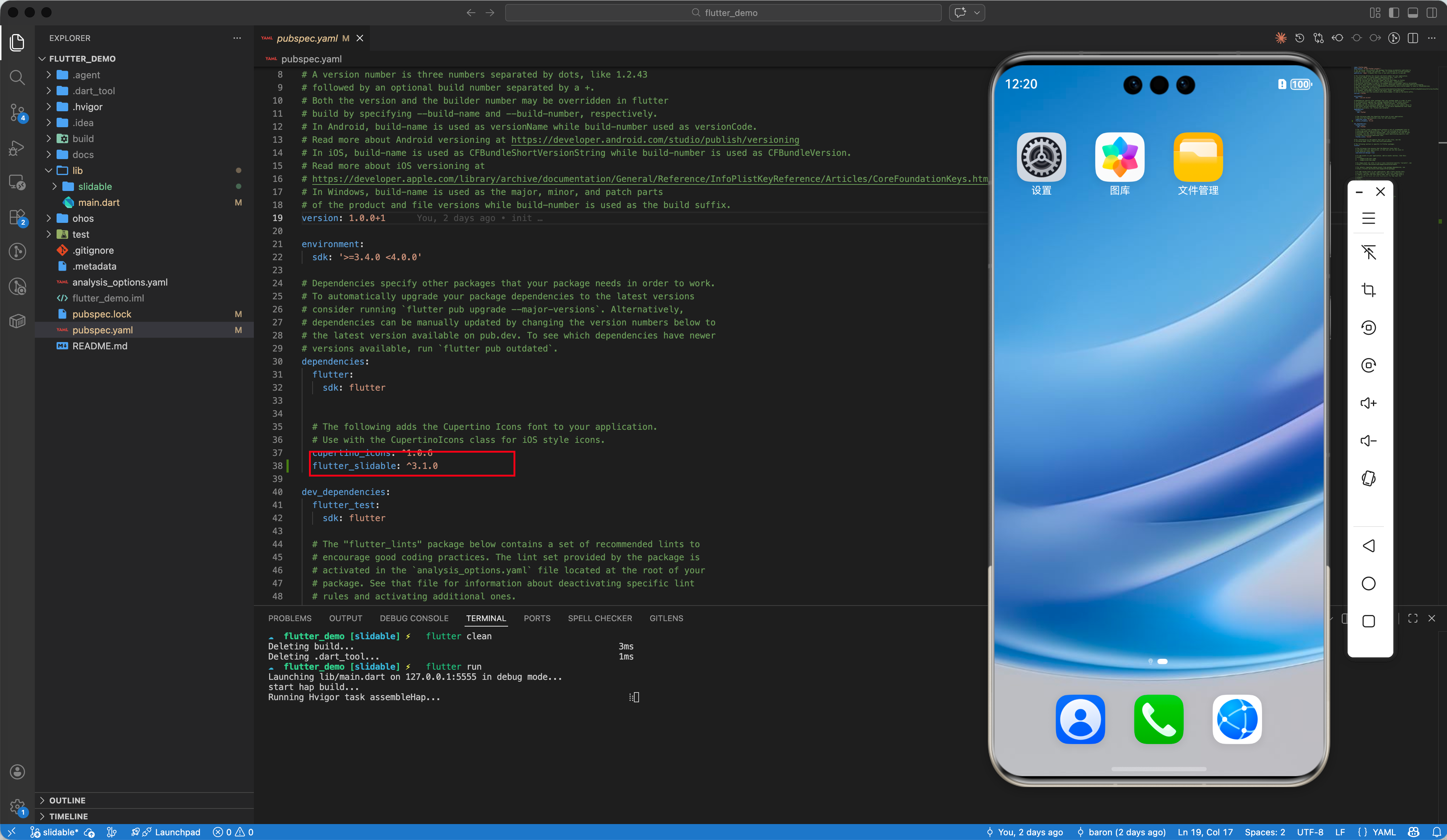
2.1 添加依赖
dependencies:
  flutter_slidable: ^3.1.0
2.2 基础用法速览
Slidable(
  // 右侧滑出的菜单
  endActionPane: ActionPane(
    motion: const ScrollMotion(),
    children: [
      SlidableAction(
        onPressed: (context) => print('删除'),
        backgroundColor: Colors.red,
        icon: Icons.delete,
        label: '删除',
      ),
    ],
  ),
  child: ListTile(title: Text('侧滑我')),
)
三、 鸿蒙适配进阶:构建“实验室”级别的交互
3.1 视觉风格适配
鸿蒙系统偏爱圆角卡片流式布局。在实现侧滑时,我们建议:
- 卡片圆角裁剪:为
Slidable的父容器添加Clip.antiAlias和圆角。 - 特定的品牌色:使用华为星空蓝(
0xFF007DFF)作为主要动作色。
3.2 自动关闭优化
在鸿蒙的高速滑动场景下,用户可能不希望多个列表项同时被展开。通过 SlidableAutoCloseBehavior 包裹整个列表,可以确保当前只有一项被激活,极大地提升了操作的精准度。
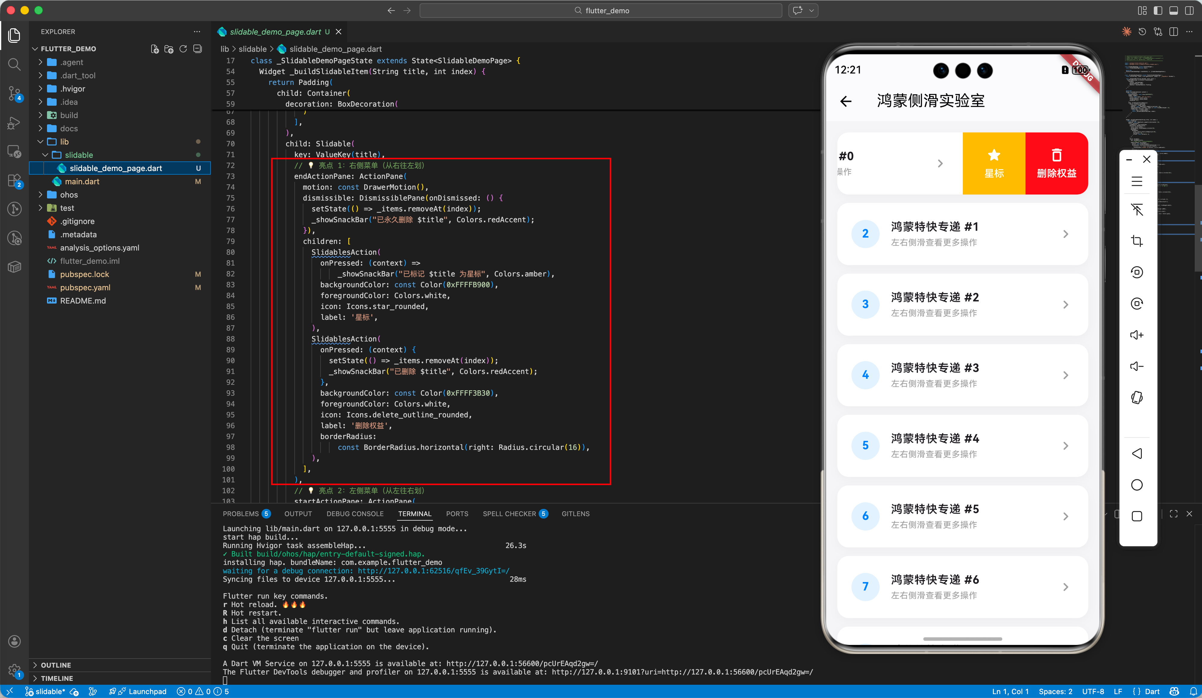
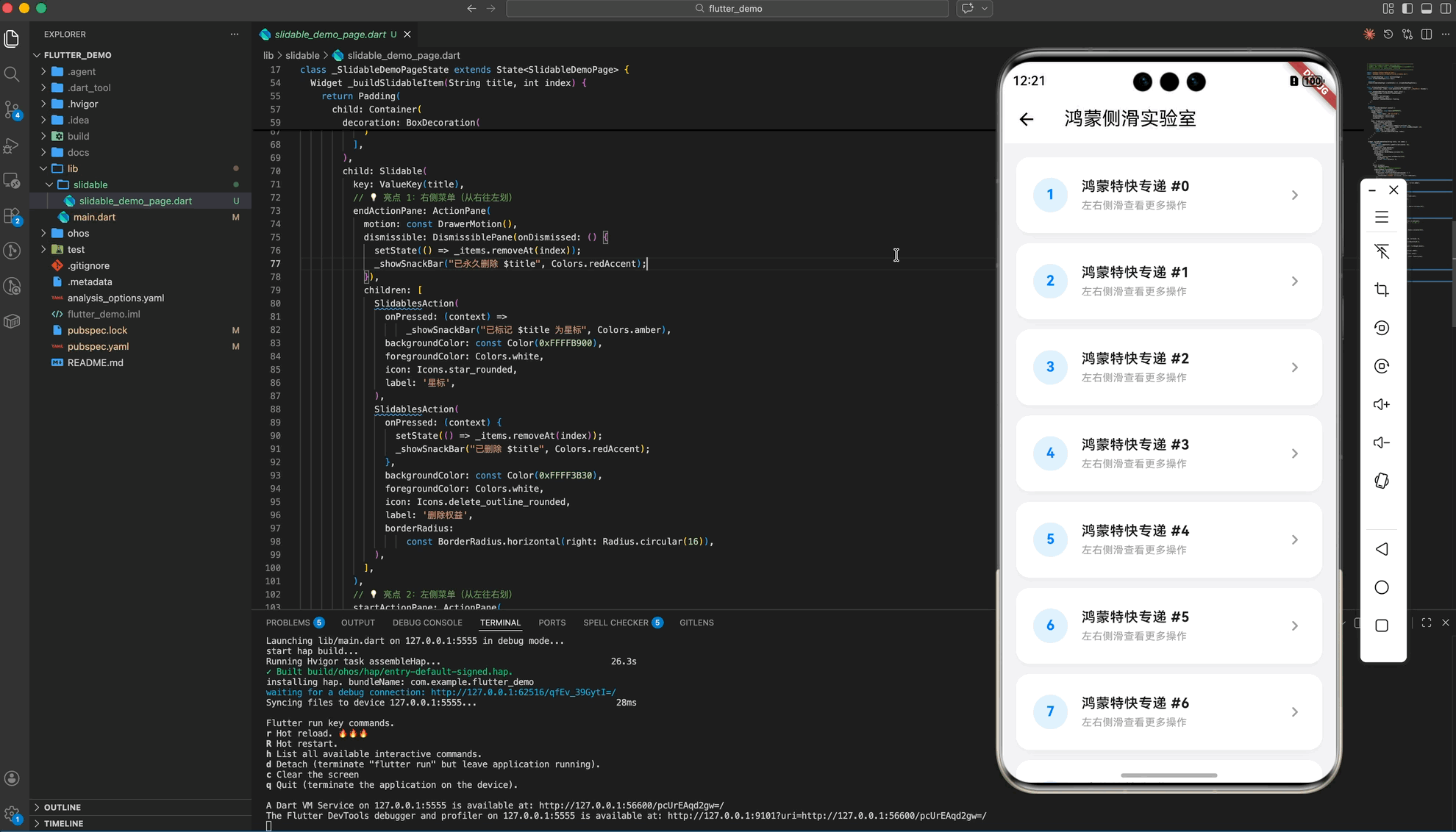
四、 完整示例:鸿蒙特快专递管理
以下是我们在示例项目中实现的完整代码段:
import 'package:flutter/material.dart';
import 'package:flutter_slidable/flutter_slidable.dart';
class SlidableDemoPage extends StatefulWidget {
const SlidableDemoPage({super.key});
State<SlidableDemoPage> createState() => _SlidableDemoPageState();
}
class _SlidableDemoPageState extends State<SlidableDemoPage> {
final List<String> _items = List.generate(20, (index) => "鸿蒙特快专递 #$index");
void _showSnackBar(String message, Color color) {
ScaffoldMessenger.of(context).showSnackBar(
SnackBar(
content: Text(message),
backgroundColor: color,
behavior: SnackBarBehavior.floating,
),
);
}
Widget build(BuildContext context) {
return Scaffold(
backgroundColor: const Color(0xFFF5F5f7),
appBar: AppBar(
title: const Text('鸿蒙侧滑实验室'),
backgroundColor: Colors.white,
foregroundColor: Colors.black,
elevation: 0.5,
),
body: SlidableAutoCloseBehavior(
child: ListView.separated(
itemCount: _items.length,
padding: const EdgeInsets.symmetric(vertical: 16),
separatorBuilder: (context, index) => const SizedBox(height: 12),
itemBuilder: (context, index) {
final item = _items[index];
return _buildSlidableItem(item, index);
},
),
),
);
}
Widget _buildSlidableItem(String title, int index) {
return Padding(
padding: const EdgeInsets.symmetric(horizontal: 16),
child: Container(
clipBehavior: Clip.antiAlias,
decoration: BoxDecoration(
color: Colors.white,
borderRadius: BorderRadius.circular(16),
boxShadow: [
BoxShadow(
color: Colors.black.withOpacity(0.03),
blurRadius: 10,
offset: const Offset(0, 4),
)
],
),
child: Slidable(
key: ValueKey(title),
// 💡 亮点 1:右侧菜单(从右往左划)
endActionPane: ActionPane(
motion: const DrawerMotion(),
dismissible: DismissiblePane(onDismissed: () {
setState(() => _items.removeAt(index));
_showSnackBar("已永久删除 $title", Colors.redAccent);
}),
children: [
SlidablesAction(
onPressed: (context) =>
_showSnackBar("已标记 $title 为星标", Colors.amber),
backgroundColor: const Color(0xFFFFB900),
foregroundColor: Colors.white,
icon: Icons.star_rounded,
label: '星标',
),
SlidablesAction(
onPressed: (context) {
setState(() => _items.removeAt(index));
_showSnackBar("已删除 $title", Colors.redAccent);
},
backgroundColor: const Color(0xFFFF3B30),
foregroundColor: Colors.white,
icon: Icons.delete_outline_rounded,
label: '删除权益',
borderRadius:
const BorderRadius.horizontal(right: Radius.circular(16)),
),
],
),
// 💡 亮点 2:左侧菜单(从左往右划)
startActionPane: ActionPane(
motion: const ScrollMotion(),
children: [
SlidablesAction(
onPressed: (context) =>
_showSnackBar("正在归档 $title", Colors.blueAccent),
backgroundColor: const Color(0xFF007DFF), // 华为星空蓝
foregroundColor: Colors.white,
icon: Icons.archive_outlined,
label: '归档',
borderRadius:
const BorderRadius.horizontal(left: Radius.circular(16)),
),
],
),
child: ListTile(
contentPadding:
const EdgeInsets.symmetric(horizontal: 20, vertical: 8),
leading: CircleAvatar(
backgroundColor: const Color(0xFF007DFF).withOpacity(0.1),
child: Text("${index + 1}",
style: const TextStyle(
color: Color(0xFF007DFF), fontWeight: FontWeight.bold)),
),
title: Text(title,
style: const TextStyle(fontWeight: FontWeight.w600)),
subtitle: const Text("左右侧滑查看更多操作",
style: TextStyle(fontSize: 12, color: Colors.grey)),
trailing:
const Icon(Icons.chevron_right_rounded, color: Colors.grey),
),
),
),
);
}
}
// 💡 适配技巧:自定义 Action 组件以符合鸿蒙视觉规范
class SlidablesAction extends StatelessWidget {
final SlidableActionCallback onPressed;
final Color backgroundColor;
final Color foregroundColor;
final IconData icon;
final String label;
final BorderRadius? borderRadius;
const SlidablesAction({
super.key,
required this.onPressed,
required this.backgroundColor,
required this.foregroundColor,
required this.icon,
required this.label,
this.borderRadius,
});
Widget build(BuildContext context) {
return SlidableAction(
onPressed: onPressed,
backgroundColor: backgroundColor,
foregroundColor: foregroundColor,
icon: icon,
label: label,
borderRadius: borderRadius ?? BorderRadius.zero,
padding: EdgeInsets.zero,
);
}
}
五、 适配小贴士
- 触感反馈:建议在
onPressed回调中加入微弱的震动反馈,以增强鸿蒙真机的交互确认感。 - 多级菜单:
flutter_slidable支持在一个ActionPane中放入多个SlidableAction,但建议不要超过 3 个,以免在小屏幕上造成视觉拥挤。 - 渲染性能:由于侧滑涉及复杂的 Offset 计算,列表项较多时,请确保
itemBuilder的内容足够精简。
🌐 欢迎加入开源鸿蒙跨平台社区:开源鸿蒙跨平台开发者社区

开源鸿蒙跨平台开发社区汇聚开发者与厂商,共建“一次开发,多端部署”的开源生态,致力于降低跨端开发门槛,推动万物智联创新。
更多推荐


 25
25 0
0- 0


 已为社区贡献33条内容

所有评论(0)