Flutter for OpenHarmony数独游戏App实战:主题选择器
本文介绍了数独游戏主题选择器的实现方法。首先定义了ThemeConfig类存储主题配置,包括名称、标签和颜色参数。预设了经典、海洋、森林等5种配色主题,每个主题包含主色、强调色和背景色。通过ThemeController管理主题状态,实现主题切换、应用和持久化存储功能。UI部分使用Wrap布局展示主题选项,用户点击即可切换应用主题。整个方案使用GetX状态管理,确保主题变更时UI及时更新,并提供主
主题选择器让用户可以个性化应用的外观。除了深色模式,用户还可以选择不同的颜色主题,让应用更符合自己的喜好。今天我们来详细实现数独游戏的主题选择器功能。
在设计主题选择器之前,我们需要考虑几个关键问题。首先是主题定义,需要预设多个颜色主题供用户选择。其次是主题应用,确保主题颜色在整个应用中一致使用。最后是预览效果,让用户在选择前能看到主题效果。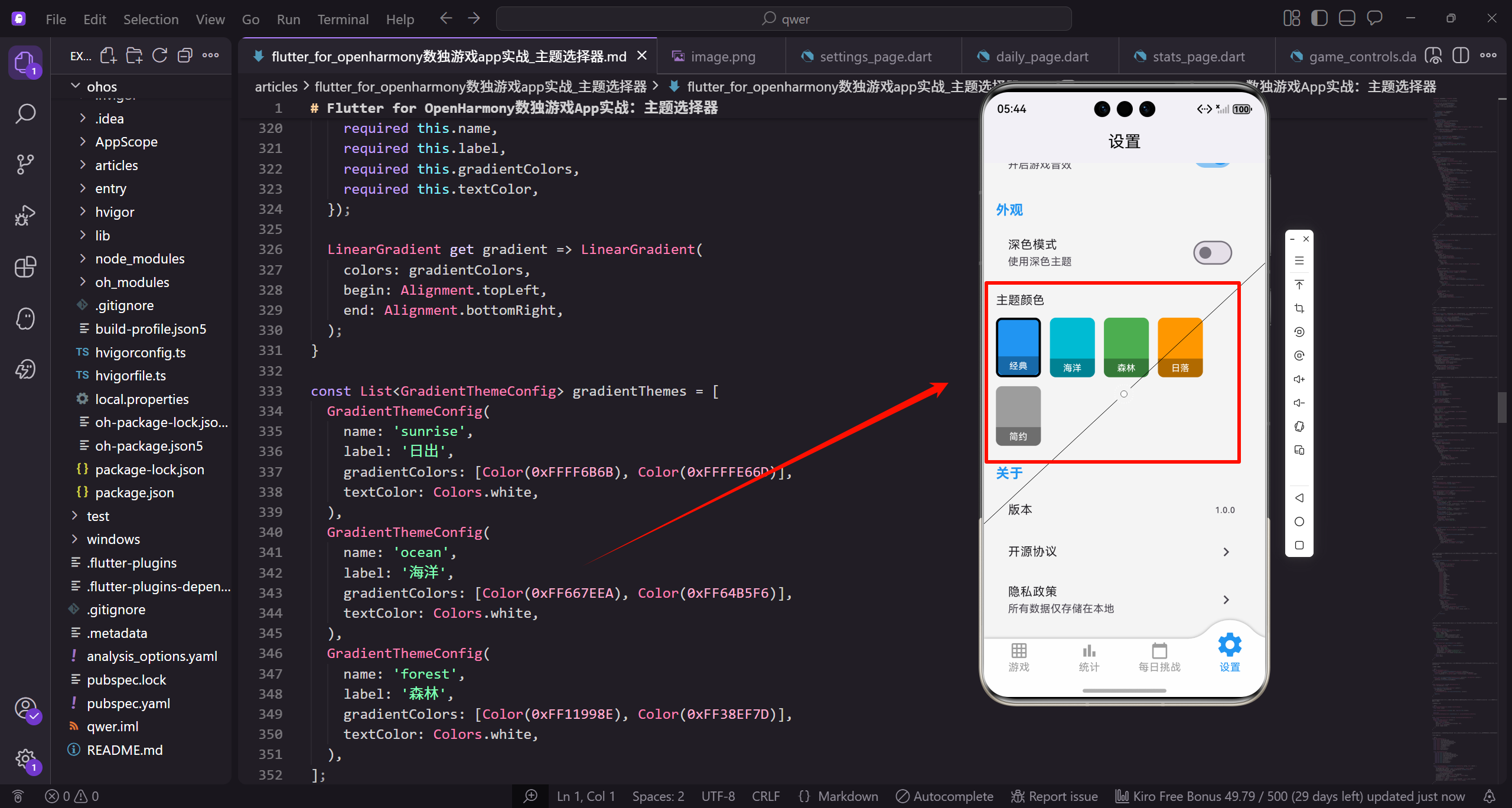
主题配置类
定义主题配置的数据结构:
class ThemeConfig {
  final String name;
  final String label;
  final Color primaryColor;
  final Color accentColor;
  final Color backgroundColor;

  const ThemeConfig({
    required this.name,
    required this.label,
    required this.primaryColor,
    required this.accentColor,
    required this.backgroundColor,
  });
}
ThemeConfig定义主题的配置,包括名称、标签、主色、强调色和背景色。name用于程序内部标识,label用于UI显示。使用const构造函数确保配置不可变,提高性能。
预设主题列表
定义可用的主题列表:
const List<ThemeConfig> availableThemes = [
  ThemeConfig(
    name: 'classic',
    label: '经典',
    primaryColor: Color(0xFF2196F3),
    accentColor: Color(0xFF1976D2),
    backgroundColor: Color(0xFFF5F5F5),
  ),
经典主题使用蓝色作为主色,这是最常见的应用配色。primaryColor是主要的品牌色,accentColor用于强调元素,backgroundColor是页面背景色。
继续添加海洋主题:
  ThemeConfig(
    name: 'ocean',
    label: '海洋',
    primaryColor: Color(0xFF00BCD4),
    accentColor: Color(0xFF0097A7),
    backgroundColor: Color(0xFFE0F7FA),
  ),
海洋主题使用青色系,给人清新凉爽的感觉。背景色使用非常浅的青色,与主色形成呼应但不会喧宾夺主。
添加森林和日落主题:
  ThemeConfig(
    name: 'forest',
    label: '森林',
    primaryColor: Color(0xFF4CAF50),
    accentColor: Color(0xFF388E3C),
    backgroundColor: Color(0xFFE8F5E9),
  ),
  ThemeConfig(
    name: 'sunset',
    label: '日落',
    primaryColor: Color(0xFFFF9800),
    accentColor: Color(0xFFF57C00),
    backgroundColor: Color(0xFFFFF3E0),
  ),
森林主题使用绿色系,日落主题使用橙色系。每个主题的三个颜色都保持同一色系,确保视觉和谐。背景色都是主色的极浅版本。
添加简约主题:
  ThemeConfig(
    name: 'minimal',
    label: '简约',
    primaryColor: Color(0xFF607D8B),
    accentColor: Color(0xFF455A64),
    backgroundColor: Color(0xFFECEFF1),
  ),
];
简约主题使用蓝灰色,适合喜欢低调风格的用户。灰色系不会分散注意力,让用户更专注于游戏本身。
主题控制器
创建主题控制器管理主题状态:
class ThemeController extends GetxController {
  String _currentTheme = 'classic';
  ThemeMode _themeMode = ThemeMode.system;

  String get currentTheme => _currentTheme;
ThemeController继承GetxController,使用GetX进行状态管理。_currentTheme存储当前选中的主题名称,默认为经典主题。_themeMode控制深色/浅色模式。
获取当前主题配置:
  ThemeConfig get currentThemeConfig {
    return availableThemes.firstWhere(
      (t) => t.name == _currentTheme,
      orElse: () => availableThemes.first,
    );
  }
currentThemeConfig getter根据主题名称查找对应的配置对象。firstWhere在列表中查找匹配项,orElse提供找不到时的默认值,确保总是返回有效的配置。
设置主题方法
实现设置主题的方法:
  void setTheme(String themeName) {
    _currentTheme = themeName;
    _applyTheme();
    _saveTheme(themeName);
    update();
  }
setTheme方法更新当前主题。首先更新状态变量,然后应用主题到UI,接着保存到本地存储,最后调用update()通知监听者重建UI。
应用主题
实现应用主题的方法:
  void _applyTheme() {
    ThemeConfig config = currentThemeConfig;
    Get.changeTheme(ThemeData(
      primaryColor: config.primaryColor,
      colorScheme: ColorScheme.fromSeed(
        seedColor: config.primaryColor,
      ),
      scaffoldBackgroundColor: config.backgroundColor,
    ));
  }
_applyTheme使用Get.changeTheme动态更新主题。ColorScheme.fromSeed根据主色自动生成完整的配色方案。scaffoldBackgroundColor设置页面背景色。
保存和加载主题
实现主题的持久化:
  Future<void> _saveTheme(String themeName) async {
    final prefs = await SharedPreferences.getInstance();
    await prefs.setString('theme', themeName);
  }

  Future<void> loadTheme() async {
    final prefs = await SharedPreferences.getInstance();
    _currentTheme = prefs.getString('theme') ?? 'classic';
    _applyTheme();
  }
}
_saveTheme将主题名称保存到SharedPreferences。loadTheme在应用启动时加载保存的主题,如果没有保存过则使用默认的经典主题。
主题选择器UI
构建主题选择器的外层结构:
Widget _buildThemeSelector() {
  return GetBuilder<ThemeController>(
    builder: (controller) => Column(
      crossAxisAlignment: CrossAxisAlignment.start,
      children: [
        Text('主题颜色', style: TextStyle(fontSize: 16.sp)),
        SizedBox(height: 12.h),
GetBuilder监听ThemeController的状态变化。Column垂直排列标题和主题选项。crossAxisAlignment设为start让内容左对齐。
使用Wrap布局主题选项:
        Wrap(
          spacing: 12.w,
          runSpacing: 12.h,
          children: availableThemes.map((theme) {
            bool isSelected = controller.currentTheme == theme.name;
Wrap组件自动换行,适应不同屏幕宽度。spacing设置水平间距,runSpacing设置行间距。遍历所有主题,判断每个主题是否被选中。
主题选项按钮
构建单个主题选项的点击区域:
            return GestureDetector(
              onTap: () => controller.setTheme(theme.name),
              child: Container(
                width: 60.w,
                height: 80.h,
                decoration: BoxDecoration(
                  color: theme.primaryColor,
                  borderRadius: BorderRadius.circular(8.r),
GestureDetector处理点击事件,点击时调用setTheme切换主题。Container定义按钮尺寸,背景色使用主题的主色,让用户直观看到颜色效果。
添加选中状态的边框和阴影:
                  border: isSelected
                      ? Border.all(color: Colors.black, width: 3)
                      : null,
                  boxShadow: isSelected ? [
                    BoxShadow(
                      color: theme.primaryColor.withOpacity(0.4),
                      blurRadius: 8,
                      spreadRadius: 2,
                    ),
                  ] : null,
                ),
选中的主题有黑色粗边框和彩色阴影,让用户清楚知道当前选择。阴影颜色使用主题色的半透明版本,与按钮颜色呼应。
选中标记和标签
添加选中勾选图标:
                child: Column(
                  mainAxisAlignment: MainAxisAlignment.end,
                  children: [
                    if (isSelected)
                      Icon(Icons.check, color: Colors.white, size: 24.sp),
                    const Spacer(),
选中的主题显示白色勾选图标,提供额外的视觉确认。Spacer将图标推到顶部,标签推到底部。
添加主题名称标签:
                    Container(
                      width: double.infinity,
                      padding: EdgeInsets.symmetric(vertical: 4.h),
                      decoration: BoxDecoration(
                        color: Colors.black.withOpacity(0.3),
                        borderRadius: BorderRadius.only(
                          bottomLeft: Radius.circular(8.r),
                          bottomRight: Radius.circular(8.r),
                        ),
                      ),
                      child: Text(
                        theme.label,
                        textAlign: TextAlign.center,
                        style: TextStyle(fontSize: 12.sp, color: Colors.white),
                      ),
                    ),
                  ],
                ),
              ),
            );
          }).toList(),
        ),
      ],
    ),
  );
}
底部半透明黑色背景上显示主题名称,白色文字确保在任何颜色上都清晰可读。圆角只设置底部,与按钮整体圆角保持一致。
主题预览组件
构建主题预览的外层容器:
Widget _buildThemePreview(ThemeConfig theme) {
  return Container(
    width: 200.w,
    padding: EdgeInsets.all(12.w),
    decoration: BoxDecoration(
      color: theme.backgroundColor,
      borderRadius: BorderRadius.circular(12.r),
      border: Border.all(color: theme.primaryColor.withOpacity(0.3)),
    ),
预览容器使用主题的背景色,边框使用主色的浅色版本。这让用户能看到主题应用后的整体效果。
预览中的标题栏:
    child: Column(
      children: [
        Container(
          height: 30.h,
          decoration: BoxDecoration(
            color: theme.primaryColor,
            borderRadius: BorderRadius.circular(4.r),
          ),
          child: Center(
            child: Text(
              theme.label,
              style: TextStyle(
                color: Colors.white,
                fontWeight: FontWeight.bold
              ),
            ),
          ),
        ),
        SizedBox(height: 8.h),
模拟AppBar的效果,使用主题主色作为背景。白色文字显示主题名称,让用户知道这是哪个主题的预览。
预览中的数字单元格:
        Row(
          mainAxisAlignment: MainAxisAlignment.spaceEvenly,
          children: List.generate(3, (index) => Container(
            width: 40.w,
            height: 40.h,
            decoration: BoxDecoration(
              color: Colors.white,
              borderRadius: BorderRadius.circular(4.r),
              border: Border.all(
                color: theme.primaryColor.withOpacity(0.5)
              ),
            ),
            child: Center(
              child: Text(
                '${index + 1}',
                style: TextStyle(
                  color: theme.primaryColor,
                  fontWeight: FontWeight.bold
                ),
              ),
            ),
          )),
        ),
模拟数独棋盘的单元格,数字使用主题主色显示。这让用户预览主题在实际游戏中的效果。
预览中的按钮:
        SizedBox(height: 8.h),
        Container(
          height: 24.h,
          decoration: BoxDecoration(
            color: theme.accentColor,
            borderRadius: BorderRadius.circular(12.r),
          ),
        ),
      ],
    ),
  );
}
模拟按钮使用强调色,展示主题的完整配色方案。圆角按钮是常见的UI元素,让预览更加真实。
在棋盘中使用主题
获取主题颜色用于单元格:
Color _getCellColor(
  bool isSelected,
  bool isHighlighted,
  bool isSameNumber,
  bool hasConflict
) {
  ThemeConfig theme = Get.find<ThemeController>().currentThemeConfig;

  if (hasConflict) return Colors.red.shade100;
  if (isSelected) return theme.primaryColor.withOpacity(0.3);
  if (isSameNumber) return theme.primaryColor.withOpacity(0.15);
  if (isHighlighted) return theme.backgroundColor;
  return Colors.white;
}
通过Get.find获取ThemeController实例,然后使用当前主题的颜色。选中和高亮使用主题主色的不同透明度,确保整个应用的颜色一致性。
获取文字颜色:
Color _getTextColor(bool isFixed, bool hasConflict) {
  ThemeConfig theme = Get.find<ThemeController>().currentThemeConfig;

  if (hasConflict) return Colors.red;
  if (isFixed) return Colors.black;
  return theme.primaryColor;
}
冲突数字始终显示红色,固定数字显示黑色,玩家填入的数字使用主题主色。这种设计让不同类型的数字有明显区分。
主题切换动画
使用GetX的主题切换:
void setTheme(String themeName) {
  _currentTheme = themeName;
  Get.changeTheme(_buildThemeData(currentThemeConfig));
  _saveTheme(themeName);
  update();
}
Get.changeTheme会自动应用平滑的过渡动画,不需要额外的动画代码。主题切换时整个应用的颜色会渐变过渡。
构建完整的ThemeData:
ThemeData _buildThemeData(ThemeConfig config) {
  return ThemeData(
    primaryColor: config.primaryColor,
    colorScheme: ColorScheme.fromSeed(seedColor: config.primaryColor),
    scaffoldBackgroundColor: config.backgroundColor,
    appBarTheme: AppBarTheme(
      backgroundColor: config.primaryColor,
      foregroundColor: Colors.white,
    ),
ThemeData包含应用的完整主题配置。appBarTheme设置导航栏的颜色,foregroundColor设置导航栏上的文字和图标颜色。
继续配置按钮主题:
    elevatedButtonTheme: ElevatedButtonThemeData(
      style: ElevatedButton.styleFrom(
        backgroundColor: config.primaryColor,
        foregroundColor: Colors.white,
      ),
    ),
  );
}
elevatedButtonTheme确保所有ElevatedButton都使用主题主色。这样整个应用的按钮颜色都会随主题变化。
棋盘主题样式
定义棋盘专用的主题样式类:
class BoardThemeStyle {
  final Color cellBackground;
  final Color selectedCellBackground;
  final Color highlightedCellBackground;
  final Color conflictCellBackground;
  final Color fixedNumberColor;
  final Color userNumberColor;
  final Color gridLineColor;
  final Color boxLineColor;

  const BoardThemeStyle({
    required this.cellBackground,
    required this.selectedCellBackground,
    required this.highlightedCellBackground,
    required this.conflictCellBackground,
    required this.fixedNumberColor,
    required this.userNumberColor,
    required this.gridLineColor,
    required this.boxLineColor,
  });
BoardThemeStyle专门定义棋盘的各种颜色。将棋盘样式独立出来,方便针对棋盘进行精细的颜色调整。
根据主题配置生成棋盘样式:
  static BoardThemeStyle fromThemeConfig(ThemeConfig config, bool isDark) {
    return BoardThemeStyle(
      cellBackground: isDark ? const Color(0xFF2D2D2D) : Colors.white,
      selectedCellBackground: config.primaryColor.withOpacity(0.3),
      highlightedCellBackground: isDark
          ? const Color(0xFF3D3D3D)
          : config.backgroundColor,
      conflictCellBackground: Colors.red.shade100,
      fixedNumberColor: isDark ? Colors.white : Colors.black,
      userNumberColor: config.primaryColor,
      gridLineColor: isDark ? Colors.grey.shade700 : Colors.grey.shade300,
      boxLineColor: isDark ? Colors.white : Colors.black,
    );
  }
}
fromThemeConfig工厂方法根据主题配置和深色模式状态生成对应的棋盘样式。深色模式下使用深色背景和浅色线条,浅色模式则相反。
总结
主题选择器的关键设计要点包括:主题配置类定义颜色方案;预设多个主题供用户选择;主题控制器管理状态和切换;主题预览让用户提前看到效果;在整个应用中统一使用主题颜色;支持主题的持久化存储。
主题选择器是个性化功能的重要组成部分,它让用户可以根据自己的喜好定制应用外观,提升使用体验。
欢迎加入开源鸿蒙跨平台社区:https://openharmonycrossplatform.csdn.net

开源鸿蒙跨平台开发社区汇聚开发者与厂商,共建“一次开发,多端部署”的开源生态,致力于降低跨端开发门槛,推动万物智联创新。
更多推荐
 3
3 0
0- 0


 已为社区贡献26条内容

所有评论(0)