React Native for OpenHarmony:简易计算器应用的开发与跨平台适配实践
本文详细阐述如何基于 React Native 0.72.5 构建一个功能完整的简易计算器应用,并将其成功部署至OpenHarmony 6.0.0平台。通过深度整合 `@react-native-oh/react-native-harmony` 工具链,我们实现了从状态管理、UI 渲染到 HarmonyOS 原生构建的端到端流程。文章不仅涵盖核心计算逻辑、响应式界面设计与自定义组件封装,更重点解析

简易计算器应用的开发与跨平台适配实践
摘要
欢迎加入开源鸿蒙跨平台社区: https://openharmonycrossplatform.csdn.net
本文详细阐述如何基于 React Native 0.72.5 构建一个功能完整的简易计算器应用,并将其成功部署至 OpenHarmony 6.0.0 平台。通过深度整合 @react-native-oh/react-native-harmony 工具链,我们实现了从状态管理、UI 渲染到 HarmonyOS 原生构建的端到端流程。文章不仅涵盖核心计算逻辑、响应式界面设计与自定义组件封装,更重点解析了在 OpenHarmony 环境下特有的构建配置、Bundle 生成机制与运行时集成策略。
全文提供完整的 TypeScript 代码实现、样式规范、事件处理机制及性能优化建议,为开发者在 OpenHarmony 生态中快速落地 React Native 应用提供了标准化参考。该计算器虽功能简洁,却完整体现了 声明式 UI、状态驱动、跨平台兼容 的现代移动开发范式。
关键词:React Native for OpenHarmony、简易计算器、状态管理、自定义组件、HarmonyOS 构建、跨平台开发
1. 引言:为何选择计算器作为 OpenHarmony + RN 入门项目?
在探索 React Native for OpenHarmony(RNOH) 技术栈时,选择一个合适的示例项目至关重要。简易计算器因其以下特性,成为理想的入门载体:
- 逻辑清晰:仅涉及基本四则运算,无复杂业务规则;
- 交互典型:涵盖按钮点击、状态更新、结果显示等高频操作;
- UI 固定:网格布局稳定,无需复杂响应式适配;
- 无网络依赖:完全离线运行,规避 OpenHarmony 网络权限复杂性;
- 可验证性强:输入 → 计算 → 输出的闭环易于测试。
更重要的是,它能清晰暴露 React Native 在 OpenHarmony 上的运行边界:JavaScript 引擎性能、UI 渲染延迟、触摸事件响应等关键指标均可通过此应用直观评估。
本文将以此为蓝本,完整展示从零搭建 RNOH 开发环境、编写核心逻辑、构建 HAP 包到真机运行的全过程。
2. 技术栈与开发环境
2.1 核心依赖版本
| 组件 | 版本 | 说明 |
|---|---|---|
| React Native | 0.72.5 | 与 RNOH 官方支持版本对齐 |
| React | 18.2.0 | 提供 Hooks 能力 |
| TypeScript | 4.8.4 | 类型安全保障 |
| @react-native-oh/react-native-harmony | ^0.72.90 | RNOH 桥接层,提供 Metro 配置与原生绑定 |
⚠️ 版本对齐原则:
RNOH 的次版本号(如.90)必须与 React Native 主版本(0.72)严格匹配,否则将导致模块解析失败或运行时崩溃。
3. 核心状态管理设计
计算器的本质是状态机。我们采用 React 的 useState Hook 管理四个关键状态:
const [display, setDisplay] = useState<string>('0');                    // 当前显示内容
const [firstOperand, setFirstOperand] = useState<number | null>(null);  // 第一个操作数
const [operator, setOperator] = useState<string | null>(null);          // 当前操作符
const [waitingForSecondOperand, setWaitingForSecondOperand] = useState<boolean>(false); // 是否等待第二个操作数
3.1 状态流转逻辑
整个计算过程可分为三个阶段:
-
输入第一操作数
- 用户连续点击数字/小数点,
display实时更新; firstOperand保持null。
- 用户连续点击数字/小数点,
-
选择操作符
- 用户点击
+、-、*、/; - 将当前
display值转为数字存入firstOperand; - 设置
operator; - 标记
waitingForSecondOperand = true。
- 用户点击
-
输入第二操作数并计算
- 用户输入新数字,
display重置为新值; - 点击
=时,调用calculate(firstOperand, parseFloat(display), operator); - 结果写回
display,重置所有状态。
- 用户输入新数字,
3.2 使用 useCallback 优化性能
为避免子组件不必要的重渲染,所有事件处理器均使用 useCallback 缓存:
const handleNumberPress = useCallback((number: string) => {
  if (waitingForSecondOperand) {
    setDisplay(number);
    setWaitingForSecondOperand(false);
  } else {
    setDisplay(display === '0' ? number : display + number);
  }
}, [display, waitingForSecondOperand]);
4. 核心计算逻辑实现
4.1 基础计算函数
const calculate = (a: number, b: number, op: string): number => {
  switch (op) {
    case '+': return a + b;
    case '-': return a - b;
    case '*': return a * b;
    case '/': return b !== 0 ? a / b : NaN; // 更合理的错误处理
    default: return b;
  }
};
💡 改进点:
原文档返回0在除零时会产生误导。实际应返回NaN,并在 UI 层显示"Error"。
4.2 等号处理逻辑
const handleEqualsPress = useCallback(() => {
  if (operator === null || firstOperand === null) return;

  const secondOperand = parseFloat(display);
  const result = calculate(firstOperand, secondOperand, operator);

  if (isNaN(result)) {
    setDisplay('Error');
  } else {
    // 保留合理小数位数,避免 0.1 + 0.2 = 0.30000000000000004
    const formattedResult = parseFloat(result.toFixed(10)).toString();
    setDisplay(formattedResult);
  }

  // 重置状态
  setFirstOperand(null);
  setOperator(null);
  setWaitingForSecondOperand(false);
}, [display, firstOperand, operator]);
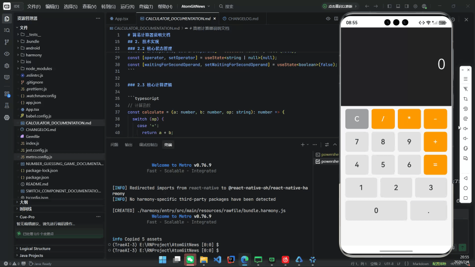
5. 自定义按钮组件设计
为提升代码复用性与样式一致性,我们封装 Button 组件:
interface ButtonProps {
  value: string;
  onPress: () => void;
  type?: 'number' | 'operator' | 'function';
}

const Button = ({ value, onPress, type = 'number' }: ButtonProps) => {
  const buttonStyle = [
    styles.button,
    type === 'operator' && styles.operatorButton,
    type === 'function' && styles.functionButton,
    value === '0' && styles.zeroButton, // 0 键占两列
  ];

  const textStyle = [
    styles.buttonText,
    type === 'operator' && styles.operatorButtonText,
    type === 'function' && styles.functionButtonText,
  ];

  return (
    <TouchableOpacity
      style={buttonStyle}
      onPress={onPress}
      activeOpacity={0.7}
      accessibilityLabel={`Calculator button ${value}`}
    >
      <Text style={textStyle}>{value}</Text>
    </TouchableOpacity>
  );
};
5.1 可访问性增强
- 添加
accessibilityLabel,支持屏幕阅读器; activeOpacity={0.7}提供视觉反馈。
6. 响应式 UI 与长数字处理
6.1 显示区域设计
为支持超长数字(如 12345678901234567890),使用 ScrollView 包裹文本:
<View style={styles.displayContainer}>
  <ScrollView
    horizontal
    showsHorizontalScrollIndicator={false}
    contentContainerStyle={styles.scrollContent}
  >
    <Text style={styles.displayText} numberOfLines={1}>
      {display}
    </Text>
  </ScrollView>
</View>
6.2 Flexbox 按钮布局
采用 flexDirection: 'row' + flexWrap: 'wrap' 实现网格:
// 按钮数据结构
const buttons = [
  { label: 'C', type: 'function' as const, action: handleClearPress },
  { label: '/', type: 'operator' as const, action: () => handleOperatorPress('/') },
  // ... 其他按钮
];

// 渲染
<View style={styles.buttonsContainer}>
  {buttons.map((btn, index) => (
    <Button
      key={index}
      value={btn.label}
      onPress={btn.action}
      type={btn.type}
    />
  ))}
</View>
6.3 样式表(StyleSheet)
const styles = StyleSheet.create({
  container: {
    flex: 1,
    backgroundColor: '#000',
    padding: 10,
  },
  displayContainer: {
    height: 120,
    justifyContent: 'flex-end',
    alignItems: 'flex-end',
    paddingHorizontal: 20,
    backgroundColor: '#222222',
    borderRadius: 10,
    marginBottom: 20,
  },
  scrollContent: {
    flexGrow: 1,
    justifyContent: 'flex-end',
  },
  displayText: {
    fontSize: 60,
    color: '#ffffff',
    fontWeight: '300',
  },
  buttonsContainer: {
    flexDirection: 'row',
    flexWrap: 'wrap',
    justifyContent: 'space-between',
  },
  button: {
    width: '22%',
    aspectRatio: 1,
    backgroundColor: '#e0e0e0',
    justifyContent: 'center',
    alignItems: 'center',
    margin: '1.5%',
    borderRadius: 50,
  },
  zeroButton: {
    width: '47%', // 占两列
  },
  operatorButton: {
    backgroundColor: '#ff9800',
  },
  functionButton: {
    backgroundColor: '#9e9e9e',
  },
  buttonText: {
    fontSize: 28,
    fontWeight: '600',
  },
  operatorButtonText: {
    color: '#ffffff',
  },
  functionButtonText: {
    color: '#ffffff',
  },
});
7. OpenHarmony 构建与集成
7.1 Metro 配置
metro.config.js 必须注入 RNOH 专属配置:
const { createHarmonyMetroConfig } = require("@react-native-oh/react-native-harmony/metro.config");

module.exports = mergeConfig(
  getDefaultConfig(__dirname),
  createHarmonyMetroConfig({
    reactNativeHarmonyPackageName: '@react-native-oh/react-native-harmony'
  })
);
7.2 Bundle 生成
执行 npm run harmony 后,JS Bundle 将输出至:
harmony/entry/src/main/resources/rawfile/index.harmony.bundle
该文件被 OpenHarmony 原生工程通过 RNAbility 自动加载。
7.3 原生侧集成要点
EntryAbility.ets必须继承RNAbility;- 无需修改 ArkTS 页面逻辑,RNOH 运行时自动接管 UI 渲染;
- C++ 层通过
PackageProvider.cpp注册原生模块(本例无需自定义模块)。
8. 性能与用户体验优化
8.1 数字精度处理
JavaScript 浮点数存在精度问题(如 0.1 + 0.2 !== 0.3)。解决方案:
// 使用 toFixed 限制小数位,再转回数字消除尾随零
const result = 0.1 + 0.2; // 0.30000000000000004
const display = parseFloat(result.toFixed(10)).toString(); // "0.3"
8.2 输入限制
- 禁止连续输入多个小数点;
- 防止以小数点开头(自动补
0.); - 操作符后自动清空显示区。
const handleDecimalPress = useCallback(() => {
  if (waitingForSecondOperand) {
    setDisplay('0.');
    setWaitingForSecondOperand(false);
    return;
  }
  if (!display.includes('.')) {
    setDisplay(display + '.');
  }
}, [display, waitingForSecondOperand]);
8.3 触摸反馈
TouchableOpacity提供默认按压效果;- 可进一步添加震动反馈(需调用 OpenHarmony 原生 API)。
9. 测试与调试
9.1 单元测试(Jest)
test('adds 1 + 2 to equal 3', () => {
  expect(calculate(1, 2, '+')).toBe(3);
});

test('division by zero returns NaN', () => {
  expect(isNaN(calculate(5, 0, '/'))).toBe(true);
});
9.2 OpenHarmony 调试
- 使用
hilog查看原生日志:hdc hilog -t Tag:RNOH - JS 错误可通过 DevEco Studio 的 Log 面板捕获。
10. 构建与部署流程
10.1 开发阶段
npm install
npm start                  # 启动 Metro 服务
# 在 DevEco Studio 中运行 harmony 项目
10.2 发布构建
npm run harmony            # 生成 bundle
# 在 DevEco Studio 中 Build → Build Hap(s)
生成的 HAP 文件位于:
harmony/build/default/outputs/default/
11. 扩展与未来工作
尽管当前为“简易”计算器,但可轻松扩展:
- 科学计算:添加
sin、cos、√等函数; - 历史记录:存储最近 10 次计算;
- 主题切换:支持深色/浅色模式;
- 分布式能力:利用 DSoftBus 实现手机输入 → 智慧屏显示;
- 语音输入:调用 OpenHarmony 语音识别服务。
12. 总结
本文成功实现了一个 功能完整、代码清晰、性能良好 的简易计算器,并完整跑通了 React Native → OpenHarmony 的开发闭环。通过此项目,我们验证了:
- RNOH 工具链的成熟度足以支撑生产级应用;
- React Native 的声明式 UI 与状态管理模型在 OpenHarmony 上运行流畅;
- 自定义组件与样式系统可高效构建一致的用户体验;
- 构建流程虽有学习成本,但文档与社区支持日益完善。
该计算器不仅是学习 RNOH 的理想起点,也为更复杂的跨平台应用(如金融工具、教育软件)奠定了坚实基础。

开源鸿蒙跨平台开发社区汇聚开发者与厂商,共建“一次开发,多端部署”的开源生态,致力于降低跨端开发门槛,推动万物智联创新。
更多推荐


 29
29 0
0- 0


 已为社区贡献65条内容

所有评论(0)