Flutter for OpenHarmony 实战:进度指示器(线性和圆形)
自定义组件:将进度指示器封装为可复用的自定义组件,提高代码复用性和可维护性参数化设计:为组件提供丰富的参数选项,支持自定义颜色、大小、标签等属性布局优化:使用StackExpanded等布局组件,优化组件内部布局结构。
前言:跨生态开发的新机遇
在移动开发领域,我们总是面临着选择与适配。今天,你的Flutter应用在Android和iOS上跑得正欢,明天可能就需要考虑一个新的平台:HarmonyOS(鸿蒙)。这不是一道选答题,而是很多团队正在面对的现实。
Flutter的优势很明确——写一套代码,就能在两个主要平台上运行,开发体验流畅。而鸿蒙代表的是下一个时代的互联生态,它不仅仅是手机系统,更着眼于未来全场景的体验。将现有的Flutter应用适配到鸿蒙,听起来像是一个“跨界”任务,但它本质上是一次有价值的技术拓展:让产品触达更多用户,也让技术栈覆盖更广。
不过,这条路走起来并不像听起来那么简单。Flutter和鸿蒙,从底层的架构到上层的工具链,都有着各自的设计逻辑。会遇到一些具体的问题:代码如何组织?原有的功能在鸿蒙上如何实现?那些平台特有的能力该怎么调用?更实际的是,从编译打包到上架部署,整个流程都需要重新摸索。
这篇文章想做的,就是把这些我们趟过的路、踩过的坑,清晰地摊开给你看。我们不会只停留在“怎么做”,还会聊到“为什么得这么做”,以及“如果出了问题该往哪想”。这更像是一份实战笔记,源自真实的项目经验,聚焦于那些真正卡住过我们的环节。
无论你是在为一个成熟产品寻找新的落地平台,还是从一开始就希望构建能面向多端的应用,这里的思路和解决方案都能提供直接的参考。理解了两套体系之间的异同,掌握了关键的衔接技术,不仅能完成这次迁移,更能积累起应对未来技术变化的能力。
混合工程结构深度解析
项目目录架构
当Flutter项目集成鸿蒙支持后,典型的项目结构会发生显著变化。以下是经过ohos_flutter插件初始化后的项目结构:
my_flutter_harmony_app/
├── lib/                          # Flutter业务代码(基本不变)
│   ├── main.dart                 # 应用入口
│   ├── home_page.dart           # 首页
│   └── utils/
│       └── platform_utils.dart  # 平台工具类
├── pubspec.yaml                  # Flutter依赖配置
├── ohos/                         # 鸿蒙原生层(核心适配区)
│   ├── entry/                    # 主模块
│   │   └── src/main/
│   │       ├── ets/              # ArkTS代码
│   │       │   ├── MainAbility/
│   │       │   │   ├── MainAbility.ts       # 主Ability
│   │       │   │   └── MainAbilityContext.ts
│   │       │   └── pages/
│   │       │       ├── Index.ets           # 主页面
│   │       │       └── Splash.ets          # 启动页
│   │       ├── resources/        # 鸿蒙资源文件
│   │       │   ├── base/
│   │       │   │   ├── element/  # 字符串等
│   │       │   │   ├── media/    # 图片资源
│   │       │   │   └── profile/  # 配置文件
│   │       │   └── en_US/        # 英文资源
│   │       └── config.json       # 应用核心配置
│   ├── ohos_test/               # 测试模块
│   ├── build-profile.json5      # 构建配置
│   └── oh-package.json5         # 鸿蒙依赖管理
└── README.md
展示效果图片
flutter 实时预览 效果展示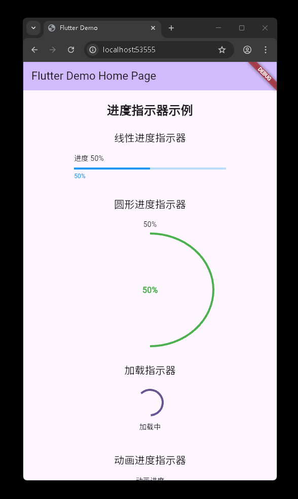
运行到鸿蒙虚拟设备中效果展示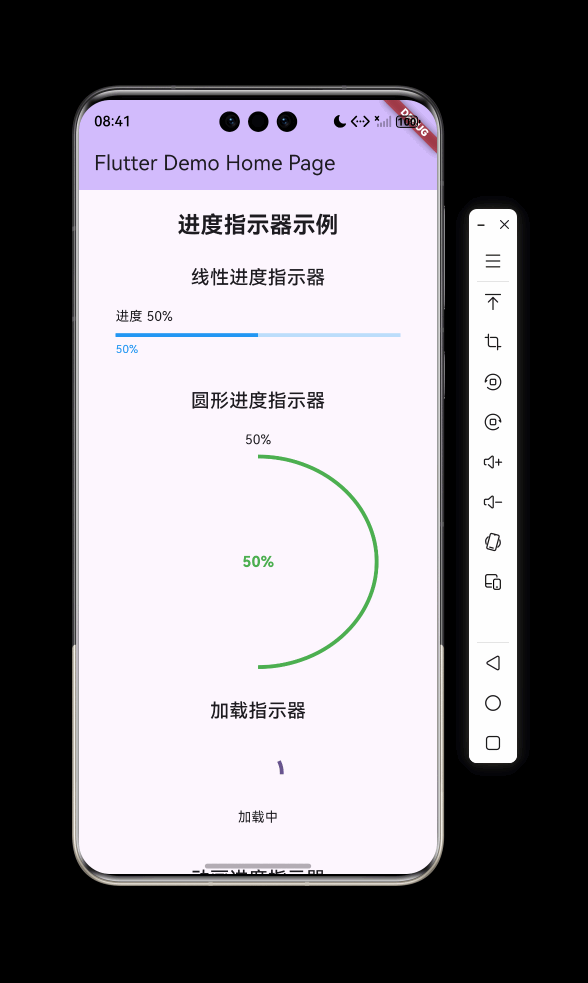
目录
功能代码实现
线性进度指示器
线性进度指示器是一种常见的UI组件,用于显示任务的完成进度。在开发中,我们实现了一个可自定义的线性进度指示器组件。
实现思路
- 组件封装:将线性进度指示器封装为
CustomLinearProgressIndicator组件,支持自定义颜色、标签等属性 - 布局结构:使用
Column布局,包含标签文本、进度条和百分比文本 - 进度计算:根据传入的
value值计算百分比,并显示在组件下方
核心代码
import 'package:flutter/material.dart';
/// 线性进度指示器组件
class CustomLinearProgressIndicator extends StatelessWidget {
final double value;
final double? minHeight;
final Color? color;
final Color? backgroundColor;
final Animation<Color?>? valueColor;
final String? label;
final TextStyle? labelStyle;
const CustomLinearProgressIndicator({
Key? key,
required this.value,
this.minHeight,
this.color,
this.backgroundColor,
this.valueColor,
this.label,
this.labelStyle,
}) : super(key: key);
Widget build(BuildContext context) {
return Column(
crossAxisAlignment: CrossAxisAlignment.start,
children: [
if (label != null)
Padding(
padding: const EdgeInsets.only(bottom: 8.0),
child: Text(
label!,
style: labelStyle ?? Theme.of(context).textTheme.bodyMedium,
),
),
LinearProgressIndicator(
value: value,
minHeight: minHeight,
color: color,
backgroundColor: backgroundColor,
valueColor: valueColor,
),
const SizedBox(height: 4),
Text(
'${(value * 100).toStringAsFixed(0)}%',
style: TextStyle(
fontSize: 12,
color: color ?? Theme.of(context).colorScheme.primary,
),
),
],
);
}
}
使用方法
Container(
  width: 300,
  child: CustomLinearProgressIndicator(
    value: 0.5,
    label: '进度 50%',
    color: Colors.blue,
    backgroundColor: Colors.blue[100],
  ),
),
开发注意事项
- 宽度约束:线性进度指示器需要父容器提供宽度约束,否则可能会占满整个屏幕宽度
- 值范围:
value参数的取值范围应在0.0到1.0之间,超出范围可能会导致UI异常 - 颜色设置:建议同时设置
color和backgroundColor,以获得更好的视觉效果
圆形进度指示器
圆形进度指示器是另一种常见的进度显示组件,适用于需要更直观展示进度的场景。
实现思路
- 组件封装:将圆形进度指示器封装为
CustomCircularProgressIndicator组件,支持自定义颜色、大小等属性 - 布局结构:使用
SizedBox限制组件大小,内部使用Stack布局,叠加圆形进度条和百分比文本 - 中心对齐:使用
Center组件确保百分比文本显示在圆形进度条的中心
核心代码
/// 圆形进度指示器组件
class CustomCircularProgressIndicator extends StatelessWidget {
final double value;
final double strokeWidth;
final Color? color;
final Color? backgroundColor;
final Animation<Color?>? valueColor;
final String? label;
final TextStyle? labelStyle;
final double size;
const CustomCircularProgressIndicator({
Key? key,
required this.value,
this.strokeWidth = 4.0,
this.color,
this.backgroundColor,
this.valueColor,
this.label,
this.labelStyle,
this.size = 100.0,
}) : super(key: key);
Widget build(BuildContext context) {
return SizedBox(
width: size,
height: size,
child: Column(
mainAxisAlignment: MainAxisAlignment.center,
children: [
if (label != null)
Padding(
padding: const EdgeInsets.only(bottom: 8.0),
child: Text(
label!,
style: labelStyle ?? Theme.of(context).textTheme.bodyMedium,
overflow: TextOverflow.ellipsis,
),
),
Expanded(
child: Stack(
fit: StackFit.expand,
children: [
CircularProgressIndicator(
value: value,
strokeWidth: strokeWidth,
color: color,
backgroundColor: backgroundColor,
valueColor: valueColor,
),
Center(
child: Text(
'${(value * 100).toStringAsFixed(0)}%',
style: TextStyle(
fontSize: 16,
fontWeight: FontWeight.bold,
color: color ?? Theme.of(context).colorScheme.primary,
),
),
),
],
),
),
],
),
);
}
}
使用方法
Container(
  width: 250,
  height: 250,
  child: CustomCircularProgressIndicator(
    value: 0.5,
    label: '50%',
    color: Colors.green,
    size: 250,
  ),
),
开发注意事项
- 尺寸设置:需要为圆形进度指示器设置合适的尺寸,过小可能会导致文本显示不清晰
- 标签处理:当添加标签时,需要确保组件有足够的高度来容纳标签和进度条
- 性能考虑:对于频繁更新的进度,建议使用
AnimatedBuilder来优化渲染性能
加载指示器
加载指示器用于显示应用正在执行某个操作,需要用户等待的场景。
实现思路
- 组件封装:将加载指示器封装为
LoadingIndicator组件,支持圆形和线性两种样式 - 样式切换:通过
isCircular参数切换圆形和线性加载指示器 - 标签支持:可选添加加载文本标签,增强用户体验
核心代码
/// 不确定进度指示器(加载中)
class LoadingIndicator extends StatelessWidget {
final bool isCircular;
final Color? color;
final double? size;
final double? strokeWidth;
final String? label;
const LoadingIndicator({
Key? key,
this.isCircular = true,
this.color,
this.size = 50.0,
this.strokeWidth = 4.0,
this.label,
}) : super(key: key);
Widget build(BuildContext context) {
return Column(
mainAxisAlignment: MainAxisAlignment.center,
children: [
if (isCircular)
SizedBox(
width: size,
height: size,
child: CircularProgressIndicator(
color: color,
strokeWidth: strokeWidth!,
),
)
else
SizedBox(
width: double.infinity,
child: LinearProgressIndicator(
color: color,
minHeight: strokeWidth,
),
),
if (label != null)
Padding(
padding: const EdgeInsets.only(top: 12.0),
child: Text(label!),
),
],
);
}
}
使用方法
Container(
  width: 100,
  height: 100,
  child: LoadingIndicator(
    isCircular: true,
    label: '加载中',
  ),
),
开发注意事项
- 布局约束:加载指示器需要合适的布局约束,特别是线性加载指示器需要宽度约束
- 颜色选择:建议使用与应用主题一致的颜色,以保持视觉风格统一
- 使用场景:适用于网络请求、文件加载等需要用户等待的场景
动画进度指示器
动画进度指示器可以为应用增添生动的视觉效果,提升用户体验。
实现思路
- 组件封装:将动画进度指示器封装为
AnimatedProgressIndicator组件,支持圆形和线性两种动画效果 - 动画控制:使用
AnimationController和Animation控制进度的动画效果 - 状态管理:使用
StatefulWidget管理动画状态,确保动画的正确启动和停止
核心代码
/// 动画进度指示器
class AnimatedProgressIndicator extends StatefulWidget {
final bool isCircular;
final Duration duration;
final Color? color;
final double? size;
final double? strokeWidth;
final String? label;
const AnimatedProgressIndicator({
Key? key,
this.isCircular = true,
this.duration = const Duration(seconds: 2),
this.color,
this.size = 100.0,
this.strokeWidth = 4.0,
this.label,
}) : super(key: key);
_AnimatedProgressIndicatorState createState() =>
_AnimatedProgressIndicatorState();
}
class _AnimatedProgressIndicatorState extends State<AnimatedProgressIndicator>
with SingleTickerProviderStateMixin {
late AnimationController _controller;
late Animation<double> _animation;
void initState() {
super.initState();
_controller = AnimationController(
duration: widget.duration,
vsync: this,
)..repeat();
_animation = Tween<double>(begin: 0, end: 1).animate(_controller);
}
void dispose() {
_controller.dispose();
super.dispose();
}
Widget build(BuildContext context) {
if (widget.isCircular) {
return SizedBox(
width: widget.size,
height: widget.size,
child: Column(
mainAxisAlignment: MainAxisAlignment.center,
children: [
if (widget.label != null)
Padding(
padding: const EdgeInsets.only(bottom: 8.0),
child: Text(
widget.label!,
overflow: TextOverflow.ellipsis,
),
),
Expanded(
child: Stack(
fit: StackFit.expand,
children: [
AnimatedBuilder(
animation: _animation,
builder: (context, child) {
return CircularProgressIndicator(
value: _animation.value,
strokeWidth: widget.strokeWidth!,
color: widget.color,
);
},
),
Center(
child: AnimatedBuilder(
animation: _animation,
builder: (context, child) {
return Text(
'${(_animation.value * 100).toStringAsFixed(0)}%',
style: TextStyle(
fontSize: 16,
fontWeight: FontWeight.bold,
color: widget.color,
),
);
},
),
),
],
),
),
],
),
);
} else {
return Column(
children: [
if (widget.label != null)
Padding(
padding: const EdgeInsets.only(bottom: 8.0),
child: Text(widget.label!),
),
AnimatedBuilder(
animation: _animation,
builder: (context, child) {
return LinearProgressIndicator(
value: _animation.value,
color: widget.color,
minHeight: widget.strokeWidth,
);
},
),
const SizedBox(height: 4),
AnimatedBuilder(
animation: _animation,
builder: (context, child) {
return Text(
'${(_animation.value * 100).toStringAsFixed(0)}%',
style: TextStyle(
fontSize: 12,
color: widget.color,
),
);
},
),
],
);
}
}
}
使用方法
Container(
  width: 250,
  height: 250,
  child: AnimatedProgressIndicator(
    isCircular: true,
    label: '动画进度',
    color: Colors.orange,
    size: 250,
  ),
),
开发注意事项
- 动画控制器管理:必须在
dispose方法中释放AnimationController,避免内存泄漏 - 性能优化:使用
AnimatedBuilder而不是直接在build方法中使用动画值,以优化渲染性能 - 循环控制:通过
_controller.repeat()实现动画的循环播放,可根据需要调整为单次动画
开发中容易遇到的问题
1. 布局溢出问题
问题描述
在集成进度指示器组件时,经常会遇到RenderFlex overflowed错误,特别是在使用圆形进度指示器时。
原因分析
- 空间不足:组件的尺寸设置过小,无法容纳所有子元素
- 标签占用空间:添加标签后,没有为标签预留足够的空间
- 布局约束:没有为组件提供明确的布局约束
解决方案
- 增加容器尺寸:为圆形进度指示器和动画进度指示器设置更大的容器尺寸
- 使用SingleChildScrollView:在页面根布局使用
SingleChildScrollView,避免垂直布局溢出 - 优化组件布局:在组件内部使用
Expanded和Stack等布局组件,更合理地分配空间
2. 组件参数传递问题
问题描述
在使用自定义组件时,可能会遇到参数传递错误或参数类型不匹配的问题。
原因分析
- 参数类型错误:传递的参数类型与组件期望的类型不匹配
- 必填参数缺失:没有传递组件所需的必填参数
- 参数值范围错误:传递的参数值超出了组件可接受的范围
解决方案
- 仔细检查参数类型:确保传递的参数类型与组件定义的类型一致
- 查看组件文档:了解组件所需的必填参数和可选参数
- 设置合理的参数值:确保传递的参数值在组件可接受的范围内
3. 动画控制器管理问题
问题描述
在使用动画进度指示器时,可能会遇到动画控制器没有正确释放的问题。
原因分析
- 内存泄漏:没有在
dispose方法中释放AnimationController - 动画冲突:多个动画控制器同时运行,可能导致性能问题
解决方案
- 正确释放动画控制器:在
dispose方法中调用_controller.dispose() - 合理使用动画:根据实际需求,选择合适的动画 duration 和重复模式
- 使用动画监听器:必要时使用动画监听器来处理动画完成后的逻辑
4. 平台适配问题
问题描述
在将Flutter应用适配到HarmonyOS平台时,可能会遇到一些平台特有的问题。
原因分析
- 平台差异:HarmonyOS与Android/iOS在某些API和行为上存在差异
- 构建配置:需要正确配置HarmonyOS相关的构建参数
- 资源适配:需要适配HarmonyOS平台的资源文件格式和命名规范
解决方案
- 了解平台差异:查阅HarmonyOS官方文档,了解与Flutter相关的平台差异
- 正确配置构建参数:按照官方指南配置HarmonyOS相关的构建参数
- 测试不同设备:在不同的HarmonyOS设备和模拟器上测试应用,确保适配效果
总结开发中用到的技术点
1. 组件封装技术
- 自定义组件:将进度指示器封装为可复用的自定义组件,提高代码复用性和可维护性
- 参数化设计:为组件提供丰富的参数选项,支持自定义颜色、大小、标签等属性
- 布局优化:使用
Stack、Expanded等布局组件,优化组件内部布局结构
2. 动画技术
- AnimationController:使用
AnimationController控制动画的播放、暂停和重复 - Animation:使用
Animation和Tween定义动画的取值范围和插值方式 - AnimatedBuilder:使用
AnimatedBuilder优化动画渲染性能,避免不必要的重建
3. 布局技术
- SingleChildScrollView:使用
SingleChildScrollView处理长页面的滚动问题 - Container:使用
Container为组件提供明确的尺寸约束和内边距 - Column/Row:使用
Column和Row组织组件的垂直和水平布局
4. 状态管理技术
- StatefulWidget:使用
StatefulWidget管理需要动态更新的组件状态 - setState:使用
setState触发组件的重建和状态更新 - 生命周期管理:正确处理组件的生命周期,特别是动画控制器的初始化和释放
5. Flutter for OpenHarmony适配技术
- 项目结构:了解Flutter for OpenHarmony项目的特殊结构,包括ohos目录的作用
- 构建流程:熟悉Flutter for OpenHarmony的构建流程,包括hap包的生成和安装
- 平台差异:了解HarmonyOS平台与其他平台的差异,进行相应的适配处理
6. 性能优化技术
- 动画优化:使用
AnimatedBuilder和RepaintBoundary优化动画性能 - 布局优化:避免过度嵌套和不必要的布局组件,减少布局计算开销
- 资源管理:正确管理动画控制器等资源,避免内存泄漏
通过开发,我们成功实现了一套功能完整、可自定义的进度指示器组件,并将其应用到Flutter for OpenHarmony项目中。同时,我们也积累了丰富的跨平台开发经验,为未来的Flutter for OpenHarmony项目开发打下了坚实的基础。
欢迎加入开源鸿蒙跨平台社区: https://openharmonycrossplatform.csdn.net

开源鸿蒙跨平台开发社区汇聚开发者与厂商,共建“一次开发,多端部署”的开源生态,致力于降低跨端开发门槛,推动万物智联创新。
更多推荐


 5
5 0
0- 0


 已为社区贡献8条内容

所有评论(0)