Flutter for OpenHarmony 实战: mango_shop 通用组件库的封装与跨端复用
·
Flutter for OpenHarmony 实战:mango_shop 通用组件库的封装与跨端复用

作者:爱吃大芒果
个人主页 爱吃大芒果
本文所属专栏Flutter
更多专栏
Ascend C 算子开发教程(进阶)
鸿蒙集成
OpenAgents
openJiuwen
从0到1自学C++
组件库现状分析
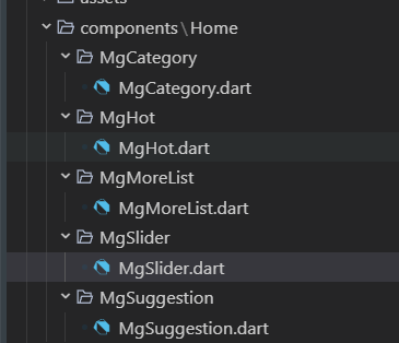
mango_shop 项目目前已经实现了一些基础组件,主要集中在首页模块,包括:
- MgSlider:轮播图组件,支持自动轮播和点击交互
- MgCategory:分类导航组件,使用网格布局展示分类图标
- MgHot:热门商品组件,横向滚动展示热门商品
- MgSuggestion:推荐商品组件
- MgMoreList:更多商品列表组件
这些组件采用了一致的设计模式:
- 基于
StatefulWidget实现 - 内部管理组件状态和数据
- 支持响应式布局,根据屏幕宽度调整显示效果
- 包含动画效果和交互反馈
通用组件库封装方案
1. 组件库架构设计
1.1 目录结构优化
建议将组件库重构为以下结构:
lib/
├── components/
│   ├── common/           # 通用基础组件
│   │   ├── MgButton/      # 按钮组件
│   │   ├── MgCard/        # 卡片组件
│   │   ├── MgImage/       # 图片组件
│   │   └── MgText/        # 文本组件
│   ├── layout/            # 布局组件
│   │   ├── MgGrid/        # 网格布局
│   │   ├── MgList/        # 列表布局
│   │   └── MgStack/       # 堆叠布局
│   ├── home/              # 首页专用组件
│   │   ├── MgSlider/      # 轮播图
│   │   ├── MgCategory/    # 分类导航
│   │   └── MgHot/         # 热门商品
│   └── widgets/           # 业务组件
│       ├── MgProductCard/ # 商品卡片
│       └── MgCartItem/    # 购物车项
├── utils/
│   ├── theme/             # 主题相关
│   │   ├── colors.dart    # 颜色定义
│   │   └── styles.dart    # 样式定义
│   └── platform/          # 平台适配
│       └── adapter.dart   # 平台适配器
1.2 组件设计原则
- 单一职责:每个组件只负责一个功能
- 可配置性:通过参数配置组件行为和样式
- 可扩展性:支持自定义子组件和样式
- 跨平台兼容:确保在所有平台上表现一致
- 性能优化:避免不必要的重建和计算
2. 基础组件封装
2.1 MgButton 组件
import 'package:flutter/material.dart';
import 'package:mango_shop/utils/theme/colors.dart';
enum MgButtonType {
primary,
secondary,
outline,
text,
}
class MgButton extends StatelessWidget {
final String text;
final VoidCallback? onPressed;
final MgButtonType type;
final bool disabled;
final double? width;
final double? height;
final EdgeInsets? padding;
final TextStyle? textStyle;
final Decoration? decoration;
const MgButton({
Key? key,
required this.text,
this.onPressed,
this.type = MgButtonType.primary,
this.disabled = false,
this.width,
this.height,
this.padding,
this.textStyle,
this.decoration,
}) : super(key: key);
Widget build(BuildContext context) {
Color backgroundColor;
Color textColor;
Color borderColor;
switch (type) {
case MgButtonType.primary:
backgroundColor = disabled ? AppColors.gray300 : AppColors.primary;
textColor = Colors.white;
borderColor = Colors.transparent;
break;
case MgButtonType.secondary:
backgroundColor = disabled ? AppColors.gray300 : AppColors.secondary;
textColor = Colors.white;
borderColor = Colors.transparent;
break;
case MgButtonType.outline:
backgroundColor = Colors.transparent;
textColor = disabled ? AppColors.gray300 : AppColors.primary;
borderColor = disabled ? AppColors.gray300 : AppColors.primary;
break;
case MgButtonType.text:
backgroundColor = Colors.transparent;
textColor = disabled ? AppColors.gray300 : AppColors.primary;
borderColor = Colors.transparent;
break;
}
return Container(
width: width,
height: height,
decoration: decoration ?? BoxDecoration(
color: backgroundColor,
border: type == MgButtonType.outline
? Border.all(color: borderColor, width: 1)
: null,
borderRadius: BorderRadius.circular(8),
),
child: TextButton(
onPressed: disabled ? null : onPressed,
style: TextButton.styleFrom(
padding: padding ?? EdgeInsets.symmetric(horizontal: 16, vertical: 10),
shape: RoundedRectangleBorder(
borderRadius: BorderRadius.circular(8),
),
),
child: Text(
text,
style: textStyle ?? TextStyle(
color: textColor,
fontSize: 14,
fontWeight: FontWeight.w500,
),
),
),
);
}
}
2.2 MgProductCard 组件
import 'package:flutter/material.dart';
import 'package:mango_shop/utils/theme/colors.dart';
import 'package:mango_shop/utils/theme/styles.dart';
class MgProductCard extends StatelessWidget {
final String id;
final String name;
final String image;
final double price;
final double? originalPrice;
final int sales;
final List<String>? tags;
final VoidCallback? onTap;
final VoidCallback? onAddToCart;
const MgProductCard({
Key? key,
required this.id,
required this.name,
required this.image,
required this.price,
this.originalPrice,
required this.sales,
this.tags,
this.onTap,
this.onAddToCart,
}) : super(key: key);
Widget build(BuildContext context) {
return GestureDetector(
onTap: onTap,
child: Container(
decoration: BoxDecoration(
color: AppColors.white,
borderRadius: BorderRadius.circular(12),
boxShadow: [
BoxShadow(
color: AppColors.black.withOpacity(0.1),
spreadRadius: 2,
blurRadius: 16,
offset: Offset(0, 6),
),
],
border: Border.all(
color: AppColors.gray300.withOpacity(0.2),
width: 1,
),
),
child: Column(
children: [
Container(
height: 160,
decoration: BoxDecoration(
borderRadius: BorderRadius.vertical(top: Radius.circular(12)),
image: DecorationImage(
image: AssetImage(image),
fit: BoxFit.cover,
),
),
child: Stack(
children: [
// 标签
if (tags != null && tags!.isNotEmpty)
Positioned(
top: 8,
left: 8,
child: Container(
padding: EdgeInsets.symmetric(
horizontal: 8,
vertical: 4,
),
decoration: BoxDecoration(
color: Colors.red.withOpacity(0.9),
borderRadius: BorderRadius.circular(4),
),
child: Text(
tags![0],
style: TextStyle(
color: Colors.white,
fontSize: 10,
fontWeight: FontWeight.bold,
),
),
),
),
],
),
),
Padding(
padding: EdgeInsets.all(12),
child: Column(
crossAxisAlignment: CrossAxisAlignment.start,
children: [
Text(
name,
style: AppTextStyles.bodyMedium.copyWith(
fontWeight: FontWeight.w500,
),
maxLines: 2,
overflow: TextOverflow.ellipsis,
),
SizedBox(height: 6),
Row(
children: [
Text(
'¥$price',
style: AppTextStyles.price.copyWith(
fontSize: 16,
fontWeight: FontWeight.bold,
),
),
if (originalPrice != null)
Row(
children: [
SizedBox(width: 6),
Text(
'¥$originalPrice',
style: TextStyle(
color: AppColors.textHint,
fontSize: 12,
decoration: TextDecoration.lineThrough,
),
),
],
),
],
),
SizedBox(height: 6),
Row(
mainAxisAlignment: MainAxisAlignment.spaceBetween,
children: [
Text(
'已售$sales件',
style: TextStyle(
color: AppColors.textHint,
fontSize: 11,
),
),
if (onAddToCart != null)
GestureDetector(
onTap: onAddToCart,
child: Container(
width: 28,
height: 28,
decoration: BoxDecoration(
color: AppColors.primary,
borderRadius: BorderRadius.circular(14),
),
child: Icon(
Icons.add,
color: Colors.white,
size: 16,
),
),
),
],
),
],
),
),
],
),
),
);
}
}
3. 高级组件封装
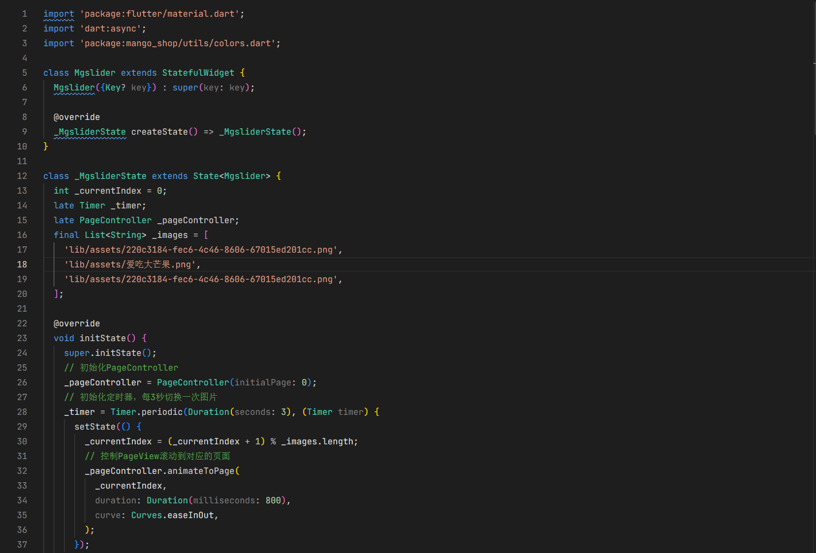
3.1 MgSlider 组件优化
import 'package:flutter/material.dart';
import 'dart:async';
import 'package:mango_shop/utils/theme/colors.dart';
class MgSlider extends StatefulWidget {
final List<String> images;
final Duration autoPlayDuration;
final bool autoPlay;
final ValueChanged<int>? onImageTap;
final double height;
const MgSlider({
Key? key,
required this.images,
this.autoPlayDuration = const Duration(seconds: 3),
this.autoPlay = true,
this.onImageTap,
this.height = 220,
}) : super(key: key);
_MgSliderState createState() => _MgSliderState();
}
class _MgSliderState extends State<MgSlider> {
int _currentIndex = 0;
late Timer _timer;
late PageController _pageController;
void initState() {
super.initState();
_pageController = PageController(initialPage: 0);
if (widget.autoPlay && widget.images.length > 1) {
_startAutoPlay();
}
}
void _startAutoPlay() {
_timer = Timer.periodic(widget.autoPlayDuration, (Timer timer) {
setState(() {
_currentIndex = (_currentIndex + 1) % widget.images.length;
_pageController.animateToPage(
_currentIndex,
duration: Duration(milliseconds: 800),
curve: Curves.easeInOut,
);
});
});
}
void dispose() {
if (widget.autoPlay) {
_timer.cancel();
}
_pageController.dispose();
super.dispose();
}
void didUpdateWidget(covariant MgSlider oldWidget) {
super.didUpdateWidget(oldWidget);
if (widget.autoPlay != oldWidget.autoPlay ||
widget.images.length != oldWidget.images.length) {
if (_timer.isActive) {
_timer.cancel();
}
if (widget.autoPlay && widget.images.length > 1) {
_startAutoPlay();
}
}
}
Widget build(BuildContext context) {
final screenWidth = MediaQuery.of(context).size.width;
final isLargeScreen = screenWidth > 600;
final sliderHeight = widget.height > 0
? widget.height
: (isLargeScreen ? 280 : 220);
if (widget.images.isEmpty) {
return Container(
height: sliderHeight,
color: AppColors.gray200,
child: Center(
child: Text('暂无轮播图'),
),
);
}
return Container(
height: sliderHeight,
child: Stack(
children: [
PageView.builder(
controller: _pageController,
itemCount: widget.images.length,
onPageChanged: (index) {
setState(() {
_currentIndex = index;
});
},
itemBuilder: (context, index) {
return GestureDetector(
onTap: () {
if (widget.onImageTap != null) {
widget.onImageTap!(index);
}
},
child: Container(
width: double.infinity,
height: double.infinity,
child: ClipRRect(
child: Image.asset(
widget.images[index],
fit: BoxFit.cover,
width: double.infinity,
height: double.infinity,
),
),
),
);
},
),
if (widget.images.length > 1)
Positioned(
bottom: 20,
left: 0,
right: 0,
child: Row(
mainAxisAlignment: MainAxisAlignment.center,
children: widget.images.asMap().entries.map((entry) {
return AnimatedContainer(
duration: Duration(milliseconds: 300),
width: _currentIndex == entry.key ? 24 : 8,
height: 8,
margin: EdgeInsets.symmetric(horizontal: 4),
decoration: BoxDecoration(
borderRadius: BorderRadius.circular(4),
color: _currentIndex == entry.key
? AppColors.primary
: AppColors.white.withOpacity(0.8),
boxShadow: [
BoxShadow(
color: AppColors.black.withOpacity(0.1),
blurRadius: 4,
offset: Offset(0, 2),
),
],
),
);
}).toList(),
),
),
],
),
);
}
}
4. 主题与样式管理
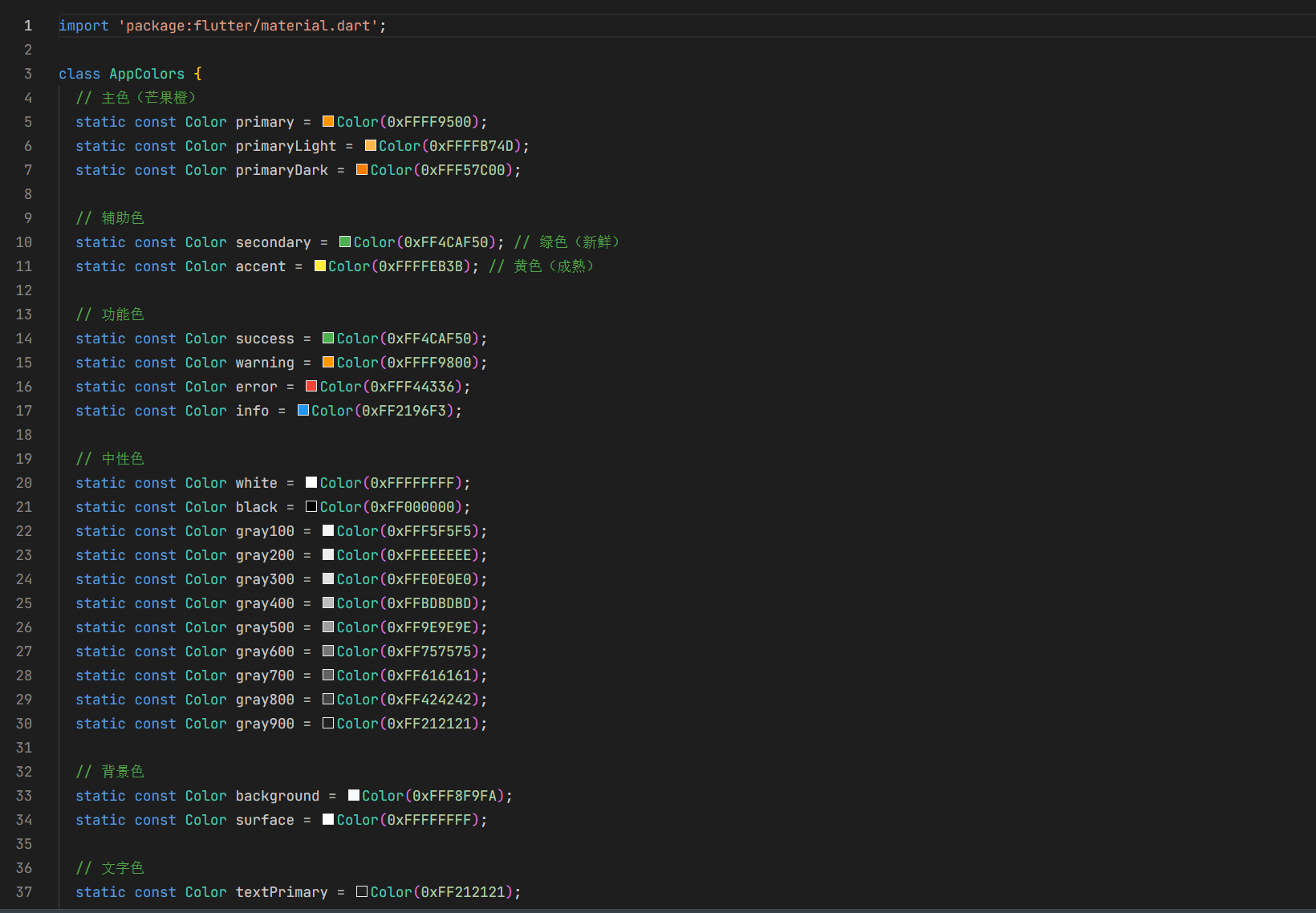
4.1 颜色管理
// lib/utils/theme/colors.dart
class AppColors {
  static const Color primary = Color(0xFFE53935);
  static const Color secondary = Color(0xFF4CAF50);
  static const Color white = Color(0xFFFFFFFF);
  static const Color black = Color(0xFF000000);
  static const Color background = Color(0xFFF5F5F5);
  static const Color textPrimary = Color(0xFF333333);
  static const Color textSecondary = Color(0xFF666666);
  static const Color textHint = Color(0xFF999999);
  static const Color gray200 = Color(0xFFEEEEEE);
  static const Color gray300 = Color(0xFFE0E0E0);
  static const Color gray400 = Color(0xFFBDBDBD);
  static const Color gray500 = Color(0xFF9E9E9E);
}
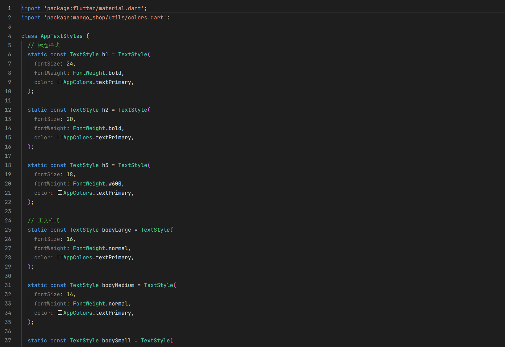
4.2 样式管理
// lib/utils/theme/styles.dart
import 'package:flutter/material.dart';
import 'package:mango_shop/utils/theme/colors.dart';

class AppTextStyles {
  static const TextStyle h1 = TextStyle(
    fontSize: 24,
    fontWeight: FontWeight.bold,
    color: AppColors.textPrimary,
  );

  static const TextStyle h2 = TextStyle(
    fontSize: 20,
    fontWeight: FontWeight.bold,
    color: AppColors.textPrimary,
  );

  static const TextStyle h3 = TextStyle(
    fontSize: 18,
    fontWeight: FontWeight.bold,
    color: AppColors.textPrimary,
  );

  static const TextStyle bodyLarge = TextStyle(
    fontSize: 16,
    color: AppColors.textPrimary,
  );

  static const TextStyle bodyMedium = TextStyle(
    fontSize: 14,
    color: AppColors.textPrimary,
  );

  static const TextStyle bodySmall = TextStyle(
    fontSize: 12,
    color: AppColors.textSecondary,
  );

  static const TextStyle price = TextStyle(
    fontSize: 18,
    fontWeight: FontWeight.bold,
    color: AppColors.primary,
  );
}
跨端复用实现
1. 平台适配层设计
1.1 平台适配器
// lib/utils/platform/adapter.dart
import 'dart:io';
import 'package:flutter/foundation.dart';
import 'package:flutter/material.dart';

class PlatformAdapter {
  // 判断当前平台
  static bool get isAndroid => Platform.isAndroid;
  static bool get isIOS => Platform.isIOS;
  static bool get isWeb => kIsWeb;
  static bool get isWindows => Platform.isWindows;
  static bool get isLinux => Platform.isLinux;
  static bool get isMacOS => Platform.isMacOS;
  static bool get isOpenHarmony {
    // Flutter for OpenHarmony 会设置特定的环境变量
    // 或者可以通过其他方式判断
    return Platform.environment.containsKey('OHOS') ||
           Platform.operatingSystem.toLowerCase() == 'openharmony';
  }

  // 获取平台特定的样式
  static EdgeInsets get platformPadding {
    if (isOpenHarmony) {
      // OpenHarmony 平台的特殊 padding
      return EdgeInsets.symmetric(horizontal: 12);
    }
    return EdgeInsets.symmetric(horizontal: 16);
  }

  // 获取平台特定的字体大小
  static double get platformFontSize(double baseSize) {
    if (isOpenHarmony) {
      // OpenHarmony 平台的字体大小调整
      return baseSize * 0.95;
    }
    return baseSize;
  }

  // 平台特定的图片加载
  static Widget platformImage({
    required String path,
    double? width,
    double? height,
    BoxFit fit = BoxFit.cover,
  }) {
    if (isOpenHarmony) {
      // OpenHarmony 平台的图片加载优化
      return Image.asset(
        path,
        width: width,
        height: height,
        fit: fit,
        // 添加 OpenHarmony 特定的配置
      );
    }
    return Image.asset(
      path,
      width: width,
      height: height,
      fit: fit,
    );
  }
}
2. OpenHarmony 平台特殊适配
2.1 资源适配
Flutter for OpenHarmony 会自动将 pubspec.yaml 中声明的资源文件打包到 OpenHarmony 应用的 rawfile 目录中。但对于需要在 OpenHarmony 原生代码中使用的资源,需要进行手动适配:
- 图标资源:将应用图标等需要在 OpenHarmony 原生界面使用的图标,复制到
ohos/entry/src/main/resources/base/media/目录 - 字符串资源:将需要国际化的字符串,添加到对应的
string.json文件中 - 颜色资源:将主题颜色等,添加到
color.json文件中
2.2 组件适配
对于在 OpenHarmony 平台上有特殊表现要求的组件,可以通过平台判断进行适配:
Widget build(BuildContext context) {
  if (PlatformAdapter.isOpenHarmony) {
    // OpenHarmony 平台特定实现
    return _buildOpenHarmonyVersion();
  }
  // 通用实现
  return _buildCommonVersion();
}
3. 性能优化
3.1 组件性能优化
- 使用 const 构造器:对于不变的组件,使用 const 构造器
- 避免不必要的重建:使用
const、final和ValueKey避免不必要的重建 - 使用 RepaintBoundary:对于频繁重绘的组件,使用
RepaintBoundary隔离 - 懒加载:对于列表和网格中的组件,使用懒加载
3.2 OpenHarmony 平台性能优化
- 资源预加载:在 OpenHarmony 平台上,预加载首屏需要的资源
- 内存管理:及时释放不再使用的资源,避免内存泄漏
- 渲染优化:减少过度绘制,优化布局层级
组件库使用示例
1. 基础组件使用
// 使用 MgButton
MgButton(
  text: '加入购物车',
  type: MgButtonType.primary,
  onTap: () {
    print('加入购物车');
  },
),

// 使用 MgProductCard
MgProductCard(
  id: '1',
  name: '海南芒果 新鲜水果',
  image: 'lib/assets/220c3184-fec6-4c46-8606-67015ed201cc.png',
  price: 19.9,
  originalPrice: 29.9,
  sales: 1234,
  tags: ['热销', '新鲜'],
  onTap: () {
    print('查看商品详情');
  },
  onAddToCart: () {
    print('加入购物车');
  },
),
2. 高级组件使用
// 使用 MgSlider
MgSlider(
  images: [
    'lib/assets/220c3184-fec6-4c46-8606-67015ed201cc.png',
    'lib/assets/爱吃大芒果.png',
    'lib/assets/52da9c14-9404-4e4d-83a1-4a294050350f.png',
  ],
  autoPlay: true,
  autoPlayDuration: Duration(seconds: 4),
  height: 250,
  onImageTap: (index) {
    print('点击了轮播图第${index + 1}张');
  },
),
3. 主题使用
// 使用主题颜色
Container(
  color: AppColors.primary,
  child: Text(
    '主题颜色示例',
    style: AppTextStyles.bodyMedium.copyWith(
      color: AppColors.white,
    ),
  ),
),
项目集成与构建
1. 组件库集成
将组件库集成到项目中:
- 本地集成:直接将组件库代码复制到项目的
lib/components目录 - 包集成:将组件库封装为独立的包,通过
pubspec.yaml依赖
2. 构建配置
2.1 pubspec.yaml 配置
dependencies:
  flutter:
    sdk: flutter
  cupertino_icons: ^1.0.8
  carousel_slider: ^5.1.1
  image_picker: ^1.1.1

dev_dependencies:
  flutter_test:
    sdk: flutter
  flutter_lints: ^5.0.0

flutter:
  uses-material-design: true
  assets:
    - lib/assets/icons/
    - lib/assets/images/
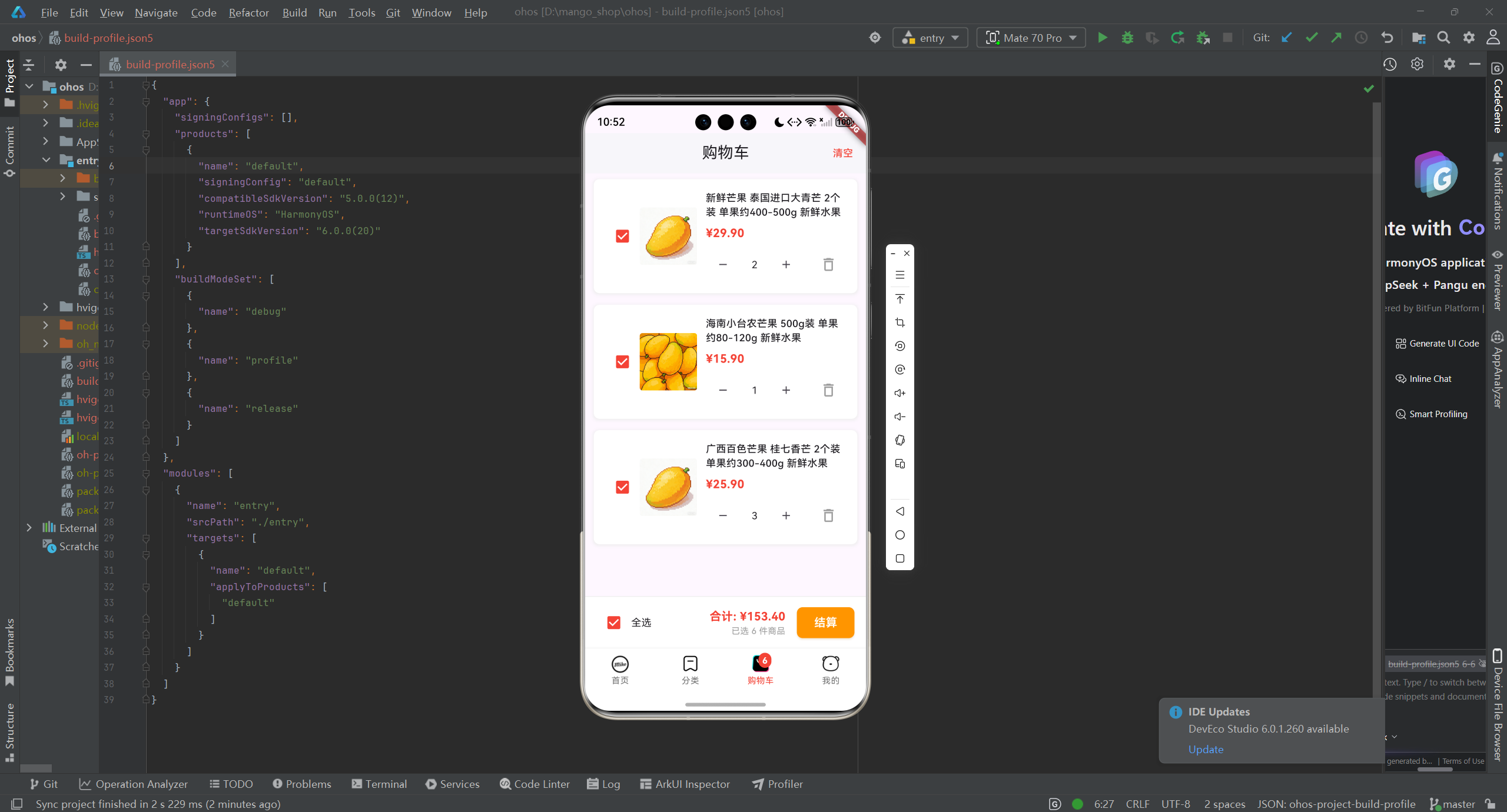
2.2 OpenHarmony 构建配置
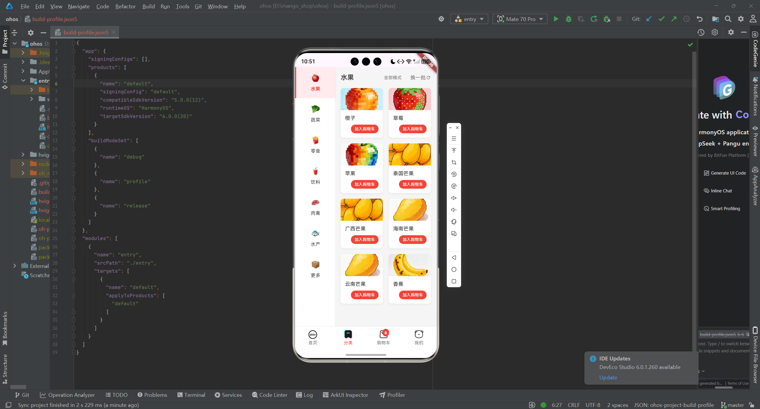
确保 ohos/build-profile.json5 和 ohos/entry/module.json5 配置正确,特别是资源相关的配置。
3. 运行与测试
3.1 在不同平台运行
# Android
flutter run -d android

# iOS
flutter run -d ios

# Web
flutter run -d web

# Windows
flutter run -d windows

# Linux
flutter run -d linux

# OpenHarmony
flutter run -d ohos
3.2 测试策略
- 单元测试:测试组件的基本功能
- 集成测试:测试组件在不同场景下的表现
- 性能测试:测试组件的性能表现
- 跨平台测试:确保组件在所有平台上表现一致
总结与展望
通过本文介绍的通用组件库封装方案,我们可以:
- 提高开发效率:通过复用组件,减少重复代码
- 保证一致性:统一的组件设计和实现,确保应用风格一致
- 简化维护:集中管理组件代码,便于后续维护和更新
- 跨平台兼容:确保组件在所有平台上表现一致,特别是 OpenHarmony 平台
未来,可以考虑:
- 组件库文档化:为组件库添加详细的文档和示例
- 组件库发布:将组件库发布为开源包,供更多开发者使用
- 组件库扩展:添加更多功能组件,如表单组件、动画组件等
- 主题定制:支持更灵活的主题定制,适应不同应用的需求
- 性能优化:持续优化组件性能,提升应用体验
Flutter for OpenHarmony 为跨平台开发提供了新的可能性,通过合理的组件库设计和平台适配,可以构建出在所有平台上表现出色的应用。
欢迎加入开源鸿蒙跨平台社区:开源鸿蒙跨平台开发者社区

开源鸿蒙跨平台开发社区汇聚开发者与厂商,共建“一次开发,多端部署”的开源生态,致力于降低跨端开发门槛,推动万物智联创新。
更多推荐

 6
6 0
0- 0


 已为社区贡献22条内容

所有评论(0)