Flutter for OpenHarmony垃圾分类指南App实战:意见反馈实现
本文介绍了在Flutter for OpenHarmony环境下实现意见反馈页面的关键技术,主要包括:1)使用StatefulWidget管理表单状态;2)采用ChoiceChip组件实现反馈类型选择;3)通过TextField实现多行文本输入;4)添加图片上传功能增强反馈效果。页面布局分为三个核心部分:反馈类型选择、内容输入和提交按钮,并采用SingleChildScrollView确保键盘弹出
前言
用户的反馈是产品改进的重要来源。意见反馈页面让用户可以方便地提交问题和建议,是App和用户沟通的桥梁。本文将详细介绍如何在Flutter for OpenHarmony环境下实现一个完整的意见反馈页面,包括表单设计、类型选择、输入验证以及提交逻辑等核心技术点。
一个好的反馈系统不仅能收集用户意见,还能让用户感受到被重视。当用户遇到问题或有想法时,能够快速找到反馈入口,简单几步就能提交,这种流畅的体验会大大提升用户满意度。反馈数据是产品迭代的宝贵资源,通过分析用户反馈,可以发现产品的不足,了解用户的真实需求。
从产品角度看,意见反馈功能是建立用户信任的重要手段。当用户看到自己的反馈得到回应,问题得到解决,会产生强烈的归属感和忠诚度。因此,反馈页面不仅要做得好用,后续的处理流程也要完善,让用户感受到反馈的价值。
技术要点概览
本页面涉及的核心技术点:
- StatefulWidget:管理表单状态
- TextEditingController:输入框控制器
- ChoiceChip:反馈类型选择
- 表单验证:输入内容的有效性检查
- SingleChildScrollView:键盘弹出时内容滚动
为什么用StatefulWidget
这个页面需要管理多个状态:选中的反馈类型、输入框的内容、提交状态等:
class FeedbackPage extends StatefulWidget {
const FeedbackPage({super.key});
State<FeedbackPage> createState() => _FeedbackPageState();
}
class _FeedbackPageState extends State<FeedbackPage> {
final _controller = TextEditingController();
final _contactController = TextEditingController();
String _selectedType = '功能建议';
bool _isSubmitting = false;
final _formKey = GlobalKey<FormState>();
TextEditingController用来控制输入框,可以获取输入的内容,也可以清空输入框。_selectedType记录当前选中的反馈类型,默认值是"功能建议"。_isSubmitting标记是否正在提交,用于防止重复提交。_formKey用于表单验证,可以统一管理多个输入框的验证状态。
StatefulWidget是Flutter中管理可变状态的标准方案。当用户选择反馈类型、输入文字时,这些状态的变化需要触发UI更新。setState方法会通知Flutter重新构建Widget树,让界面反映最新的状态。相比StatelessWidget,StatefulWidget虽然稍微复杂一些,但提供了完整的生命周期管理和状态控制能力。
资源释放
Controller使用完后必须释放,避免内存泄漏:
void dispose() {
_controller.dispose();
_contactController.dispose();
super.dispose();
}
dispose方法在Widget被销毁时调用,是清理资源的最佳时机。TextEditingController内部持有一些监听器和资源,如果不释放会导致内存泄漏。特别是在频繁打开关闭页面的场景中,内存泄漏会累积,最终导致应用卡顿甚至崩溃。
养成良好的资源管理习惯很重要。除了Controller,其他需要手动释放的资源还包括AnimationController、StreamSubscription、Timer等。Flutter的dispose机制提供了统一的资源清理入口,确保资源在合适的时机被释放。
页面布局
页面分为三个部分:反馈类型选择、反馈内容输入、提交按钮:
Widget build(BuildContext context) {
return Scaffold(
appBar: AppBar(
title: const Text('意见反馈'),
actions: [
TextButton.icon(
onPressed: () => Get.toNamed(Routes.feedbackHistory),
icon: Icon(Icons.history, color: Colors.white),
label: Text('历史', style: TextStyle(color: Colors.white)),
),
],
),
body: SingleChildScrollView(
padding: EdgeInsets.all(16.w),
child: Form(
key: _formKey,
child: Column(
crossAxisAlignment: CrossAxisAlignment.start,
children: [
_buildTypeSection(),
SizedBox(height: 24.h),
_buildContentSection(),
SizedBox(height: 24.h),
_buildContactSection(),
SizedBox(height: 24.h),
_buildImageSection(),
SizedBox(height: 32.h),
_buildSubmitButton(),
],
),
),
),
);
}
Widget _buildTypeSection() {
return Column(
crossAxisAlignment: CrossAxisAlignment.start,
children: [
Text(
'反馈类型',
style: TextStyle(
fontSize: 16.sp,
fontWeight: FontWeight.w500,
color: Colors.black87,
),
),
SizedBox(height: 12.h),
用SingleChildScrollView包裹,这样键盘弹出时内容可以滚动,输入框不会被遮挡。这是移动端表单页面的标准做法,因为键盘会占据屏幕下半部分的空间,如果不能滚动,用户可能看不到正在输入的内容。
Form组件配合GlobalKey可以统一管理表单验证。当用户点击提交时,调用_formKey.currentState?.validate()可以触发所有输入框的验证逻辑,如果有任何一个输入框验证失败,都会阻止提交并显示错误提示。这种集中式的验证管理比单独验证每个输入框更加优雅和可维护。
AppBar的actions添加了历史记录入口,让用户可以查看之前提交的反馈。这个细节很重要,因为用户可能想查看某个问题的处理进度,或者参考之前提交过的内容。把历史记录入口放在显眼的位置,可以提升功能的可发现性。
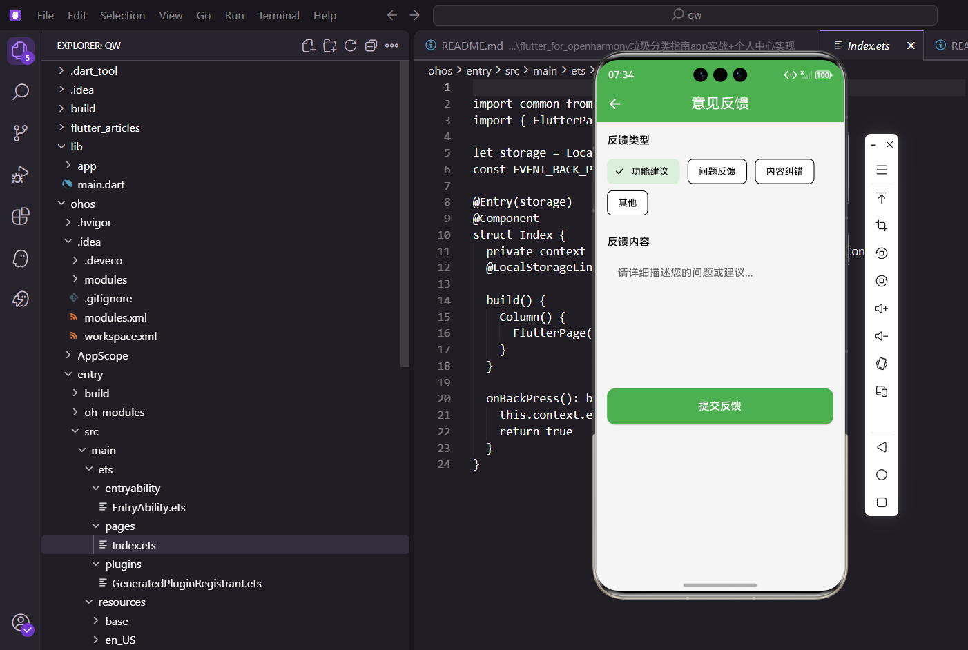
反馈类型选择
用ChoiceChip组件实现类型选择:
            Wrap(
              spacing: 12.w,
              runSpacing: 8.h,
              children: ['功能建议', '问题反馈', '内容纠错', '其他'].map((type) {
                final isSelected = _selectedType == type;
                return ChoiceChip(
                  label: Text(type),
                  selected: isSelected,
                  selectedColor: AppTheme.primaryColor.withOpacity(0.2),
                  labelStyle: TextStyle(
                    color: isSelected ? AppTheme.primaryColor : Colors.black87,
                    fontWeight: isSelected ? FontWeight.w500 : FontWeight.normal,
                  ),
                  backgroundColor: Colors.grey.shade100,
                  shape: RoundedRectangleBorder(
                    borderRadius: BorderRadius.circular(20.r),
                    side: BorderSide(
                      color: isSelected ? AppTheme.primaryColor : Colors.transparent,
                      width: 1.5,
                    ),
                  ),
                  onSelected: (selected) {
                    if (selected) setState(() => _selectedType = type);
                  },
                );
              }).toList(),
            ),
          ],
        );
      }
ChoiceChip是Material Design提供的选择芯片组件,自带选中和未选中的样式,用起来很方便。Wrap组件让芯片自动换行,不会溢出屏幕。spacing控制芯片之间的横向间距,runSpacing控制换行后的纵向间距。
选中状态的芯片使用主题色背景和边框,未选中的使用灰色背景。这种视觉反馈让用户清楚地知道当前选择了哪个类型。labelStyle根据选中状态动态调整文字颜色和字重,进一步强化视觉区分。shape属性自定义芯片的形状,使用圆角矩形并根据选中状态显示不同的边框。
反馈类型说明
四种反馈类型覆盖了常见的场景:
- 功能建议:用户希望增加某个功能,比如添加语音搜索、离线模式等
- 问题反馈:用户遇到了bug或问题,比如闪退、数据错误、功能异常等
- 内容纠错:垃圾分类信息有误,比如某个物品的分类不正确
- 其他:不属于以上类型的反馈,给用户一个兜底选项
类型分类的好处是可以帮助运营团队快速分流处理。功能建议交给产品经理评估,问题反馈交给技术团队排查,内容纠错交给内容运营修正。这种分类处理机制可以提高反馈处理效率,确保每个反馈都能得到专业的响应。
增强版类型选择
可以为每种类型添加图标和描述:
final feedbackTypes = [
  {'type': '功能建议', 'icon': Icons.lightbulb_outline, 'desc': '希望增加的功能'},
  {'type': '问题反馈', 'icon': Icons.bug_report, 'desc': '遇到的bug或问题'},
  {'type': '内容纠错', 'icon': Icons.edit, 'desc': '分类信息有误'},
  {'type': '其他', 'icon': Icons.more_horiz, 'desc': '其他类型的反馈'},
];

Widget _buildTypeSelector() {
  return Column(
    crossAxisAlignment: CrossAxisAlignment.start,
    children: feedbackTypes.map((item) {
      final isSelected = _selectedType == item['type'];
      return Card(
        margin: EdgeInsets.only(bottom: 8.h),
        color: isSelected ? AppTheme.primaryColor.withOpacity(0.1) : null,
        child: ListTile(
          leading: Icon(
            item['icon'] as IconData,
            color: isSelected ? AppTheme.primaryColor : Colors.grey,
          ),
          title: Text(item['type'] as String),
          subtitle: Text(item['desc'] as String),
          trailing: isSelected ? Icon(Icons.check, color: AppTheme.primaryColor) : null,
          onTap: () => setState(() => _selectedType = item['type'] as String),
        ),
      );
    }).toList(),
  );
}
反馈内容输入
用TextField组件实现多行文本输入:
  Widget _buildContentSection() {
    return Column(
      crossAxisAlignment: CrossAxisAlignment.start,
      children: [
        Text(
          '反馈内容',
          style: TextStyle(
            fontSize: 16.sp,
            fontWeight: FontWeight.w500,
            color: Colors.black87,
          ),
        ),
        SizedBox(height: 12.h),
        TextField(
          controller: _controller,
          maxLines: 6,
          maxLength: 500,
          decoration: InputDecoration(
            hintText: '请详细描述您的问题或建议,我们会认真对待每一条反馈...',
            hintStyle: TextStyle(color: Colors.grey.shade400, fontSize: 14.sp),
            filled: true,
            fillColor: Colors.white,
            border: OutlineInputBorder(
              borderRadius: BorderRadius.circular(12.r),
              borderSide: BorderSide(color: Colors.grey.shade300),
            ),
            enabledBorder: OutlineInputBorder(
              borderRadius: BorderRadius.circular(12.r),
              borderSide: BorderSide(color: Colors.grey.shade300),
            ),
            focusedBorder: OutlineInputBorder(
              borderRadius: BorderRadius.circular(12.r),
              borderSide: BorderSide(color: AppTheme.primaryColor, width: 2),
            ),
            counterStyle: TextStyle(color: Colors.grey.shade600),
          ),
          style: TextStyle(fontSize: 15.sp, height: 1.5),
        ),
      ],
    );
  }
maxLines: 6让输入框显示6行高度,适合输入较长的内容。这个高度经过测试,既能显示足够的内容,又不会占据过多屏幕空间。maxLength: 500限制最大字符数,避免用户输入过长的内容,同时也能防止后端接口因为数据过大而报错。
hintText给用户一个友好的提示,告诉他们应该输入什么样的内容。提示文字要具体明确,让用户知道如何描述问题才能得到更好的帮助。hintStyle设置提示文字的颜色和大小,使用浅灰色让提示文字和正式输入的文字有明显区分。
边框样式的设计很重要。enabledBorder是输入框未获得焦点时的边框,使用浅灰色。focusedBorder是获得焦点时的边框,使用主题色并加粗,给用户明确的视觉反馈,让他们知道当前正在这个输入框中输入。这种交互细节可以显著提升用户体验。
style属性设置输入文字的样式,height: 1.5设置行高,让多行文字的阅读体验更好。counterStyle设置字符计数器的样式,使用灰色让它不那么突出,但又能让用户随时了解还能输入多少字符。
图片上传功能
有些问题用文字描述不清楚,让用户上传截图会更有帮助:
final _images = <File>[].obs;

Widget _buildImageUploader() {
  return Column(
    crossAxisAlignment: CrossAxisAlignment.start,
    children: [
      Text('上传截图(可选)', style: TextStyle(fontSize: 16.sp, fontWeight: FontWeight.w500)),
      SizedBox(height: 12.h),
      Obx(() => Wrap(
        spacing: 8.w,
        runSpacing: 8.h,
        children: [
          ..._images.map((file) => _buildImageItem(file)),
          if (_images.length < 4) _buildAddButton(),
        ],
      )),
    ],
  );
}

Widget _buildImageItem(File file) {
  return Stack(
    children: [
      ClipRRect(
        borderRadius: BorderRadius.circular(8.r),
        child: Image.file(
          file,
          width: 80.w,
          height: 80.w,
          fit: BoxFit.cover,
        ),
      ),
      Positioned(
        top: 0,
        right: 0,
        child: GestureDetector(
          onTap: () => _images.remove(file),
          child: Container(
            padding: EdgeInsets.all(2.w),
            decoration: BoxDecoration(
              color: Colors.red,
              shape: BoxShape.circle,
            ),
            child: Icon(Icons.close, size: 14.sp, color: Colors.white),
          ),
        ),
      ),
    ],
  );
}

Widget _buildAddButton() {
  return GestureDetector(
    onTap: _pickImage,
    child: Container(
      width: 80.w,
      height: 80.w,
      decoration: BoxDecoration(
        color: Colors.grey.shade200,
        borderRadius: BorderRadius.circular(8.r),
        border: Border.all(color: Colors.grey.shade300, style: BorderStyle.solid),
      ),
      child: Icon(Icons.add_photo_alternate, size: 32.sp, color: Colors.grey),
    ),
  );
}

Future<void> _pickImage() async {
  final picker = ImagePicker();
  final image = await picker.pickImage(source: ImageSource.gallery);
  if (image != null) {
    _images.add(File(image.path));
  }
}
联系方式输入
可以让用户留下联系方式,方便后续沟通:
final _contactController = TextEditingController();

Widget _buildContactInput() {
  return Column(
    crossAxisAlignment: CrossAxisAlignment.start,
    children: [
      Text('联系方式(可选)', style: TextStyle(fontSize: 16.sp, fontWeight: FontWeight.w500)),
      SizedBox(height: 12.h),
      TextField(
        controller: _contactController,
        decoration: InputDecoration(
          hintText: '请输入手机号或邮箱',
          filled: true,
          fillColor: Colors.white,
          prefixIcon: Icon(Icons.contact_mail),
          border: OutlineInputBorder(
            borderRadius: BorderRadius.circular(12.r),
            borderSide: BorderSide.none,
          ),
        ),
      ),
    ],
  );
}
提交按钮
提交按钮使用全宽设计,方便用户点击:
  Widget _buildSubmitButton() {
    return SizedBox(
      width: double.infinity,
      height: 48.h,
      child: ElevatedButton(
        onPressed: _isSubmitting ? null : _submit,
        style: ElevatedButton.styleFrom(
          backgroundColor: AppTheme.primaryColor,
          disabledBackgroundColor: Colors.grey.shade300,
          padding: EdgeInsets.symmetric(vertical: 14.h),
          shape: RoundedRectangleBorder(
            borderRadius: BorderRadius.circular(12.r),
          ),
          elevation: 0,
        ),
        child: _isSubmitting
            ? SizedBox(
                width: 20.w,
                height: 20.w,
                child: CircularProgressIndicator(
                  strokeWidth: 2,
                  valueColor: AlwaysStoppedAnimation<Color>(Colors.white),
                ),
              )
            : Text(
                '提交反馈',
                style: TextStyle(
                  fontSize: 16.sp,
                  color: Colors.white,
                  fontWeight: FontWeight.w500,
                ),
              ),
      ),
    );
  }
按钮宽度撑满屏幕,高度通过height属性控制,确保按钮有足够的点击区域。圆角和输入框保持一致,视觉上更协调。elevation设置为0去掉阴影,符合现代扁平化设计风格。
提交状态的处理很重要。当_isSubmitting为true时,按钮显示加载动画并禁用点击,防止用户重复提交。CircularProgressIndicator使用白色,与按钮背景形成对比。disabledBackgroundColor设置禁用状态的背景色,让用户知道按钮当前不可用。
这种设计模式在表单提交场景中非常常见,可以有效防止重复提交导致的数据重复问题。同时,加载动画给用户明确的反馈,让他们知道系统正在处理他们的请求,不会因为没有响应而重复点击。
提交逻辑
提交前要验证用户是否输入了内容:
  bool _isSubmitting = false;

  void _submit() async {
    // 验证输入
    if (_controller.text.trim().isEmpty) {
      Get.snackbar('提示', '请输入反馈内容');
      return;
    }

    if (_controller.text.trim().length < 10) {
      Get.snackbar('提示', '反馈内容至少需要10个字符');
      return;
    }

    // 防止重复提交
    if (_isSubmitting) return;

    setState(() => _isSubmitting = true);

    try {
      // 上传图片
      final imageUrls = await _uploadImages();

      // 提交反馈
      await _submitFeedback(
        type: _selectedType,
        content: _controller.text.trim(),
        images: imageUrls,
        contact: _contactController.text.trim(),
      );

      Get.snackbar('成功', '感谢您的反馈!');
      Get.back();
    } catch (e) {
      Get.snackbar('错误', '提交失败,请重试');
    } finally {
      setState(() => _isSubmitting = false);
    }
  }

  Future<List<String>> _uploadImages() async {
    final urls = <String>[];
    for (var image in _images) {
      final url = await ApiService.uploadImage(image);
      urls.add(url);
    }
    return urls;
  }

  Future<void> _submitFeedback({
    required String type,
    required String content,
    required List<String> images,
    required String contact,
  }) async {
    await ApiService.submitFeedback({
      'type': type,
      'content': content,
      'images': images,
      'contact': contact,
      'deviceInfo': await _getDeviceInfo(),
      'appVersion': await _getAppVersion(),
    });
  }
}
验证逻辑说明
trim()去掉首尾空格,避免用户只输入空格就提交。提交成功后显示感谢提示,然后返回上一页。
草稿保存
用户输入到一半退出了,下次进来内容还在:
void initState() {
super.initState();
_loadDraft();
}
Future<void> _loadDraft() async {
final draft = await storage.read('feedback_draft');
if (draft != null) {
_controller.text = draft['content'] ?? '';
_selectedType = draft['type'] ?? '功能建议';
setState(() {});
}
}
Future<void> _saveDraft() async {
await storage.write('feedback_draft', {
'content': _controller.text,
'type': _selectedType,
});
}
void dispose() {
_saveDraft();
_controller.dispose();
super.dispose();
}
历史记录
让用户可以查看自己提交过的反馈和处理状态:
Widget _buildHistoryButton() {
return TextButton.icon(
onPressed: () => Get.toNamed(Routes.feedbackHistory),
icon: Icon(Icons.history),
label: Text('历史反馈'),
);
}
// 历史反馈页面
class FeedbackHistoryPage extends StatelessWidget {
Widget build(BuildContext context) {
return Scaffold(
appBar: AppBar(title: Text('历史反馈')),
body: Obx(() {
final list = controller.feedbackHistory;
if (list.isEmpty) {
return Center(child: Text('暂无反馈记录'));
}
return ListView.builder(
itemCount: list.length,
itemBuilder: (context, index) {
final item = list[index];
return Card(
margin: EdgeInsets.all(8.w),
child: ListTile(
title: Text(item.type),
subtitle: Text(item.content, maxLines: 2, overflow: TextOverflow.ellipsis),
trailing: _buildStatusChip(item.status),
onTap: () => _showDetail(item),
),
);
},
);
}),
);
}
Widget _buildStatusChip(String status) {
Color color;
switch (status) {
case 'pending':
color = Colors.orange;
break;
case 'processing':
color = Colors.blue;
break;
case 'resolved':
color = Colors.green;
break;
default:
color = Colors.grey;
}
return Chip(
label: Text(_getStatusText(status), style: TextStyle(fontSize: 12.sp, color: Colors.white)),
backgroundColor: color,
);
}
}
设备信息收集
收集设备信息有助于排查问题:
Future<Map<String, dynamic>> _getDeviceInfo() async {
  final deviceInfo = DeviceInfoPlugin();

  if (Platform.isAndroid) {
    final info = await deviceInfo.androidInfo;
    return {
      'platform': 'Android',
      'model': info.model,
      'version': info.version.release,
      'sdk': info.version.sdkInt,
    };
  } else if (Platform.isIOS) {
    final info = await deviceInfo.iosInfo;
    return {
      'platform': 'iOS',
      'model': info.model,
      'version': info.systemVersion,
    };
  }

  return {'platform': 'Unknown'};
}
性能优化
1. 使用const构造函数
const Text('反馈类型')
const Icon(Icons.add_photo_alternate, size: 32)
2. 防止重复提交
bool _isSubmitting = false;

void _submit() {
  if (_isSubmitting) return;
  _isSubmitting = true;
  // ...
}
总结
意见反馈页面是产品和用户沟通的重要渠道。做好这个功能,能帮助产品持续改进,也能让用户感受到被重视。本文介绍的实现方案包括:
- 表单设计:类型选择、内容输入、联系方式、图片上传等完整的反馈表单
- 输入验证:空值检查、长度检查、格式验证等多重验证机制
- 提交逻辑:防重复提交、错误处理、成功反馈等完善的提交流程
- 用户体验:草稿保存、历史记录、设备信息收集等贴心功能
- 状态管理:使用StatefulWidget管理表单状态,确保交互流畅
通过完善的反馈功能,可以建立起产品和用户之间的良好沟通渠道。用户的每一条反馈都是产品改进的宝贵资源,认真对待用户反馈,及时响应和处理,可以显著提升用户满意度和忠诚度。
在实际项目中,反馈系统不仅要做好前端的收集工作,后端的处理流程也同样重要。建议建立完善的反馈处理机制,包括自动分类、优先级评估、处理进度跟踪、用户通知等环节。让用户看到自己的反馈得到了重视和处理,会大大增强他们对产品的信任感。
此外,还可以考虑添加一些高级功能,比如反馈投票(让其他用户也能看到并支持某个反馈)、反馈社区(用户之间可以讨论问题)、智能推荐(根据用户描述推荐相关的FAQ)等,进一步提升反馈系统的价值。
欢迎加入开源鸿蒙跨平台社区:https://openharmonycrossplatform.csdn.net

开源鸿蒙跨平台开发社区汇聚开发者与厂商,共建“一次开发,多端部署”的开源生态,致力于降低跨端开发门槛,推动万物智联创新。
更多推荐

 8
8 0
0- 0


 已为社区贡献25条内容

所有评论(0)