Flutter × OpenHarmony 构建应急物资管理系统:欢迎区域设计与实现解析
本文介绍了基于Flutter×OpenHarmony技术栈开发的应急物资管理系统欢迎区域设计与实现。系统采用跨端架构,实现多设备适配。欢迎区域通过渐变背景、圆角设计和卡片式布局提升用户体验,核心代码解析展示了Flutter Widget构建过程,包括主题应用、布局结构和视觉优化。该方案兼顾信息传达清晰性和视觉吸引力,为应急管理系统提供了现代化的交互界面。
文章目录
Flutter × OpenHarmony 构建应急物资管理系统:欢迎区域设计与实现解析
前言
在突发事件管理中,应急物资的及时调度和高效管理至关重要。随着移动端和多设备的普及,如何构建一个跨端、易维护、用户体验良好的应急物资管理系统成为了开发者关注的重点。本文将以 Flutter × OpenHarmony 为技术栈,重点讲解系统“欢迎区域”的设计与实现,分享开发思路、代码拆解以及跨端适配经验。
背景
应急物资管理系统主要用于监控库存、调度资源、生成报表并在紧急情况下快速响应。传统系统通常局限于单一平台,缺乏灵活性。而 Flutter × OpenHarmony 提供了跨端 UI 构建能力,使得同一套代码能够在手机、平板、嵌入式终端等设备上运行,这为应急管理系统提供了极大的便利。
系统的欢迎区域作为用户首次进入应用时的第一印象,需要做到以下几点:
- 信息传达清晰:让用户了解系统状态与核心功能。
- 视觉吸引:使用渐变、圆角和卡片式布局增强现代感。
- 跨端适配:保证在不同屏幕尺寸、分辨率下显示效果一致。
Flutter × OpenHarmony 跨端开发介绍
Flutter 提供了声明式 UI 框架、丰富的 Widget 库和高性能渲染能力;OpenHarmony 提供了多设备运行时和分布式能力,使得 Flutter 应用可以无缝适配手机、平板甚至嵌入式设备。
结合两者的优势,开发流程通常包括:
- UI 构建:使用 Flutter Widget 构建界面。
- 跨端适配:利用 OpenHarmony 的分布式能力,实现统一代码在不同终端运行。
- 主题管理:统一调色板、字体、卡片样式,保证视觉一致性。
- 状态管理:可选 Provider、Riverpod 等管理系统状态,如库存信息、系统运行状态等。

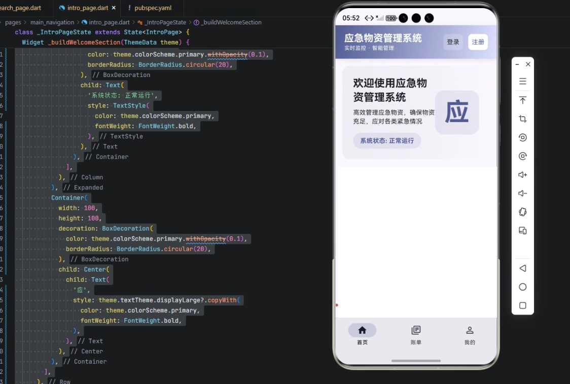
开发核心代码:欢迎区域实现
下面是核心代码(Flutter Widget)及详细解析。
Widget _buildWelcomeSection(ThemeData theme) {
return Container(
padding: const EdgeInsets.all(24),
decoration: BoxDecoration(
gradient: LinearGradient(
begin: Alignment.centerLeft,
end: Alignment.centerRight,
colors: [
theme.colorScheme.surfaceVariant.withOpacity(0.5),
theme.colorScheme.surface.withOpacity(0.8),
],
),
borderRadius: BorderRadius.circular(16),
),
child: Row(
children: [
Expanded(
child: Column(
crossAxisAlignment: CrossAxisAlignment.start,
children: [
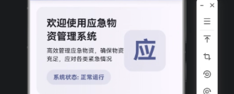
Text(
'欢迎使用应急物资管理系统',
style: theme.textTheme.headlineSmall?.copyWith(
fontWeight: FontWeight.bold,
),
),
const SizedBox(height: 8),
Text(
'高效管理应急物资,确保物资充足,应对各类紧急情况',
style: theme.textTheme.bodyMedium,
),
const SizedBox(height: 16),
Container(
padding: const EdgeInsets.symmetric(horizontal: 16, vertical: 8),
decoration: BoxDecoration(
color: theme.colorScheme.primary.withOpacity(0.1),
borderRadius: BorderRadius.circular(20),
),
child: Text(
'系统状态: 正常运行',
style: TextStyle(
color: theme.colorScheme.primary,
fontWeight: FontWeight.bold,
),
),
),
],
),
),
Container(
width: 100,
height: 100,
decoration: BoxDecoration(
color: theme.colorScheme.primary.withOpacity(0.1),
borderRadius: BorderRadius.circular(20),
),
child: Center(
child: Text(
'应',
style: theme.textTheme.displayLarge?.copyWith(
color: theme.colorScheme.primary,
fontWeight: FontWeight.bold,
),
),
),
),
],
),
);
}
逐行解析
- 函数声明与参数
Widget _buildWelcomeSection(ThemeData theme)
- 创建一个返回 Widget 的私有函数
_buildWelcomeSection。 theme用于统一获取当前应用的主题颜色、字体和风格。
- Container 外层容器
return Container(
  padding: const EdgeInsets.all(24),
  decoration: BoxDecoration(
    gradient: LinearGradient(
      begin: Alignment.centerLeft,
      end: Alignment.centerRight,
      colors: [
        theme.colorScheme.surfaceVariant.withOpacity(0.5),
        theme.colorScheme.surface.withOpacity(0.8),
      ],
    ),
    borderRadius: BorderRadius.circular(16),
  ),
- padding:容器内间距为 24,保证文字与边缘有呼吸感。
- BoxDecoration:支持渐变背景和圆角。
- LinearGradient:从左到右渐变,使用主题色
surfaceVariant和surface并调整透明度,使视觉柔和。 - borderRadius:圆角 16 像素,现代 UI 风格。
- 布局 Row
child: Row(
  children: [
- 水平布局,左侧文字区域,右侧标识区域。
- 左侧文字区域
Expanded(
  child: Column(
    crossAxisAlignment: CrossAxisAlignment.start,
    children: [
- Expanded:自动占满剩余空间。
- Column:垂直布局标题、描述、状态信息。
- crossAxisAlignment:左对齐。
- 标题文字
Text(
  '欢迎使用应急物资管理系统',
  style: theme.textTheme.headlineSmall?.copyWith(
    fontWeight: FontWeight.bold,
  ),
),
- 使用主题字体
headlineSmall,加粗强调。
- 描述文字
const SizedBox(height: 8),
Text(
  '高效管理应急物资,确保物资充足,应对各类紧急情况',
  style: theme.textTheme.bodyMedium,
),
- SizedBox:增加文字间距。
- 描述文字使用主题
bodyMedium。
- 系统状态显示
const SizedBox(height: 16),
Container(
  padding: const EdgeInsets.symmetric(horizontal: 16, vertical: 8),
  decoration: BoxDecoration(
    color: theme.colorScheme.primary.withOpacity(0.1),
    borderRadius: BorderRadius.circular(20),
  ),
  child: Text(
    '系统状态: 正常运行',
    style: TextStyle(
      color: theme.colorScheme.primary,
      fontWeight: FontWeight.bold,
    ),
  ),
),
- 小卡片式展示系统状态。
- 背景使用主色轻透明,圆角 20 像素。
- 文本颜色与主题主色一致,突出状态信息。
- 右侧标识区域
Container(
  width: 100,
  height: 100,
  decoration: BoxDecoration(
    color: theme.colorScheme.primary.withOpacity(0.1),
    borderRadius: BorderRadius.circular(20),
  ),
  child: Center(
    child: Text(
      '应',
      style: theme.textTheme.displayLarge?.copyWith(
        color: theme.colorScheme.primary,
        fontWeight: FontWeight.bold,
      ),
    ),
  ),
),
- 固定大小 100x100,背景轻透明。
- 居中显示文字 “应”,作为应急标识,醒目且美观。
心得
- 渐变和圆角设计让界面看起来现代化且柔和,用户体验友好。
- 主题适配使得界面在不同设备上颜色一致,跨端体验统一。
- 组件化布局(Row + Column + Expanded)方便扩展,如增加快捷入口、通知信息等。
- 小卡片式信息提示直观展示系统状态,可扩展为库存状态、紧急预警等。
总结
本文展示了如何基于 Flutter × OpenHarmony 构建应急物资管理系统的欢迎区域,并对代码进行了逐行解析。通过渐变、圆角、主题色和组件化布局,欢迎区域不仅美观,还兼具信息传达功能。该模式可扩展至整个系统界面开发,保证跨端一致性和良好的用户体验。
欢迎加入开源鸿蒙跨平台社区:https://openharmonycrossplatform.csdn.net

开源鸿蒙跨平台开发社区汇聚开发者与厂商,共建“一次开发,多端部署”的开源生态,致力于降低跨端开发门槛,推动万物智联创新。
更多推荐

 12
12 0
0- 0


 已为社区贡献2条内容

所有评论(0)