Flutter for OpenHarmony 实战之基础组件:第二篇 Row 与 Column 弹性布局详解
线性布局是 UI 开发中最基础的布局模型。本文深入剖析 Flutter 中的 Row(水平布局)和 Column(垂直布局)组件,详解主轴与交叉轴概念、Flex 弹性布局机制,并结合 OpenHarmony 折叠屏特性,演示如何实现动态响应式布局。
Flutter for OpenHarmony 实战之基础组件:第二篇 Row 与 Column 弹性布局详解
前言
在 Flutter for OpenHarmony 开发中,90% 的页面布局都是通过 Row(水平排列)和 Column(垂直排列)组合实现的。它们继承自 Flex 组件,拥有强大的弹性布局能力。
本文你将学到:
- 彻底搞懂 MainAxis(主轴)与 CrossAxis(交叉轴)
- Expanded、Flexible 与 Spacer 的区别与应用
- 解决
RenderFlex overflowed溢出警告 - 复杂列表项(List Item)的布局实战
- 鸿蒙折叠屏设备上的横竖排动态切换
一、核心概念:主轴与交叉轴
理解 Row和 Column 的关键在于分清主轴 (Main Axis) 和 交叉轴 (Cross Axis)。
1.1 轴向图解
| 组件 | 主轴 (Main Axis) | 交叉轴 (Cross Axis) |
|---|---|---|
| Row | 水平方向 (Horizontal) → | 垂直方向 (Vertical) ↓ |
| Column | 垂直方向 (Vertical) ↓ | 水平方向 (Horizontal) → |
// Row 的轴向示意
Row(
  // 主轴方向:水平(默认从左到右)
  direction: Axis.horizontal,

  // 主轴对齐:决定子组件在水平方向如何分布
  mainAxisAlignment: MainAxisAlignment.start,

  // 交叉轴对齐:决定子组件在垂直方向如何对齐
  crossAxisAlignment: CrossAxisAlignment.center,

  children: [...],
)
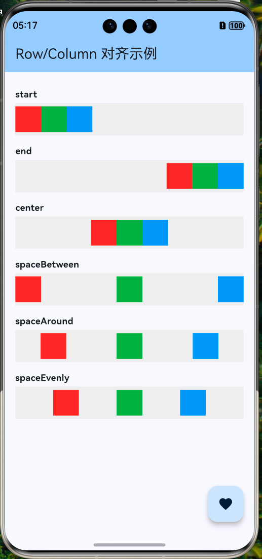
1.2 主轴对齐方式 (MainAxisAlignment)
main.dart
import 'package:flutter/material.dart';
import 'widgets/main_axis_demo.dart';

/// 应用入口函数
void main() {
  // 运行 Flutter 应用
  runApp(const MyApp());
}

/// 根 Widget - 应用程序的顶层组件
class MyApp extends StatelessWidget {
  const MyApp({super.key});

  @override
  Widget build(BuildContext context) {
    return MaterialApp(
      title: 'Flutter for OpenHarmony',  // 应用标题
      debugShowCheckedModeBanner: false, // 隐藏调试标签
      theme: ThemeData(
        // 主题配置
        colorScheme: ColorScheme.fromSeed(seedColor: Colors.blue),
        useMaterial3: true, // 使用 Material 3 设计
      ),
      home: const HomePage(), // 首页
    );
  }
}

/// 首页 Widget
class HomePage extends StatelessWidget {
  const HomePage({super.key});

  @override
  Widget build(BuildContext context) {
    return Scaffold(
      // 应用栏
      appBar: AppBar(
        title: const Text('Row/Column 对齐示例'),
        backgroundColor: Theme.of(context).colorScheme.inversePrimary,
      ),
      // 页面主体
      body: const SingleChildScrollView(
        child: Padding(
          padding: EdgeInsets.symmetric(vertical: 20),
          child: MainAxisDemo(),
        ),
      ),
      // 悬浮按钮
      floatingActionButton: FloatingActionButton(
        onPressed: () {
          // 显示提示
          ScaffoldMessenger.of(context).showSnackBar(
            const SnackBar(content: Text('Flutter + OpenHarmony = ❤️')),
          );
        },
        child: const Icon(Icons.favorite),
      ),
    );
  }
}
控制子组件在主轴方向上的分布逻辑:
my_first_app/lib/widgets/main_axis_demo.dart
/// 主轴对齐示例
class MainAxisDemo extends StatelessWidget {
const MainAxisDemo({super.key});
Widget build(BuildContext context) {
return Column(
children: [
// start: 靠头对齐 (默认)
_buildRow(MainAxisAlignment.start, 'start'),
// end: 靠尾对齐
_buildRow(MainAxisAlignment.end, 'end'),
// center: 居中对齐
_buildRow(MainAxisAlignment.center, 'center'),
// spaceBetween: 两端对齐,中间间距相等
_buildRow(MainAxisAlignment.spaceBetween, 'spaceBetween'),
// spaceAround: 每个元素两侧间距相等 (首尾间距是中间的一半)
_buildRow(MainAxisAlignment.spaceAround, 'spaceAround'),
// spaceEvenly: 所有间距完全相等
_buildRow(MainAxisAlignment.spaceEvenly, 'spaceEvenly'),
],
);
}
Widget _buildRow(MainAxisAlignment align, String label) {
return Container(
color: Colors.grey[200],
height: 50,
margin: const EdgeInsets.only(bottom: 10),
child: Row(
mainAxisAlignment: align,
children: [
_buildBox(Colors.red),
_buildBox(Colors.green),
_buildBox(Colors.blue),
],
),
);
}
Widget _buildBox(Color color) => Container(width: 40, height: 40, color: color);
}
1.3 交叉轴对齐方式 (CrossAxisAlignment)
控制子组件在交叉轴方向上的对齐逻辑:
- start: 顶部对齐(Row)/ 左侧对齐(Column)
- end: 底部对齐(Row)/ 右侧对齐(Column)
- center: 居中对齐(默认)
- stretch: 拉伸填满(需要约束条件允许)
- baseline: 基线对齐(仅用于 Text 文本对齐)
⚠️ 注意:使用 CrossAxisAlignment.stretch 时,如果是 Row,子组件高度会被强制拉伸到最大;如果是 Column,子组件宽度会被拉伸。
二、弹性布局详解
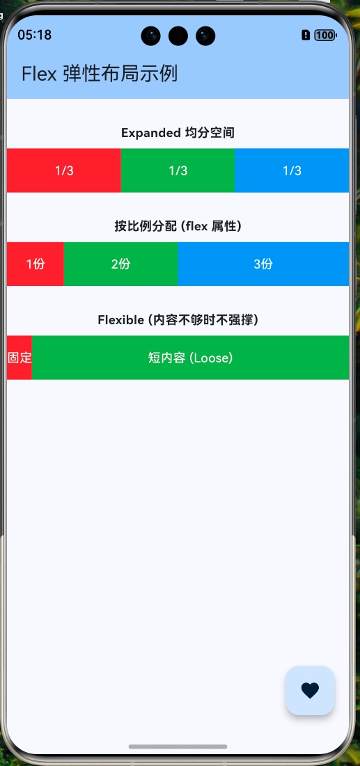
在 Android 开发中我们常用 weight 权重,在 Flutter 中对应的就是 Expanded 和 Flexible。
2.1 Expanded vs Flexible
| 组件 | 特性 | 空间占用 |
|---|---|---|
| Expanded | 强制填满剩余空间 | fit: FlexFit.tight |
| Flexible | 允许填满,但也允许更小 | fit: FlexFit.loose (默认) |
my_first_app/lib/widgets/flex_demo.dart
/// 弹性布局对比示例
class FlexDemo extends StatelessWidget {
const FlexDemo({super.key});
Widget build(BuildContext context) {
return Column(
children: [
// 场景一:Expanded 均分空间
Row(
children: [
Expanded(child: _buildBox(Colors.red, '1/3')),
Expanded(child: _buildBox(Colors.green, '1/3')),
Expanded(child: _buildBox(Colors.blue, '1/3')),
],
),
const SizedBox(height: 20),
// 场景二:按比例分配 (flex 属性)
Row(
children: [
Expanded(
flex: 1,
child: _buildBox(Colors.red, '1份'),
),
Expanded(
flex: 2,
child: _buildBox(Colors.green, '2份'),
),
Expanded(
flex: 3,
child: _buildBox(Colors.blue, '3份'),
),
],
),
const SizedBox(height: 20),
// 场景三:Flexible (内容不够时不强撑)
Row(
children: [
_buildBox(Colors.red, '固定'),
Flexible(
fit: FlexFit.loose,
child: Container(
color: Colors.green,
height: 50,
// 虽然是 Flexible,但内容只有这么短,不会占满剩余空间
child: const Text('短内容'),
),
),
],
),
],
);
}
Widget _buildBox(Color color, String text) {
return Container(
height: 50,
color: color,
alignment: Alignment.center,
child: Text(text, style: const TextStyle(color: Colors.white)),
);
}
}
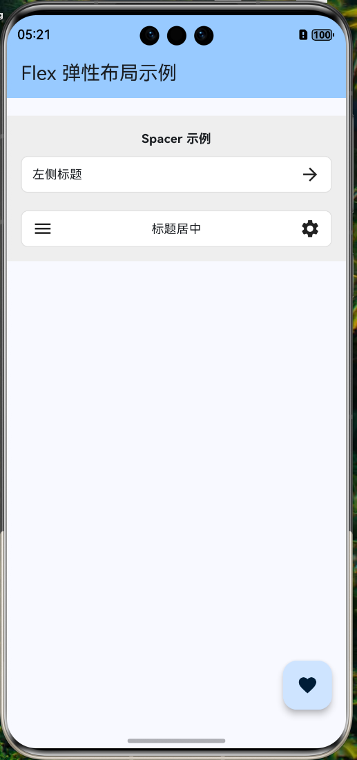
2.2 Spacer 占位组件
Spacer 本质上是一个 Expanded(child: SizedBox.shrink()),专门用于撑开空间。
my_first_app/lib/widgets/spacer_demo.dart
import 'package:flutter/material.dart';
/// Spacer 组件示例
class SpacerDemo extends StatelessWidget {
const SpacerDemo({super.key});
Widget build(BuildContext context) {
return Container(
padding: const EdgeInsets.all(16),
color: Colors.grey[200],
child: Column(
children: [
const Text('Spacer 示例', style: TextStyle(fontWeight: FontWeight.bold)),
const SizedBox(height: 10),
// 示例 1: 基本用法
Container(
padding: const EdgeInsets.symmetric(horizontal: 12, vertical: 8),
decoration: BoxDecoration(
color: Colors.white,
borderRadius: BorderRadius.circular(8),
border: Border.all(color: Colors.grey.shade300),
),
child: const Row(
children: [
Text('左侧标题'),
Spacer(), // 自动撑满中间所有空隙
Icon(Icons.arrow_forward),
],
),
),
const SizedBox(height: 20),
// 示例 2: 多个 Spacer 和 flex 比例
Container(
padding: const EdgeInsets.symmetric(horizontal: 12, vertical: 8),
decoration: BoxDecoration(
color: Colors.white,
borderRadius: BorderRadius.circular(8),
border: Border.all(color: Colors.grey.shade300),
),
child: const Row(
children: [
Icon(Icons.menu),
Spacer(flex: 1), // 占 1 份空隙
Text('标题居中'),
Spacer(flex: 1), // 占 1 份空隙,实现视觉居中
Icon(Icons.settings),
],
),
),
],
),
);
}
}
三、常见问题与解决方案
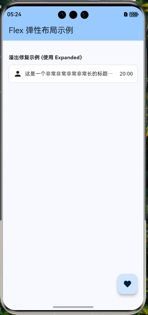
3.1 溢出警告 (Yellow/Black Striped Banner)
这是新手最常遇到的错误:A RenderFlex overflowed by ... pixels。
原因:子组件的总尺寸超过了父容器的主轴尺寸。
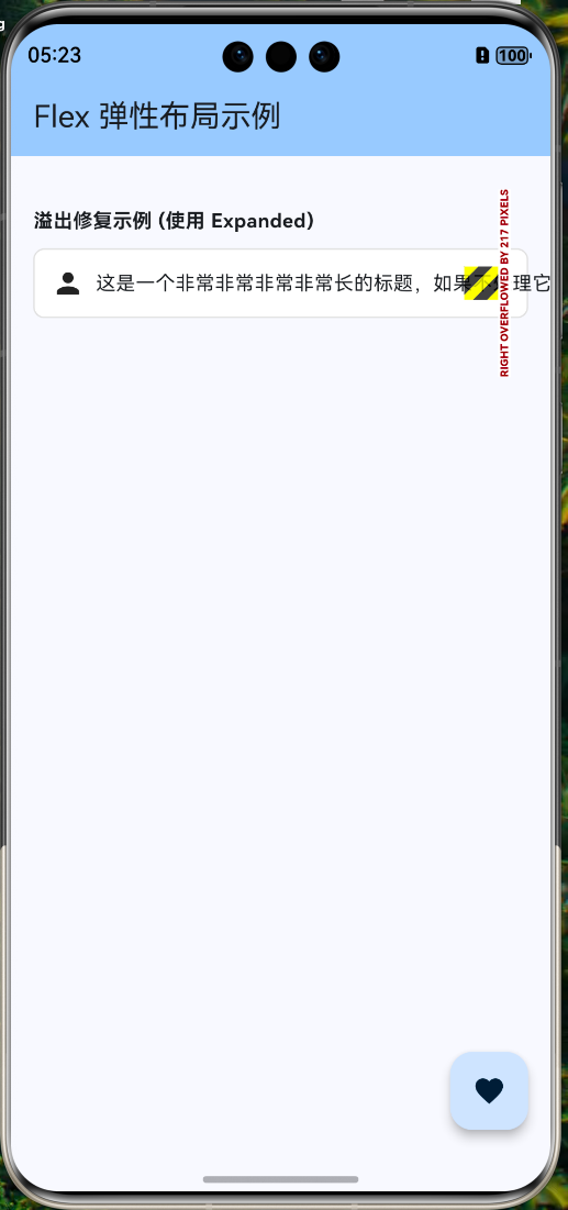
解决方案:
- 使用 Expanded/Flexible:让超出部分自动缩放。
- 使用 ScrollView:如果确实需要滚动,包裹
SingleChildScrollView。 - 截断文本:对于 Text,设置
overflow: TextOverflow.ellipsis。
my_first_app/lib/widgets/overflow_fix_demo.dart
import 'package:flutter/material.dart';
/// 溢出修复示例
class OverflowFixDemo extends StatelessWidget {
const OverflowFixDemo({super.key});
Widget build(BuildContext context) {
return Container(
padding: const EdgeInsets.all(16),
child: Column(
crossAxisAlignment: CrossAxisAlignment.start,
children: [
const Text('溢出修复示例 (使用 Expanded)', style: TextStyle(fontWeight: FontWeight.bold)),
const SizedBox(height: 10),
Container(
padding: const EdgeInsets.all(12),
decoration: BoxDecoration(
color: Colors.white,
border: Border.all(color: Colors.grey.shade300),
borderRadius: BorderRadius.circular(8),
),
child: Row(
children: [
const Icon(Icons.person),
const SizedBox(width: 8),
// const Text(
// '这是一个非常非常非常非常长的标题,如果不处理它就会导致布局溢出警告',
// ),
// ✅ 修复:使用 Expanded 包裹长文本
Expanded(
child: const Text(
'这是一个非常非常非常非常长的标题,如果不处理它就会导致布局溢出警告',
maxLines: 1,
overflow: TextOverflow.ellipsis, // 超出显示省略号
),
),
const SizedBox(width: 8),
const Text('20:00'),
],
),
),
],
),
);
}
}
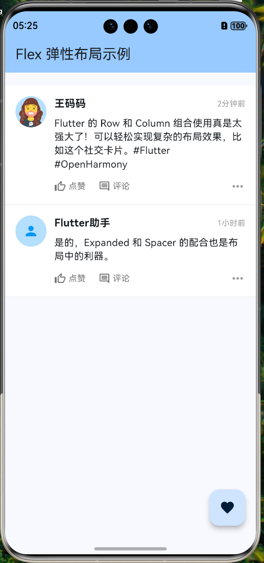
四、OpenHarmony 实战:复杂列表卡片
我们要实现一个类似微信朋友圈或电商订单的复杂卡片布局。
4.1 布局分析
[Row]
 ├── [Image] (左侧头像)
 └── [Column] (右侧内容区域)
      ├── [Row] (顶部:昵称 + 时间)
      ├── [Text] (中部:正文内容)
      └── [Row] (底部:操作按钮)
4.2 代码实现
my_first_app/lib/widgets/social_post_card.dart
import 'package:flutter/material.dart';
/// 社交动态卡片组件
class SocialPostCard extends StatelessWidget {
final String avatar;
final String name;
final String time;
final String content;
const SocialPostCard({
super.key,
required this.avatar,
required this.name,
required this.time,
required this.content,
});
Widget build(BuildContext context) {
return Container(
padding: const EdgeInsets.all(16),
decoration: BoxDecoration(
color: Colors.white,
border: Border(bottom: BorderSide(color: Colors.grey[200]!)),
),
child: Row(
crossAxisAlignment: CrossAxisAlignment.start, // ❗重点:顶端对齐
children: [
// 1. 左侧头像
CircleAvatar(
radius: 24,
backgroundImage: NetworkImage(avatar),
backgroundColor: Colors.blue[100],
),
const SizedBox(width: 12),
// 2. 右侧内容区 (占据剩余宽度)
Expanded(
child: Column(
crossAxisAlignment: CrossAxisAlignment.start, // ❗重点:左对齐
children: [
// 2.1 顶部栏:昵称 + 时间
Row(
mainAxisAlignment: MainAxisAlignment.spaceBetween,
children: [
Text(
name,
style: const TextStyle(
fontSize: 16,
fontWeight: FontWeight.bold,
),
),
Text(
time,
style: TextStyle(
fontSize: 12,
color: Colors.grey[500],
),
),
],
),
const SizedBox(height: 8),
// 2.2 正文内容
Text(
content,
style: const TextStyle(fontSize: 15, height: 1.4),
),
const SizedBox(height: 12),
// 2.3 底部操作栏
Row(
children: [
_buildActionButton(Icons.thumb_up_outlined, '点赞'),
const SizedBox(width: 20),
_buildActionButton(Icons.comment_outlined, '评论'),
const Spacer(), // 撑开空间
const Icon(Icons.more_horiz, color: Colors.grey),
],
),
],
),
),
],
),
);
}
Widget _buildActionButton(IconData icon, String label) {
return Row(
children: [
Icon(icon, size: 18, color: Colors.grey[600]),
const SizedBox(width: 4),
Text(
label,
style: TextStyle(fontSize: 13, color: Colors.grey[600]),
),
],
);
}
}
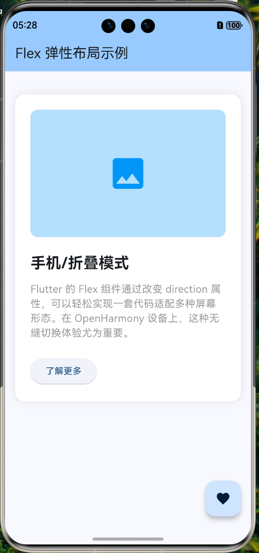
五、鸿蒙特色:折叠屏动态布局
OpenHarmony 的一大特色是多设备协同与折叠屏支持。我们需要利用 Flex 实现更智能的响应式布局。
5.1 需求场景
- 折叠态 (手机模式):垂直排列 (Column)
- 展开态 (平板模式):水平排列 (Row)
5.2 Flex 动态切换
不要写两个 Widget,而是使用 Flex 组件并通过 direction 属性动态控制。
my_first_app/lib/widgets/responsive_flex_layout.dart
/// 响应式 Flex 布局
class ResponsiveFlexLayout extends StatelessWidget {
const ResponsiveFlexLayout({super.key});
Widget build(BuildContext context) {
// 获取屏幕宽度
final width = MediaQuery.of(context).size.width;
// 阈值设为 600 (通常平板/展开态 > 600)
final isWideScreen = width > 600;
return Center(
child: Container(
margin: const EdgeInsets.all(16),
padding: const EdgeInsets.all(24),
decoration: BoxDecoration(
color: Colors.white,
borderRadius: BorderRadius.circular(16),
boxShadow: [
BoxShadow(
color: Colors.black.withOpacity(0.1),
blurRadius: 10,
)
],
),
// 核心逻辑:宽屏用 Row,窄屏用 Column
child: Flex(
direction: isWideScreen ? Axis.horizontal : Axis.vertical,
mainAxisSize: MainAxisSize.min,
children: [
// 图片区域
Container(
width: isWideScreen ? 200 : double.infinity,
height: 200,
decoration: BoxDecoration(
color: Colors.blue[100],
borderRadius: BorderRadius.circular(12),
),
child: const Icon(Icons.image, size: 64, color: Colors.blue),
),
SizedBox(
width: isWideScreen ? 24 : 0,
height: isWideScreen ? 0 : 24,
),
// 文本区域
Flexible(
child: Column(
crossAxisAlignment: CrossAxisAlignment.start,
mainAxisSize: MainAxisSize.min,
children: [
Text(
isWideScreen ? '平板/展开模式' : '手机/折叠模式',
style: const TextStyle(
fontSize: 24,
fontWeight: FontWeight.bold,
),
),
const SizedBox(height: 12),
const Text(
'Flutter 的 Flex 组件通过改变 direction 属性,可以轻松实现一套代码适配多种屏幕形态。在 OpenHarmony 设备上,这种无缝切换体验尤为重要。',
style: TextStyle(fontSize: 16, color: Colors.grey),
),
const SizedBox(height: 24),
ElevatedButton(
onPressed: () {},
child: const Text('了解更多'),
),
],
),
),
],
),
),
);
}
}
六、总结与预告
6.1 核心知识点图谱
- 布局基础:Row(水平)、Column(垂直)、Flex(通用)
- 轴向概念:Direction 决定主轴,垂直方向为交叉轴
- 弹性控制:
Expanded:霸道总裁,强占剩余空间Flexible:温柔绅士,给多少用多少,不强占Spacer:透明占位符,撑开间距
- 溢出处理:遇事不决 Expanded/SingleChildScrollView
6.2 下一步学习
掌握了线性布局后,如果我们需要元素重叠显示(比如图片上的标签,或者视频封面的播放按钮)该怎么办?
下一篇预告:
《Flutter for OpenHarmony 实战之基础组件:第三篇 Stack 层叠布局详解》
我们将深入 Stack 和 Positioned 组件,解锁更自由的 UI 布局能力。
📦 完整代码已上传至 AtomGit:open-harmony-example (分支: basic/2-row-column)
🌐 欢迎加入开源鸿蒙跨平台社区:开源鸿蒙跨平台开发者社区

开源鸿蒙跨平台开发社区汇聚开发者与厂商,共建“一次开发,多端部署”的开源生态,致力于降低跨端开发门槛,推动万物智联创新。
更多推荐

 16
16 0
0- 0


 已为社区贡献4条内容

所有评论(0)