Flutter for OpenHarmony 实战:图片轮播(Carousel)组件的实现
是Google开发的开源UI工具包,支持用一套代码构建和六大平台应用,实现"一次编写,多处运行"。是由开放原子开源基金会运营的分布式操作系统,为全场景智能设备提供统一底座,具有多设备支持、模块化设计、分布式能力和开源开放等特性。
欢迎加入开源鸿蒙跨平台社区: https://openharmonycrossplatform.csdn.net
前言
Flutter是Google开发的开源UI工具包,支持用一套代码构建iOS、Android、Web、Windows、macOS和Linux六大平台应用,实现"一次编写,多处运行"。
OpenHarmony是由开放原子开源基金会运营的分布式操作系统,为全场景智能设备提供统一底座,具有多设备支持、模块化设计、分布式能力和开源开放等特性。
Flutter for OpenHarmony技术方案使开发者能够:
- 复用Flutter现有代码(Skia渲染引擎、热重载、丰富组件库)
- 快速构建符合OpenHarmony规范的UI
- 降低多端开发成本
- 利用Dart生态插件资源加速生态建设
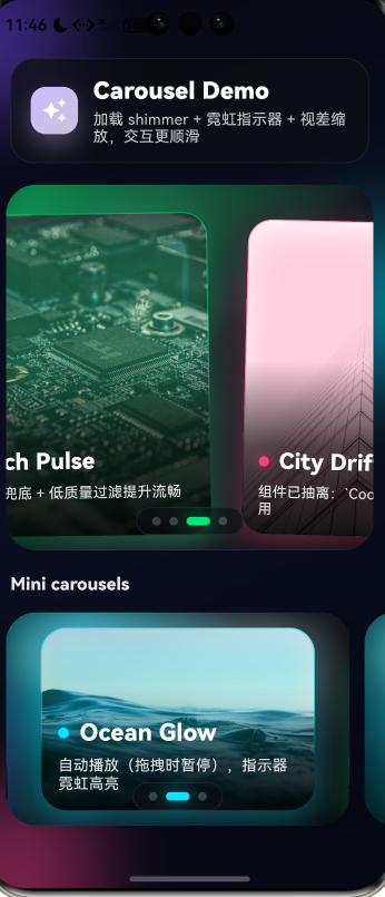
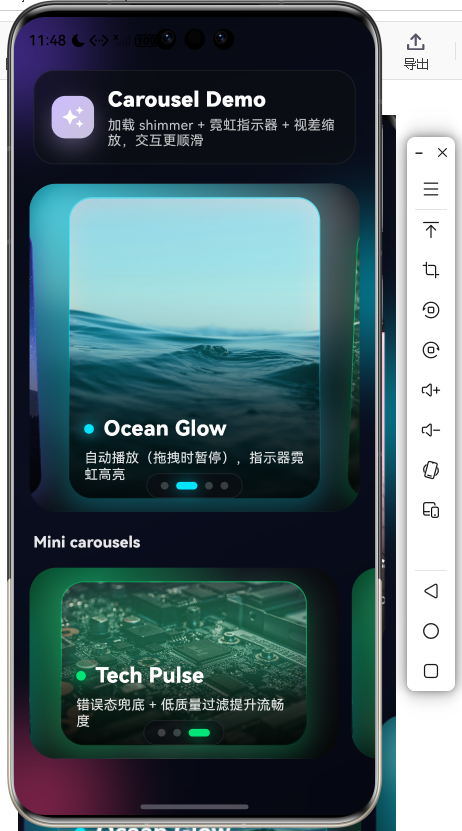
先看效果
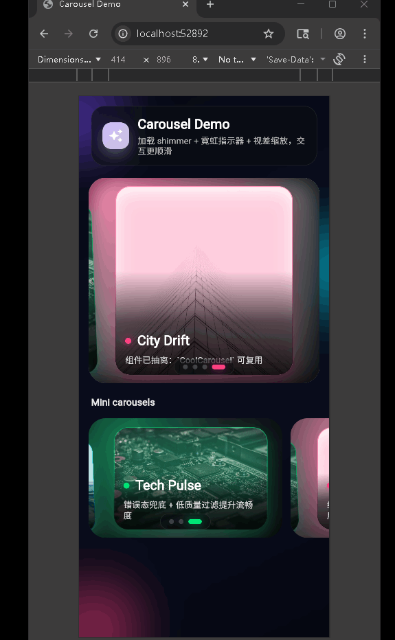
在鸿蒙真机 上模拟器上成功运行后的效果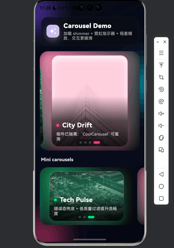
主要完成**轮播图(Carousel)**相关的结构、组件与用法。实现了带视差缩放、自动播放、霓虹指示器和 Shimmer 加载效果的轮播组件,并支持在页面中复用多个轮播实例。熟练掌握 Flutter 中 PageView 的使用、动画与手势配合、网络图片加载与占位、以及组件抽离与复用。
📋 目录
项目结构说明
应用入口
轮播演示页 (CarouselDemoPage)
CoolCarousel 组件
Shimmer 组件
使用示例
项目结构说明
文件目录结构
lib/
├── main.dart                    # 应用入口
├── app/
│   └── app.dart                 # 根组件 DemoApp(主题、路由等)
├── pages/
│   └── carousel_demo_page.dart  # 轮播演示页
└── widgets/
    ├── cool_carousel.dart       # 轮播组件
    └── shimmer.dart             # 骨架屏/加载闪烁效果
入口与页面
- main.dart:
runApp(MyApp()),MyApp仅负责挂载DemoApp。 - app/app.dart:定义
DemoApp,配置主题、首页等,当前首页为轮播演示。 - pages/carousel_demo_page.dart:轮播演示页,包含一个大轮播 + 底部多个「Mini 轮播」横向列表。
组件与数据流
- 演示页内置
CarouselSlide列表(图片 URL、标题、副标题、强调色)。 - 数据传入
CoolCarousel,内部用PageController+PageView.builder实现滑动与索引。 - 图片未加载完成时由
ShimmerBox占位;加载失败显示错误态。 - 当前页变化驱动背景模糊图、指示器高亮和卡片视差效果。
应用入口
1. main.dart
import 'package:flutter/material.dart';
import 'app/app.dart';
void main() {
runApp(const MyApp());
}
class MyApp extends StatelessWidget {
const MyApp({super.key});
Widget build(BuildContext context) {
return const DemoApp();
}
}
入口只负责挂载应用,具体主题和首页由 DemoApp 决定。
2. DemoApp(app/app.dart)
(此处根据你实际 app/app.dart 内容补充:例如 MaterialApp、theme、home: CarouselDemoPage() 等。若尚未有该文件,可写「当前由 main 直接指定首页为轮播演示页」。)
轮播演示页 (CarouselDemoPage)
1. 页面结构
return Scaffold(
  backgroundColor: const Color(0xFF070912),
  body: Stack(
    children: [
      const _AmbientBackground(),   // 渐变 + 光斑背景
      SafeArea(
        child: CustomScrollView(
          slivers: [
            SliverToBoxAdapter(child: _Header(...)),
            SliverToBoxAdapter(child: CoolCarousel(...)),  // 主轮播
            SliverToBoxAdapter(child: Text('Mini carousels')),
            SliverToBoxAdapter(child: ListView.separated(...)),  // 横向多个小轮播
          ],
        ),
      ),
    ],
  ),
);
底层为环境背景,上层为可滚动内容:标题区、主轮播、Mini 轮播列表。
2. 轮播数据与主轮播
List<CarouselSlide> _slides() => const [
  CarouselSlide(
    imageUrl: 'https://...',
    title: 'Neon Night',
    subtitle: '超快响应 + 视差缩放动效 + 加载 shimmer',
    accent: Color(0xFF7C4DFF),
  ),
  // ...
];

// 主轮播
CoolCarousel(
  slides: slides,
  height: 340,
  onTapSlide: (i) {
    ScaffoldMessenger.of(context).showSnackBar(
      SnackBar(content: Text('点击了:${slides[i].title}'), ...),
    );
  },
)
CarouselSlide 提供图片、标题、副标题和强调色;主轮播高度 340,并支持点击回调。
3. Mini 轮播列表
SizedBox(
  height: 230,
  child: ListView.separated(
    scrollDirection: Axis.horizontal,
    itemCount: 3,
    separatorBuilder: (_, __) => const SizedBox(width: 14),
    itemBuilder: (context, idx) {
      final subset = [
        slides[idx],
        slides[(idx + 1) % slides.length],
        slides[(idx + 2) % slides.length],
      ];
      return SizedBox(
        width: 320,
        child: CoolCarousel(
          slides: subset,
          height: 220,
          viewportFraction: 0.86,
          autoPlayInterval: const Duration(seconds: 3),
        ),
      );
    },
  ),
)
横向 ListView 中每个 item 是一个窄版 CoolCarousel,不同 viewportFraction 和 autoPlayInterval 体现组件可配置复用。
4. 头部与背景
- _Header:毛玻璃容器(
BackdropFilter)+ 图标 + 标题/副标题。 - _AmbientBackground:深色渐变 + 多个
_GlowBlob光斑 + 整体模糊,形成环境光效果。
CoolCarousel 组件
1. CarouselSlide 与参数
class CarouselSlide {
const CarouselSlide({
required this.imageUrl,
required this.title,
required this.subtitle,
required this.accent,
});
final String imageUrl;
final String title;
final String subtitle;
final Color accent;
}
// 组件参数
CoolCarousel({
required this.slides,
this.height = 320,
this.viewportFraction = 0.82, // 每页可见比例
this.autoPlay = true,
this.autoPlayInterval = const Duration(seconds: 4),
this.onTapSlide,
});
viewportFraction 小于 1 时可露出左右相邻页,形成「卡片轮播」效果。
2. 状态与自动播放
late final PageController _controller = PageController(
  viewportFraction: widget.viewportFraction,
);
final ValueNotifier<int> _index = ValueNotifier<int>(0);
Timer? _timer;
bool _isUserDragging = false;

void _startAutoPlay() {
  _timer?.cancel();
  if (!widget.autoPlay || widget.slides.length <= 1) return;
  _timer = Timer.periodic(widget.autoPlayInterval, (_) async {
    if (!mounted || _isUserDragging) return;
    final next = (current + 1) % widget.slides.length;
    await _controller.animateToPage(next, duration: ..., curve: Curves.easeOutCubic);
  });
}
- 通过
NotificationListener<ScrollNotification>在ScrollStartNotification时设_isUserDragging = true,在ScrollEndNotification时设回false,拖拽时自动播放会暂停。 _onScroll中根据_controller.page更新_index,供背景与指示器使用。
3. 视差与指示器
// 卡片视差:随 page 偏移做缩放、Y 位移、旋转
AnimatedBuilder(
  animation: _controller,
  builder: (context, child) {
    final page = _controller.page ?? _index.value.toDouble();
    final offset = (i - page);
    final abs = offset.abs().clamp(0.0, 1.0);
    final scale = lerpDouble(1.0, 0.90, abs)!;
    final dy = lerpDouble(0.0, 18.0, abs)!;
    final rotate = lerpDouble(0.0, 0.04, offset.clamp(-1, 1))!;
    return Transform.translate(
      offset: Offset(0, dy),
      child: Transform.scale(scale: scale, child: Transform.rotate(angle: rotate, child: child)),
    );
  },
  child: _SlideCard(...),
)

// 底部指示器:当前项用 accent 色 + 拉长 + 阴影
_Indicators(length: widget.slides.length, index: idx, accent: widget.slides[idx].accent)
当前页略大、略靠前,两侧页略小并带轻微旋转,形成层次感;指示器与当前 slide 的 accent 一致,带霓虹阴影。
4. 图片加载与 Shimmer
// _NetworkImageWithShimmer
Image.network(
  url,
  loadingBuilder: (context, child, loadingProgress) {
    if (loadingProgress == null) return AnimatedOpacity(..., child: child);
    return ShimmerBox(
      borderRadius: radius,
      baseColor: const Color(0xFF141826),
    );
  },
  errorBuilder: (context, _, __) => Container(..., child: Icon(Icons.broken_image_rounded)),
)
未加载完成显示 ShimmerBox;加载完成后淡入真实图片;失败显示占位与错误图标。
Shimmer 组件
1. Shimmer 与 ShimmerBox
// 滑动渐变实现闪光
class Shimmer extends StatefulWidget {
  const Shimmer({super.key, required this.child, this.period = const Duration(milliseconds: 1200)});
  final Widget child;
  final Duration period;
}
// 内部 AnimationController 重复动画,用 ShaderMask + LinearGradient + _SlidingGradientTransform 让高亮带平移

// 方便用的矩形占位
class ShimmerBox extends StatelessWidget {
  const ShimmerBox({super.key, required this.borderRadius, this.baseColor = const Color(0xFF1F2230), this.height, this.width});
  final BorderRadius borderRadius;
  final Color baseColor;
  final double? height;
  final double? width;
  // build: Shimmer(child: Container(decoration: BoxDecoration(color: baseColor, borderRadius: borderRadius)))
}
Shimmer 提供通用闪烁效果,ShimmerBox 用于轮播图等区域的矩形占位。
使用示例
final slides = [
  const CarouselSlide(
    imageUrl: 'https://example.com/1.jpg',
    title: '标题',
    subtitle: '副标题',
    accent: Color(0xFF6366F1),
  ),
];

CoolCarousel(
  slides: slides,
  height: 300,
  viewportFraction: 0.85,
  autoPlay: true,
  autoPlayInterval: const Duration(seconds: 5),
  onTapSlide: (index) => print('tap $index'),
)
按需传入 slides、高度、可见比例、自动播放间隔和点击回调即可在任意页面复用轮播。
总结
- 入口:
main.dart→MyApp→DemoApp,当前首页为轮播演示页。 - 演示页:主轮播 + 横向多个 Mini 轮播,搭配毛玻璃头部和渐变光斑背景。
- CoolCarousel:
PageView+ 视差缩放/旋转、自动播放(拖拽暂停)、霓虹指示器、网络图 + Shimmer 占位与错误态。 - Shimmer:通用闪烁动画与
ShimmerBox占位,无第三方依赖。
如需扩展,可在此基础上增加更多 CarouselSlide 数据源、不同 viewportFraction/height 的轮播变体,或替换为本地资源图。
欢迎加入开源鸿蒙跨平台社区: https://openharmonycrossplatform.csdn.net

开源鸿蒙跨平台开发社区汇聚开发者与厂商,共建“一次开发,多端部署”的开源生态,致力于降低跨端开发门槛,推动万物智联创新。
更多推荐

 11
11 0
0- 0


 已为社区贡献22条内容

所有评论(0)