构建高校四六级报名管理系统:基于 Flutter × OpenHarmony 的快速入口与信息项设计实践
本文介绍了基于Flutter×OpenHarmony的高校四六级报名管理系统开发实践。针对传统Web平台操作繁琐、跨端适配困难等问题,系统采用移动端设计,提供快速入口和信息项展示功能。通过Flutter实现跨端支持,可部署于Android、iOS和OpenHarmony设备。文章详细解析了快速入口和报名流程卡片的核心代码实现,包括网格布局、主题适配和状态显示等关键技术点。该方案有效提升了用户体验,
文章目录
构建高校四六级报名管理系统:基于 Flutter × OpenHarmony 的快速入口与信息项设计实践
前言
随着高校信息化的不断推进,四六级考试报名系统也逐渐从传统纸质或单一 Web 平台迁移到移动端应用。学生希望能够随时随地完成报名、查看成绩及准考证信息,而高校管理者则希望系统操作直观、维护简单、可跨平台部署。
本文将分享基于 Flutter × OpenHarmony 的跨端开发实践,重点展示 快速入口与信息项设计 的实现方法与代码解析。通过这一案例,你可以学习到如何使用 Flutter 构建高可复用的 UI 组件,并兼顾 OpenHarmony 的跨端兼容性。
背景
传统高校四六级报名系统多依赖于 Web 平台或高校内部系统,存在以下问题:
- 操作流程繁琐:学生需要在多个页面之间跳转,完成报名、缴费、准考证打印等操作。
- 跨端适配困难:不同操作系统、设备尺寸差异导致维护成本高。
- 用户体验不足:缺乏快速入口和可视化流程展示,学生难以直观掌握报名状态。
为了解决这些问题,我们设计了一个 移动端报名管理系统,核心特点包括:
- 快速入口:一屏展示最常用功能入口,减少操作步骤。
- 信息项展示:清晰呈现报名流程与状态,让用户直观了解进度。
- 跨端支持:使用 Flutter 开发,可部署在 Android、iOS、OpenHarmony 设备,实现统一维护。
Flutter × OpenHarmony 跨端开发介绍
Flutter 是 Google 推出的 UI 框架,特点是一次开发,多端运行。它通过 Dart 语言和 Widget 树 构建 UI,提供丰富的组件和动画支持。
OpenHarmony 是华为主导的开源分布式操作系统,支持多设备互联和分布式应用。结合 Flutter:
- 可以通过 HarmonyOS 插件或 OpenHarmony SDK 调用系统能力,如文件管理、摄像头、通知。
- UI 和业务逻辑可以共享,减少多端开发成本。
- 对不同屏幕尺寸、分辨率、输入方式(触控、键盘、手写)均可适配。
因此,Flutter × OpenHarmony 成为高校移动端应用开发的理想组合。
开发核心代码(详细解析)
下面将重点讲解 快速入口 和 报名流程信息项 的核心实现,并逐行解析每段代码的逻辑与设计思路。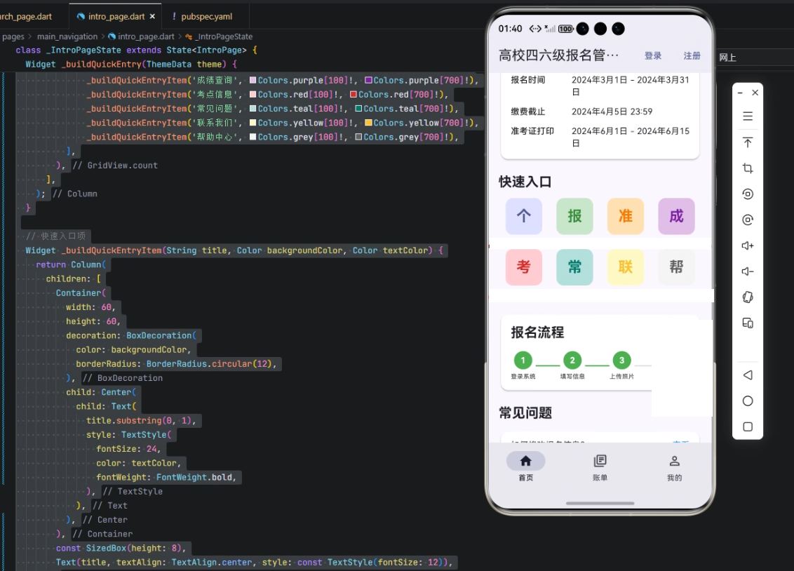
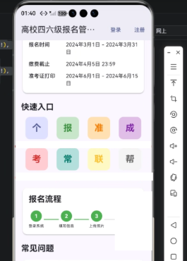
1. 快速入口
Widget _buildQuickEntry(ThemeData theme) {
  return Column(
    crossAxisAlignment: CrossAxisAlignment.start,
    children: [
      Text('快速入口', style: theme.textTheme.titleLarge?.copyWith(fontWeight: FontWeight.bold)),
      const SizedBox(height: 12),
      GridView.count(
        crossAxisCount: 4,
        shrinkWrap: true,
        physics: const NeverScrollableScrollPhysics(),
        children: [
          _buildQuickEntryItem('个人中心', theme.colorScheme.primaryContainer, theme.colorScheme.primary),
          _buildQuickEntryItem('报名记录', Colors.green[100]!, Colors.green[700]!),
          _buildQuickEntryItem('准考证', Colors.orange[100]!, Colors.orange[700]!),
          _buildQuickEntryItem('成绩查询', Colors.purple[100]!, Colors.purple[700]!),
          _buildQuickEntryItem('考点信息', Colors.red[100]!, Colors.red[700]!),
          _buildQuickEntryItem('常见问题', Colors.teal[100]!, Colors.teal[700]!),
          _buildQuickEntryItem('联系我们', Colors.yellow[100]!, Colors.yellow[700]!),
          _buildQuickEntryItem('帮助中心', Colors.grey[100]!, Colors.grey[700]!),
        ],
      ),
    ],
  );
}
解析:
-
Column 布局:用于垂直排列标题和快速入口网格。
-
Text(‘快速入口’):显示模块标题,使用
theme.textTheme.titleLarge保持主题一致,并加粗字体。 -
GridView.count:
crossAxisCount: 4→ 每行显示 4 个快速入口项。shrinkWrap: true→ 避免 GridView 占用无限空间。physics: NeverScrollableScrollPhysics()→ 禁止内部滚动,由外层父 ScrollView 控制。
-
_buildQuickEntryItem:封装每个入口按钮,复用性高,支持不同图标颜色和文本。
2. 快速入口单项
Widget _buildQuickEntryItem(String title, Color backgroundColor, Color textColor) {
  return Column(
    children: [
      Container(
        width: 60,
        height: 60,
        decoration: BoxDecoration(
          color: backgroundColor,
          borderRadius: BorderRadius.circular(12),
        ),
        child: Center(
          child: Text(
            title.substring(0, 1),
            style: TextStyle(
              fontSize: 24,
              color: textColor,
              fontWeight: FontWeight.bold,
            ),
          ),
        ),
      ),
      const SizedBox(height: 8),
      Text(title, textAlign: TextAlign.center, style: const TextStyle(fontSize: 12)),
    ],
  );
}
解析:
-
Container:固定宽高,圆角背景,用作图标区域。
-
title.substring(0, 1):取功能标题首字母作为图标,简洁直观。
-
Text 样式:
fontSize: 24→ 图标大小。color: textColor→ 颜色可自定义,便于主题区分。fontWeight: FontWeight.bold→ 突出显示。
-
下方文字:显示完整标题,12号字体,居中。
3. 报名流程卡片
Widget _buildRegistrationProcess(ThemeData theme) {
  return Card(
    elevation: 2,
    shape: RoundedRectangleBorder(
      borderRadius: BorderRadius.circular(12),
    ),
    child: Padding(
      padding: const EdgeInsets.all(16),
      child: Column(
        crossAxisAlignment: CrossAxisAlignment.start,
        children: [
          Text('报名流程', style: theme.textTheme.titleLarge?.copyWith(fontWeight: FontWeight.bold)),
          const SizedBox(height: 16),
          Row(
            mainAxisAlignment: MainAxisAlignment.spaceBetween,
            children: [
              _buildProcessStep(1, '登录系统', true),
              Container(width: 40, height: 2, color: Colors.green),
              _buildProcessStep(2, '填写信息', true),
              Container(width: 40, height: 2, color: Colors.green),
              _buildProcessStep(3, '上传照片', true),
              Container(width: 40, height: 2, color: Colors.grey[300]),
              _buildProcessStep(4, '网上缴费', false),
              Container(width: 40, height: 2, color: Colors.grey[300]),
              _buildProcessStep(5, '打印准考证', false),
            ],
          ),
        ],
      ),
    ),
  );
}
解析:
- Card:轻量卡片效果,带圆角和阴影。
- Padding:内边距 16,保持内容不贴边。
- Text(‘报名流程’) → 标题,统一风格。
- Row → 水平排列流程步骤。
- _buildProcessStep → 每个步骤节点,可展示完成状态。
- **Container(width: 40, height: 2, color: …) ** → 步骤间的连接线,颜色区分完成与未完成。
4. 流程步骤节点
Widget _buildProcessStep(int step, String title, bool completed) {
  return Column(
    children: [
      Container(
        width: 30,
        height: 30,
        decoration: BoxDecoration(
          color: completed ? Colors.green : Colors.grey[200],
          borderRadius: BorderRadius.circular(15),
        ),
        child: Center(
          child: Text(
            step.toString(),
            style: TextStyle(
              color: completed ? Colors.white : Colors.grey,
              fontWeight: FontWeight.bold,
            ),
          ),
        ),
      ),
      const SizedBox(height: 4),
      Text(title, style: const TextStyle(fontSize: 10)),
    ],
  );
}
解析:
- Container → 圆形节点,显示步骤编号。
- completed 参数 → 控制颜色,完成用绿色,未完成用灰色。
- Text → 显示编号,字体加粗、颜色区分。
- 下方文字 → 步骤名称,10号字体,保持紧凑视觉。
心得
- 组件化设计:快速入口和流程节点都封装为独立组件,提高代码复用性。
- 视觉引导:通过颜色和大小区分完成与未完成步骤,让用户一目了然。
- 跨端一致性:Flutter + OpenHarmony 结合,实现统一 UI 风格,降低多端维护成本。
- 易扩展:新增快速入口或流程步骤,只需在
GridView或Row中添加即可,无需改动底层逻辑。
总结
本文展示了基于 Flutter × OpenHarmony 的高校四六级报名管理系统中 快速入口与信息项模块 的实现方法。通过 组件化、跨端适配、视觉引导 的设计原则,我们不仅提升了用户体验,也降低了开发维护成本。
未来可以结合 分布式数据同步、通知推送、身份认证 等功能,进一步完善系统,使其成为高校移动端考试报名的标准解决方案。
欢迎加入开源鸿蒙跨平台社区:https://openharmonycrossplatform.csdn.net

开源鸿蒙跨平台开发社区汇聚开发者与厂商,共建“一次开发,多端部署”的开源生态,致力于降低跨端开发门槛,推动万物智联创新。
更多推荐

 3
3 0
0- 0


 已为社区贡献30条内容

所有评论(0)