Flutter for OpenHarmony 实战:骨架屏(Skeleton)加载动画
是Google开发的开源UI工具包,支持用一套代码构建和六大平台应用,实现"一次编写,多处运行"。是由开放原子开源基金会运营的分布式操作系统,为全场景智能设备提供统一底座,具有多设备支持、模块化设计、分布式能力和开源开放等特性。
欢迎加入开源鸿蒙跨平台社区: https://openharmonycrossplatform.csdn.net
前言
Flutter是Google开发的开源UI工具包,支持用一套代码构建iOS、Android、Web、Windows、macOS和Linux六大平台应用,实现"一次编写,多处运行"。
OpenHarmony是由开放原子开源基金会运营的分布式操作系统,为全场景智能设备提供统一底座,具有多设备支持、模块化设计、分布式能力和开源开放等特性。
Flutter for OpenHarmony技术方案使开发者能够:
- 复用Flutter现有代码(Skia渲染引擎、热重载、丰富组件库)
- 快速构建符合OpenHarmony规范的UI
- 降低多端开发成本
- 利用Dart生态插件资源加速生态建设
先看效果
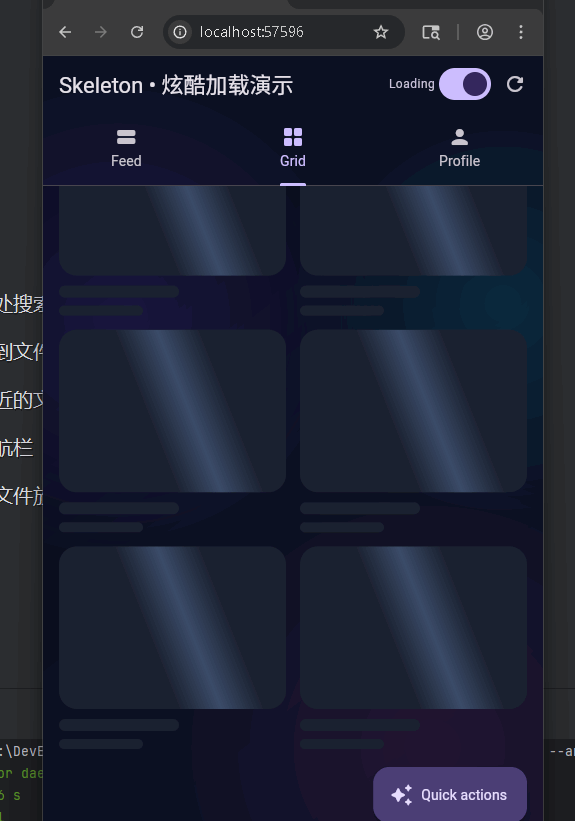
在鸿蒙真机 上模拟器上成功运行后的效果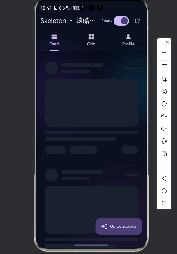
使用一个全局 Shimmer 动画驱动整棵骨架子树,减少重建、滚动更顺滑,并提供了 Feed 列表、Grid 网格、Profile 个人页三种常见场景的骨架占位与真实内容切换。
可熟练了解 Skeleton 主题与 Shimmer 驱动、基础形状组件(Box / Line / Circle / Card / Profile)、加载态与下拉刷新结合、以及深色炫酷 UI 的搭建方式。
📋 目录
项目结构说明
应用入口
骨架屏核心(skeleton.dart)
- SkeletonThemeData 与 SkeletonTheme
- SkeletonShimmer 全局驱动
- Skeleton 与 ShaderMask
- 基础形状:SkeletonBox / Line / Circle
- 占位布局:Card / Profile / List
演示页(skeleton_demo_page.dart)
使用示例
项目结构说明
文件目录结构
lib/
├── main.dart                    # 应用入口
├── app/
│   └── app.dart                 # DemoApp(根 MaterialApp,需与入口配合)
├── demo/
│   ├── skeleton_demo_app.dart  # 骨架屏演示的 MaterialApp 包装
│   └── skeleton_demo_page.dart # 骨架屏演示页(Feed/Grid/Profile)
└── skeleton/
    └── skeleton.dart            # 骨架屏组件库(Theme / Shimmer / 形状 / 占位)
说明:若入口直接使用骨架屏演示,可在 main.dart 中 import 'demo/skeleton_demo_app.dart' 并 runApp(const SkeletonDemoApp())。
入口与依赖关系
main.dart
  └── app/app.dart (DemoApp)
        └── 若为骨架演示:demo/skeleton_demo_app.dart (SkeletonDemoApp)
              └── demo/skeleton_demo_page.dart (SkeletonDemoPage)
                    └── skeleton/skeleton.dart (SkeletonShimmer, Skeleton, 占位组件)
数据与交互流向
- 启动:
SkeletonDemoPage在initState中执行_bootstrap(),先置_loading = true,延迟约 850ms 后_seedData()再置_loading = false。 - 加载中:三个 Tab 根据
_loading用AnimatedSwitcher在「骨架占位」与「真实内容」之间切换。 - Shimmer:
SkeletonShimmer提供单一AnimationController,通过SkeletonTheme把progress动画下发,子节点用Skeleton+ShaderMask统一扫光。 - 刷新:
_refresh()再次置_loading = true,延迟后重算数据并置_loading = false;Feed Tab 使用RefreshIndicator触发_refresh。 - 速度:
_speed控制_shimmerDuration,进而改变SkeletonShimmer的duration,实现扫光快慢可调。
应用入口
1. main.dart
import 'package:flutter/material.dart';
import 'app/app.dart';
void main() {
runApp(const MyApp());
}
class MyApp extends StatelessWidget {
const MyApp({super.key});
Widget build(BuildContext context) {
return const DemoApp(); // 根应用,内部可挂 SkeletonDemoApp 或其它 Demo
}
}
入口只负责挂载根 Widget(如 DemoApp);若本项目仅做骨架屏演示,可改为挂载 SkeletonDemoApp。
2. SkeletonDemoApp
import 'package:flutter/material.dart';
import 'skeleton_demo_page.dart';
class SkeletonDemoApp extends StatelessWidget {
const SkeletonDemoApp({super.key});
Widget build(BuildContext context) {
final scheme = ColorScheme.fromSeed(
seedColor: const Color(0xFF7C4DFF),
brightness: Brightness.dark,
);
return MaterialApp(
title: 'Skeleton Demo',
debugShowCheckedModeBanner: false,
theme: ThemeData(
colorScheme: scheme,
useMaterial3: true,
scaffoldBackgroundColor: const Color(0xFF0B1020),
appBarTheme: const AppBarTheme(
backgroundColor: Colors.transparent,
elevation: 0,
scrolledUnderElevation: 0,
),
),
home: const SkeletonDemoPage(),
);
}
}
深色主题 + 紫色种子色,首页即骨架屏演示页。
骨架屏核心(skeleton.dart)
1. SkeletonThemeData 与 SkeletonTheme
class SkeletonThemeData {
const SkeletonThemeData({
required this.baseColor,
required this.highlightColor,
this.borderRadius = const BorderRadius.all(Radius.circular(16)),
this.shimmerAngle = -0.35, // 弧度,负值向左倾斜
this.shimmerBandSize = 0.18, // 高光带宽度占比
});
final Color baseColor;
final Color highlightColor;
final BorderRadius borderRadius;
final double shimmerAngle;
final double shimmerBandSize;
}
class SkeletonTheme extends InheritedWidget {
const SkeletonTheme({
super.key,
required this.data,
required this.progress, // 0~1 的动画,驱动扫光
required super.child,
});
final SkeletonThemeData data;
final Animation<double> progress;
static SkeletonTheme of(BuildContext context) {
final theme = context.dependOnInheritedWidgetOfExactType<SkeletonTheme>();
if (theme != null) return theme;
// 未找到时返回默认,避免子组件报错
return SkeletonTheme(
data: SkeletonThemeData(
baseColor: Colors.grey.shade800,
highlightColor: Colors.grey.shade700,
),
progress: const AlwaysStoppedAnimation<double>(0),
child: const SizedBox.shrink(),
);
}
// ...
}
主题通过 InheritedWidget 下发 data 和 progress,子组件用 SkeletonTheme.of(context) 取用;progress 由 SkeletonShimmer 提供。
2. SkeletonShimmer 全局驱动
class SkeletonShimmer extends StatefulWidget {
  const SkeletonShimmer({
    super.key,
    required this.child,
    this.enabled = true,
    this.duration = const Duration(milliseconds: 1350),
    this.theme,
  });

  final Widget child;
  final bool enabled;
  final Duration duration;
  final SkeletonThemeData? theme;
  // ...
}

// 内部:AnimationController(vsync: this, duration: widget.duration)
// enabled 为 true 时 repeat(),否则 stop()
// 将 CurvedAnimation(parent: _controller, curve: Curves.linear) 作为 progress
// 用 TickerMode(enabled: widget.enabled) 包一层,关闭时停掉 Ticker 省电
一个控制器驱动整棵子树,避免每个骨架块各自开动画,列表滚动更流畅。
3. Skeleton 与 ShaderMask
class Skeleton extends StatelessWidget {
const Skeleton({ super.key, required this.child, this.enabled = true });
final Widget child;
final bool enabled;
Widget build(BuildContext context) {
final s = SkeletonTheme.of(context);
if (!enabled) return child;
return RepaintBoundary(
child: AnimatedBuilder(
animation: s.progress,
child: child,
builder: (context, child) {
return ShaderMask(
blendMode: BlendMode.srcATop,
shaderCallback: (bounds) {
final t = s.progress.value;
final slide = (t * 2) - 1; // -1..1,控制高光左右扫
final band = s.data.shimmerBandSize.clamp(0.08, 0.38);
return LinearGradient(
colors: [ baseColor, highlightColor, baseColor ],
stops: [ (0.5 - band), 0.5, (0.5 + band) ],
transform: _ShimmerTransform(slidePercent: slide, angle: s.data.shimmerAngle),
).createShader(bounds);
},
child: child,
);
},
),
);
}
}
用 ShaderMask + 线性渐变 + GradientTransform 实现扫光;RepaintBoundary 限制重绘范围。
4. 基础形状:SkeletonBox / Line / Circle
// 矩形,可指定 width/height/radius/margin
class SkeletonBox extends StatelessWidget {
  final double? width;
  final double? height;
  final BorderRadius? radius;
  final EdgeInsetsGeometry? margin;
  // 内部:Container(decoration: BoxDecoration(color: s.data.baseColor, borderRadius: r))
}

// 条状,默认 height: 12,圆角条
class SkeletonLine extends StatelessWidget {
  // 内部用 SkeletonBox + radius: BorderRadius.circular(999)
}

// 圆形
class SkeletonCircle extends StatelessWidget {
  final double size;
  // Container(shape: BoxShape.circle, color: baseColor)
}
这些组件只负责「形状」和「底色」,实际扫光由外层 Skeleton(child: SkeletonBox(...)) 提供。
5. 占位布局:Card / Profile / List
// 卡片占位:头像圆 + 两行线 + 大图框 + 标题线 + 底部小条
class SkeletonCardPlaceholder extends StatelessWidget {
  // 使用 SkeletonCircle, SkeletonLine, SkeletonBox 拼出卡片布局
}

// 个人页占位:大头像 + 两行线 + 两格统计 + 一块面板
class SkeletonProfilePlaceholder extends StatelessWidget { ... }

// 列表:ListView.builder + itemBuilder,便于长列表骨架
class SkeletonList extends StatelessWidget {
  final int itemCount;
  final Widget Function(BuildContext context, int index) itemBuilder;
  final EdgeInsetsGeometry? padding;
}
演示页中:Feed 用 SkeletonList + Skeleton(child: SkeletonCardPlaceholder());Grid 用 GridView.builder 每格 Skeleton(child: _GridSkeletonCard());Profile 用 Skeleton(child: SkeletonProfilePlaceholder())。
演示页(skeleton_demo_page.dart)
1. 页面状态与 Shimmer 配置
class _SkeletonDemoPageState extends State<SkeletonDemoPage> {
  bool _loading = true;
  double _speed = 1.0;
  final List<_DemoPost> _posts = <_DemoPost>[];
  final Set<int> _liked = <int>{};

  Duration get _shimmerDuration {
    final multiplier = _speed.clamp(0.6, 1.6);
    return Duration(milliseconds: (1350 / multiplier).round());
  }

  SkeletonThemeData get _skeletonTheme {
    return const SkeletonThemeData(
      baseColor: Color(0xFF1A2130),
      highlightColor: Color(0xFF3B4B68),
      borderRadius: BorderRadius.all(Radius.circular(18)),
      shimmerAngle: -0.38,
      shimmerBandSize: 0.18,
    );
  }
}
_loading 为 true 时三个 Tab 都显示骨架;_speed 控制 Shimmer 动画时长;主题与演示页深色风格一致。
2. 三 Tab:Feed / Grid / Profile
body: Stack(
  children: [
    const _NeonBackground(),  // 渐变 + 光斑 CustomPaint
    TabBarView(
      children: [
        _FeedTab(loading: _loading, posts: _posts, liked: _liked, ...),
        _GridTab(loading: _loading, onTap: ...),
        _ProfileTab(loading: _loading, likedCount: ..., postsCount: ...),
      ],
    ),
  ],
),
- Feed:
AnimatedSwitcher在SkeletonList(7 条卡片骨架)与ListView.builder(真实帖子)间切换。 - Grid:在 8 格骨架 Grid 与 10 格
_NeonTile间切换。 - Profile:在
Skeleton(child: SkeletonProfilePlaceholder())与_ProfileContent间切换。
3. 加载态切换与下拉刷新
Future<void> _bootstrap() async {
  setState(() => _loading = true);
  await Future<void>.delayed(const Duration(milliseconds: 850));
  if (!mounted) return;
  _seedData();
  setState(() => _loading = false);
}

Future<void> _refresh() async {
  setState(() => _loading = true);
  await Future<void>.delayed(const Duration(milliseconds: 900));
  if (!mounted) return;
  _seedData(shuffle: true);
  setState(() => _loading = false);
}

// Feed 里
RefreshIndicator(
  onRefresh: _refresh,
  child: AnimatedSwitcher(
    duration: const Duration(milliseconds: 260),
    child: loading ? SkeletonList(...) : ListView.builder(...),
  ),
)
首次进入走 _bootstrap,下拉刷新走 _refresh,都是先亮骨架再出内容,交互统一。
4. Quick actions 与速度调节
floatingActionButton: FloatingActionButton.extended(
  onPressed: () => _showQuickActions(context),
  icon: const Icon(Icons.auto_awesome_rounded),
  label: const Text('Quick actions'),
),
// 底部弹 sheet:_SpeedSlider(_speed, onChanged) + 若干 _ActionChip
// 如「开始/结束加载」「快一点」「慢一点」「刷新数据」
通过 Slider 调整 _speed 从而改变 _shimmerDuration,并传给 SkeletonShimmer(duration: _shimmerDuration, ...),实现扫光速度可调。
使用示例
最小用法:单块骨架 + 全局 Shimmer
SkeletonShimmer(
  enabled: true,
  duration: const Duration(milliseconds: 1350),
  theme: const SkeletonThemeData(
    baseColor: Color(0xFF1A2130),
    highlightColor: Color(0xFF3B4B68),
  ),
  child: Scaffold(
    body: Skeleton(
      child: SkeletonCardPlaceholder(),  // 或 SkeletonBox / SkeletonLine 等
    ),
  ),
)
列表骨架
SkeletonList(
  padding: const EdgeInsets.only(top: 10, bottom: 90),
  itemCount: 7,
  itemBuilder: (context, index) {
    return const Skeleton(child: SkeletonCardPlaceholder());
  },
)
根据 loading 切换骨架/内容
AnimatedSwitcher(
  duration: const Duration(milliseconds: 260),
  child: loading
      ? SkeletonList(...)
      : ListView.builder(...),
)
欢迎加入开源鸿蒙跨平台社区: https://openharmonycrossplatform.csdn.net

开源鸿蒙跨平台开发社区汇聚开发者与厂商,共建“一次开发,多端部署”的开源生态,致力于降低跨端开发门槛,推动万物智联创新。
更多推荐
 14
14 0
0- 0


 已为社区贡献24条内容

所有评论(0)