Flutter for OpenHarmony 实战之基础组件:第四篇 Text 文本组件全解
本文全面解析Flutter for OpenHarmony中的Text组件使用技巧,涵盖基础样式设置、文本溢出处理、富文本实现等核心功能。主要内容包括:1)通过TextStyle控制文字颜色、大小、行高等样式属性;2)使用maxLines和overflow处理文本溢出问题;3)利用RichText和TextSpan实现混合样式文本;4)实战演示电商价格显示和用户协议点击交互实现。文章还介绍了文本对
Flutter for OpenHarmony 实战之基础组件:第四篇 Text 文本组件全解
前言
在 Flutter for OpenHarmony 开发中,Text 组件看似简单,实则暗藏玄机。
你是否遇到过:
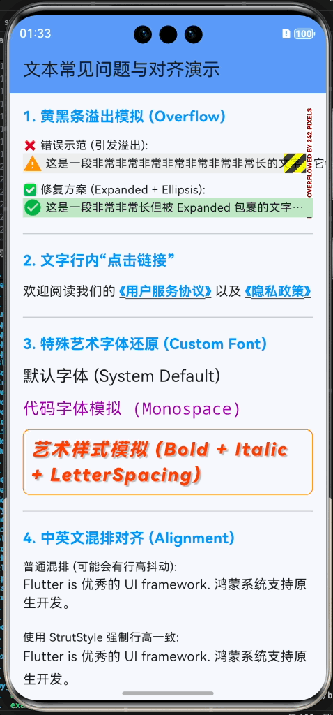
- 文字太长导致黄黑条溢出?
- 想给文字中间加个“点击链接”?
- UI 设计稿里的特殊艺术字体怎么还原?
- 中英文混排时的对齐问题?
本文你将学到:
- TextStyle 的全能样式控制
- 处理文本溢出 (Ellipsis) 的多种姿势
- RichText 富文本与 TextSpan 的嵌套艺术
- 实战:实现“用户协议”点击跳转与“展开全文”功能
- 鸿蒙应用中的自定义字体配置
一、Text 基础用法
1.1 核心样式 (TextStyle)
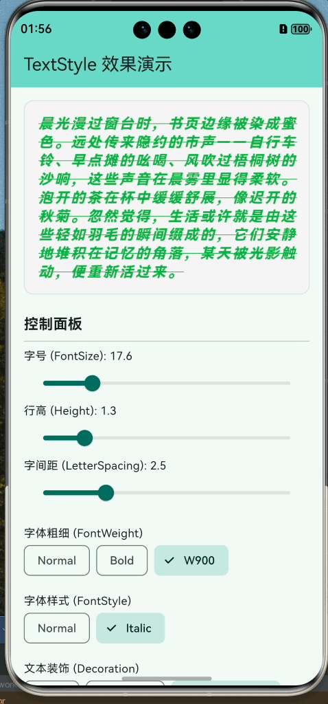
TextStyle 控制着文字的颜色、大小、粗细、行高等视觉属性。
Text(
  "晨光漫过窗台时,书页边缘被染成蜜色。远处传来隐约的市声——自行车铃、早点摊的吆喝、风吹过梧桐树的沙响,这些声音在晨雾里显得柔软。泡开的茶在杯中缓缓舒展,像迟开的秋菊。忽然觉得,生活或许就是由这些轻如羽毛的瞬间缀成的,它们安静地堆积在记忆的角落,某天被光影触动,便重新活过来。",
  style: TextStyle(
    color: Colors.blue, // 颜色
    fontSize: 24, // 字号 (逻辑像素)
    fontWeight: FontWeight.bold, // 粗细 (w100 - w900)
    fontStyle: FontStyle.italic, // 斜体
    letterSpacing: 1.5, // 字间距
    wordSpacing: 4.0, // 单词间距
    height: 1.5, // 行高倍率 (fontSize * height)
    decoration: TextDecoration.underline, // 下划线
    decorationStyle: TextDecorationStyle.dashed, // 虚线
  ),
)
1.2 对齐与溢出处理
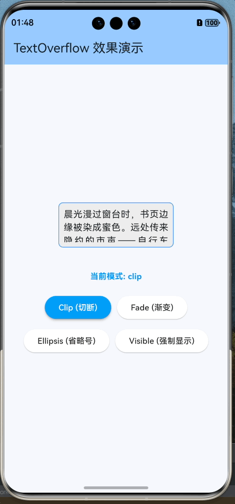
当文字内容超过容器宽度时,我们需要决定它是换行、截断还是缩放。
Container(
  width: 200,
  color: Colors.grey[200],
  child: const Text(
    '这是一段非常非常长的测试文本,它肯定会超过容器的宽度,我们需要截断它。',
    textAlign: TextAlign.justify,   // 两端对齐
    maxLines: 2,                    // 最多显示 2 行
    overflow: TextOverflow.ellipsis,// 超出显示省略号 (...)
    softWrap: true,                 // 允许自动换行
  ),
)
TextOverflow 选项:
clip: 直接切断(默认,可能把字切一半)。fade: 渐变消失。ellipsis: 显示省略号 (…)。visible: 强制渲染出界(通常不推荐)。
二、RichText 富文本
如果一行文字中需要不同的样式(例如:加粗的标题和普通的正文,或者红色的价格),就不能只用一个 Text 组件了。
2.1 Text.rich 构造函数
Flutter 推荐使用 Text.rich 或 RichText 组件,它们通过 TextSpan 树来构建内容。
import 'package:flutter/gestures.dart';
import 'package:flutter/material.dart';
/// 演示 Text.rich 和 RichText 的使用
class TextRichPage extends StatelessWidget {
const TextRichPage({super.key});
Widget build(BuildContext context) {
return Scaffold(
appBar: AppBar(
title: const Text('富文本 (RichText) 演示'),
backgroundColor: Theme.of(context).colorScheme.inversePrimary,
),
body: SingleChildScrollView(
padding: const EdgeInsets.all(20.0),
child: Column(
crossAxisAlignment: CrossAxisAlignment.start,
children: [
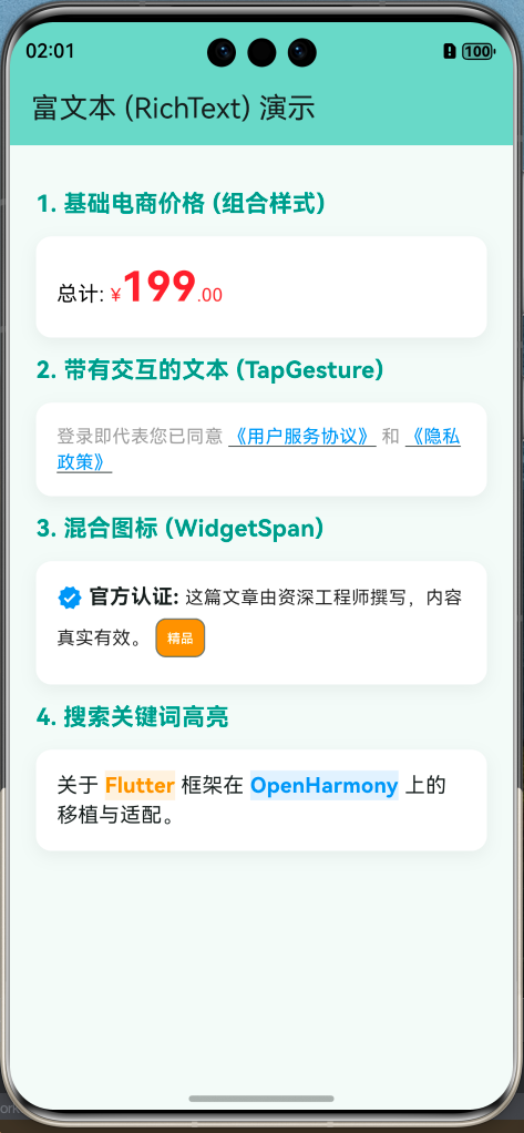
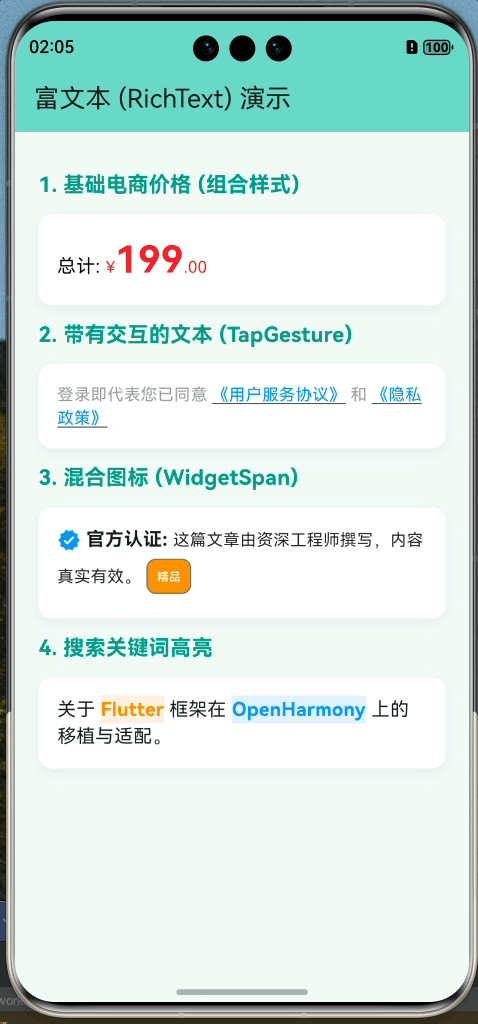
_buildSectionTitle("1. 基础电商价格 (组合样式)"),
_buildDemoBox(
const Text.rich(
TextSpan(
text: '总计: ',
style: TextStyle(color: Colors.black, fontSize: 16),
children: [
TextSpan(
text: '¥',
style: TextStyle(color: Colors.red, fontSize: 14),
),
TextSpan(
text: '199',
style: TextStyle(
color: Colors.red,
fontSize: 32,
fontWeight: FontWeight.bold,
),
),
TextSpan(
text: '.00',
style: TextStyle(color: Colors.red, fontSize: 14),
),
],
),
),
),
_buildSectionTitle("2. 带有交互的文本 (TapGesture)"),
_buildDemoBox(
Text.rich(
TextSpan(
text: '登录即代表您已同意 ',
style: const TextStyle(color: Colors.grey),
children: [
TextSpan(
text: '《用户服务协议》',
style: const TextStyle(
color: Colors.blue,
decoration: TextDecoration.underline),
recognizer: TapGestureRecognizer()
..onTap = () {
ScaffoldMessenger.of(context).showSnackBar(
const SnackBar(content: Text('跳转到服务协议...')),
);
},
),
const TextSpan(text: ' 和 '),
TextSpan(
text: '《隐私政策》',
style: const TextStyle(
color: Colors.blue,
decoration: TextDecoration.underline),
recognizer: TapGestureRecognizer()
..onTap = () {
ScaffoldMessenger.of(context).showSnackBar(
const SnackBar(content: Text('跳转到隐私政策...')),
);
},
),
],
),
),
),
_buildSectionTitle("3. 混合图标 (WidgetSpan)"),
_buildDemoBox(
const Text.rich(
TextSpan(
children: [
WidgetSpan(
alignment: PlaceholderAlignment.middle,
child: Icon(Icons.verified, color: Colors.blue, size: 20),
),
TextSpan(
text: ' 官方认证: ',
style:
TextStyle(fontWeight: FontWeight.bold, fontSize: 16),
),
TextSpan(
text: '这篇文章由资深工程师撰写,内容真实有效。',
style: TextStyle(color: Colors.black87),
),
WidgetSpan(
alignment: PlaceholderAlignment.middle,
child: Padding(
padding: EdgeInsets.symmetric(horizontal: 4.0),
child: Chip(
label: Text('精品',
style:
TextStyle(fontSize: 10, color: Colors.white)),
backgroundColor: Colors.orange,
visualDensity: VisualDensity.compact,
padding: EdgeInsets.zero,
),
),
),
],
),
),
),
_buildSectionTitle("4. 搜索关键词高亮"),
_buildDemoBox(
Text.rich(
TextSpan(
text: '关于 ',
style: const TextStyle(fontSize: 16),
children: [
TextSpan(
text: 'Flutter',
style: TextStyle(
color: Colors.orange,
fontWeight: FontWeight.bold,
backgroundColor: Colors.orange.withOpacity(0.12)),
),
const TextSpan(text: ' 框架在 '),
TextSpan(
text: 'OpenHarmony',
style: TextStyle(
color: Colors.blue,
fontWeight: FontWeight.bold,
backgroundColor: Colors.blue.withOpacity(0.12)),
),
const TextSpan(text: ' 上的移植与适配。'),
],
),
),
),
const SizedBox(height: 40),
],
),
),
);
}
Widget _buildSectionTitle(String title) {
return Padding(
padding: const EdgeInsets.symmetric(vertical: 12.0),
child: Text(
title,
style: const TextStyle(
fontSize: 18, fontWeight: FontWeight.bold, color: Colors.teal),
),
);
}
Widget _buildDemoBox(Widget child) {
return Container(
width: double.infinity,
padding: const EdgeInsets.all(16.0),
decoration: BoxDecoration(
color: Colors.white,
borderRadius: BorderRadius.circular(12),
boxShadow: [
BoxShadow(
color: Colors.black.withOpacity(0.05),
blurRadius: 10,
offset: const Offset(0, 4),
),
],
),
child: child,
);
}
}
三、实战案例 1:可点击的用户协议
登录页面常见的需求:
“登录即代表同意《用户协议》和《隐私政策》”
这里的协议名称需要高亮并可点击。
agreement_detail_page.dart
import 'package:flutter/material.dart';
/// 仿真的协议详情页面
class AgreementDetailPage extends StatelessWidget {
final String title;
const AgreementDetailPage({super.key, required this.title});
Widget build(BuildContext context) {
return Scaffold(
appBar: AppBar(
title: Text(title),
backgroundColor: Theme.of(context).colorScheme.inversePrimary,
),
body: SingleChildScrollView(
padding: const EdgeInsets.all(20.0),
child: Column(
crossAxisAlignment: CrossAxisAlignment.start,
children: [
Text(
'最后更新日期:2026年2月1日',
style: TextStyle(color: Colors.grey[600], fontSize: 14),
),
const SizedBox(height: 20),
_buildSection('一、 前言',
'欢迎使用我们的产品!我们非常重视您的隐私和个人信息保护。本协议将向您说明我们如何收集、使用和保护您的信息。'),
_buildSection('二、 信息的收集',
'1. 您在注册账户时提供的手机号码、密码。\n2. 您在操作过程中主动上传的图片、文档等。\n3. 设备的型号、操作系统版本、位置信息等基础系统信息。'),
_buildSection(
'三、 信息的使用', '我们收集的信息将用于身份验证、提供基础服务、安全保障以及通过您的偏好为您推荐更合适的内容。'),
_buildSection(
'四、 信息的公开与分享', '除非法律法规要求或征得您的明确同意,我们不会将您的个人信息向第三方进行披露。'),
_buildSection('五、 您的权利', '您可以随时访问、更正、删除您的个人信息,或注销您的账户。'),
const SizedBox(height: 40),
const Center(
child: Text(
'--- 到底了 ---',
style: TextStyle(color: Colors.grey),
),
),
const SizedBox(height: 20),
],
),
),
);
}
Widget _buildSection(String title, String content) {
return Column(
crossAxisAlignment: CrossAxisAlignment.start,
children: [
Text(
title,
style: const TextStyle(fontSize: 18, fontWeight: FontWeight.bold),
),
const SizedBox(height: 10),
Text(
content,
style:
const TextStyle(fontSize: 16, height: 1.6, color: Colors.black87),
),
const SizedBox(height: 24),
],
);
}
}
text_rich_page.dart
import 'package:flutter/gestures.dart';
import 'package:flutter/material.dart';
import 'package:my_first_app/agreement_detail_page.dart';
/// 演示 Text.rich 和 RichText 的使用
class TextRichPage extends StatelessWidget {
const TextRichPage({super.key});
Widget build(BuildContext context) {
return Scaffold(
appBar: AppBar(
title: const Text('富文本 (RichText) 演示'),
backgroundColor: Theme.of(context).colorScheme.inversePrimary,
),
body: SingleChildScrollView(
padding: const EdgeInsets.all(20.0),
child: Column(
crossAxisAlignment: CrossAxisAlignment.start,
children: [
_buildSectionTitle("1. 基础电商价格 (组合样式)"),
_buildDemoBox(
const Text.rich(
TextSpan(
text: '总计: ',
style: TextStyle(color: Colors.black, fontSize: 16),
children: [
TextSpan(
text: '¥',
style: TextStyle(color: Colors.red, fontSize: 14),
),
TextSpan(
text: '199',
style: TextStyle(
color: Colors.red,
fontSize: 32,
fontWeight: FontWeight.bold,
),
),
TextSpan(
text: '.00',
style: TextStyle(color: Colors.red, fontSize: 14),
),
],
),
),
),
_buildSectionTitle("2. 带有交互的文本 (TapGesture)"),
_buildDemoBox(
Text.rich(
TextSpan(
text: '登录即代表您已同意 ',
style: const TextStyle(color: Colors.grey),
children: [
TextSpan(
text: '《用户服务协议》',
style: const TextStyle(
color: Colors.blue,
decoration: TextDecoration.underline),
recognizer: TapGestureRecognizer()
..onTap = () {
Navigator.push(
context,
MaterialPageRoute(
builder: (context) =>
const AgreementDetailPage(title: '用户服务协议'),
),
);
},
),
const TextSpan(text: ' 和 '),
TextSpan(
text: '《隐私政策》',
style: const TextStyle(
color: Colors.blue,
decoration: TextDecoration.underline),
recognizer: TapGestureRecognizer()
..onTap = () {
Navigator.push(
context,
MaterialPageRoute(
builder: (context) =>
const AgreementDetailPage(title: '隐私政策'),
),
);
},
),
],
),
),
),
_buildSectionTitle("3. 混合图标 (WidgetSpan)"),
_buildDemoBox(
const Text.rich(
TextSpan(
children: [
WidgetSpan(
alignment: PlaceholderAlignment.middle,
child: Icon(Icons.verified, color: Colors.blue, size: 20),
),
TextSpan(
text: ' 官方认证: ',
style:
TextStyle(fontWeight: FontWeight.bold, fontSize: 16),
),
TextSpan(
text: '这篇文章由资深工程师撰写,内容真实有效。',
style: TextStyle(color: Colors.black87),
),
WidgetSpan(
alignment: PlaceholderAlignment.middle,
child: Padding(
padding: EdgeInsets.symmetric(horizontal: 4.0),
child: Chip(
label: Text('精品',
style:
TextStyle(fontSize: 10, color: Colors.white)),
backgroundColor: Colors.orange,
visualDensity: VisualDensity.compact,
padding: EdgeInsets.zero,
),
),
),
],
),
),
),
_buildSectionTitle("4. 搜索关键词高亮"),
_buildDemoBox(
Text.rich(
TextSpan(
text: '关于 ',
style: const TextStyle(fontSize: 16),
children: [
TextSpan(
text: 'Flutter',
style: TextStyle(
color: Colors.orange,
fontWeight: FontWeight.bold,
backgroundColor: Colors.orange.withOpacity(0.12)),
),
const TextSpan(text: ' 框架在 '),
TextSpan(
text: 'OpenHarmony',
style: TextStyle(
color: Colors.blue,
fontWeight: FontWeight.bold,
backgroundColor: Colors.blue.withOpacity(0.12)),
),
const TextSpan(text: ' 上的移植与适配。'),
],
),
),
),
const SizedBox(height: 40),
],
),
),
);
}
Widget _buildSectionTitle(String title) {
return Padding(
padding: const EdgeInsets.symmetric(vertical: 12.0),
child: Text(
title,
style: const TextStyle(
fontSize: 18, fontWeight: FontWeight.bold, color: Colors.teal),
),
);
}
Widget _buildDemoBox(Widget child) {
return Container(
width: double.infinity,
padding: const EdgeInsets.all(16.0),
decoration: BoxDecoration(
color: Colors.white,
borderRadius: BorderRadius.circular(12),
boxShadow: [
BoxShadow(
color: Colors.black.withOpacity(0.05),
blurRadius: 10,
offset: const Offset(0, 4),
),
],
),
child: child,
);
}
}
⚠️ 注意:使用 TapGestureRecognizer 后,记得它是需要手动销毁的吗?在 StatelessWidget 中这样写通常没问题,但在 StatefulWidget 中如果是在 build 外创建,需要在 dispose 中处理。
四、实战案例 2:展开/收起全文
实现一个带状态的文本组件,控制长文本的显示行数。
import 'package:flutter/material.dart';
/// 一个支持 展开/收起 全文的文本组件
class ExpandableText extends StatefulWidget {
final String text;
final int maxLines;
const ExpandableText({
super.key,
required this.text,
this.maxLines = 3,
});
State<ExpandableText> createState() => _ExpandableTextState();
}
class _ExpandableTextState extends State<ExpandableText> {
// 状态:是否已展开
bool _isExpanded = false;
Widget build(BuildContext context) {
return Column(
crossAxisAlignment: CrossAxisAlignment.start,
children: [
// 核心文本内容
AnimatedSize(
duration: const Duration(milliseconds: 300),
curve: Curves.easeInOut,
child: Text(
widget.text,
// 根据状态决定是否限制行数:null 表示不限制
maxLines: _isExpanded ? null : widget.maxLines,
// 展开时设置为 visible,折叠时使用 ellipsis (...)
overflow:
_isExpanded ? TextOverflow.visible : TextOverflow.ellipsis,
style: const TextStyle(
fontSize: 16, height: 1.5, color: Colors.black87),
),
),
// 切换按钮
GestureDetector(
onTap: () {
setState(() {
_isExpanded = !_isExpanded;
});
},
child: Padding(
padding: const EdgeInsets.only(top: 8),
child: Row(
mainAxisSize: MainAxisSize.min,
children: [
Text(
_isExpanded ? '收起' : '展开全文',
style: const TextStyle(
color: Colors.blue,
fontWeight: FontWeight.bold,
),
),
Icon(
_isExpanded
? Icons.keyboard_arrow_up
: Icons.keyboard_arrow_down,
size: 18,
color: Colors.blue,
),
],
),
),
),
],
);
}
}
/// 演示页面
class ExpandableTextPage extends StatelessWidget {
const ExpandableTextPage({super.key});
Widget build(BuildContext context) {
const String longText =
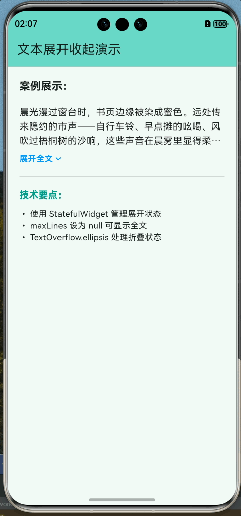
"晨光漫过窗台时,书页边缘被染成蜜色。远处传来隐约的市声——自行车铃、早点摊的吆喝、风吹过梧桐树的沙响,这些声音在晨雾里显得柔软。泡开的茶在杯中缓缓舒展,像迟开的秋菊。忽然觉得,生活或许就是由这些轻如羽毛的瞬间缀成的,它们安静地堆积在记忆的角落,某天被光影触动,便重新活过来。这段文字很长,如果不经过处理,它会直接占满整个屏幕,影响用户的阅读节奏。通过展开收起组件,我们可以让界面保持整洁。";
return Scaffold(
appBar: AppBar(
title: const Text('文本展开收起演示'),
backgroundColor: Theme.of(context).colorScheme.inversePrimary,
),
body: Padding(
padding: const EdgeInsets.all(20.0),
child: Column(
crossAxisAlignment: CrossAxisAlignment.start,
children: [
const Text(
"案例展示:",
style: TextStyle(fontSize: 18, fontWeight: FontWeight.bold),
),
const SizedBox(height: 20),
// 使用自定义的展开组件
const ExpandableText(
text: longText,
maxLines: 3,
),
const Divider(height: 40),
const Text(
"技术要点:",
style: TextStyle(
fontSize: 16,
fontWeight: FontWeight.bold,
color: Colors.teal),
),
const SizedBox(height: 10),
const Text(
"• 使用 StatefulWidget 管理展开状态\n• maxLines 设为 null 可显示全文\n• TextOverflow.ellipsis 处理折叠状态"),
],
),
),
);
}
}
五、鸿蒙应用中的字体适配
5.1 使用自定义字体
想要应用更有个性,通常会引入 .ttf 或 .otf 字体文件。
- 添加文件:将字体文件放入项目的
assets/fonts/目录(需手动创建)。 - 配置 pubspec.yaml:
flutter:
  fonts:
    - family: HarmonyOS_Sans
      fonts:
        - asset: assets/fonts/HarmonyOS_Sans_Bold.ttf
          weight: 700
        - asset: assets/fonts/HarmonyOS_Sans_Regular.ttf
          weight: 400
- 在代码中使用:
import 'package:flutter/material.dart';
/// 鸿蒙字体适配演示页面
class FontDemoPage extends StatelessWidget {
const FontDemoPage({super.key});
Widget build(BuildContext context) {
return Scaffold(
appBar: AppBar(
title: const Text('系统与自定义字体适配'),
backgroundColor: Theme.of(context).colorScheme.inversePrimary,
),
body: SingleChildScrollView(
padding: const EdgeInsets.all(20.0),
child: Column(
crossAxisAlignment: CrossAxisAlignment.start,
children: [
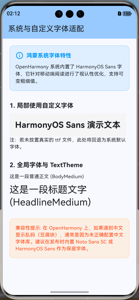
_buildInfoCard(
"鸿蒙系统字体特性",
"OpenHarmony 系统内置了 HarmonyOS Sans 字体,它针对移动端阅读进行了视认性优化,支持可变粗细值。",
),
const SizedBox(height: 30),
const Text("1. 局部使用自定义字体",
style: TextStyle(fontSize: 18, fontWeight: FontWeight.bold)),
const SizedBox(height: 10),
Container(
padding: const EdgeInsets.all(16),
color: Colors.grey[100],
child: const Text(
'HarmonyOS Sans 演示文本',
style: TextStyle(
fontFamily: 'HarmonyOS_Sans', // 对应 pubspec.yaml 中的定义
fontSize: 24,
fontWeight: FontWeight.bold,
),
),
),
const Text("注:若未放置真实的 ttf 文件,此处将回退为系统默认字体。"),
const SizedBox(height: 30),
const Text("2. 全局字体与 TextTheme",
style: TextStyle(fontSize: 18, fontWeight: FontWeight.bold)),
const SizedBox(height: 10),
Text("这是一段普通正文 (BodyMedium)",
style: Theme.of(context).textTheme.bodyMedium),
const SizedBox(height: 10),
Text("这是一段标题文字 (HeadlineMedium)",
style: Theme.of(context).textTheme.headlineMedium),
const SizedBox(height: 30),
_buildWarningBox("兼容性提示",
"在 OpenHarmony 上,如果遇到中文显示乱码(豆腐块),通常是因为未正确配置中文字体库。建议在发布时内置 Noto Sans SC 或 HarmonyOS Sans 作为保底字体。"),
],
),
),
);
}
Widget _buildInfoCard(String title, String content) {
return Container(
padding: const EdgeInsets.all(16),
decoration: BoxDecoration(
color: Colors.blue.withOpacity(0.1),
borderRadius: BorderRadius.circular(12),
border: Border.all(color: Colors.blue.withOpacity(0.3)),
),
child: Column(
crossAxisAlignment: CrossAxisAlignment.start,
children: [
Row(
children: [
const Icon(Icons.info_outline, color: Colors.blue),
const SizedBox(width: 8),
Text(title,
style: const TextStyle(
fontWeight: FontWeight.bold,
fontSize: 16,
color: Colors.blue)),
],
),
const SizedBox(height: 10),
Text(content, style: const TextStyle(fontSize: 14, height: 1.5)),
],
),
);
}
Widget _buildWarningBox(String title, String content) {
return Container(
padding: const EdgeInsets.all(16),
decoration: BoxDecoration(
color: Colors.orange.withOpacity(0.1),
borderRadius: BorderRadius.circular(12),
border: Border.all(color: Colors.orange.withOpacity(0.3)),
),
child: Text(
"$title: $content",
style: const TextStyle(fontSize: 14, color: Colors.deepOrange),
),
);
}
}
5.2 全局字体配置
为了避免在每个 Text 中都写 fontFamily,我们可以在 MaterialApp 的主题中全局配置。
MaterialApp(
  theme: ThemeData(
    fontFamily: 'HarmonyOS_Sans', // 全局生效
    textTheme: const TextTheme(
      displayLarge: TextStyle(fontSize: 32, fontWeight: FontWeight.bold),
      bodyMedium: TextStyle(fontSize: 16),
    ),
  ),
  home: const MyHomePage(),
);
5.3 鸿蒙系统字体特性
OpenHarmony 系统自带了 HarmonyOS Sans 字体,它针对多终端阅读进行了优化。
提示:目前 Flutter for OpenHarmony 会尝试调用系统的默认字体回退机制。如果遇到中文显示为“豆腐块”(乱码),通常是因为未正确加载中文字体,建议在发布 App 时内置一套开源中文字体(如 Noto Sans SC)以保证 100% 的兼容性。
六、特殊效果:阴影与描边
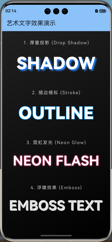
有时候为了艺术效果,我们需要给文字加阴影或描边。
import 'package:flutter/material.dart';
/// 艺术文字演示页面:阴影、描边与发光效果
class ArtTextPage extends StatelessWidget {
const ArtTextPage({super.key});
Widget build(BuildContext context) {
return Scaffold(
appBar: AppBar(
title: const Text('艺术文字效果演示'),
backgroundColor: Theme.of(context).colorScheme.inversePrimary,
),
body: Container(
width: double.infinity,
decoration: BoxDecoration(
// 使用深色背景更容易观察艺术文字效果
gradient: LinearGradient(
begin: Alignment.topLeft,
end: Alignment.bottomRight,
colors: [Colors.grey[900]!, Colors.black],
),
),
child: SingleChildScrollView(
padding: const EdgeInsets.symmetric(vertical: 40.0, horizontal: 20.0),
child: Column(
children: [
_buildTitle("1. 厚重投影 (Drop Shadow)"),
const Text(
'SHADOW',
style: TextStyle(
fontSize: 60,
fontWeight: FontWeight.w900,
color: Colors.white,
shadows: [
Shadow(
blurRadius: 15.0,
color: Colors.blueAccent,
offset: Offset(5.0, 5.0),
),
],
),
),
const SizedBox(height: 50),
_buildTitle("2. 描边模拟 (Stroke)"),
const Text(
'OUTLINE',
style: TextStyle(
fontSize: 60,
fontWeight: FontWeight.w900,
color: Colors.white,
shadows: [
// 四个方向的阴影模拟描边
Shadow(offset: Offset(-1.5, -1.5), color: Colors.blue),
Shadow(offset: Offset(1.5, -1.5), color: Colors.blue),
Shadow(offset: Offset(1.5, 1.5), color: Colors.blue),
Shadow(offset: Offset(-1.5, 1.5), color: Colors.blue),
],
),
),
const SizedBox(height: 50),
_buildTitle("3. 霓虹发光 (Neon Glow)"),
Text(
'NEON FLASH',
style: TextStyle(
fontSize: 48,
fontWeight: FontWeight.bold,
color: Colors.white,
shadows: [
Shadow(
blurRadius: 10.0,
color: Colors.pinkAccent,
offset: const Offset(0, 0),
),
Shadow(
blurRadius: 20.0,
color: Colors.pinkAccent.withOpacity(0.5),
offset: const Offset(0, 0),
),
],
),
),
const SizedBox(height: 50),
_buildTitle("4. 浮雕效果 (Emboss)"),
const Text(
'EMBOSS TEXT',
style: TextStyle(
fontSize: 48,
fontWeight: FontWeight.bold,
color: Color(0xFFE0E0E0),
shadows: [
Shadow(
color: Colors.white,
offset: Offset(-2, -2),
blurRadius: 2,
),
Shadow(
color: Colors.black45,
offset: Offset(2, 2),
blurRadius: 2,
),
],
),
),
const SizedBox(height: 40),
],
),
),
),
);
}
Widget _buildTitle(String title) {
return Padding(
padding: const EdgeInsets.only(bottom: 20.0),
child: Text(
title,
style: const TextStyle(
color: Colors.white70,
fontSize: 16,
letterSpacing: 2,
),
),
);
}
}
七、总结
Text 组件虽然基础,但它是用户获取信息最直接的窗口。
核心知识点
- 截断:长文本务必考虑
maxLines和overflow。 - 富文本:
TextSpan是实现混排和点击事件的神器。 - 字体:全局配置
fontFamily可以统一 App 风格。 - 交互:利用
GestureDetector或TapGestureRecognizer让文字“活”起来。
下一篇预告
有了文字、有了布局,我们的 App 还需要更丰富的内容形式。
《Flutter for OpenHarmony 实战之基础组件:第五篇 Image 图片组件与资源管理》
下一篇我们将深入探讨图片的加载(本地/网络)、缓存机制、占位图处理以及如何在 OpenHarmony 中适配不同分辨率的图片资源。
🌐 欢迎加入开源鸿蒙跨平台社区:开源鸿蒙跨平台开发者社区

开源鸿蒙跨平台开发社区汇聚开发者与厂商,共建“一次开发,多端部署”的开源生态,致力于降低跨端开发门槛,推动万物智联创新。
更多推荐


 20
20 0
0- 0


 已为社区贡献6条内容

所有评论(0)