flutter_for_openharmony家庭相册app实战+活动详情实现
本文介绍了Flutter活动详情页面的实现方案。页面采用卡片式布局,主要功能包括: 页面结构:使用StatelessWidget构建,包含头部信息、活动详情和参与人员三个主要部分 头部设计:展示活动类型图标、标题和时间,通过渐变背景区分不同活动类型 功能实现:支持编辑和删除操作,通过弹出菜单提供操作入口 数据展示:使用Consumer监听FamilyProvider获取参与成员信息 页面布局清晰,
活动详情页面是家庭相册App中的核心功能之一,它承载着展示活动完整信息的重任。用户通过这个页面可以查看活动的所有细节,包括时间、地点、参与人员等,还可以对活动进行编辑或删除操作。这篇文章会详细讲解如何构建一个功能完善、视觉精美的活动详情页面。
页面设计思路
在设计活动详情页面时,我们需要考虑信息的层次结构。最重要的信息应该放在最显眼的位置,次要信息则可以适当弱化。我们把页面分为几个区域:顶部的活动头部区域用渐变背景突出显示活动类型和标题,中间的信息卡片区域展示详细信息,底部的参与成员区域展示家人头像,最后是操作按钮区域。
import 'package:flutter/material.dart';
import 'package:flutter_screenutil/flutter_screenutil.dart';
import 'package:provider/provider.dart';
import 'package:intl/intl.dart';

class EventDetailScreen extends StatelessWidget {
  final FamilyEvent event;

  const EventDetailScreen({super.key, required this.event});
这个页面接收一个FamilyEvent对象作为参数,包含了活动的所有信息。我们使用StatelessWidget因为页面本身不需要管理状态,所有数据都来自传入的event对象。引入的包中,flutter_screenutil用于屏幕适配,provider用于状态管理,intl用于日期格式化。
页面结构搭建
页面的整体结构使用Scaffold + SingleChildScrollView的组合,确保内容可以流畅滚动。
Widget build(BuildContext context) {
return Scaffold(
appBar: AppBar(
title: const Text('活动详情'),
elevation: 0,
actions: [
PopupMenuButton<String>(
onSelected: (value) {
if (value == 'edit') {
_editEvent(context);
} else if (value == 'delete') {
_showDeleteDialog(context);
}
},
itemBuilder: (context) => [
const PopupMenuItem(
value: 'edit',
child: Row(
children: [
Icon(Icons.edit, size: 20),
SizedBox(width: 8),
Text('编辑活动'),
],
),
),
AppBar右侧的PopupMenuButton提供编辑和删除功能的入口。这种设计把次要操作收纳在菜单中,保持界面简洁。elevation设为0去掉AppBar的阴影,让顶部区域和头部背景融为一体。
PopupMenuItem中使用Row布局,把图标和文字组合在一起,让菜单项更直观。onSelected回调根据选中的值执行不同的操作,这是一种常见的菜单处理模式。
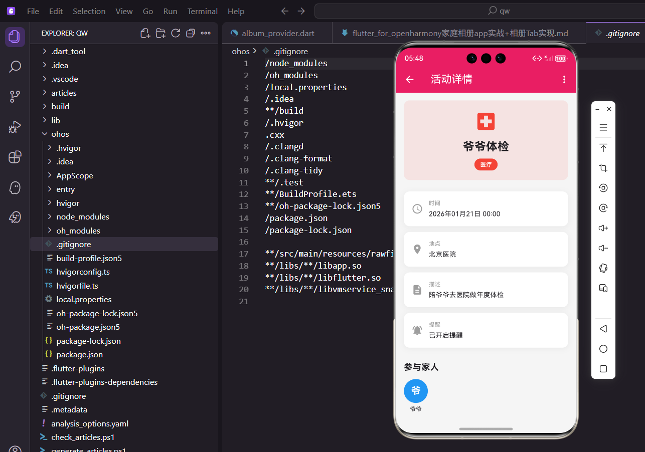
活动头部的视觉设计
头部区域是页面的视觉焦点,我们用渐变背景和大图标来吸引用户注意力。
Widget _buildHeaderSection() {
  return Container(
    width: double.infinity,
    padding: EdgeInsets.all(24.w),
    decoration: BoxDecoration(
      gradient: LinearGradient(
        colors: [
          _getColorForEventType(event.type),
          _getColorForEventType(event.type).withOpacity(0.7),
        ],
        begin: Alignment.topLeft,
        end: Alignment.bottomRight,
      ),
    ),
    child: Column(
      children: [
        Container(
          padding: EdgeInsets.all(16.w),
          decoration: BoxDecoration(
            color: Colors.white.withOpacity(0.2),
            shape: BoxShape.circle,
          ),
          child: Icon(
            _getIconForEventType(event.type),
            size: 48,
            color: Colors.white,
          ),
        ),
渐变背景的颜色根据活动类型动态变化,比如学校活动用蓝色,聚会用橙色,医疗用红色。这种颜色编码帮助用户快速识别活动类型。渐变从左上到右下,让背景更有层次感。
图标放在半透明的圆形容器中,形成玻璃质感的效果。这种设计在现代UI中很流行,能够营造出精致的视觉效果。图标大小设为48,在手机屏幕上显示效果很好。
        SizedBox(height: 16.h),
        Text(
          event.title,
          style: TextStyle(
            fontSize: 24.sp,
            fontWeight: FontWeight.bold,
            color: Colors.white,
          ),
          textAlign: TextAlign.center,
        ),
        SizedBox(height: 8.h),
        Container(
          padding: EdgeInsets.symmetric(
            horizontal: 16.w,
            vertical: 6.h,
          ),
          decoration: BoxDecoration(
            color: Colors.white.withOpacity(0.3),
            borderRadius: BorderRadius.circular(20.r),
          ),
          child: Text(
            event.type,
            style: TextStyle(
              color: Colors.white,
              fontSize: 13.sp,
              fontWeight: FontWeight.w500,
            ),
          ),
        ),
活动标题用大号加粗白色文字,在彩色背景上非常醒目。textAlign设为center让标题居中显示,这是详情页面的常见布局方式。
活动类型标签用圆角矩形容器包裹,半透明白色背景让它在渐变背景上既清晰可见又不会太突兀。这种标签设计在很多应用中都能看到,用户已经形成了认知习惯。
        SizedBox(height: 16.h),
        Row(
          mainAxisAlignment: MainAxisAlignment.center,
          children: [
            const Icon(
              Icons.access_time,
              color: Colors.white,
              size: 16,
            ),
            SizedBox(width: 4.w),
            Text(
              event.isAllDay
                  ? DateFormat('yyyy年MM月dd日', 'zh_CN').format(event.date)
                  : DateFormat('yyyy年MM月dd日 HH:mm', 'zh_CN')
                      .format(event.date),
              style: TextStyle(
                color: Colors.white,
                fontSize: 14.sp,
              ),
            ),
          ],
        ),
      ],
    ),
  );
}
时间信息用图标+文字的组合展示,图标让信息更直观。根据isAllDay属性选择不同的日期格式,全天活动只显示日期,定时活动显示日期和时间。DateFormat的’zh_CN’参数确保日期以中文格式显示。
详细信息卡片的实现
详细信息区域用多个卡片展示不同类型的信息,每个卡片都有统一的样式。
Widget _buildInfoSection() {
  return Padding(
    padding: EdgeInsets.symmetric(horizontal: 16.w),
    child: Column(
      crossAxisAlignment: CrossAxisAlignment.start,
      children: [
        Text(
          '活动详情',
          style: TextStyle(
            fontSize: 18.sp,
            fontWeight: FontWeight.bold,
            color: Colors.black87,
          ),
        ),
        SizedBox(height: 12.h),
        if (event.location != null && event.location!.isNotEmpty)
          _buildInfoCard(
            icon: Icons.location_on,
            iconColor: const Color(0xFF9C27B0),
            title: '地点',
            content: event.location!,
          ),
区域标题用加粗字体,让用户知道这是一个新的信息区域。crossAxisAlignment.start让所有子组件左对齐,形成整齐的排版。
地点信息只在有值时才显示,这是通过if条件判断实现的。这种做法让页面更灵活,不会显示空白的信息项。每个信息卡片都有自己的颜色,通过颜色编码帮助用户快速识别信息类型。
        if (event.description.isNotEmpty)
          _buildInfoCard(
            icon: Icons.description,
            iconColor: const Color(0xFF2196F3),
            title: '描述',
            content: event.description,
          ),
        _buildInfoCard(
          icon: event.isReminder
              ? Icons.notifications_active
              : Icons.notifications_off,
          iconColor: event.isReminder
              ? const Color(0xFFFF9800)
              : Colors.grey,
          title: '提醒',
          content: event.isReminder ? '已开启提醒' : '未开启提醒',
        ),
描述信息同样只在非空时显示。提醒状态的图标和颜色根据isReminder属性动态变化,开启时用橙色的铃铛图标,关闭时用灰色的静音图标。这种视觉反馈让用户一眼就能看出提醒状态。
Widget _buildInfoCard({
  required IconData icon,
  required Color iconColor,
  required String title,
  required String content,
}) {
  return Container(
    margin: EdgeInsets.only(bottom: 12.h),
    padding: EdgeInsets.all(16.w),
    decoration: BoxDecoration(
      color: Colors.white,
      borderRadius: BorderRadius.circular(16.r),
      boxShadow: [
        BoxShadow(
          color: Colors.black.withOpacity(0.05),
          blurRadius: 10,
          offset: const Offset(0, 2),
        ),
      ],
    ),
信息卡片用白色背景和轻微的阴影,让它从页面背景中凸显出来。圆角半径16让卡片看起来更柔和。阴影的透明度很低(0.05),只是为了增加层次感,不会太明显。
    child: Row(
      crossAxisAlignment: CrossAxisAlignment.start,
      children: [
        Container(
          padding: EdgeInsets.all(10.w),
          decoration: BoxDecoration(
            color: iconColor.withOpacity(0.1),
            borderRadius: BorderRadius.circular(12.r),
          ),
          child: Icon(
            icon,
            color: iconColor,
            size: 20,
          ),
        ),
        SizedBox(width: 12.w),
        Expanded(
          child: Column(
            crossAxisAlignment: CrossAxisAlignment.start,
            children: [
              Text(
                title,
                style: TextStyle(
                  fontSize: 12.sp,
                  color: Colors.grey[600],
                ),
              ),
              SizedBox(height: 4.h),
              Text(
                content,
                style: TextStyle(
                  fontSize: 15.sp,
                  color: Colors.black87,
                  fontWeight: FontWeight.w500,
                ),
              ),
            ],
          ),
        ),
      ],
    ),
  );
}
卡片内部是Row布局,左侧是带背景的图标,右侧是标题和内容。图标容器的背景色使用图标颜色的半透明版本,形成统一的视觉风格。
Expanded让右侧的文字区域占据剩余空间,确保长文本能够正常换行。标题用小号灰色字体,内容用较大的黑色字体,形成清晰的视觉层次。
参与成员的展示
参与成员区域展示所有参与活动的家人,用头像和名字的组合。
Widget _buildMembersSection(List<dynamic> members) {
  return Padding(
    padding: EdgeInsets.symmetric(horizontal: 16.w),
    child: Column(
      crossAxisAlignment: CrossAxisAlignment.start,
      children: [
        Row(
          children: [
            Text(
              '参与家人',
              style: TextStyle(
                fontSize: 18.sp,
                fontWeight: FontWeight.bold,
                color: Colors.black87,
              ),
            ),
            SizedBox(width: 8.w),
            Container(
              padding: EdgeInsets.symmetric(
                horizontal: 8.w,
                vertical: 2.h,
              ),
              decoration: BoxDecoration(
                color: const Color(0xFFE91E63).withOpacity(0.1),
                borderRadius: BorderRadius.circular(12.r),
              ),
              child: Text(
                '${members.length} 人',
                style: TextStyle(
                  fontSize: 12.sp,
                  color: const Color(0xFFE91E63),
                  fontWeight: FontWeight.w600,
                ),
              ),
            ),
          ],
        ),
标题旁边显示参与人数,用带背景色的小标签展示。这种设计让用户快速了解有多少人参与活动,不需要数头像。标签的粉色和应用的主题色一致。
        SizedBox(height: 12.h),
        Container(
          padding: EdgeInsets.all(16.w),
          decoration: BoxDecoration(
            color: Colors.white,
            borderRadius: BorderRadius.circular(16.r),
            boxShadow: [
              BoxShadow(
                color: Colors.black.withOpacity(0.05),
                blurRadius: 10,
                offset: const Offset(0, 2),
              ),
            ],
          ),
          child: Wrap(
            spacing: 16.w,
            runSpacing: 16.h,
            children: members.map((member) {
              return _buildMemberItem(member);
            }).toList(),
          ),
        ),
      ],
    ),
  );
}
成员列表用Wrap组件展示,它会自动换行,适应不同数量的成员。spacing和runSpacing设置成员之间的间距,让布局不会太拥挤。
Widget _buildMemberItem(dynamic member) {
  return SizedBox(
    width: 80.w,
    child: Column(
      children: [
        Container(
          width: 60.w,
          height: 60.w,
          decoration: BoxDecoration(
            gradient: LinearGradient(
              colors: [
                _getColorForMember(member.id),
                _getColorForMember(member.id).withOpacity(0.7),
              ],
              begin: Alignment.topLeft,
              end: Alignment.bottomRight,
            ),
            shape: BoxShape.circle,
            boxShadow: [
              BoxShadow(
                color: _getColorForMember(member.id).withOpacity(0.3),
                blurRadius: 8,
                offset: const Offset(0, 4),
              ),
            ],
          ),
          child: Center(
            child: Text(
              member.name.substring(0, 1),
              style: TextStyle(
                color: Colors.white,
                fontSize: 24.sp,
                fontWeight: FontWeight.bold,
              ),
            ),
          ),
        ),
每个成员用圆形头像展示,头像用渐变背景色和阴影效果,看起来很有质感。头像中显示成员名字的首字母,这是在没有真实头像时的常见做法。
颜色根据成员ID生成,确保同一个成员在不同地方显示的颜色一致。这种颜色编码帮助用户快速识别不同的家人。
        SizedBox(height: 8.h),
        Text(
          member.name,
          style: TextStyle(
            fontSize: 13.sp,
            color: Colors.black87,
          ),
          textAlign: TextAlign.center,
          maxLines: 1,
          overflow: TextOverflow.ellipsis,
        ),
        if (member.relation != null)
          Text(
            member.relation!,
            style: TextStyle(
              fontSize: 11.sp,
              color: Colors.grey[600],
            ),
            textAlign: TextAlign.center,
          ),
      ],
    ),
  );
}
头像下方显示成员名字和关系。名字设置maxLines为1,超长时用省略号截断,避免破坏布局。关系信息用较小的灰色字体,只在有值时显示。
操作按钮区域
页面底部提供编辑和删除两个操作按钮,让用户可以快速执行操作。
Widget _buildActionSection(BuildContext context) {
  return Padding(
    padding: EdgeInsets.symmetric(horizontal: 16.w),
    child: Row(
      children: [
        Expanded(
          child: OutlinedButton.icon(
            onPressed: () => _editEvent(context),
            icon: const Icon(Icons.edit),
            label: const Text('编辑活动'),
            style: OutlinedButton.styleFrom(
              foregroundColor: const Color(0xFF2196F3),
              side: const BorderSide(color: Color(0xFF2196F3)),
              padding: EdgeInsets.symmetric(vertical: 14.h),
              shape: RoundedRectangleBorder(
                borderRadius: BorderRadius.circular(12.r),
              ),
            ),
          ),
        ),
编辑按钮用OutlinedButton,只有边框没有填充色,视觉上比较轻量。蓝色表示这是一个常规操作,不会造成破坏性后果。icon参数让按钮自动包含图标,不需要手动布局。
        SizedBox(width: 12.w),
        Expanded(
          child: ElevatedButton.icon(
            onPressed: () => _showDeleteDialog(context),
            icon: const Icon(Icons.delete),
            label: const Text('删除活动'),
            style: ElevatedButton.styleFrom(
              backgroundColor: Colors.red,
              foregroundColor: Colors.white,
              padding: EdgeInsets.symmetric(vertical: 14.h),
              shape: RoundedRectangleBorder(
                borderRadius: BorderRadius.circular(12.r),
              ),
            ),
          ),
        ),
      ],
    ),
  );
}
删除按钮用ElevatedButton,红色背景突出显示这是一个危险操作。两个按钮用Expanded包裹,让它们平分可用空间,保持视觉平衡。
辅助方法的实现
页面需要几个辅助方法来处理颜色和图标的映射。
Color _getColorForEventType(String type) {
  switch (type) {
    case '学校':
      return const Color(0xFF2196F3);
    case '聚会':
      return const Color(0xFFFF9800);
    case '医疗':
      return const Color(0xFFF44336);
    case '户外':
      return const Color(0xFF4CAF50);
    case '探亲':
      return const Color(0xFF9C27B0);
    default:
      return const Color(0xFF607D8B);
  }
}
根据活动类型返回对应的颜色,这些颜色都是Material Design的标准色。default分支返回灰色,处理未知类型的情况。
IconData _getIconForEventType(String type) {
  switch (type) {
    case '学校':
      return Icons.school;
    case '聚会':
      return Icons.celebration;
    case '医疗':
      return Icons.local_hospital;
    case '户外':
      return Icons.park;
    case '探亲':
      return Icons.home;
    default:
      return Icons.event;
  }
}
图标的选择要符合活动类型的语义,让用户一看就能理解。Material Icons提供了丰富的图标选择,基本能满足各种需求。
Color _getColorForMember(String id) {
  final colors = [
    const Color(0xFFE91E63),
    const Color(0xFF9C27B0),
    const Color(0xFF3F51B5),
    const Color(0xFF2196F3),
    const Color(0xFF00BCD4),
    const Color(0xFF4CAF50),
    const Color(0xFFFF9800),
    const Color(0xFFFF5722),
  ];
  return colors[id.hashCode % colors.length];
}
成员颜色通过ID的哈希值计算,确保同一个成员总是显示相同的颜色。颜色数组包含8种颜色,基本能覆盖大多数家庭的成员数量。
编辑和删除功能
最后实现编辑和删除的具体逻辑。
void _editEvent(BuildContext context) {
  Navigator.push(
    context,
    MaterialPageRoute(
      builder: (context) => AddEventScreen(
        event: event,
        selectedDate: event.date,
      ),
    ),
  );
}
编辑功能跳转到添加活动页面,传入当前活动对象。添加页面会根据是否有event参数来判断是新建还是编辑模式。
void _showDeleteDialog(BuildContext context) {
  showDialog(
    context: context,
    builder: (dialogContext) => AlertDialog(
      title: const Text('删除活动'),
      content: const Text('确定要删除这个活动吗?删除后无法恢复。'),
      shape: RoundedRectangleBorder(
        borderRadius: BorderRadius.circular(16.r),
      ),
      actions: [
        TextButton(
          onPressed: () => Navigator.pop(dialogContext),
          child: const Text('取消'),
        ),
        ElevatedButton(
          onPressed: () {
            context.read<EventProvider>().deleteEvent(event.id);
            Navigator.pop(dialogContext);
            Navigator.pop(context);
            ScaffoldMessenger.of(context).showSnackBar(
              SnackBar(
                content: const Text('活动已删除'),
                backgroundColor: Colors.red,
                behavior: SnackBarBehavior.floating,
                shape: RoundedRectangleBorder(
                  borderRadius: BorderRadius.circular(10.r),
                ),
              ),
            );
          },
          style: ElevatedButton.styleFrom(
            backgroundColor: Colors.red,
          ),
          child: const Text('删除'),
        ),
      ],
    ),
  );
}
删除前弹出确认对话框,避免误操作。对话框的shape设置圆角,和应用的整体风格保持一致。确认删除后,调用Provider的deleteEvent方法删除数据,然后关闭对话框和详情页面,最后显示SnackBar提示操作成功。
总结
活动详情页面通过精心设计的布局和丰富的视觉效果,为用户提供了良好的浏览体验。渐变背景、信息卡片、成员头像等元素的组合,让页面既美观又实用。
在实现过程中,我们大量使用了条件渲染来处理可选信息,用颜色编码来区分不同类型的内容,用对话框来确认危险操作。这些都是移动应用开发中的最佳实践。
通过合理使用Flutter的组件和布局系统,我们用相对简洁的代码实现了一个功能完善的详情页面。这个页面不仅能展示信息,还提供了编辑和删除的操作入口,满足了用户的实际需求。
欢迎加入开源鸿蒙跨平台社区:https://openharmonycrossplatform.csdn.net

开源鸿蒙跨平台开发社区汇聚开发者与厂商,共建“一次开发,多端部署”的开源生态,致力于降低跨端开发门槛,推动万物智联创新。
更多推荐

 6
6 0
0- 0


 已为社区贡献25条内容

所有评论(0)