构建跨端驾照学习助手的练习测试模块:Flutter × OpenHarmony 实战解析
跨端驾照学习助手练习测试模块开发 本文介绍了基于Flutter和OpenHarmony的跨端驾照学习助手练习测试模块开发。该方案通过Flutter的声明式UI和OpenHarmony的跨端能力,实现了"一套代码,多端运行"的效果。文章重点解析了核心UI构建代码,包括练习测试区域的整体布局(_buildPracticeTestSection)和单个练习项(_buildPracti
文章目录
构建跨端驾照学习助手的练习测试模块:Flutter × OpenHarmony 实战解析
前言
随着智能设备和跨端技术的发展,驾照学习应用正逐渐从单一移动端走向多平台适配。用户希望在手机、平板甚至 PC 上都能顺畅地进行科目练习和模拟测试。本文将结合 Flutter 与 OpenHarmony,带你实现一个高复用、跨平台的“练习测试模块”,并详细解析其中的核心代码。
通过本文,你不仅能掌握 Flutter 的 UI 构建技巧,也能理解在 OpenHarmony 跨端环境下如何保持一致的用户体验。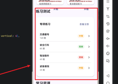
背景
传统驾照学习应用中,练习题和测试区域往往由列表和卡片组件构成,但随着屏幕尺寸、操作系统和交互方式的多样化,如何构建灵活、响应式的 UI 成了挑战:
- 多端适配:手机、平板甚至 PC 端,布局需自动调整。
- 模块化组件:不同练习项(如交通信号、安全行车)应可复用。
- 状态与交互管理:每个练习项需要展示题量、难度,点击后可跳转详情或做题。
Flutter 结合 OpenHarmony 的跨端能力,使得我们可以“一套代码,多端运行”,大幅提升开发效率。
Flutter × OpenHarmony 跨端开发介绍
Flutter 是 Google 推出的 UI 框架,以 声明式 UI、跨平台渲染 著称;而 OpenHarmony 是华为开源的分布式操作系统,支持多种设备形态。
结合两者的优势:
- 统一 UI 构建:Flutter 提供丰富的组件库,OpenHarmony 提供多端适配能力。
- 模块化开发:通过 Widget 封装功能模块,轻松在不同终端复用。
- 高性能渲染:Flutter 渲染性能优秀,OpenHarmony 可直接调用原生能力,实现流畅体验。
- 响应式布局:利用
Column、Row、Card等组件,轻松实现自适应布局。
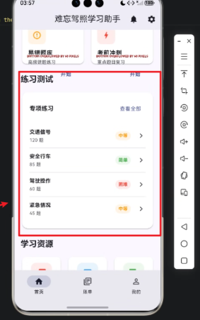
本项目的重点是“练习测试区域”,包括模块标题、专项练习卡片以及单个练习项。
开发核心代码(详细解析)
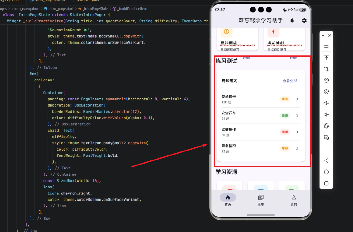
1️⃣ 构建练习测试区域 _buildPracticeTestSection
Widget _buildPracticeTestSection(ThemeData theme) {
  return Column(
    crossAxisAlignment: CrossAxisAlignment.start,
    children: [
      Text(
        '练习测试',
        style: theme.textTheme.titleLarge?.copyWith(
          fontWeight: FontWeight.bold,
        ),
      ),
      const SizedBox(height: 16),
      Card(
        elevation: 2,
        shape: RoundedRectangleBorder(
          borderRadius: BorderRadius.circular(16),
        ),
        child: Padding(
          padding: const EdgeInsets.all(20),
          child: Column(
            children: [
              Row(
                mainAxisAlignment: MainAxisAlignment.spaceBetween,
                children: [
                  Text(
                    '专项练习',
                    style: theme.textTheme.titleMedium?.copyWith(
                      fontWeight: FontWeight.bold,
                    ),
                  ),
                  TextButton(
                    onPressed: () {},
                    child: Text(
                      '查看全部',
                      style: theme.textTheme.bodyMedium?.copyWith(
                        color: theme.colorScheme.primary,
                      ),
                    ),
                  ),
                ],
              ),
              const SizedBox(height: 16),
              Column(
                children: [
                  _buildPracticeItem('交通信号', 120, '中等', theme),
                  const Divider(height: 1, thickness: 1),
                  _buildPracticeItem('安全行车', 85, '简单', theme),
                  const Divider(height: 1, thickness: 1),
                  _buildPracticeItem('驾驶操作', 60, '困难', theme),
                  const Divider(height: 1, thickness: 1),
                  _buildPracticeItem('紧急情况', 45, '中等', theme),
                ],
              ),
            ],
          ),
        ),
      ),
    ],
  );
}
解析:
- 整体布局:使用
Column垂直排列标题与卡片,crossAxisAlignment: CrossAxisAlignment.start保证左对齐。 - 标题设计:
theme.textTheme.titleLarge+ 加粗字体,清晰突出模块。 - 卡片组件:
Card+ 圆角 + 阴影,提升视觉层次感。 - 子模块:使用
Row+TextButton组合实现“专项练习”标题和查看全部按钮。 - 练习列表:再次使用
Column垂直排列每个练习项,并通过Divider分隔。
2️⃣ 构建单个练习项 _buildPracticeItem
Widget _buildPracticeItem(String title, int questionCount, String difficulty, ThemeData theme) {
  Color difficultyColor;
  switch (difficulty) {
    case '简单':
      difficultyColor = Colors.green;
      break;
    case '中等':
      difficultyColor = Colors.orange;
      break;
    case '困难':
      difficultyColor = Colors.red;
      break;
    default:
      difficultyColor = Colors.grey;
  }

  return Padding(
    padding: const EdgeInsets.symmetric(vertical: 12),
    child: Row(
      mainAxisAlignment: MainAxisAlignment.spaceBetween,
      children: [
        Column(
          crossAxisAlignment: CrossAxisAlignment.start,
          children: [
            Text(
              title,
              style: theme.textTheme.bodyMedium?.copyWith(
                fontWeight: FontWeight.bold,
              ),
            ),
            const SizedBox(height: 4),
            Text(
              '$questionCount 题',
              style: theme.textTheme.bodySmall?.copyWith(
                color: theme.colorScheme.onSurfaceVariant,
              ),
            ),
          ],
        ),
        Row(
          children: [
            Container(
              padding: const EdgeInsets.symmetric(horizontal: 8, vertical: 4),
              decoration: BoxDecoration(
                borderRadius: BorderRadius.circular(12),
                color: difficultyColor.withOpacity(0.1),
              ),
              child: Text(
                difficulty,
                style: theme.textTheme.bodySmall?.copyWith(
                  color: difficultyColor,
                  fontWeight: FontWeight.bold,
                ),
              ),
            ),
            const SizedBox(width: 16),
            Icon(
              Icons.chevron_right,
              color: theme.colorScheme.onSurfaceVariant,
            ),
          ],
        ),
      ],
    ),
  );
}
解析:
-
难度色彩:根据难度(简单/中等/困难)显示不同颜色,让用户一眼识别。
-
布局设计:
Row+Column嵌套,左侧显示题目和数量,右侧显示难度标签和箭头。 -
可复用性:
_buildPracticeItem支持动态传入title、题量、难度,实现多模块复用。 -
美化细节:
Container+borderRadius+ 半透明背景,实现圆角标签。Icon提示可点击,增强交互感。- 间距通过
SizedBox精准控制。
心得
在 Flutter × OpenHarmony 的跨端开发中:
- 组件封装是关键:通过
_buildPracticeItem统一封装练习项,未来扩展或修改只需在一个地方调整。 - 主题适配非常重要:通过
ThemeData和colorScheme,实现暗黑模式和多设备颜色一致。 - 布局嵌套合理化:
Column+Row+Padding+Divider,即保证可读性,也保证灵活性。 - 跨端注意性能:避免过多嵌套和动态计算,尽量让 Widget 树扁平化,提高渲染效率。
总结
本文通过一个 驾照学习助手的练习测试模块,展示了 Flutter 在 OpenHarmony 跨端环境下的 UI 构建方法。我们从模块整体布局到单个练习项的封装,详细解析了代码逻辑与设计理念。
通过这种方式,不仅能快速搭建多端一致的练习测试界面,也为未来扩展模拟考试、排行榜等功能奠定基础。Flutter × OpenHarmony 的结合,使得跨平台开发更加高效且易维护。
欢迎加入开源鸿蒙跨平台社区:https://openharmonycrossplatform.csdn.net

开源鸿蒙跨平台开发社区汇聚开发者与厂商,共建“一次开发,多端部署”的开源生态,致力于降低跨端开发门槛,推动万物智联创新。
更多推荐
 30
30 0
0- 0


 已为社区贡献31条内容

所有评论(0)