鸿蒙flutter第三方库适配 - 服务端驱动UI应用
欢迎加入开源鸿蒙跨平台社区:https://openharmonycrossplatform.csdn.net适配的第三方库地址:运行效果图服务端驱动UI应用是一款创新的动态界面管理工具,通过服务端配置实现UI的动态渲染和更新。应用支持动态页面配置、A/B测试、个性化界面定制等核心功能,让开发者无需发版即可更新应用界面,极大提升了产品迭代效率。应用以深邃的紫色为主色调,象征创新与科技。涵盖动态页面
服务端驱动UI应用
欢迎加入开源鸿蒙跨平台社区:
https://openharmonycrossplatform.csdn.net
适配的第三方库地址:
- shared_preferences: https://pub.dev/packages/shared_preferences
- local_auth: https://pub.dev/packages/local_auth
一、项目概述
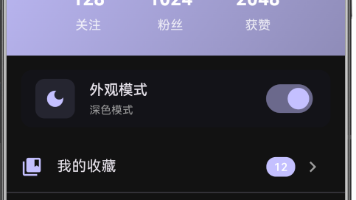
运行效果图
1.1 应用简介
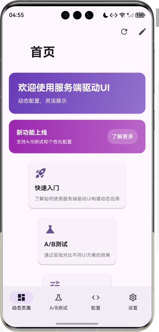
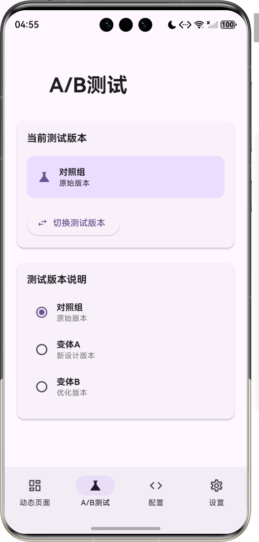
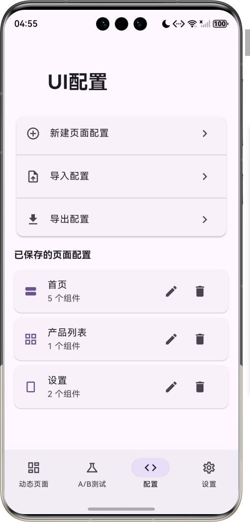
服务端驱动UI应用是一款创新的动态界面管理工具,通过服务端配置实现UI的动态渲染和更新。应用支持动态页面配置、A/B测试、个性化界面定制等核心功能,让开发者无需发版即可更新应用界面,极大提升了产品迭代效率。
应用以深邃的紫色为主色调,象征创新与科技。涵盖动态页面、A/B测试、UI配置、系统设置四大模块。用户可以实时预览不同UI配置、切换测试版本、编辑页面组件、个性化定制界面,体验灵活高效的动态UI管理。
1.2 核心功能
| 功能模块 | 功能描述 | 实现方式 |
|---|---|---|
| 动态页面 | 服务端配置动态渲染 | JSON配置解析 |
| A/B测试 | 多版本UI对比测试 | 版本切换引擎 |
| 个性化界面 | 用户偏好定制界面 | 偏好设置系统 |
| 组件编辑 | 可视化编辑UI组件 | 配置编辑器 |
| 生物认证 | 安全访问个性化设置 | LocalAuthentication |
| 本地缓存 | 离线使用UI配置 | SharedPreferences |
| 热更新 | 无需发版更新UI | 配置热加载 |
| 配置导入导出 | JSON配置管理 | 文件操作 |
1.3 UI组件类型定义
| 序号 | 组件类型 | Emoji | 描述 | 用途 |
|---|---|---|---|---|
| 1 | header | 📋 | 页面头部 | 标题展示 |
| 2 | card | 🃏 | 卡片组件 | 信息展示 |
| 3 | list | 📝 | 列表组件 | 多项展示 |
| 4 | button | 🔘 | 按钮组件 | 交互操作 |
| 5 | text | 📄 | 文本组件 | 文字展示 |
| 6 | image | 🖼️ | 图片组件 | 图片展示 |
| 7 | grid | 📊 | 网格组件 | 多列布局 |
| 8 | banner | 🎯 | 横幅组件 | 活动推广 |
1.4 页面布局类型定义
| 序号 | 布局类型 | Emoji | 描述 | 适用场景 |
|---|---|---|---|---|
| 1 | single | 📱 | 单页布局 | 简单页面 |
| 2 | tabbed | 📑 | 标签布局 | 多Tab页面 |
| 3 | scrollable | 📜 | 滚动布局 | 长内容页面 |
| 4 | grid | 🔲 | 网格布局 | 多项展示 |
1.5 A/B测试版本定义
| 序号 | 版本名称 | Emoji | 描述 | 用途 |
|---|---|---|---|---|
| 1 | control | 📊 | 对照组 | 原始版本 |
| 2 | variantA | 🅰️ | 变体A | 新设计版本 |
| 3 | variantB | 🅱️ | 变体B | 优化版本 |
1.6 技术栈
| 技术领域 | 技术选型 | 版本要求 |
|---|---|---|
| 开发框架 | Flutter | >= 3.0.0 |
| 编程语言 | Dart | >= 2.17.0 |
| 设计规范 | Material Design 3 | - |
| 数据存储 | SharedPreferences | >= 2.0.0 |
| 生物认证 | local_auth | >= 2.0.0 |
| 动画效果 | AnimationController | 内置 |
| 目标平台 | 鸿蒙OS / Web | API 21+ |
1.7 项目结构
lib/
└── main_server_driven_ui.dart
    ├── ServerDrivenUIApp              # 应用入口
    ├── UIComponentType                # 组件类型枚举
    ├── ABTestVariant                  # A/B测试版本枚举
    ├── PageLayout                     # 页面布局枚举
    ├── UIComponent                    # UI组件模型
    ├── PageConfig                     # 页面配置模型
    ├── ServerDrivenHomePage           # 主页面(底部导航)
    ├── _buildDynamicPage              # 动态页面
    ├── _buildABTestPage               # A/B测试页
    ├── _buildConfigPage               # 配置页
    ├── _buildSettingsPage             # 设置页
    └── ConfigEditorPage               # 配置编辑页
二、系统架构
2.1 整体架构图
2.2 类图设计
2.3 页面导航流程
2.4 组件渲染流程
三、核心模块设计
3.1 数据模型设计
3.1.1 UI组件类型枚举 (UIComponentType)
enum UIComponentType {
  header,
  card,
  list,
  button,
  text,
  image,
  grid,
  banner,
}
3.1.2 A/B测试版本枚举 (ABTestVariant)
enum ABTestVariant {
  control(label: '对照组', description: '原始版本'),
  variantA(label: '变体A', description: '新设计版本'),
  variantB(label: '变体B', description: '优化版本');

  final String label;
  final String description;
  const ABTestVariant({required this.label, required this.description});
}
3.1.3 页面布局枚举 (PageLayout)
enum PageLayout {
  single,
  tabbed,
  scrollable,
  grid,
}
3.1.4 UI组件模型 (UIComponent)
class UIComponent {
  final String id;
  final UIComponentType type;
  final Map<String, dynamic> properties;
  final List<UIComponent>? children;
  final String? abTestGroup;

  const UIComponent({
    required this.id,
    required this.type,
    required this.properties,
    this.children,
    this.abTestGroup,
  });

  factory UIComponent.fromJson(Map<String, dynamic> json) {
    return UIComponent(
      id: json['id'] ?? '',
      type: UIComponentType.values.firstWhere(
        (e) => e.name == json['type'],
        orElse: () => UIComponentType.text,
      ),
      properties: Map<String, dynamic>.from(json['properties'] ?? {}),
      children: json['children'] != null
          ? (json['children'] as List).map((c) => UIComponent.fromJson(c)).toList()
          : null,
      abTestGroup: json['abTestGroup'],
    );
  }
}
3.1.5 页面配置模型 (PageConfig)
class PageConfig {
  final String id;
  final String title;
  final PageLayout layout;
  final List<UIComponent> components;
  final ABTestVariant? abVariant;
  final DateTime updatedAt;

  const PageConfig({
    required this.id,
    required this.title,
    required this.layout,
    required this.components,
    this.abVariant,
    required this.updatedAt,
  });

  factory PageConfig.fromJson(Map<String, dynamic> json) {
    return PageConfig(
      id: json['id'] ?? '',
      title: json['title'] ?? '',
      layout: PageLayout.values.firstWhere(
        (e) => e.name == json['layout'],
        orElse: () => PageLayout.scrollable,
      ),
      components: json['components'] != null
          ? (json['components'] as List).map((c) => UIComponent.fromJson(c)).toList()
          : [],
      abVariant: json['abVariant'] != null
          ? ABTestVariant.values.firstWhere(
              (e) => e.name == json['abVariant'],
              orElse: () => ABTestVariant.control,
            )
          : null,
      updatedAt: json['updatedAt'] != null
          ? DateTime.parse(json['updatedAt'])
          : DateTime.now(),
    );
  }
}
3.1.6 组件类型分布
3.2 页面结构设计
3.2.1 主页面布局
3.2.2 动态页面结构
3.2.3 A/B测试页结构
3.2.4 配置编辑页结构
3.3 组件工厂逻辑
3.4 A/B测试逻辑
四、UI设计规范
4.1 配色方案
应用以深邃的紫色为主色调,象征创新与科技:
| 颜色类型 | 色值 | 用途 |
|---|---|---|
| 主色 | #673AB7 (Deep Purple) | 导航、主题元素 |
| 辅助色 | #7E57C2 | 卡片背景 |
| 第三色 | #9575CD | 按钮颜色 |
| 强调色 | #B39DDB | 高亮元素 |
| 背景色 | #FAFAFA | 页面背景 |
| 卡片背景 | #FFFFFF | 信息卡片 |
| 成功色 | #4CAF50 | 认证成功 |
| 警告色 | #FF9800 | 提示信息 |
4.2 组件配色
| 组件类型 | 主色值 | 用途 |
|---|---|---|
| Header | #673AB7 | 页面头部 |
| Card | #FFFFFF | 卡片背景 |
| Banner | #9C27B0 | 横幅背景 |
| Button | #7E57C2 | 按钮颜色 |
4.3 字体规范
| 元素 | 字号 | 字重 | 颜色 |
|---|---|---|---|
| 页面标题 | 24px | Bold | 主色 |
| 组件标题 | 16px | Bold | #000000 |
| 组件描述 | 14px | Regular | #666666 |
| 按钮文字 | 14px | Medium | 主色 |
| 提示文字 | 12px | Regular | #999999 |
4.4 组件规范
4.4.1 Header组件
┌─────────────────────────────────────────────────────────────┐
│  ╔═══════════════════════════════════════════════════════╗ │
│  ║  欢迎使用服务端驱动UI                                  ║ │
│  ║  动态配置,灵活展示                                    ║ │
│  ╚═══════════════════════════════════════════════════════╝ │
└─────────────────────────────────────────────────────────────┘
4.4.2 Card组件
┌─────────────────────────────────────────────────────────────┐
│  ┌─────────────────────────────────────────────────────┐   │
│  │  🚀 快速入门                                        │   │
│  │                                                      │   │
│  │  了解如何使用服务端驱动UI构建动态应用                 │   │
│  └─────────────────────────────────────────────────────┘   │
└─────────────────────────────────────────────────────────────┘
4.4.3 Banner组件
┌─────────────────────────────────────────────────────────────┐
│  ╔═══════════════════════════════════════════════════════╗ │
│  ║  🎯 新功能上线                          [了解更多]    ║ │
│  ║  支持A/B测试和个性化配置                              ║ │
│  ╚═══════════════════════════════════════════════════════╝ │
└─────────────────────────────────────────────────────────────┘
4.4.4 A/B测试选择器
┌─────────────────────────────────────────────────────────────┐
│  当前测试版本                                               │
│  ┌─────────────────────────────────────────────────────┐   │
│  │  🧪 对照组                                          │   │
│  │  原始版本                                           │   │
│  └─────────────────────────────────────────────────────┘   │
│                                                             │
│  [切换测试版本]                                             │
└─────────────────────────────────────────────────────────────┘
五、核心功能实现
5.1 配置加载实现
Future<void> _loadConfigs() async {
  final prefs = await SharedPreferences.getInstance();
  final configsJson = prefs.getString('ui_configs');

  if (configsJson != null) {
    try {
      final List<dynamic> decoded = jsonDecode(configsJson);
      setState(() {
        _pageConfigs.clear();
        _pageConfigs.addAll(decoded.map((c) => PageConfig.fromJson(c)));
      });
    } catch (e) {
      _loadDefaultConfigs();
    }
  } else {
    _loadDefaultConfigs();
  }

  if (_pageConfigs.isNotEmpty) {
    _loadPage(0);
  }
}
5.2 组件渲染实现
Widget _buildComponent(UIComponent component) {
  if (component.abTestGroup != null &&
      component.abTestGroup != _currentABVariant.name) {
    return const SizedBox.shrink();
  }

  switch (component.type) {
    case UIComponentType.header:
      return _buildHeaderComponent(component);
    case UIComponentType.card:
      return _buildCardComponent(component);
    case UIComponentType.list:
      return _buildListComponent(component);
    case UIComponentType.button:
      return _buildButtonComponent(component);
    case UIComponentType.text:
      return _buildTextComponent(component);
    case UIComponentType.image:
      return _buildImageComponent(component);
    case UIComponentType.grid:
      return _buildGridComponent(component);
    case UIComponentType.banner:
      return _buildBannerComponent(component);
  }
}
5.3 A/B测试实现
void _applyABTestVariant() {
  ScaffoldMessenger.of(context).showSnackBar(
    SnackBar(content: Text('已应用 ${_currentABVariant.label} 配置')),
  );
  _loadPage(_currentIndex);
}

Widget _buildComponent(UIComponent component) {
  if (component.abTestGroup != null &&
      component.abTestGroup != _currentABVariant.name) {
    return const SizedBox.shrink();
  }
  // ... 渲染组件
}
5.4 生物认证实现
Future<void> _authenticate() async {
  if (!_biometricAvailable) {
    setState(() => _isAuthenticated = true);
    return;
  }

  try {
    final authenticated = await _localAuth.authenticate(
      localizedReason: '请验证身份以访问个性化设置',
      options: const AuthenticationOptions(
        stickyAuth: true,
        biometricOnly: true,
      ),
    );
    setState(() => _isAuthenticated = authenticated);
  } catch (e) {
    setState(() => _isAuthenticated = true);
  }
}
5.5 配置编辑实现
void _saveConfig() {
  final config = PageConfig(
    id: widget.config?.id ?? 'page_${DateTime.now().millisecondsSinceEpoch}',
    title: _titleController.text,
    layout: _selectedLayout,
    components: _components,
    updatedAt: DateTime.now(),
  );
  widget.onSave(config);
  Navigator.pop(context);
}

void _addComponent(UIComponentType type) {
  setState(() {
    _components.add(UIComponent(
      id: 'component_${DateTime.now().millisecondsSinceEpoch}',
      type: type,
      properties: _getDefaultProperties(type),
    ));
  });
}
六、交互设计
6.1 配置更新流程
6.2 A/B测试切换流程
6.3 个性化设置流程
七、扩展功能规划
7.1 后续版本规划
7.2 功能扩展建议
7.2.1 服务端集成
集成功能:
- 真实服务端API对接
- 配置版本管理
- 增量更新机制
- 离线缓存策略
7.2.2 实时更新
更新功能:
- WebSocket实时推送
- 配置变更通知
- 热更新机制
- 版本回滚支持
7.2.3 数据分析
分析功能:
- 用户行为追踪
- A/B测试效果分析
- 组件点击统计
- 转化率分析
八、注意事项
8.1 开发注意事项
-
配置验证:解析JSON配置时需验证数据格式
-
异常处理:组件渲染需完善的异常处理
-
性能优化:复杂组件树需考虑性能优化
-
版本兼容:配置格式变更需考虑向后兼容
-
安全考虑:敏感配置需加密存储
8.2 常见问题
| 问题 | 原因 | 解决方案 |
|---|---|---|
| 配置解析失败 | JSON格式错误 | 捕获异常并加载默认配置 |
| 组件渲染异常 | 属性类型错误 | 类型转换和默认值处理 |
| A/B测试无效 | 版本标识错误 | 检查abTestGroup匹配 |
| 生物认证失败 | 设备不支持 | 提供备选认证方式 |
| 配置丢失 | 存储异常 | 定期备份配置 |
8.3 使用技巧
🌐 服务端驱动UI应用技巧 🌐
配置管理
- 定期备份重要配置
- 使用有意义的组件ID
- 合理组织组件层级
- 测试不同布局效果
A/B测试
- 明确测试目标
- 设置对照版本
- 收集用户反馈
- 分析测试数据
个性化设置
- 了解用户偏好
- 提供合理选项
- 保存用户选择
- 支持重置默认
九、运行说明
9.1 环境要求
| 环境 | 版本要求 |
|---|---|
| Flutter SDK | >= 3.0.0 |
| Dart SDK | >= 2.17.0 |
| 鸿蒙OS | API 21+ |
| Web浏览器 | Chrome 90+ |
9.2 运行命令
# 查看可用设备
flutter devices

# 运行到Web服务器
flutter run -d web-server -t lib/main_server_driven_ui.dart --web-port 8144

# 运行到鸿蒙设备
flutter run -d 127.0.0.1:5555 lib/main_server_driven_ui.dart

# 代码分析
flutter analyze lib/main_server_driven_ui.dart
十、总结
服务端驱动UI应用是一款创新的动态界面管理工具,通过服务端配置实现UI的动态渲染和更新。应用支持动态页面配置、A/B测试、个性化界面定制、组件编辑等核心功能,让开发者无需发版即可更新应用界面,极大提升了产品迭代效率。
核心功能涵盖动态页面、A/B测试、UI配置、个性化设置、生物认证、本地缓存、热更新、配置导入导出八大模块。用户可以实时预览不同UI配置、切换测试版本、编辑页面组件、个性化定制界面,体验灵活高效的动态UI管理。
应用采用 Material Design 3 设计规范,以深邃的紫色为主色调,象征创新与科技。通过本应用,希望能够为开发者提供便捷的动态UI管理体验,加速产品迭代和优化。
服务端驱动UI应用——动态配置,灵活展示

开源鸿蒙跨平台开发社区汇聚开发者与厂商,共建“一次开发,多端部署”的开源生态,致力于降低跨端开发门槛,推动万物智联创新。
更多推荐
 2
2 0
0- 0


 已为社区贡献1条内容

所有评论(0)