Flutter for OpenHarmony:小试牛刀 实现一个简单卡片组件
/ 必需属性:标题、描述、图标// 卡片标题,如"欢迎使用 Flutter"// 卡片描述文字// 卡片图标,如 Icons.star// 可选属性:颜色、点击事件、操作按钮cardColor;// 卡片背景颜色,?表示可选,不传则使用主题色onTap;// 点击回调函数,可选actionText;// 操作按钮文字,如"了解更多"super.key,required this.title, //
前言
Flutter是Google开发的开源UI工具包,支持用一套代码构建iOS、Android、Web、Windows、macOS和Linux六大平台应用,实现"一次编写,多处运行"。
OpenHarmony是由开放原子开源基金会运营的分布式操作系统,为全场景智能设备提供统一底座,具有多设备支持、模块化设计、分布式能力和开源开放等特性。
Flutter for OpenHarmony技术方案使开发者能够:
- 复用Flutter现有代码(Skia渲染引擎、热重载、丰富组件库)
- 快速构建符合OpenHarmony规范的UI
- 降低多端开发成本
- 利用Dart生态插件资源加速生态建设
该集成方案结合了Flutter的高效开发优势和OpenHarmony的分布式特性,可显著提升跨平台应用开发效率。
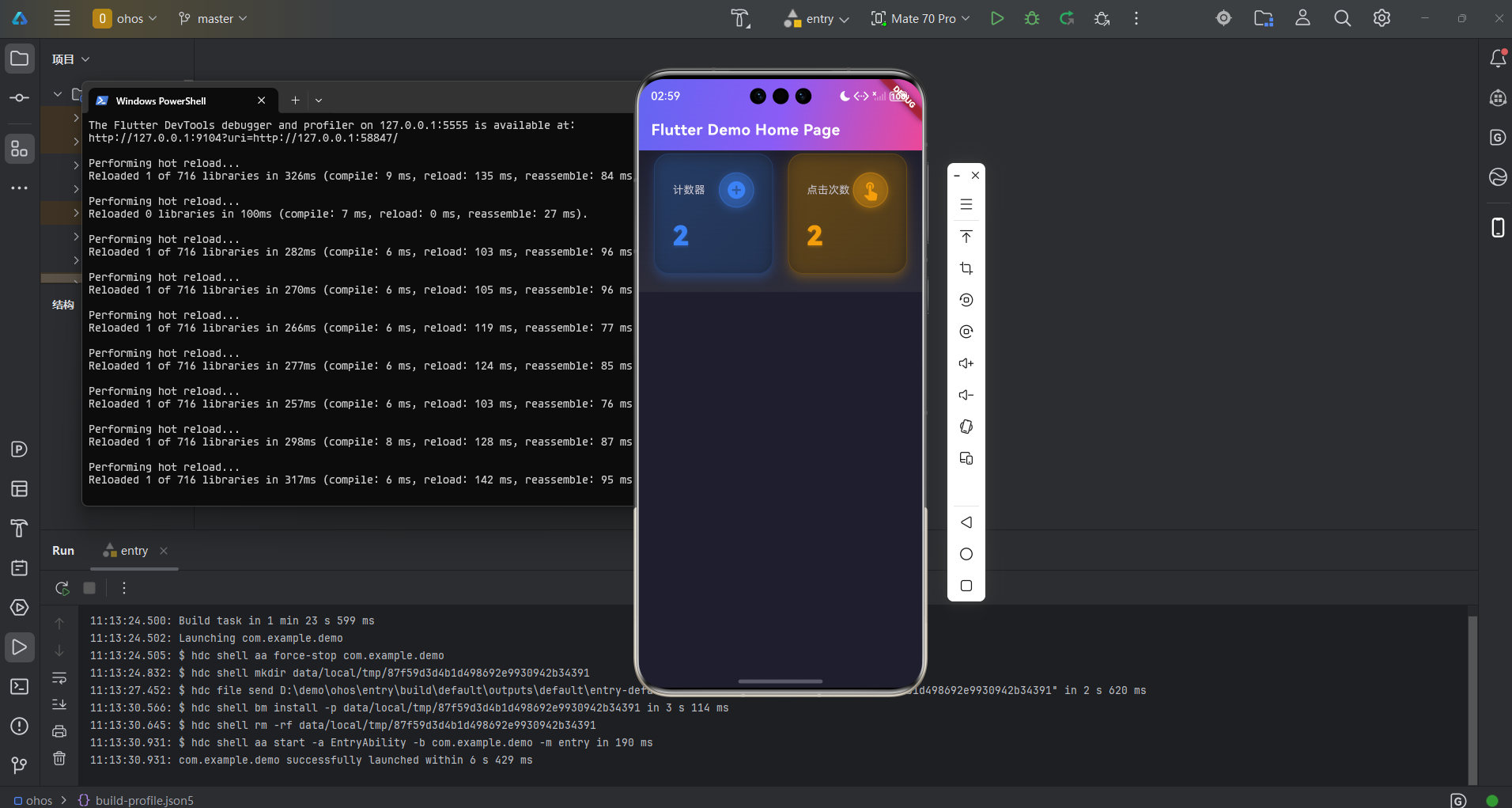
web端调试阶段 完整效果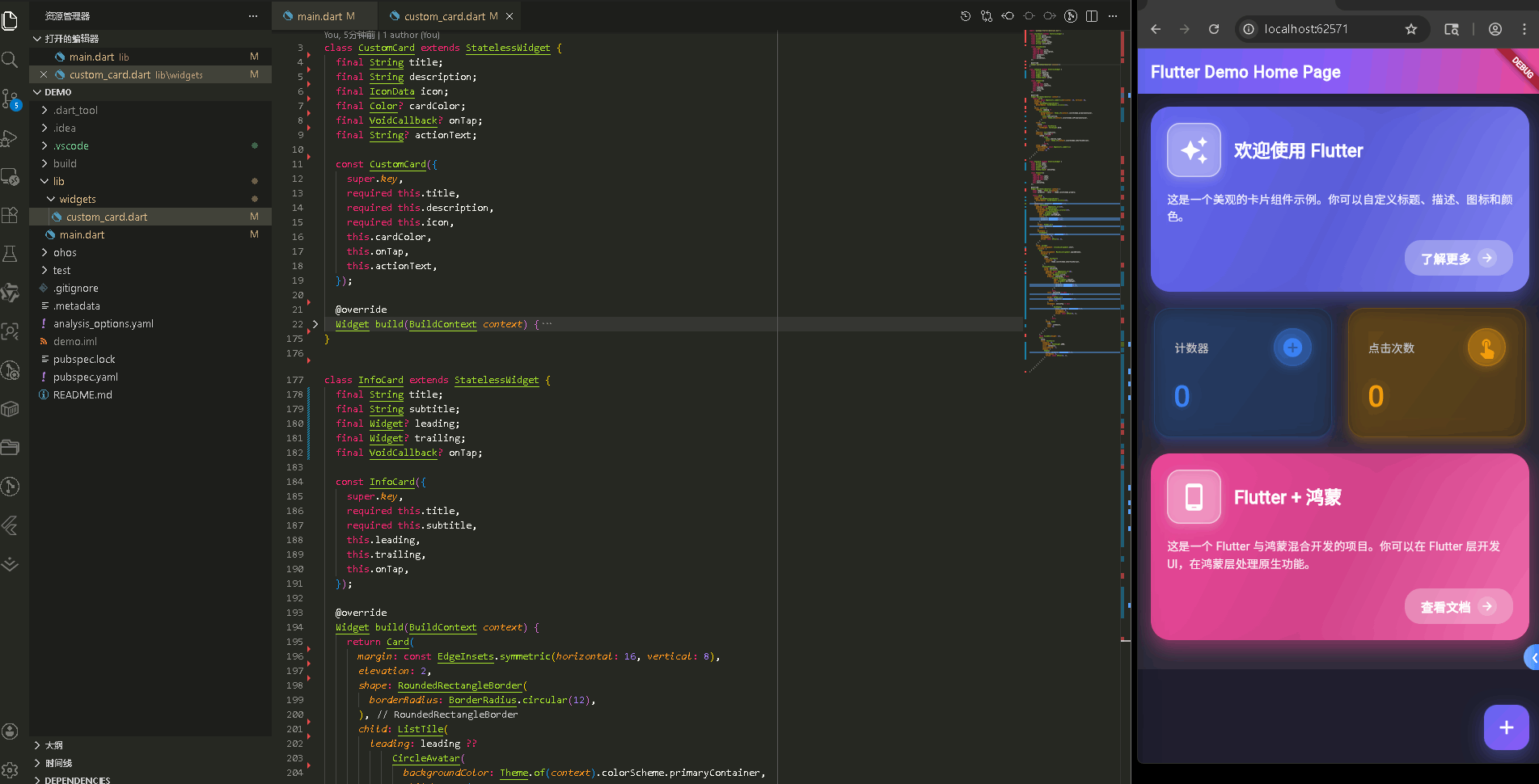
在真机模拟器上成功运行后的效果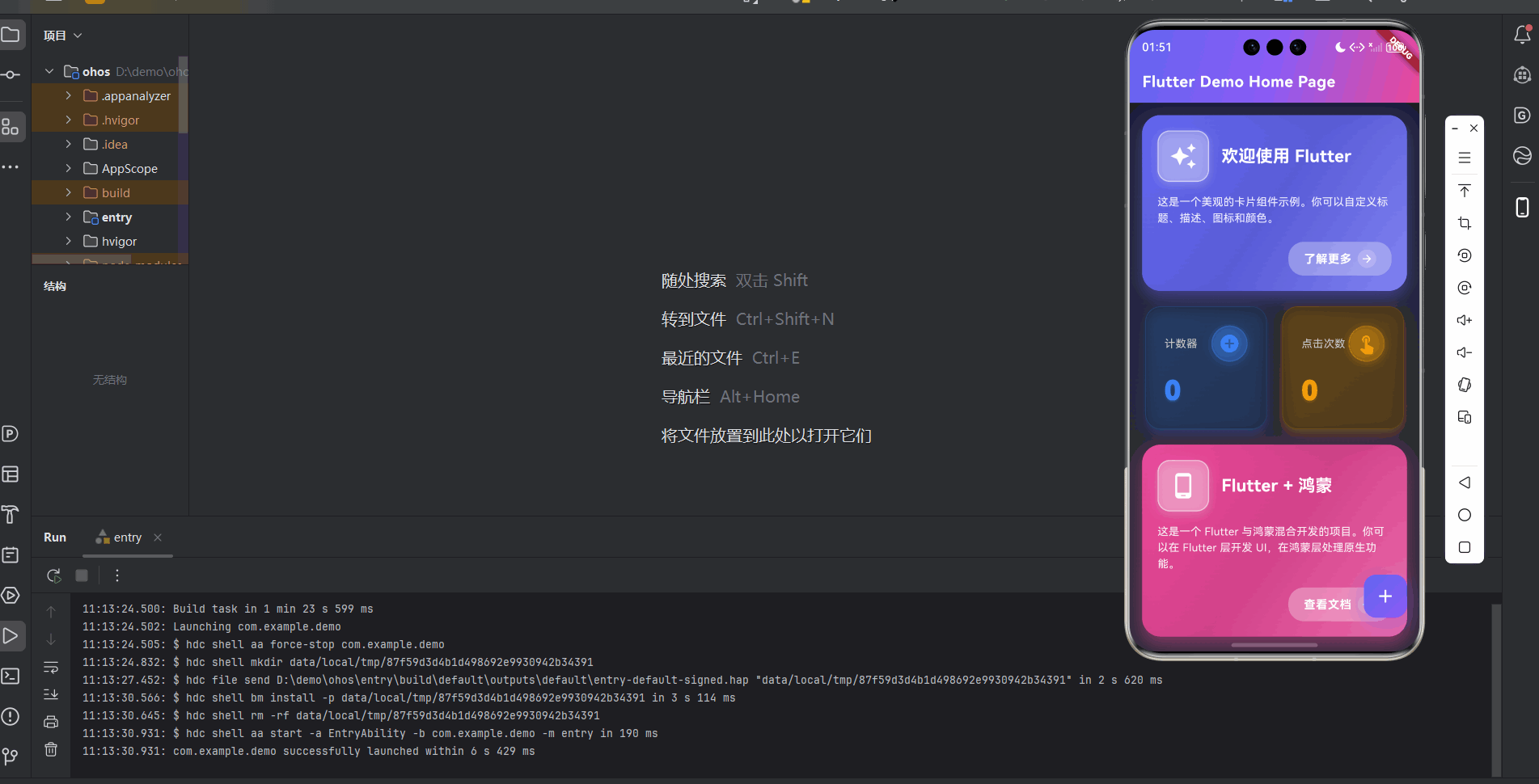
CustomCard 组件开发
- 定义组件属性和构造函数
- build() 方法 - 获取主题信息
- Card 外层容器
- InkWell 点击效果
- Container 装饰 - 渐变背景
- 双重阴影效果
- Column 布局和图标标题行
- 描述文本
- 操作按钮(条件渲染)
InfoCard 组件开发
StatCard 组件开发
组件使用示例
CustomCard 组件
1. 定义组件属性和构造函数
class CustomCard extends StatelessWidget {
  // 必需属性:标题、描述、图标
  final String title;           // 卡片标题,如"欢迎使用 Flutter"
  final String description;    // 卡片描述文字
  final IconData icon;         // 卡片图标,如 Icons.star

  // 可选属性:颜色、点击事件、操作按钮
  final Color? cardColor;      // 卡片背景颜色,? 表示可选,不传则使用主题色
  final VoidCallback? onTap;   // 点击回调函数,可选
  final String? actionText;    // 操作按钮文字,如"了解更多"

  const CustomCard({
    super.key,
    required this.title,        // required 表示必须传
    required this.description,
    required this.icon,
    this.cardColor,             // 没有 required,可选
    this.onTap,
    this.actionText,
  });
}
这里定义了组件的"身份证"。final 表示值不可修改
2. build() 方法 - 获取主题信息
Widget build(BuildContext context) {
// 从上下文获取主题信息,用于默认颜色
final theme = Theme.of(context);
final colorScheme = theme.colorScheme;
build() 方法是组件的建造师,负责渲染界面。Theme.of(context) 从上下文获取主题,如果用户没提供 cardColor,就用主题的默认颜色。
3. Card 外层容器
return Card(
  elevation: 12,              // 阴影高度,值越大卡片越"浮"
  margin: const EdgeInsets.all(16),  // 外边距,四周各 16 像素
  shape: RoundedRectangleBorder(
    borderRadius: BorderRadius.circular(24),  // 圆角半径 24 像素
  ),
  // 阴影颜色:如果有自定义颜色就用自定义的,否则用主题色
  shadowColor: cardColor?.withOpacity(0.3) ?? colorScheme.primary.withOpacity(0.3),
Card 是 Flutter 的卡片组件。elevation 控制阴影,值越大越立体。margin 是外边距,borderRadius 是圆角。
4. InkWell 点击效果
child: InkWell(
  onTap: onTap,               // 点击时执行回调
  borderRadius: BorderRadius.circular(24),  // 水波纹圆角,要和卡片一致
InkWell 提供点击时的水波纹效果。onTap 是点击回调,borderRadius 控制水波纹范围。
5. Container 装饰 - 渐变背景
child: Container(
  decoration: BoxDecoration(
    borderRadius: BorderRadius.circular(24),
    // 三元运算符:如果提供了 cardColor 就用自定义渐变,否则用主题色
    gradient: cardColor != null
        ? LinearGradient(
            begin: Alignment.topLeft,      // 渐变起始位置(左上)
            end: Alignment.bottomRight,    // 渐变结束位置(右下)
            colors: [
              cardColor!,                  // 纯色
              cardColor!.withOpacity(0.8), // 80% 不透明
              Color.lerp(cardColor!, Colors.white, 0.2) ?? cardColor!,  // 混合 20% 白色
            ],
            stops: const [0.0, 0.5, 1.0],  // 颜色位置:0% → 50% → 100%
          )
        : LinearGradient(
            begin: Alignment.topLeft,
            end: Alignment.bottomRight,
            colors: [
              colorScheme.primaryContainer,
              colorScheme.secondaryContainer,
            ],
          ),
Container 的 decoration 设置装饰。gradient 是线性渐变,从左上到右下。Color.lerp() 是颜色插值,混合两种颜色。stops 控制颜色在渐变中的位置。
6. 双重阴影效果
boxShadow: [
  // 主阴影:更明显,让卡片有立体感
  BoxShadow(
    color: (cardColor ?? colorScheme.primary).withOpacity(0.3),
    blurRadius: 20,           // 模糊半径
    spreadRadius: 2,           // 扩散半径
    offset: const Offset(0, 8), // 向下偏移 8 像素
  ),
  // 光晕效果:更柔和,范围更大
  BoxShadow(
    color: (cardColor ?? colorScheme.primary).withOpacity(0.1),
    blurRadius: 40,
    spreadRadius: 4,
    offset: const Offset(0, 4),
  ),
],
两个阴影叠加创造层次感。第一个是主阴影,第二个是光晕。
7. Column 布局和图标标题行
padding: const EdgeInsets.all(20),  // 内边距
child: Column(
  crossAxisAlignment: CrossAxisAlignment.start,  // 左对齐
  mainAxisSize: MainAxisSize.min,   // 只占用必要空间
  children: [
    Row(  // 水平布局:图标 + 标题
      children: [
        // 图标容器
        Container(
          padding: const EdgeInsets.all(14),
          decoration: BoxDecoration(
            color: Colors.white.withOpacity(0.25),  // 半透明白色背景
            borderRadius: BorderRadius.circular(16),
            border: Border.all(
              color: Colors.white.withOpacity(0.5),
              width: 1.5,
            ),
            boxShadow: [
              BoxShadow(
                color: Colors.white.withOpacity(0.2),
                blurRadius: 10,
                spreadRadius: 1,
                offset: const Offset(0, 4),
              ),
            ],
          ),
          child: Icon(
            icon,
            size: 36,
            color: Colors.white,
          ),
        ),
        const SizedBox(width: 16),  // 图标和标题之间的间距
        // 标题:使用 Expanded 占据剩余空间
        Expanded(
          child: Text(
            title,
            style: const TextStyle(
              fontSize: 22,
              fontWeight: FontWeight.bold,
              color: Colors.white,
            ),
          ),
        ),
      ],
    ),
Column 是垂直布局,Row 是水平布局。图标容器有半透明背景和边框。Expanded 让标题占据剩余空间。SizedBox 用于间距。
8. 描述文本
const SizedBox(height: 16),  // 标题和描述之间的间距
Text(
  description,
  style: TextStyle(
    fontSize: 14,
    color: Colors.white.withOpacity(0.9),  // 90% 不透明,稍微淡一点
    height: 1.5,  // 行高是字体的 1.5 倍,让文字不拥挤
  ),
),
描述文字比标题小,颜色也淡一些,不会抢标题风头
9. 操作按钮(条件渲染)
// 只有当提供了 actionText 和 onTap 时才显示按钮
if (actionText != null && onTap != null) ...[
  const SizedBox(height: 20),
  Align(
    alignment: Alignment.centerRight,  // 右对齐
    child: Container(
      padding: const EdgeInsets.symmetric(
        horizontal: 20,  // 左右各 20 像素
        vertical: 10,    // 上下各 10 像素
      ),
      decoration: BoxDecoration(
        color: Colors.white.withOpacity(0.3),
        borderRadius: BorderRadius.circular(20),
      ),
      child: Row(
        mainAxisSize: MainAxisSize.min,  // 只占用必要空间
        children: [
          Text(
            actionText!,  // ! 表示确定不为空
            style: const TextStyle(
              color: Colors.white,
              fontWeight: FontWeight.bold,
              fontSize: 15,
              letterSpacing: 0.5,  // 字母间距
            ),
          ),
          const SizedBox(width: 8),
          // 箭头图标容器
          Container(
            padding: const EdgeInsets.all(4),
            decoration: BoxDecoration(
              color: Colors.white.withOpacity(0.2),
              shape: BoxShape.circle,  // 圆形
            ),
            child: const Icon(
              Icons.arrow_forward,
              color: Colors.white,
              size: 16,
            ),
          ),
        ],
      ),
    ),
  ),
],
Align 控制位置,mainAxisSize.min 让按钮不拉伸。
InfoCard 组件开发
1. 定义组件属性
class InfoCard extends StatelessWidget {
  final String title;        // 主标题
  final String subtitle;    // 副标题
  final Widget? leading;    // 左侧组件(通常是图标),可选
  final Widget? trailing;   // 右侧组件(通常是箭头),可选
  final VoidCallback? onTap; // 点击事件,可选
简洁的列表式卡片,适合设置页面、功能列表等场景。
2. build() 方法 - ListTile
Widget build(BuildContext context) {
return Card(
margin: const EdgeInsets.symmetric(horizontal: 16, vertical: 8),
elevation: 2,
shape: RoundedRectangleBorder(
borderRadius: BorderRadius.circular(12),
),
child: ListTile(
// 左侧图标:如果没提供就用默认的 CircleAvatar
leading: leading ??
CircleAvatar(
backgroundColor: Theme.of(context).colorScheme.primaryContainer,
child: Icon(
Icons.info_outline,
color: Theme.of(context).colorScheme.onPrimaryContainer,
),
),
title: Text(
title,
style: const TextStyle(
fontWeight: FontWeight.bold,
),
),
subtitle: Text(subtitle),
// 右侧箭头:如果提供了 onTap 就显示,否则不显示
trailing: trailing ??
(onTap != null
? Icon(
Icons.chevron_right,
color: Theme.of(context).colorScheme.onSurfaceVariant,
)
: null),
onTap: onTap,
contentPadding: const EdgeInsets.symmetric(
horizontal: 16,
vertical: 8,
),
),
);
}
ListTile 是 Flutter 的标准列表项组件,自动处理布局。leading ?? ... 是空值合并,如果 leading 为 null 就用默认值。
StatCard 组件开发
1. 定义组件属性
class StatCard extends StatelessWidget {
  final String label;        // 标签文本,如"计数器"
  final String value;        // 显示的值,如"123"
  final IconData icon;       // 图标
  final Color? color;        // 主题颜色,可选
  final VoidCallback? onIconTap; // 图标点击事件,可选
统计卡片,用于显示数据。如果提供了 onIconTap,图标可以点击。
2. build() 方法 - 主题和颜色
Widget build(BuildContext context) {
final theme = Theme.of(context);
// 如果有自定义颜色就用自定义的,否则用主题主色
final cardColor = color ?? theme.colorScheme.primary;
获取主题,确定使用的颜色。
3. Card 和 Container 装饰
return Card(
  elevation: 8,
  shape: RoundedRectangleBorder(
    borderRadius: BorderRadius.circular(20),
  ),
  shadowColor: cardColor.withOpacity(0.3),  // 彩色阴影
  child: Container(
    padding: const EdgeInsets.all(24),
    decoration: BoxDecoration(
      borderRadius: BorderRadius.circular(20),
      // 淡渐变背景
      gradient: LinearGradient(
        begin: Alignment.topLeft,
        end: Alignment.bottomRight,
        colors: [
          cardColor.withOpacity(0.15),  // 15% 不透明
          cardColor.withOpacity(0.05),  // 5% 不透明
        ],
      ),
      // 边框
      border: Border.all(
        color: cardColor.withOpacity(0.2),
        width: 1,
      ),
      // 光晕效果
      boxShadow: [
        BoxShadow(
          color: cardColor.withOpacity(0.2),
          blurRadius: 15,
          spreadRadius: 1,
          offset: const Offset(0, 4),
        ),
      ],
    ),
卡片有淡渐变背景、边框和光晕。shadowColor 让阴影颜色和主题一致。
4. 标签和可点击图标
child: Column(
  crossAxisAlignment: CrossAxisAlignment.start,
  children: [
    Row(
      mainAxisAlignment: MainAxisAlignment.spaceBetween,  // 两端对齐
      children: [
        // 标签文本
        Text(
          label,
          style: TextStyle(
            fontSize: 14,
            color: theme.colorScheme.onSurfaceVariant,
          ),
        ),
        // 可点击图标
        GestureDetector(
          onTap: onIconTap,  // 点击事件
          child: Container(
            padding: const EdgeInsets.all(8),
            decoration: BoxDecoration(
              shape: BoxShape.circle,  // 圆形
              // 如果可点击,使用渐变背景和阴影
              gradient: onIconTap != null
                  ? LinearGradient(
                      begin: Alignment.topLeft,
                      end: Alignment.bottomRight,
                      colors: [
                        cardColor.withOpacity(0.3),
                        cardColor.withOpacity(0.15),
                      ],
                    )
                  : null,
              // 如果不可点击,使用纯色背景
              color: onIconTap == null
                  ? cardColor.withOpacity(0.1)
                  : null,
              border: Border.all(
                color: cardColor.withOpacity(0.3),
                width: 1.5,
              ),
              // 可点击时显示阴影
              boxShadow: onIconTap != null
                  ? [
                      BoxShadow(
                        color: cardColor.withOpacity(0.3),
                        blurRadius: 8,
                        spreadRadius: 1,
                        offset: const Offset(0, 2),
                      ),
                    ]
                  : null,
            ),
            child: Icon(
              icon,
              color: cardColor,
              size: 28,
            ),
          ),
        ),
      ],
    ),
GestureDetector 让图标可以点击。根据是否可点击,显示不同的样式:可点击时有渐变和阴影,不可点击时只有纯色背景。
5. 大号数值显示
const SizedBox(height: 12),
Text(
  value,
  style: TextStyle(
    fontSize: 36,              // 超大字体
    fontWeight: FontWeight.w900, // 超粗体
    color: cardColor,
    letterSpacing: -1,          // 负字母间距,让数字更紧凑
    shadows: [                  // 文字阴影,增加立体感
      Shadow(
        color: cardColor.withOpacity(0.3),
        blurRadius: 8,
        offset: const Offset(0, 2),
      ),
    ],
  ),
),
数值用超大、超粗字体显示,非常醒目。letterSpacing: -1 让数字更紧凑,shadows 增加立体感。
组件使用示例
CustomCard 使用示例
CustomCard1
CustomCard(
  title: '欢迎使用 Flutter',
  description: '这是一个美观的卡片组件示例。你可以自定义标题、描述、图标和颜色。',
  icon: Icons.auto_awesome,  // 星星图标
  cardColor: const Color(0xFF6366F1),  // 紫色,0xFF 表示完全不透明
  actionText: '了解更多',
  onTap: () {
    // 显示提示消息
    ScaffoldMessenger.of(context).showSnackBar(
      SnackBar(
        content: const Text('卡片被点击了!✨'),
        duration: const Duration(seconds: 1),
        backgroundColor: const Color(0xFF6366F1),
        behavior: SnackBarBehavior.floating,  // 浮动样式
        shape: RoundedRectangleBorder(
          borderRadius: BorderRadius.circular(10),
        ),
      ),
    );
  },
)
onTap 点击时执行。ScaffoldMessenger 用于显示提示消息。
CustomCard2
  CustomCard(
     title: 'Flutter + 鸿蒙',
      description:
          '这是一个 Flutter 与鸿蒙混合开发的项目。你可以在 Flutter 层开发 UI,在鸿蒙层处理原生功能。',
      icon: Icons.phone_android,
      cardColor: const Color(0xFFEC4899),
      actionText: '查看文档',
      onTap: () {
        ScaffoldMessenger.of(context).showSnackBar(
          SnackBar(
            content: const Text('查看项目说明文档了解更多信息 📚'),
            duration: const Duration(seconds: 2),
            backgroundColor: const Color(0xFFEC4899),
            behavior: SnackBarBehavior.floating,
            shape: RoundedRectangleBorder(
              borderRadius: BorderRadius.circular(10),
            ),
          ),
        );
      },
    ),
StatCard 使用示例
Padding(
  padding: const EdgeInsets.symmetric(horizontal: 16),
  child: Row(
    children: [
      // 第一个统计卡片
      Expanded(
        child: StatCard(
          label: '计数器',
          value: '$_counter',  // 字符串插值,把数字转成字符串
          icon: Icons.add_circle,
          color: const Color(0xFF3B82F6),  // 蓝色
          onIconTap: _incrementCounter,    // 点击图标时增加计数
        ),
      ),
      const SizedBox(width: 12),  // 两个卡片之间的间距
      // 第二个统计卡片
      Expanded(
        child: StatCard(
          label: '点击次数',
          value: '$_counter',
          icon: Icons.touch_app,
          color: const Color(0xFFF59E0B),  // 橙色
          onIconTap: _incrementCounter,
        ),
      ),
    ],
  ),
)
Expanded 让两个卡片平分宽度。'$_counter' 是字符串插值,把数字转成字符串。两个卡片都使用 _incrementCounter 方法,点击任何一个图标都会增加计数。
状态更新方法
int _counter = 0;  // 计数器变量,初始值为 0

void _incrementCounter() {
  setState(() {    // 必须调用 setState 才能更新 UI
    _counter++;    // 计数器加 1
  });
}
setState() 是状态更新的关键。修改状态必须在 setState() 中,否则 UI 不会更新。_counter++ 是 _counter = _counter + 1 的简写。
欢迎加入开源鸿蒙跨平台社区: https://openharmonycrossplatform.csdn.net

开源鸿蒙跨平台开发社区汇聚开发者与厂商,共建“一次开发,多端部署”的开源生态,致力于降低跨端开发门槛,推动万物智联创新。
更多推荐

 21
21 0
0- 0


 已为社区贡献3条内容

所有评论(0)